Python数据分析实战—用matplotlib实现数据可视化(2)
《Python数据分析实战》
1.处理日期值
数据处理过程中,最常见的一个问题就是日期类型数据的处理。
import datetime
import numpy as np
import matplotlib.pyplot as plt
import matplotlib.dates as mdates

#分别表示月份和日子(这个例子主要是用到月份)
mothes = mdates.MonthLocator()
days = mdates.DayLocator()

#定义时间显示格式
timeFmt = mdates.DateFormatter('%Y-%m')

events = [datetime.date(2015,1,23),datetime.date(2015,1,28),datetime.date(2015,2,3),datetime.date(2015,2,21),datetime.date(2015,3,15),datetime.date(2015,3,24),datetime.date(2015,4,8),datetime.date(2015,4,24)]
readings = [12,22,25,20,18,15,17,14]

#注意是subplots,返回一个figure对象和一个子图的array列表。
fig,ax = plt.subplots()

plt.plot(events,readings)

#设置显示格式
ax.xaxis.set_major_locator(mothes)
ax.xaxis.set_major_formatter(timeFmt)

plt.show()
下面显示是否添加时间格式的区别:


关于日期转换的另一个例子:
from pylab import *
import matplotlib as mpl
import datetime

#获取figure和axes对象
fig = figure()
ax = gca()
start = datetime.datetime(2013, 1, 1)
stop = datetime.datetime(2013, 12, 31)
#设置时间间隔
delta = datetime.timedelta(days = 1)
#Return a sequence of equally spaced Matplotlib dates.返回等距的时间序列
dates = mpl.dates.drange(start, stop, delta)

#生成对应的整数随机分布
values = np.random.rand(len(dates))

ax = gca()
ax.plot_date(dates, values, linestyle= '-', marker='')
date_format = mpl.dates.DateFormatter('%Y-%m-%d')
ax.xaxis.set_major_formatter(date_format)

#autofmt_xdate解释:Date ticklabels often overlap, so it is useful to rotate them and right align them.
#Also, a common use case is a number of subplots with shared xaxes where the x-axis is date data.
#The ticklabels are often long, and it helps to rotate them on the bottom subplot and turn them off on other subplots, as well as turn off xlabels.
fig.autofmt_xdate()
show() 
可以查考:
https://www.cnblogs.com/nju2014/p/5620776.html
https://blog.csdn.net/panda1234lee/article/details/52311593
https://blog.csdn.net/akon_wang_hkbu/article/details/78845752
2.图表列型
a.线性图:
import matplotlib.pyplot as plt
import numpy as np

x = np.arange(-2*np.pi,2*np.pi,0.01)
y = np.sin(3*x)/x
y2 = np.sin(2*x)/x
y3 = np.sin(3*x)/x

plt.plot(x,y,'k--',linewidth=3)
plt.plot(x,y2,'m-.')
plt.plot(x,y3,color='#87a3cc',linestyle='--')
注意:
1.matplotlib自动为每条线分配一种不同的颜色。
2.可以用plot()函数的第三个参数指定颜色、线型,把这些设置所用的字符编码放到同一个字符串即可。你还可以使用单独的关键字参数,用color指定颜色,用linestyle指定线型。
使用xticks()和yticks()指定x轴和y轴的刻度。
import matplotlib.pyplot as plt
import numpy as np

x = np.arange(-2*np.pi,2*np.pi,0.01)
y = np.sin(3*x)/x
y2 = np.sin(2*x)/x
y3 = np.sin(3*x)/x

plt.plot(x,y,'k--',linewidth=3)
plt.plot(x,y2,'m-.')
plt.plot(x,y3,color='#87a3cc',linestyle='--')

#为了正确显示符合π,需要使用含有LaTeX表达式的字符串。记得将其置于两个$之间,并在前面加上r前缀。
plt.xticks([-2*np.pi,-np.pi,0,np.pi,2*np.pi],[r'$-2\pi$',r'$-\pi$',r'$0$',r'$+\pi$',r'$+2\pi$'])
plt.yticks([-1,0,+1,+2,+3],[r'$-1$',r'$0$',r'$+1$',r'$+2$',r'$$+3'])

plt.show()
在前面你所见过的所有线型图中,x轴和y轴总是置于Figure的边缘(跟图像的边框重合)。另外一种显示轴的方法是,两条轴穿过原点(0,0),也就是笛卡尔坐标轴。
import matplotlib.pyplot as plt
import numpy as np

x = np.arange(-2*np.pi,2*np.pi,0.01)
y = np.sin(3*x)/x
y2 = np.sin(2*x)/x
y3 = np.sin(x)/x

plt.plot(x,y,color='b')
plt.plot(x,y2,color='r')
plt.plot(x,y3,color='g')

#为了正确显示符合π,需要使用含有LaTeX表达式的字符串。记得将其置于两个$之间,并在前面加上r前缀。
plt.xticks([-2*np.pi,-np.pi,0,np.pi,2*np.pi],[r'$-2\pi$',r'$-\pi$',r'$0$',r'$+\pi$',r'$+2\pi$'])
plt.yticks([-1,0,+1,+2,+3],[r'$-1$',r'$0$',r'$+1$',r'$+2$',r'$+3$'])

#用gca()函数获取Axes对象
ax =plt.gca()
#使用set_color()函数,把颜色设置为none,删除跟坐标轴不符合的边(右和上)
ax.spines['right'].set_color('none')
ax.spines['top'].set_color('none')
#用set_position()函数移动跟x轴和y轴相符的边框,使其穿过原点(0,0)
ax.xaxis.set_ticks_position('bottom')
ax.spines['bottom'].set_position(('data',0))
ax.yaxis.set_ticks_position('left')
ax.spines['left'].set_position(('data',0))

plt.show()
用注释和箭头(可选)标明曲线上某一数据点的位置,这一功能非常有用。例如,可以用LaTeX表达式作为注释,比如添加表示x趋于0时函数sinx/x的极限的公式。
matplotlib库的annotate()函数特别适用于添加注释。虽然它又多个关键字参数,这些参数可改善显示效果,但是参数设置略显繁琐。第一个参数为含有LaTeX表达式、要在图形中显示的字符串;随后是各种关键字参数。注释在图表中的位置用存在数据点[x,y]坐标的列表来表示,需要把它们传给xy关键字参数。文本注释跟它解释的数据点之间的距离用xytext关键字参数指定,用曲线箭头将其表示出来。箭头的属性则由arrowprops关键字参数指定。
import matplotlib.pyplot as plt
import numpy as np

x = np.arange(-2*np.pi,2*np.pi,0.01)
y = np.sin(3*x)/x
y2 = np.sin(2*x)/x
y3 = np.sin(x)/x

plt.plot(x,y,color='b')
plt.plot(x,y2,color='r')
plt.plot(x,y3,color='g')

#为了正确显示符合π,需要使用含有LaTeX表达式的字符串。记得将其置于两个$之间,并在前面加上r前缀。
plt.xticks([-2*np.pi,-np.pi,0,np.pi,2*np.pi],[r'$-2\pi$',r'$-\pi$',r'$0$',r'$+\pi$',r'$+2\pi$'])
plt.yticks([-1,0,+1,+2,+3],[r'$-1$',r'$0$',r'$+1$',r'$+2$',r'$+3$'])

plt.annotate(r'$\lim{x\to 0}\frac{\sin(x)}{x}=1$',xy=[0,1],xycoords='data',xytext=[30,30],fontsize=16,textcoords='offset points',arrowprops=
                dict(arrowstyle="->",connectionstyle='arc3,rad=.2')
)

#用gca()函数获取Axes对象
ax =plt.gca()
#使用set_color()函数,把颜色设置为none,删除跟坐标轴不符合的边(右和上)
ax.spines['right'].set_color('none')
ax.spines['top'].set_color('none')
#用set_position()函数移动跟x轴和y轴相符的边框,使其穿过原点(0,0)
ax.xaxis.set_ticks_position('bottom')
ax.spines['bottom'].set_position(('data',0))
ax.yaxis.set_ticks_position('left')
ax.spines['left'].set_position(('data',0))

plt.show()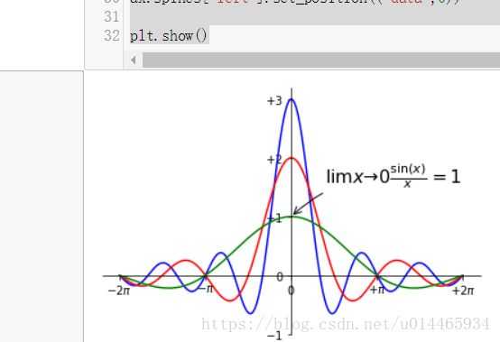
为pandas数据结构绘制线性图:
关于DataFrame数据结构的基本操作:https://blog.csdn.net/u014281392/article/details/75331570
将DataFrame中的数据做成线性图表很简单,只需把DataFrame作为参数传入plot()函数,就能得到多序列线性图。
import numpy as np
import pandas as pd

df2 = pd.DataFrame({
    'co1':[1,2,3],
    'co2':[4,5,6]
}, index=['a','b','c'])

x = np.arange(3)

plt.plot(x,df2)
plt.legend(df2,loc=2)

plt.show()
b.直方图:
直方图由竖立在x轴上的多个相邻的矩形组成,这些矩阵把x轴拆分为一段段彼此不重叠的线段(线段两个端点所标识的数据范围也叫面元),矩形的面积跟落在其所对应的面元的元素数量成正比。这种可视化方法常被用于样本分布等统计研究。
pyplot用于绘制直方图的函数为hist()。运算结果除了以图形形式表示外,还能以元组形式返回。
pop = np.random.randint(0,100,100)
plt.hist(pop,bins=20)
plt.show()
n,bins,patches = pit.hist(pop,bins=20)
#hist()函数的返回值
plt.hist(pop,bins=20)
>>
plt.hist(pop,bins=20)
plt.hist(pop,bins=20)
(array([ 8., 7., 7., 7., 4., 5., 1., 3., 6., 6., 12.,
4., 3., 5., 5., 3., 7., 1., 4., 2.]),
array([ 1. , 5.85, 10.7 , 15.55, 20.4 , 25.25, 30.1 , 34.95,
39.8 , 44.65, 49.5 , 54.35, 59.2 , 64.05, 68.9 , 73.75,
78.6 , 83.45, 88.3 , 93.15, 98. ]),
20 Patch objects>)