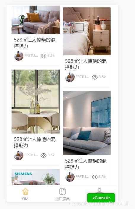
结合vue实现移动端页面的瀑布流布局
参考博客:浅谈瀑布流原理及Vue实现
结合自己项目的需求进行修改
基本原理:多行等宽不等高元素排列。第一排图片的顶部会处于同一个高度,依次排列在顶端,第二行以及之后的行则利用定位在最短的一列下面进行排列
// 封装了WaterFallFlow.vue子组件
<template>
  <div class="waterfall_container">
    <div
      v-for="(item, index) in waterfallList"
      :key="index"
      class="waterfall_item"
      :style="{ top: item.top + 'px', left: item.left + 'px', width: imgWidth + 'px', height: item.itemHeight }"
    >
      <div class="coverImg">
        <Cover :src="item.src" alt="" :height="item.imgHeightPercent + '%'"></Cover>
      </div>
      <div class="content">
        <div class="title line2">528㎡让人惊艳的混搭魅力</div>
        <div class="info flex flex-between flex-middle">
          <div class="designer flex-item-3">
            <img src="@/assets/images/灵感详情.png" alt="" />
            <span class="name">FFSTUDsssssssssssIO</span>
          </div>
          <div class="watcher flex-item-2">
            <img src="@/assets/images/icon/列表-浏览量.png" alt="" />
            <span> 3.5k</span>
          </div>
        </div>
      </div>
    </div>
  </div>
</template>

<script>
import Cover from "@/components/Cover";
export default {
  components: {
    Cover,
  },
  props: {
  // 父组件传值给子组件
    list: {
      type: Array,
      default: function() {
        return [
        // 在js中存放静态文件链接的时候要用require,不然不会显示
          require("@/assets/images/灵感列表2.png"),
          require("@/assets/images/产品目录3.png"),
          require("@/assets/images/灵感详情.png"),
          require("@/assets/images/灵感列表1.png"),
          require("@/assets/images/产品目录2.png"),
          require("@/assets/images/产品目录1.png"),
          require("@/assets/images/国际趋势2品牌1.png"),
          require("@/assets/images/国际趋势2品牌2.png"),
          require("@/assets/images/国际趋势2品牌3.png"),
          require("@/assets/images/国际趋势1品牌3.png"),
          require("@/assets/images/国际趋势1品牌2.png"),
          require("@/assets/images/设计师列表-作品3.png"),
          require("@/assets/images/设计师列表-作品2.png"),
        ];
      },
    },
  },
  data() {
    return {
      waterfallList: [],
      imgWidth: 0, // 图片宽度
      contentHeight: 100, // 内容高度
      waterfallCol: 2, // 瀑布流列数
      itemRight: 0.5, // 图片右边距(以rem为单位)
      itemBottom: 1, // 图片下边距(以rem为单位)
      waterfallDeviationHeight: [], // 瀑布流高度偏移量
    };
  },
  mounted() {
    // 根元素像素
    const rootElePixel = parseInt(window.getComputedStyle(document.querySelector("html"), null).fontSize);
    this.itemRight *= rootElePixel;
    this.itemBottom *= rootElePixel;
    this.calculationValue();
  },
  methods: {
    // 计算每项的宽度(即图片/内容宽度)
    calculationValue() {
      const containerWidth = document.querySelector(".waterfall_container").offsetWidth;
      this.imgWidth = (containerWidth / this.waterfallCol) - this.itemRight;
      // 初始化偏移高度数组,该数组用于存放每一列的高度
      this.waterfallDeviationHeight = new Array(this.waterfallCol);
      for (let i = 0; i < this.waterfallDeviationHeight.length; i++) {
        this.waterfallDeviationHeight[i] = 0;
      }
      this.imgPreloading();
    },
    // 图片预加载
    imgPreloading() {
      for (let i = 0; i < this.list.length; i++) {
        const aImg = new Image();
        aImg.src = this.list[i];
        // 注意:图片加载完成的顺序不一样的,所以在页面显示图片的顺序每次都可能不一样
        aImg.onload = aImg.onerror = (e) => {
          const itemData = {};
          // 图片高度按比例缩放
          const imgHeight = (this.imgWidth / aImg.width) * aImg.height;
          // 获取图片高度比
          itemData.imgHeightPercent = (imgHeight / this.imgWidth) * 100;
          // 整体高度 = 图片高度 + 内容高度
          itemData.height = imgHeight + this.contentHeight;
          itemData.src = this.list[i];
          // 将每一项都push到一个列表中
          this.waterfallList.push(itemData);
          // 进行瀑布流布局
          this.waterfallFlowLayout(itemData);
        };
      }
    },
    // 瀑布流布局
    waterfallFlowLayout(itemData) {
      const shortestIndex = this.getShortestCol();
      itemData.top = this.waterfallDeviationHeight[shortestIndex];
      itemData.left = shortestIndex * (this.itemRight + this.imgWidth);
      this.waterfallDeviationHeight[shortestIndex] += itemData.height + this.itemBottom;
    },
    /**
     * 找到最短的列并返回索引
     * @returns {number} 索引
     */
    getShortestCol() {
      const shortest = Math.min.apply(null, this.waterfallDeviationHeight);
      return this.waterfallDeviationHeight.indexOf(shortest);
    },
  },
};
</script>

<style lang="less" scoped>
.waterfall_container {
  width: 100%;
  height: 100%;
  position: relative;
  .waterfall_item {
    float: left;
    position: absolute;
    // 底边阴影
    box-shadow: 0px 0.2rem 0.1rem #f7f8fa;
    .content {
      width: 100%;
      padding: 0.4rem;
      .title {
        font-size: 0.8rem;
      }
      .info {
        margin: 0.4rem 0;
        font-size: 0.5rem;
        color: #bbb;
        .designer {
          margin-right: 0.3rem;
          white-space: nowrap;
          overflow: hidden;
          text-overflow: ellipsis;
          img {
            border-radius: 50%;
            width: 1.6rem;
            height: 1.6rem;
          }
        }
        .watcher {
          img {
            width: 1rem;
            height: 1rem;
          }
        }
      }
    }
  }
  img {
    vertical-align: middle;
  }
}
</style>
// 封面图Cover.vue子组件
<template>
  <div>
    <div class="cover-img">
      <img :src="src" :alt="alt" />
    </div>
    <!-- 控制封面图高度 -->
    <div class="holder" :style="'padding-bottom:' + height"></div>
  </div>
</template>

<script>
export default {
  props: {
    src: {
      type: String,
      required: true,
    },
    alt: {
      type: String,
      default: "",
    },
    height: {
      type: String,
      default: "100%",
    },
  },
  data() {
    return {};
  },
};
</script>

<style lang="less" scoped>
.cover-img {
  position: absolute;
  width: 100%;
  height: 100%;
  top: 0;
  left: 0;
  overflow: hidden;
  background-position: 50%;
  background-size: cover;
}
.cover-img img {
  width: 100%;
  height: 100%;
  position: absolute;
  top: 0;
  left: 50%;
  height: 100%;
  transform: translateX(-50%);
}
.holder {
  width: 100%;
  position: relative;
  padding-bottom: 100%;
  background-repeat: no-repeat;
  background-size: cover;
}
</style>
效果图: