CSS背景
CSS 可以添加背景颜色和背景图片,以及来进行图片设置。
| background-color | 背景颜色 |
|---|---|
| background-image | 背景图片地址 |
| background-repeat | 是否平铺 |
| background-position | 背景位置 |
| background-attachment | 背景固定还是滚动 |
| 背景的合写(复合属性) | |
| background:背景颜色 背景图片地址 背景平铺 背景滚动 背景位置 |
背景图片(image)
background-image: url("images/bj.jpg");
参数:
none : 无背景图(默认的)
url : 使用绝对或相对地址指定背景图像
background-image 属性允许指定一个图片展示在背景中(只有CSS3才可以多背景)可以和 background-color 连用。 如果图片不重复地话,图片覆盖不到地地方都会被背景色填充。 如果有背景图片平铺,则会覆盖背景颜色。
小技巧: 我们提倡 背景图片后面的地址,url不要加引号。
背景平铺(repeat)
background-repeat : repeat | no-repeat | repeat-x | repeat-y
参数:
repeat :  背景图像在纵向和横向上平铺(默认的)
no-repeat :  背景图像不平铺
repeat-x :  背景图像在横向上平铺
repeat-y :  背景图像在纵向平铺
设置背景图片时,默认把图片在水平和垂直方向平铺以铺满整个元素。
repeat-x :  背景图像在横向上平铺
背景位置(position)
background-position : length || length
background-position : position || position
参数:
length : 百分数 | 由浮点数字和单位标识符组成的长度值。请参阅长度单位
position : top | center | bottom | left | center | right
说明:
设置或检索对象的背景图像位置。必须先指定background-image属性。默认值为:(0% 0%)。
如果只指定了一个值,该值将用于横坐标。纵坐标将默认为50%。第二个值将用于纵坐标。
注意:
position 后面是x坐标和y坐标。 可以使用方位名词或者 精确单位。
如果和精确单位和方位名字混合使用,则必须是x坐标在前,y坐标后面。比如 background-position: 15px top; 则 15px 一定是 x坐标 top是 y坐标。
实际工作用的最多的,就是背景图片居中对齐了
<html lang="en">
<head>
	<meta charset="UTF-8">
	<title>CSS背景title>
	<style>
       .nav {
       	  width: 300px;
       	  height: 300px;
       	  background-color: green;
       	  background-image: url("images/bj.jpg");
       	  background-repeat: no-repeat;
       	  /* 2.第一个值X坐标 第二只Y坐标 */
       	  /* background-position: 10px 30px;*/
       	  /* 3.混搭 */
       	  background-position: 10px center;
       }
       .head {
       	  width: 400px;
       	  height: 400px;
       	  background-color: skyblue;
       	  background-image: url("images/bj.jpg");
       	  background-repeat: no-repeat;  /* 不平铺 */
       	  /* background-repeat: repeat-x;  */ /* 横向平铺 */

       	  /* 1.利用方位名称 top  right left bottom 来更改背景图片的位置
            方位名称没有顺序
       	  */
       	  /* background-position: right top; */
       	  background-position: center center ;
       }
	style>
head>
<body>
	<div class="nav">div>
	<div class="head">div>
	<div class="bottom">div>
html>
背景附着
background-attachment : scroll | fixed
参数:
scroll :  背景图像是随对象内容滚动
fixed :  背景图像固定
说明:
设置或检索背景图像是随对象内容滚动还是固定的。
背景简写
background属性的值的书写顺序官方并没有强制标准的。为了可读性,建议大家如下写:
background:背景颜色 背景图片地址 背景平铺 背景滚动 背景位置
background: transparent url(image.jpg) repeat-y scroll 50% 0 ;
<html lang="en">
<head>
	<meta charset="UTF-8">
	<title>背景附着title>
	<style>
         /*   body {
       	background-color: #000;
       	background-image: url(images/ms.jpg);
       	background-repeat: no-repeat;
       	background-position: center  -25px;

       	background-attachment: fixed;
       } */
       body {
       	  background:#000 url(images/ms.jpg) no-repeat center -25px fixed;
       }
         p {
         	color: #fff;
         	font-size: 25px;
         }
	style>
head>
<body>
	<p>“大数据”是需要新处理模式才能具有更强的决策力、洞察发现力和流程优化能力来适应海量、高增长率和多样化的信息资产p>
body>
html>
背景半透明
CSS3支持背景半透明的写法语法格式是:
background: rgba(0,0,0,0.3);
最后一个参数是alpha 透明度 取值范围 0~1之间
注意: 背景半透明是指盒子背景半透明, 盒子里面的内容不收影响。
同样, 可以给 文字和边框透明 都是 rgba 的格式来写。
color:rgba(0,0,0,0.3);
border: 1px solid rgba(0,0,0,0.3);
<html lang="en">
<head>
	<meta charset="UTF-8">
	<title>背景半透明title>
	<style>
	   body {
	   	 background: #000 url(images/king.jpg) no-repeat top center;
	   }
       div {
       	  height: 400px;
       	  background: rgba(0,0,0,0.5);
       }
	style>
head>
<body>
	<div>div>
body>
html>
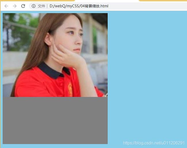
背景缩放(CSS3)
通过background-size设置背景图片的尺寸,就像我们设置img的尺寸一样,在移动Web开发中做屏幕适配应用非常广泛。
其参数设置如下:
a) 可以设置长度单位(px)或百分比(设置百分比时,参照盒子的宽高)
b) 设置为cover时,会自动调整缩放比例,保证图片始终填充满背景区域,如有溢出部分则会被隐藏(用的最多)。
c) 设置为contain会自动调整缩放比例,保证图片始终完整显示在背景区域
background-image: url('images/gyt.jpg');
            background-size: 300px 100px;
            /* background-size: contain; */
            /* background-size: cover; */
<html lang="en">
<head>
	<meta charset="UTF-8">
	<title>背景缩放title>
	<style>
	   body {
	   	 background-color: skyblue;
	   }
       div {
       	 width: 400px;
       	 height: 500px;
       	 background: gray url(images/bj.jpg) no-repeat;
       	 /* 背景图片设置大小 尽量改一个值等比例缩放 百分比缩放*/
       	 /* background-size: 300px ; */
       	 /*background-size: 50%;*/

       	 /* 会自动调整缩放比例,保证图片始终填充背景区域,如果溢出部分则会被隐藏
           1.图片进行等比例缩放 图片一定要保证宽度和高度同时满足盒子的大小,
            势必会有部分超出去,就看不见了
       	  */
       	 /*background-size: cover;*/

         /* contain 自动调整缩放比例,保证图片始终完整显示在背景区域 */
       	 background-size: contain;
       }
	style>
head>
<body>
	<div>div>
body>
html>
多背景(CSS3)
以逗号分隔可以设置多背景,可用于自适应布局
- 一个元素可以设置多重背景图像
- 每组属性间使用逗号分隔
- 如果设置的多重背景图之间存在着交集(即存在着重叠关系),前面的背景图会覆盖在后面的背景图之上
- 为了避免背景色将图像盖住,背景色通常都定义在最后一组上
background-image: url('images/gyt.jpg'),url('images/robot.png');
<html lang="en">
<head>
	<meta charset="UTF-8">
	<title>黑马前端-多背景title>
	<style>
       div {
       	width: 500px;
       	height: 500px;
       	background: url(images/l.jpg) no-repeat left top,
       	url(images/3.jpg) no-repeat right bottom skyblue;

       }
	style>
head>
<body>
	<div>div>
body>
html>
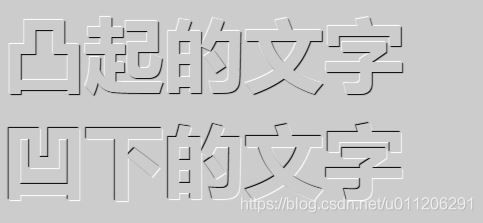
凸凹文字
<html lang="en">
<head>
	<meta charset="UTF-8">
	<title>凸凹文字title>
	<style>
	body {
		background-color: #ccc;
	}
     div {
     	color: #ccc;
        font: 700 80px "微软雅黑";
        }
        div:first-child {
        	/* 水平位置 垂直位置 模糊距离 阴影颜色 */
        	text-shadow: 1px 1px 1px #000,-1px -1px 1px #fff;
        }
        div:last-child {
        	/* 水平位置 垂直位置 模糊距离 阴影颜色 */
        	text-shadow: -1px -1px 1px #000,1px 1px 1px #fff;
        }
	style>
head>
<body>
	<div>凸起的文字div>
	<div>凹下的文字div>
body>
html>