Meizu MX 4-core review: Twice the power
魅族MX四核评测:两倍动力
GSMArena 团队 2012.7.18
1#
Introduction 介绍
Make a stronghold of your home market and prepare for worldwide expansion. Meizu didn't invent the wheel with this strategy but is using it to great success. One would think a market as vast as China - and with huge potential for growth at that - would be enough to keep Meizu busy but they're keen on making a name for themselves globally. And what better way to do that than being in the top 4 of quad-core smartphone manufacturers?
The partnership with Samsung was the key to bringing a quad-core phone to the market. Meizu didn't quite beat the big names with LG, HTC and, naturally, Samsung getting there first, but it secured a precious advantage over local rivals Huawei and that should be a big win for them.
以本地市场作为大本营然后逐步的向国际市场进军并不是魅族发明的,但是魅族正在使用这个策略来取得重大的成功,也许有人认为中国这个广阔并且有着巨大发展潜力的市场足以让魅族忙活着了,可是魅族公司不是这样想,他们瞄准了国际市场,因此,为了这个目标还有比跻身于世界四大四核智能手机制造商更好的策略吗?(HTC one x,三星galaxy s3,魅族mx 四核,LG Optimus 4X HD P880)
和三星的合作是魅族四核手机面世的关键,魅族知名度不如LG,HTC及首个推出四核手机的三星,但是和国内的竞争对手华为比起来它有着巨大的优势(指推出四核手机方面),这是相对于华为的一个重大的胜利(为什么仅仅提起华为?)


Meizu MX 4-core official photos
魅族mx四核官方图
We're about to start exploring a phone we've already seen. The Meizu MX 4-core is virtually the same as the original dual-core Meizu MX, if you don't count the two extra cores. But who are we fooling here? We know you do. Now here's the cheat sheet to get you started.
我们马上就来逐一展示魅族mx四核。实际上,如果不加上另外的两个处理器核心,魅族mx四核和之前的双核完全一样,我们知道你也知道这些,因此,我们在这里是不是无聊到没事找事做?(意思是看了下文就知道不是无聊到没事找事做),下面是我们评测开始之前罗列的魅族mx四核产品规格。
Key features
- Quad-band GSM and penta-band 3G support
- 21.6 Mbps HSDPA and 5.76 Mbps HSUPA
- 4.0" 16M-color ASV capacitive touchscreen of 640 x 960 pixel resolution; Gorilla glass
- Heavily skinned Android OS v4.0 ("Flyme OS")
- 1.4 GHz quad-core Cortex-A9 CPU, Mali-400MP GPU, Exynos 4212 Quad chipset, 1GB of RAM
- 8 MP wide-angle autofocus camera with LED flash, face and smile detection; Wide Dynamic Mode
- Up to 1080p video recording @ 30fps
- Wi-Fi 802.11 b, g and n support; Wi-Fi hotspot
- GPS with A-GPS connectivity; Digital compass
- 32/64GB of internal storage
- Accelerometer, gyroscope and proximity sensor
- Charging MHL microUSB port with USB host, TV-out support (1080p via an optional adapter) and S/PDIF-out for dock connection
- Standard 3.5 mm audio jack
- Stereo Bluetooth v2.1
- Active noise cancellation with a dedicated mic
- VGA secondary video-call camera
- Full Flash support
- Document editor
- File manager comes preinstalled
- Impressively rich audio and video format support
规格
- 支持四频GSM和五波段3G(不懂)
- 21.6MBPS 高速下行分组接入和5.76Mbps高速上行分组接入(下载上传速度?)
- 4寸 1600万像素 960*640分辨率ASV电容屏;大猩猩玻璃
- 深入美化的android4.0系统 flyme os(字面理解是“严重剥皮”的android,哈哈)
- 1.4GHz 基于A9架构四核CPU,Mali-400MP 图像处理器,三星四核4212猎户座芯片,1G内存
- 800万像素广角、自动对焦并带有LED带光灯的相机,识别人脸和笑脸;宽动态模式
- 最高1080p摄像功能(30fps)
- Wi-Fi 802.11,支持 b, g,n(什么意思?) ; Wi-Fi 热点
- A-GPS(GPS定位和基站定位结合),数字罗盘
- 自带16G存储
- 加速器,陀螺仪,距离传感器
- 带有USB HOST(u盘直接读取)功能的移动高清microusb接口,1080p电视输出,S/PDIF-输出(索尼推出的一个音频输出标准)
- 标准3.5毫米耳机接口
- 2.1版本立体声蓝牙(据说其他手机都4.0版本)
- 通过专用麦克实现主动式噪音过滤
- VGA级别的可视视频通话摄像头(前置的那个)
- Flash支持
- 文档编辑(flyme去除了word打开的软件了)
- 内置文档管理(这个真心做的好)
- 丰富的视频音频格式支持
Main disadvantages
- Tries too hard to beat the iPhone at its own game
- Sub-par viewing angles and sunlight legibility
- Looks exactly like its predecessor
- No dedicated camera key (but cool Gesture captuire option and volume rocker alternative)
- Non-expandable internal storage
- Battery not user replaceable
- No FM radio
主要缺点
- 游戏和iphone不能媲美(自身游戏?)
- 可视角度、阳光下辨识度不达标(说的太严厉了)
- 外观和上代没有改变
- 没有相机快捷键(音量键不能,难道他们想通过音量键作相机快捷键?)
- 不支持存储卡扩展
- 不支持换电池
- 没有FM(老话题了)
If you've been paying attention, you'd notice that the lists are quite similar - the original Meizu MX has been there, done that. There are only two major changes and one of them is the updated Flyme OS. The MX 4-core offers a user experience so vastly different from the established brands that Meizu may not be too worried in the end about the high-profile competition.
The other update the Meizu MX 4-core brings is the real deal, which is why it's right there in the smartphone's name. The two extra cores, the better GPU and the new 32nm architecture mean the Meizu flagship is now faster and smoother while still using roughly the same amount of power.
如果大家注意的话,会发现上述罗列的项目和mx双核特别的相似,四核仅有两个重大的升级,一个是“废了米”系统-带给用户和其他手机品牌操作完全不同的感受(魅族或许最后不会在激烈的市场竞争中过分担心这些品牌,why?仅仅因为flyme?)
另外一个升级魅族带来的很实惠,就是手机之所以成为智能手机的东西:另外的两个cpu核心,更好的GPU和新的32纳米架构让手机电量保持相同的时候给用户更好更快的操作感受。
![]()

The Meizu MX 4-core studio shots 四核视频(略去)
We are at a point in the smartphone evolution when you can get all the functionally you need from the app stores, as long as you have the hardware to run it. That makes the extra cores as big an update as anyone would ever need. On the other hand, failure to make a big difference in the benchmarks will reduce the Meizu MX 4-core to one of the most trivial upgrades a flagship has received since the iPhone 4S.
We will only know for sure when the review is done, so let's waste no more time. The unboxing and hardware inspection coming up right after the break.
当今我们处在智能手机快速更新换代的年代,只要你有硬件那么你就可以在软件中心下载所需的各种功能,这使得几乎所有人都想要更快的CPU,也就是说,如果魅族不在硬件标准上“标新立异”,那么魅族也将沦为iphone 4s发布以来其他所谓升级的“旗舰”实际却是小打小闹中的一员(这句话太好了,笔者认为其他所谓旗舰,大多是自称,和iphone 4s还是不能比)。
我们将来可以确定的是评测什么时候结束,因此不要浪费时间了,开箱和硬件检测马上就带给大家。
2#
Unboxing
We didn't get the Meizu MX 4-core in its retail packaging but it came with a set of accessories, which users will most certainly be getting in the box. Our unit has a compact charger and a microUSB data cable. There's a tool used for easy opening of the back cover, too.
开箱
我们拿到手的并不是魅族最终零售版,不过盒子里有大家肯定也会有的配件:小巧的充电器,micruousb数据线,还有一个打开后盖的工具。


A charger, USB cable and back cover opening tool
充电器,micruousb数据线,后盖开启工具
We didn't get a headset and we are not sure whether there will be one in the final retail bundle.
我们没有找到耳机,不确定是否最终零售版会有(肯定的告诉你,预定的也没有)
Meizu MX 4-core 360-degree spin
Mx四核360角度图
The Meizu MX measures 121.1 x 63.3 x 10.3 mm, which is more than reasonably pocketable by today's standards. Not surprising really, a 4" screen is downright small by the same yardstick.
Mx四核的尺寸是 121.1 x 63.3 x 10.3 mm,按照这个时代的标准很方便的放入口袋,可是拿在手里4寸屏幕就小了(老外手普遍大)
Design and controls
The Meizu MX 4-core is impossible to tell apart from its dual-core predecessor and that's not the best way to go about an upgrade. They doubled the processing power but didn't bother doing anything about the packaging - and to be honest, we weren't impressed with the original.
外观设计
Mx四核和之前的双核从外观上基本看不到区别,对一种升级版来说这不是一种最好的方式。(即不认同外观继续沿用前序设计),魅族公司他们升级了CPU可是在外包装没有做变动(我也认为需要变动),真心的说,我们对先前的产品印象不深(不知道是说产品还是包装)。
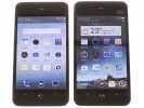

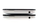
The Meixu MX and MX 4-core side by side魅族mx双核和四核
We've been over the uncanny resemblance to the iPhone. Being one of only few quad-core smartphones, the Meizu MX 4-core is to be taken seriously but looking like an iPhone replica doesn't help.
我们已经见多了iphone外观相似机,作为稀少的四核,魅族mx四核曾被传言的很神秘,可实际拿到手发现外观还是iphone控。(不知道这里翻译是否正确)


The Meizu MX 4-core sized up against the quad-core competition
魅族mx四核和其他双核手机的尺寸对比
The phone is made entirely of plastic and we have to say we're not big fans of it. The screen is a fingerprint magnet and the glossy white battery cover looks cheap and doesn't allow a secure grip.
手机基本全是塑料做的,我们对此不感冒(实际是有一圈金属的),屏幕是指纹收集器,背部光滑的塑料感觉很廉价,并且感觉容易从手里划掉(我也同意,为什么不磨砂设计,M9那样)

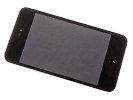
The Meizu MX hasn't lost the iPhone resemblance
魅族mx外观也是iphone控
The phone has a good hand fit thanks to the beveled edges of the back and the compact size, but the glossy rear is disappointing in terms of both looks and feel. The battery cover resembles the hyperglaze finish of the Samsung Galaxy S III but isn't anywhere near it quality-wise.
There's a kind of double coating with a see-through layer on top of the white plastic. You can easily spot this around the 3.5mm jack where the transparent top layer creates an unpleasant flake. The surface is very slippery and fingerprint-prone. Smudges are as good as invisible on white but most of the time the phone feels like it's going to slip out of hand.
At the front panel we have a narrow slit for the earpiece and the video-call camera next to it. An ambient light and a proximity sensor are also here.
Mx四核在尺寸和边缘的收边处理带给人很好的操作感,可是光滑的后盖在外观和实际使用中都不爽(第二次提到了),并且感觉和三星galaxy s3的抛光处理类似,可是质量上并不一样(应该是说魅族的差)。
后盖是双塑料处理,在耳机接口周围可以很容易的弄掉外层塑料(耳机那里有一个薄薄的一层),外层太滑腻了(第三次提到),虽然白色的塑料不容易看到指纹,可是一直总感觉手机要从手中划掉(同感)。
在手机的正面上端有听筒(很狭窄)(不过通话声音还是很大),它旁边是视屏通话摄像头(从没有用过视频通话),光线感应器和距离感应器也在这个区域。

Earpiece and video-call camera along with the proximity and ambient light sensors
听筒、前置摄像头和距离感应器三者在一起
Below the screen is where it gets interesting - the central Home key is small and rounded, subtly projecting from the surface. That makes it easy to find by touch and it's fairly comfortable to hit, despite its small size.
On either side of it are the two capacitive soft keys. They are rather special - a Meizu patent actually. The context aware keys change appearance and function depending on what's happening on the screen.
The left one is typically a Back key and shows a < symbol but switches to a single dot when there's nothing to come back from (it serves as a lock key in this situation, upon a press and hold).
屏幕下方的home键设计的很小巧,圆圆的从手机正面突出,虽然很小,可是很容易按到。
在home键两侧是两个隐藏式虚拟按键,设计的很特别(已经是魅族的专利),在你屏幕操作的时候,它会根据内容的不同而有不同的变化。
左边的按键是一个标准返回键,外观上是“<”,但是当没有什么返回操作的时候就会变成一个圆点(这时候长按会锁屏)
感触:这个老外肯定不是第一次使用魅族mx,这些都知道。
The right one spends most of the time as a Menu key (displaying three dots) but turns into a single dot when there's no context menu available. Anywhere in the interface and regardless of whether it's a single dot or a three-dot pattern, this key launches a heavily customized task switcher upon a press and hold.
That's not all for the soft key tricks though - the capacitive controls are haptic enabled, with strong sharp vibration upon a press. What's really impressive though is the icon rotation to match the orientation of the screen. Also, you can adjust the brightness of their backlighting individually from the screen and upon a tap the keys pulse brighter (even if they're at the brightest setting).
Now, such keys may not seem like much, but Meizu's implementation is really cool (and one of the highlights of the MX 4-core), so we wanted to cover them in detail. You can see them on video in the User interface section of this review.
右边的按键大部分的时候是作为菜单键(三个小圆点)使用,可是当操作项没有菜单的时候会变成一个小圆点,在任何时候不论是一个小圆点还是三个小圆点,长按这个菜单键都会弹出一个魅族深度定制的任务界面(大家懂的,不多解释)。
这还不是这两个感触式按键的全部,它还有震动回馈,给人印象更深的是屏幕旋转的时候它会随之作出各种图形变化,另外,你还可以调整它们的亮度,这样按动它们的时候会更亮(应该是说亮度在触摸的时候有一个变化)。
也许上面的特征感觉一般,可是我们能体会到魅族产品的用心(这样翻译有点别扭),因此我们打算仔细的研究,大家可以看到评测中的视频(这里略去)

The situation-aware capacitive keys are pretty cool
触摸按钮的随内容感应的设计太爽了
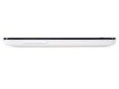
The rest of the tour will go pretty quick. The left side houses the volume keys while the right side is bare. The volume rocker is really uncomfortable - thin and quite flat.
其他外观简单的说下,左边有音量键,右边什么也没有,音量键操作感真的不好-太薄太平(同感)
![]()
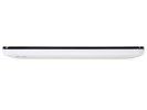
The volume keys are on the left, while the right side is bare
左边有音量键,右边什么也没有
At the top are the Power/Lock key, the 3.5mm audio jack and the secondary noise-cancelling mc.
顶部有电源键/锁屏键、耳机接口和噪音过滤mic。


A view of the top: Power/Lock key, 3.5mm audio jack and the secondary microphone
The bottom features the microUSB port and primary microphone along with two connectors that are most likely for the dock. The microUSB port serves three different duties - data connection to a computer, charging and HD TV-Out over a MHL link.
底部有microUSB接口和主mic,两侧有两个小铁柱(锁定外壳),microUSB有三个用途:连接电脑,充电和通过MHL连接实现电视高清输出。
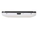

The microUSB port is at the bottom底部配置microUSB
The back of the Meizu MX 4-core features the 8MP camera lens with an LED flash right next to it. The loudspeaker is also here, located at the sloping edge of the back. The loudspeaker doesn't get muffled, but you should be careful with the camera - it can get scratched and is usually covered in fingerprints.
The back is the only place that offers a hint of a difference between the two MX models. Our test unit has a small 32GB label to indicate the amount of inbuilt storage. The 4-core comes in 32GB and 64GB flavors. The original Meizu MX only had a 16GB version.
Mx四核的后盖上有800万的摄像头,其边上有一个LED闪光灯,扬声器也在这里,不过是后盖的边缘,这样不至于平放手机扬声器被遮住(大爱这个设计,其他品牌的android在这方便基本废了),不过你要小心摄像头被划到和指纹的侵扰(这里为魅族打抱不平,mx从双核起在摄像头上就做了防指纹处理)。
![]()


The back features the 8MP camera lens, the LED flash and the loudspeaker grilles
手机背部有800万照相机,LED闪光灯和扬声器
The back cover can be popped open to reveal the microSIM card slot, which uses a metal tray to get the card in and out easier. You can also see the battery, but it's not user replaceable (not easily anyway), as it's wired. The battery is a 1700mAh Li-Po unit, which is 100mAh larger than what the original MX had.
后盖打开后可以发现microSIM卡插槽,插槽使用了一个金属小盘实现方便插入和取出。还能看到电池,奇怪的是不让用户更换(高手还是可以的),电池容量是1700毫安,比之前的双核多出100毫安。
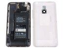
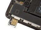
Taking a peek under the cover开盖后一瞥
We are yet to complete our dedicated battery test, but we'll update this article with our findings once it's ready.
我们目前还没有对电池进行针对性的测试,不过我们会在完成之后更新这篇文章。
3#
Display
The Meizu MX 4-core has a 4" screen, which given its 3:2 aspect ratio is noticeably bigger than the 16:10 and 16:9 four-inch competitors. However the new quad-core top droids comes with 4.7" to 4.8" screens, which dwarf the Meizu MX 4-core display.
The ASV LCD unit has 640 x 960 pixel resolution, which is the same as the Retina display of the iPhone 4 and 4S. That may've been impressive last year, but the competition has taken a huge step forward since. 720p is now the norm, so no one is going to be too excited about 288ppi (even though it's really as sharp-looking as it gets).
屏幕显示
Mx四核的屏幕采用的是3:2比例的四寸面板,目测会比一些16:10和16:9的四寸机子可视面积大(说的对,看看小米什么的就知道了),可是最新的四核旗舰摩托droids已经从4.7寸到了4.8寸,这让mx四核看着好小(个人认为下一代的魅族产品尺寸会大)。
Mx四核的ASV LCD屏幕分辨率达到640 x 960,这和使用Retina屏的iphone 4、iphon4s一样,这个标准在去年还会令人兴奋,不过智能手机屏幕升级的很快,现在的标准都是720P了,因此不会有人对魅族mx屏幕的288ppi太感冒(虽然这个屏幕显示效果还是很精致)

The screen is good, but you expect much more from a flagship these days
四核屏幕不错,可是你或许对当今的旗舰有更多的期待
Normally the contrast is decent, but it drops rapidly as you start tilting the screen. Colors are good, but hardly as spectacular as those on the Super AMOLEDs and the best LCDs.Brightness and contrast are slightly better than they were on the original MX, but differences aren't huge.
Here are the brightness and contrast measurements for the display. You can find more about the testing procedures here.
Mx四核的屏幕对比度还是可以,但是当倾斜屏幕的时候对比度下降很快;色彩还原也不错,但是没有Super AMOLED屏和最好的LCD屏震感,和mx老双核比起来在亮度和对比度有所提高,但是幅度不大。
下表罗列的是各个手机的亮度和对比度。
| Display test | 50% brightness亮度 | 100% brightness亮度 | ||||
| Black, cd/m2 | White, cd/m2 | Contrast ratio | Black, cd/m2 | White, cd/m2 | Contrast ratio | |
| Meizu MX 4-core | 0.18 | 143 | 804 | 0.69 | 581 | 846 |
| Meizu MX | 0.17 | 123 | 740 | 0.56 | 396 | 708 |
| LG Optimus 4X HD | 0.34 | 369 | 1077 | 0.68 | 750 | 1102 |
| HTC One X | 0.15 | 200 | 1375 | 0.39 | 550 | 1410 |
| Samsung I9300 Galaxy S III | 0 | 174 | ∞ | 0 | 330 | ∞ |
| Apple iPhone 4S | 0.14 | 205 | 1463 | 0.52 | 654 | 1261 |
The sunlight legibility is nothing to write home about either as seen from our in-studio measurements. It's still slightly better than on the original Meizu MX thanks to the increased brightness.
通过我们设备测试数据不好详细描述光照下的可视度,不过由于亮度的提高,四核比双核有了轻微的提高。
Contrast ratio对比度
- Sort by Label
- Sort by Value
- Nokia 808 PureView4.698
- Samsung I9300 Galaxy S III3.419
- Samsung Omnia W3.301
- Samsung Galaxy S3.155
- Nokia N93.069
- Samsung Galaxy Note2.970
- HTC One S2.901
- Samsung Galaxy S II2.832
- Huawei Ascend P12.655
- Nokia Lumia 9002.562
- Apple iPhone 4S2.269
- HTC One X2.158
- Nokia N82.144
- Apple iPhone 42.016
- Sony Ericsson Xperia ray1.955
- Sony Xperia U1.758
- LG Optimus 4X HD1.691
- HTC One V1.685
- LG Optimus Vu1.680
- Samsung Galaxy Ace 2 I81601.566
- LG Optimus 3D1.542
- Nokia Asha 3021.537
- Meizu MX 4-core1.462
- Nokia Lumia 6101.432
- Gigabyte GSmart G13551.361
- HTC Desire C1.300
- LG Optimus L71.269
- Meizu MX1.221
- Samsung Galaxy Pocket1.180
- Samsung Galaxy mini 21.114
We zoomed into the display using our digital microscope so you can get a better idea of how the pixels are arranged, and how big they are. As you can see the pixels are about as big as those on the HTC One X, which suggests about equal perceived sharpness.
我们通过数字显微镜放大屏幕,这样可以看到屏幕像素的布局及大小,可以发现mx四核像素的大小同htc one x的一样大,也就是说两个手机在细腻度一样。
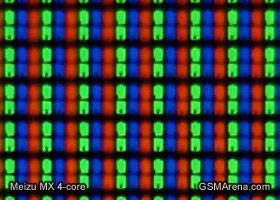
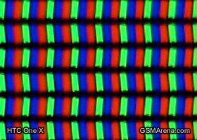
The Meizu MX 4-core display pixels compared to those of the HTC One X
Mx四核和htc one x的屏幕像素对比
Handling
The Meizu MX 4-core is comfortable to hold in the hand - it's not too big, too heavy or too thick. We wish the phone had higher quality finish and more secure grip, but if you can get over that (or are going to use a case/pouch) there are no complaints about the build quality.
握感
Mx四核握在手里很舒服,它不是太大,不是太重,不是太厚,可我们希望手机有更高质量的外层和更安全的握持,除非你使用外套或者手机袋(再次抱怨魅族的抛光镜面后盖)。
While it has its flaws, the hardware of the 4-core should get the attention of serious buyers. Having tried the original Meizu MX, we know the software has its way to impress too. The highly customized FlyMe OS is coming up, followed by the usual round of benchmarks, which should allow the Exynos 4212 Quad to flex some muscle.
抛去这些缺陷(后盖指纹这个),谨慎的购买者还是会关注mx四核的硬件,通过之前的mx双核我们对其软件有了很深的印象,下面高度订制的flyme系统马上就要到来,同之前的高标准一样,flyme 系统能让猎户座4212四核展示其威能。
4#
Flyme OS 1.0 is unrecognizable Android ICS
Flyme 系统看不出是android4.0 ICS
The Meuzi MX 4-core runs on a heavily modified ICS-based Flyme OS 1.0, with a 1.0.1 update available for download. This is not your average Android skin, customizations run way deeper than usual. By comparison, you can fairly easily replace Samsung's TouchWiz and HTC's Sense with a custom launcher of choice - but not Meizu's Flyme. We're not saying impossible, but it will involve some deep tinkering with the OS.
Mx四核采用基于android4.0ICS深度修改的flyme 1.0系统(现在1.0.1已经可以下载,不建议升级),它不同于一般的android桌面,比一般的android桌面订制的更深。我们可以下载一个启动器很方便的更换三星的TouchWiz界面和HTC的Sense界面,但是魅族的Flyme不可以,当然,也不是不可能,只是flyme系统包含了一些深度的修改(相比其他的桌面软件仅仅是改一个图标过度效果)
The Flyme is very different from what seasoned Android users might expect (though not unfamiliar if you've seen the original Meizu MX). Once again, Meizu's goal was clearly to emulate the iPhone experience and we should say they did a pretty good job of it - way better actually than they handled the hardware design.
Flyme的改变超出android老手的想象(当然对于mx双核的用户来说不陌生),我们再一次发现魅族的目标是将iphone在手机上的经验带到自己身上,并且这次很成功(这要比关门自己搞硬件设计的方式好)。
Even though its core has been updated to ICS, the Flyme OS is very simple Android with a flat interface and no app drawer. You can put folders and widgets on the homescreen but shortcuts are an alien concept to the UI - essentially, each app you install appears on the homescreen. This is the ultimate simplicity - there's no app drawer to drag icons from onto the homescreen.
The downside of this completely new approach to Android is that Ice Cream Sandwich has been stripped down of almost every new feature - focus was instead on the performance optimizations under the hood. The web browser got better compared to the previous Flyme OS app, but if you expected the stock ICS browser or its new ICS gallery app, calendar, music player, face unlock etc. - you're in for a disappointment.
虽然flyme系统的内核升级到了ICS,可是它简直就是一个简单的平面并且没有程序入口,我们可以在桌面放置文件夹和小插件,但flyme系统最经最大程度的精简,从本质上说已经没有了软件快捷键的概念,没有一个安装程序的入口来拖动程序快捷键到桌面(这样的设计本来就好,讨厌原生android找软件还要到专门的区域)。
这带来的负面是android冰淇淋几乎所有的新特性都被剥离,关注点被放在了展示效果最佳上,现在的浏览器比前个版本的flyme os比起来效果更好,可是你不可能在flyme os上找到android原生浏览器、图库、日历、音乐播放器、面部解锁(个人更习惯flyme 的浏览器、图库等)。
On the other hand, Meizu's Flyme OS has most of the important functionality covered: it's got a fairly elaborate lockscreen, pretty good task manager and Notifications, as well as a number of nice little touches that you'll be happy to discover as you explore the interface. Here's a video of the Flyme OS to get you started.
The lockscreen is the slide up to unlock type, but borrows the idea of launching different things depending on where you swipe. If you start the gesture over the padlock icon you will just unlock the phone, but you also have Phone and Message icons for the dialer/inbox too. Sadly, these two shortcuts are non-customizable.
另一方面,魅族的flyme系统涵盖了大多数的功能:精致的锁屏界面,漂亮的任务管理和通知,还有许多后续研究发现的小功能。
屏幕滑动解锁,可以通过滑动不同的图标启动不同的功能,如果按住小锁键得到的仅仅就是解锁,可是如果滑动电话或短信图标得到的就是拨号和短信界面,悲剧的是这两个快捷键是写死的,不给修改。

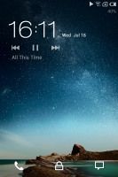
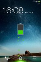

The Meizu MX 4-core lockscreen mx4锁屏界面
There are no lockscreen widgets other than the default clock panel and the music controls (only when the music player is active). We liked a lot even a really minor thing like the battery charging animation.
Beyond the lockscreen is a fairly standard Android homescreen and you can dock up to five apps at the bottom, the middle one - the web browser - is non-customizable. There's no app drawer though and all installed applications have their icon on the homescreen instead. You can get the shortcuts of rarely used apps out of the way by putting them in folders - each folder can store up to 16 apps. The usual gesture for removing icons (dragging them to the bottom of the screen) uninstalls the app.
除了默认的时钟和音乐控件(需要播放器在工作状态),屏幕锁定界面没有其他的插件。我们对很小巧的电池充电动画效果特别的喜欢。
除了锁屏界面和原生的android不同,用户可以在低栏订制5个app,中间的浏览器除外,flyme 系统没有程序入口,所有安装的软件都在页面上,可以把不常用的软件放在一个文件夹里面(每个文件夹最多放置16个软件),一般android手机中的移除app(拖动图标到低栏)flyme是删除的操作。
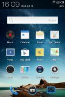
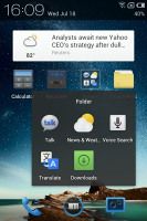
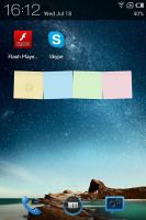
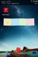
The homescreen doubles as the app drawer页面同时是安装软件存放的地方
You only get three homescreen panes at first (there's an indicator of the currently active one), but as they start to fill up, you can grab an app icon or a widget and drag them to the side and a new homescreen will appear. There's no overview mode where you can easily add, delete or rearrange homescreen panes.
We mentioned widgets - the Meizu MX came with very few preinstalled and you can access them only via Settings->Customize->Widgets. You get Google search, Quick Contacts, Notes, a calendar and the News & weather widget. That's it, there's not even a clock widget. If you want more, you'll have to get third party widgets off the market. Unlike the original Meizu MX, the widgets can be used more than once - you can have the Google search bar on all homescreen panes for example.
手机最初只有三个页面(当前活动页面有一个指示器小横条),一旦这一页充满的时候,可以将软件图标或者插件拖动到屏幕边缘,这时新的一个页面就产生了,系统没有提供一个全局模式来告诉你那里方便的增加或删除或布置页面(实际上插件添加的时候有这个功能)
魅族mx最初基本没有预装插件,如果想给桌面添加插件,必须通过设置-个性化-插件,预制的的插件有google搜索、快速拨号、便签、日历和新闻&天气,居然没有时钟插件,如果需要更多的插件,必须安装第三方软件,和之前的魅族mx双核不一样,flyme上的插件可以不限制次数使用,比如你就可以在所有页面添加搜索栏。
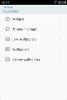
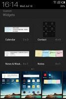
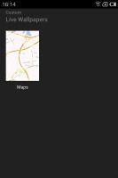

Adding things to the homescreen • Choosing a wallpaper添加壁纸
You can set the homescreen wallpaper as usual and there are quite a few provided. Live wallpapers are enabled too.
The notification area has been updated with five connectivity toggles (Wi-Fi, mobile data, Bluetooth, GPS, Sync). If you tap on the Wi-Fi network name you'll get a list with all available networks in range and you can quickly switch on to another router without digging in the Settings menu. At the bottom of the drop down list you'll can also set the type of mobile network you prefer (auto, 3G or GSM).
There are a few more toggles available from the menu that pops up when you press and hold the Power/Lock key - they switch on and off the ringer, the vibration, airplane mode, GSM network and screen auto-rotation.
可以和以往的操作一样更改壁纸,魅族内置了几张壁纸,同样也有动态壁纸。
通知栏的下拉菜单升级到了五个开关,分别是wifi、移动数据(edge)、蓝牙、GPS和同步,点击wifi,就可以看到区域内活动可以使用的wifi列表,这样可以快速切换不同的wifi源而不需要到设置里面点击(大爱这个设计),在下拉的列表底部还可以选择手机的网络接入方式(自动,3G或GSM)(不得不佩服这个老外的细心)。
长按电源键(锁屏键)还会弹出另外的开关,可以点击打开或关闭铃声、震动、飞行模式、GSM网络(这个是干嘛的?)和转屏。
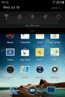
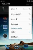
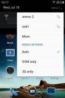
The notification area is only as big as needs to be
通知区域的长度大小根据自身数量会调整
The task switcher (hold the menu key) has been completely rewritten since the Gingerbread-based Flyme OS. The new task switcher is different from what you're used to in Android and a quite similar to its iOS counterpart. It's launched by a press and hold of the Menu button.
When activated, the task switcher appears at the bottom of the screen. It's a side-scrollable row of icons, showing the recently opened apps. You can kill apps by tapping and holding on an icon and then dragging it over the X at the very bottom. There is a shortcut too to kill all running apps.
Just like in iOS you get music controls here too. They are always visible below the rows of running apps, though this time around there is no volume slider.
任务(长按菜单键打开)在以姜饼为原型的flyme os上完全重写,新的任务切换和我们在平常android上用到的不一样反而和iOS上的很像。
任务被激活的时候出现在屏幕底部,显示的是最近打开的app(图标可以滑动),可以长按一个图标然后滑动到底部的红色x号来结束这个软件的进程,任务栏也有一个快捷键可以一键清除所有运行中的程序。
同iOS类似这里可以得到音乐播放器控制按钮,它们会在正在运行的app下方,不过这里没有播放器音量调节按钮。
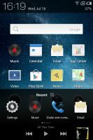
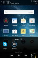
The iOS-like task switcher类似iOS的任务切换
There's one more trick to the interface - when you're scrolling long lists, you can tap the top right corner of the display (near the battery icon on the status bar) and the list will automatically scroll back to the top. It's something that most people might miss, but can come in handy when dealing with long lists.
That's about it for the general user interface. We just want to note that the screen transitions have been changed since the previous Flyme OS version. In the original Meizu MX they were lifted directly from the iOS, while this time around they're more like the vanilla Android ICS.
We're quite pleased with the overall speed and responsiveness of the UI, we experienced no misbehavior or glitches. Everything runs smoothly, and that's hardly a surprise given the quad-core processor powering the whole thing and the optimizations coming with ICS.
界面浏览还有一个小技巧:当我们滑动很长的列表时候,可以点屏幕击右上角(靠近电池图标附近),这时候列表会自动的回到头部(购买了快手势并且设置了点击为home的有点小悲剧),这个技巧或许大多数人会遗忘,但是当处理长列表的时候迟早会用到。
上面讲的是基本的用户界面,我们更加关注的是屏幕过渡已经从最初的泄露版flyme作了改动,最初的mx界面直接学习iOS的,现在的更加像android香草冰淇淋的。
我们对总体运行速度和UI人机交互特别的满意,android ICS的优化和强大的四核CPU动力带给的体验过程没有误操作或小毛病发生,一切运行的很流畅。(怎么没有死机和睡死?)
Synthetic benchmarks
综合跑分(不对数码经常关注的人,benchmarks真的不好翻译为跑分)
The Meizu MX 4-core runs on a quad-core ARM Cortex-A9 processor clocked at 1.4 GHz. You can set the CPU behavior from the accessibility settings (a bit odd), where you get low, normal and high CPU level options. At the highest setting, the CPU runs can reach its maximal 1.4GHz frequency. At normal, the clocked is capped to1GHz and the low has the CPU limited to a maximum of 600MHz.
We ran our traditional benchmarks and the Meizu MX 4-core did splendidly. Directly compared to the dual-core Meizu MX though, the 4-core version only made a big enough difference in the CPU-intensive Linpack benchmark.
The BenchmarkPi performance rivals both the Samsung Galaxy S III and the HTC One X (Tegra 3), but falls behind the Krait-powered Ones S and One X for AT&T. Note that BenchmarkPi uses one core only, so it is understandable the newer Krait processors do better.
Mx 四核有一颗基于ARM-A9架构的四核处理器,主频锁定在1.4GHz,可以在辅助功能设置(有点怪)里调整处理器的性能,从高到低分别为“性能优先,性能均衡,省电模式”(有四核在手的我表示对这点翻译毫无压力),对应的主频依次为1.4GHz(最高)、1GHz、600MHz(最低)。
在传统跑分测试环节,mx四核结果优异,同mx双核对比,CPU浮点性能测试四核领先了一大截。
BenchmarkPi 结果(越小越好)Mx四核的跑分打败了三星galaxy s3和HTC One X(Tegra3处理器),可是败给了采用高通Krait处理器(28纳米)的AT&T定制机HTC Ones S和 One X,要注意的是跑分只用处理器一个核心,因此较新的Krait CPU的结果好点。
Benchmark Pi
Lower is better(越小越好)
- Sort by Label
- Sort by Value
- HTC One X (Snapdragon S4)279
- HTC One S306
- HTC One X (Tegra 3)338
- Samsung Galaxy S III344
- LG Optimus 4X350
- Samsung Galaxy Note 10.1351
- Meizu MX 4-core362
- Samsung Galaxy Nexus408
- Meizu MX463
The Linpack result took us by surprise. The Meizu MX 4-core did better than the Galaxy S III and almost leveled with the Krait-powered One S. The advantage over the dual-core Meizu MX is huge.
Linpack(值越大越好)结果让我们大吃一惊,mx四核的结果超越了三星Galaxy S3并且和 one S持平,优势对于mx双核更大。
Linpack
Higher is better(越大越好)
- Sort by Label
- Sort by Value
- HTC One S210
- HTC One X (Snapdragon S4)196
- Meizu MX 4-core189.1
- Samsung Galaxy S III177.1
- LG Optimus 4X141.5
- HTC One X (Tegra 3)126.1
- Samsung Galaxy Note 10.190
- Meizu MX88.3
The Mali-400MP GPU got a good score at the NenaMark 2 graphics benchmark, putting the Meizu MX 4-core in the third place. However, we should note the 640x960 pixel display works in Meizu's favor and the 720p screen contestants shouldn't have been so much ahead, let alone be able to beat it.
It seems that the GPU of the Meizu MX 4-core has been down-clocked (compared to the Galaxy S III) to conserve power and/or to prevent overheating issues.
受益于Mali-400MP的图像处理器在NenaMark2上图形跑分结果优异,mx四核排在第三名,不过我们要注意到魅族采用的是640*960分辨率的屏幕(这个分辨率是魅族的大爱),没有超出采用720P分辨率屏幕的对手很多(这个太专业,不懂)
Mx四核的GPU貌似频率被锁定(同三星S3比起来),以此来提供均衡动力并避免过热的弊端。(看来老外也深刻的知道mx发热的“佳话”)
NenaMark 2
Higher is better(越高越好)
- Sort by Label
- Sort by Value
- HTC One S60.5
- Samsung Galaxy S III58.8
- Meizu MX 4-core54.1
- LG Optimus 4X52.3
- Samsung Galaxy S II51.6
- HTC One X (Snapdragon S4)49.1
- Meizu MX48.6
- HTC One X (Tegra 3)47.5
- Samsung Galaxy Note 10.143.6
- Samsung Galaxy Nexus24
When it came to browser benchmarks, the Meizu MX 4-core took the second place in both the Sun Spider and BrowserMark charts. It is almost on par with the Galaxy S III but so is the dual-core Meizu MX, so the achievement is down to the optimizations Meizu did as much as to the snappy CPU.
在浏览器跑分上,Sun Spinder和BrowserMark给出的成绩魅族mx四核都是第二名,这几乎和三星galaxy s3持平,也和mx双核保存一致,这要归功于魅族的优化和强大的内置的CPU.
SunSpider太阳蜘蛛?
Lower is better(越低越好)
- Sort by Label
- Sort by Value
- Samsung Galaxy S III1447
- Meizu MX 4-core1458.1
- Meizu MX1544.4
- HTC One S1708
- New Apple iPad1722
- HTC One X (Tegra 3)1757
- HTC One X (Snapdragon S4)1834
- LG Optimus 4X1845
- Samsung Galaxy S II1849
- Samsung Galaxy Nexus1863
- Samsung Galaxy Note 10.11891
- Apple iPhone 4S2217
BrowserMark浏览器得分
Higher is better(越高越好)
- Sort by Label
- Sort by Value
- Samsung Galaxy S III169811
- Meizu MX 4-core136806
- LG Optimus 4X134036
- Meizu MX129837
- Samsung Galaxy Note 10.1113256
- Samsung Galaxy S II111853
- Samsung Galaxy Nexus103591
- New Apple iPad103264
- HTC One S98435
- HTC One X (Tegra 3)96803
- HTC One X (Snapdragon S4)92232
- Apple iPhone 4S88725
A not-so-social phonebook
不怎么社交性的通讯簿
The pretty basic phonebook on the Meizu MX 4-core is almost identical with what we saw in the dual-core Meizu MX. At its core is a list of all contacts but you can view only a specific group or filter where contracts come from - phone contacts, email account or a Meizu account.
You can't add Facebook or Twitter or any social network out of the box. Installing the Facebook or Twitter app will allow you to sync your contacts from there. You can link contacts, but the functionality is annoyingly limited.
四核上的通讯簿基本和双核上的没有变化,主界面是所有联系人的名单,不过你可以通过右上角的群组:电话联系人,邮件账户或魅族账户来单独过滤查看联系人(我还没有用过)。
不能增加通讯簿自身功能之外的facebook或twitter及任何社交网络软件信息,安装了facebook或者twitter软件之后允许同步联系人,可以连接这些联络人,可是功能很不完善(天朝屌丝从不懂facebook和twitter这些玩意)


The phonebook • Searching through the contacts list
通讯簿及联系人查询界面
The phonebook will automatically link contacts with the same name, but that's it. You can't manually link or unlink contacts.
电话簿会自动和联系人关联(使用同一个名字),但仅此而已,不允许手动关联联系人或解除关联(这里应该说的是联系人和联系人电话的附属关系)。
Viewing a contact's info shows you all the available details and that's about it. We liked how phone numbers are listed though - the whole line is a button that will dial the number, but there's a message icon to the right to send a text message instead.
查看联系人的时候会显示联系人所有的详细信息,联系人所有的联系方式都罗列了,这点很好,本想电话一整行是打通电话,不想最右边还有一个发短信图标(修改联系人必须按右键弹出的修改进行修改,怎么不在右上角给一个进入修改按钮呢,同闹钟界面那样)


Viewing a contact's details联系人详细资料
The phonebook integrates with the phone app and the call log. The only new addition to the phonebook is the search field at the top of the contact list in addition to the alphabetical scroll.
联系人整合了拨打电话和通话往来,另外新的关注点是查找时除了滑动会弹出联系人首字母,通讯录顶部也有字母显示。
Telephony well covered通话信号很好
Just like the dual-core MX, the Meizu MX 4-core had no reception issues and the in-call audio was good, though not very loud even at the loudest setting.
The dialer of the Meizu MX 4-core lacks smart dialing but it does have one interesting trick - dial a number and it will tell you the country (e.g. "United States" for a number starting with +1, "United Kingdom" for +44 and so on).
和mx双核差不多,mx四核的接听连接和接听声音没有问题(有问题还叫手机?),有个问题就是即使把通话音量调最高,声音也不是很响。(我认为比双核高多了)
Mx四核的拨号键没有智能拨号功能,不过它有一个很有趣的功能:拨号的时候,它会告诉你所属国家(比如,以+1开头的是美国,+44是英国等。)


Dialing a number (note the country code recognition) • In a call with Dexter • Vibrate on connection option
拨号(注意识别了国家的代号)、带有联系人图像的通话?、接听震动
Another interesting trick is the built-in blacklist, which allows you to prevent phone numbers not on your contact list from phoning you and filter calls from selected numbers. There's also an option for automatic recording of your calls, which is a pretty cool feature to have if you are absent minded.
During a call, the proximity sensor will lock the screen when you lift the phone up to your face. There's an option for the phone to vibrate when the call is connected, so you won't miss it.
The call log is the first tab of the telephony app and it keeps a list of all your recent calls.
另外一个有趣的设计是内置的黑名单功能,它可以阻止来自不在联系人目录和被过滤掉电话号码的来电,还有一个很cool的是对贵人多忘事的人设计的:来电自动录音。(貌似最近缺氧的YUYU那个来电录音活动很火,并且勾引出了卓越,四年了才知道是mm%>_<%)。
通话的时候,手机靠近脸部,距离感应器会关闭屏幕,还有就是接听震动的选项来提醒使用者已经在通话了。
通话记录设计在最左边第一个按钮,它会保留你近期的通话。(其实评测人员没有深入的讲通话记录,在通话记录界面点击一个号码会到联系人界面,如果这个人有两个号码,这时通话的号码是高亮的)。

The call log • You can mass delete log entries
通话记录,可以全选进行批量删除
To set a custom track as a ringtone you need to copy it to the designated Ringtones folder, which will make it accessible in the Settings menu. You can't just use the music player like on most Androids.
We ran our traditional loudspeaker test on the Meizu MX 4-core and it scored a Good mark. Here's how it stacks up against the competition. You can learn more about the testing procedures over here.
用户如果要自定义铃声,不能像其他android手机一样到音乐播放器那里指定,而是需要把铃声拷贝到指定的Ringtones文件夹,然后就可以在铃声界面选择它了。
对mx四核的常规(应该不能翻译成传统)扬声器测试,发现其成绩不错,下表是各个手机测试分数(Excellent优越> Very Good非常好> Good好> Average一般> Below Average一般以下)
(没有想到htc desire最好)
声音分贝 噪音 铃声分贝 总体
| Speakerphone test | Voice, dB | Pink noise/ Music, dB | Ringingphone, dB | Overall score |
| Apple iPhone 4 | 65.1 | 60.3 | 66.2 | Below Average |
| Samsung Galaxy Nexus | 66.2 | 60.5 | 69.0 | Below Average |
| Apple iPhone 4S | 65.8 | 64.5 | 74.6 | Average |
| HTC One X | 65.1 | 66.0 | 75.8 | Average |
| Meizu MX 4-core | 68.5 | 65.5 | 75.1 | Good |
| LG Optimus 4X HD | 68.7 | 66.6 | 79.3 | Good |
| Samsung I9300 Galaxy S III | 75.1 | 66.5 | 75.0 | Good |
| Motorola RAZR XT910 | 74.7 | 66.6 | 82.1 | Very Good |
| HTC Desire | 76.6 | 75.7 | 84.6 | Excellent |
Flyme message lifts up the iOS-like messaging iOS式短信
The messaging department is quite straightforward: there are no folders here, just New message, Search and Settings buttons. Above is a list of all your messages organized into threads.
短信界面特别的精练:这里没有文件夹(诺基亚那样的收件箱,发件箱),只有新建、查找和设置按钮,然后主体部分就是依次排列的所有信息。


Viewing the message threads短信界面
When composing a message, the input field starts out at only one line tall, but will grow to up to seven lines if need be. Left of the text box is a button that handles attachments and smileys.
To add message recipients, just start typing the corresponding name or number and choose from the contacts offered.
编辑短信的时候,输入栏最初只有一行,不过高度会随着内容的增加而增高,输入栏左边的一个按钮可以添加附件和笑脸符。
增加收件人只需输入相应的名字或号码或者从弹出的联系人中选择。


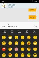
Viewing a thread • Multi-line input box • Inserting a smile and add multimedia shortcuts
输入栏多行编辑,添加一个笑脸和彩信快捷键。
When you add multimedia content to the message, it is automatically turned into an MMS. You can either quickly add a smile, a photo or an audio file to go with the text or compose an MMS using all the available features (like multiple slides, slide timing, layout, etc.). The multiple slides are all shown inside the compose box.
Batch operations are enabled for multiple threads - Mark as spam and Delete are available.
Digging deeper into Settings you'll come across the so-called Flyme Messages. If you turn this on and log in with your Flyme OS account, you'll be able to send free messages (text or multimedia) to other Flyme-enabled devices - just like the iOS iMessages.
当在信息里面添加多媒体的时候,短信会自动变成彩信,这时候你可以很方便的添加笑脸、照片或音频到文字里,或者编辑彩信(比如幻灯片样式、幻灯片倒计时、布局等),幻灯片样式全部显示在编辑框里面(这个真的不懂,翻译的会有问题)(我测试了我的四核不能添加多媒体)。
选中多个之后可以进行批量处理,标记为垃圾短信(添加到用户黑名单,下次就收不到这些人的短信)或删除。
在短信设置里面深入挖掘会发现一个叫flyme短信的选项,选中之后并且登陆自己的flyme账户,就可以免费的给另外的flyme账户发送短信(或彩信),就是苹果的iMessages相似(据说flyme用户之间还能免费通话)
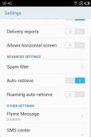
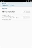

Activating Flyme Messages激活flyme信息
Moving on to email, we were surprised to find the default Gmail app is missing. You could always download it from the Play Store though (if you live outside China, where the Play Store is not available).
Meizu have tweaked the generic email client instead and decided it would be enough for all your email accounts. It supports multiple Exchange, POP or IMAP inboxes and you have access to the original folders that are created online, side by side with the standard local ones such as inbox, drafts and sent items.
Switching between accounts is pretty easy. The top row holds two labels - the first is the name of the current folder (tap to change the folder) and the one next to it is the name of the account you're currently using (again, tap to change). There's no combined inbox though.
在邮件我们惊奇的发现默认的Gmail不在了,不过可以在play商店下载(大陆的用户表示不懂)。
魅族重新设计了邮件并尽量的满足所有的邮件类型,它支持多交换类型(不标准)、POP和IMAP协议,并且保留了用户在线创建的文件夹(比如gmail的notes文件夹),按下左下角文件夹图表可以看到依次排列的收件箱,草稿箱和发件箱。
多邮箱之间的切换非常的方便,顶栏有两个标签,第一个是目前浏览的文件夹(评测这里说可以点击这个图标来切换文件夹,我测试不可以,必须通过上面提到的低栏文件夹图标来切换),另外一个是目前使用的邮箱(点击切换另外一个),不过没有发现整合的收件箱(就是一个收件箱显示所有邮箱地址的邮件)


The email app also does a good job 邮件做的也不错
There's support for batch operations - Mark, Filter and Delete are the available options. Filter acts against spam to weed out unwanted email addresses. There's also the option to switch to threaded view in which case an icon appears alongside the name of each thread, giving you the number of messages inside.
Google Talk handles the Instant Messaging department. The G-Talk network is compatible with a variety of popular clients like Pidgin, Kopete, iChat and Ovi Contacts.
Text entry is handled by a custom keyboard (completely redesigned from the previous Flyme OS iteration) with well-spaced keys. It's quite easy to use and the reasonably big screen helps too. Weirdly, there's no landscape mode anywhere in the messaging department, so you'll rarely get to use the roomier landscape keyboard (it is available in apps that support landscape).
邮箱支持批处理操作,包括标记、过滤和删除,过滤可以去掉收件箱中不想要的邮箱地址,还有一个按主题分类的选项,这时候每行会在地址右下边出现一个数字符号,告诉你这个分类下的邮件数量(我也是翻译的时候才知道这功能,并且看了自己mx邮箱才好翻译^_^)
Google Talk模块处理即时消息,它支持各类流行的客户端,比如Pidgin,Kopete,iChat和Ovi(港版的mx四核,大陆的完毕不明白这是嘛玩意)
内置的输入法是魅族订制的(重新编译了上个flyme系统的输入法,看来这个大神有上个flyme),每个按键之间空格做的很好,输入法使用起来很方便,在按下字母的时候屏幕上会有显示,奇怪的是编辑短信的时候没有横屏模式(记得2.3在魅友千呼万唤下短信支持了横屏模式,不过用后发现不好用,很少用),因此,一般横屏使用的很少(有一些时候支持横屏)


The big display makes for a big, comfy keyboard but the landscape keyboard is a rare occurrence
横屏时候按键很大,可是出现的几率不大
6#
Image gallery and excellent file explorer
图库和卓越的文件管理(文件管理真心要夸)
At first glance the Meizu MX 4-core's gallery looks similar to the Gingerbread Android gallery, but it's actually a custom-made app. It stacks images from folders just like the regular app, but this is about where similarities end.
第一眼看mx四核的图库感觉和原生的android图库没有区别,不过它是一个重新订制的,文件夹里面包裹的图片设计看着也和其他的软件没有区别,实际这也是仅有的相似之处。
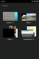


The custom gallery • Picking multiple photos图库中选择多个相片
Inside the folders, images are arranged in a rectangular grid. You can email, share (via Bluetooth, MMS) or delete multiple images by picking them one by one from the grid after you tap and hold on a photo.
点开图片文件夹发现图片在矩形格子里依次排列,在按下图片之后可以依次选中,然后可以进行批量邮件发送,共享(通过蓝牙、彩信)或删除。

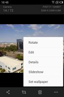

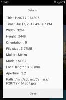
Viewing a single image • editing options • details
单个图片查看,编辑选项,相片详情
When viewing a single image, a tap on the screen will display the available options. You can Share, Crop, Delete, Set Wallpaper, Rotate, Open in Image Editor and view Details.
The Meizu MX came with a very good file browser preinstalled. It lets you browse the contents of the built-in memory and offers features such as copy, paste and delete for multiple files. Sharing files over Bluetooth or email is also easy as are batch operations with multiple files and folders.
查看单张图片的时候,按下屏幕会弹出共享、剪切、删除、设为壁纸、旋转、编辑模式和照片详情。
Mx内置了操作感特别好的文件管理,它显示在sd卡中的文件,可以进行复制、黏贴和多文件删除操作,多个文件夹或文件选中后可以进行批量的蓝牙或邮件共享操作。
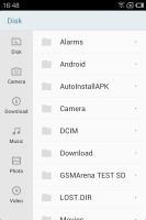
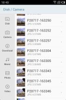
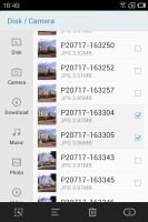

The file manager is very capable文件管理功能强大
The file browser also handled opening and extracting ZIP files, which can come in handy.
文档里面能够直接打开和加压ZIP或RAR文件,这个你早晚能用到。
The video player handles everything视频播放器能播放一切
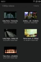
The Meizu MX 4-core comes with a dedicated Video app, but it expects videos to be placed in a certain folder. You can use the file browser to get videos to play from elsewhere - it offers thumbnails and everything so we ended up using it more often than the Video app itself.
Mx四核的视频播放器做的很精致,它和图库设计的差不多,把文件放置在文件夹里面(也可在文档里面打开文件夹播放),并且提供了缩略图及其他视频信息,我们用它的时候比视频文件本身还多。(这个说的很有韵味,需要仔细揣摩)
Once you get into the player, things really start to look up. The player handled all the DivX, XviD and H.264 files we threw at it trouble-free (in .AVI, .MKV and .MP4 containers) and resolution didn't matter either - 1080p videos played without a hitch. The audio codecs weren't a problem either.
You also get a lot of nice options - a dedicated brightness setting for the video player and lock UI key. You can zoom in and out with pinch gestures. If additional audio streams or subtitles are available you'll get additional icons on the display for more settings. Note that Chinese and English fonts are supported only.
播放器能够毫无压力的支持DivX, XviD 和 H.264视频文件及AVI, .MKV 和 .MP4视频格式,即使1080p分辨率拖拽也没有延时,声音的解码也没有问题(只不过四寸屏稍显不爽)。
播放器还有许多人喜欢设计,比如亮度调节和锁屏按钮,通过双手的捏合(这个不知道专业怎么说)实现缩放,如果视频有额外的声道和字幕,那么可以在设置里面选择,注意目前文字仅支持中文和英文。


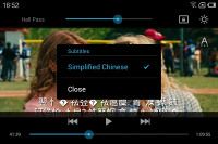

Playing a video • A lot of settings are available
视频播放器有多个选项
With the MHL connectivity, the Meizu MX 4-core turns into a very capable video player. Even without it, at 4" big and with 960x640 resolution you can enjoy 720p videos reasonably comfortable though the 3:2 aspect ratio of the screen will involve some cropping if you want to use all the pixels. Still, the much larger 16:9 HD screens of the MX 4-core competitors do a far better job for watching videos on the go.
通过MHL连接,mx四核的播放器更加的霸气侧漏,及时没有MHL连接线,4寸、960*640分辨率的屏幕欣赏720P的视频也不错,只不过3:2的屏幕尺寸设计会让一些视频出现黑白,即使如此,视频处理方便, 那些更大的采用16:9HD屏幕的mx四核对手追赶魅族仍需要走很长的路(说的不错)。
Good-looking music player漂亮的音乐播放器
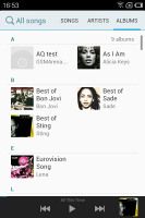
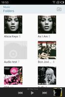
Just like the video player, the music player can only find tracks located in a specific folder. You can browse your collection the traditional way or you can select to have it filtered by folders..
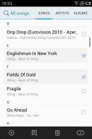
In the first case tracks are sorted into several playlists like All songs, Recently added, Folders and you have the option to create custom playlists. When viewing All songs you can choose between three types of sorting in a tabbed layout: song name, artist and album.
同视频播放器差不多,音乐播放器也是对音乐进行了文件夹归类,可以通过传统的方式浏览歌曲或者通过文件夹过滤的方式选择歌曲(文件夹更方便找到)。
刚打开播放器页面能看到以下几类分类:所有歌曲、文件夹、最近增加、自定义列表,进入所有歌曲之后,有了另外的三个分类:歌曲名、艺术家、专辑。
The music controls are at the bottom of the screen, with a small album thumb. If you tap on the album art you'll get to the full-screen Now Playing interface featuring repeat and shuffle buttons, playback controls, a volume slider and a scrubber.
The middle section with the full-size album art is side-scrollable: you can swipe to the left or right to display the current playlist or the lyrics karaoke style.
曲库底部一栏是音乐控制按钮,还有一个唱片小图标,点击之后进入到正在播放界面,这个界面包含了重复播放、随机播放、播放进度条和音量条及选项按钮。
中间唱片封面是可以左右滑动的,之后分别会显示播放列表和卡拉ok歌曲歌词样式。


The Now playing interface • Fetching album art automatically • Current playlist and the karaoke-style lyrics
正在播放界面,自动获取歌曲信息选项、专辑列表和卡拉ok歌词
You can access the equalizer from the advanced menu. It features several presets, which you can edit manually.
可以在更多选项里面设置均衡器,预置了几种,你还可以自定义
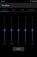
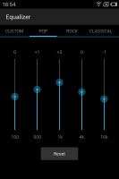
Picking an equalizer preset and editing it
选择一个预置均衡器和编辑均衡器
If the music player is working you'll get music controls on the lockscreen - there're always available in the task switcher too.
The music player also has a play timer, which will turn it off automatically in 5 - 60 minutes.
当歌曲正在播放时候,锁屏界面能看到控制按钮,任何时候长按右键弹出的任务栏也会出现控制按钮。
播放器还有一个计时功能,可以设置5-60分钟的自动停止播放。
Very good audio quality
音质不错
The Meizu MX 4-core went off to an impressive start in our audio quality test. When attached to an active external amplifier, the smartphone did impressively well, with the average intermodulation distortion remaining its only non-perfect score. The MX 4-core also turned out to be pretty loud, unlike its predecessor.
Another difference between the two MX generations is the headphones on performance. While last time around we saw a huge drop in performance when we plugged in the set we usually use for testng, this time around the degradation was limited to some extra distortion and stereo crosstalk. It's an ideal performance, but it should be as good as ideal for everyone, but the most demanding audiophiles out there.
And here go the results so you can see for yourselves.
Mx四核在音质测试中给我们了一个好的初始印象,连接到外置喇叭的时候,mx四核表现的也很好,排在中等水平的互调失真是其唯一的低分(不懂这个),另外,播放器的声音也很大,比起之前的双核好很多(这是真话)。
两代mx之间的另外差别是带上耳机之后的表现,之前的双核我们测试发现在插上耳机之后性能下降很大,这次的四核的外部失真和立体声干扰得到了控制,这是除了音乐发烧友之外的所有人要求的(什么意思?应该是音乐发烧友不会用手机来听歌)。
备注:从M8时代一路走过来的人,明显的感觉魅族在音质方便越做越差了,望改进。
响应频率 噪音水平 动态范围 IMD噪音 立体干扰
| Test | Frequency response | Noise level | Dynamic range | THD | IMD + Noise | Stereo crosstalk |
| Meizu MX 4-core | +0.03, -0.04 | -90.4 | 90.4 | 0.109 | 0.083 | -90.3 |
| Meizu MX 4-core (headphones attached) | +0.07, -0.01 | -90.2 | 90.2 | 0.235 | 0.219 | -55.0 |
| Meizu MX | +0.03, -0.04 | -90.6 | 90.5 | 0.022 | 0.022 | -89.5 |
| Meizu MX (headphones attached) | +0.04, -0.04 | -90.8 | 90.8 | 0.954 | 0.991 | -52.7 |
| LG Optimus 4X HD | +0.02, -0.52 | -74.8 | 74.8 | 0.345 | 0.318 | -81.6 |
| LG Optimus 4X HD (headphones attached) | +0.03, -0.51 | -70.1 | 69.9 | 0.815 | 0.811 | -64.5 |
| Samsung I9300 Galaxy S III | +0.03, -0.05 | -90.3 | 90.3 | 0.012 | 0.018 | -92.6 |
| Samsung I9300 Galaxy S III (headphones attached) | +0.11, -0.04 | -90.2 | 90.2 | 0.0092 | 0.090 | -53.1 |
| HTC One X | +0.02, -0.08 | -82.1 | 82.1 | 0.137 | 0.393 | -80.7 |
| HTC One X (headphones attached) | +0.10, -0.10 | -80.6 | 80.6 | 0.174 | 0.459 | -60.8 |
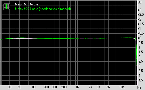
Meizu MX 4-core frequency response
You can learn more about the whole testing process here.
7#
Decent 8MP shooter
800万摄像头
On the hardware side of things, the Meizu MX 4-core has an 8 megapixel camera module for a maximum image resolution of 3264 x 2448 pixels and an LED flash. On paper this one is pretty much the same as the one we saw on the dual-core MX.
The user interface is similar to the stock Android camera app. The three main controls are on the right side of the viewfinder - from top to bottom, they are the still shot/video switch, the virtual shutter key and the gallery shortcut (which shows the thumbnail of the last photo taken). On the left side of the viewfinder are the front/back camera toggle and the flash mode setting. All the icons are orientation-aware and will automatically align to portrait or landscape.
硬件方便,魅族mx四核配置一颗800万像素、最高支持3264 x 2448分辨率照片的摄像头及一个LED闪光灯,在配置上和双核没有区别。
照相界面和原生的android照相机很像,在照相窗体的右侧从上到下有三个主按钮:拍照/录像切换、虚拟快门键、图库快捷键(显示上个拍照的缩略图),左侧是前置/后置摄像头切换和闪光灯设置。所有的按钮都是有重力感应的,并在肖像模式和风景模式时自动重新排列(这是真的吗?)。

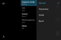
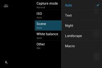
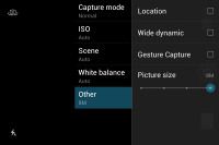
The Meizu MX camera interface照相界面
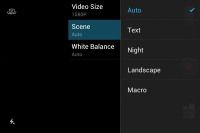
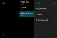
Pressing the context menu key gives you a few extra settings -capture mode (normal, panorama, smile or burst shot), scenes, white balance, ISO settings, Wide Dynamic Range, and geo-tagging.
Similar to the iPhone, you can use the Meizu's volume rocker to capture a photo. Unfortunately, it is of no use for auto-focus. You can tap and hold the virtual shutter though and the phone will autofocus before taking the shot upon releasing the virtual button - something we hoped for in the previous version of the Flyme OS. Continuous autofocus is available too.
按下菜单键会出现一些附加设置:照相模式(常规、全景、笑脸、连拍)(此时我马上打开我的mx相机查看,大家懂的)、场景、白平衡、ISO设置、宽动态(至今不懂这是什么)和位置坐标记录。
和水果机类似,可以使用音量键来拍照,不过悲剧的是音量键不能自动对焦,可以按住虚拟快门键,然后在松开的时候系统能自动对焦(惊喜,我还是才知道快门键长按还有这个功能)(这个是我们对上个flyme系统的建议),相机也支持连续对焦。
A really cool feature of the MX 4-core is called Gesture capture and it allows you to snap a photo by putting your hand the top part of the phone. It works with the built-in proximity sensor and lets you snap a photo without touching the screen and introducing unnecessary camera shake.
The images have solid 8MP quality. The MX 4-core does well to keep noise in check and the amount of resolved detail is pleasing. The colors and white balance are good as well. The uneven sharpness of its lens is the main problem of the MX 4-core camera.
There's a notable drop in the amount of resolved detail as you go closer to the left border of the shots and while it's not as bad as the original MX had it, this is still pretty annoying.
一个必须要讲的有趣的设计是手势拍照,它利用近距离感应器,只需要用手在手机距离感应器装置部位划过而不需要按动快门就能拍照(这样也能减少因按动快门带来的拍照抖动)(这个作用我还是才知道)(狼友必备?)。
800万相机在噪点控制和细节处理方面做的还是不错的,色彩和白平衡也很好,镜头的锐度不均衡是mx四核相机的主要问题(嘛意思?等待高手解决)
靠近照片左边缘看会发现细节丢失严重,虽然比双核好点,可是还是很烦人。
(使用了mx双核四核我必须要吐槽了:相机照片为什么普遍曝光过多,特别是光线好的时候,导致照片泛白?!!!!!!!!!!!!不要告诉我什么是对着太阳光照的,其他手机这个问题很少看到)


Meizu MX 4-core camera samples四核相机拍照样张
Photo quality comparison
照片质量对比分析
Here's the Meizu MX 4-core in the 8MP category of our Photo Compare Tool. The tool's page will give you enough info on how to use it and what to look for.
In the synthetic resolution chart, the Meizu MX 4-core does worse than most of the 8 megapixel shooters, which is surprising given the good performance it demonstrated outside the studio. Once again we'd blame it all on the imperfect lens, which prevent the sensor for fulfilling its potential.
下图是图像对比工具对mx四核800万相机的测试。
在合成分辨率测试环节,魅族mx四核要比大多数800万相机差,这和它在室外的表现大相径庭,再一次我们把问题归咎于这个差劲的镜头上面,这个镜头让感光传感器的潜能得不到充分的发挥(太专业了,表示不懂,不过mx的800万相机拍照有时候是不行)。
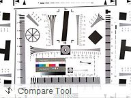


Meizu MX 4-core in our Photo Compare Tool
Full HD video camera
全高清视频拍摄
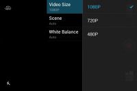
The camcorder uses the same interface as the still camera, except the bar to the right side is now transparent and there are black bars on the top and the bottom to fit the 16:9 video. You can control the video light and pick scenes before you start shooting.
摄像使用和静态拍照同一个界面,只不过右侧的功能栏是透明的了,然后因为拍摄16:9的视频屏幕上下会有黑边,在拍摄之前可以选择白平衡和场景。
录像界面
The Meizu MX 4-core captures videos at up to 1080p resolution at 30fps in MP4 files. The bitrate is around 10Mbps, which is a bit low for FullHD videos, with AAC-encoded stereo sound (44.1kHz sampling rate).
Video quality on the MX 4-core is a bit better than it was on the original MX and will please most users. There may be better camcorders out there, but the MX 4-core is well above average, producing footage with a decent enough detail, low noise and decent colors.
Mx四核最高支持30fps(帧/秒)的1080p分辨率录像(MP4文件),比特率是10Mbps左右(略小于全高清视频的标准),音频是嵌入式AAC立体声(44.1kHz采样率)(太专业了)。
Mx四核的录像画质比上代的双核好了一些,大多数人会满意,市场上应该还会有效果更好的录像手机,不过mx四核会在中等偏上的水平,它的画面细节丰富、低噪点、色彩丰富(依据郭德纲的话是“不吝赞美之词”)。
Strangely enough the 720p videos have the same bitrate as the 1080p clips and at times the two have virtually the same amount of resolved detail. It seems that the compression applied to the 1080p footage is a bit too strong, which leads to loss of detail at times.
Sadly, the Meizu MX 4-core has the same issue with its 1080p recording as the Apple iPhone 4S and the Samsung I9100 Galaxy S II. This means that the field of view is greatly reduced compared to when you are capturing 720p footage or still shots. Obviously, despite the powerful chipset, the MX 4-core is unable to process the information from the whole sensor so it only uses the middle part for 1080p video capture.
Here go the 1080p and 720p video samples so you can see for yourself. Just don't forget to choose 1080p resolution and view them full screen.
很奇怪的是720p的录像和1080p有相同的比特率,并且偶尔两个类型的视频在细节方面也一样,貌似mx四核在1080p录像的压缩处理有点怪,这偶尔会导致细节的丢失(同意这个观点)。
悲剧,魅族mx四核在1080p录像存在和iphone 4S及三星galaxy s2一样的问题(不知道s3是否存在),就是说同720p录像或静态拍照比较起来,1080p录像时候视野会严重的下降(请高手指点这到底说的是什么),很明显,虽然mx四核配置了强大的芯片组,可是它的传感器并不能将“所见”转化为数字信息(视频文件),它只达到了1080p的部分指标(说的很形象,说白了就是1080p有水分)。
Also, here's an untouched 1080p@30fps and 720p@30fps videos that comes straight from the phone without any re-encoding.
Video quality comparison
录像画质分析
The Meizu MX 4-core entered our Video Compare Tool database. Its results aren't too bad, but can really come anywhere near the best 1080p footage out there.
下图是魅族mx四核在录像画质分析工具上的表现,结果不是很差,不过和最好的1080p比起来,基本没有达标(不奢求了,720p也就行了)


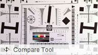
Meizu MX 4-core in our Video Compare Tool
Connectivity使用范围
The Meizu MX 4-core will work anywhere you go - it does quad-band GSM/GPRS/EDGE along with penta-band 3G with blazing fast HDPA+ - the downlink reaches up to 21.6Mbps.
Locally, you get Wi-Fi b/g/n with WPS for easy and secure connections to new Wi-Fi routers. The Meizu MX uses Bluetooth 2.1 + EDR, which is getting old but still gets the job done.
Mx四核可以用在地球的各处,它支持GSM/GPRS/EDGE双波段,峰值达到HDPA+的五波段3G,下载峰值高达21.6Mbps(天朝不奢望)。
本地你可以使用b/g/n wifi,并可作为热点(有WPS,安全没有问题)(WPS是什么不懂),mx使用的蓝牙是2.1 + EDR,这个有点老,不过应付日常使用没有问题。
Unfortunately, just like the dual-core MX, the Meizu MX 4-core has rather poor Wi-Fi reception. It's not a death-grip issue, but if you move away from the router with some moderate obstacles in the way, the signal drops to the bottom threshold. It works most of the time, but it cuts out too. Other phones have little issues working in the same area. 2G/3G reception wasn't an issue.
悲剧的是和mx双核一样,四核的wifi信号也很弱,当你离开路由器中间有几个小障碍物的时候,四核的wifi信号就会降低到最弱临界值,这本身不是一个致命问题,大部分时间wifi都是连接的,但是有时候也会断掉,其他的手机在这方面问题不大。四核的2G/3G信号不存在问题。(这是真的吗?我感觉四核的wifi比双核的好多了,之前在办公室的厕所-距离路由器有三个门 7m左右双核接收不了wifi信号,四核ok)。
The microUSB port is quite interesting - it supports mass storage connections with a computer as you would expect, but also does USB host for hooking things to the phone, MHL for HD TV-Out and also S/PDIF, which is a digital way to output multi-channel audio and will be used for the dock.
microUSB功能强大,它支持除去最常用的电脑连接之外的多种连接方式,比如USB 宿主(可以讲U盘直接连接到mx),电视高清MHL输出,还有一个数字音频接口协议支持S/PDIF,它可以将多通道的音频以数字信号的方式输出,用于到其他接口上(这个太高端)
支持S/PDIF
There is no NFC support.
没有NFC
8#
Redesigned web browser is great
重新设计的浏览器很不错
The web browser plays a central role in the Meizu MX 4-core as evidenced by its shortcut's position - the middle shortcut in the dock at the bottom of the homescreen, which is usually where the app drawer shortcut goes (or the dialer shortcut).
The user interface of the browser has been completely redesigned (compared to vanilla Android) and we found a couple of things we really liked about it. The back end is the same as on all Androids, so you can expect the same level of compatibility and speed you're used to.
浏览器在mx四核上处于核心的地位,这在它所处的位置能够得到验证:手机屏幕下方的中间位置,这个位置其他手机一般作为软件入口或者拨号键。(并且还是不能修改的哦)。
浏览器的ui被完全的重新设计(同原生android相比),我们在它上面发现了许多喜欢的地方,不过它的内核还是基于android,因此不用担心它的速度和兼容性。
Anyway, the browser interface dedicates almost the entire screen to the web page, save for the status bar on top. To bring out more controls, you tap the Menu key.
The controls include the standard stuff - address bar on top and several buttons at the bottom (new tab, close tab, bookmarks,etc.). Above those controls is a line of thumbnails of all the tabs. You can switch tabs or close them from here. It's one of the best tab management solution we've seen on a mobile browser yet.
浏览器将最大的页面留给了网页,仅在顶部留有一个地址栏,可以触摸菜单键得到更多的选项(这里表扬一下弹出菜单的设计,flyme整体的弹出菜单都是在功能点发出,并且不会占据整个页面,我认为这个设计特别好)。
控制按钮包括了一些基本的项目:顶栏的地址栏和底部的工具栏(包括新建、关闭页面和书签等),在底部工具栏的上面是一行浏览页面的缩略图,这里可以触摸切换不同页面或者关闭,这是我们在手机浏览器上见到的最好的设计。(不吝赞美之词)

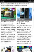
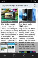
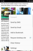
The browser has a very capable custom interface
浏览器具有强大的个性化界面
The browser supports double tap and pinch zooming. It's really fast and fluid too. There are also goodies like text reflow or sharing an URL over email or SMS.
The browser came without Flash preinstalled, but we installed it manually from the Play Store and it worked. 1080p YouTube videos played fine without any lag or visual artifacts. We tested the dual-core MX after the update and it did a splendid job with the full HD videos as well. Flash games played without a hitch, too.
浏览器支持双击适应屏幕和手指缩放,很快很流畅,并且还有文本回流和email、短信共享超链接的功能(text reflow文本回流?不懂,求解释)。
浏览器没有预装flash插件,我们从play商店下载安装之后就可以在YouTube观看1080p视频了,过程没有任何的拖延或画面假象(visual artifacts?),我们接着测试了升级之后的mx双核(非采用新cpu的mx双核),它在观看全高清视频的时候也没有压力,flash游戏玩起来也不卡。

Watching a YouTube video 观看YouTube视频(从没看过)
Meizu also supports HTML5 videos, which are the future of mobile video streaming, so we can't really give the browser anything but a great mark
魅族的flyme也支持HTML5视频,这是手机视频未来的潮流,因此,我们在浏览器方面除了说好别无其他。
The organizer covers the basics日程管理覆盖基本功能
The Meizu MX 4-core features a calendar that supports multiple online accounts. It offers monthly, weekly, daily and agenda views and is pretty straightforward to work with. Creating a new event lets you set which calendar to store it in, along with a reminder.
Mx四核的日历支持多个在线账户,它提供月、周、天为单位的日程表,做的很直观,在创建一个新事件之后可以选择存放在那天,并且还可设置提醒时间。
Moving on, we have the Clock app that will handle multiple alarms with custom repeat times, ringtones, snooze time and labels. There are also a stopwatch and timer integrated within the Clock app.
在闹钟这里,可以设置做个自定义的闹钟,每个闹钟可以定义重复的日期(比如周一到周五,周六到周日)、铃声、贪睡时间和标签,这里还有一个秒表和计时器。

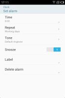
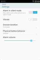
You can set multiple alarms with different repeat patterns
可以设置多个不同重复样式的闹钟(具体什么意思?)
The Notes app offers four different colors for the background of a note, which will be helpful if you want to organize them into several categories. There's a widget accompanying the Notes app, which displays the most recent notes and offers a quick shortcut for creating new ones.
便签一共有4个不同的背景颜色选择,这样可以快速的识别到你的便签类别,同时便签有其桌面小部件,显示最新的便签并可以快速的添加便签。

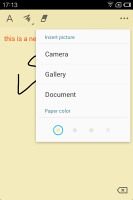

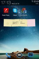
The Notes app helps you stay organized with different colors • The Notes widget
便签不同的颜色方便识别,便签小部件
The Recorder app rounds off the organizer functionality of the phone. It offers the option to record calls, which some might find useful.
录音强化了手机的功能,可以设置通话录音,这个有时候会有用的(貌似M8时代就有了吧,还记得我还珍藏了一个曾经追求的mm的美好声音%>_<%)
A calculator app is also on board.
计算器
9#
Documents To Go comes free of charge
免费的Documents To Go
If you look through the homescreens, you won't find a document viewer app but if you try to open an Office document from the file browser, you will be prompted to download the free version of Documents to Go off the Meizu Store. It can create, edit .DOC, .XLS and .PPT (both Office 2003 and 2007 files) and read PDFs.
The app works very fast in both zooming and panning. It lacks functionality like searching inside the document though.
浏览桌面发现并不能找到任何文档浏览软件,不过在你打开文档的时候,系统会带领你到软件中心下载免费的Documents To Go,它可以创建和编辑2003和2007格式的doc、xls和ppt,还可以浏览pdf文件。(个人认为Documents To Go有一点不好就是会在上面弄出一行显示浏览的文档名称,其实之前的金软还行)
Documents To Go在缩放和移动方面都很流程,不过缺少内容查账的功能。(经过我的测试是有查账功能)
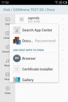

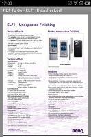

Viewing documents on the Meizu MX 4-core
Google Maps
Google地图
The Meizu MX 4-core comes with a GPS receiver, which took less than a minute and a half to get satellite lock from a cold start. You can use the A-GPS functionality to get near instantaneous locks or the network positioning if you only need a rough idea of your location.
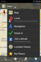
The latest available version of the Maps is 6.9 and offers all the extras you may need, including voice-guided navigation and offline maps caching for supported areas.
Mx四核有GPS功能,在冷启动(cold start这个词汇太好了)的时候大约一分半钟能锁定卫星(我的mx四核刚买来一天没有连到星,现在正常了),如果想得到更近的即时位置,可以使用A-GPS功能(GPS和移动基站双重定位),不过如果只想知道大概的位置,使用联网的定位就行了。(我认为GPS是用来开车时候用的)。
最新可用的谷歌地图版本是6.9,它提供了很多有用的功能,比如语音导航和所支持地区的离线地图(那个谷歌导航貌似是谷歌街景,很强大)。
If you don't live in one of the supported countries the best you can do is plan a route in advance and keep an eye on your current location during travel.
Street view is, as usual, a part of the standard package - it gives you a panoramic view of every bit of road in the covered areas. With the compass mode enabled, it feels like a virtual tour of the place.
如果你不居住在谷歌地图所支持的国家,最好事先规划好路线,然后旅行的时候注意现在的位置(老外开始骄傲了)。
谷歌街景是谷歌地图的一部分,它可以给你提供所覆盖地区的每一条路和每一个角度的全景图,再加上罗盘仪,感觉就像是在一个地区虚拟旅行(我们只有羡慕嫉妒恨了)。
Google Play and Meizu's own App Center
歌商店和魅族自己的软件中心
The Google Play app market, previously known as the Android Market, lets you download various apps for your device. Upon launch of the Market app you're greeted with the tiled interface of the Featured window. A swipe to the right takes you to the Categories view.
谷歌商店(之前叫android市场)是提供下载各种软件的地方,打开这个软件之后,首先映入眼帘的是平面化布局的方格,向右边滑动会看到分类界面(记得魅族就是google android开发成员中的一员,这次flyme的平面化设计和这里的goole商店平面化设计应用有某种联系,魅族应该掌握了一部分android最新设计的理念)
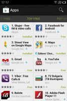
Swiping to the left takes you through Top Paid, Top Free, Top Grossing, Top New Paid, Top New Free and Trending (the ones with growing popularity). New sections are available such as Staff Picks, Editor's Choice and more.
Downloads are easy and apps install by themselves once they are complete. Before you agree to download an app, the Market will show you what features the app requires access to (e.g. Internet connectivity, access to the file system, etc.). You can also see if updates are available for your currently installed apps by going to My Apps in the contextual menu.
Google Play is not available in China, so Meizu is providing an alternative app store (App Center) with both free and paid apps and games. It's unable to offer the variety of the Android official repository, so it will be of little use to international owners.
向左滑动会出现热门付费、热门免费、付费最多、最新付费、最新免费及最流行(增长最快的app)(国内的mx四核google商店没有付费的),还有软件合集、编辑推荐等(过国内的差别挺大)。
下载很简单,下载之后软件会自动的安装,在同意下载之前,google商店会告诉你软件的权限要求(比如网络连接、写入系统等),可以点击菜单键进入到我的软件查看安装软件的更新情况。
谷歌商店不适用在中国,因此魅族开发了自己的软件中心,包含免费和付费app,因为它的软件不能提供符合android各类正式的准则要求(看来google商城的准入门槛挺高),因此对国际用户来说用途不大。


Meizu App Center is targeted at the Chinese market
魅族的软件中心面向的是中国市场
10#
Final words
总结语
The Meizu MX 4-core is quite a bit of a shocker. Just like the original Meizu MX, this Chinese smartphone has enough twists and turns to keep you guessing, and interested. There we go, that's one. If anyone expected anything of that caliber to come out of China, their money was most likely on Huawei.
The Meizu MX 4-core looks and feels exactly the same as its dual-core predecessor, which is to say, not particularly exciting. Essentially, a cheap plasticky iPhone replica is one of the most powerful smartphones in the market. How's that for a nice surprise?
It gets better. Flagships as we know them have plenty of history and experience behind them, hundred-strong armies. And it took Meizu what, two Android generations and about as many devices to conjure up a quad-core smartphone.
Mx四核横空出世鸣“惊雷”(这话翻译的我太佩服我自己了),和之前的mx双核一样,中国的智能手机市场有太多的东西让人思考和迷糊和惊喜,这个四核就是一个,如果有人想到中国走出世界,他们想到的大多数是华为。
Mx四核和之前的双核看起来一摸一样,这也就注定不能给我们带来多大的惊喜。基本上,一个价格便宜、外层塑料材质、外观iphone控的手机成了智能手机市场最强大的一员,这个惊奇怎么样?(这个略显讽刺,不过mx外观正面看确实和iphone有些神似,然后就是那个后壳我也不喜欢,喜欢磨砂或者摩托卡罗拉材质)。
说好的吧,旗舰们的背后有很多的过往故事、经历和成百个强大的装备(团队),转到魅族身上,两代android手机经验和同样很多的其他努力造就了今天的四核智能手机。
And by the way, the Meizu MX 4-core is not your average droid. The Flyme OS is all about keeping it simple, which means some of the features that rivals have are missing. But the core Android functionality is there and at times Meizu is doing impressively well. The Chinese must've put a lot of effort in making the interface look like they barely did anything to it. Yes, Flyme is one of the big and pleasant surprises of the Meziu MX 4-core. We liked its simplicity and its responsiveness, not to mention the few nice tricks it had up its sleeve.
What you're likely to miss is the value-adding apps and features of the other Android quad-cores. The Meizu MX 4-core struggles somewhat to keep up on the hardware side too. It made it to the Big Four and did so with a bang, but it's still the one with the smallest screen and lowest resolution.
顺便提醒魅族mx四核不是一个普通的android手机,flyme系统的简洁化设计意味着一些其他竞争手机有的功能它会缺失,但是flyme不缺少android的核心功能,反而有些方面魅族做的特别好,魅族公司肯定花费了大力气作出之前不怎么关注的界面ui,可以说flyme是魅族mx四核手机最大的惊喜之一。我们喜欢这个系统的简洁和快速响应,当然还有它特有的一些人性化设计。
这里我们没有介绍其他android四核手机软件的附加功能和特性,魅族mx四核在硬件方面的高配置造就它成为四大强机之一,并且还大放异彩,可是它仍旧在四大旗舰中屏幕最小和分辨率最小。
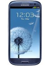
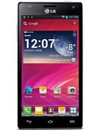
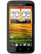
Samsung I9300 Galaxy S III • LG Optimus 4X HD P880 • HTC One X
Yet, the Meizu MX 4-core is supposed to be the budget option - if there's any such thing as a low-cost quad-core smartphone. The pricing will be make or break and Meizu should really get serious about making its phone globally available. With no streamlined supply, the asking price through random online retailers is ridiculously inflated.
The sooner the MX 4-core gets closer to the Chinese price tag of $480 for the 32GB version, the better. This will make the new Meziu flagship a device worth waiting for. You know, an alternative to waiting for the price of a Galaxy S III or an HTC One X to drop..
Whatever happens though, the Meizu MX 4-core deserves respect for fighting its way to the top, for making room for itself among formidable rivals. For being in good company, at the very least. And we mean a bunch that most other phones look at in shock and awe.
不过如果考虑价格成本,魅族mx四核被认为是具备性价比的四核手机,定价将成为关键,魅族公司也已经改认真的考虑其手机的国际化。如果没有合理的直销,网上随便的询价,无良的商家会毫无道理的抬高价格。
Mx四核的定价越尽快的靠近中国市场的定价480刀越好,这能让其成为值得等待的旗舰,因为大家都知道,用户还在期待另外的旗舰三星galaxy s3和htc one x的降价。
无论如何,魅族mx四核在造就自身巅峰的道路上值得尊敬,在激烈的市场竞争中赢得一片天地的努力值得尊敬,至少是一个用心在做好产品的公司(For being in good company, at the very least),这让其对手看着有些害怕(And we mean a bunch that most other phones look at in shock and awe.)
(最后这一段翻译的不好,求大师指导)


