R语言如何对多个图进行布局
R语言如何对多个图进行布局
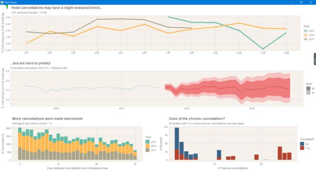
ggplot2画图非常快速高效,但是我们如何将两个图进行合并。这个是我用到的一个图
答案就是使用一个神仙包:cowplot,直接在CRAN就可以安装。
下面主要是画了4个画,然后对他们进行组装:
library(tidyverse)
library(lubridate)
library(tsibble)
library(feasts)
library(fable)
# devtools::install_github('cttobin/ggthemr')
library(ggthemr)
library(forecast)
library(cowplot)


# install.packages("digest")
#get data
hotels <- readr::read_csv('hotels.csv')

#add useful variables:
#total number nights stayed
#convert reservation status to ymd
#arrival date (ymd)
#cancel lead time - elapsed time between cancellation and scheduled arrival
hotels_new <- hotels %>%
  mutate(total_length_of_stay = stays_in_weekend_nights   stays_in_week_nights) %>%
  mutate(arrival_date = ymd(paste(arrival_date_year,
                                  arrival_date_month,
                                  arrival_date_day_of_month, sep=" "))) %>%
  mutate(cancel_lead_time = ifelse(reservation_status=="Canceled",
                                   day(as.period(lubridate::interval(reservation_status_date,
                                                          arrival_date))), NA))

#construct tstibble of cancellations per month
hotels_ts <- hotels_new %>%
  select(is_canceled, arrival_date) %>%
  mutate(rows = rownames(.))

hotels_ts <- as_tsibble(hotels_ts,
                        index = "arrival_date",
                        interval = "Daily",
                        key = "rows") %>%
  index_by(year_month = ~ yearmonth(.)) %>% # monthly aggregates
  summarize(
    perc_cancellations = sum(is_canceled, na.rm = TRUE) / length(is_canceled)
  )

#set theme
ggthemr("light", layout = "plain", text_size = 12)
1.这个产生的就是hotel_features
#extract time series features and plot by season
hotel_features <- hotels_ts %>% features(perc_cancellations, feat_stl)
seasonal_plot <- hotels_ts %>%
  mutate(year = year(year_month)) %>%
  mutate(month = month(year_month, label = T, abbr = T)) %>%
  ggplot()   geom_line(aes(x=month, y=perc_cancellations,
                           group=as.character(year),
                           color = as.character(year)), size = 2)
  scale_color_discrete(name = "Year")   xlab("")
  ylab("% Cancelled out of all bookings")
  labs(title = "Hotel cancellations may have a slight seasonal trend...",
       subtitle = "STL seasonal strength = 0.608")
2.这个产生的就是forecast_plot
#super basic forecasting (STL   random walk)
forecast_plot <- stl(hotels_ts, s.window="periodic", robust=TRUE) %>%
  forecast(method="naive") %>%
  autoplot(lwd=3, size=3, fcol='red', col='blue')
  labs(title = "...but are hard to predict",
       subtitle = "Forecasted cancellation from STL   Random walk")
  ylab("% Cancelled out of all bookings")   xlab("")
3.这个产生的就是cancel_lead_plot
#look at number of days between cancellation and scheduled arrival, by year
cancel_lead_plot <- ggplot(hotels_new)
  geom_bar(aes(x=cancel_lead_time,
               group=as.character(arrival_date_year),
               fill=as.character(arrival_date_year)))
  xlab("Days between cancellation and scheduled arrival")
  ylab("# Cancellations")
  labs(title="More cancellations were made last-minute",
       subtitle="Average # days before arrival = 13")
  scale_fill_discrete(name = "Year")
4.这个产生的就是pre_plot
#look at previous cancellations
prev_plot <- hotels_new %>% filter(previous_cancellations > 1) %>%
  ggplot()   geom_bar(aes(x=previous_cancellations, fill=as.character(is_canceled),
                          group=as.character(is_canceled)))
  ylab("# Bookers")   xlab("# Previous cancellations")
  scale_fill_manual(name = "Cancelled?", labels=c("No", "Yes"),
                    values = swatch()[c(6, 5)])
  labs(title="Case of the chronic cancellation?",
       subtitle="All bookers with 14 or more previous cancellations canceled again")
5.最后组合一下
plot_grid(seasonal_plot, forecast_plot,
          plot_grid(cancel_lead_plot, prev_plot, ncol=2),
          nrow=3)
最后就达到上面这个效果,非常显著。