【机器学习】SciPy 系统/层次聚类和树状图教程
【原文链接】https://joernhees.de/blog/2015/08/26/scipy-hierarchical-clustering-and-dendrogram-tutorial/
This is a tutorial on how to use scipy's hierarchical clustering.
One of the benefits of hierarchical clustering is that you 不用提前知道数据需要分成多少类(类别数量用k表示). Sadly, there doesn't seem to be much documentation on how to actually use scipy's hierarchical clustering to 做出知情的决定然后获得类别.
In the following I'll explain:
- how to use scipy's hierarchical clustering
- how to plot a nice dendrogram from it
- how to use the dendrogram to select a distance cut-off (aka determining the number of clusters k in your data)
- how to retrieve the k clusters
- how to visualize the clusters (2D case)
Naming conventions:
Before we start, as i know that it's easy to get lost, some naming conventions:
- X 样本 (n x m array), aka data points or "singleton clusters"
- n number of samples
- m number of features
- Z cluster linkage array (contains the hierarchical clustering information)
- k number of cluster
Imports and Setup, Generating Sample Data, Perform the Hierarchical Clustering
As the scipy linkage docs tell us, 'ward'(离差平方和) is one of the 方法 that can be used to 计算clusters之间距离. 'ward' causes linkage() to use the Ward variance minimization algorithm.
I think it's a good default choice, but it never hurts to play around with some other common linkage methods like 'single', 'complete', 'average', ... and the different distance metrics (距离度量) like 'euclidean' (default), 'cityblock' aka Manhattan, 'hamming'(汉明距离), 'cosine'... if you have the feeling that your data should not just be clustered to minimize the overall intra cluster variance in euclidean space. For example, you should have such a weird feeling with long (binary) feature vectors (e.g., 词向量 in 文本聚类).
# needed imports
from matplotlib import pyplot as plt
from scipy.cluster.hierarchy import dendrogram, linkage
import numpy as np
# some setting for this notebook to actually show the graphs inline in the notebook, rather than in a new window.
from IPython import get_ipython
get_ipython().run_line_magic('matplotlib', 'inline')
np.set_printoptions(precision=5, suppress=True)  # suppress scientific float notation

# 生成两个cluster: a有100点, b有50:
np.random.seed(4711)  # for repeatability of this tutorial
a = np.random.multivariate_normal([10, 0], [[3, 1], [1, 4]], size=[100,])
b = np.random.multivariate_normal([0, 20], [[3, 1], [1, 4]], size=[50,])
X = np.concatenate((a, b),)
print(X.shape)  # 150 样本 with 2维
plt.scatter(X[:,0], X[:,1])
plt.show()

# generate the linkage matrix
Z = linkage(X, 'ward')
As you can see there's a lot of choice here and while python and scipy make it very easy to do the clustering, it's you who has to understand and make these choices. If i find the time, i might give some more practical advice about this, but for now i'd urge you to at least read up on the linked methods and metrics to make a somewhat informed choice. Another thing you can and should definitely do is check the Cophenetic Correlation Coefficient of your clustering with help of the cophenet() function. This (very very briefly) 比较 (correlates) the 样本中成对成对的实际距离 to 系统聚类暗示的距离. The closer the value is to 1, 聚类就越好地保留了原本的距离, which in our case is pretty close: 0.98001483875742679
from scipy.cluster.hierarchy import cophenet
from scipy.spatial.distance import pdist
c, coph_dists = cophenet(Z, pdist(X))
print(c)
No matter what method and metric you pick, the linkage() function will use that method and metric to 计算clusters的距离 (从n个独立的样本 (aka data 点) as singleton clusters 开始)) and 在每次迭代式 will merge the two clusters which have the 最小距离 according the selected method and metric. It will 返回一个距离为n - 1的数组 giving you information about 为了成对成对地合并 n 个 clusters 所需的 n - 1 次 cluster merges. 在第i次迭代的时候,Z[i] will tell us which clusters were merged, let's take a look at the first two points that were merged:
print(Z[0])
array([ 52.     ,  53.     ,   0.04151,   2.     ])
We can see that ach row of the resulting array has the format [idx1, idx2, dist, sample_count].
In its first iteration the linkage algorithm decided to merge the two clusters (original samples here) with indices 52 and 53, 因为他们两个之间的距离仅为 0.04151. 因此产生了一个cluster with a total of 2 样本.
In the second iteration the algorithm decided to merge the clusters (original samples here as well) with indices 14 and 79, which had a distance of 0.04914. This again formed another cluster with a total of 2 samples.
The indices of the clusters until now correspond to our samples. Remember that we had a total of 150 samples, so indices 0 to 149. Let's have a look at the first 20 iterations:
print(Z[:20])
array([[  52.     ,   53.     ,    0.04151,    2.     ],
       [  14.     ,   79.     ,    0.05914,    2.     ],
       [  33.     ,   68.     ,    0.07107,    2.     ],
       [  17.     ,   73.     ,    0.07137,    2.     ],
       [   1.     ,    8.     ,    0.07543,    2.     ],
       [  85.     ,   95.     ,    0.10928,    2.     ],
       [ 108.     ,  131.     ,    0.11007,    2.     ],
       [   9.     ,   66.     ,    0.11302,    2.     ],
       [  15.     ,   69.     ,    0.11429,    2.     ],
       [  63.     ,   98.     ,    0.1212 ,    2.     ],
       [ 107.     ,  115.     ,    0.12167,    2.     ],
       [  65.     ,   74.     ,    0.1249 ,    2.     ],
       [  58.     ,   61.     ,    0.14028,    2.     ],
       [  62.     ,  152.     ,    0.1726 ,    3.     ],
       [  41.     ,  158.     ,    0.1779 ,    3.     ],
       [  10.     ,   83.     ,    0.18635,    2.     ],
       [ 114.     ,  139.     ,    0.20419,    2.     ],
       [  39.     ,   88.     ,    0.20628,    2.     ],
       [  70.     ,   96.     ,    0.21931,    2.     ],
       [  46.     ,   50.     ,    0.22049,    2.     ]])
We can observe that until iteration 13 the algorithm only directly merged original samples. We can also observe the 单调 increase of the distance.
In iteration 13 the algorithm decided to merge cluster indices 62 with 152. If you paid attention the 152 should astonish you as we only have original sample indices 0 to 149 for our 150 samples. All indices idx >= len(X) actually refer to the cluster formed in Z[idx - len(X)].
This means that while idx 149 corresponds to X[149], idx 150 corresponds to the cluster formed in Z[0], idx 151 to Z[1], 152 to Z[2], ...
Hence, the merge iteration 13 merged sample 62 to 之前在第二次迭代 (152 - 2) 中 merged 的样本:33 and 68.
Let's check out the points coordinates to see if this makes sense:
print(X[[33, 68, 62]])
array([[ 9.83913, -0.4873 ],
       [ 9.89349, -0.44152],
       [ 9.97793, -0.56383]])
Seems pretty close, but let's plot the points again and highlight them:
idxs = [33, 68, 62]
plt.figure(figsize=(10, 8))
plt.scatter(X[:,0], X[:,1])  # plot all points
plt.scatter(X[idxs,0], X[idxs,1], c='r')  # plot interesting points in red again
plt.show()
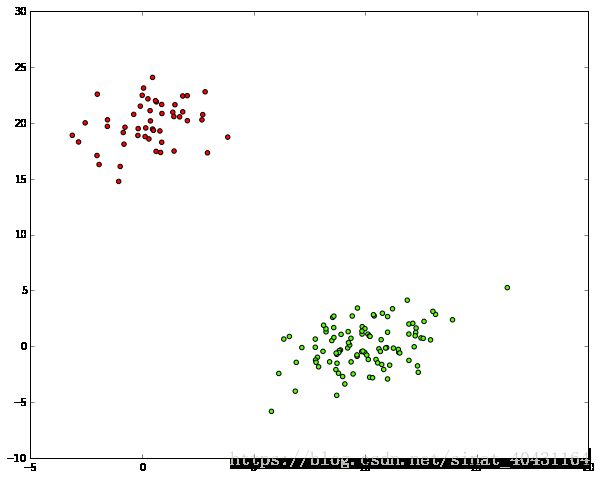
We can see that the 3 red dots are pretty close to each other, which is a good thing.
The same happened in iteration 14 where the alrogithm merged indices 41 to 15 and 69:
idxs = [33, 68, 62]
plt.figure(figsize=(10, 8))
plt.scatter(X[:,0], X[:,1])
plt.scatter(X[idxs,0], X[idxs,1], c='r')
idxs = [15, 69, 41]
plt.scatter(X[idxs,0], X[idxs,1], c='y')
plt.show()
Showing that the 3 yellow dots are also quite close.
And so on...
We'll later come back to visualizing this, but now let's have a look at what's called a dendrogram of this hierarchical clustering first:
Plotting a Dendrogram
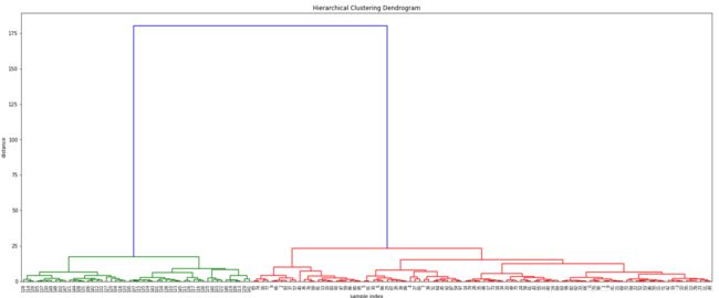
A dendrogram is a visualization in form of a tree showing merges 的顺序 and 距离 during the hierarchical clustering.
# calculate full dendrogram
plt.figure(figsize=(25, 10))
plt.title('Hierarchical Clustering Dendrogram')
plt.xlabel('sample index')
plt.ylabel('distance')
dendrogram(
    Z,
    leaf_rotation=90.,  # rotates the x axis labels
    leaf_font_size=8.,  # font size for the x axis labels
)
plt.show()
If this is the first time you see a dendrogram, it's probably quite confusing, so let's take this apart...
- On the x axis you see labels. If you don't specify anything else they are the indices of your samples in X.
- On the y axis you see the distances (of the 'ward' method in our case).
Starting from each label at the bottom, you can see a vertical line up to a horizontal line. The 高度 of that 水平线 tells you about the 距离 at which this label was merged into another label or cluster (这个标签和另一个标签或cluster merge时的距离). You can find that other cluster by following the other vertical line down again. If you don't encounter another horizontal line, it was just merged with the other label you reach, otherwise it was merged into another cluster that was formed earlier.
Summarizing:
- 水平线是 cluster merges
- vertical lines tell you which clusters/labels were part of merge forming that new cluster
- 水平线的高度 tell you about the distance that needed to be "bridged" to form the new cluster (形成一个新的cluster所需要桥接的距离)
You can also see that from distances > 25 up there's a huge jump of the distance to the final merge at a distance of approx. 180. Let's have a look at the distances of the last 4 merges:
print(Z[-4:,2])
array([  15.11533,   17.11527,   23.12199,  180.27043])
Such distance jumps / gaps in the dendrogram are pretty interesting for us. They indicate that something is merged here, that 可能不应该被 merged. In other words: maybe the things that were merged here really don't belong to the same cluster, telling us that maybe there's just 2 clusters here.
Looking at indices in the above dendrogram also shows us that the green cluster only has indices >= 100, while the red one only has such < 100. This is a good thing as it shows that the algorithm re-discovered the two classes in our toy example.
In case you're wondering about where the colors come from, you might want to have a look at the color_threshold argument of dendrogram(), which as not specified 自动选择 a distance cut-off value of 70% of the 最后一次 merge and then 将最后一次 merge 下面的第一层 clusters 上色.
Dendrogram Truncation
As you might have noticed, the above is pretty big for 150 samples already and you probably have way more in real scenarios, so let me spend a few seconds on highlighting some other features of the dendrogram() function:
plt.title('Hierarchical Clustering Dendrogram (truncated)')
plt.xlabel('sample index')
plt.ylabel('distance')
dendrogram(
    Z,
    truncate_mode='lastp',  # show only the last p merged clusters
    p=12,  # show only the last p merged clusters
    show_leaf_counts=False,  # otherwise numbers in brackets are counts
    leaf_rotation=90.,
    leaf_font_size=12.,
    show_contracted=True,  # to get a distribution impression in truncated branches
)
plt.show()
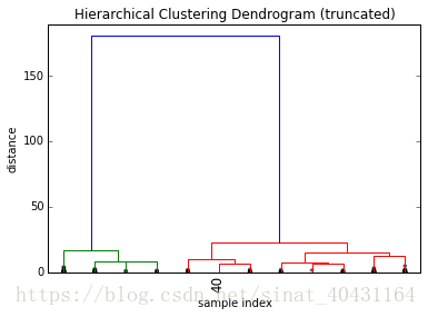
The above shows a truncated dendrogram, which only shows the last p=12 out of our 149 merges.
First thing you should notice are that most labels are missing. This is because except for X[40] all other samples were already merged into clusters before the last 12 merges.
The parameter show_contracted allows us to draw black dots at the heights of those previous cluster merges, so we can still spot gaps even if we don't want to 弄乱 the whole visualization. In our example we can see that the dots are all at pretty small distances when compared to the huge last merge at a distance of 180, telling us that we probably didn't miss much there.
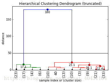
As it's kind of hard to keep track of the cluster sizes just by the dots, dendrogram()will by default also print the cluster sizes in brackets () if a cluster was truncated:
plt.title('Hierarchical Clustering Dendrogram (truncated)')
plt.xlabel('sample index or (cluster size)')
plt.ylabel('distance')
dendrogram(
    Z,
    truncate_mode='lastp',  # show only the last p merged clusters
    p=12,  # show only the last p merged clusters
    leaf_rotation=90.,
    leaf_font_size=12.,
    show_contracted=True,  # to get a distribution impression in truncated branches
)
plt.show()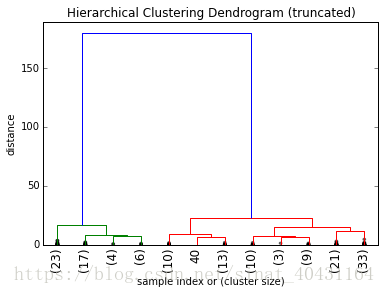
Eye Candy
Even though this already makes for quite a nice visualization, we can pimp it even more by also annotating the distances inside the dendrogram by using some of the useful return values dendrogram():
def fancy_dendrogram(*args, **kwargs):
    max_d = kwargs.pop('max_d', None)
    if max_d and 'color_threshold' not in kwargs:
        kwargs['color_threshold'] = max_d
    annotate_above = kwargs.pop('annotate_above', 0)

    ddata = dendrogram(*args, **kwargs)

    if not kwargs.get('no_plot', False):
        plt.title('Hierarchical Clustering Dendrogram (truncated)')
        plt.xlabel('sample index or (cluster size)')
        plt.ylabel('distance')
        for i, d, c in zip(ddata['icoord'], ddata['dcoord'], ddata['color_list']):
            x = 0.5 * sum(i[1:3])
            y = d[1]
            if y > annotate_above:
                plt.plot(x, y, 'o', c=c)
                plt.annotate("%.3g" % y, (x, y), xytext=(0, -5),
                             textcoords='offset points',
                             va='top', ha='center')
        if max_d:
            plt.axhline(y=max_d, c='k')
    return ddata

fancy_dendrogram(
    Z,
    truncate_mode='lastp',
    p=12,
    leaf_rotation=90.,
    leaf_font_size=12.,
    show_contracted=True,
    annotate_above=10,  # useful in small plots so annotations don't overlap
)
plt.show()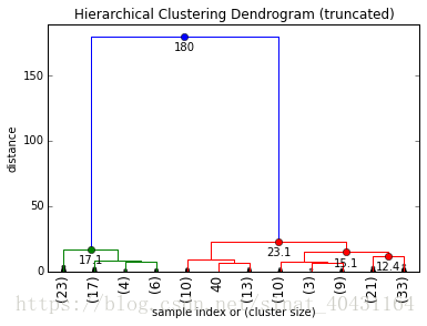
Selecting a Distance Cut-Off aka Determining the Number of Clusters
As explained above already, a huge jump in distance is typically what we're interested in if we want to argue for a certain number of clusters. If you have the chance to do this manually, i'd always opt for that, as it allows you to gain some insights into your data and to perform some 合理性检查 on the edge cases (a problem or situation that occurs only at an extreme (maximum or minimum) operating parameter). In our case i'd probably just say that our cut-off is 50, as the jump is pretty obvious. Let's visualize this in the dendrogram as a cut-off line:
# set cut-off to 50
max_d = 50  # max_d as in max_distance
fancy_dendrogram(
    Z,
    truncate_mode='lastp',
    p=12,
    leaf_rotation=90.,
    leaf_font_size=12.,
    show_contracted=True,
    annotate_above=10,
    max_d=max_d,  # plot a horizontal cut-off line
)
plt.show()
As we can see, we ("surprisingly") have two clusters at this cut-off.
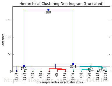
In general for a chosen cut-off value max_d you can always simply count 和 dendrogram 的垂直线的交点的数量 to get the number of formed clusters. Say we choose a cut-off of max_d = 16, we'd get 4 final clusters:
Automated Cut-Off Selection (or why you shouldn't rely on this)
Now while this manual selection of a cut-off value offers a lot of benefits when it comes to checking for a meaningful clustering and cut-off, there are cases in which you want to automate this.
The problem again is that there is no golden method to pick the number of clusters for all cases (which is why i think the investigative & backtesting (testing a predictive model using existing historic data) manual method is preferable). Wikipedia lists a couple of common methods. Reading this, you should realize how different the approaches and how vague their descriptions are.
I honestly think it's a really bad idea to just use any of those methods, unless you know the data you're working on really really well.
Inconsistency Method
For example, let's have a look at the "inconsistency" method, which seems to be one of the defaults for the fcluster() function in scipy.
The question driving the inconsistency method is "what makes a distance jump a jump (什么样的距离才能算作一个跳跃)?". It answers this by comparing each cluster merge's 高度 h to the 平均值 avg and normalizing it by the 标准差 std formed over the depth (应该是树的高度) previous levels (应该是树的层):
$$inconsistency = \frac{h - avg}{std}$$The following shows a 矩阵 of the avg, std, count, inconsistency for each of the last 10 merges of our hierarchical clustering with depth = 5
from scipy.cluster.hierarchy import inconsistent
depth = 5
incons = inconsistent(Z, depth)
print(incons[-10:])

array([[  1.80875,   2.17062,  10.     ,   2.44277],
       [  2.31732,   2.19649,  16.     ,   2.52742],
       [  2.24512,   2.44225,   9.     ,   2.37659],
       [  2.30462,   2.44191,  21.     ,   2.63875],
       [  2.20673,   2.68378,  17.     ,   2.84582],
       [  1.95309,   2.581  ,  29.     ,   4.05821],
       [  3.46173,   3.53736,  28.     ,   3.29444],
       [  3.15857,   3.54836,  28.     ,   3.93328],
       [  4.9021 ,   5.10302,  28.     ,   3.57042],
       [ 12.122  ,  32.15468,  30.     ,   5.22936]])
Now you might be tempted to say "yay, let's just pick 5" as a limit in the inconsistencies, but look at what happens if we set depth to 3 instead:
depth = 3
incons = inconsistent(Z, depth)
print(incons[-10:])

array([[  3.63778,   2.55561,   4.     ,   1.35908],
       [  3.89767,   2.57216,   7.     ,   1.54388],
       [  3.05886,   2.66707,   6.     ,   1.87115],
       [  4.92746,   2.7326 ,   7.     ,   1.39822],
       [  4.76943,   3.16277,   6.     ,   1.60456],
       [  5.27288,   3.56605,   7.     ,   2.00627],
       [  8.22057,   4.07583,   7.     ,   1.69162],
       [  7.83287,   4.46681,   7.     ,   2.07808],
       [ 11.38091,   6.2943 ,   7.     ,   1.86535],
[ 37.25845, 63.31539, 7. , 2.25872]])Another problem in its calculation is that the previous d levels' heights aren't 正态分布的, but expected to increase, so you can't really just treat the current level as an "outlier"(离群值,an observation point that is distant from other observations) of a normal distribution, as it's expected to be bigger.
Elbow Method
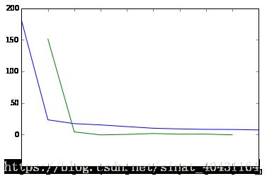
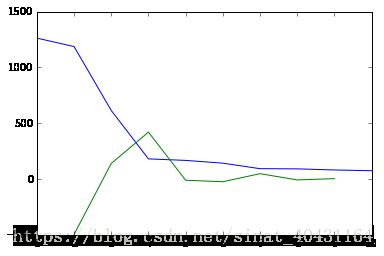
Another thing you might see out there is a 变体 of the "elbow method". It tries to find the clustering step where the 距离增长的加速度 is the biggest (the "strongest elbow" of the blue line graph below, which is the highest value of the green graph below):
acceleration = np.diff(last, 2)  # 2nd 导数 of the distances
acceleration_rev = acceleration[::-1]
plt.plot(idxs[:-2] + 1, acceleration_rev)
plt.show()
k = acceleration_rev.argmax() + 2  # if idx 0 is the max of this we want 2 clusters
print("clusters:", k)
clusters: 2
While this works nicely in our simplistic example (the green line takes its maximum for k=2), it's pretty 有缺陷的 as well.
One issue of this method has to do with the way an "elbow" is defined: you need at least a right and a left point, which implies that this method will never be able to tell you that 所有的数据都在一个cluster中.
Another problem with this variant lies in the np.diff(Z[:, 2], 2) though. Z[:, 2] 中的距离的顺序 isn't properly reflecting one branch of the tree 中的 merges 的顺序. In other words: 不能保证 Z[i] 中的距离包含在 Z[i+1] 的分支中. By simply computing the np.diff(Z[:, 2], 2) we assume that this doesn't matter and just compare our merge tree 从不同分支出发的跳跃距离.
If you still don't want to believe this, let's just construct another simplistic example but this time with very different 方差 in the different clusters:
c = np.random.multivariate_normal([40, 40], [[20, 1], [1, 30]], size=[200,])
d = np.random.multivariate_normal([80, 80], [[30, 1], [1, 30]], size=[200,])
e = np.random.multivariate_normal([0, 100], [[100, 1], [1, 100]], size=[200,])
X2 = np.concatenate((X, c, d, e),)
plt.scatter(X2[:,0], X2[:,1])
plt.show()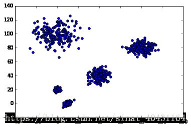
As you can see we have 5 clusters now, but they have increasing variances... let's have a look at the dendrogram again and how you can use it to spot the problem:
Z2 = linkage(X2, 'ward')
plt.figure(figsize=(10,10))
fancy_dendrogram(
    Z2,
    truncate_mode='lastp',
    p=30,
    leaf_rotation=90.,
    leaf_font_size=12.,
    show_contracted=True,
    annotate_above=40,
    max_d=170,
)
plt.show()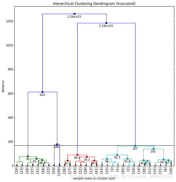
When looking at a dendrogram like this and trying to put a cut-off line somewhere, you should notice the very 不同的分布情况 of merge distances below that cut-off line. Compare the distribution in the cyan cluster to the red, green or even two blue clusters that have even been truncated away. In the cyan cluster below the cut-off we don't really have any discontinuity of merge distances up to very close to the cut-off line. The two blue clusters on the other hand are each merged below a distance of 25, and have a gap of > 155 to our cut-off line.
The variant of the "elbow" method will incorrectly see the jump from 167 to 180 as minimal and tell us we have 4 clusters:
last = Z2[-10:, 2]
last_rev = last[::-1]
idxs = np.arange(1, len(last) + 1)
plt.plot(idxs, last_rev)
acceleration = np.diff(last, 2)  # 2nd derivative of the distances
acceleration_rev = acceleration[::-1]
plt.plot(idxs[:-2] + 1, acceleration_rev)
plt.show()
k = acceleration_rev.argmax() + 2  # if idx 0 is the max of this we want 2 clusters
print("clusters:", k)The same happens with the inconsistency metric:
print(inconsistent(Z2, 5)[-10:])
[[  13.99222   15.56656   30.         3.86585]
 [  16.73941   18.5639    30.         3.45983]
 [  19.05945   20.53211   31.         3.49953]
 [  19.25574   20.82658   29.         3.51907]
 [  21.36116   26.7766    30.         4.50256]
 [  36.58101   37.08602   31.         3.50761]
 [  12.122     32.15468   30.         5.22936]
 [  42.6137   111.38577   31.         5.13038]
 [  81.75199  208.31582   31.         5.30448]
 [ 147.25602  307.95701   31.         3.6215 ]]
I hope you can now understand why i'm warning against blindly using any of those methods on a dataset you know nothing about. They can give you some indication, but you should always go back in and check if the results make sense, for example with a dendrogram which is a great tool for that (especially if you have higher dimensional data that you can't simply visualize anymore).
Retrieve the Clusters
Now, let's finally have a look at how to 获得 clusters, for different ways of determining k. We can use the fcluster function.
Knowing max_d:
Let's say we determined the max distance with help of a dendrogram, then we can do the following to get the cluster id for each of our samples:
from scipy.cluster.hierarchy import fcluster
max_d = 50
clusters = fcluster(Z, max_d, criterion='distance')
print(clusters)

array([2, 2, 2, 2, 2, 2, 2, 2, 2, 2, 2, 2, 2, 2, 2, 2, 2, 2, 2, 2, 2, 2, 2,
       2, 2, 2, 2, 2, 2, 2, 2, 2, 2, 2, 2, 2, 2, 2, 2, 2, 2, 2, 2, 2, 2, 2,
       2, 2, 2, 2, 2, 2, 2, 2, 2, 2, 2, 2, 2, 2, 2, 2, 2, 2, 2, 2, 2, 2, 2,
       2, 2, 2, 2, 2, 2, 2, 2, 2, 2, 2, 2, 2, 2, 2, 2, 2, 2, 2, 2, 2, 2, 2,
       2, 2, 2, 2, 2, 2, 2, 2, 1, 1, 1, 1, 1, 1, 1, 1, 1, 1, 1, 1, 1, 1, 1,
       1, 1, 1, 1, 1, 1, 1, 1, 1, 1, 1, 1, 1, 1, 1, 1, 1, 1, 1, 1, 1, 1, 1,
       1, 1, 1, 1, 1, 1, 1, 1, 1, 1, 1, 1], dtype=int32)
Knowing k:
Another way starting from the dendrogram is to say "i can see i have k=2" clusters. You can then use:
k=2
print(fcluster(Z, k, criterion='maxclust'))

array([2, 2, 2, 2, 2, 2, 2, 2, 2, 2, 2, 2, 2, 2, 2, 2, 2, 2, 2, 2, 2, 2, 2,
       2, 2, 2, 2, 2, 2, 2, 2, 2, 2, 2, 2, 2, 2, 2, 2, 2, 2, 2, 2, 2, 2, 2,
       2, 2, 2, 2, 2, 2, 2, 2, 2, 2, 2, 2, 2, 2, 2, 2, 2, 2, 2, 2, 2, 2, 2,
       2, 2, 2, 2, 2, 2, 2, 2, 2, 2, 2, 2, 2, 2, 2, 2, 2, 2, 2, 2, 2, 2, 2,
       2, 2, 2, 2, 2, 2, 2, 2, 1, 1, 1, 1, 1, 1, 1, 1, 1, 1, 1, 1, 1, 1, 1,
       1, 1, 1, 1, 1, 1, 1, 1, 1, 1, 1, 1, 1, 1, 1, 1, 1, 1, 1, 1, 1, 1, 1,
       1, 1, 1, 1, 1, 1, 1, 1, 1, 1, 1, 1], dtype=int32)
Using the Inconsistency Method (default):
If you're really sure you want to use the inconsistency method to determine the number of clusters in your dataset, you can use the default criterion of fcluster() and hope you picked the correct values:
from scipy.cluster.hierarchy import fcluster
print(fcluster(Z, 8, depth=10))

array([2, 2, 2, 2, 2, 2, 2, 2, 2, 2, 2, 2, 2, 2, 2, 2, 2, 2, 2, 2, 2, 2, 2,
       2, 2, 2, 2, 2, 2, 2, 2, 2, 2, 2, 2, 2, 2, 2, 2, 2, 2, 2, 2, 2, 2, 2,
       2, 2, 2, 2, 2, 2, 2, 2, 2, 2, 2, 2, 2, 2, 2, 2, 2, 2, 2, 2, 2, 2, 2,
       2, 2, 2, 2, 2, 2, 2, 2, 2, 2, 2, 2, 2, 2, 2, 2, 2, 2, 2, 2, 2, 2, 2,
       2, 2, 2, 2, 2, 2, 2, 2, 1, 1, 1, 1, 1, 1, 1, 1, 1, 1, 1, 1, 1, 1, 1,
       1, 1, 1, 1, 1, 1, 1, 1, 1, 1, 1, 1, 1, 1, 1, 1, 1, 1, 1, 1, 1, 1, 1,
       1, 1, 1, 1, 1, 1, 1, 1, 1, 1, 1, 1], dtype=int32)
Visualizing Your Clusters
If you're lucky enough and your data is very low dimensional, you can actually visualize the resulting clusters very easily:
plt.figure(figsize=(10, 8))
plt.scatter(X[:,0], X[:,1], c=clusters, cmap='prism')  # plot points with cluster dependent colors
plt.show()
Further Reading:
- The scipy hierarchical clustering module: http://docs.scipy.org/doc/scipy/reference/cluster.hierarchy.html
- The scipy distance computation docs: http://docs.scipy.org/doc/scipy/reference/spatial.distance.html
- The scipy hierarchical clustering module docs often refer to the MATLAB docs saying that a certain function is similar to the MATLAB one. Here's their hierarchical clustering tutorial: http://mathworks.com/help/stats/hierarchical-clustering.html
【完整代码】
# needed imports
from matplotlib import pyplot as plt
from scipy.cluster.hierarchy import dendrogram, linkage
import numpy as np
# some setting for this notebook to actually show the graphs inline in the notebook, rather than in a new window.
from IPython import get_ipython
get_ipython().run_line_magic('matplotlib', 'inline')
np.set_printoptions(precision=5, suppress=True)  # suppress scientific float notation

# 生成两个cluster: a有100点, b有50:
np.random.seed(4711)  # for repeatability of this tutorial
a = np.random.multivariate_normal([10, 0], [[3, 1], [1, 4]], size=[100,])
b = np.random.multivariate_normal([0, 20], [[3, 1], [1, 4]], size=[50,])
X = np.concatenate((a, b),)
print(X.shape)  # 150 样本 with 2维
plt.scatter(X[:,0], X[:,1])
plt.show()

# generate the linkage matrix
Z = linkage(X, 'ward')

from scipy.cluster.hierarchy import cophenet
from scipy.spatial.distance import pdist
c, coph_dists = cophenet(Z, pdist(X))
print(c)

print(Z[0])
print(Z[:20])
print(X[[33, 68, 62]])
idxs = [33, 68, 62]
plt.figure(figsize=(10, 8))
plt.scatter(X[:,0], X[:,1])  # plot all points
plt.scatter(X[idxs,0], X[idxs,1], c='r')  # plot interesting points in red again
plt.show()

idxs = [33, 68, 62]
plt.figure(figsize=(10, 8))
plt.scatter(X[:,0], X[:,1])
plt.scatter(X[idxs,0], X[idxs,1], c='r')
idxs = [15, 69, 41]
plt.scatter(X[idxs,0], X[idxs,1], c='y')
plt.show()

# calculate full dendrogram
plt.figure(figsize=(25, 10))
plt.title('Hierarchical Clustering Dendrogram')
plt.xlabel('sample index')
plt.ylabel('distance')
dendrogram(
    Z,
    leaf_rotation=90.,  # rotates the x axis labels
    leaf_font_size=8.,  # font size for the x axis labels
)
plt.show()

print(Z[-4:,2])

plt.title('Hierarchical Clustering Dendrogram (truncated)')
plt.xlabel('sample index')
plt.ylabel('distance')
dendrogram(
    Z,
    truncate_mode='lastp',  # show only the last p merged clusters
    p=12,  # show only the last p merged clusters
    show_leaf_counts=False,  # otherwise numbers in brackets are counts
    leaf_rotation=90.,
    leaf_font_size=12.,
    show_contracted=True,  # to get a distribution impression in truncated branches
)
plt.show()

plt.title('Hierarchical Clustering Dendrogram (truncated)')
plt.xlabel('sample index or (cluster size)')
plt.ylabel('distance')
dendrogram(
    Z,
    truncate_mode='lastp',  # show only the last p merged clusters
    p=12,  # show only the last p merged clusters
    leaf_rotation=90.,
    leaf_font_size=12.,
    show_contracted=True,  # to get a distribution impression in truncated branches
)
plt.show()

# set cut-off to 50
max_d = 50  # max_d as in max_distance
fancy_dendrogram(
    Z,
    truncate_mode='lastp',
    p=12,
    leaf_rotation=90.,
    leaf_font_size=12.,
    show_contracted=True,
    annotate_above=10,
    max_d=max_d,  # plot a horizontal cut-off line
)
plt.show()

fancy_dendrogram(
    Z,
    truncate_mode='lastp',
    p=12,
    leaf_rotation=90.,
    leaf_font_size=12.,
    show_contracted=True,
    annotate_above=10,
    max_d=16,
)
plt.show()

from scipy.cluster.hierarchy import inconsistent
depth = 5
incons = inconsistent(Z, depth)
print(incons[-10:])

depth = 3
incons = inconsistent(Z, depth)
print(incons[-10:])

last = Z[-10:, 2]
last_rev = last[::-1]
idxs = np.arange(1, len(last) + 1)
plt.plot(idxs, last_rev)

acceleration = np.diff(last, 2)  # 2nd 导数 of the distances
acceleration_rev = acceleration[::-1]
plt.plot(idxs[:-2] + 1, acceleration_rev)
plt.show()
k = acceleration_rev.argmax() + 2  # if idx 0 is the max of this we want 2 clusters
print("clusters:", k)

c = np.random.multivariate_normal([40, 40], [[20, 1], [1, 30]], size=[200,])
d = np.random.multivariate_normal([80, 80], [[30, 1], [1, 30]], size=[200,])
e = np.random.multivariate_normal([0, 100], [[100, 1], [1, 100]], size=[200,])
X2 = np.concatenate((X, c, d, e),)
plt.scatter(X2[:,0], X2[:,1])
plt.show()

Z2 = linkage(X2, 'ward')
plt.figure(figsize=(10,10))
fancy_dendrogram(
    Z2,
    truncate_mode='lastp',
    p=30,
    leaf_rotation=90.,
    leaf_font_size=12.,
    show_contracted=True,
    annotate_above=40,
    max_d=170,
)
plt.show()

last = Z2[-10:, 2]
last_rev = last[::-1]
idxs = np.arange(1, len(last) + 1)
plt.plot(idxs, last_rev)
acceleration = np.diff(last, 2)  # 2nd derivative of the distances
acceleration_rev = acceleration[::-1]
plt.plot(idxs[:-2] + 1, acceleration_rev)
plt.show()
k = acceleration_rev.argmax() + 2  # if idx 0 is the max of this we want 2 clusters
print("clusters:", k)

print(inconsistent(Z2, 5)[-10:])

from scipy.cluster.hierarchy import fcluster
max_d = 50
clusters = fcluster(Z, max_d, criterion='distance')
print(clusters)

k=2
print(fcluster(Z, k, criterion='maxclust'))

from scipy.cluster.hierarchy import fcluster
print(fcluster(Z, 8, depth=10))

plt.figure(figsize=(10, 8))
plt.scatter(X[:,0], X[:,1], c=clusters, cmap='prism')  # plot points with cluster dependent colors
plt.show()