plotly气泡图2019
In this tutorial, I will be creating a county-level geographic bubble map of COVID-19 cases in Texas using Plotly. The plot in the above gif can be found at the bottom of my website. My website is best accessed with a laptop rather than a mobile device. I also made another tutorial on how I created another interactive plotly graph and website using dash here. All the code and data I used to create this map can found on my Github. The .ipynb file has all of the code and graph included, but you must have all the .csv and .xlsx files downloaded to create the graph on your own as well as the associated plotly libraries. I will be assuming that you have some knowledge of python, pandas, and plotly. Let's go through the steps I went through to create this beautiful map:
在本教程中,我将使用Plotly在德克萨斯州创建COVID-19案例的县级地理气泡图。 上面gif中的图可以在我的网站底部找到。 最好使用笔记本电脑而非移动设备访问我的网站。 我还制作了另一个教程,介绍如何在此处使用破折号创建另一个交互式绘图和网站。 我用来创建此地图的所有代码和数据都可以在我的Github上找到。 .ipynb文件包含所有代码和图形,但是您必须下载所有.csv和.xlsx文件才能自行创建图形以及相关的绘图库。 我将假设您对python,pandas和plotly有一定的了解。 让我们完成创建这张美丽地图的步骤:
- Load in data and clean it using pandas 加载数据并使用熊猫清理
- Merge related data frames together and clean 合并相关的数据帧并清理
- Format data to be input into the plotly graph with groupby() 使用groupby()格式化要输入到绘图图中的数据
- Create graph using plotly.express.chorograph() and plotly.graph_objects.Scattergeo() 使用plotly.express.chorograph()和plotly.graph_objects.Scattergeo()创建图
One thing to note about the code snippets is you might have to change the directory the data files are located in before running the code. Ok, let's get started!
有关代码段的注意事项之一是,您可能必须在运行代码之前更改数据文件所在的目录。 好的,让我们开始吧!
Load in data and clean it using pandas
加载数据并使用熊猫清理
import pandas as pd
import plotly.express as px
from urllib.request import urlopen
import json
import plotly.graph_objects as go# read in data
fips_data = pd.read_excel("PHR_MSA_County_masterlist.xlsx", dtype={'FIPS #': str}) #need this to plot counties on map, source: https://www.dshs.texas.gov/chs/info/info_txco.shtm
fips_df = fips_data[["County Name", "FIPS #"]]#add 48 to end of each county fips so it can be input into plotly to geo graph data
def add_48(s):
    return "48" + str(s)
fips_df["FIPS #"] = fips_df["FIPS #"].map(add_48)cities_df = pd.read_csv("uscities.csv") #need for plotting texas cities, source: https://simplemaps.com/data/us-cities# for plotting major texas cities
mask = cities_df["state_id"] == "TX"
texas_cities = cities_df[mask]
mask2 = texas_cities["population"] > 200000
big_texas_cities = texas_cities[mask2]
cities_for_map = big_texas_cities[["city", "lat", "lng"]]# load in additional data with long and lat of each county as well as covid-19 case counts for new bubble graph
ts_df = pd.read_csv("time_series_plotly.csv").drop("Unnamed: 0", axis = 1) # I created this data from a previous medium post
county_loc = pd.read_csv("Texas_Counties_Centroid_Map.csv") #source: https://data.texas.gov/dataset/Texas-Counties-Centroid-Map/ups3-9e8m/data
Step 1 is pretty self-explanatory but it will be nice to see what all 4 data frames that I loaded in look like.
第1步很容易解释,但是很高兴看到我加载的所有4个数据帧的样子。
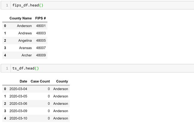
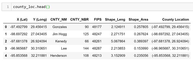
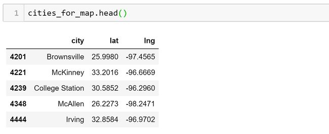
The fips_df just has all the fips codes for each county in Texas which can be used with plotly to graph each county. The ts_df is a long-form data frame that has all the COVID-19 case counts for each county for each day since March. The county_loc has the longitude and latitude for each county but they are flipped: the Y (Long) column has the latitude not the longitude of the counties which is an easy thing to fix when plotting. And the cities_for_map has the longitude and latitude data for cities in Texas that have a population greater than 200,000.
fips_df仅包含德克萨斯州每个县的所有fips代码,可用于以绘图方式绘制每个县的图形。 ts_df是一个长格式的数据框,其中包含自3月以来每天每个县的所有COVID-19案件计数。 county_loc具有每个县的经度和纬度,但是它们被翻转:Y(长)列具有纬度而不是县的经度,这在绘制时很容易确定。 并且city_for_map包含人口超过20万的德克萨斯州城市的经度和纬度数据。
2. Merge related data frames together and clean
2.合并相关的数据帧并清理
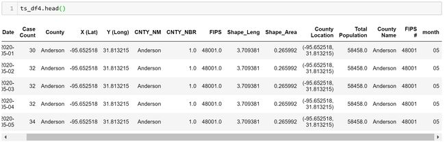
#merge covid-19 case counts with county longitude and latitude data
ts_df2 = ts_df.merge(county_loc, how = "left", left_on = "County", right_on = "CNTY_NM")#merge above df with fips data
ts_df3 = ts_df2.merge(fips_df,how = "left", left_on = "County", right_on = "County Name")
def extract_month(s):
    return s[5:7]
ts_df3["month"] = ts_df3["Date"].map(extract_month)# only extract last 4 months of data
mask = ts_df3["month"].astype(int) > 4
ts_df4 = ts_df3[mask]
A few things to note about the above code:
有关上述代码的几点注意事项:
- I am merging all three data frames using the County Name as the primary/foreign key 我使用县名作为主/外键合并所有三个数据框
- I also did not have to merge the fips_df but was having trouble using the county_loc data frame fips column to graph. 我也不必合并fips_df,但是在使用county_loc数据帧fips列进行绘图时遇到了麻烦。
- I will only be using the most recent 4 months of data since it is the most significant 我只会使用最近4个月的数据,因为它是最重要的
So now the data has a row for each day and each county in Texas with the COVID-19 case counts for the past 4 months.
因此,现在数据每天都有一行,德克萨斯州的每个县都有过去4个月的COVID-19案件计数。
3. Format data to be input into the plotly graph with groupby()
3.使用groupby()格式化要输入到绘图图中的数据
df = (ts_df4.groupby(["month", "County", "X (Lat)", "Y (Long)", "FIPS #"])["Case Count"].max()).reset_index()df["month"] = df["month"].astype(int)Ok, so this is where it gets a little complicated. I need to group by month, county, long, lat, and FIPS then get the max case count. This will give me a data frame that has the total case count for each county for each month. The data frame is shown below.
好的,这有点复杂。 我需要按月,县,长,纬度和FIPS分组,然后获得最大案例数。 这将为我提供一个数据框,其中包含每个县每个月的总病例数。 数据帧如下所示。

4. Create graph using plotly.express.chorograph() and plotly.graph_objects.Scattergeo()
4.使用plotly.express.chorograph()和plotly.graph_objects.Scattergeo()创建图
The plotting of this graph takes quite a lot of coding and understanding of plotly so I will go over it in chunks.
该图的绘制需要相当多的编码和对plotly的理解,因此我将逐块介绍它。
with urlopen('https://raw.githubusercontent.com/plotly/datasets/master/geojson-counties-fips.json') as response:
counties = json.load(response)fig = px.choropleth(df, geojson=counties, locations='FIPS #',
hover_name = "County",
scope = "usa",
title = "Total Cases"
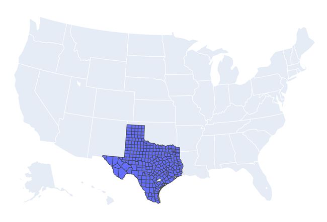
)First, we will start with the base figure that has all the counties in Texas mapped. To do this we use the plotly.express.chorograph() function and input the data frame we just created. Then specify that we want to use the geojson library to map the counties using the FIPS # column from our df. Plotly has great documentation on this here. If we just plotted this with fig.show() it would look like the image below.
首先,我们将从绘制德克萨斯州所有县的基本图开始。 为此,我们使用plotly.express.chorograph()函数并输入刚创建的数据框。 然后指定我们要使用geojson库通过df中的FIPS#列来映射县。 在这里, Plotly有很多相关的文档。 如果我们仅使用fig.show()进行绘制,则它看起来像下面的图像。
colors = ['rgb(189,215,231)','rgb(107,174,214)','rgb(33,113,181)','rgb(239,243,255)']
months = {5: 'May', 6:'June',7:'July',8:'Aug'}
#plot the bubble cases for each month and each county
for i in range(5,9)[::-1]:
mask = df["month"] == i
df_month = df[mask]
#print(df_month)
fig.add_trace(go.Scattergeo(
locationmode = 'USA-states',
lon = df_month['X (Lat)'],
lat = df_month['Y (Long)'],
text = df_month[['County','Case Count']],
name = months[i],
mode = 'markers',
marker = dict(
size = df_month['Case Count'],
color = colors[i-6],
line_width = 0,
sizeref = 9,
sizemode = "area",
reversescale = True
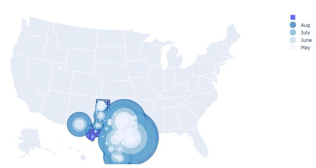
)))Ok, here comes the hardest part. First, we create a colors list that has the colors we want to use for each month. We also create a months dictionary for the graph’s legend.
好的,这是最困难的部分。 首先,我们创建一个颜色列表,其中包含我们每个月要使用的颜色。 我们还为该图的图例创建了一个月字典。
Next comes the for loop which loops through 4 times, for each month. For each month, it plots a bubble for each county based on the location using the plotly.graph_objects.Scattergeo() function. You will notice that the lon and lat variables are switched but that is because the data I imported had this problem. I use the variable sizeref to normalize the bubble points since there are some counties with very large case counts which would dominate the map if not normalized. Plotly recommends this function with sizeref:
接下来是for循环,每个月循环4次。 对于每个月,它使用plotly.graph_objects.Scattergeo()函数根据位置绘制每个县的气泡。 您会注意到lon和lat变量已切换,但这是因为我导入的数据存在此问题。 我使用变量sizeref来对冒泡点进行归一化,因为有些县的案例数非常多,如果不进行归一化,它们将主导地图。 推荐使用sizeref的此功能:
sizeref = 2. * max(array of size values) / (desired maximum marker size ** 2)But I found that function to not work well and they don’t even use it in their documentation examples. I found that 9 worked best for me but the number is very sensitive and I tried a range of 0–10, with many numbers making the plot unreadable, before choosing 9. Below is the plot in its current form:
但是我发现该功能不能很好地工作,他们甚至没有在文档示例中使用它。 我发现9最适合我,但该数字非常敏感,我选择了0到10的范围,其中许多数字使图不可读,然后选择9。下面是当前形式的图:
So we are getting close to the final product but we still need a couple more things.
因此,我们即将接近最终产品,但我们还需要几件事。
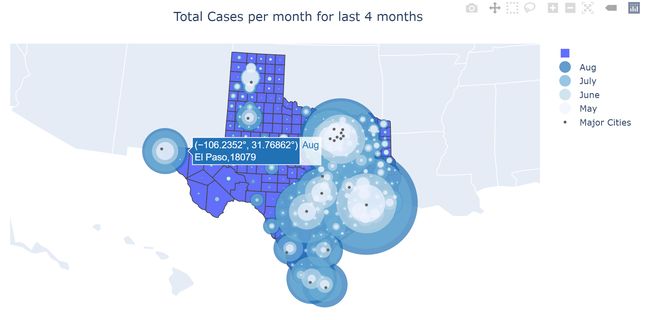
# to show texas cities on map
fig.add_trace(go.Scattergeo(
    locationmode = 'USA-states',
    lon = cities_for_map['lng'],
    lat = cities_for_map['lat'],
    hoverinfo = 'text',
    text = cities_for_map['city'],
    name = "Major Cities",
    mode = 'markers',
    marker = dict(
        size = 4,
        color = 'rgb(102,102,102)',
        line = dict(
            width = 3,
            color = 'rgba(68, 68, 68, 0)'
        )
    )))fig.update_geos(fitbounds="locations")
fig.update_layout(title_text='Total Cases per month for last 4 months', title_x=0.5)
fig.show()
In the above code block, we plot the major Texas cities using long/lat data and the plotly.graph_objects.Scattergeo() function but without the for loop. Then we update the orientation of the graph, so Texas fits well into the frame of the graph. Then we update the title of the graph and center it. Finally, we can visualize its completed form!
在上面的代码块中,我们使用长/纬度数据和plotly.graph_objects.Scattergeo()函数绘制了德克萨斯州的主要城市,但没有for循环。 然后,我们更新图的方向,以使Texas非常适合图的框架。 然后,我们更新图的标题并将其居中。 最后,我们可以可视化其完成的表单!
Thanks for reading and possibly following my tutorial! If you want to follow me on medium or LinkedIn feel free. I am also always looking for feedback on my posts and coding, so if you have any to give me, I would greatly appreciate it.
感谢您阅读并关注我的教程! 如果您想在媒体或LinkedIn上关注我,请随意。 我也一直在寻找有关我的帖子和编码的反馈,因此,如果您有任何宝贵意见,我将不胜感激。
翻译自: https://towardsdatascience.com/how-to-build-an-immersive-geo-bubble-map-with-plotly-bb20eb70414f
plotly气泡图2019