1. 先看成品

(因为图片大小问题,只截取了一部分。实际效果是一直滚动,不会有动画复位的割裂感。)
2. 问题拆分
首先看到这个需求的时候,感觉比较难做,主要是下面的原因:需要斜着滚动,且需要无限,再就是icon错位排列的问题。
后来考虑了下,对这个问题进行了拆分:
- 编写容器及icon等的 css
- 排列好icon并且丢到一个wrapper中
- 将整个wrapper倾斜30度
- 为wrapper添加无限的横向滚动动画
话不多说,开始写代码
3. 开始行动
为了方便看边界,对于一些dom添加了边框~
3.1 创建容器
容器是一个固定大小的比较好写
.box {
    height: 666px;
    width: 1182px;
    border-radius: 36px;
    border: 1px solid;
    overflow: hidden;
    text-align: center;
    font-size: 30px;
}
3.2 然后撸个icon出来
这里就不使用图片来做了,统一用这个mock 一下~
.icon {
width: 267px;
height: 267px;
border-radius: calc(267px * 0.23);
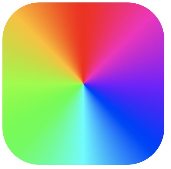
background-image: conic-gradient(
hsl(360, 100%, 50%),
hsl(315, 100%, 50%),
hsl(270, 100%, 50%),
hsl(225, 100%, 50%),
hsl(180, 100%, 50%),
hsl(135, 100%, 50%),
hsl(90, 100%, 50%),
hsl(45, 100%, 50%),
hsl(0, 100%, 50%)
);
}3.3 排列icon到wrapper中
我们把脖子沿逆时针方向旋转30度发现,实际上就是错落有致的摆放着两排icon。
我们按照图示静态的摆放一下:
                1
                2


                3
                4


                5
                6


                7
                8
.lean-box {
    display: flex;
    transform: rotate(-30deg);
}

.wrapper {
    margin-top: 180px;
    display: flex;
    flex-wrap: nowrap;
}

.wrapper .icon:nth-child(even) {
    margin-top: 45px;
    transform: translate(155px);
}

.icon-pair {
    margin-left: 45px;
}

.icon {
    display: flex;
    align-items: center;
    justify-content: center;
    color: white;
    font-size: 66px;
    font-weight: bold;
}
这样看起来就很有精神了,接下来我们需要让它动起来
3.4 添加动画
这里动起来使用的是animation,于是,编写下列代码并且添加到wrapper上:
@keyframes rowup {
    from {
        transform: translateX(0%);
    }

    to {
        transform: translateX(-500px);
    }
}
.wrapper {
    margin-top: 180px;
    display: flex;
    flex-wrap: nowrap;
    animation: rowup 5s linear infinite;
}
这时候动是动起来了,接下来的问题是,怎么无限的进行滚动呢?
无限到是动态添加dom,销毁dom,就是在这一组wrapper后创建一组一模一样的wrapper,等本组完全消失后销毁。
可是,这个成本会很高不是吗,而且这种实现方式势必需要随时间去更新icon的位置,一定有更好的方法
3.5 无缝滚动
animation动画结束后会回归第一帧,假设我们让第一帧的动画和最后一帧重合,那么是不是就看起来是无缝的了?
于是我将wrapper里面的元素重新拷贝一份放在后面(当前组称为A,拷贝组称为B),当动画结束时,B刚好移动到A的初始位置。
我们来计算一下:
这里一组8个icon排两排情况,移动的宽度应该为4个 icon宽度+ 4个margin,(267 4) + (45 4) = 1248px,这样 B 就可以刚好移动到 A 了
更新下动画:
@keyframes rowup {
    from {
        transform: translateX(0%);
    }

    to {
        transform: translateX(-1248px);
    }
}
html 也相应更新下:
                1
                2


                3
                4


                5
                6


                7
                8


                1
                2


                3
                4


                5
                6


                7
                8
3.6 完善一下
如果每次都要根据组件个数去计算的话,确实有点low了,其实会放置两个一模一样的icons,所以translateX的距离不需要计算,设置为-50%就好了,最终代码如下(可以在codepen上体验):
                1
                2


                3
                4


                5
                6


                7
                8


                1
                2


                3
                4


                5
                6


                7
                8
@keyframes rowup {
    from {
        transform: translateX(0%);
    }

    to {
        transform: translateX(-50%);
    }
}
.box {
    height: 666px;
    width: 1182px;
    border-radius: 36px;
    border: 1px solid;
    overflow: hidden;
    text-align: center;
    font-size: 30px;
}

.icon {
    width: 267px;
    height: 267px;
    border-radius: calc(267px * 0.23);
    background-image: conic-gradient(
        hsl(360, 100%, 50%),
        hsl(315, 100%, 50%),
        hsl(270, 100%, 50%),
        hsl(225, 100%, 50%),
        hsl(180, 100%, 50%),
        hsl(135, 100%, 50%),
        hsl(90, 100%, 50%),
        hsl(45, 100%, 50%),
        hsl(0, 100%, 50%)
    );
}

.lean-box {
    display: flex;
    transform: rotate(-30deg);
}

.wrapper {
    margin-top: 180px;
    display: flex;
    flex-wrap: nowrap;
    animation: rowup 5s linear infinite;
}

.wrapper .icon:nth-child(even) {
    margin-top: 45px;
    transform: translate(155px);
}

.icon-pair {
    margin-left: 45px;
}

.icon {
    display: flex;
    align-items: center;
    justify-content: center;
    color: white;
    font-size: 66px;
    font-weight: bold;
}