
image.png
最近在看论文 Phased diploid genome assemblies and pan-genomes provide insights into the genetic history of apple domestication(高水平论文看起来还真是吃力!)看懂一点记一点吧。今天的笔记记录的是论文中Figure2图d中的堆积柱形图的画法,(本来今天的推文也计划将右侧的散点图拼接到堆积柱形图的右侧的内容也记一下的,但是实现的时候遇到一些问题,暂时还没有重复出来,等到有办法了再来记录)
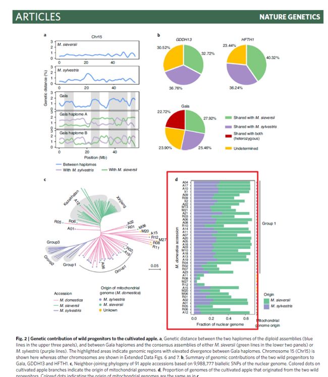
image.png
做堆积柱形图参考 https://www.datanovia.com/en/blog/how-to-create-a-ggplot-stacked-bar-chart-2/
第一步准备数据
数据总共三列,
需要示例数据可以直接在文末留言
image.png
读入数据
df<-read.csv("NG_stacked_barplot_example.csv",
             header = T)
head(df)
基本的堆积柱形图
library(ggplot2)
ggplot(df,aes(x=x,y=y))+
  geom_col(aes(fill=Origin))

image.png
旋转图形
ggplot(df,aes(x=x,y=y))+
  geom_col(aes(fill=Origin))+
  coord_flip()

image.png
更改图例的位置到最底部
ggplot(df,aes(x=x,y=y))+
  geom_col(aes(fill=Origin))+
  coord_flip()+
  theme(legend.justification = c(0,0))

image.png
更改配色
ggplot(df,aes(x=x,y=y))+
  geom_col(aes(fill=Origin))+
  coord_flip()+
  theme(legend.justification = c(0,0))+
  scale_fill_manual(values = c("#6cc396","#9896ca"))

image.png
更改坐标轴的标题
ggplot(df,aes(x=x,y=y))+
  geom_col(aes(fill=Origin))+
  coord_flip()+
  theme(legend.justification = c(0,0))+
  scale_fill_manual(values = c("#6cc396","#9896ca"))+
  labs(x=expression(paste(italic("M. domestica"),
                          "  accession")),
       y="Fraction of nuclear genome")

image.png
将y轴的标题离文字标签远一点
ggplot(df,aes(x=x,y=y))+
  geom_col(aes(fill=Origin))+
  coord_flip()+
  theme(legend.justification = c(0,0),
        axis.title.y = element_text(vjust=5),
        plot.margin = unit(c(0.1,0.1,0.1,0.5),"cm"))+
  scale_fill_manual(values = c("#6cc396","#9896ca"))+
  labs(x=expression(paste(italic("M. domestica"),
                          "  accession")),
       y="Fraction of nuclear genome")
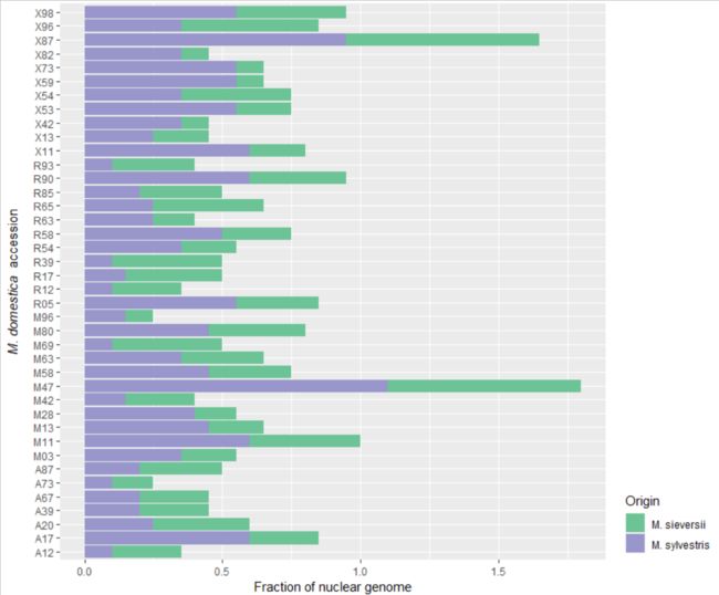
image.png
简单美化,去掉灰色背景,去掉网格线,更改一些图例的字体
library(ggplot2)
library(Cairo)
p1<-ggplot(df,aes(x=x,y=y))+
  geom_col(aes(fill=Origin))+
  coord_flip()+
  theme_bw()+
  theme(legend.justification = c(0,0),
        axis.title.y = element_text(vjust=5),
        plot.margin = unit(c(0.1,0.1,0.1,0.5),"cm"),
        panel.grid = element_blank(),
        legend.text = element_text(family = "Comic Sans MS"))+
  scale_fill_manual(values = c("#6cc396","#9896ca"))+
  labs(x=expression(paste(italic("M. domestica"),
                          "  accession")),
       y="Fraction of nuclear genome")
ggsave("Rplot10.pdf",p1,device = cairo_pdf)

image.png
但是这里遇到一个问题是:如何将图例的字体更改为斜体呢?暂时还没有想到比较好的办法
欢迎大家关注我的公众号
小明的数据分析笔记本