Day 1
重新学习R
使用R和相关数据
绘制简单图表
和matlab差不多
1. Intro
setwd( "F:/Storage/Documents/GitHub/R/W2" ) set working directory

read.csv("datasaurus.csv") csv read~

summary(d12)

names(d12) for names of column

d12$x picking column

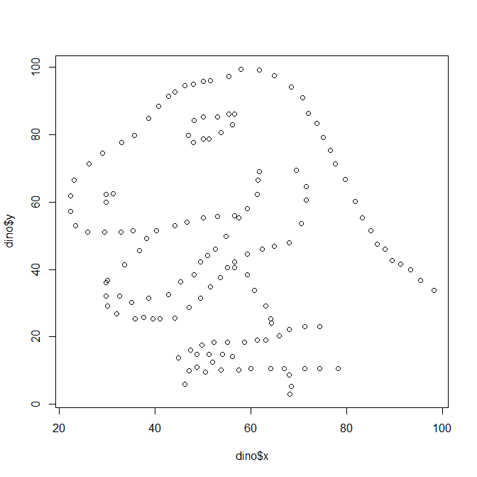
plot( dino$x, dino$y )
dev.new() #new graphics device/board

d12$dataset=="star"   #output True,false of ==

d12[d12$dataset=="star", ] #output true data
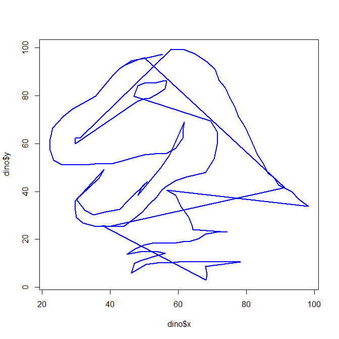
line graph is produced by type ='l'
points are drawn by type ='p'
plot(dino$x, dino$y, type = 'l' , col="blue", lwd=2) #lwd=linewide
connected according to the data order
plot(dino$x, dino$y, type = 'p' , col="blue",cex =5) #cex- point size
2. Basic
par( mfrow=c(3,3) ) rows,columns

plot(dino$x, dino$y, type = 'p' )

plot(dino$x, dino$y, type = 'l' )

plot(dino$x, dino$y, type = 'n' )

plot(dino$x, dino$y, type = 'h' )

plot(dino$x, dino$y, type = 'o' )

plot(dino$x, dino$y, type = 'b' )

plot(dino$x, dino$y, type = 'c' )

plot(dino$x, dino$y, type = 's' )

plot(dino$x, dino$y, type = 'S' )
"p" for points,
"l" for lines,
"b" for both,
"c" for the lines part alone of "b",
"o" for both ‘overplotted’,
"h" for ‘histogram’ like (or ‘high-density’) vertical lines,
"s" for stair steps,
"S" for other steps,Going from (x1; y1) to (x2; y2) with x1 < x2,
type = "s" moves first horizontal, then vertical, whereas type = "S" moves the other way around.
"n" for no plotting.
plot(dino$x, dino$y, type = 'l' , col="blue", lty=2,lwd=2) #lwd=linewide lty=linetype
par(mfrow=c(1,2), mar=c(4,4,2,1)) # mar=margin to 4 corner. c is fixed function.
plot(dino$x, dino$y, axes=F ) #axes=F false for axes
axis(1, at = c(40,60,100), labels = c("OUT", "OF", "DATA")) # draw axes 1 at c

plot( dino$x, dino$y,
      type='p', # a plot with points
      pch = 1,# using open circles as the points
      col="black", # with a black as the colour
      axes=T, # including axes
      main = "", # no title is specified
      xlab = "x", # uses the variable name
      ylab = "y", #also the variable name
      cex = 1, # the point size
      asp = 0, # each interval on the x axis scales to 1 unit on the y axis
      ann = T, # annotation is switched on, e.g. axis labels
      bty = "o", # the box type drawn around the plot
      cex.axis = 1, # the relative size of axis text
      cex.lab = 1, # and the relative sixe of the labels
      col.axis="black", # # the axis colour
      col.lab="black", # the label colour
      fg="black", # colour for axis ticks and teh bounding box
      las=0, # rotation of the text in axis labels
      xaxs="r", # controls the axes range, the default extends the data range by 4%
      yaxs="r", # and a sepearte control for the y axis
      xaxt="s", # tells R if we want an x axis
      yaxt="s", # and for the y axis
      # there are more arguments and defaults ...
      # which you can find in the documentation for 'par' and 'plot'
      # aswell as for other specific plot types
)
4.Append
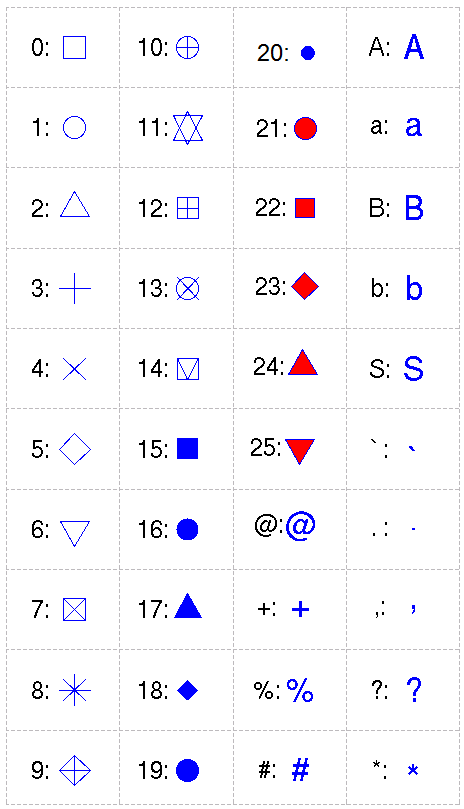
Following is a chart of PCH symbols used in R plot. When the PCH is 21-25, the parameter "col=" and "bg=" should be specified. PCH can also be in characters, such as "#", "%", "A", "a", and the character will be ploted.
Values pch=26:32 are currently unused, and pch=32:255 give the text symbol in a single-byte locale. In a multi-byte locale such as UTF-8, numeric values of pch greater than or equal to 32 specify a Unicode code point. If pch is an integer or character NA or an empty character string, the point is omitted from the plot. Value pch="." is handled specially. It is a rectangle of side 0.01 inch (scaled by cex). In addition, if cex = 1 (the default), each side is at least one pixel (1/72 inch on the pdf, postscript and xfig devices).


