一、文本Widget
在Android中使用TextView,在iOS中使用UILabel来显示文本,在Flutter中使用Text组件来控制文本的显示
1.1 普通文本的显示
将文本的控制显示分成两类:
- 控制文本布局的参数:
textAlign(文本对齐方式)、textDirection(文本排版方向 )、maxLines(文本显示最大行数 )、overflow(文本截断规则)等,都是构造函数中的参数; - 控制文本样式的参数:
fontFamily(字体名称)、fontSize(字体大小)、color(文本颜色)、shadows(文本阴影) 等,这些参数被封装到构造函数中的style参数中;
class Text extends StatelessWidget {

  const Text(
    this.data, {//文本内容 必传
    Key key,
    this.style,//用于设置文本内容的样式
    this.strutStyle,
    this.textAlign,//文本对齐方式
    this.textDirection,
    this.locale,
    this.softWrap,
    this.overflow,//文本溢出处理方式
    this.textScaleFactor,//逻辑像素的字体像素数 简单理解就是放大比例
    this.maxLines,//显示最大行数
    this.semanticsLabel,
    this.textWidthBasis,
    this.textHeightBehavior,
  }) :
       textSpan = null,
       _applyTextScaleFactorToWidgetSpan = true,
       super(key: key);
上面仅对部分常用参数做了介绍,其余参数平常很少用
const TextStyle({
    this.inherit = true,
    this.color,//文本颜色 如果指定了foreground,则此值必须为null
    this.backgroundColor,//文本背景色
    this.fontSize,//字体大小
    this.fontWeight,
    this.fontStyle,//字体变体  斜体 直体
    this.letterSpacing,
    this.wordSpacing,//单词之间添加的空间间隔
    this.textBaseline,// 对齐文本的水平线
    this.height,//文本行与行的高度
    this.locale,
    this.foreground,//文本的前景色,不能与color共同设置
    this.background,//文本背景色
    this.shadows,//Flutter Decoration背景设定(边框、圆角、阴影、形状、渐变、背景图像等)
    this.fontFeatures,
    this.decoration,//绘制文本装饰  下划线 上划线 删除线
    this.decorationColor,//绘制文本装饰的颜色
    this.decorationStyle,//绘制文本装饰的样式 虚线 两条线 正弦线等
    this.decorationThickness,
    this.debugLabel,
    String fontFamily,//使用的字体名称
    List fontFamilyFallback,
    String package,
  }) : fontFamily = package == null ? fontFamily : 'packages/$package/$fontFamily',
       _fontFamilyFallback = fontFamilyFallback,
       _package = package;
示例代码:
class TextDemo extends StatelessWidget {
  const TextDemo({
    Key key,
  }) : super(key: key);

  @override
  Widget build(BuildContext context) {
    return Text(
      "《定风波》苏轼 莫听穿林打叶声,何妨吟啸且徐行。竹杖芒鞋轻胜马,谁怕?一蓑烟雨任平生。",
      textAlign: TextAlign.center,//文本对齐方式
      maxLines: 2,//显示最大行数
      overflow: TextOverflow.ellipsis,//文本溢出处理方式
      textScaleFactor: 1.3,//逻辑像素的字体像素数 简单理解就是放大比例
      style: TextStyle(
        decoration: TextDecoration.lineThrough,
        decorationColor: Colors.yellow,
        decorationStyle: TextDecorationStyle.wavy,
        fontSize: 15,
        fontWeight: FontWeight.bold,
        textBaseline: TextBaseline.alphabetic,
        wordSpacing: 10,
      ),
    );
  }
}
效果:

代码演示
1.2 富文本展示
Android中,使用SpannableString,在iOS中,使用NSAttributedString达到效果,在Flutter中使用Text组件来控制文本的显示
const Text.rich(//Text组件的另一个构造函数
    this.textSpan, {//必传参数
    Key key,
    this.style,
    this.strutStyle,
    this.textAlign,
    this.textDirection,
    this.locale,
    this.softWrap,
    this.overflow,
    this.textScaleFactor,
    this.maxLines,
    this.semanticsLabel,
    this.textWidthBasis,
    this.textHeightBehavior,
    bool applyTextScaleFactorToWidgetSpan = false,
  }) :
       data = null,//也可以传data 另外可以通过分片拼接
       _applyTextScaleFactorToWidgetSpan = applyTextScaleFactorToWidgetSpan,
       super(key: key);
  const TextSpan({
    this.text,
    this.children,//重要 拼接
    TextStyle style,
    this.recognizer,
    this.semanticsLabel,
  }) : super(style: style,);
示例代码:
class RichTextDemo extends StatelessWidget {
  const RichTextDemo({
    Key key,
  }) : super(key: key);

  @override
  Widget build(BuildContext context) {
    return Text.rich(
      TextSpan(
        text: 'helloworld', style: TextStyle( color: Colors.red, fontSize: 25, ),
        children: [
          TextSpan( text: 'helloworld', style: TextStyle( color: Colors.green, fontSize: 22, ), ),
          WidgetSpan(child: Icon(Icons.favorite, color: Colors.red,)),
          TextSpan( text: 'helloworld', style: TextStyle( color: Colors.blue, fontSize: 20, ) ),
        ]
      ),
    );
  }
}
代码效果:
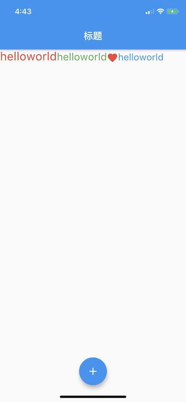
WechatIMG6.jpeg
进阶:通过源码可以得知,不管是普通文本还是富文本,只是两种Text的两种构造方法而已,在build函数中均是返回一个RichText对象

image.png
后面再学习过程中,我们都要学会看源码,查看他们底层是如何在使用
二、按钮Widget
2.1 按钮的基础
Material widget库中提供了多种按钮Widget如FloatingActionButton()、RaisedButton(浮动按钮带阴影)、FlatButton(扁平化)、OutlineButton(带边框按钮)等,都是继承于MaterialButton
话不多说,直接上代码:
const MaterialButton({
    Key key,
    @required this.onPressed,//方法要求实现 激活按钮调用方法
    this.onLongPress,//长按方法
    this.onHighlightChanged,//
    this.mouseCursor,
    this.textTheme,//定义按钮的基色,以及按钮的最小尺寸,内部填充和形状的默认值
    this.textColor,//按钮文本的颜色
    this.disabledTextColor,//disabled状态下的文本颜色
    this.color,//填充颜色
    this.disabledColor,//disabled状态下的按钮颜色
    this.focusColor,
    this.hoverColor,
    this.highlightColor,
    this.splashColor,//按钮被按下的水波纹颜色
    this.colorBrightness,//按钮的主题亮度,当设置了textColor、color颜色,此值无效!
    this.elevation,//设置阴影大小
    this.focusElevation,
    this.hoverElevation,
    this.highlightElevation,
    this.disabledElevation,
    this.padding,//内部边距调整
    this.visualDensity,
    this.shape,//按钮形状, 子类才起效果
    this.clipBehavior = Clip.none,
    this.focusNode,
    this.autofocus = false,
    this.materialTapTargetSize,//按钮默认上下有间距 通过此属性修改
    this.animationDuration,
    this.minWidth,
    this.height,
    this.enableFeedback = true,
    this.child,
  }) : super(key: key);
示例代码:
class ButtonDemo extends StatelessWidget {
  const ButtonDemo({
    Key key,
  }) : super(key: key);

  @override
  Widget build(BuildContext context) {
    return Column(
      children: [
        RaisedButton(
          onPressed: (){

          },
          textTheme: ButtonTextTheme.primary,// 按钮文本基于ThemeData.primaryColor
          highlightColor: Colors.red,
          child: Column(
            children: [
              Text("高亮红色 竖", style: TextStyle(color: Colors.white),),
              Icon(Icons.favorite,)
            ],
          ),
        ),
        RaisedButton(
          onPressed: (){

          },
          highlightColor: Colors.red,
          elevation: 10,//阴影
          child: Row(
            children: [
              Text("高亮红色 横", style: TextStyle(color: Colors.white),),
              Icon(Icons.favorite,)
            ],
          ),
        ),
        RaisedButton(
          onPressed: (){

          },
          color: Colors.orange,
          textColor: Colors.white,
          child: Text("datafdfdsfdsfdsfsdfdsfdsfdsfds"
              "sf"),
        ),
        FlatButton(//扁平化按钮
          onPressed: (){

          },
          child: Text("data"),
          color: Colors.orange,
          textColor: Colors.white,
        ),
        OutlineButton(onPressed: (){ //带边框按钮

        },
          child: Text("data"),
          color: Colors.purple,
          textColor: Colors.orange,
        ),
        FloatingActionButton(
          child: Icon(Icons.add),
          onPressed: (){

          },
        ),
        FlatButton(
          onPressed: (){

          },
          child: Row(
            mainAxisSize: MainAxisSize.min,
            children: [
              Icon(Icons.favorite, color: Colors.red,),
              Text("喜欢")
            ],
          ),
          color: Colors.orange,
          shape: RoundedRectangleBorder(
            borderRadius: BorderRadius.circular(10),
          ),
        ),
      ],
    );
  }
}
代码效果:
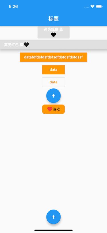
Simulator Screen Shot - iPhone 11 - 2020-11-07 at 17.26.03.png
问题1:button上下有默认间距 如何调整?(materialTapTargetSize属性)
问题2:button如何自由调整大小?(有ButtonTheme包裹,修改)
问题3:button内文字的内边距如何调整?(padding属性)
三、图片Widget
Flutter中使用Image组件
Image组件有很多的构造函数,我们这里主要学习前3个:
-
Image.assets:加载本地资源图片; -
Image.network:加载网络中的图片; Image()Image.file
1.1 本地图片 网络图片
我们先看Image() :
const Image({
    Key key,
    @required this.image,//必传参数
    this.frameBuilder,
    this.loadingBuilder,
    this.errorBuilder,
    this.semanticLabel,
    this.excludeFromSemantics = false,
    this.width,//控件宽度
    this.height,//控件高度
    this.color,//图片的混合色值 不设置colorBlendMode会直接覆盖图片
    this.colorBlendMode,////混合模式
    this.fit,//填充模式
    this.alignment = Alignment.center,////对齐方式
    this.repeat = ImageRepeat.noRepeat,//重复方式
    this.centerSlice,//指定中心区域进行九个补丁图像 类似.9图
    this.matchTextDirection = false,
    this.gaplessPlayback = false,
    this.isAntiAlias = false,
    this.filterQuality = FilterQuality.low,
  }) : super(key: key);
示例代码:
class ImageDemo extends StatelessWidget {
  const ImageDemo({
    Key key,
  }) : super(key: key);

  @override
  Widget build(BuildContext context) {
    return ListView(
      children: [
        Column(
          children: [
            Image(image: NetworkImage('https://timgsa'
                '.baidu.com/timg?image&quality=80&size=b9999_10000&sec=1604055800173&'
                'di=3b254a30548dd54b2479bd895ee39f00&imgtype=0&src=http%3A%2F%2Fb-ssl.'
                'duitang.com%2Fuploads%2Fitem%2F201804%2F19%2F20180419202214_nrvqc.jpeg'),
              width: 200,
              height: 200,
              fit: BoxFit.contain,
              repeat: ImageRepeat.repeatY,
              // alignment: Alignment.bottomLeft,
              // -1  1范围
              alignment: Alignment(0, 0),
              color: Colors.red,//并不是背景色 而是混入颜色
              colorBlendMode: BlendMode.colorBurn,//混入模式
            ),
            FadeInImage(
              placeholder: AssetImage('assets/images/golden_box.png'),
              image: NetworkImage('https://timgsa.baidu.com/timg?image&quality=80&siz'
                'e=b9999_10000&sec=1604058608291&di=0c17e499e9d33439f61a1d1769b440fa&i'
                'mgtype=0&src=http%3A%2F%2F01.minipic.eastday.com%2F20170407%2F20170407'
                '003654_e05a7fc92c762cbe49f8c0adf0d0b41d_1.jpeg'),
              fadeInDuration: Duration(seconds: 5),
              fadeOutDuration: Duration(seconds: 5),
            ),
            Image.network('https://timgsa.baidu.com/timg?image&quality=80&siz'
                'e=b9999_10000&sec=1604058608291&di=0c17e499e9d33439f61a1d1769b440fa&i'
                'mgtype=0&src=http%3A%2F%2F01.minipic.eastday.com%2F20170407%2F20170407'
                '003654_e05a7fc92c762cbe49f8c0adf0d0b41d_1.jpeg'),
            Image(image: AssetImage('assets/images/global_logo.png')),
            Image.asset('assets/images/golden_box.png'),
            CircleAvatar(
              backgroundImage: NetworkImage('https://timgsa.baidu.com/timg?image&quality=80&siz'
                  'e=b9999_10000&sec=1604058608291&di=0c17e499e9d33439f61a1d1769b440fa&i'
                  'mgtype=0&src=http%3A%2F%2F01.minipic.eastday.com%2F20170407%2F20170407'
                  '003654_e05a7fc92c762cbe49f8c0adf0d0b41d_1.jpeg'),
              child: Container(
                alignment: Alignment(0, .5),
                width: 200,
                height: 200,
                child: Text("我是谁", style: TextStyle(fontSize: 8, color: Colors.red),)
              ),
            )
          ],
        ),
      ],
    );
  }
}
代码效果:

Simulator Screen Shot - iPhone 11 - 2020-11-07 at 17.47.16.png
本地图片的配置
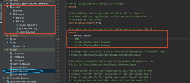
image.png
1.2 网络占位图
通过FadeInImage实现网络请求占位图
const FadeInImage({
    Key key,
    @required this.placeholder,//必传
    this.placeholderErrorBuilder,
    @required this.image,//必传
    this.imageErrorBuilder,
    this.excludeFromSemantics = false,
    this.imageSemanticLabel,
    this.fadeOutDuration = const Duration(milliseconds: 300),//效果
    this.fadeOutCurve = Curves.easeOut,
    this.fadeInDuration = const Duration(milliseconds: 700),//效果
    this.fadeInCurve = Curves.easeIn,
    this.width,
    this.height,
    this.fit,
    this.alignment = Alignment.center,
    this.repeat = ImageRepeat.noRepeat,
    this.matchTextDirection = false,
  }) : super(key: key);
1.3 圆角头像
Flutter中实现圆角效果也是使用一些Widget来实现的。
1、CircleAvatar
const CircleAvatar({
    Key key,
    this.child,
    this.backgroundColor,
    this.backgroundImage,
    this.onBackgroundImageError,
    this.foregroundColor,
    this.radius,
    this.minRadius,
    this.maxRadius,
  }) :  super(key: key);
2、ClipOval
class _ZQHomeContentState extends State {
  @override
  Widget build(BuildContext context) {
    return ClipOval(
        child: Image.network(
          'https://tva1.sinaimg.cn/large/006y8mN6gy1g7aa03bmfpj3069069mx8.jpg',
          width: 200,
          height: 200,
        )
    );
  }
}
3、Container+BoxDecoration
后续讲到Container时再着重讲解
上面三种方法的使用
class _ZQHomeContentState extends State {
  @override
  Widget build(BuildContext context) {
    return Column(
      children: [
        Container(
          width: 200,
            height: 200,
            decoration: BoxDecoration(
              gradient: LinearGradient(
                colors: [Colors.red, Colors.cyan],
              ),
              borderRadius:BorderRadius.all(Radius.circular(200)),
              image: DecorationImage(
                image: NetworkImage(
                  'https://tva1.sinaimg.cn/large/006y8mN6gy1g7aa03bmfpj3069069mx8.jpg',
                ),
              ),
            ),
        ),
        CircleAvatar(
          radius: 100,
          backgroundImage: NetworkImage('https://timgsa.baidu.com/timg?image&quality=80&siz'
              'e=b9999_10000&sec=1604058608291&di=0c17e499e9d33439f61a1d1769b440fa&i'
              'mgtype=0&src=http%3A%2F%2F01.minipic.eastday.com%2F20170407%2F20170407'
              '003654_e05a7fc92c762cbe49f8c0adf0d0b41d_1.jpeg'),
        ),
        ClipOval(
            child: Image.network(
              "https://tva1.sinaimg.cn/large/006y8mN6gy1g7aa03bmfpj3069069mx8.jpg",
              width: 200,
              height: 200,
            )
        )
      ],
    );
  }
}
1.4 Icon
Icon字体图标和图片图标
字体图片矢量图 放大的时候不会失真
class IconDemo extends StatelessWidget {
  const IconDemo({
    Key key,
  }) : super(key: key);

  @override
  Widget build(BuildContext context) {
    return Column(
      children: [
        Icon(Icons.perm_phone_msg, color: Colors.cyan, size: 300, ),
        Icon(IconData(0xe8a8, fontFamily: 'MaterialIcons'),size: 200,color: Colors.red,),
        Text('\ue8a8',style: TextStyle(fontSize: 200, fontFamily: 'MaterialIcons', color: Colors.orange),)
      ],
    );
  }
}