Carousel(旋转轮播滑块)


 //.js
$(document).ready(function(){
$('.carousel').carousel();
});
方法:
duration Transition duration in milliseconds. (Default: 200)
dist Perspective zoom. If 0, all items are the same size. (Default: -100)
shift Set the spacing of the center item. (Default: 0)
padding Set the padding between non center items. (Default: 0)
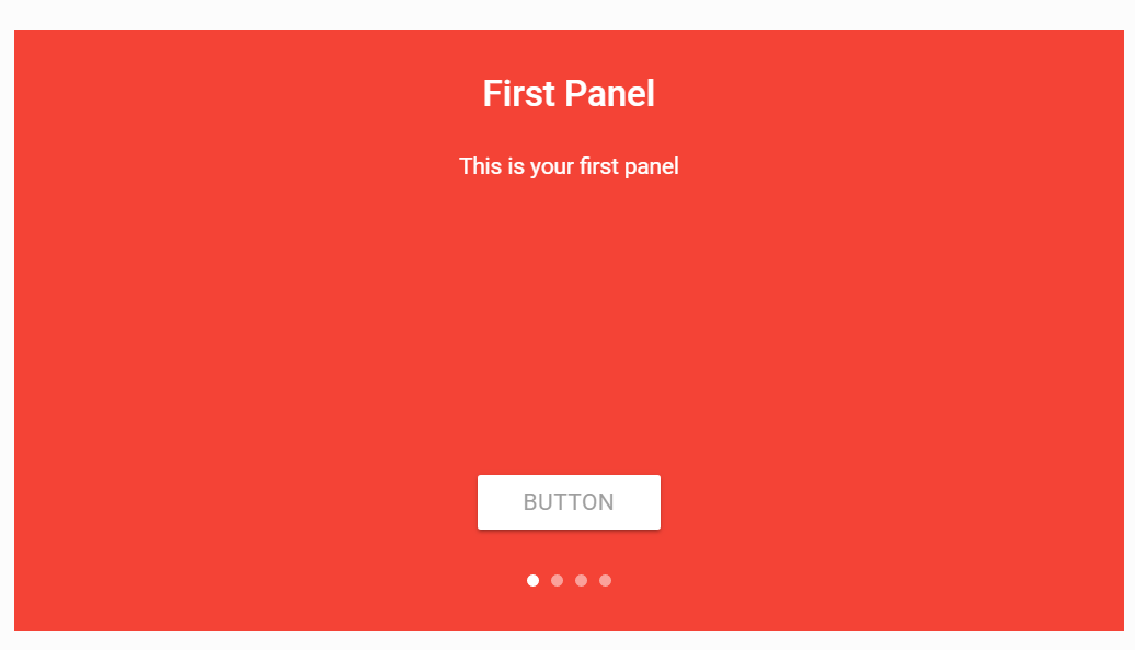
fullWidth Make the carousel a full width slider like the second example. (Default: false)
indicators Set to true to show indicators. (Default: false)
noWrap Don't wrap around and cycle through items. (Default: false)
jq:
// Next slide
$('.carousel').carousel('next');
$('.carousel').carousel('next', 3); // Move next n times.
// Previous slide
$('.carousel').carousel('prev');
$('.carousel').carousel('prev', 4); // Move prev n times.
// Set to nth slide
$('.carousel').carousel('set', 4);
// Destroy carousel
$('.carousel').carousel('destroy');
//.js
 $(document).ready(function(){
      $('.carousel').carousel();
    });
方法:
duration    Transition duration in milliseconds. (Default: 200)
dist    Perspective zoom. If 0, all items are the same size. (Default: -100)
shift   Set the spacing of the center item. (Default: 0)
padding Set the padding between non center items. (Default: 0)
fullWidth   Make the carousel a full width slider like the second example. (Default: false)
indicators  Set to true to show indicators. (Default: false)
noWrap  Don't wrap around and cycle through items. (Default: false)
jq:
// Next slide
$('.carousel').carousel('next');
$('.carousel').carousel('next', 3); // Move next n times.

// Previous slide
$('.carousel').carousel('prev');
$('.carousel').carousel('prev', 4); // Move prev n times.

// Set to nth slide
$('.carousel').carousel('set', 4);

// Destroy carousel
$('.carousel').carousel('destroy');


 //.js
$('.carousel.carousel-slider').carousel({fullWidth: true});
//.js
$('.carousel.carousel-slider').carousel({fullWidth: true});
Carousel3.png
//.js
$('.carousel.carousel-slider').carousel({fullWidth: true});
Collapsible(可折叠面板)
1.
Collapsible1.png

Collapsible2.png
-
filter_dramaFirst
Lorem ipsum dolor sit amet.
-
placeSecond
Lorem ipsum dolor sit amet.
-
whatshotThird
Lorem ipsum dolor sit amet.
//.js
$(document).ready(function(){
$('.collapsible').collapsible();
});
//active 选中
placeSecond
options:
$('.collapsible').collapsible({
accordion: false, // A setting that changes the collapsible behavior to expandable instead of the default accordion style
onOpen: function(el) { alert('Open'); }, // Callback for Collapsible open
onClose: function(el) { alert('Closed'); } // Callback for Collapsible close
});
Methodss:
// Open
$('.collapsible').collapsible('open', 0);
// Close
$('.collapsible').collapsible('close', 0);
// Destroy
$('.collapsible').collapsible('destroy');
手风琴Accordion

Expandable(可同时展开)

Dialogs(弹出框)
1.
// Materialize.toast(message, displayLength, className, completeCallback);
  Materialize.toast('I am a toast!', 4000) // 4000 is the duration of the toast

toast2.png
var $toastContent = $('I am toast content').add($(''));
Materialize.toast($toastContent, 10000);
Callback(回调)
Toast!
Styling Toasts(椭圆形的弹出)

Materialize.toast('I am a toast!', 3000, 'rounded') // 'rounded' is the class I'm applying to the toast
Dismiss a Toast Programatically(移除或者是消除弹出框)
 // Get toast DOM Element, get instance, then call remove function
  var toastElement = $('.toast').first()[0];
  var toastInstance = toastElement.M_Toast;
  toastInstance.remove();
//移除全部
Materialize.Toast.removeAll();
Tooltips(相对定位弹出的小框)

  Hover me!
//.js
$(document).ready(function(){
    $('.tooltipped').tooltip({delay: 50});
  });
jQuery Plugin Options:
| Option Name | Description |
|---|---|
| delay | Delay time before tooltip appears. (Default: 350) |
| tooltip | Tooltip text. Can use custom HTML if you set the html option. |
| position | Set the direction of the tooltip. 'top', 'right', 'bottom', 'left'. (Default: 'bottom') |
| html | Allow custom html inside the tooltip. (Default: false) |
Removal(移除相对弹出框)
// This will remove the tooltip functionality for the buttons on this page
  $('.tooltipped').tooltip('remove');
Dropdown(下拉列表)

Drop Me!
Options:
| Option Name | Description |
|---|---|
| inDuration | The duration of the transition enter in milliseconds. Default: 300 |
| outDuration | The duration of the transition out in milliseconds. Default: 225 |
| constrainWidth | If true, constrainWidth to the size of the dropdown activator. Default: true |
| hover | If true, the dropdown will open on hover. Default: false |
| gutter | This defines the spacing from the aligned edge. Default: 0 |
| belowOrigin | If true, the dropdown will show below the activator. Default: false |
| alignment | Defines the edge the menu is aligned to. Default: 'left' |
| stopPropagation | If true, stops the event propagating from the dropdown origin click handler. Default: false |
 Drop Me!
//.js
$('.dropdown-button').dropdown({
      inDuration: 300,
      outDuration: 225,
      constrainWidth: false, // Does not change width of dropdown to that of the activator
      hover: true, // Activate on hover
      gutter: 0, // Spacing from edge
      belowOrigin: false, // Displays dropdown below the button
      alignment: 'left', // Displays dropdown with edge aligned to the left of button
      stopPropagation: false // Stops event propagation
    }
  );
$('.dropdown-button').dropdown('open');
$('.dropdown-button').dropdown('close');
Media(媒体)
1.Material Box(图片可点击查看大图)
 //.js
$(document).ready(function(){
$('.materialboxed').materialbox();
});
//添加标题
//.js
 $(document).ready(function(){
    $('.materialboxed').materialbox();
  });
//添加标题

Slider(滑块,轮播,banner图,导航图)

-

This is our big Tagline!
Here's our small slogan.
-

Left Aligned Caption
Here's our small slogan.
-

Right Aligned Caption
Here's our small slogan.
-

This is our big Tagline!
Here's our small slogan.
//.js
$(document).ready(function(){
$('.slider').slider();
});
jQuery Plugin Options:
| Option Name | Description |
|---|---|
| indicators | Set to false to hide slide indicators. (Default: True) |
| height | Set height of slider. (Default: 400) |
| transition | Set the duration of the transition animation in ms. (Default: 500) |
| interval | Set the duration between transitions in ms. (Default: 6000) |
jQuery Plugin Methods:
// Pause slider
$('.slider').slider('pause');
// Start slider
$('.slider').slider('start');
// Next slide
$('.slider').slider('next');
// Previous slide
$('.slider').slider('prev');
Modals(弹出对话框)
1.Modals HTML Structure(正常版的弹出对话框,有取消,有确定)

Modal
2.Modals with Fixed Footer(按钮固定在底部的样式)

Modal
3.Bottom Sheet Modals(从页面底部弹出)

Modal
Modals with Button trigger(加上tigger,即可弹出关闭来回切换)
初始化
$(document).ready(function(){
    // the "href" attribute of the modal trigger must specify the modal ID that wants to be triggered
    $('.modal').modal();
  });
$('#modal1').modal('open');
$('#modal1').modal('close');
Options:
$('.modal').modal({
      dismissible: true, // Modal can be dismissed by clicking outside of the modal
      opacity: .5, // Opacity of modal background
      inDuration: 300, // Transition in duration
      outDuration: 200, // Transition out duration
      startingTop: '4%', // Starting top style attribute
      endingTop: '10%', // Ending top style attribute
      ready: function(modal, trigger) { // Callback for Modal open. Modal and trigger parameters available.
        alert("Ready");
        console.log(modal, trigger);
      },
      complete: function() { alert('Closed'); } // Callback for Modal close
    }
  );
Parallax 滚动视差
 //初始化
$(document).ready(function(){
$('.parallax').parallax();
});
//.css
.parallax-container {
height: "your height here";
}
//初始化
 $(document).ready(function(){
      $('.parallax').parallax();
    });
//.css
.parallax-container {
      height: "your height here";
    }
Tabs


//.js
$(document).ready(function(){
$('ul.tabs').tabs();
});
//methoed
$(document).ready(function(){
$('ul.tabs').tabs('select_tab', 'tab_id');
});
//active 用来表示选中状态
Test 3
jQuery Plugin Options:
| Option Name | Description |
|---|---|
| onShow | Execute a callback function when the tab is changed. The callback provides a parameter which refers to the current tab being shown. |
| swipeable | Set to true to enable swipeable tabs. This also uses the responsiveThreshold option. Default: false |
| responsiveThreshold | The maximum width of the screen, in pixels, where the swipeable functionality initializes. Default: Infinity |
Linking to an External Page(tabs关联一个页面)
    External link in new window


    External link in same window
Swipeable Tabs(带页面联动的tabs)

Test 1
Test 2
Test 3
Transitions(动画)
showStaggeredList(列表按顺序从左边滑出)
Click Me
fadeInImage(图片逐渐显示)
Click Me
wave 波纹效果
 Send
Default[SEND](http://materializecss.com/waves.html#!)

`waves-light`

`waves-red` 红波纹

`waves-yellow` 黄波纹

`waves-orange` 橙波纹

`waves-purple`  紫波纹

`waves-green` 绿波纹
`waves-teal`   蓝绿色