import matplotlib.pyplot as plt
import matplotlib
import numpy as np
font = {
'family': 'Microsoft YaHei'
}
matplotlib.rc("font", **font)
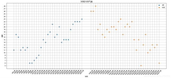
y_3 = [11, 17, 16, 11, 12, 11, 12, 6, 6, 7, 8, 9, 12, 15, 14, 17, 18, 21, 16, 17, 20, 14, 15, 15, 15, 19, 21, 22, 22,
22,
23]
y_10 = [26, 26, 28, 19, 21, 17, 16, 19, 18, 20, 20, 19, 22, 23, 17, 20, 21, 20, 22, 15, 11, 15, 5, 13, 17, 10, 11, 13,
12,
13, 6]
x_3 = np.arange(1, 32)
x_10 = np.arange(35, 66)
X = list(x_3) + list(x_10)
min = min(y_3) if min(y_3) < min(y_10) else min(y_10)
max = max(y_3) if max(y_3) > max(y_10) else max(y_10)
plt.figure(figsize=(20, 8), dpi=80)
plt.scatter(x_3, y_3, label="3月")
plt.scatter(x_10, y_10, label="10月")
y3_label = ["3月{}号".format(i) for i in x_3]
y10_label = ["10月{}号".format(i) for i in x_3]
label = y3_label + y10_label
plt.xticks(X, label, rotation=45)
plt.yticks([i for i in range(min, max + 1)])
plt.xlabel("时间")
plt.ylabel("温度")
plt.title("标题")
plt.legend()
plt.grid()
plt.show()