Matplotlib绘制折线图
Matplotlib绘制折线图
利用Jupter Notebook 绘制折线图,主要介绍如何使用matplotlib库中的各种方法绘制折线图,以及对图形的修饰。
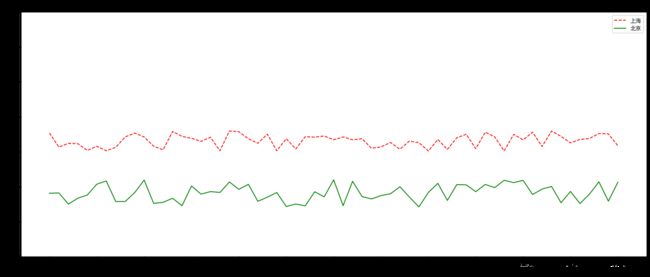
案例一:随机生成两地温度折线图
# 导入库
import matplotlib.pyplot as plt
import random

# 指定字体 雅黑
plt.rcParams['font.sans-serif'] = ['SimHei']

# 创建图形
plt.figure(figsize=(20,8),dpi=80)

# 准备数据
x = range(61)

y_shanghai = [random.uniform(15,18) for i in x]
y_beijing = [random.uniform(7,11) for i in x]

# 构造中文
x_ch = ['11点{}分'.format(i) for i in x]
y_ticks = range(40)

# 绘制折线图
plt.plot(x,y_shanghai,label='上海',color='r',linestyle='--')
plt.plot(x,y_beijing,label='北京',color='g',linestyle='-')

#修改刻度
plt.xticks(x[::5],x_ch[::5])
plt.yticks(y_ticks[::5])

# 增加描述信息
plt.xlabel('时间')
plt.ylabel('温度')

#增加标题
plt.title('上海和北京晚上11-12点温度变化折线图')

# 增加图例
plt.legend(loc='best')

plt.show()
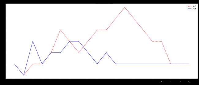
案例二:11-30岁交友数量折线图
# 导入库
import matplotlib.pyplot as plt

# 设置字体
plt.rcParams['font.sans-serif'] = ['SimHei']

# 创建图形
plt.figure(figsize=(20,8),dpi=80)

# 准备数据
x = [i for i in range(11,31)]
y1 = [1,0,1,1,2,4,3,2,3,4,4,5,6,5,4,3,3,1,1,1]
y2 = [1,0,3,1,2,2,3,3,2,1,2,1,1,1,1,1,1,1,1,1]

# 添加中文
x_ch = ['{}岁'.format(i) for i in range(11,31)]

#绘制图形
plt.plot(x_ch,y1,label='自己',color='r',linestyle='--')
plt.plot(x_ch,y2,label='同桌',color='b',linestyle='-')

# 添加坐标轴描述信息
plt.xlabel('年龄:岁')
plt.ylabel('朋友数量:个')

# 添加标题
plt.title('11-30岁交友数量折线图')

# 增加图例
plt.legend(loc='best')

plt.show()
案例三:公众号阅读量直线图
# 导入模块
import pandas as pd
import matplotlib.pyplot as plt

# 设置中文编码和负号的正常显示
plt.rcParams['font.sans-serif'] = ['SimHei']
plt.rcParams['axes.unicode_minus'] = False

# 读取需要绘图的数据
article_reading = pd.read_csv(r'E:\PythonData\exercise_data\wechart.csv')
article_reading.date = pd.to_datetime(article_reading.date)


# 取出8月份至9月28日的数据
sub_data = article_reading.loc[article_reading.date >= '2017-08-01' ,:]

# 设置图框的大小
fig = plt.figure(figsize=(20,8),dpi=80)

# 绘图
plt.plot(sub_data.date, # x轴数据
         sub_data.article_reading_cnts, # y轴数据
         linestyle = '-', # 折线类型
         color = 'g', # 折线颜色
         marker = 'o', # 点的形状
)

# 添加标题和坐标轴标签
plt.title('公众号每天阅读人数趋势图')
plt.xlabel('日期')
plt.ylabel('人数')

# 剔除图框上边界和右边界的刻度
plt.tick_params(top = 'off', right = 'off')

# 为了避免x轴日期刻度标签的重叠,设置x轴刻度自动展现,并且45度倾斜
fig.autofmt_xdate(rotation = 45)

# 显示图形
plt.show()

案例四:公众号阅读人数和阅读人次趋势图
# 导入库
import matplotlib.pyplot as plt

# 设置字体 雅黑
plt.rcParams['font.sans-serif'] = ['SimHei']

# 设置图框的大小
fig = plt.figure(figsize=(20,8),dpi=80)

# 绘图--阅读人数趋势
plt.plot(sub_data.date, # x轴数据
         sub_data.article_reading_cnts, # y轴数据
         linestyle = '-', # 折线类型
         color = 'steelblue', # 折线颜色
         marker = 'o', # 点的形状
         label = '阅读人数') # 添加标签

# 绘图--阅读人次趋势
plt.plot(sub_data.date, # x轴数据
         sub_data.article_reading_times, # y轴数据
         linestyle = '-', # 折线类型
         color = '#ff9999', # 折线颜色
         marker = 'o', # 点的形状
         label = '阅读人次') # 添加标签

# 添加标题和坐标轴标签
plt.title('公众号每天阅读人数和人次趋势图')
plt.xlabel('日期')
plt.ylabel('人数')

# 显示图例
plt.legend()

# 显示图形
plt.show()

数据链接: https://pan.baidu.com/s/1ygH_wqeCagE_Eu0B6E4jQQ.
提取码:5rfd