【蓝桥杯Web】第十三届蓝桥杯(Web 应用开发)第一次线上模拟赛
前言
第十三届蓝桥杯全国软件和信息技术专业人才大赛(软件类)新开了Web应用开发比赛,已经组织了几次模拟赛和楼赛,这里主要记录模拟赛题目和设计的知识点,帮助参赛者更好的复习琐碎的知识点和代码,有写的不对的地方欢迎指教并讨论.
文章目录
- 前言
- 一、【Bug 调试】修复网站显示问题
- 二、【Bug 调试】修复注册验证问题
- 三、【功能实现】封装函数实现个人所得税计算器
- 四、【页面布局】Flex 经典骰子布局
- 五、【页面布局】制作网站首页
- 六、【页面布局】响应式 Gulp 中文网
- 七、【数据交互】天气预报查询
- 八、【数据交互】实现卡号绑定功能
- 九、【数据交互】知乎首页数据动态化
- 十、【API 开发】RESTful API 开发
一、【Bug 调试】修复网站显示问题
- 题目描述:网页的css样式不显示,需要修复.
- 题目分析:文件引入错误.
- 题目代码
<link href="css/index.css" rel="stylesheet" type="text/css">
二、【Bug 调试】修复注册验证问题
- 题目描述:书写一个判断方法,判断输入的手机号是否符合前三个数字是:186 134-139 150-152.
- 题目分析:使用正则表达式进行判断.
| 符号 | 含义 | 举例 |
|---|---|---|
| ^ | 以……开头 | ^(123)字符串以123开头 |
| $ | 以……结尾 | 000$表示以000结尾 |
| [0-9] | 表示从0到9的任何数字 | [4-9]表示4-9的任何数字 |
| [a-z] | 表示从a到z的字母 | [abc]表示abc中的任何一个 |
| | | 或者 | 186|132 两个数字都行 |
| \d | 数字 | \d 代表任何数字 |
| \s | 空白字符 | |
| n+ | 至少一个 | 0+表示0,00,000等 |
| n* | 0或一个或多个 | 0*表示没有,0,00等 |
| n? | 0或1个 | 0?表示没有或0 |
| {} | 前面的字符有多少个 | \d{8}表示有八个数字 |
- 题目代码
function isPhone(phoneNumber) {
  var arr = /^(186|13[4-9]|15[0-2])\d{8}$/;
  // var arr = /^1(86|\[34-39]|\[50-52])\d{8}$/
  var flag = arr.test(phoneNumber);
  return flag
}
三、【功能实现】封装函数实现个人所得税计算器
- 题目描述:

- 题目分析:采用if-else语句,对输入的金额分类。
- 题目代码
function cal(salary) {
    // TODO: 在此处补充代码
    if (salary <= 5000) return 0
    else if(salary > 5000 && salary <= 9000) return (salary-5000)*0.03
    else if(salary > 9000 && salary <= 15000) return (salary-5000)*0.05
    else return (salary-5000)*0.1
}
四、【页面布局】Flex 经典骰子布局
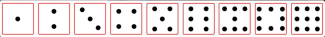
- 题目描述:利用弹性布局知识,完成骰子布局,骰子最终状态如图.
- 题目分析: 主要使用了弹性布局的相关属性.
| 属性名称 | 属性意义 | 属性可能的值 | |
|---|---|---|---|
| 容器的属性 | flex-direction | 决定item排列方向 | row,row-reverse,column,column-reverse |
| justify-content | item在主轴上的对齐方式 | flex-start,flex-end,center,space-between,space-around | |
| flex-wrap | 排列不下时,item如何换行 | nowrap,wrap,wrap-reverse | |
| align-content | 侧轴上子元素的排列方式(多行) | flex-start,flex-end,center,space-between,space-around,stretch | |
| align-items | 侧轴上子元素的排列方式(单行) | flex-start,flex-end,center,space-between,space-around,stretch | |
| flex-flow | 复合属性 | 相当于同时设置了flex-direction和flex-wrap | |
| item的属性 | order | 定义item的排列顺序 | 整数,默认为0,越小越靠前 |
| flex-grow | 当有多余空间时,item的放大比例 | 默认为0,即有多余空间时也不放大 | |
| flex-shrink | 当空间不足时,item的缩小比例 | 默认为1,即空间不足时缩小 | |
| flex-basis | 项目在主轴上占据的空间 | 长度值,默认为auto | |
| flex | grow,shrink,basis的简写 | 默认值为0 1 auto | |
| align-self | 单个item独特的对齐方式 | 同align-items,可覆盖align-items属性 |
-
题目代码
骰子一:div1,主轴默认为横轴,主轴上的排列为居中,非主轴上的排列为居中.div1 { justify-content: center; align-items: center; }骰子二:div2,主轴设置为纵轴,主轴上的排列为均匀排列,非主轴上排列为居中
.div2 {
	flex-direction: column;
    justify-content: space-around;
    align-items: center;

}
骰子三:div3,主轴默认为横轴,主轴上的排列为均匀排列,非主轴上居中排列,此时情况为居中一排,再单独设计第一个点的位置为start,第二个点的位置为end
.div3 {
    justify-content: space-around;
    align-items: center;
    padding: 10px;
}
.div3 :nth-child(1) {
	align-self: flex-start;
}
.div3 :nth-child(3) {
	align-self: flex-end;
}
骰子45679:divn,由于共同点都是在纵轴上均匀排列,设定主轴为纵轴,排列方式为均匀,不需要指定非主轴;再对里面每一个div进行设定,首先需要对子div指定排列方式:display: flex;因为外部的源代码中都指定过了;再设定主轴为横轴,排列方式为均匀即可。
.divn {
	flex-direction: column;
	justify-content: space-around;
}
.divn div{
    display: flex;
    justify-content:space-around;
}
骰子8:div8,继承divn中的部分,调整第二个子div的布局,排列应该是扩展,但是由于没有间距不好看,再根据图片调整间距
.divn .div8{
    display: flex;
    justify-content: space-between;
    padding: 0 6px;
}
五、【页面布局】制作网站首页
- 题目描述:给知乎日报排版.
- 题目分析:考察的是CSS盒子模型的应用.
- 题目代码:
* {
    margin: 0;
    padding: 0;
    box-sizing: border-box;
    font-weight: normal;
}
a {
    text-decoration: none;
}
ul {
    list-style: none;
}

body {
    width: 1024px;
    margin: 0 auto;
    background-color: #f9f9f9;
}

/* navbox */
.navbox {
    display: flex;
    height: 78px;
    justify-content: space-between;
    align-items: center;
    background-color: #fff;
}
.navbox img {
    height: 50px;
    margin-left: 30px;
}
.navbox .navright {
    margin-right: 50px;
    height: 32px;
}
.navbox .navright :first-child {
    display: inline-block;
    height: 32px;
    width: 120px;
    color: #0099F2;
    background-color: #f0f9ff;
    text-align: center;
    line-height: 32px;
}
.navbox .navright :nth-child(2) {
    display: inline-block;
    height: 32px;
    width: 120px;
    color: black;
    text-align: center;
    line-height: 32px;
}


/* container */

.container {
    display: flex;
    height: 500px;
    background-color: #008bed;
    justify-content: space-between;
    position: relative;
}
.container .img{
    align-self: flex-end;
    margin-left: 20px;
}

.container .content {
    align-self: center;
    margin-right: 40px;
    width: 410px;
}

.container .content h2 {
    font-size: 40px;
    line-height: 40px;
    color: #fdfdfd;
}

.container .content .info {
    font-size: 16px;
    line-height: 26px;
    color: #99d1f8;
}

/* tabtitle */
.tabtitle {
    height: 100px;
    width: 960px;
    display: flex;
    justify-content: space-between;
    margin: 0 auto;
    align-items: center;

}

.tabtitle h3 {
    color: #000000;
    font-size: 24px;
}

.tabtitle h4 {
    color: #cccccc;
    font-size: 24px;
}

/* list */
.list {
    width: 960px;
    margin: 0 auto;
}
.list ul {
    display: flex;
    justify-content:space-between;
    flex-wrap: wrap;

}
.list ul li {
    width: 300px;
    height: 374px;
    background-color: #fff;
    margin-bottom: 20px;
    text-align: center;
}

.list ul li img {
    height: 260px;
    width: 260px;
    margin-top: 20px;
}

.list ul li p{
    text-align: start;
    margin-left: 25px;
    color: #333333;
    font-size: 14px;
}

.list .more {
    height: 62px;
    line-height: 62px;
    font-size: 20px;
    text-align: center;
    background-color: #e8eef2;
    margin-bottom: 30px;
}
.list .more a {
    color: #59abdf;
}

/* footer */
.footer {
    background-color: #e5e5e5;
}

.footer .footerBox {
    width: 960px;
    height: 265px;
    margin: 0 auto;
    display: flex;
    justify-content: space-between;
}

.footer .footerBox .footerL {
    width: 710px;
    padding-top: 32px;
}

.footer .footerBox .footerL p {
    font-size: 14px;
    line-height: 25px;
    margin-bottom: 15px;
}

.footer .footerBox .footerR {
    width: 141px;
    height: 152px;
    text-align: center;
    margin-top: 30px;
}
六、【页面布局】响应式 Gulp 中文网
- 题目描述,根据页面宽度适应不同布局。在
index.html文件