数据分析中的常用数学模型实战教程笔记(下)
文章目录
-
- SVM模型
-
- 代码操作
- 手写体字母识别
-
- 用最佳参数做预测
- 使用默认参数做预测
- 森林火灾可能性预测
- Kmeans-K均值聚类模型
-
- 随机一个三组二元正态分布随机数
-
- 拐点法
- 轮廓系数法
- 函数代码
-
- 花瓣分类
- 球员定位分类
- DBSCAN聚类模型(密度聚类)
-
- 函数代码
-
- K均值和DBSCAN聚类区别
- 各个省份出生率死亡率
- GDBT模型
-
- Adaboost算法
-
- 损失函数
- 函数代码
- GBDT算法
-
- GBDT函数代码
- 非平衡数据处理
-
- SMOTE算法的思想
- GBDT的改进之XGBoost算法
-
- 信用卡违约行为
-
- 信用卡欺诈行为
SVM模型
支持向量机(Support Vector Machine, SVM)是一类按监督学习方式对数据进行*二元分类*的广义线性分类器,其决策边界是对学习样本求解的最大边距超平面(maximum-margin hyperplane) [1-3]  。
SVM被提出于1964年,在二十世纪90年代后得到快速发展并衍生出一系列改进和扩展算法,在人像识别、文本分类等模式识别问题中有得到应用。

线性可分模型

非线性可分模型 --- 核函数 -- 拓展到高维去解决
	· 线性核函数
	· 多项式核函数
	· 高斯核函数
	· sigmoid核函数
	经验之谈 大多数情况下,选择高斯核函数是一种相对偷懒而又有效的方法,因为高斯核是一种指数函数,它的泰勒展开式可以是无穷维的,即相当于把原始样本点映射到高维空间中

# 非线性比线性可分准确率更高

具体公式推导参考:https://zhuanlan.zhihu.com/p/52168498
代码操作
# 线性可分SVM模型
LinearSVC(tol=0.0001, C=1.0, multi_class='ovr', fit_intercept=True, intercept_scaling=1,
class_weight=None, max_iter=1000)
tol:⽤用于指定SVM模型迭代的收敛条件,默认为0.0001
C:⽤用于指定⽬目标函数中松弛因⼦子的惩罚系数值,默认为1
fit_intercept:bool类型参数,是否拟合线性“超平⾯面”的截距项,默认为True
intercept_scaling:当参数fit_intercept为True时,该参数有效,通过给参数传递⼀一个浮点值,就相
当于在⾃自变量量X矩阵中添加⼀一常数列列,默认该参数值为1
class_weight:⽤用于指定因变量量类别的权重,如果为字典,则通过字典的形式{class_label:weight}
传递每个类别的权重;如果为字符串串'balanced',则每个分类的权重与实际样本中的⽐比例例成反⽐比,当
各分类存在严重不不平衡时,设置为'balanced'会⽐比较好;如果为None,则表示每个分类的权重相等
max_iter:指定模型求解过程中的最⼤大迭代次数,默认为1000

# 非线性可分SVM模型
SVC(C=1.0, kernel=‘rbf’, degree=3, gamma=‘auto’, coef0=0.0, tol=0.001,
class_weight=None, verbose=False, max_iter=-1, random_state=None)
C:⽤用于指定⽬目标函数中松弛因⼦子的惩罚系数值,默认为1
kernel:⽤用于指定SVM模型的核函数,该参数如果为'linear',就表示线性核函数;如果为'poly',就
表示多项式核函数,核函数中的r和p值分别使⽤用degree参数和gamma参数指定;如果为'rbf',表示
径向基核函数,核函数中的r参数值仍然通过gamma参数指定;如果为'sigmoid',表示Sigmoid核函
数,核函数中的r参数值需要通过gamma参数指定;如果为'precomputed',表示计算⼀一个核矩阵
degree:⽤用于指定多项式核函数中的p参数值
gamma:⽤用于指定多项式核函数或径向基核函数或Sigmoid核函数中的r参数值
coef0:⽤用于指定多项式核函数或Sigmoid核函数中的r参数值
tol:⽤用于指定SVM模型迭代的收敛条件,默认为0.001
class_weight:⽤用于指定因变量量类别的权重,如果为字典,则通过字典的形式{class_label:weight}
传递每个类别的权重;如果为字符串串'balanced',则每个分类的权重与实际样本中的⽐比例例成反⽐比,当
各分类存在严重不不平衡时,设置为'balanced'会⽐比较好;如果为None,则表示每个分类的权重相等
max_iter:指定模型求解过程中的最⼤大迭代次数,默认为-1,表示不不限制迭代次数
手写体字母识别
用最佳参数做预测
from sklearn import svm
import pandas as pd
from sklearn import model_selection
from sklearn import metrics

data=pd.read_csv(r'C:\Users\Administrator\Desktop\letterdata.csv')
#拆分为训练集和测试集
predictors=data.columns[1:]
x_train,x_test,y_train,y_test=model_selection.train_test_split(data[predictors],data.letter,
                                                               test_size=0.25,random_state=1234)
#网格搜索法,寻找线性可分SVM的最佳惩罚系数C
C=[0.05,0.1,0.5,1,2,5]
parameters={'C':C}
grid_linear_svc=model_selection.GridSearchCV(estimator=svm.LinearSVC(),
                                             param_grid=parameters,
                                             scoring='accuracy',cv=5,verbose=1)
#模型训练
grid_linear_svc.fit(x_train,y_train)
#返回交叉验证后的的最佳参数值
print(grid_linear_svc.best_params_,grid_linear_svc.best_score_)
#模型预测
pred_linear_svc=grid_linear_svc.predict(x_test)
#返回模型预测准确率
print(metrics.accuracy_score(y_test,pred_linear_svc))

out:
0.71479

--------------------------------------------------------------------------------------------------------
from sklearn import svm
import pandas as pd
from sklearn import model_selection
from sklearn import metrics

data=pd.read_csv(r'C:\Users\Administrator\Desktop\letterdata.csv')
#拆分为训练集和测试集
predictors=data.columns[1:]
x_train,x_test,y_train,y_test=model_selection.train_test_split(data[predictors],data.letter,
                                                               test_size=0.25,random_state=1234)
#网格搜索法,寻找线性可分SVM的最佳惩罚系数C和核函数
C=[0.1,0.5,1,2,5]
kernel=['rbf','linear','poly','sigmoid']
parameters={'kernel':kernel,'C':C}
grid_svc=model_selection.GridSearchCV(estimator=svm.SVC(),
                                             param_grid=parameters,
                                             scoring='accuracy',cv=5,verbose=1)
#模型训练
grid_svc.fit(x_train,y_train)
#返回交叉验证后的的最佳参数值
print(grid_svc.best_params_,grid_svc.best_score_)
#模型预测
pred_svc=grid_svc.predict(x_test)
#返回模型预测准确率
print(metrics.accuracy_score(y_test,pred_svc))


out:
0.9596
使用默认参数做预测
# 导入第三方模块
from sklearn import svm
import pandas as pd
from sklearn import model_selection
from sklearn import metrics

# 读取外部数据
letters = pd.read_csv(r'letterdata.csv')
# 数据前5行
letters.head()
# 查看自变量个数
letters.shape

*** (20000,17) ***
# 将数据拆分为训练集和测试集
predictors = letters.columns[1:]
X_train,X_test,y_train,y_test = model_selection.train_test_split(letters[predictors], letters.letter,
                                                                 test_size = 0.25, random_state = 1234)

# 选择线性可分SVM模型
linear_svc = svm.LinearSVC()
# 模型在训练数据集上的拟合
linear_svc.fit(X_train,y_train)

***LinearSVC(C=1.0, class_weight=None, dual=True, fit_intercept=True,
          intercept_scaling=1, loss='squared_hinge', max_iter=1000,
          multi_class='ovr', penalty='l2', random_state=None, tol=0.0001,
          verbose=0)***
# 模型在测试集上的预测
pred_linear_svc = linear_svc.predict(X_test)
# 模型的预测准确率
metrics.accuracy_score(y_test, pred_linear_svc)

*** 0.5672 ***
*** 准确率太低 不选择线性可分SVM模型 ***
# 选择非线性SVM模型
nolinear_svc = svm.SVC(kernel='rbf')
# 模型在训练数据集上的拟合
nolinear_svc.fit(X_train,y_train)
# 模型在测试集上的预测
pred_svc = nolinear_svc.predict(X_test)
# 模型的预测准确率
metrics.accuracy_score(y_test,pred_svc)

*** 0.9734
选择非线性SVM模型预测手写体字母准确率是非常高的
***
森林火灾可能性预测
# 读取外部数据
forestfires = pd.read_csv(r'forestfires.csv')
# 数据前5行
forestfires.head()
# 观察多个列字段 数据处理
# 删除day变量
forestfires.drop('day',axis = 1, inplace = True)
# 将月份作数值化处理
forestfires.month = pd.factorize(forestfires.month)[0]
# 预览数据前5行
forestfires.head()
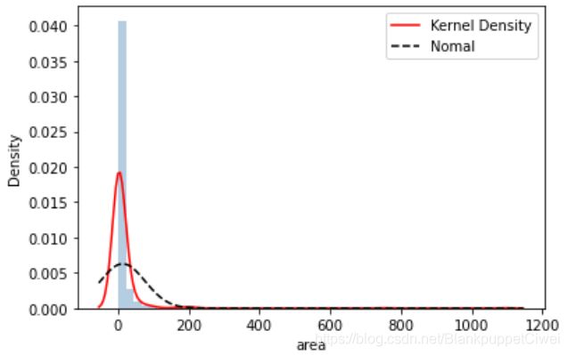
# 导入第三方模块
import seaborn as sns
import matplotlib.pyplot as plt
from scipy.stats import norm
# 绘制森林烧毁面积的直方图
sns.distplot(forestfires.area, bins = 50, kde = True, fit = norm, hist_kws = {'color':'steelblue'},
kde_kws = {'color':'red', 'label':'Kernel Density'},
fit_kws = {'color':'black','label':'Nomal', 'linestyle':'--'})
# 显示图例
plt.legend()
# 显示图形
plt.show()
# 导入第三方模块
from sklearn import preprocessing
import numpy as np
from sklearn import neighbors
# 对area变量作对数变换
y = np.log1p(forestfires.area)
# 将X变量作标准化处理
predictors = forestfires.columns[:-1]
X = preprocessing.scale(forestfires[predictors])

# 将数据拆分为训练集和测试集
X_train,X_test,y_train,y_test = model_selection.train_test_split(X, y, test_size = 0.25, random_state = 1234)

# 构建默认参数的SVM回归模型
svr = svm.SVR()
# 模型在训练数据集上的拟合
svr.fit(X_train,y_train)
# 模型在测试上的预测
pred_svr = svr.predict(X_test)
# 计算模型的MSE
metrics.mean_squared_error(y_test,pred_svr)

*** 1.9268192310372876 ***

*** 选择非线性可分模型 ***
# 使用网格搜索法,选择SVM回归中的最佳C值、epsilon值和gamma值
epsilon = np.arange(0.1,1.5,0.2)
C= np.arange(100,1000,200)
gamma = np.arange(0.001,0.01,0.002)
parameters = {'epsilon':epsilon,'C':C,'gamma':gamma}
grid_svr = model_selection.GridSearchCV(estimator = svm.SVR(max_iter=10000),param_grid =parameters,
                                        scoring='neg_mean_squared_error',cv=5,verbose =1, n_jobs=2)
# 模型在训练数据集上的拟合
grid_svr.fit(X_train,y_train)
# 返回交叉验证后的最佳参数值
print(grid_svr.best_params_, grid_svr.best_score_)

***
{'C': 300, 'epsilon': 1.1000000000000003, 'gamma': 0.001} -1.9946668196316621
***

# 模型在测试集上的预测
pred_grid_svr = grid_svr.predict(X_test)
# 计算模型在测试集上的MSE值
metrics.mean_squared_error(y_test,pred_grid_svr)

*** 1.7455012238826595 ***
*** 数据越小越好 模型预测成功率越高 ***
Kmeans-K均值聚类模型
一、从数据中随机挑选k个样本点作为原始的簇中⼼心
二、计算剩余样本与簇中⼼心的距离,并把各样本标记为离k个簇中⼼心最近的类别
三、重新计算各簇中样本点的均值,并以均值作为新的k个簇中⼼心
四、不不断重复第⼆步和第三步,直到簇中⼼心的变化趋于稳定,形成最终的k个簇

有监督机器学习算法
	含有因变量y
无监督机器学习算法
	不含因变量y

1 优点
容易理解,聚类效果不错,虽然是局部最优, 但往往局部最优就够了;
处理大数据集的时候,该算法可以保证较好的伸缩性;
当簇近似高斯分布的时候,效果非常不错;
算法复杂度低。

2 缺点
K 值需要人为设定,不同 K 值得到的结果不一样;
对初始的簇中心敏感,不同选取方式会得到不同结果;
对异常值敏感;
样本只能归为一类,不适合多分类任务;
不适合太离散的分类、样本类别不平衡的分类、非凸形状的分类。(球形最佳)

针对K值的选择
	1.拐点法
    	图形可视化
    2.轮廓系数法
    	数学公式计算
随机一个三组二元正态分布随机数
# 导入第三方包
import pandas as pd
import numpy as np
import matplotlib.pyplot as plt
from sklearn.cluster import KMeans
from sklearn import metrics

# 随机生成三组二元正态分布随机数
np.random.seed(1234)
mean1 = [0.5, 0.5]
cov1 = [[0.3, 0], [0, 0.3]]
x1, y1 = np.random.multivariate_normal(mean1, cov1, 1000).T

mean2 = [0, 8]
cov2 = [[1.5, 0], [0, 1]]
x2, y2 = np.random.multivariate_normal(mean2, cov2, 1000).T

mean3 = [8, 4]
cov3 = [[1.5, 0], [0, 1]]
x3, y3 = np.random.multivariate_normal(mean3, cov3, 1000).T

# 绘制三组数据的散点图
plt.scatter(x1,y1)
plt.scatter(x2,y2)
plt.scatter(x3,y3)
# 显示图形
plt.show()

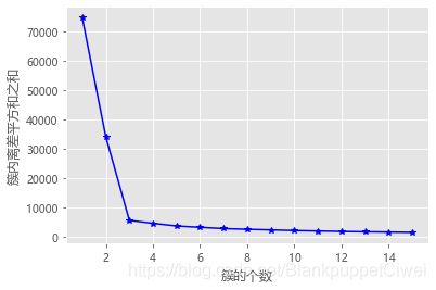
拐点法
# 拐点函数
def k_SSE(X, clusters):
	# 选择连续的K种不不同的值
	K = range(1,clusters+1)
	# 构建空列列表⽤用于存储总的簇内离差平⽅方和
	TSSE = []
	for k in K:
		# ⽤用于存储各个簇内离差平⽅方和
		SSE = []
		kmeans = KMeans(n_clusters=k)
		kmeans.fit(X)
		# 返回簇标签
		labels = kmeans.labels_
		# 返回簇中⼼心
		centers = kmeans.cluster_centers_
		# 计算各簇样本的离差平⽅方和,并保存到列列表中
			for label in set(labels):
				SSE.append(np.sum((X.loc[labels == label,]-centers[label,:])**2))
			# 计算总的簇内离差平⽅方和
		TSSE.append(np.sum(SSE))

	# 中文和负号的正常显示
    plt.rcParams['font.sans-serif'] = ['Microsoft YaHei']
    plt.rcParams['axes.unicode_minus'] = False
    # 设置绘图风格
    plt.style.use('ggplot')
    # 绘制K的个数与GSSE的关系
    plt.plot(K, TSSE, 'b*-')
    plt.xlabel('簇的个数')
    plt.ylabel('簇内离差平方和之和')
    # 显示图形
    plt.show()

# 将三组数据集汇总到数据框中
X = pd.DataFrame(np.concatenate([np.array([x1,y1]),np.array([x2,y2]),np.array([x3,y3])], axis = 1).T)
# 自定义函数的调用
k_SSE(X, 15)

*** 3 ***
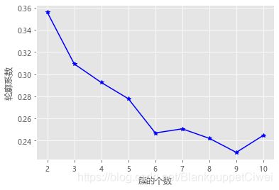
轮廓系数法
# 构造自定义函数,用于绘制不同k值和对应轮廓系数的折线图
def k_silhouette(X, clusters):
    K = range(2,clusters+1)
    # 构建空列表,用于存储个中簇数下的轮廓系数
    S = []
    for k in K:
        kmeans = KMeans(n_clusters=k)
        kmeans.fit(X)
        labels = kmeans.labels_
        # 调用字模块metrics中的silhouette_score函数,计算轮廓系数
        S.append(metrics.silhouette_score(X, labels, metric='euclidean'))

    # 中文和负号的正常显示
    plt.rcParams['font.sans-serif'] = ['Microsoft YaHei']
    plt.rcParams['axes.unicode_minus'] = False
    # 设置绘图风格
    plt.style.use('ggplot')
    # 绘制K的个数与轮廓系数的关系
    plt.plot(K, S, 'b*-')
    plt.xlabel('簇的个数')
    plt.ylabel('轮廓系数')
    # 显示图形
    plt.show()

# 自定义函数的调用
k_silhouette(X, 15)
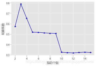
选择系数最大的k值
函数代码
KMeans(n_clusters=8, init='k-means++', n_init=10, max_iter=300, tol=0.0001)
n_clusters:⽤用于指定聚类的簇数
init:⽤用于指定初始的簇中⼼心设置⽅方法,如果为'k-means++',则表示设置的初始簇中⼼心之间相距较
远;如果为'random',则表示从数据集中随机挑选k个样本作为初始簇中⼼心;如果为数组,则表示⽤用
户指定具体的簇中⼼心
n_init:⽤用于指定Kmeans算法运⾏行行的次数,每次运⾏行行时都会选择不不同的初始簇中⼼心,⽬目的是防⽌止算
法收敛于局部最优,默认为10
max_iter:⽤用于指定单次运⾏行行的迭代次数,默认为300
tol:⽤用于指定算法收敛的阈值,默认为0.0001
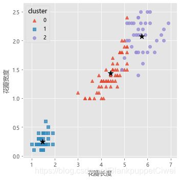
花瓣分类
# 导入第三方包
import pandas as pd
import numpy as np
import matplotlib.pyplot as plt
from sklearn.cluster import KMeans
from sklearn import metrics
# 读取iris数据集
iris = pd.read_csv(r'iris.csv')
# 查看数据集的前几行
iris.head()
# 提取出用于建模的数据集X
X = iris.drop(labels = 'Species', axis = 1)
# 构建Kmeans模型
kmeans = KMeans(n_clusters = 3)
kmeans.fit(X)
# 聚类结果标签
X['cluster'] = kmeans.labels_
# 各类频数统计
X.cluster.value_counts()
# 导入第三方模块
import seaborn as sns
# 三个簇的簇中心
centers = kmeans.cluster_centers_
# 绘制聚类效果的散点图
sns.lmplot(x = 'Petal_Length', y = 'Petal_Width', hue = 'cluster', markers = ['^','s','o'],
data = X, fit_reg = False, scatter_kws = {'alpha':0.8}, legend_out = False)
plt.scatter(centers[:,2], centers[:,3], marker = '*', color = 'black', s = 130)
plt.xlabel('花瓣长度')
plt.ylabel('花瓣宽度')
# 图形显示
plt.show()
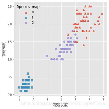
# 增加一个辅助列,将不同的花种映射到0,1,2三种值,目的方便后面图形的对比
iris['Species_map'] = iris.Species.map({'virginica':0,'setosa':1,'versicolor':2})
# 绘制原始数据三个类别的散点图
sns.lmplot(x = 'Petal_Length', y = 'Petal_Width', hue = 'Species_map', data = iris, markers = ['^','s','o'],
fit_reg = False, scatter_kws = {'alpha':0.8}, legend_out = False)
plt.xlabel('花瓣长度')
plt.ylabel('花瓣宽度')
# 图形显示
plt.show()
球员定位分类
# 读取球员数据
players = pd.read_csv(r'players.csv')
players.head()

# 排名	球员	球队	得分	命中-出手	命中率	命中-三分	三分命中率	命中-罚球	罚球命中率	场次	上场时间

# 绘制得分与命中率的散点图
sns.lmplot(x = '得分', y = '命中率', data = players,
           fit_reg = False, scatter_kws = {'alpha':0.8, 'color': 'steelblue'})
plt.show()

from sklearn import preprocessing
# 数据标准化处理
X = preprocessing.minmax_scale(players[['得分','罚球命中率','命中率','三分命中率']])
# 将数组转换为数据框
X = pd.DataFrame(X, columns=['得分','罚球命中率','命中率','三分命中率'])
# 使用拐点法选择最佳的K值
k_SSE(X, 15)

*** 曲线较为平滑,无明显拐点,k值不好取 ***

# 使用轮廓系数选择最佳的K值
k_silhouette(X, 10)

# 将球员数据集聚为3类
kmeans = KMeans(n_clusters = 3)
kmeans.fit(X)
# 将聚类结果标签插入到数据集players中
players['cluster'] = kmeans.labels_
# 构建空列表,用于存储三个簇的簇中心
centers = []
for i in players.cluster.unique():
    centers.append(players.ix[players.cluster == i,['得分','罚球命中率','命中率','三分命中率']].mean())
# 将列表转换为数组,便于后面的索引取数
centers = np.array(centers)

# 绘制散点图
sns.lmplot(x = '得分', y = '命中率', hue = 'cluster', data = players, markers = ['^','s','o'],
           fit_reg = False, scatter_kws = {'alpha':0.8}, legend = False)
# 添加簇中心
plt.scatter(centers[:,0], centers[:,2], c='k', marker = '*', s = 180)
plt.xlabel('得分')
plt.ylabel('命中率')
# 图形显示
plt.show()


DBSCAN聚类模型(密度聚类)
针对K均值聚类的两个缺陷,都可以采用密度聚类完成
	1.可以排除异常点
    2.可以聚类非球形

重要概念
	核心对象*、非核心对象(依据最小样本点数量)
    直接密度可达 		o -- p
    密度可达		    o -- p -- n
    密度相连			p -- o* -- n      p、n密度可连

噪声对象:不是核心对象,且也不在任何一个核心对象的e邻域内;
边缘对象:顾名思义是类的边缘点,它不是核心对象,但在某一个核心对象的e邻域内;

具体公式可参考:https://blog.csdn.net/guoziqing506/article/details/80318529
函数代码
cluster.DBSCAN(eps=0.5, min_samples=5, metric=‘euclidean’, p=None)
eps:⽤用于设置密度聚类中的e领域,即半径,默认为0.5
min_samples:⽤用于设置e领域内最少的样本量量,默认为5
metric:⽤用于指定计算点之间距离的⽅方法,默认为欧⽒氏距离
p:当参数metric为闵可夫斯基('minkowski')距离时,p=1,表示计算点之间的曼哈顿距离;p=2,
表示计算点之间的欧⽒氏距离;该参数的默认值为2
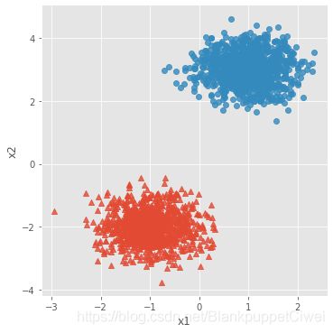
K均值和DBSCAN聚类区别
# 导入第三方模块
import pandas as pd
import numpy as np
from sklearn.datasets.samples_generator import make_blobs
import matplotlib.pyplot as plt
import seaborn as sns
from sklearn import cluster

# 模拟数据集
X,y = make_blobs(n_samples = 2000, centers = [[-1,-2],[1,3]], cluster_std = [0.5,0.5], random_state = 1234)
# 将模拟得到的数组转换为数据框,用于绘图
plot_data = pd.DataFrame(np.column_stack((X,y)), columns = ['x1','x2','y'])
# 设置绘图风格
plt.style.use('ggplot')
# 绘制散点图(用不同的形状代表不同的簇)
sns.lmplot('x1', 'x2', data = plot_data, hue = 'y',markers = ['^','o'],
           fit_reg = False, legend = False)
# 显示图形
plt.show()
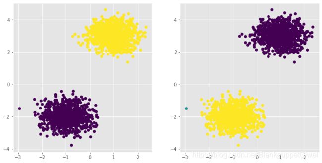
# 导入第三方模块
from sklearn import cluster
# 构建Kmeans聚类和密度聚类
kmeans = cluster.KMeans(n_clusters=2, random_state=1234)
kmeans.fit(X)
dbscan = cluster.DBSCAN(eps = 0.5, min_samples = 10)
dbscan.fit(X)
# 将Kmeans聚类和密度聚类的簇标签添加到数据框中
plot_data['kmeans_label'] = kmeans.labels_
plot_data['dbscan_label'] = dbscan.labels_

# 绘制聚类效果图
# 设置大图框的长和高
plt.figure(figsize = (12,6))
# 设置第一个子图的布局
ax1 = plt.subplot2grid(shape = (1,2), loc = (0,0))
# 绘制散点图
ax1.scatter(plot_data.x1, plot_data.x2, c = plot_data.kmeans_label)
# 设置第二个子图的布局
ax2 = plt.subplot2grid(shape = (1,2), loc = (0,1))
# 绘制散点图(为了使Kmeans聚类和密度聚类的效果图颜色一致,通过序列的map“方法”对颜色作重映射)
ax2.scatter(plot_data.x1, plot_data.x2, c=plot_data.dbscan_label.map({-1:1,0:2,1:0}))
# 显示图形
plt.show()
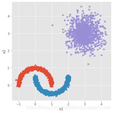
# 导入第三方模块
from sklearn.datasets.samples_generator import make_moons
# 构造非球形样本点
X1,y1 = make_moons(n_samples=2000, noise = 0.05, random_state = 1234)
# 构造球形样本点
X2,y2 = make_blobs(n_samples=1000, centers = [[3,3]], cluster_std = 0.5, random_state = 1234)
# 将y2的值替换为2(为了避免与y1的值冲突,因为原始y1和y2中都有0这个值)
y2 = np.where(y2 == 0,2,0)
# 将模拟得到的数组转换为数据框,用于绘图
plot_data = pd.DataFrame(np.row_stack([np.column_stack((X1,y1)),np.column_stack((X2,y2))]), columns = ['x1','x2','y'])

# 绘制散点图(用不同的形状代表不同的簇)
sns.lmplot('x1', 'x2', data = plot_data, hue = 'y',markers = ['^','o','>'],
           fit_reg = False, legend = False)
# 显示图形
plt.show()
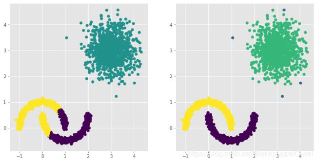
# 构建Kmeans聚类和密度聚类
kmeans = cluster.KMeans(n_clusters=3, random_state=1234)
kmeans.fit(plot_data[['x1','x2']])
dbscan = cluster.DBSCAN(eps = 0.3, min_samples = 5)
dbscan.fit(plot_data[['x1','x2']])
# 将Kmeans聚类和密度聚类的簇标签添加到数据框中
plot_data['kmeans_label'] = kmeans.labels_
plot_data['dbscan_label'] = dbscan.labels_

# 绘制聚类效果图
# 设置大图框的长和高
plt.figure(figsize = (12,6))
# 设置第一个子图的布局
ax1 = plt.subplot2grid(shape = (1,2), loc = (0,0))
# 绘制散点图
ax1.scatter(plot_data.x1, plot_data.x2, c = plot_data.kmeans_label)
# 设置第二个子图的布局
ax2 = plt.subplot2grid(shape = (1,2), loc = (0,1))
# 绘制散点图(为了使Kmeans聚类和密度聚类的效果图颜色一致,通过序列的map“方法”对颜色作重映射)
ax2.scatter(plot_data.x1, plot_data.x2, c=plot_data.dbscan_label.map({-1:1,0:0,1:3,2:2}))
# 显示图形
plt.show()
各个省份出生率死亡率
# 读取外部数据
Province = pd.read_excel(r'Province.xlsx')
Province.head()
# 绘制出生率与死亡率散点图
plt.scatter(Province.Birth_Rate, Province.Death_Rate, c = 'steelblue')
# 添加轴标签
plt.xlabel('Birth_Rate')
plt.ylabel('Death_Rate')
# 显示图形
plt.show()
# 读入第三方包
from sklearn import preprocessing
# 选取建模的变量
predictors = ['Birth_Rate','Death_Rate']
# 变量的标准化处理
X = preprocessing.scale(Province[predictors])
X = pd.DataFrame(X)
X
# 构建空列表,用于保存不同参数组合下的结果
res = []
# 迭代不同的eps值
for eps in np.arange(0.001,1,0.05):
# 迭代不同的min_samples值
for min_samples in range(2,10):
dbscan = cluster.DBSCAN(eps = eps, min_samples = min_samples)
# 模型拟合
dbscan.fit(X)
# 统计各参数组合下的聚类个数(-1表示异常点)
n_clusters = len([i for i in set(dbscan.labels_) if i != -1])
# 异常点的个数
outliners = np.sum(np.where(dbscan.labels_ == -1, 1,0))
# 统计每个簇的样本个数
stats = str(pd.Series([i for i in dbscan.labels_ if i != -1]).value_counts().values)
res.append({'eps':eps,'min_samples':min_samples,'n_clusters':n_clusters,'outliners':outliners,'stats':stats})
# 将迭代后的结果存储到数据框中
df = pd.DataFrame(res)
df
# 根据条件筛选合理的参数组合
df.loc[df.n_clusters == 3, :]
***
eps min_samples n_clusters outliners stats
40 0.251 2 3 23 [3 3 2]
57 0.351 3 3 19 [6 3 3]
88 0.551 2 3 7 [17 5 2]
96 0.601 2 3 7 [17 5 2]
104 0.651 2 3 5 [17 7 2]
112 0.701 2 3 5 [17 7 2]
129 0.801 3 3 4 [17 7 3]
136 0.851 2 3 2 [24 3 2]
144 0.901 2 3 1 [24 4 2]
152 0.951 2 3 1 [24 4 2]
***
%matplotlib
# 中文乱码和坐标轴负号的处理
plt.rcParams['font.sans-serif'] = ['Microsoft YaHei']
plt.rcParams['axes.unicode_minus'] = False
# 利用上述的参数组合值,重建密度聚类算法
dbscan = cluster.DBSCAN(eps = 0.801, min_samples = 3)
# 模型拟合
dbscan.fit(X)
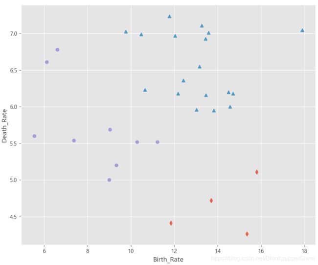
Province['dbscan_label'] = dbscan.labels_
# 绘制聚类聚类的效果散点图
sns.lmplot(x = 'Birth_Rate', y = 'Death_Rate', hue = 'dbscan_label', data = Province,
markers = ['*','d','^','o'], fit_reg = False, legend = False)
# 添加省份标签
for x,y,text in zip(Province.Birth_Rate,Province.Death_Rate, Province.Province):
plt.text(x+0.1,y-0.1,text, size = 8)
# 添加参考线
plt.hlines(y = 5.8, xmin = Province.Birth_Rate.min(), xmax = Province.Birth_Rate.max(),
linestyles = '--', colors = 'red')
plt.vlines(x = 10, ymin = Province.Death_Rate.min(), ymax = Province.Death_Rate.max(),
linestyles = '--', colors = 'red')
# 添加轴标签
plt.xlabel('Birth_Rate')
plt.ylabel('Death_Rate')
# 显示图形
plt.show()
`
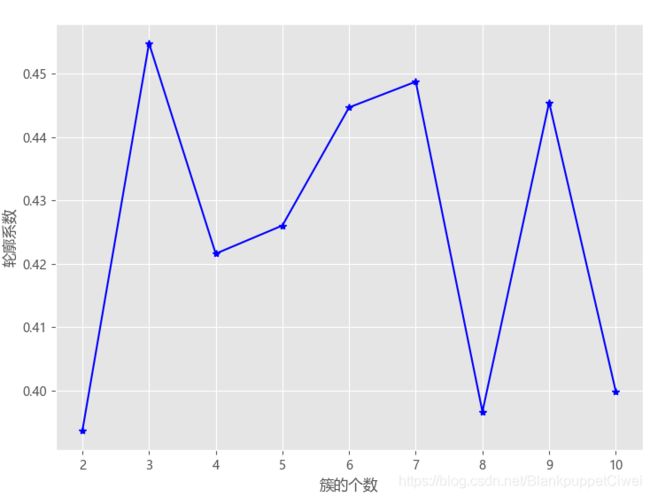
# 导入第三方模块
from sklearn import metrics
# 构造自定义函数,用于绘制不同k值和对应轮廓系数的折线图
def k_silhouette(X, clusters):
    K = range(2,clusters+1)
    # 构建空列表,用于存储个中簇数下的轮廓系数
    S = []
    for k in K:
        kmeans = cluster.KMeans(n_clusters=k)
        kmeans.fit(X)
        labels = kmeans.labels_
        # 调用字模块metrics中的silhouette_score函数,计算轮廓系数
        S.append(metrics.silhouette_score(X, labels, metric='euclidean'))

    # 中文和负号的正常显示
    plt.rcParams['font.sans-serif'] = ['Microsoft YaHei']
    plt.rcParams['axes.unicode_minus'] = False
    # 设置绘图风格
    plt.style.use('ggplot')
    # 绘制K的个数与轮廓系数的关系
    plt.plot(K, S, 'b*-')
    plt.xlabel('簇的个数')
    plt.ylabel('轮廓系数')
    # 显示图形
    plt.show()

# 聚类个数的探索
k_silhouette(X, clusters = 10)

# 利用Kmeans聚类
kmeans = cluster.KMeans(n_clusters = 3)
# 模型拟合
kmeans.fit(X)
Province['kmeans_label'] = kmeans.labels_
# 绘制Kmeans聚类的效果散点图
sns.lmplot(x = 'Birth_Rate', y = 'Death_Rate', hue = 'kmeans_label', data = Province,
           markers = ['d','^','o'], fit_reg = False, legend = False)
# 添加轴标签
plt.xlabel('Birth_Rate')
plt.ylabel('Death_Rate')
plt.show()
GDBT模型
Adaboost算法
是一个关注二分类的集成算法
与线性回归模型思想类似

提升树算法与线性回归模型思想类似,所不同的是该算法实现了多颗基础决策树f(x)的加权运算,最具代表的提升树为AdaBoost算法
F(x)是由M棵基础决策树构成的最终提升树,公式 = 经过m-1迭代后的提升树 + m棵基础决策树所对应的权重 × m棵基础决策树

判断实数的正负号。即如果输入是正数,那么输出为1;输入为负数,那么输出为-1;如果输入是0的话,那么输出为0。因此,AdaBoost的目标是判断\{-1,1\}{−1,1}的二分类判别算法

每一颗基础决策树都是基于前一棵基础决策树的分类结果对样本点设置不同的权重,如果在前一棵决策树中将某样本点预测错误,会增大该样本点的权重,否则会相应降低样本点的权重,进而再构建下一棵基础决策树,更加关注权重大的样本点。

三大问题
	1.样本点权重
    2.基础决策树选择
    3.每颗决策树的权重
损失函数
将所有训练样本点代入损失函数中,一定存在一个最佳的Am和Fm(x),使得损失函数尽量最大化的降低
函数代码
AdaBoostClassifier(base_estimator= None , n_estimators = 50,
					learning_rate = 1.0 , algorithm = ‘SAMME.R’ , random_state = None)
AdaBoostRegressor(base_estimator= None , n_estimators= 50 ,
				learning_rate = 1.0 , loss = ‘linear’ , random_state = None)

base_estimator  :基本分类器,就是我们常说的弱分类器,默认为决策树分类器(CART),在理论上可以选择任何一个分类器,但是需要支持选择样本的权重,一般用决策树或者是神经网络。
n_estimators  :    弱分类器的个数,默认为50个,一般来说 n_estimators太小的话会出现欠拟合,过大的话会出现过拟合,因此一般选择一个适中的数值,这也是调参的必要性。
learning_rate  :学习率,即每个弱分类器的权重缩减系数,取值范围为0到1。一般来说弱分类器的分数和学习率要一起调参,一般来说可从一个小一点的开始调参。
algorithm:算法的选择,主要有 ‘SAMME’, ‘SAMME.R’两种,默认为 SAMME.R。两者的主要区别在弱分类器的权重度量上,SAMME使用的是样本集的分类效果作为若学习器的权重,而 SAMME.R使用了对样本集分类的预测概率大小作为弱学习器的权重,因为SAMME.R使用的是概率度量的连续值,迭代一般比 SAMME快。
random_state:随机状态的设定,默认为None,可以设置为整型数值,也可以给定一个随机状态。

AdaBoostRegressor中的参数与AdaBoostClassifier基本相同,主要有
base_estimator,n_estimators ,learning_rate ,loss ,random_state,
与AdaBoostClassifier所不同的就是loss参数,loss参数是用来指定模型计算误差的类型
linear、square和exponential三种选项,分别对应着线性误差、平方误差和指数误差,默认为线性误差。
GBDT算法
梯度提升树算法实际上是提升算法的扩展版,在原始的提升算法中,如果损失函数为平⽅方损失或指数
损失,求解损失函数的最⼩小值问题会⾮非常简单,但如果损失函数为更更⼀一般的函数,⽬目标值的求解就会相对
复杂很多。GBDT就是⽤用来解决这个问题,利利⽤用损失函数的负梯度值作为该轮基础模型损失值的近似,并利利
⽤用这个近似值构建下⼀一轮基础模型。
GBDT函数代码
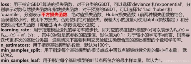
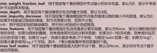
GradientBoostingClassifier(loss='deviance', learning_rate=1, n_estimators=100, subsample=1
, min_samples_split=2, min_samples_leaf=1, max_depth=3,min_impurity_decrease=0.0
, init=None, random_state=None, max_features=None
, max_leaf_nodes=None, warm_start=False
)
非平衡数据处理
在实际应用中,类别型的因变量可能存在严重的偏倚,即类别之间的比例严重失调。如欺诈问题中,
欺诈类观测在样本集中毕竟占少数;客户流失问题中,忠实的客户往往也是占很少⼀一部分;在某营销活动
的响应问题中,真正参与活动的客户也同样只是少部分。
如果数据存在严重的不平衡,预测得出的结论往往也是有偏的,即分类结果会偏向于较多观测的类。
SMOTE算法的思想
对少数类别样本进行分析和模拟,并将人工模拟的新样本添加到数据集中,进而使原始数据中的类别不在严重失衡
采样最邻近算法,计算出每个少数类样本的k个近邻
从K个近邻中随机挑选N个样本进行随机线性插值
构造新的少数类样本
将新样本与原数据合成,产生新的训练集
SMOTE(ratio='auto', random_state=None, k_neighbors=5, m_neighbors=10)

ratio:⽤用于指定重抽样的⽐比例例,如果指定字符型的值,可以是'minority'(表示对少数类别的样本进
⾏行行抽样)、'majority'(表示对多数类别的样本进⾏行行抽样)、'not minority'(表示采⽤用⽋欠采样⽅方
法)、'all'(表示采⽤用过采样⽅方法),默认为'auto',等同于'all'和'not minority'。如果指定字典型的
值,其中键为各个类别标签,值为类别下的样本量量。
random_state:⽤用于指定随机数⽣生成器器的种⼦子,默认为None,表示使⽤用默认的随机数⽣生成器器。
k_neighbors:指定近邻个数,默认为5个。
m_neighbors:指定从近邻样本中随机挑选的样本个数,默认为10个。
GBDT的改进之XGBoost算法
XGBoost是由传统的GBDT模型发展而来的,GBDT模型在求解最优化问题时应用了了一阶导技
术,而XGBoost则使用损失函数的一阶和二阶导,而且可以自定义损失函数,只要损失函数可一阶和二阶求导。
XGBoost算法相比于GBDT算法还有其他优点,例例如支持并行计算,大大提高算法的运行效
率;XGBoost在损失函数中加入了了正则项,用来控制模型的复杂度,进而可以防止模型的过拟合;
XGBoost除了支持CART基础模型,还支持线性基础模型;XGBoost采用了了随机森林的思想,对字段
进行行抽样,既可以防止过拟合,也可以降低模型的计算量量。
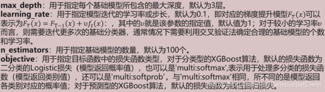
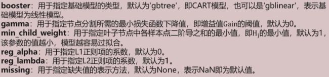
XGBRegressor=(max_depth=3, learning_rate=0.1, n_estimators=100, silent=True, objective='binary:logistic', gamma=0,
              min_child_weight=1,  max_delta_step=0, reg_alpha=0, reg_lambda=1, missing=None)
信用卡违约行为
# 导入第三方包
import pandas as pd
import matplotlib.pyplot as plt

# 读入数据
default = pd.read_excel(r'default of credit card.xls')

# 数据集中是否违约的客户比例
plt.rcParams['font.sans-serif'] = ['Microsoft YaHei']
plt.rcParams['axes.unicode_minus'] = False
# 统计客户是否违约的频数
counts = default.y.value_counts()
# 绘制饼图
plt.pie(x = counts, # 绘图数据
        labels=pd.Series(counts.index).map({0:'不违约',1:'违约'}), # 添加文字标签
        autopct='%.1f%%' # 设置百分比的格式,这里保留一位小数
       )
# 显示图形
plt.show()

*** 违约率22.1% ***

default.head()

*** 查看数据列表,清洗不需要的 ***
# 将数据集拆分为训练集和测试集
# 导入第三方包
from sklearn import model_selection
from sklearn import ensemble
from sklearn import metrics

# 排除数据集中的ID变量和因变量,剩余的数据用作自变量X
X = default.drop(['ID','y'], axis = 1)
y = default.y
# 数据拆分
X_train,X_test,y_train,y_test = model_selection.train_test_split(X,y,test_size = 0.25, random_state = 1234)

# 构建AdaBoost算法的类
AdaBoost1 = ensemble.AdaBoostClassifier()
# 算法在训练数据集上的拟合
AdaBoost1.fit(X_train,y_train)
# 算法在测试数据集上的预测
pred1 = AdaBoost1.predict(X_test)

# 返回模型的预测效果
print('模型的准确率为:\n',metrics.accuracy_score(y_test, pred1))
print('模型的评估报告:\n',metrics.classification_report(y_test, pred1))

*****
模型的准确率为:
 0.8125333333333333
模型的评估报告:
               precision    recall  f1-score   support

           0       0.83      0.96      0.89      5800
           1       0.68      0.32      0.44      1700

    accuracy                           0.81      7500
   macro avg       0.75      0.64      0.66      7500
weighted avg       0.80      0.81      0.79      7500
*****
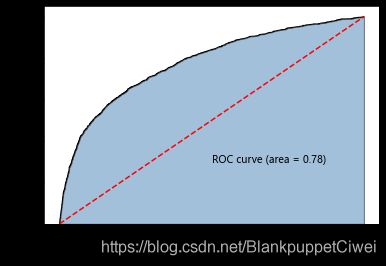
# 计算客户违约的概率值,用于生成ROC曲线的数据
y_score = AdaBoost1.predict_proba(X_test)[:,1]
fpr,tpr,threshold = metrics.roc_curve(y_test, y_score)
# 计算AUC的值
roc_auc = metrics.auc(fpr,tpr)

# 绘制面积图
plt.stackplot(fpr, tpr, color='steelblue', alpha = 0.5, edgecolor = 'black')
# 添加边际线
plt.plot(fpr, tpr, color='black', lw = 1)
# 添加对角线
plt.plot([0,1],[0,1], color = 'red', linestyle = '--')
# 添加文本信息
plt.text(0.5,0.3,'ROC curve (area = %0.2f)' % roc_auc)
# 添加x轴与y轴标签
plt.xlabel('1-Specificity')
plt.ylabel('Sensitivity')
# 显示图形
plt.show()
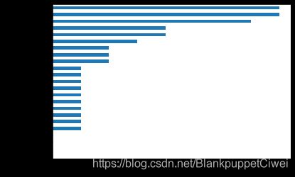
影响违约率的因素
# 自变量的重要性排序
importance = pd.Series(AdaBoost1.feature_importances_, index = X.columns)
importance.sort_values().plot(kind = 'barh')
plt.show()
# 取出重要性比较高的自变量建模
predictors = list(importance[importance>0.02].index)
predictors

# 通过网格搜索法选择基础模型所对应的合理参数组合
# 导入第三方包
from sklearn.model_selection import GridSearchCV
from sklearn.tree import DecisionTreeClassifier

max_depth = [3,4,5,6]
params1 = {'base_estimator__max_depth':max_depth}
base_model = GridSearchCV(estimator = ensemble.AdaBoostClassifier(base_estimator = DecisionTreeClassifier()),
                          param_grid= params1, scoring = 'roc_auc', cv = 5, n_jobs = 4, verbose = 1)
base_model.fit(X_train[predictors],y_train)
# 返回参数的最佳组合和对应AUC值
base_model.best_params_, base_model.best_score_

*** {'base_estimator__max_depth': 3}, 0.7410384967844161  ***
# 通过网格搜索法选择提升树的合理参数组合
# 导入第三方包
from sklearn.model_selection import GridSearchCV

n_estimators = [100,200,300]
learning_rate = [0.01,0.05,0.1,0.2]
params2 = {'n_estimators':n_estimators,'learning_rate':learning_rate}
adaboost = GridSearchCV(estimator = ensemble.AdaBoostClassifier(base_estimator = DecisionTreeClassifier(max_depth = 3)),
                        param_grid= params2, scoring = 'roc_auc', cv = 5, n_jobs = 4, verbose = 1)
adaboost.fit(X_train[predictors] ,y_train)
# 返回参数的最佳组合和对应AUC值
adaboost.best_params_, adaboost.best_score_

*** {'learning_rate': 0.05, 'n_estimators': 100}, 0.769515151270839 ***
# 使用最佳的参数组合构建AdaBoost模型
AdaBoost2 = ensemble.AdaBoostClassifier(base_estimator = DecisionTreeClassifier(max_depth = 3),
                                       n_estimators = 300, learning_rate = 0.01)
# 算法在训练数据集上的拟合
AdaBoost2.fit(X_train[predictors],y_train)
# 算法在测试数据集上的预测
pred2 = AdaBoost2.predict(X_test[predictors])

# 返回模型的预测效果
print('模型的准确率为:\n',metrics.accuracy_score(y_test, pred2))
print('模型的评估报告:\n',metrics.classification_report(y_test, pred2))

*****
模型的准确率为:
 0.8158666666666666
模型的评估报告:
               precision    recall  f1-score   support

           0       0.83      0.96      0.89      5800
           1       0.69      0.34      0.45      1700

    accuracy                           0.82      7500
   macro avg       0.76      0.65      0.67      7500
weighted avg       0.80      0.82      0.79      7500
# 计算正例的预测概率,用于生成ROC曲线的数据
y_score = AdaBoost2.predict_proba(X_test[predictors])[:,1]
fpr,tpr,threshold = metrics.roc_curve(y_test, y_score)
# 计算AUC的值
roc_auc = metrics.auc(fpr,tpr)

# 绘制面积图
plt.stackplot(fpr, tpr, color='steelblue', alpha = 0.5, edgecolor = 'black')
# 添加边际线
plt.plot(fpr, tpr, color='black', lw = 1)
# 添加对角线
plt.plot([0,1],[0,1], color = 'red', linestyle = '--')
# 添加文本信息
plt.text(0.5,0.3,'ROC curve (area = %0.2f)' % roc_auc)
# 添加x轴与y轴标签
plt.xlabel('1-Specificity')
plt.ylabel('Sensitivity')
# 显示图形
plt.show()

*** ROC曲线还是0.78 ***
# 运用网格搜索法选择梯度提升树的合理参数组合
learning_rate = [0.01,0.05,0.1,0.2]
n_estimators = [100,300,500]
max_depth = [3,4,5,6]
params = {'learning_rate':learning_rate,'n_estimators':n_estimators,'max_depth':max_depth}
gbdt_grid = GridSearchCV(estimator = ensemble.GradientBoostingClassifier(),
                         param_grid= params, scoring = 'roc_auc', cv = 5, n_jobs = 4, verbose = 1)
gbdt_grid.fit(X_train[predictors],y_train)
# 返回参数的最佳组合和对应AUC值
gbdt_grid.best_params_, gbdt_grid.best_score_

***
{'learning_rate': 0.05, 'max_depth': 5, 'n_estimators': 100},
 0.7742273667024198)
***
# 基于最佳参数组合的GBDT模型,对测试数据集进行预测
pred = gbdt_grid.predict(X_test[predictors])
# 返回模型的预测效果
print('模型的准确率为:\n',metrics.accuracy_score(y_test, pred))
print('模型的评估报告:\n',metrics.classification_report(y_test, pred))

*****
模型的准确率为:
 0.8142666666666667
模型的评估报告:
               precision    recall  f1-score   support

           0       0.83      0.95      0.89      5800
           1       0.68      0.35      0.46      1700

    accuracy                           0.81      7500
   macro avg       0.75      0.65      0.67      7500
weighted avg       0.80      0.81      0.79      7500
*****
# 计算违约客户的概率值,用于生成ROC曲线的数据
y_score = gbdt_grid.predict_proba(X_test[predictors])[:,1]
fpr,tpr,threshold = metrics.roc_curve(y_test, y_score)
# 计算AUC的值
roc_auc = metrics.auc(fpr,tpr)

# 绘制面积图
plt.stackplot(fpr, tpr, color='steelblue', alpha = 0.5, edgecolor = 'black')
# 添加边际线
plt.plot(fpr, tpr, color='black', lw = 1)
# 添加对角线
plt.plot([0,1],[0,1], color = 'red', linestyle = '--')
# 添加文本信息
plt.text(0.5,0.3,'ROC curve (area = %0.2f)' % roc_auc)
# 添加x轴与y轴标签
plt.xlabel('1-Specificity')
plt.ylabel('Sensitivity')
# 显示图形
plt.show()

*** 0. 78  ***
信用卡欺诈行为
import pandas as pd
import matplotlib.pyplot as plt
import numpy as np
# 读入数据
creditcard = pd.read_csv(r'creditcard.csv')
# 为确保绘制的饼图为圆形,需执行如下代码
plt.axes(aspect = 'equal')
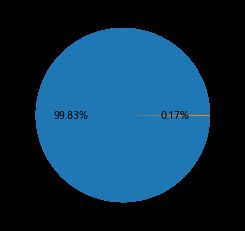
# 统计交易是否为欺诈的频数
counts = creditcard.Class.value_counts()
# 绘制饼图
plt.pie(x = counts, # 绘图数据
labels=pd.Series(counts.index).map({0:'正常',1:'欺诈'}), # 添加文字标签
autopct='%.2f%%' # 设置百分比的格式,这里保留一位小数
)
# 显示图形
plt.show()
from sklearn import model_selection
# 将数据拆分为训练集和测试集
# 删除自变量中的Time变量
X = creditcard.drop(['Time','Class'], axis = 1)
y = creditcard.Class
# 数据拆分
X_train,X_test,y_train,y_test = model_selection.train_test_split(X,y,test_size = 0.3, random_state = 1234)
#!conda install -c conda-forge imbalanced-learn
#!conda install nb_conda # to grant to select conda environments as core of jupyter notebook
#!pip install imblearn
#!pip install delayed
#!pip install imblearn --user
#!conda install imblearn -i https://repo.anaconda.com/pkgs/main/win-64
#!conda install scikit-learn
#!pip3 install imblearn
# smote算法模块的导入可能会出问题 根据情况所需下载上面的内容 多尝试

# 导入第三方包
from imblearn.over_sampling import SMOTE
import imblearn
import sklearn
from sklearn.utils.fixes import delayed

# 运用SMOTE算法实现训练数据集的平衡
over_samples = SMOTE(random_state=1234)
# over_samples_X,over_samples_y = over_samples.fit_sample(X_train, y_train)
over_samples_X, over_samples_y = over_samples.fit_sample(X_train.values,y_train.values.ravel())
# 重抽样前的类别比例
print(y_train.value_counts()/len(y_train))
# 重抽样后的类别比例
print(pd.Series(over_samples_y).value_counts()/len(over_samples_y))

***
0    0.998239
1    0.001761
Name: Class, dtype: float64
1    0.5
0    0.5
dtype: float64
***
# https://www.lfd.uci.edu/~gohlke/pythonlibs/
# 导入第三方包
from sklearn import metrics
import xgboost
import numpy as np
# 构建XGBoost分类器
xgboost = xgboost.XGBClassifier()
# 使用重抽样后的数据,对其建模
xgboost.fit(over_samples_X,over_samples_y)
# 将模型运用到测试数据集中
resample_pred = xgboost.predict(np.array(X_test))

# 返回模型的预测效果
print('模型的准确率为:\n',metrics.accuracy_score(y_test, resample_pred))
print('模型的评估报告:\n',metrics.classification_report(y_test, resample_pred))

*****

模型的准确率为:
 0.9992977774656788
模型的评估报告:
               precision    recall  f1-score   support

           0       1.00      1.00      1.00     85302
           1       0.78      0.81      0.79       141

    accuracy                           1.00     85443
   macro avg       0.89      0.90      0.90     85443
weighted avg       1.00      1.00      1.00     85443

*****
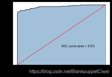
#计算欺诈交易的概率值,用于生成ROC曲线的数据
y_score = xgboost.predict_proba(np.array(X_test))[:,1]
fpr,tpr,threshold = metrics.roc_curve(y_test, y_score)
# 计算AUC的值
roc_auc = metrics.auc(fpr,tpr)

# 绘制面积图
plt.stackplot(fpr, tpr, color='steelblue', alpha = 0.5, edgecolor = 'black')
# 添加边际线
plt.plot(fpr, tpr, color='black', lw = 1)
# 添加对角线
plt.plot([0,1],[0,1], color = 'red', linestyle = '--')
# 添加文本信息
plt.text(0.5,0.3,'ROC curve (area = %0.2f)' % roc_auc)
# 添加x轴与y轴标签
plt.xlabel('1-Specificity')
plt.ylabel('Sensitivity')
# 显示图形
plt.show()
# 构建XGBoost分类器
import xgboost
xgboost2 = xgboost.XGBClassifier()
# 使用非平衡的训练数据集拟合模型
xgboost2.fit(X_train,y_train)
# 基于拟合的模型对测试数据集进行预测
pred2 = xgboost2.predict(X_test)
# 混淆矩阵
pd.crosstab(pred2,y_test)
Class 0 1
row_0
0 85292 32
1 10 109
# 返回模型的预测效果
print('模型的准确率为:\n',metrics.accuracy_score(y_test, pred2))
print('模型的评估报告:\n',metrics.classification_report(y_test, pred2))

***
模型的准确率为:
 0.9995084442259752
模型的评估报告:
               precision    recall  f1-score   support

           0       1.00      1.00      1.00     85302
           1       0.92      0.77      0.84       141

    accuracy                           1.00     85443
   macro avg       0.96      0.89      0.92     85443
weighted avg       1.00      1.00      1.00     85443
***
# 计算欺诈交易的概率值,用于生成ROC曲线的数据
y_score = xgboost2.predict_proba(X_test)[:,1]
fpr,tpr,threshold = metrics.roc_curve(y_test, y_score)
# 计算AUC的值
roc_auc = metrics.auc(fpr,tpr)

# 绘制面积图
plt.stackplot(fpr, tpr, color='steelblue', alpha = 0.5, edgecolor = 'black')
# 添加边际线
plt.plot(fpr, tpr, color='black', lw = 1)
# 添加对角线
plt.plot([0,1],[0,1], color = 'red', linestyle = '--')
# 添加文本信息
plt.text(0.5,0.3,'ROC curve (area = %0.2f)' % roc_auc)
# 添加x轴与y轴标签
plt.xlabel('1-Specificity')
plt.ylabel('Sensitivity')
# 显示图形
plt.show()

此数据集模型预测概率很高,模型预测精准
下篇完
供自己学习参考使用
转载说明出处