matplotlib+cartopy+geopandas,实现专业地图可视化
知乎上有人问如何实现精细化地图?现有的excel、tableau、powerbi都只能套用有限的模板,是否有工具能实现高度定制化?

除了专业的Gis软件外,我能想到相对完美的就是使用Python来实现。
如果想制作出版级的地图可视化图表,且处理大数据集,推荐使用matplotlib+cartopy+geopandas的组合,从GIS数据处理、到Geo、Map地图绘制,到可视化图片展示生成,它们都能完美解决。
matplotlib、cartopy、geopandas都是python的第三方工具库,在可视化领域非常强大,下面一一介绍。
matplotlib是python图表可视化的基础库,相信很多人都熟悉。它能创建静态、动态、交互式图表,支持自定义所有图表元素,且对地图制作非常友好。

cartopy是基于matplotlib接口的专业地理空间可视化库,它利用PROJ、Numpy和Shapely库,可以绘制出版级的地理图表。

geopandas是在pandas数据类型上构建出来的地理空间数据处理分析库,能对shapefile、geojson数据进行处理、分析及可视化。
总的来讲,matplotlib用于图表设计、cartopy用于地图展示、geopandas用于gis数据处理,搭配起来使用几乎可以媲美专业的gis软件。
而且它们可定制性极强,你几乎自行可以设计所有的地图细节,这是tableau,finereport,excel所无法实现的。
因为是基于python生态的地图工具,处理大数据集不在话下,哪怕GB、TB级别的数据,也可以通过合适的数据处理手段来生成地图。
cartopy绘图
用 Cartopy 画地图的基本流程并不复杂:
创建画布。
通过指定 projection 参数,创建 GeoAxes 对象。
调用 GeoAxes 的方法画图。
比如绘制海岸线:
import cartopy.crs as ccrs
from cartopy.mpl.ticker import LongitudeFormatter, LatitudeFormatter
import matplotlib.pyplot as plt


def main():
    fig = plt.figure(figsize=(8, 10))

    # Label axes of a Plate Carree projection with a central longitude of 180:
    ax1 = fig.add_subplot(2, 1, 1,
                          projection=ccrs.PlateCarree(central_longitude=180))
    ax1.set_global()
    ax1.coastlines()
    ax1.set_xticks([0, 60, 120, 180, 240, 300, 360], crs=ccrs.PlateCarree())
    ax1.set_yticks([-90, -60, -30, 0, 30, 60, 90], crs=ccrs.PlateCarree())
    lon_formatter = LongitudeFormatter(zero_direction_label=True)
    lat_formatter = LatitudeFormatter()
    ax1.xaxis.set_major_formatter(lon_formatter)
    ax1.yaxis.set_major_formatter(lat_formatter)

    plt.show()


if __name__ == '__main__':
    main()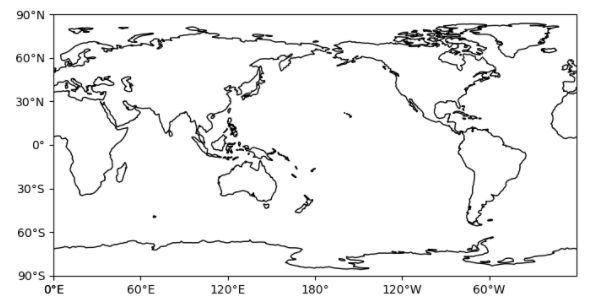
绘制地图:
import cartopy.crs as ccrs
import cartopy.feature as cfeature
import matplotlib.pyplot as plt


def main():
    fig = plt.figure()
    ax = fig.add_subplot(1, 1, 1, projection=ccrs.PlateCarree())
    ax.set_extent([-20, 60, -40, 45], crs=ccrs.PlateCarree())

    ax.add_feature(cfeature.LAND)
    ax.add_feature(cfeature.OCEAN)
    ax.add_feature(cfeature.COASTLINE)
    ax.add_feature(cfeature.BORDERS, linestyle=':')
    ax.add_feature(cfeature.LAKES, alpha=0.5)
    ax.add_feature(cfeature.RIVERS)

    plt.show()


if __name__ == '__main__':
    main()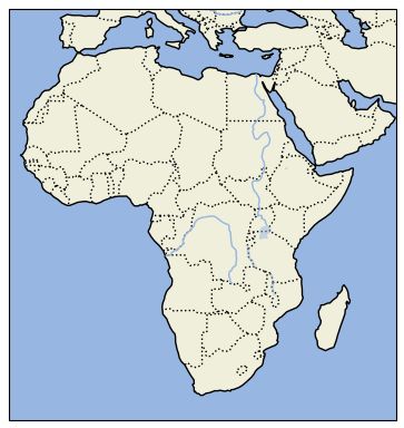
##geopandas绘图
geopandas主要用来处理地理空间数据,也可以通过matplotlib接口来展示地图。
当然它也是依赖shapely、fiona、pyproj等众多地理空间库来进行数据分析、处理的,数据形态类似pandas的dataframe。
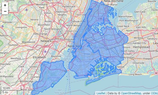
import geopandas as gpd
from matplotlib_scalebar.scalebar import ScaleBar

nybb = gpd.read_file(gpd.datasets.get_path('nybb'))
nybb = nybb.to_crs(32619)  # Convert the dataset to a coordinate
# system which uses meters

ax = nybb.plot()
ax.add_artist(ScaleBar(1))
import geopandas
import contextily as cx

df = geopandas.read_file(geopandas.datasets.get_path('nybb'))
ax = df.plot(figsize=(10, 10), alpha=0.5, edgecolor='k')

df.crs
df_wm = df.to_crs(epsg=3857)
ax = df_wm.plot(figsize=(10, 10), alpha=0.5, edgecolor='k')
cx.add_basemap(ax)
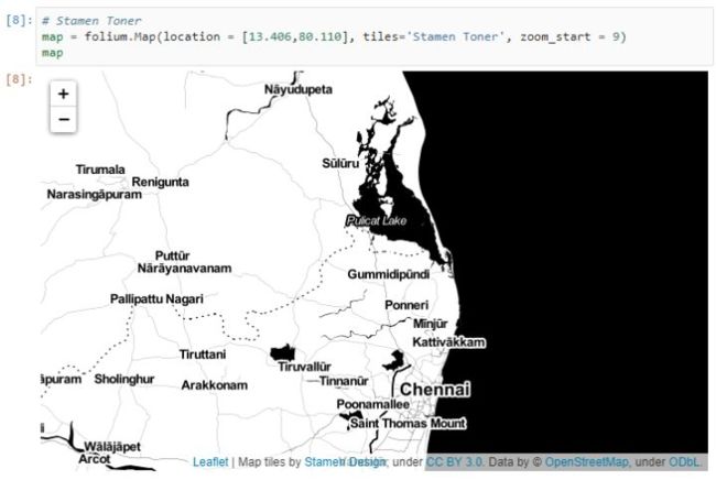
你还可以通过folium读取地图进行可视化。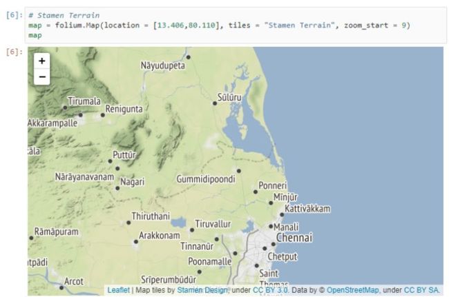
小结
matplotlib+cartopy+geopandas的组合非常强大,能解决地理空间大部分的可视化需求。
我想python处理地理空间数据也是现在的趋势,学会将有很大帮助。
-------- End --------推荐同名微信视频号

图解Pandas图文00-内容框架介绍图文01-数据结构介绍图文02-创建数据对象图文03-操作Excel文件图文04-常见的数据访问图文05-常见的数据运算图文06-常见的数学计算图文07-常见的数据统计图文08-常见的数据筛选图文09-常见的缺失值处理图文10-数据合并操作