R语言绘图-3-Circular-barplot图
0. 参考:
https://r-graph-gallery.com/web-circular-barplot-with-R-and-ggplot2.html
1. 说明:
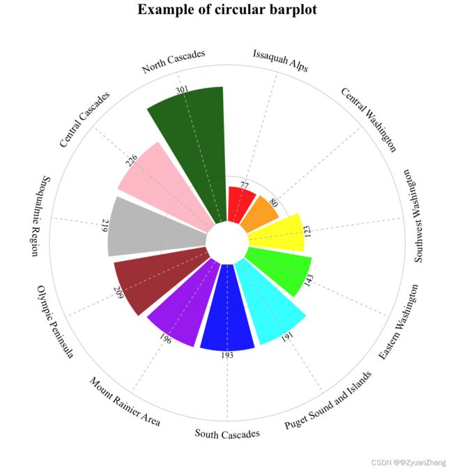
利用 ggplot 绘制 环状的条形图 (circular barplot),并且每个条带按照数值大小进行排列。
2 绘图代码:
注意:绘图代码中的字体为 “Times New Roman”,如果没有这个字体的话,可以更换为其他字体,或者用下面代码加载改字体:
## 加载字体
library(extrafont)
font_import(pattern = "Times New Roman")
loadfonts()
## 绘图
library(stringr)
library(dplyr)
library(geomtextpath)
library(ggplot2)

## 加载原始数据集
hike_data <- readr::read_rds(url('https://raw.githubusercontent.com/rfordatascience/tidytuesday/master/data/2020/2020-11-24/hike_data.rds')) ## 如果不能加载数据,就通过链接把 hike_data.rds 下载下来,然后再通过 readr::read_rds() 加载数据
#hike_data <- readr::read_rds("/Users/zhiyuanzhang/Downloads/hike_data.rds")
hike_data$region <- as.factor(word(hike_data$location, 1, sep = " -- "))

## 分组统计 region 的数目
plot_df <- hike_data %>%
  group_by(region) %>%
  summarise(n = n())

## 新增一列 location,将其转化为 factor,顺序为region数目生序排列
plot_df$location = factor(plot_df$region, levels = c(levels(reorder(plot_df$region, plot_df$n))))

## 绘图
ggplot(plot_df) +
  ## 绘制横线
  geom_hline(
    aes(yintercept = y),
    data.frame(y = c(0,1,3.5) * 100), ## 根据 location 数目的最大值设定范围(可理解为 y 的范围)
    color = "lightgrey",
  ) +
  ## 绘制条形图
  geom_col(
    aes(
      x = reorder(location, n),
      y = n,
      fill = location
    ),
    position = "dodge2",
    show.legend = FALSE, ## 不显示图例
    alpha = .9
  ) +

  ## 自定义每个条形图的填充色
  scale_fill_manual(
    values=c("red", "orange", "yellow", "green", "cyan", "blue", "purple", "brown", "gray", "pink", "darkgreen"),
    labels=c(levels(plot_df$location)),
    name="Location") + ## 有图例的话,图例的名称为 Location

  ## 绘制线段
  geom_segment(
    aes(
      x = reorder(location, n),
      y = 0,
      xend = reorder(location, n),
      yend = 350 ## 和上面一样,根据数目进行调整
    ),
    linetype = "dashed",
    color = "gray"
  ) +

  ## 变成环形图
  coord_polar() +

  ## 添加文本注释,同时保证文本的方向是和环的方向一致的
  geom_textpath(aes(x = location, y=n, label = n), hjust=0.5, vjust=1, colour = "Black",
                family="Times New Roman", size=5) +
  ## 添加文本注释,代替坐标轴中文本
  geom_textpath(aes(x = location, y=350, label = location), hjust=0.5, vjust=2, colour = "Black",
                family="Times New Roman", size=6) + ## y 指定文本位置

  ## 构造一个内环
  scale_y_continuous(
    limits = c(-50, 350),
    expand = c(0, 0)
  ) +

  ## 添加标题
  labs(title = "Example of circular barplot") +

  ## 修改主题
  theme(
    ## 设置全部文本的字体
    text = element_text(family = "Times New Roman", face="bold"),

    ## 设置标题的字体
    plot.title = element_text(size = 25, hjust = 0.5),

    ## 将画布背景设置为白色,并去掉画布的线
    panel.background = element_rect(fill = "white", color = "white"),
    panel.grid = element_blank(),
    panel.grid.major.x = element_blank(),

    ## 设置坐标轴
    axis.title = element_blank(),
    axis.ticks = element_blank(),
    axis.text.y = element_blank(),

    axis.text.x = element_blank(), ## 将 x 轴文本设为空,用上面 geom_textpath 添加的文本做替换

    ## 设置图例(如果有的话,因为上面设置了 show.legend = FALSE,所以不会显示图例)
    legend.title = element_blank(),
    legend.text = element_text(size=12),
    legend.position = "right"
  )
3. 结果: