几个好看的echarts表格效果
option代码
init3() {
let myChart = this.$echarts.init(document.getElementById("main3"));
let option = {
backgroundColor: "rgba(0,0,0,0)",
title: {
text: "单位/kg",
textStyle: {
color: "#a8aab0",
fontSize: 12,
},
left: "50px",
top: "30px",
},
tooltip: {
//提示框组件
trigger: "axis",
formatter: "{b}
{a0}: {c0}
{a1}: {c1}",
axisPointer: {
type: "shadow",
label: {
backgroundColor: "#6a7985",
},
},
textStyle: {
color: "#fff",
fontStyle: "normal",
fontFamily: "微软雅黑",
fontSize: 12,
},
},
grid: {
left: "10%",
right: "10%",
bottom: "10%",
top: "25%",
// padding:'0 0 10 0',
containLabel: true,
},
legend: {
//图例组件,颜色和名字
right: "10%",
top: "10%",
itemGap: 16,
itemWidth: 18,
itemHeight: 10,
data: [
{
name: "计划订单数",
//icon:'image://../wwwroot/js/url2.png', //路径
},
{
name: "实际订单数",
},
],
textStyle: {
color: "#a8aab0",
fontStyle: "normal",
fontFamily: "微软雅黑",
fontSize: 12,
},
},
xAxis: [
{
type: "category",
// boundaryGap: true,//坐标轴两边留白
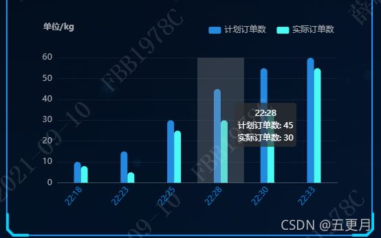
data: ["22:18", "22:23", "22:25", "22:28", "22:30", "22:33"],
axisLabel: {
//坐标轴刻度标签的相关设置。
// interval: 0,//设置为 1,表示『隔一个标签显示一个标签』
// margin:15,
textStyle: {
color: "#078ceb",
fontStyle: "normal",
fontFamily: "微软雅黑",
fontSize: 12,
},
rotate: 50,
},
axisTick: {
//坐标轴刻度相关设置。
show: false,
},
axisLine: {
//坐标轴轴线相关设置
lineStyle: {
color: "#fff",
opacity: 0.2,
},
},
splitLine: {
//坐标轴在 grid 区域中的分隔线。
show: false,
},
},
],
yAxis: [
{
type: "value",
splitNumber: 5,
axisLabel: {
textStyle: {
color: "#a8aab0",
fontStyle: "normal",
fontFamily: "微软雅黑",
fontSize: 12,
},
},
axisLine: {
show: false,
},
axisTick: {
show: false,
},
splitLine: {
show: true,
lineStyle: {
color: ["#fff"],
opacity: 0.06,
},
},
},
],
series: [
{
name: "计划订单数",
type: "bar",
data: [10, 15, 30, 45, 55, 60],
barWidth: 10,
barGap: 0, //柱间距离
itemStyle: {
normal: {
show: true,
color: new echarts.graphic.LinearGradient(0, 0, 0, 1, [
{
offset: 0,
color: "#248ae0",
},
{
offset: 1,
color: "#248ae0",
},
]),
barBorderRadius: [50, 50, 0, 0],
borderWidth: 0,
},
},
},
{
name: "实际订单数",
type: "bar",
data: [8, 5, 25, 30, 35, 55],
barWidth: 10,
barGap: 0, //柱间距离
itemStyle: {
normal: {
show: true,
color: new echarts.graphic.LinearGradient(0, 0, 0, 1, [
{
offset: 0,
color: "#49fbf3",
},
{
offset: 1,
color: "#49fbf3",
},
]),
barBorderRadius: [50, 50, 0, 0],
borderWidth: 0,
},
},
},
],
};
let app = {
currentIndex: -1,
};
setInterval(function () {
let dataLen = option.series[0].data.length;
// 取消之前高亮的图形
myChart.dispatchAction({
type: "downplay",
seriesIndex: 0,
dataIndex: app.currentIndex,
});
app.currentIndex = (app.currentIndex + 1) % dataLen;
//console.log(app.currentIndex);
// 高亮当前图形
myChart.dispatchAction({
type: "highlight",
seriesIndex: 0,
dataIndex: app.currentIndex,
});
// 显示 tooltip
myChart.dispatchAction({
type: "showTip",
seriesIndex: 0,
dataIndex: app.currentIndex,
});
}, 2000);
myChart.setOption(option);
},
代码
init4() {
let myChart = this.$echarts.init(document.getElementById("main4"));
this.option = {
backgroundColor: "rgba(0,0,0,0)",
angleAxis: {
type: "value",
min: 0,
max: 100,
axisLine: {
show: false,
},
axisTick: {
show: false,
},
splitLine: {
show: false,
},
axisLabel: {
show: false,
},
},
radiusAxis: {
type: "category",
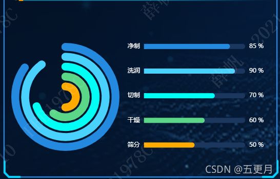
data: ["其他", "资源加工工业", "制造", "轻纺工业", "机械电子制造业"],
z: 100,
axisLine: {
show: false,
},
axisTick: {
show: false,
},
axisLabel: {
show: true,
margin: 2,
fontSize: 10,
formatter: function (value, index) {
let list = [50, 60, 70, 20, 30];
return list[index] + "%";
},
textStyle: {
color: "rgba(255,255,255,0)",
},
interval: 0,
},
},
polar: {
center: ["50%", "50%"],
radius: ["10%", "100%"],
},
tooltip: {
show: false,
},
series: [
{
type: "bar",
barWidth: "80%",
data: [50],
coordinateSystem: "polar",
name: "净制",
stack: "a",
roundCap: true,
itemStyle: {
color: "#ffaa00",
barWidth: 20,
barBorderRadius: 3,
},
z: 5,
},
{
type: "bar",
data: [0, 60, 0, 0, 0],
coordinateSystem: "polar",
name: "洗润",
stack: "a",
roundCap: true,
itemStyle: {
color: "#5bd887",
barWidth: 10,
},
},
{
type: "bar",
data: [0, 0, 70, 0, 0],
coordinateSystem: "polar",
name: "切制",
stack: "a",
roundCap: true,
itemStyle: {
color: "#00fff4",
barWidth: 10,
},
},
{
type: "bar",
data: [0, 0, 0, 90, 0],
coordinateSystem: "polar",
name: "干燥",
stack: "a",
roundCap: true,
itemStyle: {
color: "#4ad2ff",
barBorderRadius: 5,
barWidth: 10,
},
},
{
type: "bar",
data: [0, 0, 0, 0, 85],
coordinateSystem: "polar",
name: "筛分",
stack: "a",
roundCap: true,
itemStyle: {
color: "#248ae0",
barBorderRadius: 5,
barWidth: 10,
},
},
],
};
//最后把option放到echarts中就可以了
myChart.setOption(this.option);
},
右边为手写样式,echarts只有左边圆环部分
init2() {
// 建议使用 let 代替所有的 var
let myChart = this.$echarts.init(document.getElementById("main6"));
let trafficWay = [
{
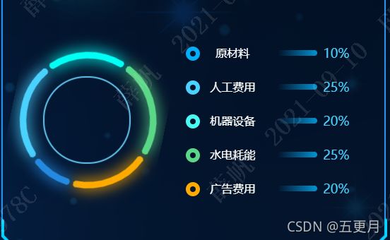
name: "水电能耗",
value: 20,
},
{
name: "水电能耗",
value: 25,
},
{
name: "机械设备",
value: 20,
},
{
name: "人工费用",
value: 25,
},
{
name: "原材料",
value: 10,
},
];
let data = [];
let color = ["#ffaa00", "#5bd887", "#00fff4", "#4ad2ff", "#248ae0"];
for (let i = 0; i < trafficWay.length; i++) {
data.push(
{
value: trafficWay[i].value,
// name: trafficWay[i].name,
itemStyle: {
normal: {
borderWidth: 5,
shadowBlur: 20,
borderColor: color[i],
shadowColor: color[i],
},
},
},
{
value: 2,
name: "",
itemStyle: {
normal: {
label: {
show: false,
},
labelLine: {
show: false,
},
color: "rgba(0, 0, 0, 0)",
borderColor: "rgba(0, 0, 0, 0)",
borderWidth: 0,
},
},
}
);
}
let seriesOption = [
{
name: "",
type: "pie",
clockWise: false,
radius: [90, 94.2],
hoverAnimation: true,
itemStyle: {
normal: {
label: {
show: false,
},
},
},
data: data,
},
];
let option = {
backgroundColor: "rgba(0,0,0,0)",
color: color,
tooltip: {
show: false,
},
toolbox: {
show: false,
},
series: seriesOption,
};
myChart.setOption(option);
},

    init4() {
      let myChart = this.$echarts.init(document.getElementById("main8"));
      let legendItem = ["预计", "实际"];
      let option = {
        backgroundColor: "rgba(0,0,0,0)",
        title: {
          text: "单位/个",
          textStyle: {
            color: "#fff",
            fontSize: 12,
          },
          left: "20px",
          top: "10px",
        },
        tooltip: {
          trigger: "axis",
          axisPointer: {
            lineStyle: {
              color: {
                type: "linear",
                x: 0,
                y: 0,
                x2: 0,
                y2: 1,
                colorStops: [
                  {
                    offset: 0,
                    color: "rgba(0, 255, 233,0)",
                  },
                  {
                    offset: 0.5,
                    color: "rgba(255, 255, 255,1)",
                  },
                  {
                    offset: 1,
                    color: "rgba(0, 255, 233,0)",
                  },
                ],
                global: false,
              },
            },
          },
          renderMode: "html",
          backgroundColor: "rgba(255, 255, 255, 0.3)",
          borderWidth: 0,
          borderColor: "rgba(15, 45, 83, 0.9)",
          textStyle: {
            color: "#fff",
          },
          formatter: (val) => {
            const style =
              "display: inline-block;width: 10px;height: 10px;border-radius: 50%";
            const tooltip = val
              .map((i) => {
                const { seriesName, color, value } = i;
                return ` ${seriesName}: ${value} /个`;
              })
              .join("
");
            return tooltip;
          },
        },
        legend: {
          center: true,
          top: 10,
          data: legendItem,
          textStyle: {
            color: "#00DEFF",
          },
        },
        grid: {
          top: "15%",
          left: "10%",
          right: "5%",
          bottom: "10%",
          containLabel: false,
        },
        xAxis: [
          {
            type: "category",
            axisLine: {
              show: true,
              lineStyle: {
                color: "#39608F",
              },
            },
            splitArea: {
              color: "#f00",
              lineStyle: {
                color: "#f00",
              },
            },
            axisLabel: {
              color: "#fff",
            },
            splitLine: {
              show: false,
            },
            axisTick: {
              show: false,
            },
            boundaryGap: true,
            data: ["1月", "2月", "3月", "4月", "5月", "6月", "7月"],
          },
        ],

        yAxis: [
          {
            type: "value",
            axisLine: {
              show: true,
              lineStyle: {
                color: "#39608F",
              },
            },
            axisLabel: {
              show: true,
              textStyle: {
                color: "#d1e6eb",
              },
            },
            axisTick: {
              show: false,
            },
            splitLine: {
              lineStyle: {
                type: "dashed",
                color: "#39608F",
              },
            },
          },
        ],
        series: [
          {
            name: legendItem[0],
            type: "line",
            smooth: true,
            showAllSymbol: true,
            symbol: "circle",
            symbolSize: 10,
            lineStyle: {
              normal: {
                color: "#90c7ff",
                shadowColor: "rgba(0, 0, 0, 0)",
                shadowBlur: 0,
                shadowOffsetY: 5,
                shadowOffsetX: 5,
              },
            },
            label: {
              show: false,
            },

            itemStyle: {
              color: "#90c7ff",
              borderColor: "#fff",
              borderWidth: 2,
              shadowColor: "rgba(0, 0, 0, 0)",
              shadowBlur: 0,
              shadowOffsetY: 6,
              shadowOffsetX: 2,
            },
            areaStyle: {
              normal: {
                color: new echarts.graphic.LinearGradient(
                  0,
                  0,
                  0,
                  1,
                  [
                    {
                      offset: 0,
                      color: "rgba(36, 102, 171, 0.8)",
                    },
                    {
                      offset: 1,
                      color: "rgba(36, 102, 171, 0)",
                    },
                  ],
                  false
                ),
                shadowColor: "rgba(0,179,244, 0.9)",
                shadowBlur: 20,
              },
            },
            data: [45, 55, 63, 45, 32, 47, 31],
          },
          {
            name: legendItem[1],
            type: "line",
            smooth: true,
            showAllSymbol: true,
            symbol: "circle",
            symbolSize: 10,
            lineStyle: {
              normal: {
                color: "#8dfafb",
                shadowColor: "rgba(0, 0, 0, 0)",
                shadowBlur: 0,
                shadowOffsetY: 5,
                shadowOffsetX: 5,
              },
            },
            label: {
              show: false,
            },

            itemStyle: {
              color: "#8dfafb",
              // borderColor: "#fff",
              borderWidth: 2,
              shadowColor: "rgba(0, 0, 0, 0)",
              shadowBlur: 0,
              shadowOffsetY: 1,
              shadowOffsetX: 1,
            },
            areaStyle: {
              normal: {
                color: new echarts.graphic.LinearGradient(
                  0,
                  0,
                  0,
                  1,
                  [
                    {
                      offset: 0,
                      color: "rgba(40, 158, 169, 0.8)",
                    },
                    {
                      offset: 1,
                      color: "rgba(40, 158, 169, 0)",
                    },
                  ],
                  false
                ),
                shadowColor: "rgba(0,179,244, 0.9)",
                shadowBlur: 20,
              },
            },
            data: [35, 65, 45, 70, 50, 30, 46],
          },
        ],
      };
      let app = {
        currentIndex: -1,
      };
      setInterval(function () {
        let dataLen = option.series[0].data.length;

        // 取消之前高亮的图形
        myChart.dispatchAction({
          type: "downplay",
          seriesIndex: 0,
          dataIndex: app.currentIndex,
        });
        app.currentIndex = (app.currentIndex + 1) % dataLen;
        // 高亮当前图形
        myChart.dispatchAction({
          type: "highlight",
          seriesIndex: 0,
          dataIndex: app.currentIndex,
        });
        // 显示 tooltip
        myChart.dispatchAction({
          type: "showTip",
          seriesIndex: 0,
          dataIndex: app.currentIndex,
        });
      }, 2000);
      myChart.setOption(option);
    },
补充第三点右边部分样式代码
        <div class="echart-content-list">
          <div
            class="line-list"
            v-for="(item, index) in percentList"
            :key="index"
          >
            <div
              class="index-crycle"
              :style="`border: 6px solid ${investmentList[index].color};`"
            >div>
            <div class="line-title">{{ item.name }}div>
            <div class="line-bg">div>
            <div class="line-percent">{{ item.value }}%div>
          div>
        div>
    .echart-content-list {
      width: 55%;
      height: 100%;
      position: relative;
      padding: 28px 0 0 30px;
      box-sizing: border-box;
      .line-list {
        width: 100%;
        height: 48px;
        display: flex;
        align-items: center;
        // justify-content: space-between;
        .index-crycle {
          width: 20px;
          height: 20px;
          margin-top: 2px;
          border-radius: 50%;
          border: 6px solid #4ad2ff;
          box-sizing: border-box;
        }
        .line-title {
          width: 68px;
          height: 48px;
          line-height: 48px;
          color: #fff;
          font-size: 16px;
          padding: 0 30px 0 12px;
        }
        .line-bg {
          width: 56px;
          height: 8px;
          border-radius: 0 4px 4px 0;
          background-image: -webkit-gradient(
            linear,
            right top,
            left top,
            from(rgba(1, 180, 255, 0.8)),
            to(rgba(1, 180, 255, 0))
          );
        }
        .line-percent {
          margin-left: 8px;
          height: 24px;
          font-size: 18px;
          color: #4ad2ff;
          line-height: 24px;
        }
      }
    }