媒体查询,flex弹性盒布局,响应式布局
文章目录
-
- 媒体查询
-
-
- 示例1
- 示例2
- 媒体查询的其他引入方式
-
- 1.外部样式表
- 2.内部样式表(在一个style中)
- 3.内部样式表(在多个style中)
-
- flex
-
- flex-direction
- flex-wrap
- flex-flow
- justify-content
- align-items
- align-content
- 其他属性,对子元素设置
- 给子元素设置伸缩的特殊写法
- rem的使用方法
- 使用js获取屏幕宽度更改字体尺寸
- 自适应布局
- 局部自适应配合媒体查询
- 响应式布局
- rem弹性布局
媒体查询
为适应移动端不同手机的屏幕尺寸,识别不同宽度匹配不同方案
@media常用参数
| 属性名称 | 作用 |
|---|---|
| width、height | 浏览器可视宽度、高度 |
| device-width | 设备屏幕的宽度 |
| device-height | 设备屏幕的高度 |
示例1
背景色的设置:根据不同的屏幕尺寸,设置不同的背景色
(把device-width改成width即浏览器尺寸)
/*screen是区分打印/屏幕显示,一般是屏幕显示,可以去掉*/
div {
  width: 150px;
  height: 200px;
}
/* 屏幕尺寸为100px~200px时背景色为红色 */
@media screen and (min-device-width:100px) and (max-device-width:200px){
  div {
    background-color: rgb(221, 39, 39);
  }

}

/* 屏幕尺寸为201px~300px时背景色为蓝色 */
@media screen and (min-device-width:201px) and (max-device-width:300px){
  div {
    background-color: rgb(39, 215, 221);
  }

}
示例2
div换行显示
body div{
  float:left;
  height:50px
}
body div:nth-child(1){
  background-color: rgb(240, 6, 6);
}
body div:nth-child(2){
  background-color: rgb(150, 240, 6);
}
body div:nth-child(3){
  background-color: rgb(6, 154, 240);
}
/* 一行显示3个 */
@media screen and (max-device-width:200px){
  body div{
    width: 100%;
  }
}

@media screen and (min-device-width:201px) and (max-device-width:300px){
  body div{
    width: 50%;
  }
}

@media screen and (min-device-width:301px){
  body div{
    width: 33.3%;
  }
}
媒体查询的其他引入方式
1.外部样式表
写在link标签中,有条件地引入外部样式表
  <link rel="stylesheet" href="style.css">


  <link rel="stylesheet" href="style2.css"
  media="(min-device-width:400px)">


  <link rel="stylesheet" href="style3.css"
  media="(min-device-width:300px) and (max-device-width:399px)">
  <div id="div0">
    <div>div>
    <div>div>
    <div>div>
  div>
style.css
#div0{
  width: 100%;
  height: 500px;
}
#div0 div{
  float:left;
  height: 100px;
  width: 100%;
}

#div0 div:nth-child(1){
  background-color: rgb(245, 12, 12);
}
#div0 div:nth-child(2){
  background-color: rgb(202, 245, 12);
}
#div0 div:nth-child(3){
  background-color: rgb(12, 198, 245);
}
style2.css
#div0 div{
  width: 33.3%;
}
style3.css
#div0 div{
  width: 50%;
}
2.内部样式表(在一个style中)
3.内部样式表(在多个style中)
  <style>
    div{
      width: 100%;
      height: 500px;
    }
    body div{
      float: left;
      height: 100px;
    }
    body div:nth-child(1){
      background-color: rgb(240, 6, 6);
    }
    body div:nth-child(2){
      background-color: rgb(150, 240, 6);
    }
    body div:nth-child(3){
      background-color: rgb(6, 154, 240);
    }
  style>


  <style media="(min-device-width:300px) and (max-device-width:399px)">
    body div{
      width: 50%;
    }
  style>


  <style media="(min-device-width:400px) and (max-device-width:499px)">
    body div{
      width: 33.3%;
    }
  style>
head>
<body>
  <div>div>
  <div>div>
  <div>div>
body>
html>
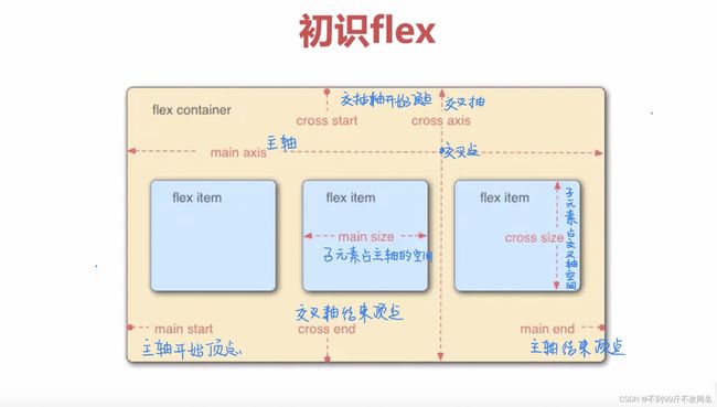
flex
flexibleBox即弹性盒子,用来进行弹性布局,配合rem处理尺寸的适配问题,任何容器都可指定为flex布局,在一些场合可以与block+定位的方式配合,增加灵活性。
以主元素的排列方式为基准,分为主轴和交叉轴,
盒子中元素横向排列时x轴为主轴,y轴为交叉轴;纵向排列时相反。
四个顶点分别为主轴/交叉轴的开始顶点,结束顶点
以下以横向图为例
flex-direction
决定子元素在父元素盒子中的排列方式,决定主轴是x轴还是y轴
| 属性值 | 作用 |
|---|---|
| row | 默认值。从左到右水平显示 |
| row-reverse | 与row相同,但以相反顺序 |
| column | 垂直显示,按从上到下的顺序 |
| column-reverse | 与column相同,但以相反的顺序 |
  <div id="div0">
    <div>1div>
    <div>2div>
    <div>3div>
    <div>4div>
  div>
#div0 {
  width:500px;
  background-color: rgb(12, 208, 243);
  display: flex;
  flex-direction: column-reverse;
  /* 设置div0为弹性盒子 */
}

#div0 div{
  width: 100px;
  height: 100px;
  background-color: rgb(178, 253, 39);
}
flex-wrap
决定子元素在父元素中是否换行
| 属性值 | 作用 |
|---|---|
| nowrap | 默认值。不换行或不换列 |
| wrap | 换行或换列 |
| wrap | 换行或换列,但以相反的顺序 |
flex-flow
flex-direction 和 flex-wrap属性的简写形式
语法:flex-flow:< flex-direction > || < flex-wrap >
flex-flow: row wrap-reverse;
justify-content
存在剩余空间时,剩余空间调整为间距的间距设置方式
| 属性值 | 作用 |
|---|---|
| flex-start | 默认值。从左到右,挨着行的开头 |
| flex-end | 从右到左,挨着行的结尾 |
| center | 居中显示 |
| space-between | 平均分布在该行上,两边不留间隔空间 |
| space-around | 平均分布在该行上,两边留有一半的间隔空间 |
#div0 {
  /* 设置宽度为超过三个,但不足四个的情况 */
  width:380px;
  background-color: rgb(12, 208, 243);
   /* 设置div0为弹性盒子 */
  display: flex;
  /* flex-direction: row; */
  flex-flow: row wrap-reverse;
  justify-content:space-around;
}
align-items
设置每个flex属性在交叉轴上的默认对齐方式
交叉轴是区别主轴那条轴
align-items处理单行是指把每一行当成一个独立的个体
| 属性值 | 作用 |
|---|---|
| stretch | 默认值。自适应 |
| flex-start | 位于容器的开头 |
| flex-end | 位容器的结尾 |
| center | 居中显示 |
#div0 {
  width:400px;
  /* 设置高度,这样才能显示交叉轴的排列情况 */
  height:400px;
  background-color: rgb(12, 208, 243);
   /* 设置div0为弹性盒子 */
  display: flex;
  /* row即主轴设置为x轴 */
  flex-flow: row wrap;
  justify-content:space-around;
  align-items:center;
}
align-content
设置每个flex元素在交叉轴上的默认对齐方式,
与align-items不同的是,align-content处理多行,是把多行里的内容当成一个整体处理
| 属性值 | 作用 |
|---|---|
| flex-start | 位于容器的开头 |
| flex-end | 位于容器的结尾 |
| center | 位于容器的中心 |
| space-between | 之间留有空白 |
| space-around | 两端都留有空白 |
其他属性,对子元素设置
| 属性值 | 作用 |
|---|---|
| flex-basis | 设置弹性盒子基准值 |
| flex-grow | 设置弹性盒子的扩展比率 |
| flex-shrink | 设置弹性盒子的缩小比率 |
| flex | flex-grow、flex-shrink、flex-basis的缩写(顺序:扩大,缩小,基准值) |
基准值是指相对于主轴占的宽度,设置了flex-basis后,width将失效
flex-basis:33%;
#div0 div:nth-child(1){
  flex-basis:50px;
  flex-grow:1;
}
#div0 div:nth-child(2){
  flex-basis:100px;
  flex-grow:4;
}
把剩余元素分成三份,第一个子div拓展2份,第二个子div拓展1份
假设父元素400px
400-50-100 = 250
250/5 = 50
第一个子div:50+501 =100
第二个子div:100+504 = 300
flex-shrink是子元素太大时的缩小比率,和flex-grow相反
/* 假设父元素是400px
400-600 = 200
200/4 = 50
300-1*50 = 250
300-3*50 = 150
*/
#div0 div:nth-child(1){
  flex-basis:300px;
  flex-grow:1;
  flex-shrink:1;
}
#div0 div:nth-child(2){
  flex-basis:300px;
  flex-grow:4;
  flex-shrink:3;
}
简写方式
flex:flex-grow flex-shrink flex-basis(顺序:扩大,缩小,基准值)|
#div0 div:nth-child(1){
  /* flex-basis:300px;
  flex-grow:1;
  flex-shrink:1; */
  flex:1 1 300px;
}
给子元素设置伸缩的特殊写法
| 属性 | 作用 |
|---|---|
| flex:auto; | flex:1 1 auto |
| flex:none; | flex 0 0 auto |
| flex:0%; | flex:1 1 0% |
| flex:100px; | flex:1 1 100px |
| flex:1; | flex:1 1 0%; |
rem的使用方法
rem是一个度量单位,尺寸以根元素的字体大小作为依据
html{
  font-size: 10px;
}

div{
  font-size: 1rem;
}
与em的区别:
rem相对于根字体,r为route
em相对于父一级字体,父一级可能有多个,父一级字体可能是自己设计,也可能是级联继承。
使用js获取屏幕宽度更改字体尺寸
var c = () => {
  let w = document.documentElement.clientWidth;//获取屏幕宽度
  let n = (20 * (w / 320) > 40 ? 40 +"px":(20 * (w / 320) + "px"));
  //以苹果尺寸320px为标准,可自行更改,假设基准大小是20
  document.documentElement.style.fontSize = n;
}
//初始化效果
window.addEventListener("load",c);
//屏幕尺寸发生改变后
window.addEventListener("resize",c);
自适应布局
两个特点:不同设备对应不同的html文件;局部自适应
使用js判断是什么设备,再转到不同html文件中
var redirect = () => {
    //获取设备信息
    let userAgent = navigator.userAgent.toLowerCase();
    //正则表达式判断设备类型
    let device = /ipad|iphone|midp|rv:1.2.3.4|ucweb|android|windows ce|windows mobile/;
    if(device.test(userAgent)){
      //跳转移动端设备
      window.location.href = "move.html";
    }else {
      //跳转pc端设备
      window.location.href = "pc.html";
    }
  }
  redirect();
局部自适应配合媒体查询
<div id="div0">
    <div>div>
    <div>div>
    <div>div>
  div>
#div0{
      display:flex;
    }
    #div0 div:first-child{
      height: 50px;
      background-color: rgb(229, 233, 29);
      flex:0 0 50px;
    }
    #div0 div:nth-child(2){
      background-color: rgb(243, 8, 8);
      flex:1 1 auto;
    }
    #div0 div:nth-child(3){
      flex:0 0 50px;
      background-color: rgb(202, 247, 4);
    }
    @media (min-device-width:400px) and (max-device-width:500px){
      #div0 div:nth-child(2){
        background-color: rgb(14, 232, 240);
      }
    }
    @media (min-device-width:501px) and (max-device-width:700px){
      #div0 div:nth-child(2){
        background-color: rgb(162, 8, 252);
      }
    }
响应式布局
布局特点:确保一个页面在所有终端上,都能显示出令人满意的效果
主要是css的代码编写
设计思路:使用%或者rem为单位
rem弹性布局
为了保证在各种屏幕上的不失真,就要根据实际屏幕宽度做等比例换算