【5万字】详解 Plotly Express 可视化
目录
- 一、 环境与数据准备
-
- 1.1 环境准备
- 1.2 数据准备
- 二、 线形图(Line)
-
- 2.1 单条曲线
- 2.2 多条曲线绘制
- 2.3 分列绘制曲线
- 三、面积图(Area)
- 四、散点图(Scatter)
-
- 4.1 密集数据散点图
- 4.2 全球多个国家
- 4.3 散点矩阵图
- 五、饼图(Pie)
-
- 5.1 饼图(Pie)
- 5.2 环形图
- 六、柱状图(Bar)
-
- 6.1 垂直柱状图
- 6.2 水平柱状图
- 6.3 对数坐标
- 6.4 堆积柱状图
- 6.5 分组的柱状图
- 6.6 样式形状
- 七、箱形图(Box)
-
- 7.1 垂直箱形图
- 7.2 水平箱形图
- 八、小提琴图(Violin)
-
- 8.1 小提琴图
- 8.2 显示箱体的小提琴图
- 8.3 显示箱体及分位数值的小提琴图
- 8.4 水平的小提琴图
- 九、密度图
- 十、 联合分布图(Marginal)
-
- 10.1 联合分布图(Marginal):使用小提琴图和箱形图
- 10.2 联合分布图(Marginal):使用小提琴图和直方图
- 十一、 直方图(Histogram)
-
- 11.1 直方图(Histogram)
- 11.2 直方图(Histogram):设置纵轴数据分布的展现方式
- 11.3 直方图(Histogram):对多个对象进行可视化
- 十二、 漏斗图(Funnel)
-
- 12.1 漏斗图(Funnel)
- 12.2 面积漏斗图
- 十三、平行坐标图(Parallel)
-
- 13.1 数据分类的平行坐标图(Parallel)
- 13.1 数据流向的平行坐标图(Parallel)
- 十四、密度图(Density)
- 十五、极坐标图(Polar)
-
- 15.1 极坐标柱状图
- 15.2 极坐标散点图
- 十六、雷达图
- 十七、图片显示(Imshow)
- 十八、热力图
-
- 18.1 热力图
- 18.2 密度热力图
- 十九、旭日图(Sunburst)
-
- 19.1 旭日图(Sunburst)
- 19.2 旭日图(Sunburst) 不同的交互显示方式
- 二十、甘特图(Timeline)
-
- 20.1 甘特图(Timeline)
- 20.2 甘特图(Timeline):颜色分组
- 20.3 甘特图(Timeline):数值型因素(比如完成进度比例),设置颜色分组
- 二十一、树形图(Treemap)
-
- 21.1 树形图(Treemap):离散颜色
- 21.2 树形图(Treemap):连续颜色
- 二十二、冰柱图 (icicle)
- 二十三、三维散点图(Scatter 3D)
- 二十四、地图(Map)
- 二十五、Plotly 生态系统的一部分
- 附记:全部代码

我是阳哥的搬运工,从PDF到网页,从 junpyter notebook 到 VS Code,
更多精彩内容请扫描上方二维码,关注阳哥的“Python数据之道”或者阳哥的网站:http://liyangbit.com/添加链接描述。

Plotly Express 是 Python 交互式可视化库 Plotly 的高级组件,受 Seaborn 和 ggplot2 的启发,它专门设计为具有简洁,一致且易于学习的 API :只需一次导入,您就可以在一个函数调用中创建丰富的交互式绘图,包括分面绘图(faceting)、地图、动画和趋势线等。
使用 Plotly Express 可以轻松地进行数据可视化,一旦导入 Plotly Express(通常简称px),大多数绘图只需要一个函数调用,接受一个整洁的 Pandas dataframe,并简单描述你想要制作的图。如果你想要一个基本的散点图,它只是px.scatter(dataframe,x =“column_name”,y =“column_name”)。
Plotly Express 语法简洁,同时功能强大,可以绘制咱们遇到的大部分图表类型,比如线形图、散点图、柱状图、面积图、树形图、旭日图、甘特图等,本文将从如下 20 个方面,详细介绍 Plotly Express 的使用,看完内容介绍后,相应你也会喜欢上这个工具的。

一、 环境与数据准备
1.1 环境准备
现在 Plotly Express 不需要单独安装,它是包含在 Plotly 中的,用pip install plotly命令可以安装Plotly。
pip install -i https://pypi.tuna.tsinghua.edu.cn/simple pandas
pip install -i https://pypi.tuna.tsinghua.edu.cn/simple plotly
pip install -i https://pypi.tuna.tsinghua.edu.cn/simple kaleido	# 保存图片
pip install -i https://pypi.tuna.tsinghua.edu.cn/simple mkl
pip install -i https://pypi.tuna.tsinghua.edu.cn/simple  scikit_image # 加载图片
如果你用的是 Anaconda,也可以用conda install plotly命令来安装,然后导入。本文中,还用到 Pandas 等工具,完整的导入如下:
import plotly.express as px
import plotly.io as pio
import plotly.graph_objects as go
import pandas as pd

# pd.set_option('display.max_rows', None)		#显示所有行
pd.set_option('display.max_columns', None) 	#显示所有列
pd.set_option('max_colwidth', None)			# 显示列中单独元素的最大长度
pd.set_option('expand_frame_repr',False) 	# True表示列可以换行显示。设置成False的时候不允许换行显示;
pd.set_option('display.width', 80) 			#横向最多显示多少个字符;
本文代码测试的时候,使用的环境如下:
Windows10 系统
VS Code: V1.58.2
Python: v3.9
Plotly: V5.1.0
Pandas: V1.3.1

1.2 数据准备
本文涉及的图形种类比较多,先介绍下covid-19相关的数据。我们需要读取并整理出需要的 DataFrame,以便在后续可视化时使用。分为三个小的步骤:
(a) 读取数据及调整格式
print(os.getcwd())  # E:\python_study\env_study

# 读取数据及调整格式
data = pd.read_csv('./data/covid-19.csv',parse_dates=['date'],index_col=0)
# 将数据复制一份
df_all = data.copy()
# 将时间格式转为字符串格式的日期,以 YYYY-mm-dd 的形式保存
df_all['dates'] = df_all['date'].apply(lambda x:x.strftime('%Y-%m-%d'))
# 添加现存确诊列
df_all['current'] = df_all['confirmed'] - df_all['cured'] - df_all['dead']
df_all.fillna('', inplace=True)
print(df_all.info())
print(df_all)

(b) 获取全球的数据
# 国内总计数量
df_cn = df_all.query("country=='中国' and province==''")
df_cn = df_cn.sort_values('date',ascending=False)
# 国外,按国家统计
df_oversea = df_all.query("country!='中国'")
df_oversea = df_oversea.fillna(value="")
df_oversea = df_oversea.sort_values('date',ascending=False)
df_global =	df_cn.append(df_oversea)
df_global =	df_global.sort_values(['country','date'])
print(df_global	)

© 更新全球的数据
countries_all = list(df_global['country'].unique())
df_global_new = pd.DataFrame()
for item in countries_all:
    df_item = df_global.query('country==@item')
    df_i = df_item.copy(deep=False)
    df_i['new-confirmed'] = df_i['confirmed'].diff()
    df_i['new-cured'] = df_i['cured'].diff()
    df_global_new = df_global_new.append(df_i)

df_global_new = df_global_new.dropna()
print(df_global_new)

这两个 DataFrame:df_global和df_global_new我们会在后续可视化时多次用到。
二、 线形图(Line)
线形图是所有可视化工具中最常见的图表之一,在 px 中,用px.line()来进行可视化。
2.1 单条曲线
# 2.1 单条曲线
def plot_line():
    df = df_global.groupby('date')[['confirmed','current','cured','dead']].sum()
    df['new-confirmed'] = df['confirmed'].diff()
    df = df.dropna()
    df = df.sort_index().loc['20200122':,:]
    fig = px.line(df,x=df.index,y='confirmed')
    return fig

fig = plot_line()
# 保存为图片
fig.write_image('./images/px/01-line-1.png')
# jupyter notebook中显示
fig.show()
# 默认浏览器中显示
plotly.offline.plot(fig)
代码函数说明:
需要说明的是,在最简洁的情况下,绘制线形图只需要用px.line(df,x =“column_name”,y =“ column_name”)来绘制即可,比如上面示例中的px.line(df,x=df.index,y=‘confirmed’)
由于本文涉及可视化图表比较多,需要调整的 DataFrame 也比较多,因此,一般以自定义函数的形式进行封装,这样显得逻辑要清楚些。
实际上,Plotly Express 默认的可视化,一般就是一行代码,这点咱们需要在脑海里有个印象。
plotly可以以三种方式展示绘图效果:
-
jupyter notebook展示,有交互效果

-
保存的静态图片,没有交互效果。

-
浏览器中显示有交互效果。

2.2 多条曲线绘制
# 2.2 多条曲线绘制
"""在 Plotly v4.8 版本以后,支持同时绘制多条曲线,其语法格式为px.line(df,x =“column_name”,y =[“column_name_1”,“column_name_2”,“column_name_3”,⋯⋯])"""
def plot_line_multi():
    df = df_global.groupby('date')[['confirmed','current','cured','dead']].sum ()
    df['new-confirmed'] = df['confirmed'].diff()
    df = df.dropna()
    df = df.sort_index().loc['20200122':,:]
    fig = px.line(df,x=df.index,y=['confirmed','current','dead'])
    return fig

fig = plot_line_multi()
fig.write_image('./images/px/01-line-2.png')
# fig.show()

2.3 分列绘制曲线
# 2.3 分列绘制曲线
"""Plotly Express 支持绘制分列或行的曲线图,通过设置参数facet_row或facet_col来实现"""
def plot_line_facet():
    df = df_global_new.set_index('date').loc['20201204':'20201208',:]
    countries_list = ['美国','印度','俄罗斯','巴西','法国']
    df = df[df['country'].isin(countries_list)]
    fig = px.line(
                df,
                x=df.index,
                y='new-confirmed',
                color='country',
                line_group='country',
                facet_col='country',
                )
    fig.update_traces(mode='markers+lines')
    return fig
fig = plot_line_facet()
fig.write_image('./images/px/01-line-3.png')
# fig.show()

在 Plotly Express 中,不止px.line()支持参数facet_row或facet_col,还有其他一些图形也是支持的,比如散点图、柱状图等,可以查看源码中是否包含facet_row=None和facet_col=None。

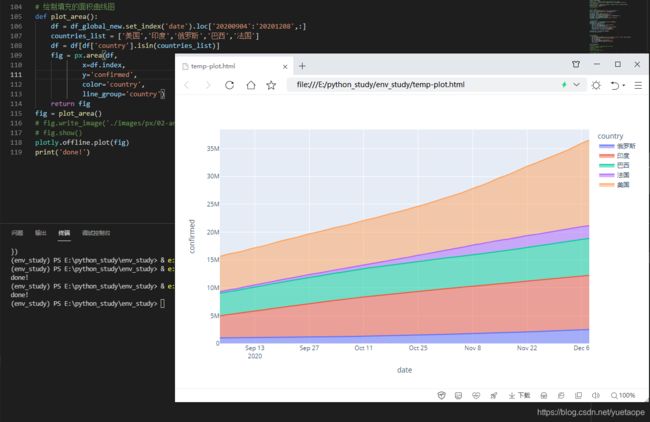
三、面积图(Area)
面积图,跟线形图有点类似,曲线下带阴影面积,因此称之为面积图。Plotly Express 中通过px.area()来实现。
# 绘制填充的面积曲线图
def plot_area():
    df = df_global_new.set_index('date').loc['20200904':'20201208',:]
    countries_list = ['美国','印度','俄罗斯','巴西','法国']
    df = df[df['country'].isin(countries_list)]
    fig = px.area(df,
            x=df.index,
            y='confirmed',
            color='country',
            line_group='country')
    return fig
fig = plot_area()
# fig.write_image('./images/px/02-area-1.png')
# fig.show()
plotly.offline.plot(fig)
四、散点图(Scatter)
4.1 密集数据散点图
# 散点图(Scatter)
"""散点图,也是咱们常用的图形之一,Plotly Express 中通过px.scatter()来实现"""
def plot_scatter_line():
    df = df_global.groupby('date')[['confirmed','current','cured','dead']].sum()
    df['new-confirmed'] = df['confirmed'].diff()
    df = df.dropna()
    df = df.sort_index().loc['20200122':,:]
    fig = px.scatter(df,x='confirmed',y='dead')
    return fig
fig = plot_scatter_line()
fig.write_image('./images/px/03-sactter-1.png')
# fig.show()
plotly.offline.plot(fig)

上面这张图,初看起来,跟线形图有点类似,实际它是散点图,只是点比较密集,局部放大后。

4.2 全球多个国家
# 对全球多个国家的数据进行可视化后,散点分布就明显了:
def plot_scatter():
    df = df_global_new.set_index('date').loc['20201208':'20201208']
    df = df.sort_values('confirmed',ascending=False).head(30)
    fig = px.scatter(df,
            x='confirmed',
            y='dead',
            color='country',
            size='confirmed'
            )
    return fig

fig = plot_scatter()
fig.write_image('./images/px/03-sactter-2.png')
# fig.show()
plotly.offline.plot(fig)
对全球多个国家的数据进行可视化后,散点分布就明显了:

4.3 散点矩阵图
# 散点矩阵图在 Plotly Express 中,针对散点矩阵图,专门有一个 API 来实现px.scatter_matrix():
def plot_scatter_matrix():
    df = df_global_new.set_index('date').loc['20201208':'20201208']
    df = df.sort_values('confirmed',ascending=False).head(30)
    fig = px.scatter_matrix(df,
                dimensions=['confirmed','cured','dead'],
                color='country',
                size='confirmed'
                )
    return fig

fig = plot_scatter_matrix()
fig.write_image('./images/px/03-sactter-3.png')
# fig.show()
plotly.offline.plot(fig)

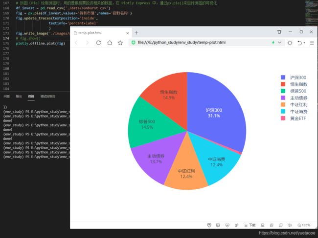
五、饼图(Pie)
5.1 饼图(Pie)
# 饼图(Pie)绘制饼图时,用的是跟股票投资相关的数据,在 Plotly Express 中,通过px.pie()来进行饼图的可视化
df_invest = pd.read_csv('./data/sunburst.csv')
fig = px.pie(df_invest,values='持有市值',names='指数名称')
fig.update_traces(textposition='inside',
                textinfo='percent+label'
                )
fig.write_image('./images/px/04-pie-1.png')
# fig.show()
plotly.offline.plot(fig)
5.2 环形图
# 环形图 通过设置参数hole,还可以将饼图变为环形图
fig = px.pie(df_invest,
            values='持有市值',
            names='指数名称',
            hole=0.6
            )
fig.update_traces(textposition='inside',
            textinfo='percent+label'
            )
fig.write_image('./images/px/04-pie-2.png')
# fig.show()
plotly.offline.plot(fig)

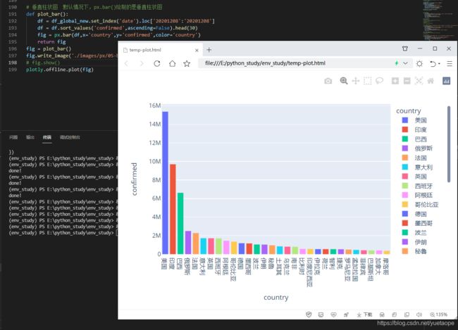
六、柱状图(Bar)
柱状图,是数据可视化中必不可少的基础图形,在 Plotly Express 中,通过px.bar()来实现。
6.1 垂直柱状图
# 垂直柱状图  默认情况下,px.bar()绘制的是垂直柱状图
def plot_bar():
    df = df_global_new.set_index('date').loc['20201208':'20201208']
    df = df.sort_values('confirmed',ascending=False).head(30)
    fig = px.bar(df,
            x='country',
            y='confirmed',
            color='country')
    return fig
fig = plot_bar()
fig.write_image('./images/px/05-bar-1.png')
# fig.show()
plotly.offline.plot(fig)
6.2 水平柱状图
# 水平柱状图  通过设置参数orientation的值,可以绘制水平柱状图
def plot_bar_h():
    df = df_global_new.set_index('date').loc['20201208':'20201208']
    df = df.sort_values('confirmed',ascending=False).head(30)
    fig = px.bar(df,
                x='confirmed',
                y='country',
                color='country',
                orientation='h'
                )
    return fig
fig = plot_bar_h()
fig.write_image('./images/px/05-bar-2.png')
# fig.show()
plotly.offline.plot(fig)

6.3 对数坐标
# 对数坐标  上面的水平柱状图,由于最大的数值和最小的数值差异比较大,用数据绝对值进行可视化时,图表的展示效果可能不是太好,这个时候,可以考虑用对数坐标来展示,通过设置参数log_x或log_y来实现
def plot_bar_log():
    df = df_global_new.set_index('date').loc['20201208':'20201208']
    df = df.sort_values('confirmed',ascending=False).head(30)
    fig = px.bar(df,
            x='confirmed',
            y='country',
            color='country',
            orientation='h',
            log_x=True # log_x 对数坐标
            )
    return fig
fig = plot_bar_log()
fig.write_image('./images/px/05-bar-3.png')
# fig.show()
plotly.offline.plot(fig)

6.4 堆积柱状图
# 堆积柱状图 柱状图的展现方式:当同一系列中有不同的类型时,绘制柱状图的时候,通常有堆积和分组两种展示形式,默认情况下,是堆积柱状图
def plot_bar_stack():
    df = df_global_new.set_index('date').loc['20201201':'20201208',:]
    countries_list = ['美国','印度','俄罗斯','巴西','法国']
    df = df[df['country'].isin(countries_list)]
    fig = px.bar(df,
            x=df.index,
            y='confirmed',
            color='country'
            )
    return fig
fig = plot_bar_stack()
fig.write_image('./images/px/05-bar-4.png')
# fig.show()
plotly.offline.plot(fig)

6.5 分组的柱状图
# 分组的柱状图  通过设置参数barmode="group"可以转变为分组的柱状图
def plot_bar_group():
    df = df_global_new.set_index('date').loc['20201201':'20201208',:]
    countries_list = ['美国','印度','俄罗斯','巴西','法国']
    df = df[df['country'].isin(countries_list)]
    fig = px.bar(df,
                x=df.index,
                y='confirmed',
                color='country',
                barmode='group'
                )
    return fig

fig = plot_bar_group()
fig.write_image('./images/px/05-bar-6.png')
# fig.show()
plotly.offline.plot(fig)

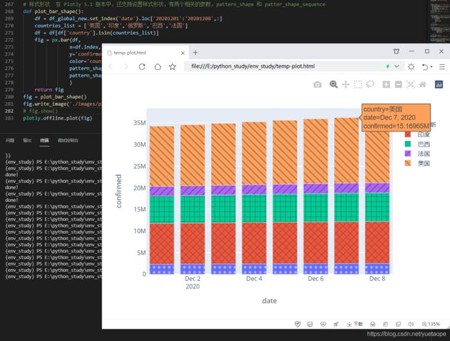
6.6 样式形状
# 样式形状  在 Plotly 5.1 版本中,还支持设置样式形状,有两个相关的参数,pattern_shape 和 patter_shape_sequence
def plot_bar_shape():
    df = df_global_new.set_index('date').loc['20201201':'20201208',:]
    countries_list = ['美国','印度','俄罗斯','巴西','法国']
    df = df[df['country'].isin(countries_list)]
    fig = px.bar(df,
                x=df.index,
                y='confirmed',
                color='country',
                pattern_shape="country",
                pattern_shape_sequence=[".", "x", "+",'/','\\'],
                )
    return fig
fig = plot_bar_shape()
fig.write_image('./images/px/05-bar-5.png')
# fig.show()
plotly.offline.plot(fig)
七、箱形图(Box)
又称为盒须图、盒式图或箱线图,是一种用作显示一组数据分散情况资料的统计图,因形状如箱子而得名。
它能显示出一组数据的最大值、最小值、中位数、及上下四分位数。
在股票以及指数基金投资时,喜欢用箱形图来对标的的估值分布情况进行可视化,效果如下:

7.1 垂直箱形图
# 垂直箱形图(Box)  针对 ETF 的累计净值数据绘制箱形图,通过px.box()来实现,
df3 = pd.read_csv('./data/data_etf.csv', parse_dates=['净值日期'])
df3['code'] = df3['code'].astype(str)
fig = px.box(df3,
            x='code',
            y='累计净值',
            color='code'
            )
fig.write_image('./images/px/06-box-1.png')
# fig.show()
plotly.offline.plot(fig)

7.2 水平箱形图
# 水平箱形图 通过设置参数orientation的值
fig = px.box(df3,
        x='累计净值',
        y='code',color='code',
        orientation='h')
fig.write_image('./images/px/06-box-3.png')
# fig.show()
plotly.offline.plot(fig)

八、小提琴图(Violin)
小提琴图 (Violin Plot) 是用来展示多组数据的分布状态以及概率密度。这种图表结合了箱形图和密度图的特征,主要用来显示数据的分布形状。跟箱形图类似,但是在密度层面展示更好。在数据量非常大不方便一个一个展示的时候小提琴图特别适用。Plotly Express 中通过px.violin()来实现。
8.1 小提琴图
# 小提琴图(Violin)
fig = px.violin(df3,
        x='code',
        y='累计净值',
        color='code')
fig.write_image('./images/px/07-violin-1.png')
# fig.show()
plotly.offline.plot(fig)
8.2 显示箱体的小提琴图
# 显示箱体的小提琴图  可以通过设置参数box=True来显示箱体
fig = px.violin(df3,
        x='code',
        y='累计净值',
        color='code',
        box=True)
fig.write_image('./images/px/07-violin-2.png')
# fig.show()
plotly.offline.plot(fig)

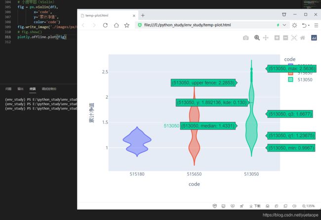
8.3 显示箱体及分位数值的小提琴图
# 显示箱体及分位数值的小提琴图   通过设置参数points='all',可以在小提琴图旁边展示数据的密度分布情况
fig = px.violin(df3,
        x='code',
        y='累计净值',
        color='code',
        box=True,
        points='all')
fig.write_image('./images/px/07-violin-3.png')
# fig.show()
plotly.offline.plot(fig)

8.4 水平的小提琴图
# 水平的小提琴图,通过设置参数orientation='h'
fig = px.violin(df3,
            x='累计净值',
            y='code',
            color='code',
            box=True,
            points='all',
            orientation='h'
            )
fig.write_image('./images/px/07-violin-4.png')
# fig.show()
plotly.offline.plot(fig)

九、密度图
# 密度图
fig = px.strip(df3,
        y='code',
        x='累计净值')
fig.write_image('./images/px/07-violin-5.png')
# fig.show()
plotly.offline.plot(fig)

十、 联合分布图(Marginal)
还可以创建联合分布图(marginal rugs),使用直方图,箱形图(box)或小提琴来显示双变量分布,也可以添加趋势线。Plotly Express 甚至可以帮助你在悬停框中添加线条公式和 R² 值!它使用 statsmodels 进行普通最小二乘(OLS)回归或局部加权散点图平滑(LOWESS)。
10.1 联合分布图(Marginal):使用小提琴图和箱形图
# 联合分布图(Marginal):使用小提琴图和箱形图
def plot_marginal():
    df = df_global_new.query('country=="美国" or country=="印度"')
    fig = px.scatter(df,x='new-confirmed',y='new-cured',
    color='country',
    size='confirmed',
    trendline='ols',
    marginal_x='violin',
    marginal_y= 'box'
    )
    return fig

fig = plot_marginal()
fig.write_image('./images/px/08-marginal-1.png')
# fig.show()
plotly.offline.plot(fig)

10.2 联合分布图(Marginal):使用小提琴图和直方图
# 联合分布图(Marginal):使用小提琴图和直方图
def plot_marginal_hist():
    df = df_global_new.query('country=="美国" or country=="印度"')
    fig = px.scatter(df,
                x='new-confirmed',
                y='new-cured',
                color='country',
                size='confirmed',
                trendline='ols',
                marginal_x='violin',
                marginal_y= 'histogram'
                )
    return fig

fig = plot_marginal_hist()
fig.write_image('./images/px/08-marginal-2.png')
# fig.show()
plotly.offline.plot(fig)

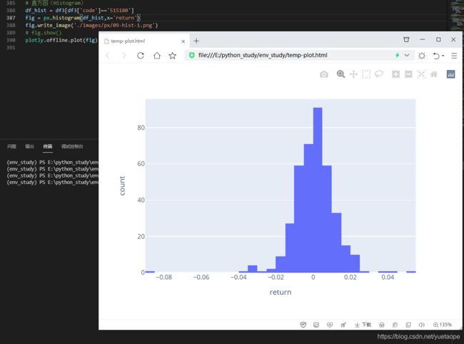
十一、 直方图(Histogram)
直方图 (Histogram),又称质量分布图,是一种统计报告图,由一系列高度不等的纵向条纹或线段表示数据分布的情况。一般用横轴表示数据类型,纵轴表示分布情况。在 Plotly Express 中,通过px.histogram()来实现。默认情况下,纵轴以计数形式(count)表示数据分布情况。
11.1 直方图(Histogram)
# 直方图(Histogram)
df_hist = df3[df3['code']=='515180']
fig = px.histogram(df_hist,x='return')
fig.write_image('./images/px/09-hist-1.png')
# fig.show()
plotly.offline.plot(fig)
11.2 直方图(Histogram):设置纵轴数据分布的展现方式
`# 直方图(Histogram):设置纵轴数据分布的展现方式,通过参数histnorm设置,其值可以是'percent', 'probability', 'density', 或'probability density'
# 纵轴为百分比的示例
fig = px.histogram(df_hist,x='return',histnorm='percent')
fig.write_image('./images/px/09-hist-2.png')
# fig.show()
plotly.offline.plot(fig)`

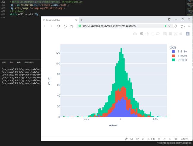
11.3 直方图(Histogram):对多个对象进行可视化
# 直方图(Histogram):对多个对象进行可视化,通过设置参数color
fig = px.histogram(df3,x='return',color='code')
fig.write_image('./images/px/09-hist-3.png')
# fig.show()
plotly.offline.plot(fig)
十二、 漏斗图(Funnel)
漏斗图是一种形如漏斗状的明晰展示事件和项目环节的图形。漏斗图由横行或竖形条状形状一层层拼接而成,分别
组成按一定顺序排列的阶段层级。每一层都用于表示不同的阶段,从而呈现出这些阶段之间的某项要素/指标递减的趋势。
漏斗图在常常应用于各行业的管理。
网站转化率是指用户通过网站进行了相应目标行动的访问次数与总访问次数的比率,相应的行动可以是用户注册、用户参与、用户购买等一系列用户行为,而漏斗图是最能表示网站转化率的图表。
12.1 漏斗图(Funnel)
# 漏斗图(Funnel)
data = dict(
    number=[10000, 7000, 4000, 2000, 1000],
    stage=["浏览次数", "关注数量", "下载数量", "咨询数量", "成交数量"])
fig = px.funnel(data,
            x='number',
            y='stage')
fig.write_image('./images/px/10-funnel-1.png')
# fig.show()
plotly.offline.plot(fig)

12.2 面积漏斗图
# 面积漏斗图,通过px.funnel_area()来实现
fig = px.funnel_area(
    names=["第一阶段", "第二阶段", "第三阶段", "第四阶段", "第五阶段"],
    values=[10000, 7000, 4000, 2000, 1000])
fig.write_image('./images/px/10-funnel-2.png')
# fig.show()
plotly.offline.plot(fig)

十三、平行坐标图(Parallel)
平行坐标图 (parallel coordinate plot) 是可视化高维多元数据的一种常用方法,为了显示多维空间中的一组对象,绘制由多条平行且等距分布的轴,并将多维空间中的对象表示为在平行轴上具有顶点的折线。顶点在每一个轴上的位置就对应了该对象在该维度上的中的变量数值。
平行坐标图可以方便的展示数据标签分类或者数据流向。数据标签分类的示例如下:
13.1 数据分类的平行坐标图(Parallel)
# 平行坐标图(Parallel)
def plot_para():
    df = df_global_new.set_index('date').loc['20201125':'20201208',:]
    countries_list = ['美国','印度','俄罗斯','巴西','法国']
    n = len(countries_list)
    countries_dict = {countries_list[x]:n-x for x in range(n)}
    # countries_dict = {'美国': 5, '印度': 4, '俄罗斯': 3, '巴西': 2, '法国':1}
    df = df[df['country'].isin(countries_list)]
    df = df.reset_index()
    df = df[['country','confirmed','current','cured','dead']]
    df['country_id'] = df['country'].apply(lambda x: countries_dict[x])
    # print(df)
    fig = px.parallel_coordinates(df,
            color='country_id',
            labels={"country_id":"Country",
                    "confirmed": "confirmed",
                    "current": "current",
                    "cured": "cured",
                    "dead": "dead", },
            color_continuous_scale=px.colors.diverging.Tealrose,
            color_continuous_midpoint=3
            )
    return fig

fig = plot_para()
fig.write_image('./images/px/11-para-1.png')
# fig.show()
plotly.offline.plot(fig)
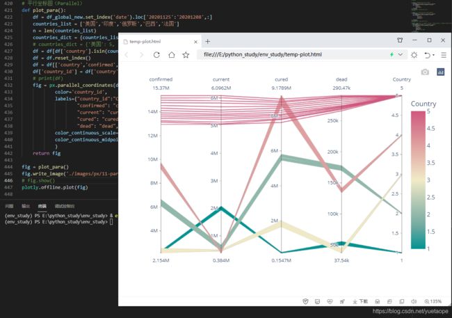
上图展示的是 5 个国家的疫情数据特征分布,展示不同国家(国家以 1、2、3、4、5 代表)在累计确诊人数、现存确诊人数、累计治愈人数、累计死亡人数的分布情况。
13.1 数据流向的平行坐标图(Parallel)
上面的平行坐标图适合对数据分类进行可视化,还有一类平行坐标图,适合对数据流向进行可视化,有点类似桑基图,不过展现形式稍微有点区别。在 Plotly Express 中,通过px.parallel_categories()来实现。
下面以投资数据为例,来进行演示:
# 数据流向的平行坐标图(Parallel)
def plot_para_cat():
    df = df_invest.reindex(columns=['市场','指数名称','标的名称','持有市值'])
    fig = px.parallel_categories(df,
                color="持有市值",
                color_continuous_scale=px.colors.sequential.PuBu
                )
    return fig

fig = plot_para_cat()
fig.write_image('./images/px/11-para-2.png')
# fig.show()
plotly.offline.plot(fig)

从上面这个数据流向的平行坐标图,可以从市场、指数名称、标的名称等维度来对投资数据的情况进行分析。
十四、密度图(Density)
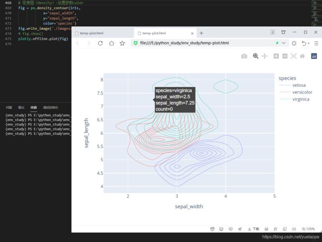
密度图表现与数据值对应的边界或域对象的一种理论图形表示方法,一般用于呈现连续变量。在 Plotly Express 中,通过px.density_contour()来实现。
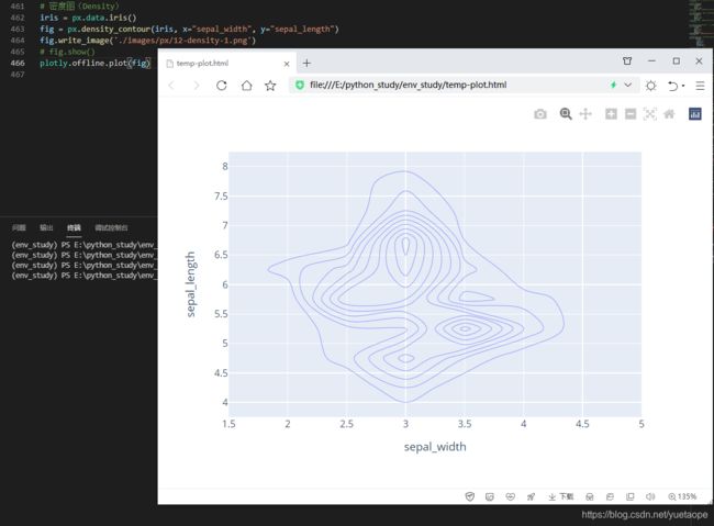
可以通过设置参数color来显示不同类别的颜色
# 密度图(Density):设置参数color
fig = px.density_contour(iris, x="sepal_width", y="sepal_length",color='species')
fig.write_image('./images/px/12-density-2.png')
# fig.show()
plotly.offline.plot(fig)
十五、极坐标图(Polar)
极坐标图可用来显示一段时间内的数据变化,或显示各项之间的比较情况。适用于枚举的数据,比如不同地域之间的数据比较。
15.1 极坐标柱状图
在极坐标下,以柱状图的形式对数据进行可视化,在 Plotly Express 中,通过px.bar_polar()来实现。
以疫情数据为例,对不同国家的数据演示如下:
# 极坐标柱状图  将累计确诊人数划分为不同的范围等级
def confirm_class(x):
    if x<=50000:
        y='1'
    elif 50000<x<=100000:
        y='2'
    elif 100000<x<=500000:
        y='3'
    elif 500000<x<=900000:
        y='4'
    elif 900000<x<=1200000:
        y='5'
    elif 1200000<x<=1700000:
        y='6'
    elif x>1700000:
        y='7'
    return y

countries_list	= ['法国','意大利','英国','西班牙','阿根廷','哥伦比亚','德国','墨西哥','波兰','伊朗','秘鲁','土耳其','乌克兰','南非']
df_global_top10_tmp = df_global_new[df_global_new['country'].isin( countries_list)]
# SettingWithCopyWarning
df_global_top10 = df_global_top10_tmp.copy(deep=False)
df_global_top10['gradient'] = df_global_top10['confirmed'].apply(confirm_class)
# df_global_top10
fig = px.bar_polar(df_global_top10,
            r="confirmed",
            theta="country", color="gradient",
            color_discrete_sequence= px.colors.sequential.Blugrn)
fig.write_image('./images/px/13-polar-2.png')
# fig.show()
plotly.offline.plot(fig)

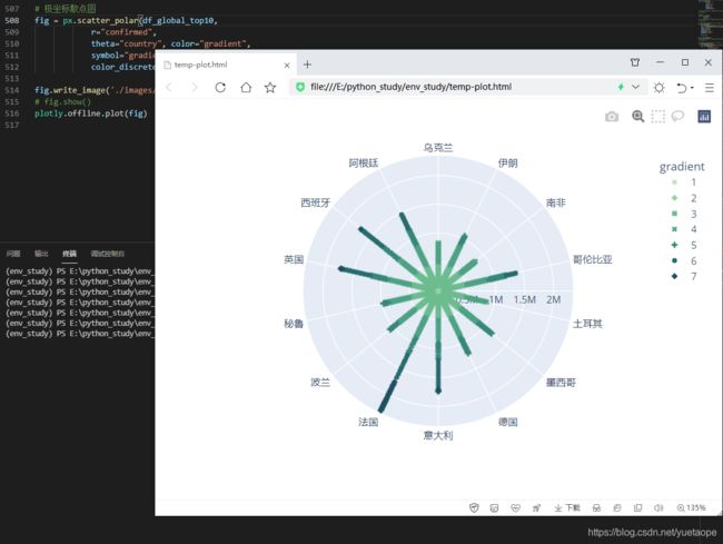
15.2 极坐标散点图
此外,在极坐标下,也可以使用散点图来对数据进行可视化,在PlotlyExpress中,通过px.scatter_polar() 来实现
# 极坐标散点图
fig = px.scatter_polar(df_global_top10,
            r="confirmed",
            theta="country", color="gradient",
            symbol="gradient",
            color_discrete_sequence=px.colors.sequential.Blugrn)

fig.write_image('./images/px/13-polar-3.png')
# fig.show()
plotly.offline.plot(fig)
十六、雷达图
在 Plotly Express 中,还支持极坐标线形图(实际上是雷达图),通过px.line_polar()来实现
# 雷达图
fig = px.line_polar(df_global_top10,
            r="confirmed",
            theta="country",
            color="gradient",
            line_close=True,
            color_discrete_sequence=px.colors.sequential.Blugrn)

fig.write_image('./images/px/13-polar-4.png')
# fig.show()
plotly.offline.plot(fig)

总觉得上面的雷达图,用于这个疫情数据时,没有太多实际意义。
不妨来看看官方的示例,对于风力强度,以及方位分布的可视化,显得更加形象和符合实际情况。
# 雷达图
df = px.data.wind()
fig = px.line_polar(df,
            r="frequency",
            theta="direction",
            color="strength",
            line_close=True,
            color_discrete_sequence=px.colors.sequential.Plasma_r)

fig.write_image('./images/px/13-polar-5.png')
# fig.show()
plotly.offline.plot(fig)

十七、图片显示(Imshow)
在 Plotly Express 中,还可通过px.imshow()来显示图片以及绘制热力图。
# 图片显示
from skimage import io
img = io.imread('./data/QR-PyDataLab.jpg')
fig = px.imshow(img)
fig.write_image('./images/px/14-imshow-1.png')
# fig.show()
plotly.offline.plot(fig)

如果不想图片中显示坐标轴中的数字,可以调整轴的参数设置来实现
# 图片显示  不显示坐标轴数字
fig = px.imshow(img)
fig.update_yaxes(
        #	title=None, # 不显示轴标题
        visible = False,
        #	showticklabels=True
        )

fig.update_xaxes(visible = False)
fig.write_image('./images/px/14-imshow-2.png')
# fig.show()
plotly.offline.plot(fig)

十八、热力图
此外,px.imshow()还可以用来绘制热力图。利用热力图可以看数据表里多个特征两两的相似度,在投资中,经
常会考察不同投资产品之间的相关性强弱情况,就可以用热力图来表示,效果如下:

以前文的数据,对三支不同的 ETF 之间的相关性用热力图来绘制
18.1 热力图
# 热力图
df_im = pd.pivot_table(df3,index=['净值日期'],columns=['code'],values=['累计净值'])
# 删除外层索引
df_im.columns = df_im.columns.droplevel()
# 隐藏列名称
df_im.columns.name = None
# 计算指数点位数值每日变化
returns = df_im.pct_change().dropna()
# 计算相关性
corr = returns.corr()

fig = px.imshow(corr,color_continuous_scale='PuBu')
fig.write_image('./images/px/14-imshow-3.png')
# fig.show()
plotly.offline.plot(fig)

18.2 密度热力图
# 密度热力图
df_hp = df_global_new.set_index('date').loc['20201208':'20201208']
countries_list = ['法国','意大利','英国','西班牙','阿根廷',
        '哥伦比亚','德国','墨西哥','波兰','伊朗',
        '秘鲁','土耳其','乌克兰','南非','比利时',
        '印度尼西亚','伊拉克','荷兰','智智利','捷克','罗马尼亚'
        ]

df_hp = df_hp[df_hp['country'].isin(countries_list)]
fig = px.density_heatmap(df_hp,
            x="confirmed",
            y="cured",
            nbinsx=20,
            nbinsy=20,
            color_continuous_scale="Blues")

fig.write_image('./images/px/14-imshow-4.png')
# fig.show()
plotly.offline.plot(fig)

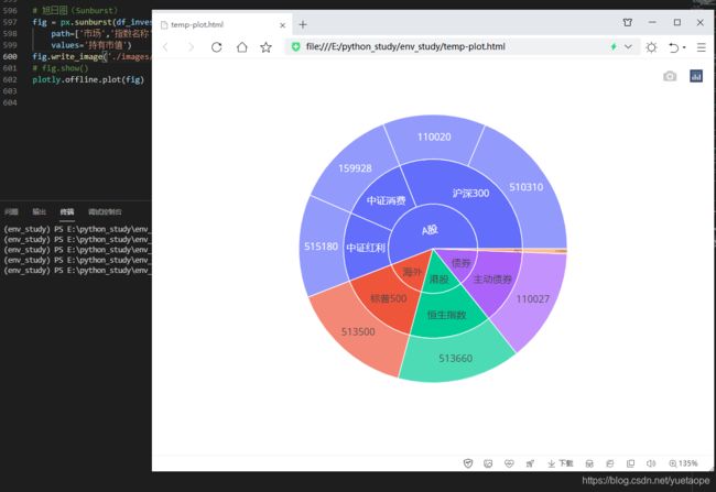
十九、旭日图(Sunburst)
旭日图(Sunburst Chart)是一种现代饼图,它超越传统的饼图和环图,能表达清晰的层级和归属关系,以父子层次结构来显示数据构成情况。旭日图中,离远点越近表示级别越高,相邻两层中,是内层包含外层的关系。
在实际项目中使用旭日图,可以更细分溯源分析数据,真正了解数据的具体构成。而且,旭日图不仅数据直观,而且图表用起来特别炫酷,分分钟拉高数据汇报的颜值!
19.1 旭日图(Sunburst)
# 旭日图(Sunburst)
fig = px.sunburst(df_invest,
    path=['市场','指数名称','标的名称'],
    values='持有市值')
fig.write_image('./images/px/15-sunburst-1.png')
# fig.show()
plotly.offline.plot(fig)
19.2 旭日图(Sunburst) 不同的交互显示方式
# 旭日图(Sunburst) 可以通过设置参数textinfo的值来控制不同的交互显示方式。
fig = px.sunburst(df_invest,
        path=['市场','指数名称','标的名称'],
        values='持有市值')
fig.update_traces(
    textinfo='label+percent entry'
# 'label+percent root',都是按照根节点来计算百分比,根节点为100%
# 'label+percent entry',根据当前位置来计算百分比,当前的最大节点为100%
# 'label+percent parent'当前最大节点占它的上一级节点的百分比不变,其他节点根据当前最大节点来计算百分比
)
fig.write_image('./images/px/15-sunburst-2.png')
# fig.show()
plotly.offline.plot(fig)`

二十、甘特图(Timeline)
在进行项目进度管理时,经常会用到甘特图,在 Plotly Express 中,,通过px.timeline()来实现进度可视化
20.1 甘特图(Timeline)
def plot_timeline():
    df = pd.DataFrame([
    dict(Task="项目1", Start='2021-02-01', Finish='2021-03-25',Manager='Lemon',Completion_pct=90),
    dict(Task="项目2", Start='2021-03-05', Finish='2021-04-15',Manager='Lee',Completion_pct=60),
    dict(Task="项目3", Start='2021-02-20', Finish='2021-05-30',Manager='Zhang',Completion_pct=70),
    dict(Task="项目4", Start='2021-04-20', Finish='2021-09-30',Manager='Lemon',Completion_pct=20),
    ])
    fig = px.timeline(df,
            x_start="Start",
            x_end="Finish",
            y="Task")
    fig.update_yaxes(autorange="reversed")
    return fig

fig = plot_timeline()
fig.write_image('./images/px/16-timeline-1.png')
# fig.show()
plotly.offline.plot(fig)

20.2 甘特图(Timeline):颜色分组
针对不同的项目人员或者其他非数值型因素,还可以设置颜色分组
# 甘特图(Timeline):颜色分组
def plot_timeline():
    df = pd.DataFrame([
    dict(Task="项目1", Start='2021-02-01', Finish='2021-03-25',Manager='Lemon',Completion_pct=90),
    dict(Task="项目2", Start='2021-03-05', Finish='2021-04-15',Manager='Lee',Completion_pct=60),
    dict(Task="项目3", Start='2021-02-20', Finish='2021-05-30',Manager='Zhang',Completion_pct=70),
    dict(Task="项目4", Start='2021-04-20', Finish='2021-09-30',Manager='Lemon',Completion_pct=20),
    ])
    fig = px.timeline(df,
            x_start="Start",
            x_end="Finish",
            y="Task",
            color='Manager',
            )
    fig.update_yaxes(autorange="reversed")
    return fig

fig = plot_timeline()
fig.write_image('./images/px/16-timeline-2.png')
# fig.show()
plotly.offline.plot(fig)

20.3 甘特图(Timeline):数值型因素(比如完成进度比例),设置颜色分组
# 甘特图(Timeline):颜色分组
def plot_timeline():
    df = pd.DataFrame([
    dict(Task="项目1", Start='2021-02-01', Finish='2021-03-25',Manager='Lemon',Completion_pct=90),
    dict(Task="项目2", Start='2021-03-05', Finish='2021-04-15',Manager='Lee',Completion_pct=60),
    dict(Task="项目3", Start='2021-02-20', Finish='2021-05-30',Manager='Zhang',Completion_pct=70),
    dict(Task="项目4", Start='2021-04-20', Finish='2021-09-30',Manager='Lemon',Completion_pct=20),
    ])
    fig = px.timeline(df,
            x_start="Start",
            x_end="Finish",
            y="Task",
            color='Completion_pct',
            color_continuous_scale=px.colors.sequential.RdBu
            )
    fig.update_yaxes(autorange="reversed")
    return fig

fig = plot_timeline()
fig.write_image('./images/px/16-timeline-1.png')
# fig.show()
plotly.offline.plot(fig)

二十一、树形图(Treemap)
树形图(Treemap)适用于显示大量分层结构(树状结构)的数据。在一个树形图中,图表被分为若干个矩形,这些矩形的大小和顺序取决于制定变量,除此之外还常用颜色不同来表示另一个变量。
在 Plotly Express 中,,通过px.treemap()来实现树形图的可视化,如下:颜色为字符型,即离散型
21.1 树形图(Treemap):离散颜色
# 树形图(Treemap):离散颜色
df_sunburst = pd.read_csv('./data/sunburst.csv')
fig = px.treemap(df_sunburst,
            path=[px.Constant('Invest portfolio'), '市场', ' 指数名称','标的名称'],
            values='持有市值',
            color='市场',
            color_discrete_sequence= px.colors.sequential.RdBu_r    # 字符型,离散颜色
            )
fig.write_image('./images/px/17-treemap-1.png')
# fig.show()
plotly.offline.plot(fig)

21.2 树形图(Treemap):连续颜色
# 树形图(Treemap):连续颜色
df_sunburst = pd.read_csv('./data/sunburst.csv')
fig = px.treemap(df_sunburst,
            path=[px.Constant('Invest portfolio'), '市场', ' 指数名称','标的名称'],
            values='持有市值',
            color='市场',
            color_discrete_sequence= 'YlGnBu'    # 数值型 , 连续颜色
            )
# fig.write_image('./images/px/17-treemap-1.png')
# fig.show()
plotly.offline.plot(fig)

二十二、冰柱图 (icicle)
还有一种特殊的树状图,称之为冰柱图(icicle),冰柱图形状类似于冬天屋檐上垂下的冰柱,因此得名。在 Plotly Express 中,,通过px.icicle()来实现。
# 冰柱图 (icicle)
fig = px.icicle(df_invest,
        path=[px.Constant("Total Portfolio"), '市场', '指数名称','标的名称'],
        values='持有市值',
        #	color_continuous_scale='YlGnBu', # 数值型,连续颜色
        color_discrete_sequence= px.colors.sequential.RdBu_r # 字符型,离散颜色
        )
fig.update_traces(root_color="lightgrey")
fig.update_layout(margin = dict(t=50, l=25, r=25, b=25))
fig.write_image('./images/px/17-treemap-3.png')
# fig.show()
plotly.offline.plot(fig)`

二十三、三维散点图(Scatter 3D)
对散点图从三个维度进行可视化,在 Plotly Express 有px.scatter_3d和px.scatter_ternary()两个函数来实现。
三维立体空间的可视化:
# 三维散点图(Scatter 3D)
df_global_top_latest = df_global_new.set_index('date').loc['20201208':'20201208',:]
countries_list = ['美国','印度','俄罗斯','巴西','法国','意大利','英国','西班牙','阿根廷','哥伦比亚','德国']
df_global_top_latest = df_global_top_latest[df_global_top_latest['country'].isin(countries_list)]
fig = px.scatter_3d(df_global_top_latest,
            x="confirmed",
            y="cured",
            z="dead",
            color="country",
            size="dead",
            hover_name="country",
            )
fig.write_image('./images/px/18-3d-1.png')
# fig.show()
plotly.offline.plot(fig)

同一个平面下,从三个维度进行可视化
# 同一个平面下,从三个维度进行可视化
df = px.data.election()
fig = px.scatter_ternary(df,
            a="Joly",
            b="Coderre",
            c="Bergeron",
            color="winner",
            size="total",
            hover_name="district",
            size_max=15,
            color_discrete_map = {"Joly": "blue", "Bergeron": " green", "Coderre":"red"} )
fig.write_image('./images/px/18-3d-2.png')
# fig.show()
plotly.offline.plot(fig)

二十四、地图(Map)
Plotly Express 对于地图的可视化提供了许多的功能,由于我自己用的并不多,这里直接给大家介绍了官方的应用案例。
# 地图1
df = px.data.gapminder().query("year == 2007")
fig = px.scatter_geo(df,
        locations="iso_alpha",
        size="pop", # size of markers, "pop" is one of the columns of gapminder
        )
fig.update_layout(margin={"r":0,"t":0,"l":0,"b":0})
fig.write_image('./images/px/19-map-1.png')
# fig.show()
plotly.offline.plot(fig)

# 地图2
df = px.data.gapminder().query("year == 2007")
fig = px.line_geo(df,
            locations="iso_alpha",
            color="continent", # "continent" is one of the columns of gapminder
            projection="orthographic")
fig.write_image('./images/px/19-map-2.png')
# fig.show()
plotly.offline.plot(fig)

# 地图3
df = px.data.election()
geojson = px.data.election_geojson()
fig = px.choropleth(df,
            geojson=geojson,
            color="Bergeron",
            locations="district",
            featureidkey="properties.district",
            projection="mercator"
            )
fig.update_geos(fitbounds="locations", visible=False)
fig.update_layout(margin={"r":0,"t":0,"l":0,"b":0})
fig.write_image('./images/px/19-map-3.png')
# fig.show()
plotly.offline.plot(fig)

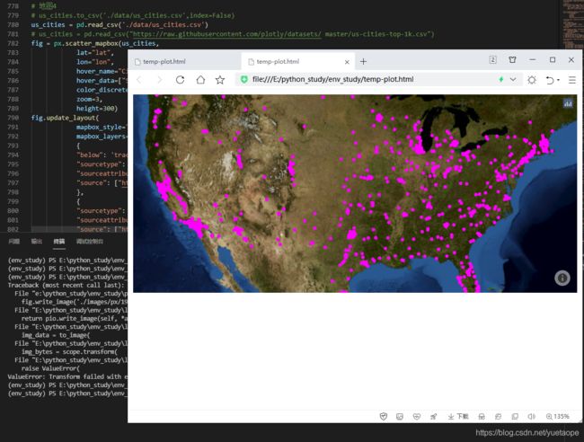
# 地图4
# us_cities.to_csv('./data/us_cities.csv',index=False)
us_cities = pd.read_csv('./data/us_cities.csv')
# us_cities = pd.read_csv("https://raw.githubusercontent.com/plotly/datasets/ master/us-cities-top-1k.csv")
fig = px.scatter_mapbox(us_cities,
            lat="lat",
            lon="lon",
            hover_name="City",
            hover_data=["State", "Population"],
            color_discrete_sequence=["fuchsia"],
            zoom=3,
            height=300)
fig.update_layout(
            mapbox_style="white-bg",
            mapbox_layers=[
            {
            "below": 'traces',
            "sourcetype": "raster",
            "sourceattribution": "United States Geological Survey",
            "source": ["https://basemap.nationalmap.gov/arcgis/rest/services/USGSImageryOnly/MapServer/tile/{z}/{y}/{x}"]
            },
            {
            "sourcetype": "raster",
            "sourceattribution": "Government of Canada",
            "source": ["https://geo.weather.gc.ca/geomet/?SERVICE=WMS&VERSION=1.3.0&REQUEST=GetMap&BBOX={bboxepsg-3857}&CRS=EPSG:3857&WIDTH=1000&HEIGHT=1000&LAYERS=RADAR_1KM_RDBR&TILED=true&FORMAT=image/png"],
            }
            ])
fig.update_layout(margin={"r":0,"t":0,"l":0,"b":0})
# fig.write_image('./images/px/19-map-4.png')
# fig.show()
plotly.offline.plot(fig)
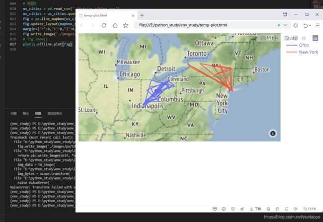
# 地图5
us_cities = pd.read_csv('./data/us_cities.csv')
us_cities = us_cities.query("State in ['New York', 'Ohio']")
fig = px.line_mapbox(us_cities, lat="lat", lon="lon", color="State", zoom=3, height=300)
fig.update_layout(mapbox_style="stamen-terrain", mapbox_zoom=4, mapbox_center_lat = 41,
margin={"r":0,"t":0,"l":0,"b":0})
fig.write_image('./images/px/19-map-5.png')
# fig.show()
plotly.offline.plot(fig)
# 地图6
df = px.data.election()
geojson = px.data.election_geojson()
fig = px.choropleth_mapbox(df,
        geojson=geojson,
        color="Bergeron",
        locations="district",
        featureidkey="properties.district",
        center={"lat": 45.5517, "lon": -73.7073},
        mapbox_style="carto-positron",
        zoom=9)
fig.update_layout(margin={"r":0,"t":0,"l":0,"b":0})
# fig.write_image('./images/px/19-map-6.png')
# fig.show()
plotly.offline.plot(fig)
# 地图7
df_eq = pd.read_csv('./data/earthquakes.csv')
fig = px.density_mapbox(df_eq,
            lat='Latitude',
            lon='Longitude',
            z='Magnitude',
            radius=10,
            center=dict(lat=0, lon=180),
            zoom=0,
            mapbox_style="stamen-terrain")
fig.update_layout(margin={"r":0,"t":0,"l":0,"b":0})
# fig.write_image('./images/px/19-map-7.png')
# fig.show()
plotly.offline.plot(fig)

二十五、Plotly 生态系统的一部分
- Plotly Express 在 2019 年初刚发布的时候,是一个单独的 Python 库,在后来的版本中,Plotly 官方将 Plotly Express 合并到 Plotly 中了,因此,Plotly Express 可以使用 Plotly 中大部分接口来对图形进行个性化设置。这个也可以认为是 Plotly Express 相对其他基于 Plotly 的第三方库(比如 cufflinks)的一些优势之处。
- 能够与 Dash 完美匹配。Dash 是 Plotly 的开源框架,用于构建具有 Plotly.py 图表的分析应用程序和仪表板。Plotly Express 产生的对象与 Dash 100%兼容。
- 最后,Plotly Express 作为一个简洁实用的 Python 可视化库,在 Plotly 生态系统下,发展迅速,所以不要犹豫,立即开始使用 Plotly Express 吧!
附记:全部代码
import plotly
import plotly.express as px
import plotly.io as pio
import plotly.graph_objects as go
import pandas as pd
import os


# pd.set_option('display.max_rows', None)		#显示所有行
pd.set_option('display.max_columns', None) 	#显示所有列
pd.set_option('max_colwidth', None)			# 显示列中单独元素的最大长度
pd.set_option('expand_frame_repr',False) 	# True表示列可以换行显示。设置成False的时候不允许换行显示;
pd.set_option('display.width', 80) 			#横向最多显示多少个字符;

# print(os.getcwd())  # E:\python_study\env_study

# 读取数据及调整格式
data = pd.read_csv('./data/covid-19.csv',parse_dates=['date'],index_col=0)
# 将数据复制一份
df_all = data.copy()
# 将时间格式转为字符串格式的日期,以 YYYY-mm-dd 的形式保存
df_all['dates'] = df_all['date'].apply(lambda x:x.strftime('%Y-%m-%d'))
# 添加现存确诊列
df_all['current'] = df_all['confirmed'] - df_all['cured'] - df_all['dead']
df_all.fillna('', inplace=True)
# print(df_all.info())
# print(df_all)

# 国内总计数量
df_cn = df_all.query("country=='中国' and province==''")
df_cn = df_cn.sort_values('date',ascending=False)
# 国外,按国家统计
df_oversea = df_all.query("country!='中国'")
df_oversea = df_oversea.fillna(value="")
df_oversea = df_oversea.sort_values('date',ascending=False)
df_global =	df_cn.append(df_oversea)
df_global =	df_global.sort_values(['country','date'])
# print(df_global	)

# 更新全球的数据
countries_all = list(df_global['country'].unique())
df_global_new = pd.DataFrame()
for item in countries_all:
    df_item = df_global.query('country==@item')
    df_i = df_item.copy(deep=False)
    df_i['new-confirmed'] = df_i['confirmed'].diff()
    df_i['new-cured'] = df_i['cured'].diff()
    df_global_new = df_global_new.append(df_i)

df_global_new = df_global_new.dropna()
# print(df_global_new)


# 2.1 单条曲线
def plot_line():
    df = df_global.groupby('date')[['confirmed','current','cured','dead']].sum()
    df['new-confirmed'] = df['confirmed'].diff()
    df = df.dropna()
    df = df.sort_index().loc['20200122':,:]
    fig = px.line(df,x=df.index,y='confirmed')
    return fig

fig = plot_line()
# 保存为图片
# fig.write_image('./images/px/01-line-1.png')
# jupyter notebook中显示
# fig.show()
# 默认浏览器中显示
# plotly.offline.plot(fig)

# 2.2 多条曲线绘制
"""在 Plotly v4.8 版本以后,支持同时绘制多条曲线,其语法格式为px.line(df,x =“column_name”,y =[“column_name_1”,“column_name_2”,“column_name_3”,⋯⋯])"""
def plot_line_multi():
    df = df_global.groupby('date')[['confirmed','current','cured','dead']].sum ()
    df['new-confirmed'] = df['confirmed'].diff()
    df = df.dropna()
    df = df.sort_index().loc['20200122':,:]
    fig = px.line(df,x=df.index,y=['confirmed','current','dead'])
    return fig

fig = plot_line_multi()
# fig.write_image('./images/px/01-line-2.png')
# fig.show()

# 2.3 分列绘制曲线
"""Plotly Express 支持绘制分列或行的曲线图,通过设置参数facet_row或facet_col来实现"""
def plot_line_facet():
    df = df_global_new.set_index('date').loc['20201204':'20201208',:]
    countries_list = ['美国','印度','俄罗斯','巴西','法国']
    df = df[df['country'].isin(countries_list)]
    fig = px.line(
                df,
                x=df.index,
                y='new-confirmed',
                color='country',
                line_group='country',
                facet_col='country',
                )
    fig.update_traces(mode='markers+lines')
    return fig
fig = plot_line_facet()
# fig.write_image('./images/px/01-line-3.png')
# fig.show()

# 绘制填充的面积曲线图
def plot_area():
    df = df_global_new.set_index('date').loc['20200904':'20201208',:]
    countries_list = ['美国','印度','俄罗斯','巴西','法国']
    df = df[df['country'].isin(countries_list)]
    fig = px.area(df,
            x=df.index,
            y='confirmed',
            color='country',
            line_group='country')
    return fig
fig = plot_area()
fig.write_image('./images/px/02-area-1.png')
# fig.show()


# 散点图(Scatter)
"""散点图,也是咱们常用的图形之一,Plotly Express 中通过px.scatter()来实现"""
def plot_scatter_line():
    df = df_global.groupby('date')[['confirmed','current','cured','dead']].sum()
    df['new-confirmed'] = df['confirmed'].diff()
    df = df.dropna()
    df = df.sort_index().loc['20200122':,:]
    fig = px.scatter(df,x='confirmed',y='dead')
    return fig
fig = plot_scatter_line()
# fig.write_image('./images/px/03-sactter-1.png')
# fig.show()
# plotly.offline.plot(fig)


# 对全球多个国家的数据进行可视化后,散点分布就明显了:
def plot_scatter():
    df = df_global_new.set_index('date').loc['20201208':'20201208']
    df = df.sort_values('confirmed',ascending=False).head(30)
    fig = px.scatter(df,
            x='confirmed',
            y='dead',
            color='country',
            size='confirmed'
            )
    return fig

fig = plot_scatter()
# fig.write_image('./images/px/03-sactter-2.png')
# fig.show()

# 散点矩阵图在 Plotly Express 中,针对散点矩阵图,专门有一个 API 来实现px.scatter_matrix():
def plot_scatter_matrix():
    df = df_global_new.set_index('date').loc['20201208':'20201208']
    df = df.sort_values('confirmed',ascending=False).head(30)
    fig = px.scatter_matrix(df,
                dimensions=['confirmed','cured','dead'],
                color='country',
                size='confirmed'
                )
    return fig

fig = plot_scatter_matrix()
fig.write_image('./images/px/03-sactter-3.png')
# fig.show()

# 饼图(Pie)绘制饼图时,用的是跟股票投资相关的数据,在 Plotly Express 中,通过px.pie()来进行饼图的可视化
df_invest = pd.read_csv('./data/sunburst.csv')
fig = px.pie(df_invest,values='持有市值',names='指数名称')
fig.update_traces(textposition='inside',
                textinfo='percent+label'
                )
# fig.write_image('./images/px/04-pie-1.png')
# fig.show()


# 环形图 通过设置参数hole,还可以将饼图变为环形图
fig = px.pie(df_invest,
            values='持有市值',
            names='指数名称',
            hole=0.6
            )
fig.update_traces(textposition='inside',
            textinfo='percent+label'
            )
# fig.write_image('./images/px/04-pie-2.png')
# fig.show()


# 垂直柱状图  默认情况下,px.bar()绘制的是垂直柱状图
def plot_bar():
    df = df_global_new.set_index('date').loc['20201208':'20201208']
    df = df.sort_values('confirmed',ascending=False).head(30)
    fig = px.bar(df,
            x='country',
            y='confirmed',
            color='country')
    return fig
fig = plot_bar()
# fig.write_image('./images/px/05-bar-1.png')
# fig.show()


# 水平柱状图  通过设置参数orientation的值,可以绘制水平柱状图
def plot_bar_h():
    df = df_global_new.set_index('date').loc['20201208':'20201208']
    df = df.sort_values('confirmed',ascending=False).head(30)
    fig = px.bar(df,
                x='confirmed',
                y='country',
                color='country',
                orientation='h'
                )
    return fig
fig = plot_bar_h()
# fig.write_image('./images/px/05-bar-2.png')
# fig.show()

# 对数坐标  上面的水平柱状图,由于最大的数值和最小的数值差异比较大,用数据绝对值进行可视化时,图表的展示效果可能不是太好,这个时候,可以考虑用对数坐标来展示,通过设置参数log_x或log_y来实现
def plot_bar_log():
    df = df_global_new.set_index('date').loc['20201208':'20201208']
    df = df.sort_values('confirmed',ascending=False).head(30)
    fig = px.bar(df,
            x='confirmed',
            y='country',
            color='country',
            orientation='h',
            log_x=True # log_x 对数坐标
            )
    return fig
fig = plot_bar_log()
# fig.write_image('./images/px/05-bar-3.png')
# fig.show()

# 堆积柱状图 柱状图的展现方式:当同一系列中有不同的类型时,绘制柱状图的时候,通常有堆积和分组两种展示形式,默认情况下,是堆积柱状图
def plot_bar_stack():
    df = df_global_new.set_index('date').loc['20201201':'20201208',:]
    countries_list = ['美国','印度','俄罗斯','巴西','法国']
    df = df[df['country'].isin(countries_list)]
    fig = px.bar(df,
            x=df.index,
            y='confirmed',
            color='country'
            )
    return fig
fig = plot_bar_stack()
fig.write_image('./images/px/05-bar-4.png')
# fig.show()

# 分组的柱状图  通过设置参数barmode="group"可以转变为分组的柱状图
def plot_bar_group():
    df = df_global_new.set_index('date').loc['20201201':'20201208',:]
    countries_list = ['美国','印度','俄罗斯','巴西','法国']
    df = df[df['country'].isin(countries_list)]
    fig = px.bar(df,
                x=df.index,
                y='confirmed',
                color='country',
                barmode='group'
                )
    return fig

fig = plot_bar_group()
# fig.write_image('./images/px/05-bar-6.png')
# fig.show()

# 样式形状  在 Plotly 5.1 版本中,还支持设置样式形状,有两个相关的参数,pattern_shape 和 patter_shape_sequence
def plot_bar_shape():
    df = df_global_new.set_index('date').loc['20201201':'20201208',:]
    countries_list = ['美国','印度','俄罗斯','巴西','法国']
    df = df[df['country'].isin(countries_list)]
    fig = px.bar(df,
                x=df.index,
                y='confirmed',
                color='country',
                pattern_shape="country",
                pattern_shape_sequence=[".", "x", "+",'/','\\'],
                )
    return fig
fig = plot_bar_shape()
# fig.write_image('./images/px/05-bar-5.png')
# fig.show()

# 垂直箱形图(Box)  针对 ETF 的累计净值数据绘制箱形图,通过px.box()来实现,
df3 = pd.read_csv('./data/data_etf.csv', parse_dates=['净值日期'])
df3['code'] = df3['code'].astype(str)
fig = px.box(df3,
            x='code',
            y='累计净值',
            color='code'
            )
fig.write_image('./images/px/06-box-1.png')
# fig.show()


# 水平箱形图 通过设置参数orientation的值
fig = px.box(df3,
        x='累计净值',
        y='code',color='code',
        orientation='h')
# fig.write_image('./images/px/06-box-3.png')
# fig.show()

# 小提琴图(Violin)
fig = px.violin(df3,
        x='code',
        y='累计净值',
        color='code')
# fig.write_image('./images/px/07-violin-1.png')
# fig.show()

# 显示箱体的小提琴图  可以通过设置参数box=True来显示箱体
fig = px.violin(df3,
        x='code',
        y='累计净值',
        color='code',
        box=True)
# fig.write_image('./images/px/07-violin-2.png')
# fig.show()


# 显示箱体及分位数值的小提琴图   通过设置参数points='all',可以在小提琴图旁边展示数据的密度分布情况
fig = px.violin(df3,
        x='code',
        y='累计净值',
        color='code',
        box=True,
        points='all')
fig.write_image('./images/px/07-violin-3.png')
# fig.show()

# 水平的小提琴图,通过设置参数orientation='h'
fig = px.violin(df3,
            x='累计净值',
            y='code',
            color='code',
            box=True,
            points='all',
            orientation='h'
            )
# fig.write_image('./images/px/07-violin-4.png')
# fig.show()

# 密度图
fig = px.strip(df3,
        y='code',
        x='累计净值')
# fig.write_image('./images/px/07-violin-5.png')
# fig.show()

# 联合分布图(Marginal):使用小提琴图和箱形图
def plot_marginal():
    df = df_global_new.query('country=="美国" or country=="印度"')
    fig = px.scatter(df,x='new-confirmed',y='new-cured',
    color='country',
    size='confirmed',
    trendline='ols',
    marginal_x='violin',
    marginal_y= 'box'
    )
    return fig

fig = plot_marginal()
# fig.write_image('./images/px/08-marginal-1.png')
# fig.show()

# 联合分布图(Marginal):使用小提琴图和直方图
def plot_marginal_hist():
    df = df_global_new.query('country=="美国" or country=="印度"')
    fig = px.scatter(df,
                x='new-confirmed',
                y='new-cured',
                color='country',
                size='confirmed',
                trendline='ols',
                marginal_x='violin',
                marginal_y= 'histogram'
                )
    return fig

fig = plot_marginal_hist()
# fig.write_image('./images/px/08-marginal-2.png')
# fig.show()

# 直方图(Histogram)
df_hist = df3[df3['code']=='515180']
fig = px.histogram(df_hist,x='return')
fig.write_image('./images/px/09-hist-1.png')
# fig.show()

# 直方图(Histogram):设置纵轴数据分布的展现方式,通过参数histnorm设置,其值可以是'percent', 'probability', 'density', 或'probability density'
# 纵轴为百分比的示例
fig = px.histogram(df_hist,x='return',histnorm='percent')
fig.write_image('./images/px/09-hist-2.png')
# fig.show()


# 直方图(Histogram):对多个对象进行可视化,通过设置参数color
fig = px.histogram(df3,x='return',color='code')
# fig.write_image('./images/px/09-hist-3.png')
# fig.show()

# 漏斗图(Funnel)
data = dict(
    number=[10000, 7000, 4000, 2000, 1000],
    stage=["浏览次数", "关注数量", "下载数量", "咨询数量", "成交数量"])
fig = px.funnel(data,
            x='number',
            y='stage')
# fig.write_image('./images/px/10-funnel-1.png')
# fig.show()

# 面积漏斗图,通过px.funnel_area()来实现
fig = px.funnel_area(
    names=["第一阶段", "第二阶段", "第三阶段", "第四阶段", "第五阶段"],
    values=[10000, 7000, 4000, 2000, 1000])
# fig.write_image('./images/px/10-funnel-2.png')
# fig.show()

# 平行坐标图(Parallel)
def plot_para():
    df = df_global_new.set_index('date').loc['20201125':'20201208',:]
    countries_list = ['美国','印度','俄罗斯','巴西','法国']
    n = len(countries_list)
    countries_dict = {countries_list[x]:n-x for x in range(n)}
    # countries_dict = {'美国': 5, '印度': 4, '俄罗斯': 3, '巴西': 2, '法国':1}
    df = df[df['country'].isin(countries_list)]
    df = df.reset_index()
    df = df[['country','confirmed','current','cured','dead']]
    df['country_id'] = df['country'].apply(lambda x: countries_dict[x])
    # print(df)
    fig = px.parallel_coordinates(df,
            color='country_id',
            labels={"country_id":"Country",
                    "confirmed": "confirmed",
                    "current": "current",
                    "cured": "cured",
                    "dead": "dead", },
            color_continuous_scale=px.colors.diverging.Tealrose,
            color_continuous_midpoint=3
            )
    return fig

fig = plot_para()
# fig.write_image('./images/px/11-para-1.png')
# fig.show()

# 数据流向的平行坐标图(Parallel)
def plot_para_cat():
    df = df_invest.reindex(columns=['市场','指数名称','标的名称','持有市值'])
    fig = px.parallel_categories(df,
                color="持有市值",
                color_continuous_scale=px.colors.sequential.PuBu
                )
    return fig

fig = plot_para_cat()
# fig.write_image('./images/px/11-para-2.png')
# fig.show()

# 密度图(Density)
iris = px.data.iris()
fig = px.density_contour(iris, x="sepal_width", y="sepal_length")
fig.write_image('./images/px/12-density-1.png')
# fig.show()


# 密度图(Density):设置参数color
fig = px.density_contour(iris,
            x="sepal_width",
            y="sepal_length",
            color='species')
# fig.write_image('./images/px/12-density-2.png')
# fig.show()

# 极坐标柱状图  将累计确诊人数划分为不同的范围等级
def confirm_class(x):
    if x<=50000:
        y='1'
    elif 50000<x<=100000:
        y='2'
    elif 100000<x<=500000:
        y='3'
    elif 500000<x<=900000:
        y='4'
    elif 900000<x<=1200000:
        y='5'
    elif 1200000<x<=1700000:
        y='6'
    elif x>1700000:
        y='7'
    return y

countries_list	= ['法国','意大利','英国','西班牙','阿根廷','哥伦比亚','德国','墨西哥','波兰','伊朗','秘鲁','土耳其','乌克兰','南非']
df_global_top10_tmp = df_global_new[df_global_new['country'].isin( countries_list)]
# SettingWithCopyWarning
df_global_top10 = df_global_top10_tmp.copy(deep=False)
df_global_top10['gradient'] = df_global_top10['confirmed'].apply(confirm_class)
# df_global_top10
fig = px.bar_polar(df_global_top10,
            r="confirmed",
            theta="country", color="gradient",
            color_discrete_sequence= px.colors.sequential.Blugrn)
# fig.write_image('./images/px/13-polar-2.png')
# fig.show()

# 极坐标散点图
fig = px.scatter_polar(df_global_top10,
            r="confirmed",
            theta="country", color="gradient",
            symbol="gradient",
            color_discrete_sequence=px.colors.sequential.Blugrn)

# fig.write_image('./images/px/13-polar-3.png')
# fig.show()

# 雷达图
fig = px.line_polar(df_global_top10,
            r="confirmed",
            theta="country",
            color="gradient",
            line_close=True,
            color_discrete_sequence=px.colors.sequential.Blugrn)

fig.write_image('./images/px/13-polar-4.png')
# fig.show()


# 雷达图
df = px.data.wind()
fig = px.line_polar(df,
            r="frequency",
            theta="direction",
            color="strength",
            line_close=True,
            color_discrete_sequence=px.colors.sequential.Plasma_r)

# fig.write_image('./images/px/13-polar-5.png')
# fig.show()

# 图片显示
from skimage import io
img = io.imread('./data/QR-PyDataLab.jpg')
fig = px.imshow(img)
# fig.write_image('./images/px/14-imshow-1.png')
# fig.show()

# 图片显示  不显示坐标轴数字
fig = px.imshow(img)
fig.update_yaxes(
        #	title=None, # 不显示轴标题
        visible = False,
        #	showticklabels=True
        )

fig.update_xaxes(visible = False)
fig.write_image('./images/px/14-imshow-2.png')
# fig.show()


# 热力图
df_im = pd.pivot_table(df3,index=['净值日期'],columns=['code'],values=['累计净值'])
# 删除外层索引
df_im.columns = df_im.columns.droplevel()
# 隐藏列名称
df_im.columns.name = None
# 计算指数点位数值每日变化
returns = df_im.pct_change().dropna()
# 计算相关性
corr = returns.corr()

fig = px.imshow(corr,color_continuous_scale='PuBu')
# fig.write_image('./images/px/14-imshow-3.png')
# fig.show()

# 密度热力图
df_hp = df_global_new.set_index('date').loc['20201208':'20201208']
countries_list = ['法国','意大利','英国','西班牙','阿根廷',
        '哥伦比亚','德国','墨西哥','波兰','伊朗',
        '秘鲁','土耳其','乌克兰','南非','比利时',
        '印度尼西亚','伊拉克','荷兰','智智利','捷克','罗马尼亚'
        ]

df_hp = df_hp[df_hp['country'].isin(countries_list)]
fig = px.density_heatmap(df_hp,
            x="confirmed",
            y="cured",
            nbinsx=20,
            nbinsy=20,
            color_continuous_scale="Blues")

# fig.write_image('./images/px/14-imshow-4.png')
# fig.show()

# 旭日图(Sunburst)
fig = px.sunburst(df_invest,
    path=['市场','指数名称','标的名称'],
    values='持有市值')
# fig.write_image('./images/px/15-sunburst-1.png')
# fig.show()

# 旭日图(Sunburst) 可以通过设置参数textinfo的值来控制不同的交互显示方式。
fig = px.sunburst(df_invest,
        path=['市场','指数名称','标的名称'],
        values='持有市值')
fig.update_traces(
    textinfo='label+percent entry'
# 'label+percent root',都是按照根节点来计算百分比,根节点为100%
# 'label+percent entry',根据当前位置来计算百分比,当前的最大节点为100%
# 'label+percent parent'当前最大节点占它的上一级节点的百分比不变,其他节点根据当前最大节点来计算百分比
)
# fig.write_image('./images/px/15-sunburst-2.png')
# fig.show()

# 甘特图(Timeline)
def plot_timeline():
    df = pd.DataFrame([
    dict(Task="项目1", Start='2021-02-01', Finish='2021-03-25',Manager='Lemon',Completion_pct=90),
    dict(Task="项目2", Start='2021-03-05', Finish='2021-04-15',Manager='Lee',Completion_pct=60),
    dict(Task="项目3", Start='2021-02-20', Finish='2021-05-30',Manager='Zhang',Completion_pct=70),
    dict(Task="项目4", Start='2021-04-20', Finish='2021-09-30',Manager='Lemon',Completion_pct=20),
    ])
    fig = px.timeline(df,
            x_start="Start",
            x_end="Finish",
            y="Task",
            )
    fig.update_yaxes(autorange="reversed")
    return fig

fig = plot_timeline()
# fig.write_image('./images/px/16-timeline-1.png')
# fig.show()
# plotly.offline.plot(fig)


# 甘特图(Timeline):颜色分组
def plot_timeline():
    df = pd.DataFrame([
    dict(Task="项目1", Start='2021-02-01', Finish='2021-03-25',Manager='Lemon',Completion_pct=90),
    dict(Task="项目2", Start='2021-03-05', Finish='2021-04-15',Manager='Lee',Completion_pct=60),
    dict(Task="项目3", Start='2021-02-20', Finish='2021-05-30',Manager='Zhang',Completion_pct=70),
    dict(Task="项目4", Start='2021-04-20', Finish='2021-09-30',Manager='Lemon',Completion_pct=20),
    ])
    fig = px.timeline(df,
            x_start="Start",
            x_end="Finish",
            y="Task",
            color='Manager',
            )
    fig.update_yaxes(autorange="reversed")
    return fig

fig = plot_timeline()
# fig.write_image('./images/px/16-timeline-2.png')
# fig.show()
# plotly.offline.plot(fig)

# 甘特图(Timeline):数值型因素(比如完成进度比例),设置颜色分组
def  plot_timeline_color():
    df = pd.DataFrame([
    dict(Task="项目1", Start='2021-02-01', Finish='2021-03-25',Manager='Lemon',Completion_pct=90),
    dict(Task="项目2", Start='2021-03-05', Finish='2021-04-15',Manager='Lee',Completion_pct=60),
    dict(Task="项目3", Start='2021-02-20', Finish='2021-05-30',Manager='Zhang',Completion_pct=70),
    dict(Task="项目4", Start='2021-04-20', Finish='2021-09-30',Manager='Lemon',Completion_pct=20),
    ])
    fig = px.timeline(df,
            x_start="Start",
            x_end="Finish",
            y="Task",
            color='Completion_pct',
            color_continuous_scale=px.colors.sequential.RdBu
            )
    fig.update_yaxes(autorange="reversed")
    return fig

fig =  plot_timeline_color()
# fig.write_image('./images/px/16-timeline-3.png')
# fig.show()

# 树形图(Treemap):离散颜色
# fig = px.treemap(df_invest,
#             path=[px.Constant('Invest portfolio'), '市场', ' 指数名称','标的名称'],
#             values='持有市值',
#             color='市场',
#             color_discrete_sequence= px.colors.sequential.RdBu_r    # 字符型,离散颜色
#             )
# fig.write_image('./images/px/17-treemap-1.png')
# fig.show()


# 树形图(Treemap):连续颜色
# fig = px.treemap(df_sunburst,
#             path=[px.Constant('Invest portfolio'), '市场', ' 指数名称','标的名称'],
#             values='持有市值',
#             color='市场',
#             color_discrete_sequence= 'YlGnBu'    # 数值型 , 连续颜色
#             )
# fig.write_image('./images/px/17-treemap-1.png')
# fig.show()

# 冰柱图 (icicle)
fig = px.icicle(df_invest,
        path=[px.Constant("Total Portfolio"), '市场', '指数名称','标的名称'],
        values='持有市值',
        #	color_continuous_scale='YlGnBu', # 数值型,连续颜色
        color_discrete_sequence= px.colors.sequential.RdBu_r # 字符型,离散颜色
        )
fig.update_traces(root_color="lightgrey")
fig.update_layout(margin = dict(t=50, l=25, r=25, b=25))
# fig.write_image('./images/px/17-treemap-3.png')
# fig.show()

# 三维散点图(Scatter 3D)
df_global_top_latest = df_global_new.set_index('date').loc['20201208':'20201208',:]
countries_list = ['美国','印度','俄罗斯','巴西','法国','意大利','英国','西班牙','阿根廷','哥伦比亚','德国']
df_global_top_latest = df_global_top_latest[df_global_top_latest['country'].isin(countries_list)]
fig = px.scatter_3d(df_global_top_latest,
            x="confirmed",
            y="cured",
            z="dead",
            color="country",
            size="dead",
            hover_name="country",
            )
# fig.write_image('./images/px/18-3d-1.png')
# fig.show()

# 同一个平面下,从三个维度进行可视化
df = px.data.election()
fig = px.scatter_ternary(df,
            a="Joly",
            b="Coderre",
            c="Bergeron",
            color="winner",
            size="total",
            hover_name="district",
            size_max=15,
            color_discrete_map = {"Joly": "blue", "Bergeron": " green", "Coderre":"red"} )
# fig.write_image('./images/px/18-3d-2.png')
# fig.show()

# 地图1
df = px.data.gapminder().query("year == 2007")
fig = px.scatter_geo(df,
        locations="iso_alpha",
        size="pop", # size of markers, "pop" is one of the columns of gapminder
        )
fig.update_layout(margin={"r":0,"t":0,"l":0,"b":0})
fig.write_image('./images/px/19-map-1.png')
# fig.show()

# 地图2
df = px.data.gapminder().query("year == 2007")
fig = px.line_geo(df,
            locations="iso_alpha",
            color="continent", # "continent" is one of the columns of gapminder
            projection="orthographic")
fig.write_image('./images/px/19-map-2.png')
# fig.show()

# 地图3
df = px.data.election()
geojson = px.data.election_geojson()
fig = px.choropleth(df,
            geojson=geojson,
            color="Bergeron",
            locations="district",
            featureidkey="properties.district",
            projection="mercator"
            )
fig.update_geos(fitbounds="locations", visible=False)
fig.update_layout(margin={"r":0,"t":0,"l":0,"b":0})
fig.write_image('./images/px/19-map-3.png')
# fig.show()

# 地图4
# us_cities.to_csv('./data/us_cities.csv',index=False)
us_cities = pd.read_csv('./data/us_cities.csv')
# us_cities = pd.read_csv("https://raw.githubusercontent.com/plotly/datasets/ master/us-cities-top-1k.csv")
fig = px.scatter_mapbox(us_cities,
            lat="lat",
            lon="lon",
            hover_name="City",
            hover_data=["State", "Population"],
            color_discrete_sequence=["fuchsia"],
            zoom=3,
            height=300)
fig.update_layout(
            mapbox_style="white-bg",
            mapbox_layers=[
            {
            "below": 'traces',
            "sourcetype": "raster",
            "sourceattribution": "United States Geological Survey",
            "source": ["https://basemap.nationalmap.gov/arcgis/rest/services/USGSImageryOnly/MapServer/tile/{z}/{y}/{x}"]
            },
            {
            "sourcetype": "raster",
            "sourceattribution": "Government of Canada",
            "source": ["https://geo.weather.gc.ca/geomet/?SERVICE=WMS&VERSION=1.3.0&REQUEST=GetMap&BBOX={bboxepsg-3857}&CRS=EPSG:3857&WIDTH=1000&HEIGHT=1000&LAYERS=RADAR_1KM_RDBR&TILED=true&FORMAT=image/png"],
            }
            ])
fig.update_layout(margin={"r":0,"t":0,"l":0,"b":0})
# fig.write_image('./images/px/19-map-4.png')
# fig.show()

# 地图5
us_cities = pd.read_csv('./data/us_cities.csv')
us_cities = us_cities.query("State in ['New York', 'Ohio']")
fig = px.line_mapbox(us_cities, lat="lat", lon="lon", color="State", zoom=3, height=300)
fig.update_layout(mapbox_style="stamen-terrain", mapbox_zoom=4, mapbox_center_lat = 41,
margin={"r":0,"t":0,"l":0,"b":0})
fig.write_image('./images/px/19-map-5.png')
# fig.show()

# 地图6
df = px.data.election()
geojson = px.data.election_geojson()
fig = px.choropleth_mapbox(df,
        geojson=geojson,
        color="Bergeron",
        locations="district",
        featureidkey="properties.district",
        center={"lat": 45.5517, "lon": -73.7073},
        mapbox_style="carto-positron",
        zoom=9)
fig.update_layout(margin={"r":0,"t":0,"l":0,"b":0})
# fig.write_image('./images/px/19-map-6.png')
# fig.show()

# 地图7
df_eq = pd.read_csv('./data/earthquakes.csv')
fig = px.density_mapbox(df_eq,
            lat='Latitude',
            lon='Longitude',
            z='Magnitude',
            radius=10,
            center=dict(lat=0, lon=180),
            zoom=0,
            mapbox_style="stamen-terrain")
fig.update_layout(margin={"r":0,"t":0,"l":0,"b":0})
# fig.write_image('./images/px/19-map-7.png')
# fig.show()
plotly.offline.plot(fig)