silver light基础1-页面布局
页面布局就是合理调整页面各个控件的位置和大小,要定位可视化对象,您必须将它们放置于Panel 或其他容器对象中,在Silverlight中,容器主要有三种方式:
1. Cavas
2. StackPanel
3. Grid
下面分别进行介绍:
1. Cavas
首先看例子:
 代码
代码

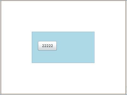
< Button Content = " 11111 " Canvas.ZIndex = " 1 " Canvas.Left = " 20 " Width = " 60 " Height = " 30 " Canvas.Top = " 30 " ></ Button >
< Button Content = " 22222 " Canvas.ZIndex = " 2 " Canvas.Left = " 20 " Width = " 60 " Height = " 30 " Canvas.Top = " 30 " ></ Button >
</ Canvas >
第1行:Name为Canvas的名称,Height和Width决定Canvas的大小,如果不写,默认Canvas占据整个网页(貌似控件都这么设置),Background为Canvas的背景色
第2,3行:在Canvas中设置两个按钮,Canvas.Left和Canvas.Top决定按钮的位置,Height和Width决定按钮的大小
其中,Canvas.ZIndex决定按钮加载的顺序,值越大,按钮加载的顺序越靠后
本例中,由于2个按钮大小相同,第二个按钮后加载,覆盖第一个按钮,显示内容22222
效果如下:
使用 Canvas 对对象进行绝对定位在某些情况下很有用,但是在大小可变的浏览器窗口中,这通常是一个很糟糕的策略。绝对定位不允许对象根据浏览器窗口的大小调整在页面上重新排列,对象保留在各自的指定像素位置。StackPanel 和 Grid 允许内容重新排列。Grid 对象是 Visual Studio Silverlight 模板使用的根元素。尽管在使用方面 Grid 对象比其他 Panel 对象要复杂一些,但是它支持内容的重新排列,并且其灵活性足以使您创建各种对象布局。要获得最佳的窗口大小调整行为(除了使用 Panel 对象定位子对象外),通常来说最好的办法是将 DOM 的宽度和高度属性保留为 100%,并且在 XAML 文件的根元素或布局根元素中不包含任何宽度或高度声明。
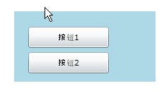
可以canvas封装一组控件,例如canvas中有两个button,一个btn1,一个btn2,判断鼠标经过canvas,两个button显示各自的名称
.xmal中
代码
< Button Name = " btn1 " Content = " 11111 " Canvas.ZIndex = " 1 " Canvas.Left = " 20 " Width = " 60 " Height = " 30 " Canvas.Top = " 22 " ></ Button >
< Button Name = " btn2 " Content = " 22222 " Canvas.ZIndex = " 2 " Canvas.Left = " 20 " Width = " 60 " Height = " 30 " Canvas.Top = " 58 " ></ Button >
</ Canvas >
.xmal.cs中
代码
{
foreach (Control c in this .canvas1.Children)
{
Button b = c as Button;
if (b.Name == " btn1 " )
{
b.Content = " 按钮1 " ;
}
else if (b.Name == " btn2 " )
{
b.Content = " 按钮2 " ;
}
else
{
}
}
效果如下:
2. StackPanel
stackpanel里的控件布局类似于堆栈,控件默认由上而下逐次排列(可以修改为从左到右<StackPanel Background="White" Orientation="Horizontal">),不能直接手动修改控件(鼠标拖拽控件位置)的位置和排列顺序
首先看例子:
代码
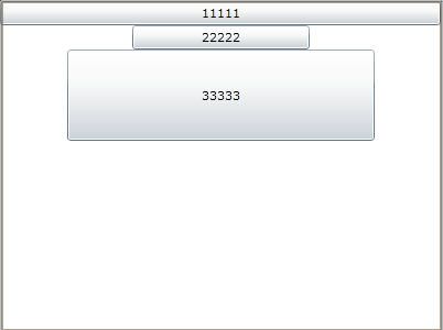
<Button Name="btn1" Content="11111" VerticalAlignment="Top" HorizontalAlignment="Center"></Button>
<Button Name="btn2" Content="22222" Width="161" VerticalAlignment="Top" HorizontalAlignment="Center"></Button>
<Button Name="btn3" Content="33333" Height="83" Width="279" VerticalAlignment="Top" HorizontalAlignment="Center"></Button>
</StackPanel>
第1行:Name为stackpanel的名称,Height和Width未写,默认stackpanel占据整个页面,控件排列顺序未写,默认从上到下
第2,3,4行:设置三个按钮,只能设置按钮的Height和Width,不能直接手动设置(鼠标拖拽控件位置)按钮的位置(与canvas不同),按钮控件只能按顺序由上到下(或者由左到右)排列
VerticalAlignment和HorizontalAlignment设置按钮在列上的所处位置(top,center,bottom,stretch)和行上的所处位置(left,center,right,stretch)
本例中选择在列上靠上显示,行上居中显示按钮
效果如下:
按钮的位置虽然不能手工拖拽,不过可以通过以下方式间接设置
<Button Name="btn1" Content="11111" Margin="10,0,0,0" VerticalAlignment="Top" HorizontalAlignment="Center"></Button>
其中Margin="10,5,8,15"表示,按钮btn1,离左边控件距离10个pixel,离上面控件距离5个pixel,离右面控件距8离个pixel,离15下面控件距离个pixel。
3. Grid
Grid控件貌似用途最多,和asp.net中的grid控件差不多,不过asp.net中的grid控件边定义行列边赋值,silverlight中的grid控件先定义行列后赋值
例如以grid显示以下的值
1 2
3 4
asp.net的grid
< tr >
< td > 1 </ td >
< td > 2 </ td >
</ tr >
< tr >
< td > 3 </ td >
< td > 4 </ td >
</ tr >
</ table >
silverlight的grid
代码
< Grid.RowDefinitions >
< RowDefinition ></ RowDefinition >
< RowDefinition ></ RowDefinition >
</ Grid.RowDefinitions >
< Grid.ColumnDefinitions >
< ColumnDefinition ></ ColumnDefinition >
< ColumnDefinition ></ ColumnDefinition >
</ Grid.ColumnDefinitions >
< TextBlock Text = " 1 " Grid.Row = " 0 " Grid.Column = " 0 " ></ TextBlock >
< TextBlock Text = " 2 " Grid.Row = " 0 " Grid.Column = " 1 " ></ TextBlock >
< TextBlock Text = " 3 " Grid.Row = " 1 " Grid.Column = " 0 " ></ TextBlock >
< TextBlock Text = " 4 " Grid.Row = " 1 " Grid.Column = " 1 " ></ TextBlock >
</ Grid >
看完了例子,下面学习下silverlight中的grid控件
代码
< Grid.RowDefinitions >
< RowDefinition Height = " 20* " ></ RowDefinition >
< RowDefinition Height = " 40* " ></ RowDefinition >
</ Grid.RowDefinitions >
< Grid.ColumnDefinitions >
< ColumnDefinition Width = " 100 " ></ ColumnDefinition >
< ColumnDefinition Width = " 200 " ></ ColumnDefinition >
< ColumnDefinition ></ ColumnDefinition >
</ Grid.ColumnDefinitions >
< TextBlock Text = " 111 " Grid.Row = " 0 " Grid.Column = " 0 " ></ TextBlock >
< TextBlock Text = " 222 " Grid.Row = " 0 " Grid.Column = " 1 " ></ TextBlock >
< TextBlock Text = " 333 " Grid.Row = " 0 " Grid.Column = " 2 " ></ TextBlock >
< TextBlock Text = " 444 " Grid.Row = " 1 " Grid.Column = " 0 " ></ TextBlock >
< TextBlock Text = " 555 " Grid.Row = " 1 " Grid.Column = " 1 " ></ TextBlock >
< TextBlock Text = " 666 " Grid.Row = " 1 " Grid.Column = " 2 " ></ TextBlock >
</ Grid >
第1行:设置grid的名称,背景色,大小,ShowGridLines="True"设置每个格子间是否显示分界线
第2-9行:设置grid的行列,先设置行,第一行高20*,第二行高40*,这个表示第一行高度=grid高度 * 20/60,第二行高度=grid高度 * 40/60
第6行开始设置grid的列,第一列宽100,第二列宽200,第三列宽度为grid剩下的宽度
第10- :设置6个TextBlock,分别处于grid的各个各自中
此外,grid的行列的宽度和高度,Height和 Width可以设置最大值,宽(高)度在这个范围内时,宽(高)度设置为auto,根据内容自动调整宽(高)度。
eg:
<ColumnDefinition Width="Auto" MinWidth="30" MaxWidth="150"></ColumnDefinition>