使用CoordinatorLayout打造各种炫酷的效果
简单来说就是
-
作为最上层的View
-
作为一个 容器与一个或者多个子View进行交互
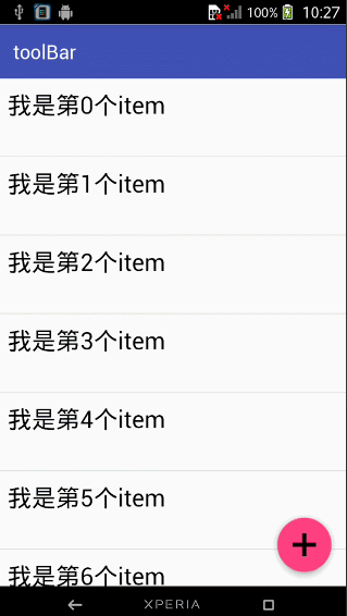
下面我们一起先来看一下我们实现的效果图
动态图
结合ToolBar

结合ViewPager

结合ViewPager的视觉特差

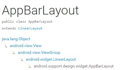
AppBarLayout
它是继承与LinearLayout的,默认 的 方向 是Vertical
| 类型 | 说明 |
| — | — |
| int SCROLL_FLAG_ENTER_ALWAYS | When entering (scrolling on screen) the view will scroll on any downwards scroll event, regardless of whether the scrolling view is also scrolling. |
| int SCROLL_FLAG_ENTER_ALWAYS_COLLAPSED | An additional flag for ‘enterAlways’ which modifies the returning view to only initially scroll back to it’s collapsed height. |
| int SCROLL_FLAG_EXIT_UNTIL_COLLAPSED | When exiting (scrolling off screen) the view will be scrolled until it is ‘collapsed’. |
| int SCROLL_FLAG_SCROLL | The view will be scroll in direct relation to scroll events. |
| int SCROLL_FLAG_SNAP | Upon a scroll ending, if the view is only partially visible then it will be snapped and scrolled to it’s closest edge. |
| 类型 | 说明 |
| — | — |
| int SCROLL_FLAG_ENTER_ALWAYS | W((entering) / (scrolling on screen))下拉的时候,这个View也会跟着滑出。 |
| int SCROLL_FLAG_ENTER_ALWAYS_COLLAPSED | 另一种enterAlways,但是只显示折叠后的高度。 |
| int SCROLL_FLAG_EXIT_UNTIL_COLLAPSED | ((exiting) / (scrolling off screen))上拉的时候,这个View会跟着滑动直到折叠。 |
| int SCROLL_FLAG_SCROLL | 这个View将会响应Scroll事件 |
| int SCROLL_FLAG_SNAP | 在Scroll滑动事件结束以前 ,如果这个View部分可见,那么这个View会停在最接近当前View的位置 |
我们可以通过两种 方法设置这个Flag
- 方法一
setScrollFlags(int)
- 方法二
app:layout_scrollFlags=“scroll|enterAlways”
注意事项
AppBarLayout必须作为CoordinatorLayout的直接子View,否则它的大部分功能将不会生效,如layout_scrollFlags等。
首先我们先来看一下我们 效果图一是怎样实现的
代码
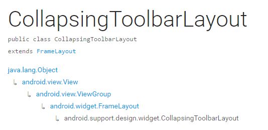
android:id=“@+id/main_content” xmlns:android=“http://schemas.android.com/apk/res/android” xmlns:app=“http://schemas.android.com/apk/res-auto” android:layout_width=“match_parent” android:layout_height=“match_parent”> android:id=“@+id/appbar” android:layout_width=“match_parent” android:layout_height=“wrap_content” android:theme=“@style/ThemeOverlay.AppCompat.Dark.ActionBar”> android:id=“@+id/toolbar” android:layout_width=“match_parent” android:layout_height=“?attr/actionBarSize” android:background=“?attr/colorPrimary” app:layout_scrollFlags=“scroll|enterAlways” app:popupTheme=“@style/ThemeOverlay.AppCompat.Light”/> . android:id=“@+id/recyclerView” android:layout_width=“match_parent” android:layout_height=“match_parent” app:layout_behavior=“@string/appbar_scrolling_view_behavior”/> android:id=“@+id/fab” android:layout_width=“wrap_content” android:layout_height=“wrap_content” android:layout_gravity=“end|bottom” android:layout_margin=“15dp” android:src=“@drawable/add_2”/> 从图中我们可以知道 layout_scrollFlags="scroll|enterAlways, 前面已经说到layout_scrollFlags=scroll的时候,这个View会 跟着 滚动 事件响应, layout_scrollFlags=“enterAlways”的时候 这个View会响应下拉事件 所以呈现出来的结果应该是我们在上拉的时候toolBar 会隐藏,下拉的时候toolBar会出来 那如果当我们的toolBar 等于 app:layout_scrollFlags="scroll|snap"的时候 , layout_scrollFlags=scroll的时候,这个View会 跟着 滚动 事件响应, layout_scrollFlags=“snap”的时候 在Scroll滑动事件结束以前 ,如果这个View部分可见,那么这个View会停在最接近当前View的位置。 综上呈现的效果如下,代码见ToolBarSampleSnar的布局文件 结合ViewPager android:id=“@+id/main_content” xmlns:android=“http://schemas.android.com/apk/res/android” xmlns:app=“http://schemas.android.com/apk/res-auto” android:layout_width=“match_parent” android:layout_height=“match_parent”> android:layout_width=“match_parent” android:layout_height=“250dp”> android:layout_height=“200dp” android:background=“?attr/colorPrimary” android:scaleType=“fitXY” android:src=“@drawable/tangyan” app:layout_scrollFlags=“scroll|enterAlways”/> android:id=“@+id/tabs” android:layout_width=“match_parent” android:layout_height=“wrap_content” android:layout_alignParentBottom=“true” android:background=“?attr/colorPrimary” app:tabIndicatorColor=“@color/colorAccent” app:tabIndicatorHeight=“4dp” app:tabSelectedTextColor=“#000” app:tabTextColor=“#fff”/> android:id=“@+id/viewpager” android:layout_width=“match_parent” android:layout_height=“match_parent” app:layout_behavior=“@string/appbar_scrolling_view_behavior”/> android:id=“@+id/fab” android:layout_width=“wrap_content” android:layout_height=“wrap_content” android:layout_gravity=“end|bottom” android:layout_margin=“15dp” android:src=“@drawable/add_2”/> 其实相对于前 一个例子,只是把 摆放RecyclerView 的位置替换成ViewPager而已,为了有页面导航器的效果,再使用 TabLayout而已,而TabLayout 在我们滑动的时候最终会停靠在 最顶部,是因为我们没有设置其layout_scrollFlags,即TabLayout是静态的 运行以后,即可看到以下的结果 代码注释 里面已经解释地很清楚了 ,这里我就不解释了 public class ViewPagerSample extends AppCompatActivity { ViewPager mViewPager; List mFragments; String[] mTitles = new String[]{ “主页”, “微博”, “相册” }; private TabLayout mTabLayout; @Override protected void onCreate(Bundle savedInstanceState) { super.onCreate(savedInstanceState); setContentView(R.layout.activity_third); // 第一步,初始化ViewPager和TabLayout mViewPager = (ViewPager) findViewById(R.id.viewpager); mTabLayout = (TabLayout) findViewById(R.id.tabs); setupViewPager(); } private void setupViewPager() { mFragments = new ArrayList<>(); for (int i = 0; i < mTitles.length; i++) { ListFragment listFragment = ListFragment.newInstance(mTitles[i]); mFragments.add(listFragment); } // 第二步:为ViewPager设置适配器 BaseFragmentAdapter adapter = new BaseFragmentAdapter(getSupportFragmentManager(), mFragments, mTitles); mViewPager.setAdapter(adapter); // 第三步:将ViewPager与TableLayout 绑定在一起 mTabLayout.setupWithViewPager(mViewPager); } } 如果我们想更改Indicator的相关样式,我们可以在布局文件里面使用 android:id=“@+id/tabs” android:layout_width=“match_parent” android:layout_height=“wrap_content” android:layout_alignParentBottom=“true” android:background=“?attr/colorPrimary” app:tabIndicatorColor=“@color/colorAccent” app:tabIndicatorHeight=“4dp” app:tabSelectedTextColor=“#000” app:tabTextColor=“#fff”/> 如果你不想使用Google 帮我们 封装好的控件的话,你也可以自己自定义一个控件,你可以参考我的这一篇博客仿网易新闻的顶部导航指示器 在看例子结合ViewPager的视觉特差之前 ,我们需要先了解CollapsingToolbarLayout这个控件 CollapsingToolbarLayout CollapsingToolbarLayout继承与FrameLayout,官网地址,请自备梯子。 简单来说 ,CollapsingToolbarLayout是工具栏的包装器,它通常作为AppBarLayout的孩子。主要实现以下功能 Collapsing title(可以折叠 的 标题 ) Content scrim(内容装饰),当我们滑动的位置 到达一定阀值的时候,内容 装饰将会被显示或者隐藏 Status bar scrim(状态栏布) Parallax scrolling children,滑动的时候孩子呈现视觉特差效果 Pinned position children,固定位置的 孩子 下面我们一起来看一下几个常量 | 常量 | 解释说明 | | — | — | | int COLLAPSE_MODE_OFF | The view will act as normal with no collapsing behavior.(这个 View将会 呈现正常的结果,不会表现出折叠效果) | | int COLLAPSE_MODE_PARALLAX | The view will scroll in a parallax fashion. See setParallaxMultiplier(float) to change the multiplier used.(在滑动的时候这个View 会呈现 出 视觉特差效果 ) | | int COLLAPSE_MODE_PIN | The view will pin in place until it reaches the bottom of the CollapsingToolbarLayout.(当这个View到达 CollapsingToolbarLayout的底部的时候,这个View 将会被放置,即代替整个CollapsingToolbarLayout) | 我们有两种方法可以设置这个常量, 方法一:在代码中使用这个方法 setCollapseMode(int collapseMode) 方法 二:在布局文件中使用自定义属性 app:layout_collapseMode=“pin” 到此 ,CollapsingToolbarLayout的一些重要属性已经讲解完毕,下面我们一起来看一下我们是怎样结合ViewPager实现视差效果的 结合ViewPager的视觉特差 xmlns:android=“http://schemas.android.com/apk/res/android” xmlns:app=“http://schemas.android.com/apk/res-auto” android:layout_width=“match_parent” android:layout_height=“match_parent” android:background=“@android:color/background_light” android:fitsSystemWindows=“true” android:id=“@+id/main.appbar” android:layout_width=“match_parent” android:layout_height=“300dp” android:fitsSystemWindows=“true” android:theme=“@style/ThemeOverlay.AppCompat.Dark.ActionBar” android:id=“@+id/main.collapsing” android:layout_width=“match_parent” android:layout_height=“250dp” android:fitsSystemWindows=“true” app:contentScrim=“?attr/colorPrimary” app:expandedTitleMarginEnd=“64dp” app:expandedTitleMarginStart=“48dp” app:layout_scrollFlags=“scroll|exitUntilCollapsed” android:id=“@+id/main.backdrop” android:layout_width=“match_parent” android:layout_height=“match_parent” android:fitsSystemWindows=“true” android:scaleType=“centerCrop” android:src=“@drawable/tangyan” app:layout_collapseMode=“parallax” /> android:id=“@+id/toolbar” android:layout_width=“match_parent” android:layout_height=“?attr/actionBarSize” app:layout_collapseMode=“pin” app:popupTheme=“@style/ThemeOverlay.AppCompat.Light” /> android:id=“@+id/tabs” android:layout_width=“match_parent” android:layout_height=“wrap_content” android:layout_alignParentBottom=“true” android:background=“?attr/colorPrimary” app:tabIndicatorColor=“@color/colorAccent” app:tabIndicatorHeight=“4dp” app:tabSelectedTextColor=“#000” app:tabTextColor=“#fff”/> android:id=“@+id/viewpager” android:layout_width=“match_parent” android:layout_height=“match_parent” app:layout_behavior=“@string/appbar_scrolling_view_behavior”> android:id=“@+id/fab” android:layout_width=“wrap_content” android:layout_height=“wrap_content” android:layout_gravity=“end|bottom” android:layout_margin=“15dp” android:src=“@drawable/add_2”/>思路 分析

布局代码如下
思路分析

下面我们一起来看一下 TabLayout是怎样结合ViewPager直线 导航器的效果的
布局代码