jquery结合Highcharts插件实现动态数据仪表盘图形化显示效果
仪表盘显示效果如图:
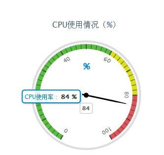
方法一效果图:
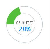
方法二效果图(插件版本4.0.1):
js代码如下:
  1 $(function(){

  2

  3 //方法一:

  4

  5     var chart = new Highcharts.Chart({

  6

  7 chart: {

  8

  9                 renderTo: 'container',

 10

 11                 type: 'gauge'

 12

 13                 // backgroundColor: "#f3f3f3"

 14

 15             },

 16

 17

 18

 19             title: {

 20

 21                 text: 'CPU使用情况(%)'

 22

 23             },

 24

 25

 26

 27             pane: {

 28

 29                 startAngle: -150,

 30

 31                 endAngle: 150,

 32

 33                 background: [{

 34

 35                     backgroundColor: '#DDD',

 36

 37                     borderWidth: 0,

 38

 39                     outerRadius: '107%',

 40

 41                     innerRadius: '103%'

 42

 43                 }]

 44

 45             },

 46

 47

 48

 49             // the value axis

 50

 51             yAxis: {

 52

 53                 min: 0,

 54

 55                 max: 100,

 56

 57

 58

 59                 minorTickInterval: 'auto',

 60

 61                 minorTickWidth: 1,

 62

 63                 minorTickLength: 10,

 64

 65                 minorTickPosition: 'inside',

 66

 67                 minorTickColor: '#444',

 68

 69

 70

 71                 tickPixelInterval: 60,

 72

 73                 tickWidth: 2,

 74

 75                 tickPosition: 'inside',

 76

 77                 tickLength: 10,

 78

 79                 tickColor: '#444',

 80

 81                 labels: {

 82

 83                     step: 2,

 84

 85                     rotation: 'auto'

 86

 87                 },

 88

 89                 title: {

 90

 91                     text: '%',

 92

 93                     style: {

 94

 95                         color: '#08c',

 96

 97                         fontSize: "18px"

 98

 99                     }

100

101                 },

102

103                 plotBands: [{

104

105                     from: 0,

106

107                     to: 60,

108

109                     color: '#55BF3B' // green

110

111                 }, {

112

113                     from: 60,

114

115                     to: 80,

116

117                     color: '#DDDF0D' // yellow

118

119                 }, {

120

121                     from: 80,

122

123                     to: 100,

124

125                     color: '#DF5353' // red

126

127                 }]

128

129             },

130

131

132

133             credits: {

134

135                 enabled: false

136

137             },

138

139

140

141             series: [{

142

143                 name: 'CPU使用率',

144

145                 color: '#08c',

146

147                 data: [80],

148

149                 tooltip: {

150

151                     valueSuffix: ' %'

152

153                 }

154

155             }]

156

157

158

159         },

160

161         // Add some life

162

163         function(chart) {

164

165             setInterval(function() {

166

167                 var point = chart.series[0].points[0],

168

169                     newVal,

170

171                     inc = Math.round((Math.random() - 0.5) * 10);

172

173

174

175                 newVal = point.y + inc;

176

177                 if (newVal < 0 || newVal > 100) {

178

179                     newVal = point.y - inc;

180

181                 }

182

183                 point.update(newVal);

184

185

186

187             }, 3000);

188

189         });

190

191 //方法二:

192

193 var gaugeOptions = {

194

195             chart: {

196                 type: 'solidgauge'

197             },

198

199             title: null,

200

201             pane: {

202                 center: ['50%', '50%'],

203                 size: '100%',

204                 startAngle: -90,

205                 endAngle: 270,

206                 borderWidth: 1,

207                 background: {

208                     backgroundColor: (Highcharts.theme && Highcharts.theme.background2) || '#fff',

209                     innerRadius: '60%',

210                     outerRadius: '100%',

211                     shape: 'arc'

212                 }

213             },

214

215             tooltip: {

216                 enabled: false

217             },

218

219             credits: {

220                 enabled: false

221             },

222

223             // the value axis

224

225             yAxis: {

226                 stops: [

227                     [0.5, '#55BF3B'], // green

228                     [0.7, '#DDDF0D'], // yellow

229                     [0.9, '#DF5353'] // red

230                 ],

231                 lineWidth: 1,

232                 minorTickInterval: null,

233                 tickPixelInterval: 360,

234                 tickWidth: 0,

235                 title: {

236                     y: 30

237                 },

238                 labels: {

239                     enabled: false

240                 }

241             },

242

243             plotOptions: {

244                 solidgauge: {

245                     dataLabels: {

246                         y: 0,

247                         borderWidth: 0,

248                         useHTML: true

249                     }

250                 }

251             }

252         };

253

254         // CPU使用率

255         $('#SYS_DIV_cpuChart').highcharts(Highcharts.merge(gaugeOptions, {

256             yAxis: {

257                 min: 0,

258                 max: 100,

259                 title: {

260                     text: 'CPU使用率'

261                 }

262             },

263

264             series: [{

265                 name: 'CPU使用率',

266                 data: [0],

267                 dataLabels: {

268                     format: '<div style="text-align:center;font-size:20px;"><span style="color:' +

269                         ((Highcharts.theme && Highcharts.theme.contrastTextColor) || '#0092FF') + '">{y}</span>' +

270                         '<span style="color:#0092FF">%</span></div>'

271                 },

272                 tooltip: {

273                     valueSuffix: ' %'

274                 }

275             }]

276

277         }));

278

279

280

281 })
html代码如下:
1 <script type="text/javascript" src="js/highcharts.js"></script>

2 <script type="text/javascript" src="js/highcharts-more.js"></script>

3

4 <div id="container" style="min-width: 400px; height: 400px; margin: 0 auto"></div>