Applying 2D Transforms
The XAML UI Framework contains a handful of built-in two-dimensional transform classes (derived from Transform) that enable you to change the size and position of elements independently from the previously discussed properties. Some also enable you to alter elements in more exotic ways, such as by rotating or skewing them.
All UIElements have a RenderTransform property that can be set to any Transform in order to change its appearance after the layout process has finished (immediately before the element is rendered). They also have a handy RenderTransformOrigin property that represents the starting point of the transform (the point that remains stationary). Figure 3.5 demonstrates the impact of setting RenderTransformOrigin to five different (x,y) values when used with one of the Transform objects that performs rotation.

Figure 3.5 Five common RenderTransformOrigins used on rotated Buttons rendered on top of unrotated Buttons
RenderTransformOrigin can be set to a Windows.Foundation.Point, with (0,0) being the default value. This represents the top-left corner, shown by the first button in Figure 3.5. An origin of (0,1) represents the bottom-left corner, (1,0) is the top-right corner, and (1,1) is the bottom-right corner. You can use numbers greater than 1 to set the origin to a point outside the bounds of an element, and you can use fractional values. Therefore, (.5,.5) represents the middle of the object. The reason the corner-pivoting appears slightly off in Figure 3.5 is an artifact of the default appearance of Buttons. They have an invisible three-pixel-wide region around their visible rectangle. If you imagine each button extending three pixels in each direction, the pivoting of the first four buttons would be exactly on each corner.
The value for RenderTransformOrigin can be specified in XAML with two comma-delimited numbers (and no parentheses). For example, a Button rotated around its center, like the one at the far right of Figure 3.5, can be created as follows:
<ButtonRenderTransformOrigin=".5,.5"><Button.RenderTransform><RotateTransformAngle="45"/></Button.RenderTransform></Button>
This section looks at all the built-in 2D transforms, all in the Windows.UI.Xaml.Media namespace:
- RotateTransform
- ScaleTransform
- SkewTransform
- TranslateTransform
- CompositeTransform
- TransformGroup
- MatrixTransform
RotateTransform
RotateTransform, which was just demonstrated, rotates an element according to the values of three double properties:
- Angle—Angle of rotation, specified in degrees (default value = 0)
- CenterX—Horizontal center of rotation (default value = 0)
- CenterY—Vertical center of rotation (default value = 0)
The default (CenterX,CenterY) point of (0,0) represents the top-left corner.
Whereas Figure 3.5 shows rotated Buttons, Figure 3.6 demonstrates what happens when RotateTransform is applied to the inner content of a Button. To achieve this, the simple string that typically appears inside a Button is replaced with an explicit TextBlock as follows:
<ButtonBackground="Orange"><TextBlockRenderTransformOrigin=".5,.5"><TextBlock.RenderTransform><RotateTransformAngle="45"/></TextBlock.RenderTransform>45°</TextBlock></Button>
ScaleTransform
ScaleTransform enlarges or shrinks an element horizontally, vertically, or in both directions. This transform has four straightforward double properties:
- ScaleX—Multiplier for the element’s width (default value = 1)
- ScaleY—Multiplier for the element’s height (default value = 1)
- CenterX—Origin for horizontal scaling (default value = 0)
- CenterY—Origin for vertical scaling (default value = 0)
A ScaleX value of 0.5 shrinks an element’s rendered width in half, whereas a ScaleX value of 2 doubles the width. CenterX and CenterY work the same way as with RotateTransform.
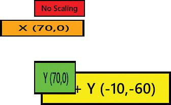
Listing 3.1 applies ScaleTransform to three Buttons in a StackPanel, demonstrating the ability to stretch them independently in height or in width. Figure 3.7 shows the result.
Figure 3.7 The scaled Buttons from Listing 3.1
LISTING 3.1 Applying ScaleTransform to Buttons in a StackPanel
<StackPanelWidth="200"><ButtonBackground="Red">No Scaling</Button><ButtonBackground="Orange"><Button.RenderTransform><ScaleTransformScaleX="2"/></Button.RenderTransform>X</Button><ButtonBackground="Yellow"><Button.RenderTransform><ScaleTransformScaleX="2"ScaleY="2"/></Button.RenderTransform>X + Y</Button><ButtonBackground="Lime"><Button.RenderTransform><ScaleTransformScaleY="2"/></Button.RenderTransform>Y</Button></StackPanel>
Figure 3.8 displays the same Buttons from Listing 3.1 (and Figure 3.7) but with explicit CenterX and CenterY values set. The point represented by each pair of these values is displayed in each Button’s text. Notice that the lime Button isn’t moved to the left like the orange Button, despite being marked with the same CenterX of 70. That’s because CenterX is relevant only when ScaleX is a value other than 1, and CenterY is relevant only when ScaleY is a value other than 1.
SkewTransform
SkewTransform slants an element according to the values of four double properties:
- AngleX—Amount of horizontal skew (default value = 0)
- AngleY—Amount of vertical skew (default value = 0)
- CenterX—Origin for horizontal skew (default value = 0)
- CenterY—Origin for vertical skew (default value = 0)
These properties behave much like the properties of the previous transforms. Figure 3.9 demonstrates SkewTransform applied as a RenderTransform on several Buttons, using the default center of the top-left corner.
TranslateTransform
TranslateTransform simply moves an element according to two double properties:
- X—Amount to move horizontally (default value = 0)
- Y—Amount to move vertically (default value = 0)
TranslateTransform is an easy way to “nudge” elements one way or another. Most likely, you’d do this dynamically based on user actions (and perhaps in an animation). With all the panels described in the next hour, it’s unlikely that you’d need to use TranslateTransform to arrange a static user interface.
Combining Transforms
If you want to transform an element multiple ways simultaneously, such as rotate and scale it, a few different options are available:
- CompositeTransform
- TransformGroup
- MatrixTransform
CompositeTransform
The CompositeTransform class is the easiest way to combine transforms. It has all the properties of the previous four transforms, although some have slightly different names: Rotation, ScaleX, ScaleY, SkewX, SkewY, TranslateX, TranslateY, CenterX, and CenterY.
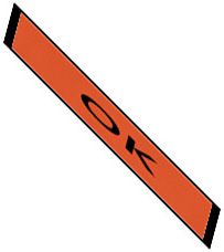
Figure 3.10 shows several transforms being applied to a single Button as follows:
<ButtonBackground="Orange"><Button.RenderTransform><!-- The composite transform order is alwaysscale, then skew, then rotate, then translate --><CompositeTransformRotation="45"ScaleX="5"ScaleY="1"SkewX="30"/></Button.RenderTransform>OK</Button>
It can be handy to always use CompositeTransform instead of the previous transforms, even if you’re only performing one type of transform.
TransformGroup
CompositeTransform always applies its transforms in the same order: scale, skew, rotate, and then translate. If you require a nonstandard order, you can use a TransformGroup instead then put its child transforms in any order. For example, the following XAML looks like it might have the same effect as the previous XAML, but Figure 3.11 shows that the result is much different:
<ButtonBackground="Orange"><Button.RenderTransform><TransformGroup><!-- First rotate, then scale, then skew! --><RotateTransformAngle="45"/><ScaleTransformScaleX="5"ScaleY="1"/><SkewTransformAngleX="30"/></TransformGroup></Button.RenderTransform>OK</Button>
Figure 3.11 This time, the Button is rotated, scaled, and then skewed.
TransformGroup is just another Transform-derived class, so it can be used wherever any transform is used.
For maximum performance, the system calculates a combined transform out of a TransformGroup’s children and applies it as a single transform, much as if you had used CompositeTransform. Note that you can apply multiple instances of the same transform to a TransformGroup. For example, applying two separate 45° RotateTransforms would result in a 90° rotation.
MatrixTransform
MatrixTransform is a low-level mechanism that can be used to represent all combinations of rotation, scaling, skewing, and translating. MatrixTransform has a single Matrix property (of type Matrix) representing a 3x3 affine transformation matrix. (Affine means that straight lines remain straight.) Its Matrix property has the following subproperties representing 6 values in a 3x3 matrix:
The final column’s values cannot be changed.


