CEGUI 文字特效
[tag-name='value']
into your strings and CEGUI does the necessary parsing (see CEGUI::BasicRenderedStringParser class reference for details).
It is important to note that these tags are like a 'state change', that means if you set a specific formatting option, it stays active until changed by another tag. You will see some examples later on.
Escaping
Sometimes you want to just display [Something] and not regard that as a control sequence. In that case, you have to escape the opening bracket - [ - only. Example
\[Text text text]
This will display:
[Text text text]
If you want to escape the string from inside C++, you have to use \\[ but you probably know that if you know your way around C++. In Python it's very similar to C++ but in Lua, the backslash is not an escape character, so just writing \[ should work fine (% is the escaping character in Lua).
Available Tags
Font Colours
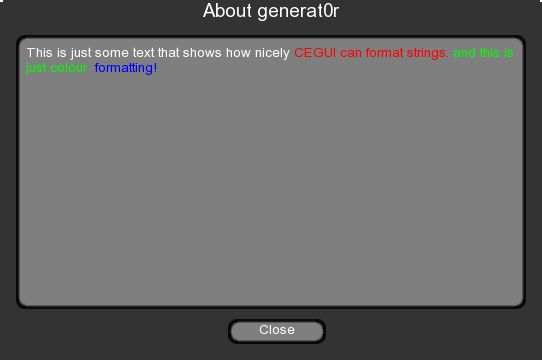
Changing the text colour in a string is quite easy, so let's start with that. In the following example, we will have some text shown in red, green and blue. Here's how the tags work:
"This is just some text that shows how nicely [colour='FFFF0000']CEGUI can format strings.[colour='FF00FF00']
and this is just colour [colour='FF0000FF'] formatting!"
In code, it looks like this:
CEGUI::Window* textComponent =
(CEGUI::Window*)CEGUI::WindowManager::getSingleton().getWindow("generat0r/AboutDialog/StaticText");
textComponent->setText("This is just some text that shows how nicely [colour='FFFF0000']CEGUI
can format strings.[colour='FF00FF00'] and this is just colour [colour='FF0000FF'] formatting!");
And that's how it looks in my app:
A note:
In case you have wondered why 4 sets of values are needed for each colour: Red, for example, is described by [colour='FFFF0000'] where the first 'FF' is the Alpha value (fully opaque in this case), the second is the value for the red component, the third for the green component and the fourth for the blue component, like in [AARRGGBB]
Font Formatting
Font formatting is a bit more involved as you need to have the actual fonts and the 'font' XML files defined for each style.
Let's assume you want to use the Arial font with the styles 'normal', italic, 'bold' and 'bold Italic'. This actually requires you to have four different Arial fonts. For Arial, the fonts are called as follows:
Arial normal (arial.ttf)
Arial bold (arialbd.ttf)
Arial italic (ariali.ttf)
Arial bold italic (arialbi.ttf)
If you want to tinker around with them you can find these and some more in the font manager app of your OS (Arial ships with Windows, so you can get them from the OS). Note that Arial is copyrighted, so you might want to use a free font for your app (check out DaFont for example).
For each font, you will now have to create the according ".font" file that tells CEGUI how to use the font:
Arial-10.font
<?xml version="1.0" ?>
<Font Name="Arial-10" Filename="arial.ttf" Type="FreeType" Size="10" NativeHorzRes="800" NativeVertRes="600"
AutoScaled="false"/>
Arial-Bold-10.font
<?xml version="1.0" ?>
<Font Name="Arial-Bold-10" Filename="arialbd.ttf" Type="FreeType" Size="10" NativeHorzRes="800"
NativeVertRes="600" AutoScaled="false"/>
Arial-Italic-10.font
<?xml version="1.0" ?>
<Font Name="Arial-Italic-10" Filename="ariali.ttf" Type="FreeType" Size="10" NativeHorzRes="800"
NativeVertRes="600" AutoScaled="false"/>
Arial-BoldItalic-10.font
<?xml version="1.0" ?>
<Font Name="Arial-BoldItalic-10" Filename="arialbi.ttf" Type="FreeType" Size="10" NativeHorzRes="800"
NativeVertRes="600" AutoScaled="false"/>
Don't forget to add the font definitions into your scheme, like so:
<?xml version="1.0" ?>
<GUIScheme Name="VanillaSkin">
<Imageset Filename="Vanilla.imageset" />
<Font Filename="Arial-10.font" />
<Font Filename="Arial-Bold-10.font" />
<Font Filename="Arial-Italic-10.font" />
<Font Filename="Arial-BoldItalic-10.font" />
<Font Filename="Arial-14.font" />
<LookNFeel Filename="Vanilla.looknfeel" />
..snip..
Here is the code:
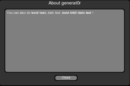
textComponent->setText("You can also do [font='Arial-Bold-10']bold text, [font='Arial-Italic-10']italic
text, [font='Arial-BoldItalic-10']bold AND italic text.[font='Arial-10']!");
And here is how it looks in my app:
Embedding Images
Embedding an image into text is quite easy. The required tag follows the general syntax. Consider the following tag:
[image='set:<imageset> image:<image>']
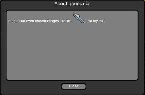
What you need to do here is specify the imageset where the image is specified and identify the image to be used. Let's assume you want to embed the MouseCursor of the TaharezLook imageset into the following text: "Nice, I can even embed images like this <mousepic here> into my text."
First you need to know the name of the imageset and the name of the image. Let's have a look at "TaharezLook.imageset" for that purpose:
<?xml version="1.0" ?>
<Imageset Name="TaharezLook" Imagefile="TaharezLook.tga" NativeHorzRes="800" NativeVertRes="600"
AutoScaled="true">
...
<Image Name="MouseArrow" XPos="138" YPos="127" Width="31" Height="25" XOffset="0" YOffset="0" />
...
</Imageset>
So the imageset is named "TaharezLook" and the wanted image is called "MouseArrow". In code this would now look like follows:
textComponent->setText("Nice, I can even embed images like this [image='set:TaharezLook image:MouseArrow']
into my text. ");
And this is how it looks in my App:
Please note: The following tags have an effect on the way the image is drawn: 'padding', 'alignment' and 'colour'.
Image Size
The 'image-size' tag allows you to change the size of embedded image components. The sizes in the tag are given in pixels and the format is as follows:
w:<width value> h:<height value>
which specifies the width and height of a following image. So to set the size of a subsequent image to 32 pixels height and 64 pixels width, you would use:
[image-size='w:32 h:64']
Here is how it might look in code:
textComponent->setText("Nice, I can even embed images like this [image-size='w:32 h:64']
[image='set:TaharezLook image:MouseArrow'] into my text.");
And here is how it looks in my app:

Please note: To set the image-size back to the real size of the image, just set the values to zero, like so: [image-size='w:0 h:0']
Vertical Alignment
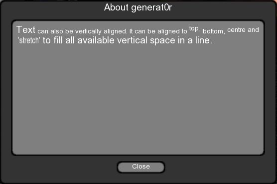
The vertical alignment tag allows you align elements within a text that have different heights. The overall available space on a line is always taken as the height of the tallest element plus any vertical padding, elements are then positioned within this vertical space according to the specified option. Currently, you can align an element to 'top', 'bottom', 'centre' and 'stretch'. The option 'stretch' will stretch the tagged elements vertically to fill the available space. Please note that the stretching is vertical only, aspect ratios of images and text are not maintained! This will be accounted for in the future, though.
The following examples are valid tags for "vert-alignment":
[vert-alignment='top']
[vert-alignment='bottom']
[vert-alignment='centre']
[vert-alignment='stretch']
Here is the code:
textComponent->setText("Text can also be vertically aligned. It can be aligned to [vert-alignment='top']top,
[vert-alignment='bottom']bottom, [vert-alignment='centre']centre and [vert-alignment='stretch']'stretch'");
And here how it looks in my app:
Please note: Embedded window elements cannot be stretched currently. This may also change in the future.
Padding
Padding is related to the vertical alignment tag in that it also allows you to specify the setting of elements in a text. You can set individual text elements or the whole text all together. The value you give the padding tag are a number of pixels to pad the surrounding elements with. The padding tag uses a "rect" property to specify padding values, like so: 'l:<value> t:<value> r:<value> b:<value>) where "l" stands for "left padding, "t" stands for "top padding", "r" stands for "right padding" and "b" stands for "bottom padding".
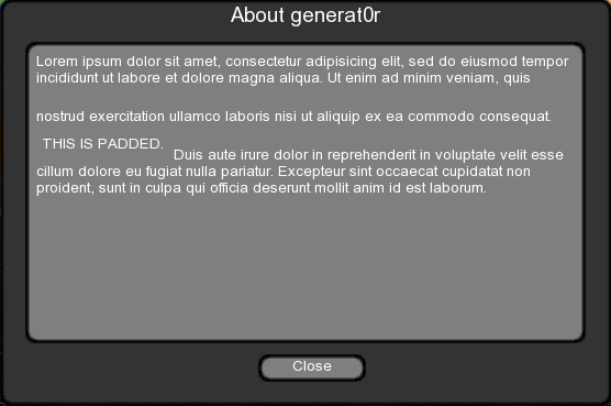
Consider the following sample text: "Lorem ipsum dolor sit amet, consectetur adipisicing elit, sed do eiusmod tempor incididunt ut labore et dolore magna aliqua. Ut enim ad minim veniam, quis nostrud exercitation ullamco laboris nisi ut aliquip ex ea commodo consequat. THIS IS PADDED. Duis aute irure dolor in reprehenderit in voluptate velit esse cillum dolore eu fugiat nulla pariatur. Excepteur sint occaecat cupidatat non proident, sunt in culpa qui officia deserunt mollit anim id est laborum."
Our aim is to pad the text element "THIS IS PADDED" with 5 pixels of left and right padding and 10 pixels of top and bottom padding. The tag would look like this:
[padding='l:5 t:10 r:5 b:10']
Use padding, for example to provide extra spacing when embedding a picture or window in text. Here is the code sample:
textComponent->setText("Lorem ipsum dolor sit amet, consectetur adipisicing elit, sed do eiusmod tempor
incididunt ut labore et dolore magna aliqua. Ut enim ad minim veniam, quis nostrud exercitation ullamco
laboris nisi ut aliquip ex ea commodo consequat. [padding='l:5 t:10 r:5 b:10']THIS IS PADDED.[padding='l:0 t:0
r:0 b:0'] Duis aute irure dolor in reprehenderit in voluptate velit esse cillum dolore eu fugiat nulla
pariatur. Excepteur sint occaecat cupidatat non proident, sunt in culpa qui officia deserunt mollit anim id
est laborum.");
And here is how it looks like in my app:
Please note: Don't try to translate the latin here – its complete nonsense. The "Lorem Ipsum" text has been around since the 1500s, when an unknown printer defined it as a dummy text to make a type specimen book, and it's still in use today. Strange but true.
Window
The 'window' tag manipulates an existing child window of the window that you set the text on, such that the window is drawn in-line with the text, which means it moves with the text automatically. The 'window' tag takes the full name of the window just as you would use it with CEGUI::WindowManager. While the named window can be any window, it only makes sense to reference windows that are attached to the window where the text will be rendered.
So let us embed a button into our text!
First, we define the window in our layout:
<?xml version="1.0" encoding="UTF-8"?>
<GUILayout >
<Window Type="Vanilla/FrameWindow" Name="generat0r/AboutDialog" >
<Property Name="Text" Value="About generat0r" />
<Property Name="TitlebarFont" Value="Arial-14" />
<Property Name="TitlebarEnabled" Value="True" />
<Property Name="CloseButtonEnabled" Value="False" />
<Property Name="SizingEnabled" Value="False" />
<Property Name="UnifiedAreaRect" Value="{{0.015,0},{0.015,0},{0.45,0},{0.40,0}}" />
<Property Name="UnifiedPosition" Value="{ {0.25, 0}, {0.25, 0} }" />

<Window Type="Vanilla/StaticText" Name="generat0r/AboutDialog/StaticText" >
<Property Name="Text" Value="Demonstrates static (non editable) text. Use the controls on your right for
formatting options." />
<Property Name="HorzExtent" Value="361" />
<Property Name="VertExtent" Value="59.5854" />
<Property Name="HorzFormatting" Value="WordWrapLeftAligned" />
<Property Name="VertFormatting" Value="TopAligned" />
<Property Name="UnifiedAreaRect" Value="{{0.03,0},{0.03,0},{0.97,0},{0.85,0}}" />

<Window Type="Vanilla/Button" Name="generat0r/AboutDialog/EmbeddedButton"
<Property Name="Text" Value="Embedded" />
<Property Name="UnifiedAreaRect" Value="{{0.42,0},{0.88,0},{0.60,0},{0.955,0}}" />
</Window>
</Window>
<Window Type="Vanilla/Button" Name="generat0r/AboutDialog/CloseButton" >
<Property Name="Text" Value="Close" />
<Property Name="UnifiedAreaRect" Value="{{0.42,0},{0.88,0},{0.60,0},{0.955,0}}" />
</Window>
</Window>
</GUILayout>
Pay special attention to the cut out segment in the above layout! Please also note that the window I want to embed is a child of the text window.
Our tag will look like this:
[window='generat0r/AboutDialog/EmbeddedButton']
Now, you just need to embed the defined window ("generat0r/AboutDialog/EmbeddedButton") into the string, like so:
textComponent->setText("Lorem ipsum dolor sit amet, consectetur adipisicing elit,sed do eiusmod tempor
incididunt ut labore et dolore magna aliqua. Ut enim ad minim veniam, quis nostrud exercitation ullamco
[window='generat0r/AboutDialog/EmbeddedButton']laboris nisi ut aliquip ex ea commodo consequat. THIS IS
PADDED. Duis aute irure dolor in reprehenderit in voluptate velit esse cillum dolore eu fugiat nulla pariatur.
Excepteur sint occaecat cupidatat non proident, sunt in culpa qui officia deserunt mollit anim id est
laborum.");
And here is how it looks in my app:

The window tag works fine with formatting options for text. Please consider, though, that the embedded window is treated as a single entity. So if you embed a window that just draws text, the text of that window will not be split for wrapping purposes, but might have its own formatting! Padding and vertical alignments work here as well, with the exception of the 'stretch' option (which will default to 'centre' and raise a note in the CEGUI.log)
Note: If you have not created the window you call here, you will get an 'unknown object' exception!
