R 基础--画图2
学习笔记!本文主要参考R语言实战第二版
基本图形
目录:
条形图
饼图
直方图
核密度图
箱线图
点图
学习开始
条形图
barplot(height):
基本条形图
install.packages("vcd")
library(vcd)
Arthritis
count=table(Arthritis$Improved)
count
dev.new()
barplot(count, main = "Bar", xlab = "type",ylab="count") #默认是竖向的图
barplot(count, main = "Bar", xlab = "type",ylab="count",
names.arg = c("No Improvement","Some Improvement","Marked Improvement"))
##更改X轴标签
barplot(count, horiz = TRUE, main = "Bar", xlab = "type",ylab="count") #水平图horiz = TRUE
堆砌条形图和分组条形图
如果height 是一个矩阵, 则可以绘制一个堆砌条形图或分组条形图 , beside 默认为 FALSE 堆砌条形图, beside 为TRUE 为分组形式
count=table(Arthritis$Improved, Arthritis$Sex)
count
#        Female Male
#None       25   17
#Some       12    2
#Marked     22    6


par(mfrow=c(1,2) )

#纵向
# 堆砌 beside=FALSE 默认值
barplot(count, main = "Bar", xlab = "type",ylab="count",
col=c("red","blue","green"),legend=rownames(count))

# 堆砌 beside=true
barplot(count, main = "Bar", xlab = "type",ylab="count",
col=c("red","blue","green"), legend=rownames(count), beside=TRUE)

##横向
barplot(count, horiz = TRUE, main = "Bar", xlab = "type",ylab="count", col=c("red","blue","green"),
 legend=rownames(count))
等高的条形图
spine(count , main = "等高条形图")
饼图
pie(x,lables)
###饼形图
par(mfrow=c(2,2))
slices=c(1,2,3,4,5)
lb=c("US","UK","FR","GE","CN")
pie(slices, labels = lbls, main = "a simple pie chart")
##添加比例数值
pct=round(slices/sum(slices)*100, 0.1)
l=paste(lb," ",pct,"%", sep="")
pie(slices, labels = l, col = rainbow(5),main = "% pie chart")
##3D pie char
install.packages("plotrix")
library(plotrix)
?pie3D
pie3D(slices,labels = l, col=rainbow(5), explode = 0.1, main="3D Pie Chart " )
##从表格创建饼图
mytable=table(state.region)
mytable
pie(mytable, labels = paste(names(mytable)," ", mytable , sep = ""), main="Pie from a table")
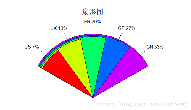
##扇形图
library(plotrix)
dev.new()
fan.plot(slices, labels = l, main="扇形图")

扇形图:
直方图
hist(x)
par(mfrow=c(2,2))

hist(mtcars$mpg)

hist(mtcars$mpg,
     freq = FALSE,
     breaks=12,
     col="red",
     xlab = "Miles Per Gallon",
     main = "Colored Histogram with 12 bins")

hist(mtcars$mpg,
     freq = FALSE,
     breaks=12,
     col="red",
     xlab = "Miles Per Gallon",
     main = "Colored Histogram with 12 bins")
rug(jitter(mtcars$mpg)) ###加入轴须
lines(density(mtcars$mpg), col="blue",lwd=2)

h=hist(mtcars$mpg,
     freq = FALSE,
     breaks=12,
     col="red",
     xlab = "Miles Per Gallon",
     main = "Colored Histogram with normalcurve and box")
xfit=seq(min(x),max(x), length(x))
yfit=dnorm(xfit, mean=mean(x),sd=sd(x))
yfit=yfit*diff(h$mids[1:2])*length(x)
lines(density(mtcars$mpg), col="blue",lwd=2)
box()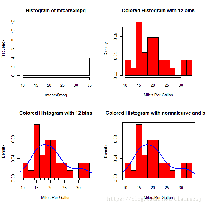
核密度图
plot(density(x))
###核密度图
dev.new()
par(mfrow=c(2,1))
mtcars
d=density(mtcars$mpg)
plot(d)

plot(d, main="核密度图")
polygon(d,col="red",border = "blue")

###核密度图比较
install.packages("sm")
library(sm)
attach(mtcars)

dev.new()
cyl_f=factor(cyl, levels = c(4,6,8), labels=c("4 cylinder","6 cylinder","8 cylinder"))
sm.density.compare(mpg, cyl,xlab="Miles Per Gallon", main="Compare by Cylinder")
colfill=c(2:(1+length(levels(cyl_f))))
legend(locator(1),levels(cyl_f),fill=colfill)

detach(mtcars)

箱线图
boxplot()
boxplot(mtcars$mpg~mtcars$cyl, main="Box Chart", col=c("red","yellow","blue"))
点图
dotchart(x,label)
##点图
dotchart(mtcars$mpg, main="Dot Chart ", labels=rownames(mtcars))

dotchart(order(mtcars$mpg), main="Dot Chart ", labels=rownames(mtcars))

x=mtcars[order(mtcars$mpg) ,]
dev.new()
dotchart(x$mpg, main="Dot Chart ", labels=rownames(mtcars), groups = x$cyl ,col=x$cyl)