1.Introduction - 介绍
We challenged ourselves to create a visual language for our users that synthesizes the classic principles of good design with the innovation and possibility of technology and science. This is material design. This spec is a living document that will be updated as we continue to develop the tenets and specifics of material design.
【翻译】
我们挑战自己为我们的用户创造一种视觉语言,将经典的良好设计原则与技术和科学的创新和可能性相结合。 这是原质化设计(Material Design)。 这份文档是动态更新的,将会随着我们对 Material Design 的探索而不断迭代、升级。
Goals - 目标
Create a visual language that synthesizes classic principles of good design with the innovation and possibility of technology and science.
【翻译】
创造一个视觉语言,能够遵循优秀设计的经典定则,同时还伴有创新理念和新的科技。
Develop a single underlying system that allows for a unified experience across platforms and device sizes. Mobile precepts are fundamental, but touch, voice, mouse, and keyboard are all first-class input methods.
【翻译】
开发一种底层系统,构建跨平台和超越设备尺寸的统一体验。遵循基本的移动设计定则,同时支持触摸、语音、鼠标、键盘等输入方式。
Principles - 原则
Material is the metaphor - 原质化是隐喻
A material metaphor is the unifying theory of a rationalized space and a system of motion. The material is grounded in tactile reality, inspired by the study of paper and ink, yet technologically advanced and open to imagination and magic.
【翻译】
通过构建系统化的动效和空间合理化利用,并将两个理念合二为一,构成了实体隐喻。与众不同的触感是实体的基础,这一灵感来自我们对纸墨的研究,但是我们相信,随着科技的进步,应用前景将不可估量
Surfaces and edges of the material provide visual cues that are grounded in reality. The use of familiar tactile attributes helps users quickly understand affordances. Yet the flexibility of the material creates new affordances that supercede those in the physical world, without breaking the rules of physics.
【翻译】
实体的表面和边缘提供基于真实效果的视觉体验,熟悉的触感让用户可以快速地理解和认知。实体的多样性可以让我们呈现出更多反映真实世界的设计效果,但同时又绝不会脱离客观的物理规律。
The fundamentals of light, surface, and movement are key to conveying how objects move, interact, and exist in space and in relation to each other. Realistic lighting shows seams, divides space, and indicates moving parts.
【翻译】
光效、表面质感、运动感这三点是解释物体运动规律、交互方式、空间关系的关键。真实的光效可以解释物体之间的交合关系、空间关系,以及单个物体的运动。
Bold, graphic, intentional - 大胆,生动,有意图
The foundational elements of print-based design – typography, grids, space, scale, color, and use of imagery – guide visual treatments. These elements do far more than please the eye. They create hierarchy, meaning, and focus. Deliberate color choices, edge-to-edge imagery, large-scale typography, and intentional white space create a bold and graphic interface that immerse the user in the experience.
【翻译】
基于传统印刷的设计 - 排版,网格,空间,尺度,颜色和图像,这些的基本要素的使用 - 指导视觉处理。 这些元素愉悦着我们。 他们创造层次,意义和焦点。 颜色选择的推敲,边缘到边缘的图像,大规模排版和有意的空白空间创建一个大胆的图形界面。
An emphasis on user actions makes core functionality immediately apparent and provides waypoints for the user.
【翻译】
让用户沉浸在体验中。 强调用户操作,使核心功能立即显现。
Motion provides meaning - 有意义的动效
Motion respects and reinforces the user as the prime mover. Primary user actions are inflection points that initiate motion, transforming the whole design.
【翻译】
动画效果(简称动效)可以有效地暗示、指引用户。动效的设计要根据用户行为而定,能够改变整体设计的触感。
All action takes place in a single environment. Objects are presented to the user without breaking the continuity of experience even as they transform and reorganize.
【翻译】
动效应当在独立的场景呈现。通过动效,让物体的变化以更连续、更平滑的方式呈现给用户,让用户能够充分知晓所发生的变化。
Motion is meaningful and appropriate, serving to focus attention and maintain continuity. Feedback is subtle yet clear. Transitions are efficient yet coherent.
【翻译】
动效应该是有意义的、合理的,动效的目的是为了吸引用户的注意力,以及维持整个系统的连续性体验。动效反馈需细腻、清爽。转场动效需高效、明晰。
2.Environment - 环境
Material design is a three-dimensional environment containing light, material, and cast shadows.
【翻译】
Material design是包含光,材料和投射阴影的三维环境。
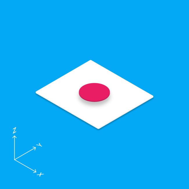
All material objects have x, y, and z dimensions.
All material objects have a single z-axis position.
Key lights create directional shadows, and ambient light creates soft shadows.
【翻译】
所有对象都有x,y和z尺寸。
所有对象都具有单个z轴位置。
主光源投射出一个定向的阴影,而环境光从各个角度投射出连贯又柔和的阴影。
Material thickness - 厚度
1dp
Shadows - 阴影
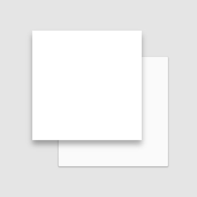
Shadows are created by the elevation difference between overlapping material.
【翻译】
不同对象的高度差产生阴影。
3D world - 3D世界
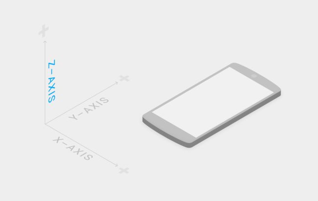
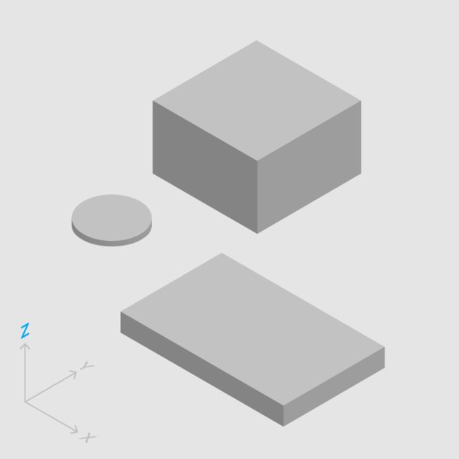
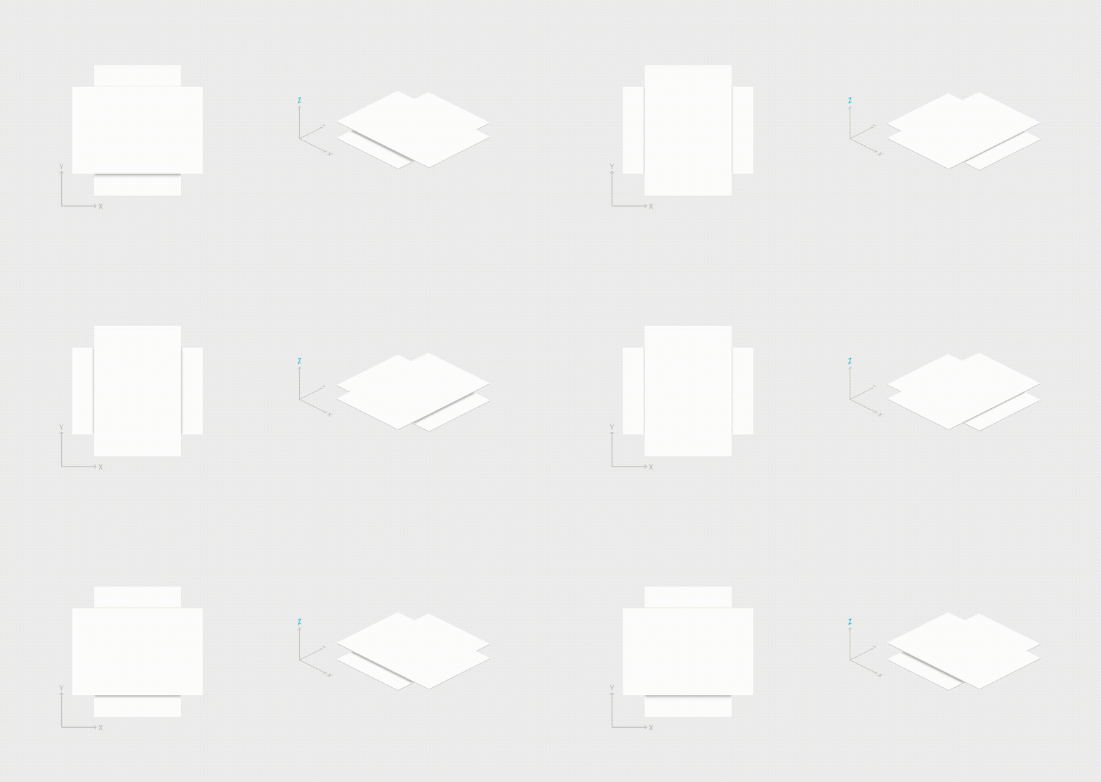
The material environment is a 3D space, which means all objects have x, y, and z dimensions. The z-axis is perpendicularly aligned to the plane of the display, with the positive z-axis extending towards the viewer. Every sheet of material occupies a single position along the z-axis and has a standard 1dp thickness, equivalent to one pixel of thicknesson screens with a pixel density of 160.
On the web, the z-axis is used for layering and not for perspective. The 3D world is emulated by manipulating the y-axis.
【翻译】
材质环境是一个3D空间,这意味着所有对象都有x,y和z维度。 z轴垂直地对准显示器的平面,正z轴朝向观看者延伸。 每张材料沿着z轴占据单个位置,并且具有标准1dp厚度,相当于像素密度为160的屏幕上的一个像素厚度。
在网页上,z轴被用来分层而不是为了视角。3D 空间通过操纵 y 轴进行仿真。
Light and shadow - 光影关系
Within the material environment, virtual lights illuminate the scene. Key lights create directional shadows, while ambient light creates soft shadows from all angles.
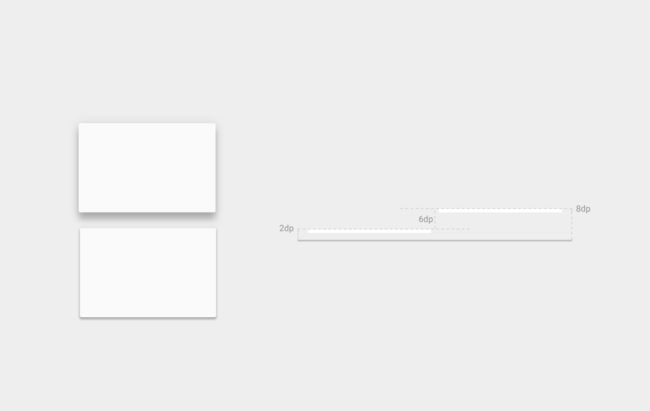
Shadows in the material environment are cast by these two light sources. In Android development, shadows occur when light sources are blocked by sheets of material at various positions along the z-axis. On the web, shadows are depicted by manipulating the y-axis only. The following example shows the card with a height of 6dp.
【翻译】
在材料环境中,虚拟光照亮场景。主光源投射出一个定向的阴影,而环境光从各个角度投射出连贯又柔和的阴影。
材料环境中的阴影由这两个光源投射。 在Android开发中,当光源被沿着z轴,被各种位置处的材料片阻挡时,发生阴影。 在web上,阴影通过仅操纵y轴来描绘。 以下示例显示为高度为6dp的卡片。
3.Material properties - Material 属性
Material has certain immutable characteristics and inherent behaviors.
【翻译】
材料具有某些不变的特性和固有的行为。
Understanding these qualities of material will help you manipulate material in a way that’s consistent with the vision of material design.
【翻译】
了解这些特性将有助于你在一定程度上熟悉材料,这与 Material Design 的构想是一致的。
Material characteristics - 特性
Solid - 固体
Occupies unique points in space - 独立占有空间
Impenetrable - 不可穿透
Mutable shape - 形状易变
Changes in size only along its plane - 仅沿其平面的进行大小变化
Unbendable - 不能弯曲
Can join to other material - 多个材料可相互连接
Can separate, split, and heal - 可以分开,分裂和复原
Can be created or destroyed - 可以创建或销毁
Moves along any axis - 沿任意轴移动
Physical properties - 物理特性
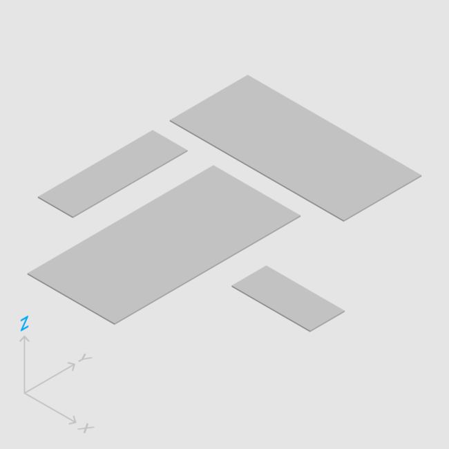
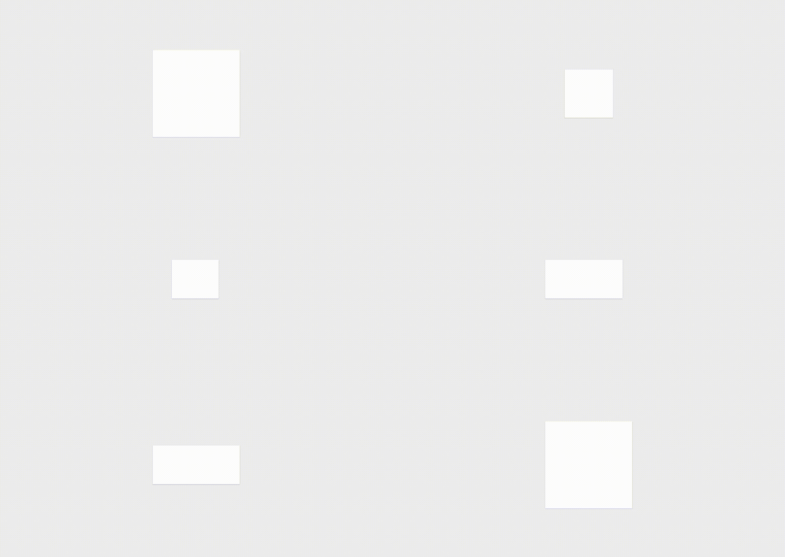
Material has varying x & y dimensions (measured in dp) and a uniform thickness (1dp).
【翻译】
材料具有变化的长宽尺寸(以 dp 为计)和均匀的厚度(1dp)。
Do.
The height and width of material can vary.
【翻译】
正确的示范
材料的高度和宽度是可变的。
Don't.
Material is always 1dp thick.
【翻译】
错误的示范
材料总是1dp厚。
Material casts shadows.
Shadows result naturally from the relative elevation (z-position) between material elements.
【翻译】
材料会形成阴影。
阴影是由于材料元件之间的相对高度(Z 轴位置)而自然产生的。
Do.
Shadows depict the relative elevation between material elements.
【翻译】
正确的示范
阴影描述材料元件之间的相对高度。
Don't.
Shadows are never approximated by coloring material.
【翻译】
错误的示范
阴影从不用着色材料近似。
Content is displayed on material, in any shape and color. Content does not add thickness to material.
【翻译】
内容可被以任何形状和颜色显示在材料上。
内容并不会增加材料的厚度。
Do.
Material can display any shape and color.
【翻译】
正确的示范
材料能展示任何形状和颜色。
Content can behave independently of the material, but is limited within the bounds of the material.
【翻译】
内容的展示能够独立于材料,但要被限制在材料的范围里。
Do.
Content behavior can be independent of the behavior of material.
【翻译】
正确的示范
内容的行为能独立于材料的行为。
Material is solid.
Input events cannot pass through material.
【翻译】
材料是实物。
输入事件不能穿过材料。
Do.
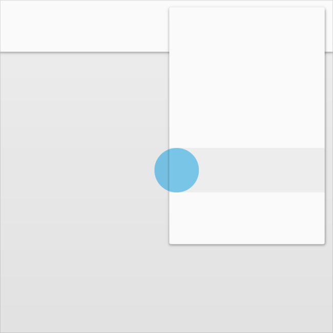
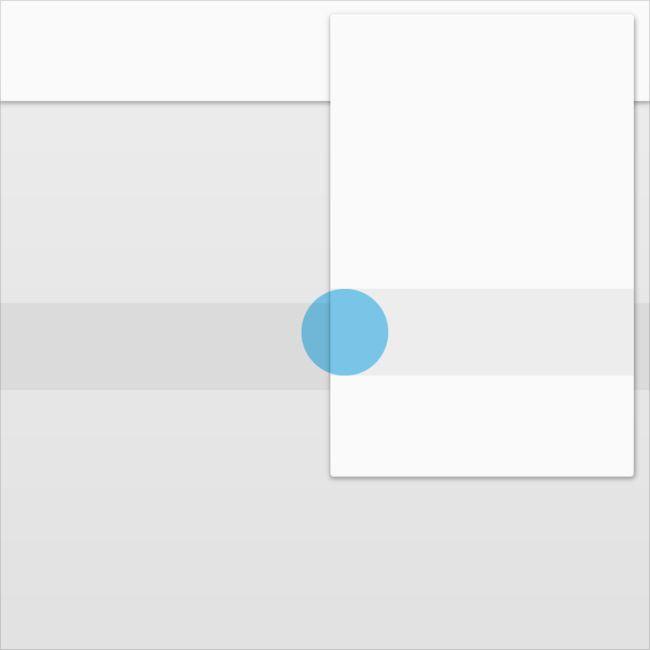
Input events only affect the foreground material.
【翻译】
正确的示范
输入事件只影响材料的前景。
Don't.
Input events cannot pass through material.
【翻译】
错误的示范
输入事件不能从材料下面穿过。
Multiple material elements cannot occupy the same point in space simultaneously.
【翻译】
多个材料元件不能同时占用相同的空间点。
Do.
Using elevation to separate material elements is one method of preventing multiple material elements from occupying the same point in space simultaneously.
【翻译】
正确的示范
利用不同的高度区分材料元件是防止多个材料元件同时占用相同空间点的一个方法。
Don't.
Multiple material elements cannot occupy the same point in space simultaneously.
【翻译】
错误的示范
多个材料元件不能同时占用相同的空间点。
Material cannot pass through other material.
For example, one sheet of material cannot pass through another sheet of material when changing elevation.
【翻译】
材料不能穿过其他材料。
例如,一片材料不能在改变高度时穿过另一片材料。
Don't.
Material cannot pass through other material.
【翻译】
错误的示范
材料不能穿过其他材料。
Transforming material - 材料的变化
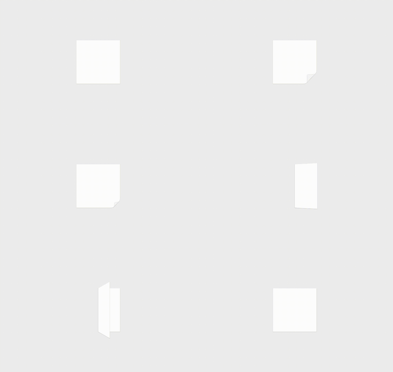
Material can change shape.
【翻译】
材料能改变形状。
Material grows and shrinks only along its plane.
【翻译】
材料只沿其平面变大和缩小。
Material never bends or folds.
【翻译】
材料决不能弯曲或折叠。
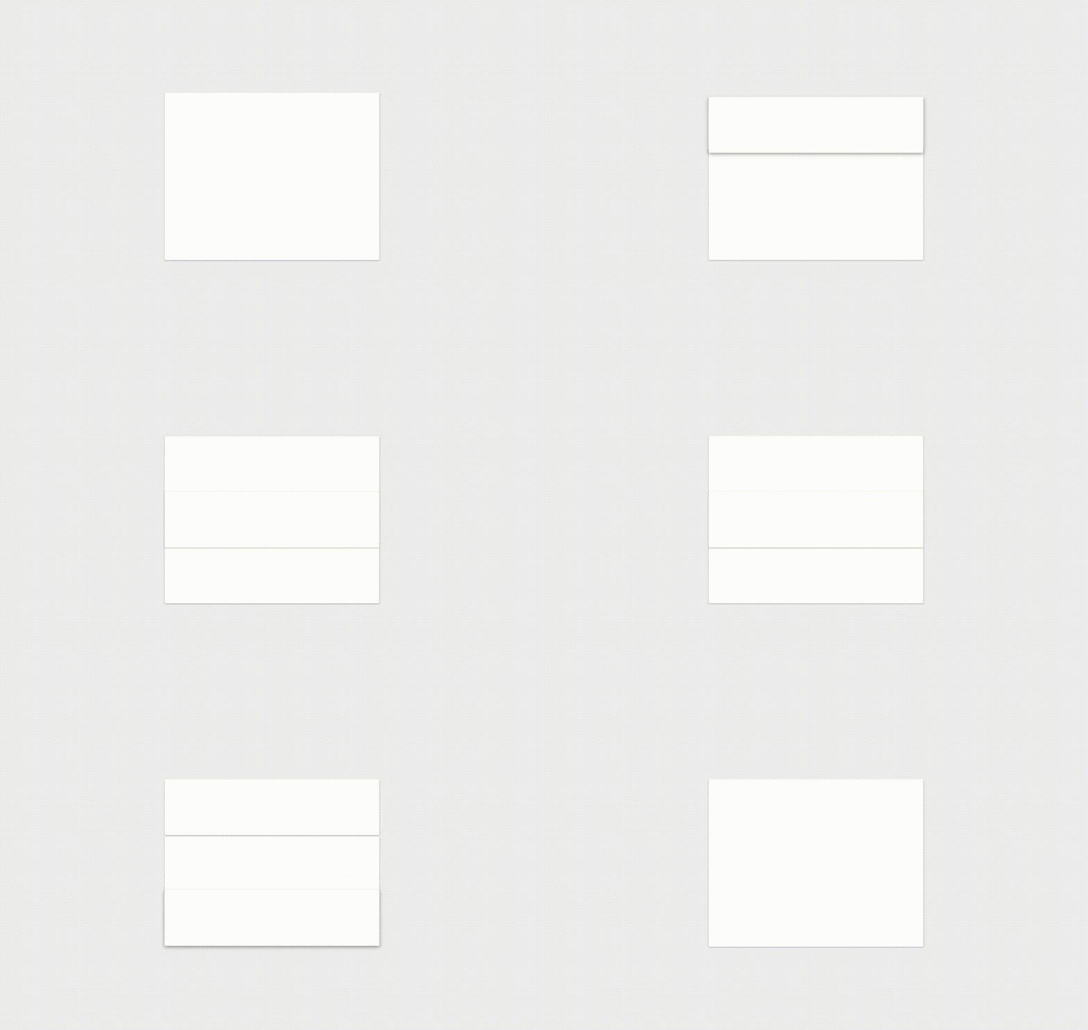
Sheets of material can join together to become a single sheet of material.
【翻译】
几片材料能合在一起组成一片材料。
When split, material can heal. For example, if you remove a portion of material from a sheet of material, the sheet of material will become a whole sheet again.
【翻译】
当材料被割开时,它还能自己复原。例如,你从一片材料中移除了一部分,这一片材料将再次变为一块完整的材料。
Movement of material - 材料的移动
Material can be spontaneously generated or destroyed anywhere in the environment.
【翻译】
材料能在环境中的任何地方自动产生或消失。
Material can move along any axis.
【翻译】
材料能沿任何轴移动
Z-axis motion is typically a result of user interaction with material.
【翻译】
Z轴产生运动一般都是用户与材料交互而产生的。
4.Elevation and shadows - 高度和阴影
Objects in material design possess similar qualities to objects in the physical world.
【翻译】
Material design 中的对象与现实生活中的对象具有相似的性质。
In the physical world, objects can be stacked or affixed to one another, but cannot pass through each other. Objects also cast shadows and reflect light.
Material design reflects these qualities to form a spatial model that is familiar to users and can be applied consistently across apps.
【翻译】
在现实生活中,不同对象可以被堆积或粘贴起来,但是不能彼此交叉。对象自身塑造了自己的阴影并返回自己的光影。
依据这些性质所构造出来的空间模型对于用户来说是非常熟悉的,这一模型也可以被长期应用于移动应用当中。
Elevation (Android) - 高度(安卓)
Elevation is the relative depth, or distance, between two surfaces along the z-axis.
【翻译】
高度是在 Z 轴上两个不同平面之间的一种相对深度或距离。
Specifications:
1、Elevation is measured in the same units as the x and y axes, typically in density-independent pixels (dp). Because material elements have depth (all material is 1dp thick), elevation is measured in distance from the top of one surface to the top of another.
2、A child object's elevation is relative to the parent object's elevation.
The images and values shown are for Android apps.
【翻译】
详述:
1、“高度”的度量单位与 X、Y 轴的度量单位相同,主要是 DP。由于所有 Material 元素都具有 1 单位 DP 的厚度,所以“高度”度量的是从一个平面顶部到另一个平面顶部的距离。
2、一个子对象的高度与其父对象的高度相关。
这里是一些与安卓应用相关的图表和数据。
Resting elevation - 静止高度
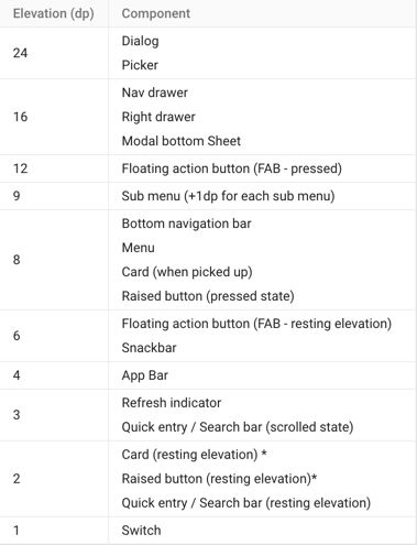
All material objects, regardless of size, have a resting elevation, or default elevation that does not change. If an object changes elevation, it should return to its resting elevation as soon as possible.
Desktop resting elevation is 2dp below the listed values to accommodate mouse and non-touch environments.
【翻译】
所有 Material 对象除去大小之外,还有一个“静止高度”,或者称“默认高度”,它是不会变化的。当一个对象的高度产生变化时,它将会尽快恢复到自身的静止高度。
桌面静止高度要低于所列值的2dp,以适应鼠标和非触摸环境。
Component elevations - 组件高度:
1、Components maintain consistent resting elevations across apps. For example, the floating action button’s elevation does not vary from one app to another.
2、Components may have different resting elevations across platforms and devices, depending on the depth of the environment. For instance, TV has a greater depth than desktop as it has a larger screen and is viewed from further away. Similarly, both TV and desktop have a greater depth than mobile.
【翻译】
1、某一元素类型的静止高度在移动应用中是一个常量。(比如,FAB 高度不会在某一个应用中是 6 dp 而在另一个应用中是 16 dp)
2、元素在某一平台中可能会存在多种静止高度,这取决于环境的深度。(比如,TV 相比于移动端和桌面来说就具有更深的层次)
Responsive elevation and dynamic elevation offsets - 感应高度与动态高度偏移
Some component types have responsive elevation, meaning they change elevation in response to user input (e.g., normal, focused, and pressed) or system events. These elevation changes are consistently implemented using dynamic elevation offsets.
Dynamic elevation offsets are the goal elevation that a component moves towards, relative to the component’s resting state. They ensure that elevation changes are consistent across actions and component types. For example, all components that lift on press have the same elevation change relative to their resting elevation.
Once the input event is completed or cancelled, the component will return to its resting elevation.
【翻译】
一些元素类型拥有感应高度,也就是说它们会根据用户的输入(比如常规的、关注的和压制的)或系统事件来改变高度。这些高度的变化会通过动态高度偏移而不断生成。
动态高度偏移是某一元素移动的目标高度,它与该元素的静止状态有关。可以确定的是高度的变化在事件和元素类型中是持久发生的。比如说,所有通过按压来提升的元素相对于其静态高度来说都具有相似的高度变化。
一旦输入事件完成或被取消,那么元素将会恢复到它的静止高度上。
Avoiding elevation interference - 避免高度冲突
Components with responsive elevations may encounter other components as they move between their resting elevations and dynamic elevation offsets. Because material cannot pass through other material, components avoid interfering with one another any number of ways, whether on a per-component basis or using the entire app layout.
On a component level, components can move or be removed before they cause interference. For example, a floating action button (FAB) can disappear or move off-screen before a user picks up a card, or it can move if a snackbar appears.
On the layout level, design your app layout to minimize opportunities for interference. For example, position the FAB to one side of stream of a cards so the FAB won’t interfere when a user tries to pick up one of cards.
【翻译】
处于感应高度的元素当它在静止高度与动态高度偏移之间移动的时候可能会遇到其他的元素。由于 Material 不能相互交叉,没有任何一种方式能够让元素之间产生冲突,无论是基于均元素基础(per-component basis)还是通过使用完整应用布局。
在某一个元素水平上,元素可以在它们产生冲突之前提前移动或被移动。比如说,一个“浮动动作按钮”(FAB)可以在用户选择一张卡片之前消失或移出屏幕,或者它也可以在某一个 “snack bar” 出现时移动。
在布局水平上,你需要通过设计你的应用布局来将产生冲突的机会降到最低水平。比如说,可以通过将 FAB 置于某个卡片流的一端来避免当用户尝试获取某个卡片时所产生的冲突。
Component elevation comparisons - 元素高度比较
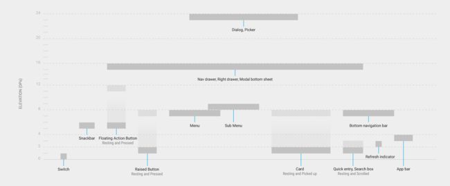
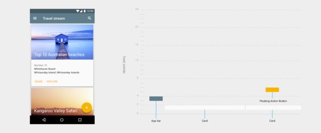
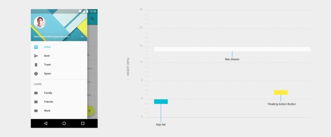
The following diagram compares component resting elevations and dynamic elevation offsets.
【翻译】
下面的图表对比了多种元素的静止高度和动态高度偏移。
In this diagram, only the elevation dimensions and layout for components are accurate. Other dimensions and overall layout of components are for illustration only.
【翻译】
在这一图表中,只有高度的尺寸和元素布局是精确的。其他尺寸和整体的元素布局只是为了说明而列出的。
An example app layout with cards and a floating action button, along with a cross-section diagram of its component elevations along its z-axis
【翻译】
一个包含卡片和FAB应用布局的实例与它在Z轴上元素高度的横截面图表。
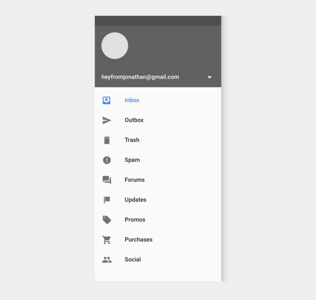
An example app layout with an open navigation drawer, along with a cross-section diagram of its component elevations along its z-axis.
【翻译】
一个包含开放导航抽屉的应用布局实例与它在Z轴上元素高度的横截面图表。
Shadows - 阴影
Shadows provide important visual cues about objects’ depth and directional movement. They are the only visual cue indicating the amount of separation between surfaces. An object’s elevation determines the appearance of its shadow.
【翻译】
“阴影”提供了对象深度和方向性移动的重要视觉线索。它们是唯一一种标示不同平面之间分离程度的视觉线索。某一对象的“高度”决定了其具体“阴影”的表现形式。
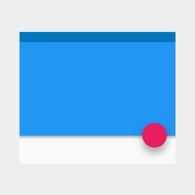
Don't.
Without a shadow, nothing indicates that the floating action button is separate from the background surfaces.
【翻译】
错误的示范
一旦没有了阴影,没有什么可以标示浮动动作按钮是从背景层分离出来的。
Don't.
Crisp shadows indicate the floating action button and the blue sheet are separate elements. However, their shadows are so similar that they imply they are both at the same elevation.
【翻译】
错误的示范
卷曲的阴影说明浮动动作按钮与“蓝层”(blue sheet)是两个分离开来的元素。然而,由于它们的阴影非常的相似以至于会被误认为它们在同一高度上。
Do.
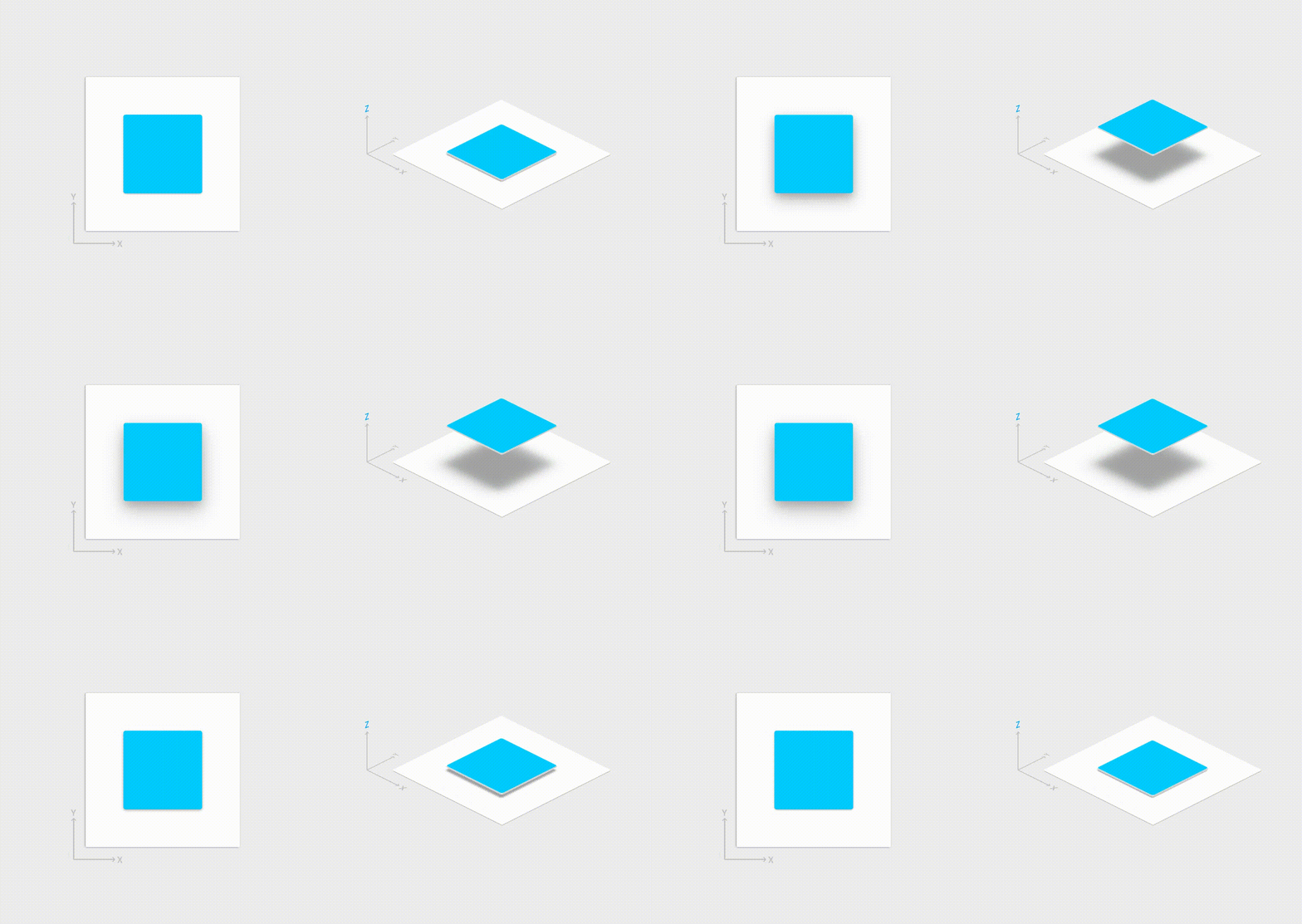
Softer, larger shadows indicate the floating action button is at a higher elevation than the blue sheet, which has a crisper shadow.
【翻译】
正确的示范
更柔和、更大的阴影说明浮动动作按钮相比于拥有更卷曲阴影的“蓝层”(blue sheet)处于更高的高度之上。
In motion, shadows provide useful cues about an object’s direction of movement and whether the distance between surfaces is increasing or decreasing.
【翻译】
在运动中,阴影提供了关于某个对象移动方向以及不同平面之间距离是否正在增加或减少的有用线索。
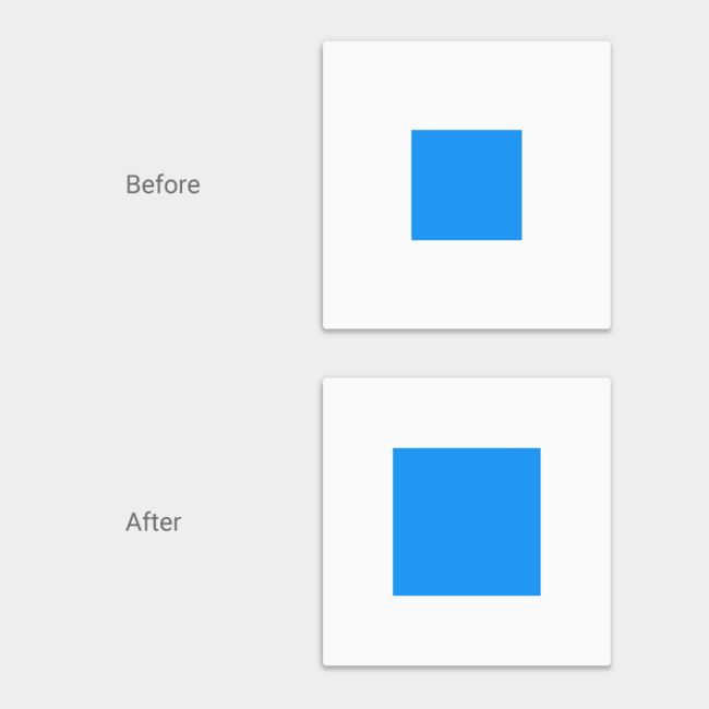
Don't.
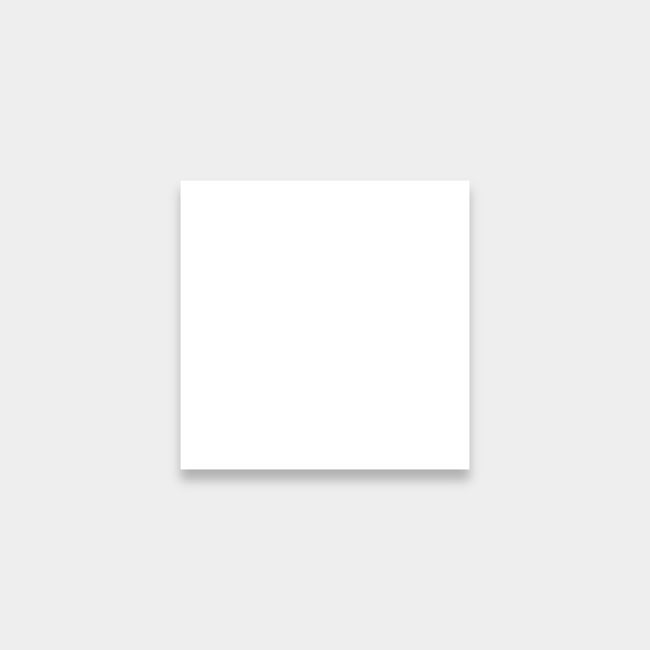
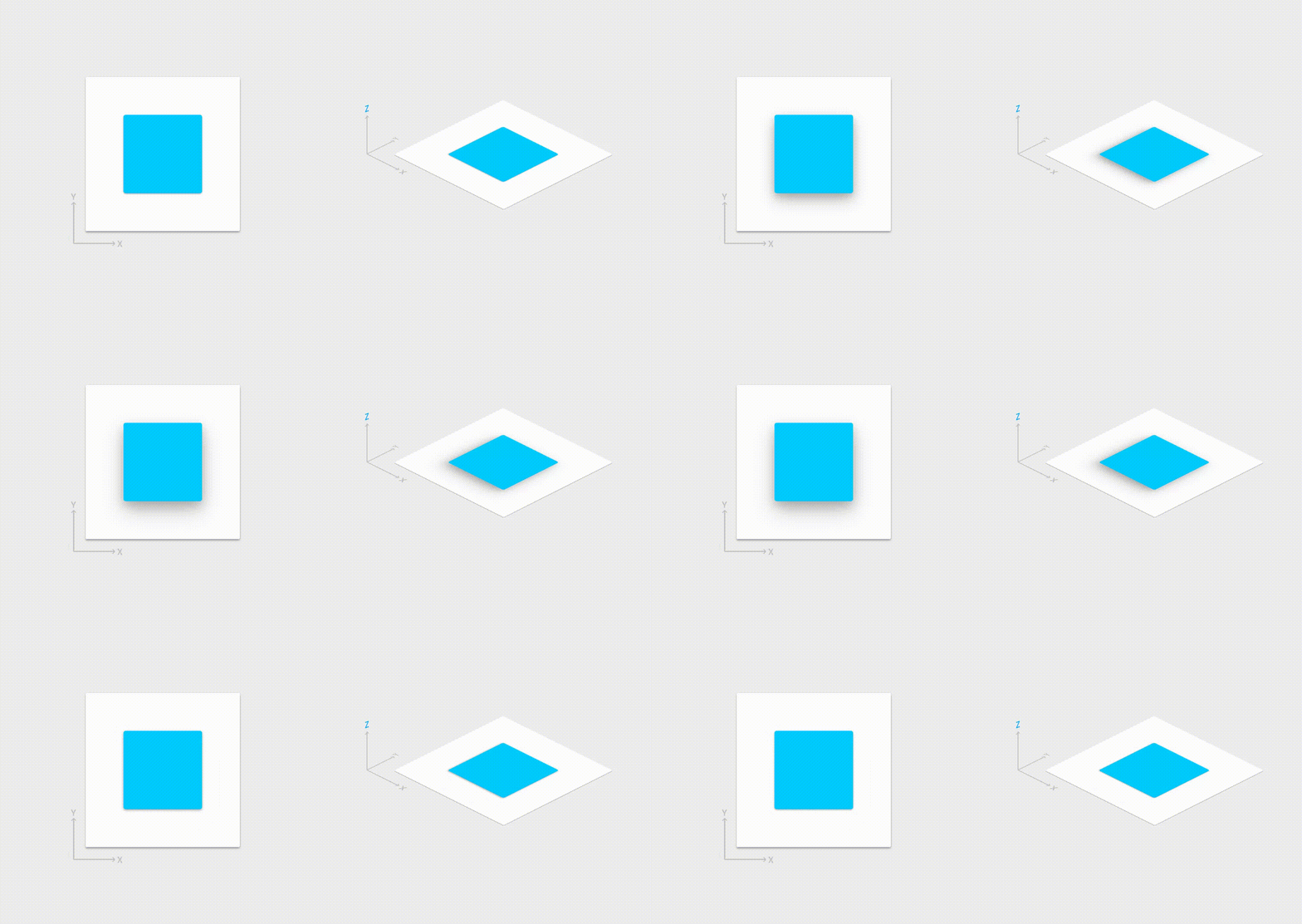
Without a shadow to indicate elevation, it’s unclear whether this square is increasing in size or increasing its elevation.
【翻译】
错误的示范
如果没有一个阴影来说明高度,那么就不能明确一个方形到底是它的自身尺寸在增加还是它的高度在增加。
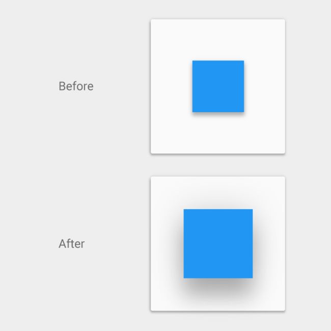
Do.
The shadow grows softer and larger as the object’s elevation increases and grows crisper and smaller as the elevation decreases.
【翻译】
正确的示范
某一个对象的高度增加时其阴影会变得更柔和、更大,当其高度减小时,阴影会变得更卷曲。
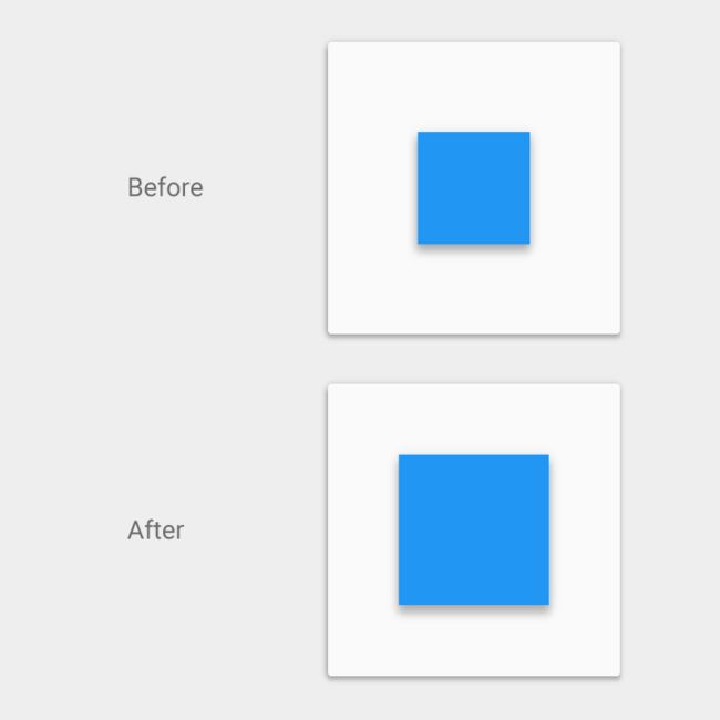
Do.
In this case, the consistent shadow helps the user understand that the object is changing shape as opposed to changing elevation.
【翻译】
正确的示范
在这一实例中,连贯的阴影帮助用户明白某一个对象看起来好像是它的高度在增加其实是它的形状在改变。
Component reference shadows - 元素参考阴影
The following component shadows should be used as canonical references. If there are any differences between the following reference shadows and component shadows found elsewhere within this spec, defer to these reference shadows.
【翻译】
下面的元素阴影应被用于标准参考。如果在说明中涉及任何关于下面的参考阴影和元素阴影的不同情况出现,那么都归于参考阴影。
App bar - 应用条
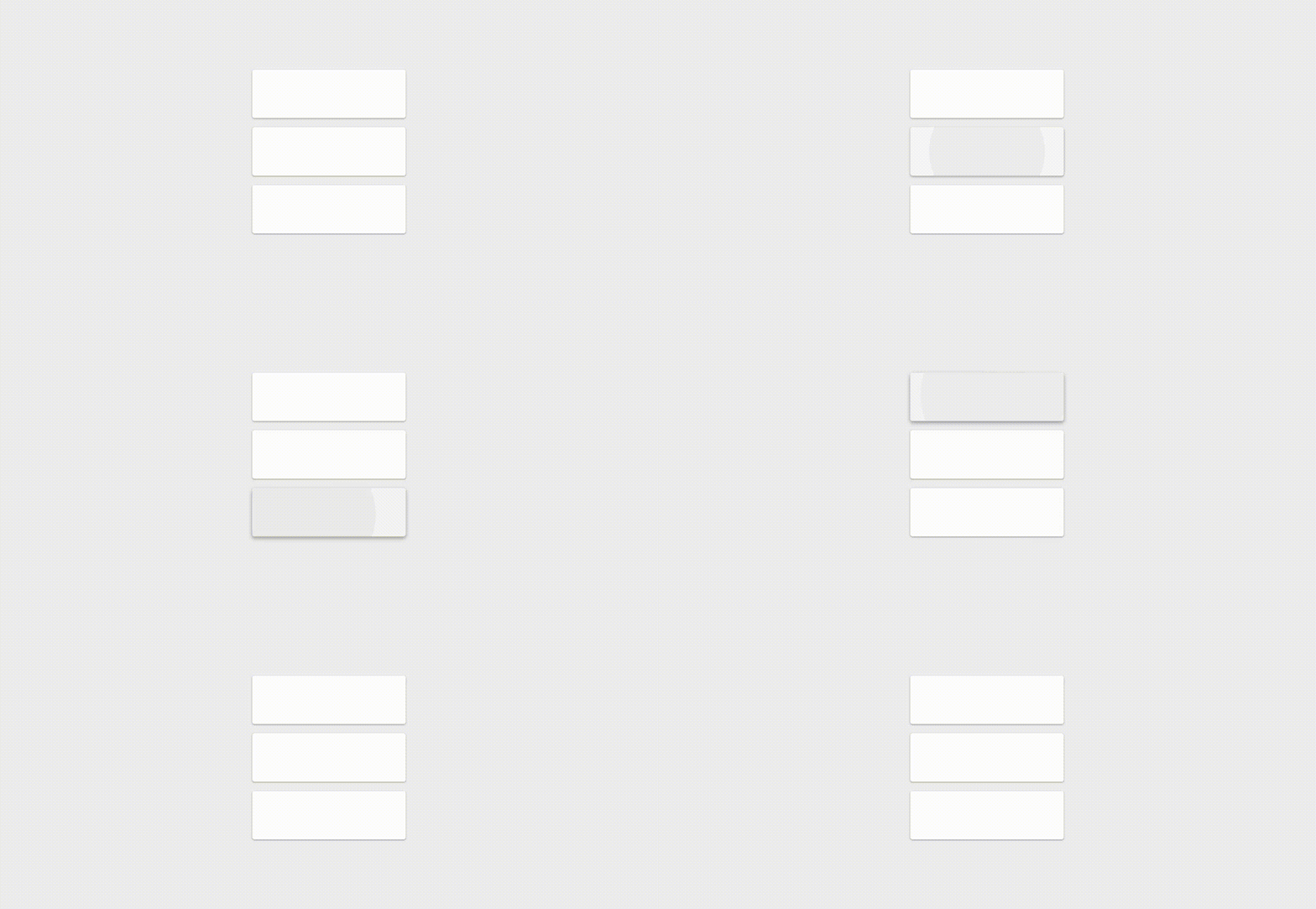
4dp
Raised button
Resting state - 静态: 2dp
Pressed state - 敲击状态: 8dp
For desktop only, raised buttons can have an elevation of(桌面):
Resting state - 静态: 0dp
Pressed state - 敲击状态: 2dp
See raised buttons for more information
Floating action button (FAB) - 浮动动作按钮
Resting state - 静态: 6dp
Pressed state - 敲击状态: 12dp
Card - 卡片
Resting state - 静态: 2dp
Raised state - 敲击状态: 8dp
For** **Desktop only, see Content blocks.
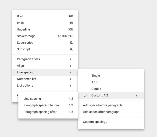
Menus and sub menus - 菜单和子菜单
Menus - 菜单: 8dp
Sub menus - 子菜单: 9dp (+1 dp for each sub menu - 为子菜单增加 1dp)
Dialogs - 对话框
24dp
Nav Drawer & Right drawer - 导航抽屉和右抽屉
16dp
Modal bottom sheet - 底部单页
16dp
Refresh indicator - 刷新指示器
3dp
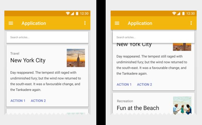
Quick entry/Search bar - 快速查询/搜索条
Resting state - 静态: 2dp
Scrolled state - 敲击状态: 3dp
Snackbar
6dp
Switch - 切换按钮
1dp
Object relationships - 对象关系
Object hierarchy - 对象层次
How you organize objects, or collections of objects, in an app determines how they move in relation to one another. Objects can move independently of each other or be constrained by objects higher in the hierarchy.
【翻译】
你怎样去组织在某一应用中的对象或对象集合取决于它们怎样依据其他对象来移动。对象可以独立自主地移动或在受到比它更高层次对象限制的条件下移动。
All objects are part of a hierarchy described in terms of a parent-child relationships. The “child” in each of these relationships refers to an element that is a subordinate to its “parent” element. Objects can be children of either the system or another object.
【翻译】
所有对象都是以“父-子”关系描述的层级体系的一部分。“子”元素在这一关系体系中代表它们“父”元素的下级元素。对象可以是这一系统的“子”元素或其他对象的“子”元素。
Parent-child specifics:
Each object has one parent.
1、Each object may have any number of children.
2、Children inherit transformative properties from their parent, such as position, rotation, scale, and elevation.
3、Siblings are objects at the same level of hierarchy.
【翻译】
“父-子”元素说明:
1、每一个对象只有一个“父”元素。
2、每一个对象可能会有任意数量的“子”元素。
“子”元素继承来自“父”元素的可以转移的属性,比如位置、循环、刻度和高度。
3、“兄弟”元素是指与某一对象处在同一层级的对象。
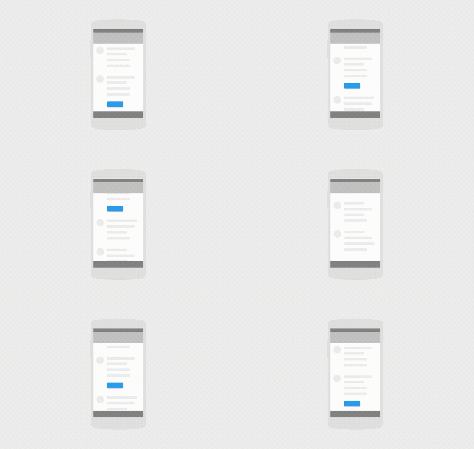
As the parent sheet scrolls, the raised button (its child) scrolls off screen with it.
【翻译】
随着父表的移动,升高的按钮(它的子元素)会伴随着它移出屏幕。
Exceptions - 例外
Items parented to the root, such as primary UI elements, move independently of other objects. For example, the floating action button does not scroll with content. Other elements include:
1、An app’s side nav drawer
2、The action bar
3、Dialogs
【翻译】
项目以根元素为父元素,比如主 UI 元素,它们相比于其他对象来说会自主移动。比如说,浮动动作按钮不会与内容一起转动。其他元素包括:
1、一个应用的边导航抽屉
2、动作条
3、对话
Interaction - 交互
How objects interact with one another is determined by their place in the parent-child hierarchy.
For example:
1、Children have minimal z-axis separation from their parent; other objects do not get inserted between parents and children.
2、In a scrolling card collection, the cards are siblings of each other, so they all move together in tandem. They are children of the card collection object that controls their movement.
【翻译】
某个对象与其他对象交互的方式由它们在“父-子”层次中所处位置决定。
比如:
1、“子”元素与其“父”元素在Z轴上的分离距离最近;其他对象不能插入父子元素之间。
2、在一个滚动的卡片集合中,所有卡片之间都是同层次的“兄弟”元素,因此它们就像坐在同一马车上的两个对象一样共同移动。它们都是控制它们移动的卡片集合对象的子元素。
Elevation - 高度
How you determine the elevation of objects – their position in z-space – depends on the content hierarchy you want to express and whether an object needs to move independently of other objects.
【翻译】
你会如何确定某些对象的高度(即它们在 Z 空间的位置)取决于你想描述的内容层次以及某一个对象是否需要相对于其他对象自主移动。
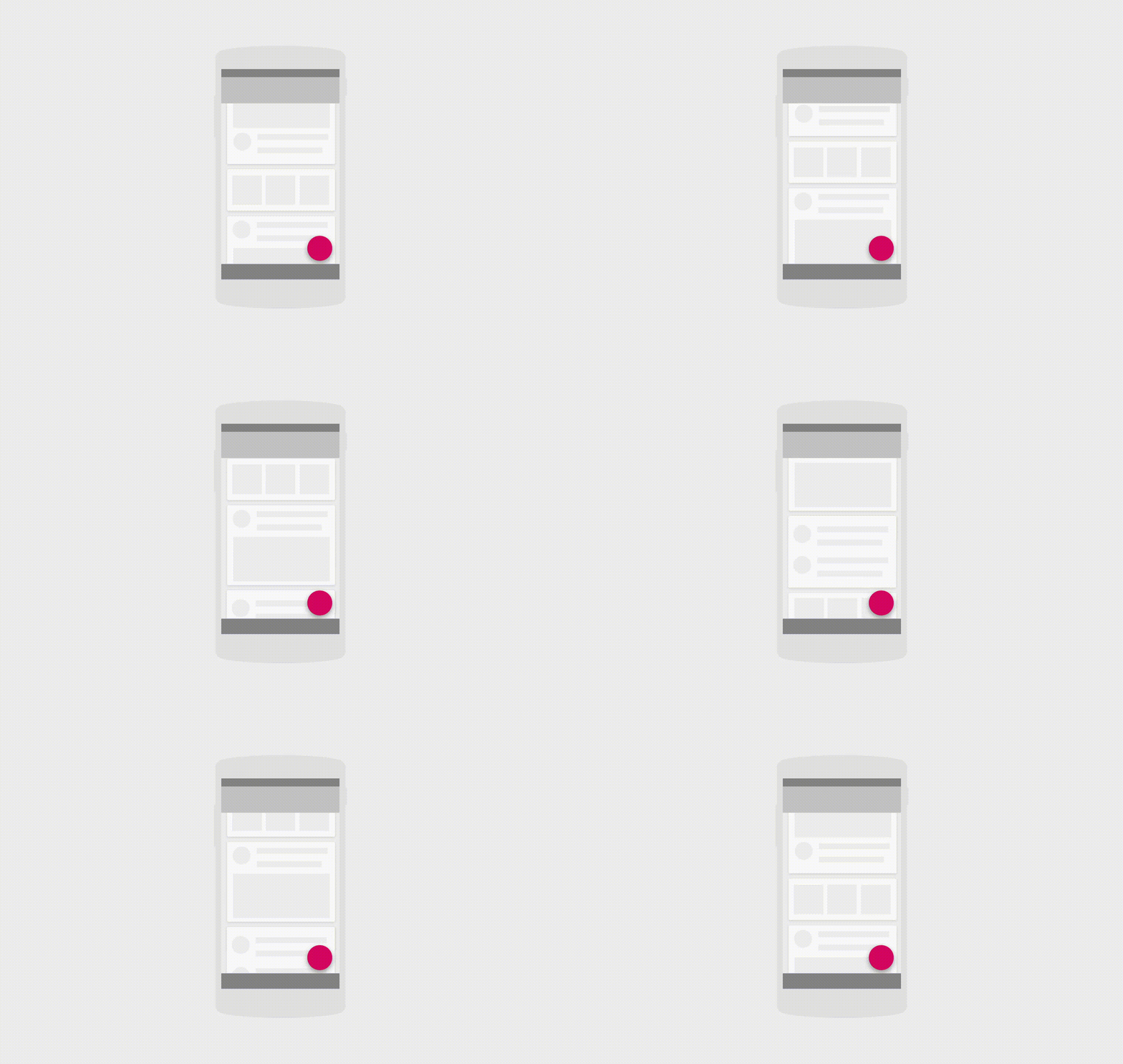
As the card collection scrolls off-screen, its child cards scroll off-screen with it. The floating action button remains in place because its parent is not being scrolled.
【翻译】
随着卡片集合卷出了屏幕,它的子卡片也会随之卷出屏幕。浮动动作按钮保留在某一地点因为它的父元素没有被卷动。
