1. matplotlib
Python 的 2D绘图库,为Python构建一个Matlab式的绘图接口,通过 Matplotlib,开发者可以仅需要几行代码,便可以生成绘图,直方图,功率谱,条形图,错误图,散点图等
Matplotlib是最常用绘图库,功能上能够满足我们的应用
serborn是在matplotlib的基础上进行了更高级的API封装,是一个补充
Bokeh 针对web
d3.js 最高级的绘图工具,js来写
官方文档
https://matplotlib.org/users/pyplot_tutorial.html
2.figure
figure可以理解为画布
如果不创建figure对象,matplotlib自动创建一个figure对象
import numpy as np
import pandas as pd
import matplotlib.pyplot as plt
fig = plt.figure()
print(fig)
###############运行结果#################
Figure(432x288)

########################################
3.快速绘图
arr1 = np.random.randn(100)
# print(arr1)
plt.plot(arr1)
plt.show()
运行结果

4.Subplot
可以通过add_subplot来分割figure,表示可以在figure的不同位置上作图
fig.add_subplot(a, b, c)
a,b 表示将fig分割成 a*b 的区域
c 表示当前选中要操作的区域,
注意:从1开始编号(不是从0开始)
plot 绘图的区域是最后一次指定subplot的位置 (jupyter notebook里不能正确显示)
# jupyter 里不能显示
arr2 = np.random.randn(100)
ax1 = fig.add_subplot(2,2,1)
ax2 = fig.add_subplot(2,2,2)
ax3 = fig.add_subplot(2,2,3)
ax4 = fig.add_subplot(2,2,4)

ax1.plot(arr2)
ax2.plot(arr2)
ax3.plot(arr2)
ax4.plot(arr2)

plt.show()
5. 直方图hist方法
参数一:数据集
bins参数:代表展现数据的直方个数
color参数:可以指定颜色
Alpha:参数可以指定透明度(默认是1,表示不透明)
plt.hist(arr2,bins=20,color='k',alpha=0.5)
plt.show()
运行结果

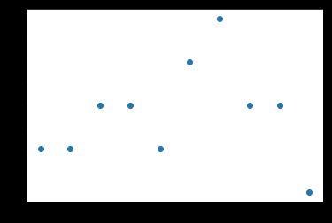
6. 散点图 scatter方法
参数1:x轴的坐标
参数2: y轴的坐标
x = [1,2,3,4,5]
y = [5,6,7,4,3]
plt.scatter(x,y,color='r')
plt.show()
运行结果

x = np.arange(10)
y = np.random.randint(0,5,10)
plt.scatter(x,y)
plt.show()
运行结果
7. 柱形图bar
x = np.arange(5)
y1,y2 = np.random.randint(1,25,size=(2,5))
width=0.3
plt.bar(x,y1,width,color='r',alpha = 0.6)
plt.bar(x+width,y2,width,color='b',alpha=0.6)
plt.show()
运行结果

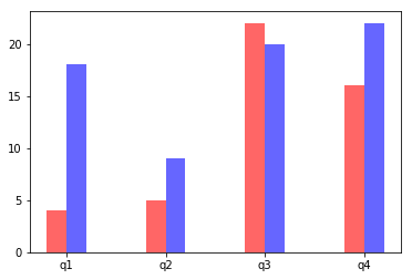
x = np.arange(4)
y1,y2 = np.random.randint(1,25,size=(2,4))
width = 0.2
ax = plt.subplot(1,1,1)
ax.bar(x,y1,width,color='r',alpha=0.6)
ax.bar(x+width,y2,width,color='b',alpha=0.6)
# 指定x轴标记的位置
ax.set_xticks(x+width/2)
ax.set_xticklabels(['q1','q2','q3','q4'])
plt.show()
运行结果
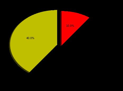
8. 饼状图
sizes:每个标签占多大,会自动去算百分比
explode:将某部分爆炸出来, 使用括号,将第一块分割出来,数值的大小是分割出来的与其他两块的间隙
labels:定义饼状图的标签,标签是列表
Colors:每部分的颜色
labeldistance,文本的位置离远点有多远,1.1指1.1倍半径的位置
autopct,圆里面的文本格式,%3.1f%%表示小数有三位,整数有一位的浮点数
shadow,饼是否有阴影
startangle:起始角度,0,表示从0开始逆时针转,为第一块。一般选择从90度开始比较好看
pctdistance:百分比的text离圆心的距离
返回值:p_texts饼图内部文本的,l_texts饼图外label的文本
# 调整图形的大小宽高
plt.figure(figsize=(8,6))
# 定义饼状图上显示的标签,列表
labels = ['IE','Chrome','Firefox']
# 每个块的大小,百分比
sizes = [40,50,10]
# 颜色
colors = ['y','k','r']
# 将某一部分爆炸出来,元组()
explode = (0.1,0,0)
patches,l_text,p_text = plt.pie(sizes,explode=explode,labels=labels,colors=colors,
                               labeldistance=1.1,autopct="%3.1f%%",shadow=True,
                               startangle=90,pctdistance=0.6)
plt.show()
运行结果
9. 矩阵绘图imshow
混淆矩阵,三个维度的关系
表示数据分布范围情况
分布越多,值越大(值偏向1),颜色偏白,如果值越小颜色偏绿色
data = np.random.randn(10,10)
print(data)
#################运行结果################
[[ 0.79216876  1.42931622 -1.7647661   1.62640919  0.66178082  0.04921573
  -0.76783192  1.07053169  1.40744264 -0.13851484]
 [-1.53587478  0.88159123  0.77804888  1.17960306 -1.6264733   0.48013081
   1.13327399  1.79135941 -1.0195475   1.14625459]
 [ 2.78574643 -0.21493639  1.34915968  1.18572988 -0.18755706 -0.03882507
  -0.21560904  0.90186994  0.19319313  1.28486583]
 [ 0.2776058   0.10872493 -1.47960929 -1.19917445  0.54804898  0.34829874
  -1.18583962  0.14511466 -1.31990892 -0.11012531]
 [-0.37740773  1.95613448  0.56153778  0.43202784  1.5774585   0.74983994
   0.65840562  0.79909888  1.44862456 -1.55017949]
 [-0.37113854 -1.76736113 -2.01355381 -0.61376981 -1.58085291  1.01602926
  -1.1105543   0.69310044  0.50535768 -0.35909564]
 [ 0.24726569 -0.0084276  -1.149235    0.58459508  1.26921766 -0.03779366
   1.99952939  0.32946322  0.36575931  1.13901872]
 [-0.82789188  1.22245847  1.30253428 -2.03761498  0.14996945  0.54857007
  -0.46994465  0.22950404  1.07208546 -0.0074044 ]
 [ 0.83339981 -0.47487887  1.66319774 -0.57931878  2.30565429 -0.24795773
  -0.04656456 -0.74630762 -0.30773271 -0.10209038]
 [-0.1210547   0.28764046  0.19531414  0.76053103  0.67383264  0.51694679
   0.03379526 -0.08532095  1.44249721  0.74751775]]
########################################
plt.imshow(data,cmap=plt.cm.ocean)
plt.colorbar()
plt.show()
运行结果

10. plt.subplots()
同时返回新创建的figure和subplot对象列表
在jupyter里可以正常显示,推荐使用这种方式创建多个图表
fig,subplot_arr = plt.subplots(2,2)
print(type(subplot_arr))
subplot_arr[0,1].hist(np.random.randn(100),bins = 20, color='b',alpha=0.4)
subplot_arr[1,1].imshow(np.random.rand(5,5))
plt.show()
运行结果

11. 颜色、标记、线型
颜色

标记

线型

fig,subplot_arr = plt.subplots(2)
arr5 = np.random.randint(0,100,20)
arr6 = np.random.randint(0,100,20)
subplot_arr[0].plot(arr5,'ro-')
subplot_arr[1].plot(arr6,color='b',linestyle='dotted',marker='o')
plt.show()
运行结果

12. 刻度、标签、图例
设置刻度范围
plt.xlim([xmin,xmax]), plt.ylim([ymin,ymax])
ax.set_xlim(), ax.set_ylim()
设置显示的刻度
plt.xticks(list), plt.yticks(list)
ax.set_xticks(list), ax.set_yticks(list)
设置刻度标签
ax.set_xticklabels()
ax.set_yticklabels()
设置坐标轴标签
ax.set_xlabel(list), ax.set_ylabel(list)
设置标题
ax.set_title()
fig,ax = plt.subplots(1)
ax.plot(np.random.randn(1000).cumsum(),label='line0')
ax.plot(np.random.randn(1000).cumsum(),label='line1')
ax.plot(np.random.randn(1000).cumsum(),label='line2')

# 设置刻度
ax.set_xlim([0,500])
# 设置x轴的显示刻度
ax.set_xticks(range(0,800,100))
# y标签
ax.set_yticklabels(['Jan','Feb','Mar'])

# 坐标轴标签
ax.set_xlabel('number')
ax.set_ylabel('month')

# 标题
ax.set_title('Example')

# 图例
ax.legend(loc='best')
plt.show()
运行结果
