前一篇:iOS 8人机交互指南(0)
UI 设计基础(UI Design Basics)
1. 为 iOS 设计(Designing for iOS)
iOS embodies the following themes:
——Deference. The UI helps people understand and interact with the content, but never competes with it.
——Clarity. Text is legible at every size, icons are precise and lucid, adornments are subtle and appropriate, and a sharpened focus on functionality motivates the design.
——Depth. Visual layers and realistic motion impart vitality and heighten people’s delight and understanding.
iOS 体现了以下几个主题:
——遵从(Deference):UI 帮助人们理解内容,并与内容进行交互,但绝不会与内容相互冲突。
——清晰(Clarity):文字在任何尺寸下都是易读的,图标是精确清楚的,装饰是巧妙而恰当的。对功能更加聚焦,以功能驱动设计。
——深度(Depth):可见的层次与现实的动效传达出一种生命力,增强了人们的愉悦感和理解力。
Whether you’re redesigning an older app or creating a new one, consider approaching the job in this way:
First, look past the UI to the app’s core functionality and affirm its relevance.
Next, use the themes of iOS to inform the design of the UI and the user experience. Add details and embellishments with care and never gratuitously.
Finally, be sure to design your UI to adapt to various devices and modes so that users can enjoy your app in as many contexts as possible.
无论你是重新设计一款已有 app 还是开发一款全新 app,可以考虑用下面的方式开始工作:
首先,精简 UI 以突出 app 的核心功能,并且确认它们间的相关性。
然后,使用 iOS 的主题来展示 UI 设计与用户体验。对于细节和装饰,不要平白无故地盲目添加,要小心谨慎。
最后,确保设计 UI 时要适配多种设备和模式,这样用户才能在尽可能多的情况下愉快地使用 app。
Throughout the process, be prepared to defy precedent, question assumptions, and let a focus on content and functionality motivate every design decision.
在这一过程中,要时刻准备着挑战先例、质疑假设、着力使内容和功能来驱动每一个设计决策。
1.1 遵从内容(Defer to Content)
Although crisp, beautiful UI and fluid motion are highlights of the iOS experience, the user’s content is at its heart.
Here are some ways to make sure that your designs elevate functionality and defer to the user’s content.
虽然新鲜好看的 UI 和流畅的动效是 iOS 体验的亮点,但用户内容仍是核心。
下面有一些方法可以确保设计能够提升功能并且遵从用户内容。
Take advantage of the whole screen. Weather is a great example of this approach: The beautiful, full-screen depiction of a location’s current weather instantly conveys the most important information, with room to spare for hourly data.
充分利用整个屏幕。天气是该方法的一个绝佳示例:采用漂亮的全屏来展示当前天气,直观地传达出最重要的信息,同时节省出空间来显示每小时的天气数据。
Reconsider visual indicators of physicality and realism. Bezels, gradients, and drop shadows sometimes lead to heavier UI elements that can overpower or compete with the content. Instead, focus on the content and let the UI play a supporting role.
重新考虑物理和现实的可视化展示。边框、渐变、阴影有时会导致 UI 元素变重,这样就无法凸显内容、甚至与内容冲突。我们应当聚焦于内容,而让 UI 只扮演一个支持的角色。
Let translucent UI elements hint at the content behind them. Translucent elements—such as Control Center—provide context, help users see that more content is available, and can signal transience. In iOS, a translucent element blurs only the content directly behind it—giving the impression of looking through rice paper—it doesn’t blur the rest of the screen.
让半透明的 UI 元素展示它们后面的内容。半透明的元素——例如控制中心——提供了一种环境,帮助用户看到更多内容,并且暗示当前界面环境是短暂存在的状态。在 iOS 中,一个半透明的元素只会使它正下方的内容变模糊,给人一种透过糯米纸看过去的感觉,它并不会使屏幕的其他区域变模糊。
1.2 展示清晰(Provide Clarity)
Providing clarity is another way to ensure that content is paramount in your app. Here are some ways to make the most important content and functionality clear and easy to interact with.
清晰的展示是另外一种确保 app 中内容至上的方式。下面是一些使得最重要的内容和功能变得清晰易交互的方法。
Use plenty of negative space. Negative space makes important content and functionality more noticeable and easier to understand. Negative space can also impart a sense of calm and tranquility, and it can make an app look more focused and efficient.
大量使用留白。留白使得重要的内容和功能更引人注意且易于理解。留白也能带来一种平静和安宁的感觉,它使得 app 看起来更聚焦、高效。
Let color simplify the UI. A key color—such as yellow in Notes—highlights important state and subtly indicates interactivity. It also gives an app a consistent visual theme. The built-in apps use a family of pure, clean system colors that look good at every tint and on both dark and light backgrounds.
通过颜色简化 UI。关键色——例如备忘录中的黄色——将重要状态高亮、并且隐约表现交互性。它还赋予 app 一致的视觉主题。内置 app 使用一系列纯粹、干净的系统颜色,从而无论背景明暗都有不错的色彩效果。
Ensure legibility by using the system fonts. iOS system fonts automatically adjust letter spacing and line height so that text is easy to read and looks great at every size. Whether you use system or custom fonts, be sure to adopt Dynamic Type so your app can respond when the user chooses a different text size.
使用系统字体来确保易读性。iOS 系统字体自动调整字间距和行高,从而使文字在任何大小下都易于阅读。无论使用系统字体还是自定义字体,一定要采用动态类型(Dynamic Type),这样 app 可以在用户选择不同文字大小时自动响应调节。
Embrace borderless buttons. By default, all bar buttons are borderless. In content areas, a borderless button uses context, color, and a call-to-action title to indicate interactivity. And when it makes sense, a content-area button can display a thin border or tinted background that makes it distinctive.
采用无边框按钮。缺省状态下,所有栏目上的按钮都是无边框的。在内容区域,一个无边框的按钮通过环境、颜色和行为召唤标题来表现交互性。确有需要时,内容区域的按钮可以通过窄边框或带颜色的背景来显示其不同。
1.3 使用深度来交流(Use Depth to Communicate)
iOS often displays content in distinct layers that convey hierarchy and position, and that help users understand the relationships among onscreen objects.
iOS 通常在不同层次下显示内容,通过层次和位置来传达含义,这样使得用户易于理解屏幕对象间的关系。
By using a translucent background and appearing to float above the Home screen, folders separate their content from the rest of the screen.
通过使用半透明背景,以及看上去浮动在主界面上方的效果,文件夹将其内容与屏幕其他区域分隔开来。
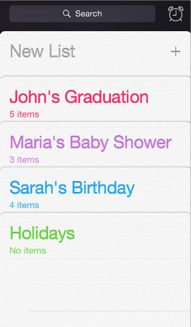
Reminders displays lists in layers, as shown here. When users work with one list, the other lists are collected together at the bottom of the screen.
如上图所示,提醒事项 app 使用多个层次来显示清单。当用户操作一个清单时,其他的清单收起在屏幕底部。
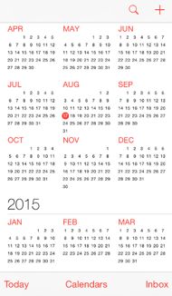
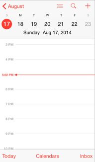
Calendar uses enhanced transitions to give users a sense of hierarchy and depth as they move between viewing years, months, and days. In the scrolling year view shown here, users can instantly see today’s date and perform other calendar tasks.
日历在年视图、月视图、日视图的切换时,使用增强的转场效果来给用户展示一种层次和深度。在这里卷起的年视图上,用户可以直观地看到今天的日期,也能操作其他日历任务。
When users select a month, the year view zooms in and reveals the month view. Today’s date remains highlighted and the year appears in the back button, so users know exactly where they are, where they came from, and how to get back.
当用户选择一个月份时,年视图缩小后显示月视图。今天的日期仍然高亮,而年份出现在返回(back)按钮旁边。这样用户可以准确地知道自己当前处于什么位置,从哪儿来,如何返回上一界面。
A similar transition happens when users select a day: The month view appears to split apart, pushing the current week to the top of the screen and revealing the hourly view of the selected day. With each transition, Calendar reinforces the hierarchical relationship between years, months, and days.
用户选择某一天时,也出现类似的转场效果:月视图出现劈裂效果,将当前的周推到屏幕顶部,然后显示所选日期的小时视图。随着每一次转场切换,日历向用户强化着年、月、日之间的层次关系。
英文原文链接
后一篇:iOS 8人机交互指南(2)


