2020年度流行色公布:我太“蓝”了!| 有声双语
提起蓝色,你的第一反应是什么?是蔚蓝深沉的大海,或是薄暮时的美丽天空?这一次,经典蓝成为了2020年度代表色彩。明年流行的经典蓝既有天空的深邃,也有大海的渊博。简约中流露出优雅,平静而令人安心。
↑↑点击播放音频↑↑
When the Pantone Color Institute announced its first Color of the Year back in 2000, it chose Cerulean, the light blue shade of the daytime sky, representing the hope and excitement of entering a new millennium.
色彩研究机构潘通在2000年首次公布年度代表色时,选择了蔚蓝色 —— 一种日间天空的浅蓝色,代表着进入新千禧年的希望与激动。
Now, as we approach the third decade of the 21st century, the global environment is concerned with collisions, violence, homelessness and climate change. Which color did Pantone pick to represent 2020?
如今,在我们即将进入21世纪的第三个十年之际,全球饱受冲突暴力、流离失所以及气候变化的困扰。潘通会选择什么颜色来代表2020年呢?
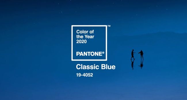
As it turns out, the US-based organization returned to blue. On Dec 12, Pantone announced its 2020 color of the year – classic blue. Darker than aquamarine and lighter than navy, it is described as “dependable” and “non-aggressive”.
最终,这家位于美国的机构再次选择了蓝色。12月12日,潘通宣布了2020年度代表色为经典蓝。这种比海蓝色深、比海军蓝浅的蓝色被形容为“可靠”且“没有攻击性”。
Classic Blue – Color of the Year 2020 – Courtesy Pantone
Today many feel stressed and overloaded, and Pantone says this color offers “calm, confidence and connection”. “We live these 24/7 lifestyles. We’re anxious. There is so much uncertainty and unrest, no matter where you are,” said Pantone vice president Laurie Pressman.
如今许多人承受着压力和重担,潘通认为这种颜色能带来“冷静、自信与沟通”。“我们过着7天24小时全天候的生活。我们很焦虑。不论你身处何处,都有着太多的不确定性和不安,”潘通副总裁劳里·普雷斯曼表示。
Leatrice Eiseman, executive director at Pantone, further explains that we are living in a time that requires trust and faith. But classic blue, a boundless blue evocative of the vast and infinite evening sky, “[can] encourage us to look beyond the obvious to expand our thinking; challenge us to think more deeply, increase our perspective and open the flow of communication”, she said.
潘通执行总监莱亚特丽斯·艾斯曼进一步解释称,我们生活在一个需要信任与信念的时代。而经典蓝这种无边无际的蓝色令人想起了广阔无垠的傍晚天空,“能够鼓励我们透过表象看事物,从而扩展思维;向我们提出进行更深度思考的挑战,开拓视野,并且敞开心扉进行沟通”,她说道。
Imagine that you are lying on the ground, gazing at the night sky. The classic blue of dusk will lead your mind to a deeper level. You will feel calm and relaxed, but not depressed, since it’s not the black sky of midnight.
想象一下,你正躺在地上,凝望夜空。薄暮时分天空的经典蓝色会让你进行更深层的思考。你会感到宁静轻快,但并不忧郁,因为这并非是午夜时的漆黑夜空。
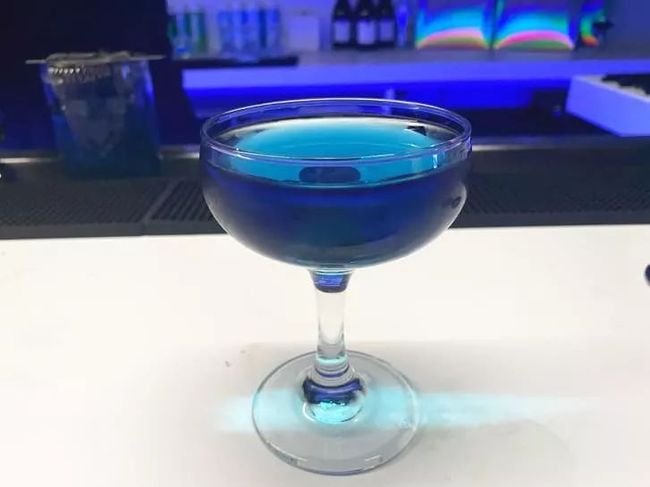
A "Classic Blue" cocktail was served at the color reveal. Credit: Kirsi Goldynia/CNN
No matter how the world changes, the classic blue is always there for you. Eiseman called it “a solid and dependable” color. Pantone also suggests that classic blue connects us to people everywhere, as we all look up at our shared sky.
不论世事如何变迁,经典蓝一直就在你身边。艾斯曼称其是种“稳定可靠”的颜色。潘通也认为经典蓝将我们与世界各地的人们联系在了一起,因为我们抬头仰望的都是同一片天空。
“This is a color we can relate to around the world, no matter where we live. We look outside the door and we see this color,” said Pressman. “It lends itself to communication and feelings of inclusivity. It brings peace and tranquility to the human spirit.”
“不论身处何地,世界各地的人们都能对这个颜色产生共鸣。大家只需向门外一瞥,就能看到这种颜色,”普雷斯曼表示。“它赋予了自身沟通与包容的含义。它为人类的心灵带来了平和宁静。”
In 2020, feeling blue can describe something positive, for a change.
2020年,蓝色不再代表忧郁,而会被赋予积极做出改变的含义。
以上文章英文内容选自《21世纪学生英文报》高三701期
本文英文音频由我报外籍编辑 Laura Michelle Dutton朗读


