新冠肺炎的可视化和预测分析(附代码)
新冠肺炎现在情况怎么样了?推荐一份Jupyter notebook代码进行了分析,把数据可视化,并对感染人数进行了预测。
来源:https://www.kaggle.com/corochann/covid-19-eda-with-recent-update-on-april?scriptVersionId=32149572
本文的可视化通过ployly实现。
本文数据更新到4月14日,最新数据下载:
https://www.kaggle.com/corochann/covid-19-eda-with-recent-update-on-april/data?scriptVersionId=32149572
(下载train.csv、test.csv、usa_states2.csv) 到input的convid19目录即可,数据更新到2020-4-14。
原始数据是这里下载修改的:
https://github.com/CSSEGISandData/COVID-19
完整代码放在github下载:
https://github.com/fengdu78/machine_learning_beginner/tree/master/covid19
代码内容
这份分析代码主要分为以下几个部分:
全球趋势
国家(地区)增长
省份情况
放大美国:现在美国正在发生什么?
欧洲
亚洲
现在哪个国家正在复苏?
什么时候会收敛?通过S型拟合进行预测
全球趋势
fig = px.line(ww_melt_df, x="date", y="value", color='variable',
              title="Worldwide Confirmed/Death Cases Over Time")
fig.show()
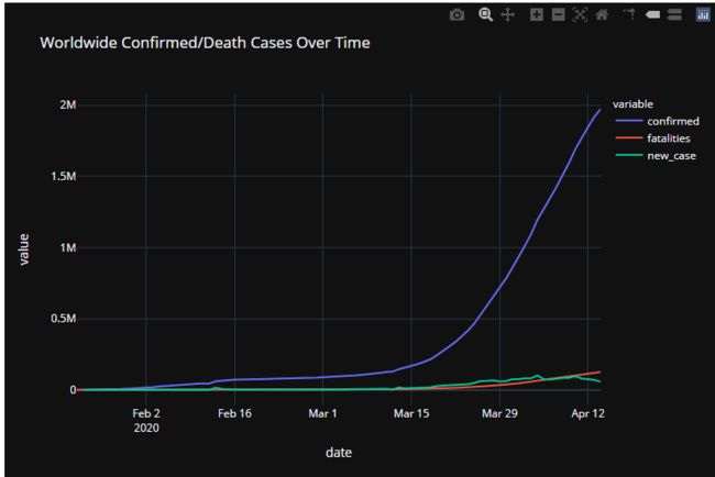 世界确诊和死亡数
fig = px.line(ww_melt_df, x="date", y="value", color='variable',
              title="Worldwide Confirmed/Death Cases Over Time (Log scale)",
             log_y=True)
fig.show()
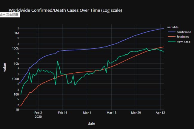 世界确诊和死亡数(取对数)
国家(地区)增长
fig = px.bar(top_country_melt_df.iloc[::-1],
             x='value',
             y='country',
             color='variable',
             barmode='group',
             title=f'Confirmed Cases/Deaths on {target_date}',
             text='value',
             height=1500,
             orientation='h')
fig.show()
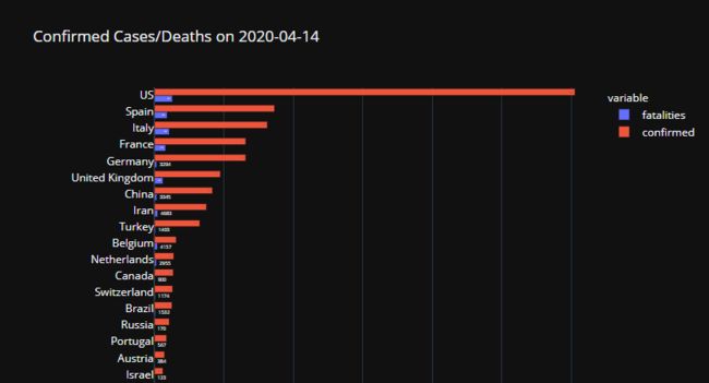 确诊数和死亡数
top30_countries = top_country_df.sort_values(
    'confirmed', ascending=False).iloc[:30]['country'].unique()
top30_countries_df = country_df[country_df['country'].isin(top30_countries)]
fig = px.line(top30_countries_df,
              x='date',
              y='confirmed',
              color='country',
              title=f'Confirmed Cases for top 30 country as of {target_date}')
fig.show()
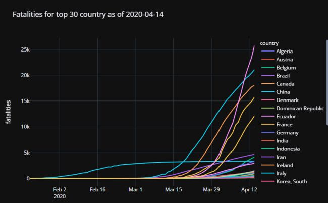 死亡最多的国家
fig = px.bar(top_country_df[:30].iloc[::-1],
             x='mortality_rate',
             y='country',
             title=f'Mortality rate HIGH: top 30 countries on {target_date}',
             text='mortality_rate',
             height=800,
             orientation='h')
fig.show()
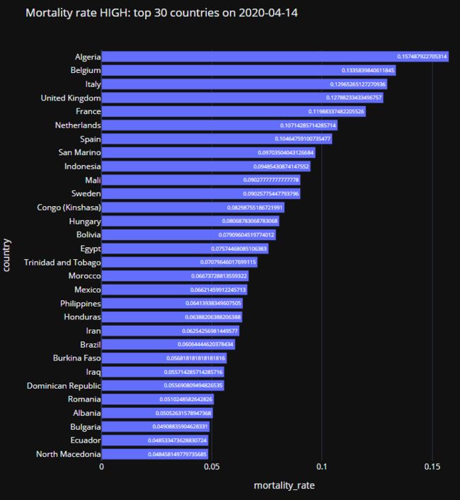 死亡率最高的国家
省份情况
出现新冠肺炎的主要国家的各省(州)的清单
放大美国:现在美国正在发生什么?
fig = px.choropleth(train_us_latest,
                    locations='province_code',
                    locationmode="USA-states",
                    color='confirmed',
                    scope="usa",
                    hover_data=['province', 'fatalities', 'mortality_rate'],
                    title=f'Confirmed cases in US on {target_date}')
fig.show()
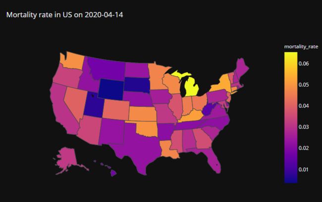 美国的死亡率情况
train_us_march = train_us.query('date > "2020-03-01"')
fig = px.line(train_us_march,
              x='date', y='confirmed', color='province',
              title=f'Confirmed cases by state in US, as of {target_date}')
fig.show()
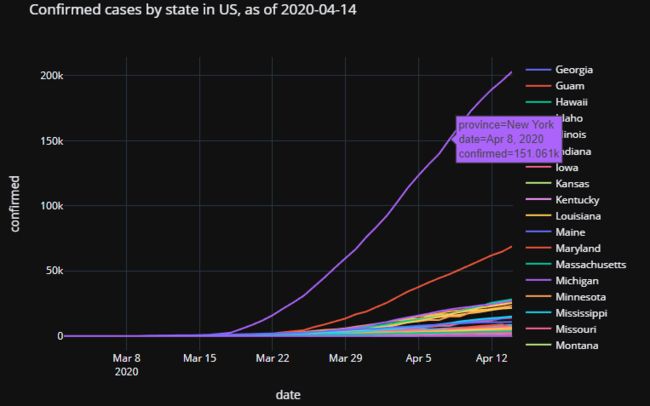 美国各州的确诊数
欧洲
fig = px.choropleth(
    train_europe_latest,
    locations="country",
    locationmode='country names',
    color="confirmed",
    hover_name="country",
    range_color=[1, train_europe_latest['confirmed'].max()],
    color_continuous_scale='portland',
    title=f'European Countries with Confirmed Cases as of {target_date}',
    scope='europe',
    height=800)
fig.show()
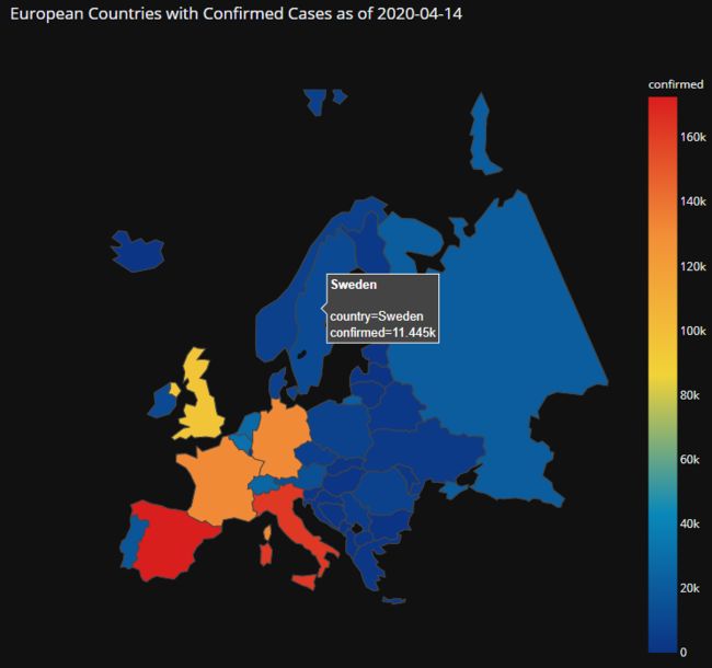 欧洲确诊数
欧洲确诊数
亚洲
country_latest = country_df.query('date == @target_date')


fig = px.choropleth(
    country_latest,
    locations="country",
    locationmode='country names',
    color="confirmed",
    hover_name="country",
    range_color=[1, 50000],
    color_continuous_scale='portland',
    title=f'Asian Countries with Confirmed Cases as of {target_date}',
    scope='asia',
    height=800)
fig.show()
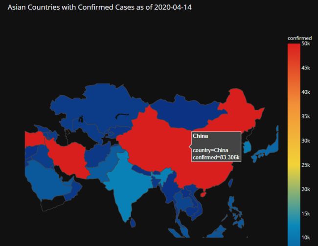 亚洲确诊数
亚洲确诊数
top_asian_country_df = country_df[country_df['country'].isin([
    'China', 'Indonesia', 'Iran', 'Japan', 'Korea, South', 'Malaysia',
    'Philippines'
])]


fig = px.line(top_asian_country_df,
              x='date',
              y='new_case',
              color='country',
              title=f'DAILY NEW Confirmed cases world wide')
fig.show()
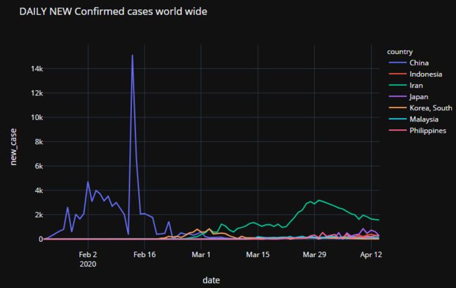 亚洲每日确诊数量
现在哪个国家正在复苏?
fig = px.choropleth(
    country_latest,
    locations="country",
    locationmode='country names',
    color="new_case_peak_to_now_ratio",
    hover_name="country",
    range_color=[0, 1],
    # color_continuous_scale="peach",
    hover_data=['confirmed', 'fatalities', 'new_case', 'max_new_case'],
    title='Countries with new_case_peak_to_now_ratio')
fig.show()
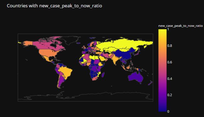 可以看到中国是最安全的国家了
什么时候会收敛?通过Sigmoid拟合进行预测
plot_sigmoid_fitting(target_country_df_list,
                     pred_df_list,
                     title='Sigmoid fitting with all latest data')
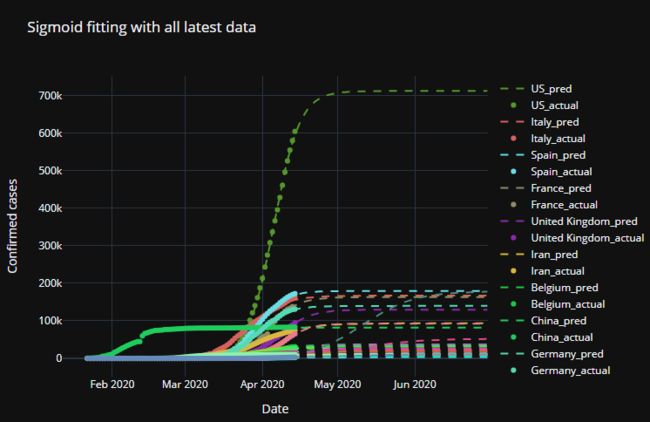 确诊数预测,美国将会达到70万以上确诊
总结
本文推荐一份Jupyter notebook代码进行了分析,把数据可视化,并对感染人数进行了预测。
完整代码放在github下载:
https://github.com/fengdu78/machine_learning_beginner/tree/master/covid19

往期精彩回顾


适合初学者入门人工智能的路线及资料下载机器学习在线手册深度学习在线手册AI基础下载(pdf更新到25集)本站qq群1003271085,加入微信群请回复“加群”获取一折本站知识星球优惠券,复制链接直接打开:https://t.zsxq.com/yFQV7am喜欢文章,点个在看