R语言简单绘图(二)
1、条形图—barplot()
barplot(c(1,2,4,2,6,4,3,5))
barplot(c(1,2,4,2,6,4,3,5), horiz = TRUE)
counts = table(Arthritis$Improved)
barplot(counts, horiz = TRUE)
counts = table(Arthritis$Improved, Arthritis$Treatment)
barplot(counts, beside = TRUE)
state <- data.frame(state.region, state.x77)
x <- aggregate(state$Illiteracy, by=list(state.region), FUN=mean)
barplot(x$x, names.arg =x$Group.1)
par(mar=c(5,8,4,2))
counts <- table(Arthritis$Improved)
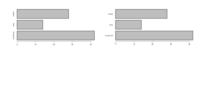
barplot(counts, horiz = TRUE, cex.names = 0.8, names.arg = c("no improved", "some", "marked"))
par(las=2)
barplot(counts, horiz = TRUE, cex.names = 0.8, names.arg = c("no improved", "some", "marked"))
2、饼图—pie()
par(mfrow=c(2,2))
x <- c(10,12, 4,16, 8)
lab <- c("US", "UK", "Australia", "Germany", "France")
pie(x, lab, main="Simple Pie Chart")

pct <- round(x/sum(x)*100)
lab1 <- paste(lab, " ", pct, "%", sep = " ")
pie(x,lab1, col = rainbow(length(lab1)), main = "Pie Chart with Percentage")

pie3D(x, explode=0.1, main="3D Pie Chart")

fan.plot(x, labels = lab, main="Fan Plot") # 扇形图

3、直方图—hist()
attach(mtcars) # 导入数据
x <- mtcars$mpg
hist(x)

hist(x,breaks = 12, col="red",xlab = "Miles Per Callon")

hist(x, freq = FALSE, breaks = 12, col = "green",xlab = "Miles Per Callon")
lines(density(x), col="red", lwd=2)

4、箱线图

boxplot(mtcars$mpg, mian="Box plot", ylab="Mile per gallon")

boxplot(mpg~cyl, data=mtcars, main="Car mileage data", xlab="Number of cylinders", ylab="Miles per gallon") # 对比图
