08_Dimensionality Reduction_03_Semi-supervised(kmeans+log_reg)_np.percentile_DBSCAN+knn_Spectral_GMM
08_Dimensionality Reduction_svd_Kernel_pca_make_swiss_roll_subplot2grid_IncrementalPCA_memmap_LLE
https://blog.csdn.net/Linli522362242/article/details/105139547
08_Dimensionality Reduction_02_Gaussian mixture_kmeans++_extent_tick_params_silhouette_image segment
https://blog.csdn.net/Linli522362242/article/details/105722461
cp11_Working with Unlabeled Data_Clustering Analysis_Kmeans_hierarchical_dendrogram_heat map_DBSCAN
https://blog.csdn.net/Linli522362242/article/details/105813977
Using Clustering for Preprocessing
Let's tackle the digits dataset which is a simple MNIST-like dataset containing 1,797 grayscale 8×8 images representing digits 0 to 9.
from sklearn.datasets import load_digits

X_digits, y_digits = load_digits( return_X_y = True )
print( X_digits.shape, y_digits.shape, np.unique(y_digits) ) ![]()
Let's split it into a training set and a test set:
X_train, X_test, y_train, y_test = train_test_split(X_digits, y_digits, random_state=42)Now let's fit a Logistic Regression model and evaluate it on the test set:
For example, one way to create a system that can classify the digit images into 10 classes (from 0 to 9) is to train 10 binary classifiers, one for each digit (a 0-detector, a 1-detector, a 2-detector, and so on). Then when you want to classify an image, you get the decision score from each classifier for that image and you select the class whose classifier outputs the highest score. This is called the one-versus-all (OvA) strategy (also called one-versus-the-rest).
from sklearn.linear_model import LogisticRegression

log_reg = LogisticRegression(multi_class = "ovr", solver="liblinear", random_state=42)
log_reg.fit(X_train, y_train)
# Return the mean accuracy on the given test data and labels.
log_reg.score( X_test, y_test )![]()
Okay, that's our baseline: 96.7% accuracy.
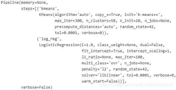
Let's see if we can do better by using K-Means as a preprocessing step. We will create a pipeline that will first cluster the training set into 50 clusters and replace the images with their distances to the 50 clusters(centroids), then apply a logistic regression model:
##########################################
Logistic Regression (aka logit, MaxEnt) classifier.
In the multiclass case, the training algorithm uses the one-vs-rest (OvR) scheme if the ‘multi_class’ option is set to ‘ovr’, and uses the cross-entropy loss if the ‘multi_class’ option is set to ‘multinomial’. (Currently the ‘multinomial’ option is supported only by the ‘lbfgs’, ‘sag’, ‘saga’ and ‘newton-cg’ solvers.)
The ‘newton-cg’, ‘sag’, and ‘lbfgs’ solvers support only L2 regularization with primal formulation, or no regularization. The ‘liblinear’ solver supports both L1 and L2 regularization, with a dual formulation only for the L2 penalty. The Elastic-Net regularization is only supported by the ‘saga’ solver.
solver{‘newton-cg’, ‘lbfgs’, ‘liblinear’, ‘sag’, ‘saga’}, default=’lbfgs’
Algorithm to use in the optimization problem.
-
For small datasets, ‘liblinear’ is a good choice, whereas ‘sag’ and ‘saga’ are faster for large ones.
-
For multiclass problems, only ‘newton-cg’, ‘sag’, ‘saga’ and ‘lbfgs’ handle multinomial loss; ‘liblinear’ is limited to one-versus-rest schemes.
-
‘newton-cg’, ‘lbfgs’, ‘sag’ and ‘saga’ handle L2 or no penalty
-
‘liblinear’ and ‘saga’ also handle L1 penalty
-
‘saga’ also supports ‘elasticnet’ penalty
-
‘liblinear’ does not support setting
penalty='none'; #default penalty="l2"
https://scikit-learn.org/stable/modules/generated/sklearn.linear_model.LogisticRegression.html
##########################################
from sklearn.pipeline import Pipeline
from sklearn.cluster import KMeans

pipeline = Pipeline([
    ( "kmeans", KMeans(n_clusters=50, random_state=42) ),
    ( "log_reg", LogisticRegression( multi_class="ovr", solver="liblinear", random_state=42)),
])
pipeline.fit(X_train, y_train)
pipeline.score( X_test, y_test )![]()
1- (1-0.9844444444444445)/(1-0.9666666666666667)![]()
How about that? We almost divided the error rate by a factor of 2我们几乎将错误率除以2( the current error rate(1-0.9844444444444445) is almostly half( (1-0.9844444444444445)/(1-0.9666666666666667)=0.46666666666666645 ) of the previous error rate(1-0.9666666666666667) ) !
But we chose the number of clusters k completely arbitrarily, we can surely do better. Since K-Means is just a preprocessing step in a classification pipeline, finding a good value for is much simpler than earlier: there's no need to perform silhouette analysis(silhouette_score_vs_k_diagram or silhouette diagram with different k; silhouette score: the mean silhouette coefficient over all the instances) or minimize the inertia(sum of the squared distances between each training instance and its closest centroid), the best value of k is simply the one that results in the best classification performance.
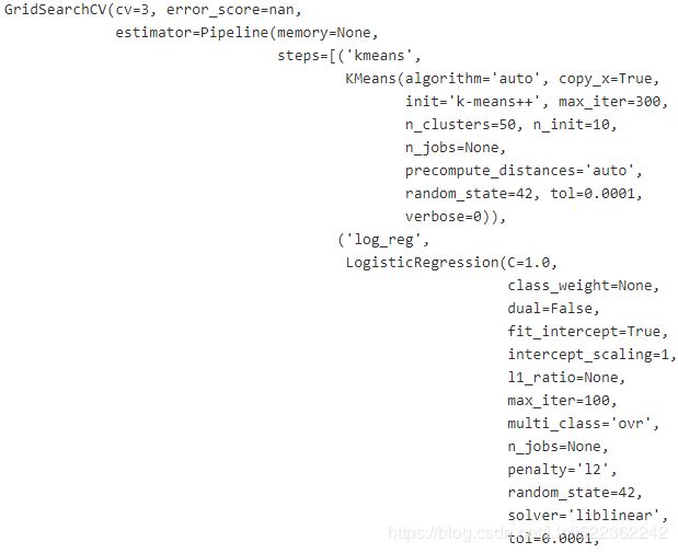
from sklearn.model_selection import GridSearchCV

# Pipeline([
#            ( "kmeans", KMeans(n_clusters=50, random_state=42) )
param_grid = dict( kmeans__n_clusters=range(2,100) ) #note double underlines
#param_grid # {'kmeans__n_clusters': range(2, 100)}
grid_clf = GridSearchCV(pipeline, param_grid, cv=3, verbose=2)
grid_clf.fit(X_train, y_train)grid_clf.best_params_![]()
grid_clf.score(X_test, y_test)![]()
The performance is slightly improved when k=55, so 55 it is.
Clustering for Semi-supervised Learning
Another use case for clustering is in semi-supervised learning, when we have plenty of unlabeled instances and very few labeled instances.
Let's look at the performance of a logistic regression model when we only have 50 labeled instances: # Supervised Learning
n_labeled = 50

log_reg = LogisticRegression( multi_class="ovr", solver="liblinear", random_state=42 )
log_reg.fit( X_train[:n_labeled], y_train[:n_labeled] )
log_reg.score(X_test, y_test)![]()
It's much less than earlier of course.
Let's see how we can do better. First, let's cluster the training set into 50 clusters, then for each cluster let's find the image closest to the centroid (k=50). We will call these images the representative images: # Unsupervised-learning
k=50

# cluster the training set into 50 clusters
kmeans = KMeans( n_clusters=k, random_state=42 )
# then replace the images with their distances to the 50 clusters' centroids
X_digits_dist = kmeans.fit_transform( X_train )
# X_train.shape       #(1347, 64) #64=8*8
# X_digits_dist.shape # (1347, 50)

# for each cluster let's find the representative image closest to the centroid
# Represents the index of the instance closest to the centroid of each cluster
representative_digit_idx = np.argmin( X_digits_dist, axis=0 )
X_representative_digits = X_train[ representative_digit_idx ] #extraction

representative_digit_idx
X_train 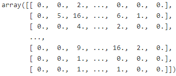 # each instance in X_train has 16 columns: 0==>0, 1~16 >0 ==>1
X_digits_dist # X_digits_dist.shape==(1347, 50)X_representative_digits.shape ![]() # 50 representative instances, 64=8x8 pixels
# 50 representative instances, 64=8x8 pixels
Now let's plot these representative images and label them manually:
import matplotlib.pyplot as plt

plt.figure( figsize=(8,2) )

for index, X_representative_digit in enumerate(X_representative_digits):
    plt.subplot( k//10, 10, index+1) # rows, columns, index(start 1)
    plt.imshow( X_representative_digit.reshape(8,8), cmap="binary", interpolation="bilinear" )
    plt.axis("off")

plt.show()
y_representative_digits = np.array([
0, 1, 3, 2, 7, 6, 4, 6, 9, 5,
1, 2, 9, 5, 2, 7, 8, 1, 8, 6,
3, 1, 5, 4, 5, 4, 0, 3, 2, 6,
1, 7, 7, 9, 1, 8, 6, 5, 4, 8,
5, 3, 3, 6, 7, 9, 7, 8, 4, 9
]) #y_train[representative_digit_idx]
Now we have a dataset with just 50 labeled instances, but instead of being completely random instances, each of them is a representative image of its cluster. Let's see if the performance is any better:
log_reg = LogisticRegression(multi_class="ovr", solver="liblinear", random_state=42)
log_reg.fit( X_representative_digits, y_representative_digits ) #supervised learning
log_reg.score( X_test, y_test )![]()
Wow! We jumped from 82.7% accuracy to 93.1%, although we are still only training the model on 50 instances. Since it's often costly and painful to label instances, especially when it has to be done manually by experts, it's a good idea to make them label representative instances rather than just random instances.
But perhaps we can go one step further: what if we propagated扩散 the labels to all the other instances in the same cluster?
np.unique(kmeans.labels_)kmeans.labels_.shape![]()
y_train_propagated = np.empty( len(X_train), dtype=np.int32 ) # empty dataset
# kmeans = KMeans( n_clusters=k, random_state=42 )
# X_digits_dist = kmeans.fit_transform( X_train ) #distances with 50 centroids
#  X_train <-- kmeans.labels_ with cluster index(0~49)
# X_digits_dist.shape # (1347, 50)

### Represents the index(0~1346) of the instance closest to the centroid of each cluster(0~49)
# representative_digit_idx = np.argmin( X_digits_dist, axis=0 ) #an index list # 1x50
# X_representative_digits = X_train[ representative_digit_idx ] # extraction # (50, 64=8x8)
# plt.imshow( X_representative_digit.reshape(8,8), cmap="binary", interpolation="bilinear" )
#           ==>y_representative_digits
for i in range(k): # 0~49                    #cluster index(or i): y or digit
    y_train_propagated[kmeans.labels_ ==i] = y_representative_digits[i]#fill with representative digits
log_reg = LogisticRegression( multi_class="ovr", solver="liblinear", random_state=42 )
log_reg.fit( X_train, y_train_propagated)log_reg.score(X_test, y_test)![]()
We got a tiny little accuracy boost( compare to log_reg.fit( X_representative_digits, y_representative_digits ), then log_reg.score( X_test, y_test ) without propagating the labels(clusters index) to all the other instances in the same cluster). Better than nothing, but we should probably have propagated the labels only to the instances closest to the centroid, because by propagating to the full cluster, we have certainly included some outliers.
Let's only propagate the labels to the 20th percentile closest to the centroid:
percentile_closest = 20
                                # 0,1,2~1346          # values: 0~49   # kmeans.labels_.shape=(1347,)
X_cluster_dist = X_digits_dist[ np.arange(len(X_train)), kmeans.labels_ ]
# X_cluster_dist.shape # (1347,)
#fill X_cluster_dist with the distance between the closest centroid with each instance
for i in range(k):
                # kmeans.labels_.shape=(1347,)
    in_cluster = (kmeans.labels_ ==i) #(False, False, True, ...1347...,False)
    cluster_dist = X_cluster_dist[in_cluster]#extraction #[distance,distance,...]
    cutoff_distance = np.percentile(cluster_dist, percentile_closest) #20%
    above_cutoff = (X_cluster_dist > cutoff_distance)
    X_cluster_dist[in_cluster & above_cutoff] = -1
partially_propagated = ( X_cluster_dist !=-1 )
X_train_partially_propagated = X_train[partially_propagated] #extraction
y_train_partially_propagated = y_train_propagated[partially_propagated]log_reg = LogisticRegression( multi_class="ovr", solver="liblinear", random_state=42 )
log_reg.fit( X_train_partially_propagated, y_train_partially_propagated )log_reg.score(X_test, y_test)![]()
Nice! With just 50 labeled instances (just 5 examples per class on average!), we got 92.2% performance, which is pretty close to the performance of logistic regression on the fully labeled digits dataset (which was 96.7%,
log_reg = LogisticRegression(multi_class = "ovr", solver="liblinear", random_state=42)
log_reg.fit(X_train, y_train)
log_reg.score( X_test, y_test ) #==>0.9666666666666667 ).
This is because the propagated labels are actually pretty good: their accuracy is very close to 99%:
np.mean( y_train_partially_propagated == y_train[partially_propagated] )![]()
You could now do a few iterations of active learning:
- Manually label the instances that the classifier is least sure about, if possible by picking them in distinct clusters.
- Train a new model with these additional labels.
DBSCAN
https://blog.csdn.net/Linli522362242/article/details/105813977 Density-based Spatial [ˈspeɪʃl]空间的 Clustering of Applications with Noise (DBSCAN). The notion of density in DBSCAN is defined as the number of data points within a specified radius ![]() (epsilon).
(epsilon).
In DBSCAN, a special label is assigned to each sample (point) using the following criteria:
- A point is considered as core point if at least a specified number ( >=MinPts, OR >= min_samples ) of neighboring points fall within the specified radius
 .
. - A border point is a point that has fewer neighbors than MinPts within
 ,but lies within the
  radius of a core point
 - All other points that are neither core nor border points are considered as noise points
After labeling the points as core, border, or noise points, the DBSCAN algorithm can be summarized in two simple steps:
- Form a separate cluster for each core point or connected group of core points (core points are connected if they are no farther away than
 ).
). - Assign each border point to the cluster of its corresponding core point.
To get a better understanding of what the result of DBSCAN can look like before jumping to the implementation, let's summarize what you have learned about core points, border points, and noise points in the following figure:![]()
One of the main advantages of using DBSCAN is that it does not assume that the clusters have a spherical shape as in k-means. Furthermore, DBSCAN is different from k-means and hierarchical clustering in that it doesn't necessarily assign each point to a cluster but is capable of removing noise points.
For a more illustrative example, let's create a new dataset of half-moon-shaped structures:
from sklearn.datasets import make_moons

X,y = make_moons( n_samples=1000, noise=0.05, random_state=42)

plt.scatter( X[:,0], X[:,1] )
plt.show()
As we can see in the resulting plot, there are two visible, half-moon-shaped groups consisting of 1000 sample points each:
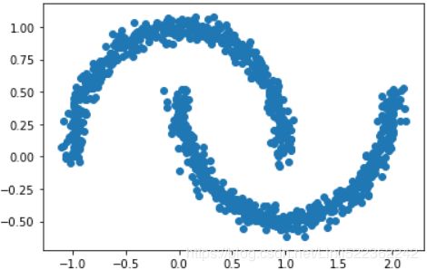
####################################################
https://scikit-learn.org/stable/modules/generated/sklearn.cluster.DBSCAN.html
min_samples: int, default=5 <== (core point + MinPts, eg 1+4=5 )
The number of samples (or total weight) in a neighborhood for a point to be considered as a core point. This includes the point itself.
core_sample_indices_ : array, shape = [n_core_samples]
Indices of core samples(core samples: the samples can be a core point).
components_ : array, shape = [n_core_samples, n_features]
Copy of each core sample found by training.
labels_ : array, shape = [n_samples]
Cluster labels for each point in the dataset given to fit(). Noisy samples are given the label -1.
First, I use DBSCAN to form two clusers, # np.unique( dbscan.labels_ ) : array([0, 1], dtype=int64)
Then use KNN to do prediction for new instances
from sklearn.cluster import DBSCAN
import numpy as np

XX = np.array([[1, 2], [2, 2], [2, 3],
              [8, 7], [25, 80], [8, 8],
             ])
clustering = DBSCAN(eps=3, min_samples=2).fit(XX)
clustering.components_clustering.core_sample_indices_![]()
clustering.labels_![]()
####################################################
from sklearn.cluster import DBSCAN

dbscan = DBSCAN( eps=0.05, min_samples=5 ) # min_samples=5 # default
dbscan.fit(X)dbscan.labels_[:10]![]()
len(dbscan.core_sample_indices_) # the number of core samples #==len(dbscan.components_)![]() # = the number of samples that can be the core points
# = the number of samples that can be the core points
len(X[dbscan.labels_==-1]) # the number of noisy points ![]() # the number of noisy points
# the number of noisy points
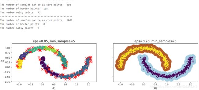
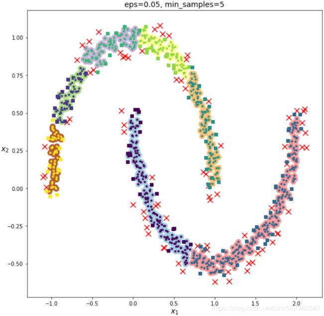
# 1000-808 -77= 115 border points #see the following figure
dbscan.core_sample_indices_[:10] ![]()
dbscan.components_[:3] # dbscan.components_: Copy of each core sample found by training# Cluster labels for each point in the dataset given to fit(). Noisy samples are given the label -1.
np.unique(dbscan.labels_) ![]()
dbscan2 = DBSCAN(eps = 0.2) # min_samples=5 # default
dbscan2.fit(X)
def plot_dbscan( dbscan, X, size, show_xlabels=True, show_ylabels=True ):
core_mask = np.zeros_like(dbscan.labels_, dtype=bool) # np.zeros(dbscan.labels_.shape)
core_mask[ dbscan.core_sample_indices_ ] = True
anomalies_mask = dbscan.labels_ == -1 # if noisy point
non_core_mask = ~( core_mask | anomalies_mask ) #border mask
cores = dbscan.components_ # Copy of each core sample found by training.
anomalies = X[anomalies_mask] # noisy point
non_cores = X[non_core_mask] # border point
print("--------------------------------------------------")
print( "The number of samples can be as core points: ", len(dbscan.core_sample_indices_) )
print( "The number of border points: ", len(non_cores) )
print( "The number noisy points: ", len(anomalies) )
plt.scatter( cores[:,0], cores[:,1],
c=dbscan.labels_[core_mask], marker='o', s=size, cmap="Paired" )
plt.scatter( cores[:,0], cores[:,1],
c=dbscan.labels_[core_mask], marker='*', s=20 )
plt.scatter( non_cores[:,0], non_cores[:,1], #border
c=dbscan.labels_[non_core_mask], marker='s', ) # marker='.'
plt.scatter( anomalies[:,0], anomalies[:,1],
c="r", marker="x", s=100 ) #noisy point
if show_xlabels:
plt.xlabel("$x_1$", fontsize=14)
else:
plt.tick_params(labelbottom=False)
if show_ylabels:
plt.ylabel("$x_2$", fontsize=14, rotation=0)
else:
plt.tick_params(labelleft=False)
plt.title( "eps={:.2f}, min_samples={}".format(dbscan.eps, dbscan.min_samples), fontsize=14 )plt.figure( figsize=(15,3.2) )
plt.subplot(121)
plot_dbscan(dbscan, X, size=100)
plt.subplot(122)
plot_dbscan(dbscan2, X, size=600, show_ylabels=False)
plt.show()dbscan = dbscan2 # since we need to cluster all points
dbscan = dbscan2 # since we need to cluster all points

from sklearn.neighbors import KNeighborsClassifier

len( dbscan.components_ ), len( dbscan.core_sample_indices_ )![]()
np.unique( dbscan.labels_ ) # since there exists two clusters![]()
#use knn for clustering
knn = KNeighborsClassifier( n_neighbors=50 )
         #here, current all points== all core points(# of of border points==0, # of noisy points==0)
knn.fit( dbscan.components_, dbscan.labels_[dbscan.core_sample_indices_])
X_new = np.array([ [-0.5,0],[0,0.5], [1,-0.1], [2,1] ])
knn.predict(X_new) ![]()
knn.predict_proba(X_new)def plot_data(X):
plt.plot(X[:,0], X[:,1], "k.", markersize=2)
def plot_centroids( centroids, weights=None, circle_color='w', cross_color='b'):
if weights is not None:
centroids = centroids[ weights>weights.max()/10 ]
plt.scatter( centroids[:,0], centroids[:,1], marker='o', s=30, linewidths=8, color=circle_color,
zorder=10, alpha=0.9) # #zorder大的图像在上层,zorder小的图像在下层
plt.scatter( centroids[:,0], centroids[:,1], marker='x', s=50, linewidths=50, color=cross_color,
zorder=11, alpha=1)
def plot_decision_boundaries( clusterer, X, resolution=1000, show_centroids=True,
show_xlabels=True, show_ylabels=True):
mins = X.min(axis=0) - 0.1
maxs = X.max(axis=0) + 0.1
xx, yy = np.meshgrid( np.linspace(mins[0], maxs[0], resolution),
np.linspace(mins[1], maxs[1], resolution)
)
Z=clusterer.predict( np.c_[ xx.ravel(), yy.ravel() ])
Z=Z.reshape(xx.shape)
# plt.show()不支持用x轴和y轴数据来设置网格,
# 而是必须通过extent参数设置图形的坐标范围[xmin, xmax, ymin, ymax]
#x1 #x2
plt.contourf(Z, extent=(mins[0],maxs[0], mins[1],maxs[1]), cmap='Pastel2')
plt.contour(Z, extent=(mins[0],maxs[0], mins[1],maxs[1]), linewidths=1, colors='k')#boundaries
plot_data(X)
if show_centroids:
plot_centroids( clusterer.cluster_centers_ )
if show_xlabels:
plt.xlabel( "$x_1$", fontsize=14 )
else:
plt.tick_params( labelbottom=False )# do not display bottom x-axis label
if show_ylabels:
plt.ylabel( "$x_2$", fontsize=14, rotation=0 )
else:
plt.tick_params( labelleft=False )plt.figure( figsize=(6,3) )
plot_decision_boundaries( knn, X, show_centroids=False )
plt.scatter( X_new[:,0], X_new[:,1], c="b", marker="+", s=200, zorder=10 )
plt.show()
Note: anormal points in X_new = np.array([ [-0.5,0],[0,0.5], [1,-0.1], [2,1] ])
y_dist, y_pred_idx = knn.kneighbors( X_new, n_neighbors=1 )
y_dist
y_pred_idx # the nearest point's indexy_pred[y_dist>0.2]=-1 #means difficult to predict
y_pred.ravel()
First extraction: get core points
Second extraction: get the nearest core point' labels from core points
# extraction
# dbscan.labels_[dbscan.core_sample_indices_]==> core points' labels
# core points' labels[y_pred_idx]
y_pred = dbscan.labels_[dbscan.core_sample_indices_][y_pred_idx]
y_pred
y_pred[y_dist>0.2]=-1 #means difficult to predict
y_pred.ravel()![]()
Other Clustering Algorithms
Spectral Clustering
So far, we saw three of the most fundamental categories of clustering algorithms:
- prototype-based clustering with k-means, Prototype-based clustering means that each cluster is represented by a prototype, which can either be the centroid质心 (average) of similar (We can define similarity as the opposite of distance and a commonly used distance for clustering samples with continuous features is the squared Euclidean distance between two points x and y in m-dimensional space:
 Note that, in the preceding equation, the index j refers to the jth dimension (feature column) of the sample points x and y.) points with continuous features, or the medoid ( the most representative or most frequently occurring point ) in the case of categorical features. ( the mean, standard deviation for continuous data types (such as age), whereas frequency and percentage are useful for categorical data (such as gender). )
 - agglomerative hierarchical clustering成团块层次聚类, start with each sample as an individual cluster and merge the closest pairs of clusters untilonly one cluster remains.
https://blog.csdn.net/Linli522362242/article/details/105813977
- and density-based clustering via DBSCAN.

- However, I also want to mention a fourth class of more advanced clustering algorithms that we have not covered in this chapter: graph-based clustering. Probably the most prominent members of the graph-based clustering family are spectral clustering algorithms谱聚类算法 . Although there are many different implementations of spectral clustering, they all have in common that they use the eigenvectors of a similarity matrix to derive the cluster relationships. Since spectral clustering is beyond the scope of this book, you can read the excellent tutorial by Ulrike von Luxburg to learn more about this topic (U. Von Luxburg. A Tutorial on Spectral Clustering. Statistics and computing, 17(4):395–416, 2007). It is freely available from arXiv at http://arxiv.org/pdf/0711.0189v1.pdf.
https://towardsdatascience.com/spectral-clustering-82d3cff3d3b7
Connectivity — Points that are connected or immediately next to each other are put in the same cluster. Even if the distance between 2 points is less, if they are not connected, they are not clustered together. Spectral clustering is a technique that follows this approach.
The difference between the K-Means Clustering and Spectral clustering can easily be shown by this illustration:
How does Spectral Clustering work?
In spectral clustering, the data points are treated as nodes of a graph. Thus, clustering is treated as a graph partitioning problem. The nodes are then mapped to a low-dimensional space that can be easily segregated to form clusters. An important point to note is that no assumption is made about the shape/form of the clusters.
What are the steps for Spectral Clustering?
Spectral clustering involves 3 steps:
1. Compute a similarity graph
2. Project the data onto a low-dimensional space
3. Create clusters
https://towardsdatascience.com/spectral-clustering-82d3cff3d3b7
https://www.cnblogs.com/pinard/p/6221564.html
from sklearn.cluster import SpectralClustering

sc1 = SpectralClustering( n_clusters=2, gamma=100, random_state=42 )
sc1.fit(X)
sc2 = SpectralClustering( n_clusters=2, gamma=1, random_state=42 )
sc2.fit(X)
adjacent matrix和affinity matrix之间的区别
如下图是一个无向图,其有4个点,5条边,每个边的权重w为1。
如果使用 adjacent matrix描述该图,则adjacent matrix应该是4x4的方阵G, 表示定点(node)与定点(node)的关系,
G=
但是,使用 affnity matrix 则表示的是点和边之间的关系,为一个4x5的矩阵
import pandas as pd
print(pd.DataFrame(sc1.affinity_matrix_[:5,:5]))
# sc1.affinity_matrix_.shape # (1000, 1000)
np.percentile( sc1.affinity_matrix_, 95)![]()
def plot_spectral_clustering(sc, X, size, alpha, show_xlabels=True, show_ylabels=True):
    plt.scatter( X[:,0], X[:,1], marker='o', s=size, c='gray', cmap='Paired', alpha=alpha )
    plt.scatter( X[:,0], X[:,1], marker='o', s=30, c='w' )

    plt.scatter( X[:,0], X[:,1], marker='.', s=10, c=sc.labels_, cmap="Paired")

    if show_xlabels:
        plt.xlabel("$x_1$", fontsize=14 )
    else:
        plt.tick_params(labelbottom=False)

    if show_ylabels:
        plt.ylabel("$x_2$", fontsize=14, rotation=0 )
    else:
        plt.tick_params(labelleft=False)

    plt.title("RBF gamma={}".format(sc.gamma), fontsize=14 )
plt.figure( figsize=(15,5) )
plt.subplot(121)
plot_spectral_clustering(sc1, X, size=500, alpha=0.1)
plt.subplot(122)
plot_spectral_clustering(sc2, X, size=4000, alpha=0.1)
plt.show()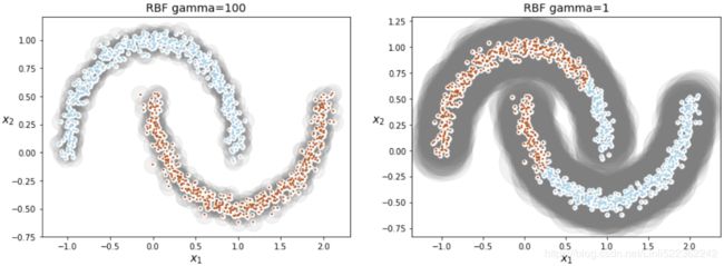
https://blog.csdn.net/Linli522362242/article/details/104280075
So γ(gamma) acts like a regularization hyperparameter: if your model is overfitting, you should reduce it, and if it is underfitting, you should increase it (similar to the C hyperparameter).
#####################################################
9.1. K-means Clustering
#####################################################
Gaussian Mixtures
https://blog.csdn.net/Linli522362242/article/details/106036242
https://jakevdp.github.io/PythonDataScienceHandbook/05.12-gaussian-mixtures.html
The k-means clustering model explored in the previous section is simple and relatively easy to understand, but its simplicity leads to practical challenges in its application. In particular, the non-probabilistic nature of k-means and its use of simple distance-from-cluster-center to assign cluster membership leads to poor performance for many real-world situations. In this section we will take a look at Gaussian mixture models (GMMs), which can be viewed as an extension of the ideas behind k-means, but can also be a powerful tool for estimation beyond simple clustering.
We begin with the standard imports:
%matplotlib inline
import matplotlib.pyplot as plt
import seaborn as sns; sns.set()
import numpy as np
Motivating GMM: Weaknesses of k-Means
Let's take a look at some of the weaknesses of k-means and think about how we might improve the cluster model. As we saw in the previous section, given simple, well-separated data, k-means finds suitable clustering results.
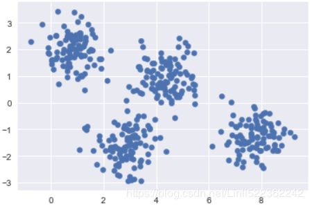
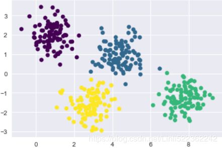
For example, if we have simple blobs of data, the k-means algorithm can quickly label those clusters in a way that closely matches what we might do by eye:
# Generate some data
from sklearn.datasets import make_blobs
X,y_true = make_blobs(n_samples =400, centers=4, cluster_std=0.6, random_state=0)
X = X[:, ::-1] #flip axes for better plotting

plt.scatter(X[:,0], X[:,1], s=40)
plt.show()
# Plot the data with K means labels
from sklearn.cluster import KMeans
kmeans = KMeans(4, random_state=0) #default: init='k-means++'
labels = kmeans.fit(X).predict(X)
plt.scatter(X[:,0], X[:,1], c=labels, s=40, cmap='viridis')
plt.show() 
From an intuitive standpoint立场, we might expect that the clustering assignment for some points is more certain than others: for example, there appears to be a very slight overlap between the two middle clusters, such that we might not have complete confidence in the cluster assigment of points between them. Unfortunately, the k-means model has no intrinsic measure of probability or uncertainty of cluster assignments (although it may be possible to use a bootstrap approach to estimate this uncertainty). For this, we must think about generalizing the model.
One way to think about the k-means model is that it places a circle (or, in higher dimensions, a hyper-sphere) at the center of each cluster, with a radius defined by the most distant point in the cluster. This radius acts as a hard cutoff for cluster assignment within the training set: any point outside this circle is not considered a member of the cluster. We can visualize this cluster model with the following function:
from sklearn.cluster import KMeans
from scipy.spatial.distance import cdist

def plot_kmeans(kmeans, X, n_clusters=4, rseed=0, ax=None):
    labels = kmeans.fit_predict(X)

    #plot the input data
    ax = ax or plt.gca()
    ax.axis('equal')
    ax.scatter(X[:,0], X[:,1], c=labels, s=40, cmap='viridis', zorder=2)

    #plot the representation of the KMeans model
    centers = kmeans.cluster_centers_         #[center] is limited to 2D
    radii = [ cdist( X[labels==clusterIndex], [center] ).max()
             for clusterIndex, center in enumerate(centers) ]
    for c, r in zip(centers, radii):         #zorder=1 put the circle under the data point(zorder=2)
        ax.add_patch( plt.Circle(c, r, fc="#CCCCCC", edgecolor="blue", lw=3, alpha=0.5, zorder=1) )


kmeans = KMeans(n_clusters=4, random_state=0)
plt.figure(figsize=(8,6))
plot_kmeans(kmeans, X) 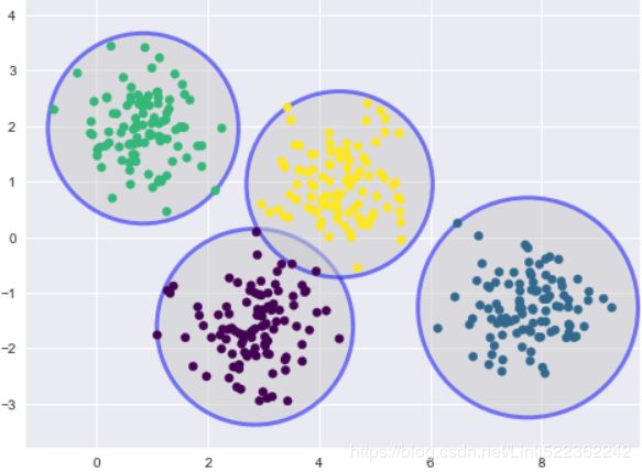
An important observation for k-means is that these cluster models must be circular: k-means has no built-in way of accounting for oblong长方形的 or elliptical clusters. So, for example, if we take the same data and transform it, the cluster assignments end up becoming muddled混乱的:
rng = np.random.RandomState(13)
X_stretched = np.dot(X, rng.randn(2,2))

fig, ax= plt.subplots(1,2, figsize=(16,8))
fig.subplots_adjust(wspace=0.1)

ax[0].scatter(X_stretched[:,0], X_stretched[:,1], s=40 )

kmeans = KMeans(n_clusters=4, random_state=0)
plot_kmeans(kmeans, X_stretched, ax=ax[1])
By eye, we recognize that these transformed clusters are non-circular, and thus circular clusters would be a poor fit. Nevertheless, k-means is not flexible enough to account for this, and tries to force-fit the data into four circular clusters. This results in a mixing of cluster assignments where the resulting circles overlap: see especially the bottom-right of this plot. One might imagine addressing this particular situation by preprocessing the data with PCA, but in practice there is no guarantee that such a global operation will circularize the individual data.
These two disadvantages of k-means—its lack of flexibility in cluster shape and lack of probabilistic cluster assignment—mean that for many datasets (especially low-dimensional datasets) it may not perform as well as you might hope.
You might imagine addressing these weaknesses by generalizing the k-means model: for example, you could measure uncertainty in cluster assignment by comparing the distances of each point to all cluster centers, rather than focusing on just the closest. You might also imagine allowing the cluster boundaries to be ellipses rather than circles, so as to account for non-circular clusters. It turns out these are two essential components of a different type of clustering model, Gaussian mixture models.
Generalizing E–M: Gaussian Mixture Models
https://blog.csdn.net/Linli522362242/article/details/106036242
https://blog.csdn.net/Linli522362242/article/details/105722461
A Gaussian mixture model (GMM) attempts to find a mixture of multi-dimensional Gaussian probability distributions that best model any input dataset. In the simplest case, GMMs can be used for finding clusters in the same manner as k-means:
from sklearn.mixture import GaussianMixture

gmm = GaussianMixture(n_components=4).fit(X)
labels = gmm.predict(X)

plt.scatter(X[:,0], X[:,1], c=labels, s=40, cmap="viridis")
plt.show()
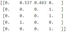
But because GMM contains a probabilistic model under the hood, it is also possible to find probabilistic cluster assignments—in Scikit-Learn this is done using the predict_proba method. This returns a matrix of size [n_samples, n_clusters] which measures the probability that any point belongs to the given cluster:
probs = gmm.predict_proba(X)
print(probs[:5].round(3) )
We can visualize this uncertainty by, for example, making the size of each point proportional to the certainty of its prediction; looking at the following figure, we can see that it is precisely the points at the boundaries between clusters that reflect this uncertainty of cluster assignment:
size = 80*probs.max(axis=1)**2 # square emphasizes difference

plt.figure(figsize=(10,6))
plt.scatter(X[:,0], X[:,1], c=labels, cmap="viridis", s=size)
plt.show() 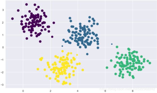
########################################################
https://blog.csdn.net/Linli522362242/article/details/106036242
constructing the covariance matrix. The symmetric d × d -dimensional covariance matrix, where d is the number of dimensions in the dataset, stores the pairwise成对地 covariances between the different features. For example, the covariance between two features ![]() and
and ![]() on the population level can be calculated via the following equation:
on the population level can be calculated via the following equation:![]()
Here, ![]() and
and ![]() are the sample means of feature j and k , respectively. Note that the sample means are zero if we standardize the dataset. A positive covariance between two features indicates that the features increase or decrease together, whereas a negative covariance indicates that the features vary in opposite directions. For example, a covariance matrix of three features can then be written as (note that
are the sample means of feature j and k , respectively. Note that the sample means are zero if we standardize the dataset. A positive covariance between two features indicates that the features increase or decrease together, whereas a negative covariance indicates that the features vary in opposite directions. For example, a covariance matrix of three features can then be written as (note that ![]() stands for the Greek uppercase letter sigma, which is not to be confused with the sum symbol):
stands for the Greek uppercase letter sigma, which is not to be confused with the sum symbol):
![]()
μ指的是均值(算术平均值, 均值对应正态分布的中间位置),σ为方标准差(方差开平方后得到标准差, 标准差衡量了数据围绕均值分散的程度)
With EM Clustering, we can go a step further and describe each cluster by its centroid (mean), covariance (so that we can have elliptical clusters), and weight (the size of the cluster or the number of instances belong to the cluster)
########################################################
Under the hood, a Gaussian mixture model is very similar to k-means: it uses an expectation–maximization approach which qualitatively does the following:
-
Choose starting guesses for the location(via means
 ) and shape(covariances
  )
)
(Initialize the means , covariances
  and mixing coefficients
  (
( ), and evaluate the initial value of the log likelihood.)
 -
Repeat until converged:
- E-step: for each point
 , find weights
  encoding the probability of membership in each cluster
(E step. Evaluate the responsibilities using the current parameter values)
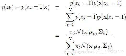 OR
OR 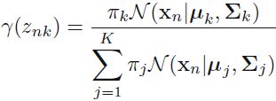
- M-step: for each cluster, update its location( via means
 ), normalization, and shape(covariances
  ) based on all data points, making use of the weights
(M step. Re-estimate the parameters using the current responsibilities)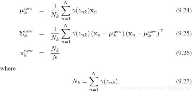
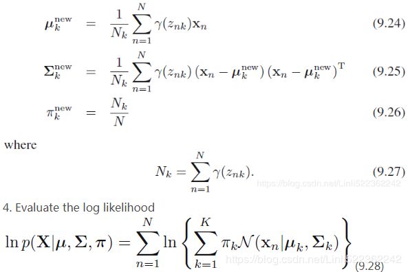
We can interpret as the effective number of points assigned to cluster k; We see that the mean
  for the Gaussian component is obtained by taking a weighted mean of all of the points in the data set, in which the weighting factor for data point
  is given by the posterior probability
  that component k was responsible for generating
  .
. - Evaluate the log likelihood
 and check for convergence of either the parameters or the log likelihood. If
the convergence criterion is not satisfied return to step 2 ( E-step + M-step ).
- E-step: for each point
The result of this is that each cluster is associated not with a hard-edged sphere, but with a smooth Gaussian model. Just as in the k-means expectation–maximization approach, this algorithm can sometimes miss the globally optimal solution, and thus in practice multiple random initializations are used.
Let's create a function that will help us visualize the (via means ![]() ) and shape(covariances
) and shape(covariances ![]() , and mixing coefficients
, and mixing coefficients ![]() ) of the GMM clusters by drawing ellipses based on the GMM output:
) of the GMM clusters by drawing ellipses based on the GMM output:
# https://blog.csdn.net/Linli522362242/article/details/105139547
# Convert covariance to principal axes
if covariance.shape ==(2,2):
# A A^T=U
# s contains all singular values
# A^T A=Vt # Vt contains all the principal components
U,s,Vt = np.linalg.svd( covariance)
# y/x=tan(A), then A=arctan(y/x), A=arctan(y,x)
angle = np.degrees( np.arctan2( U[1,0], U[0,0] ) )
width, height = 2 * np.sqrt(s) # np.sqrt(s)==eigen value
else:
angle=0
width, height = 2*np.sqrt( covariance )
#finally, gmm.means_![]() , gmm.covariances_
, gmm.covariances_![]() , gmm.weights_
, gmm.weights_![]()
# https://blog.csdn.net/jasonzhoujx/article/details/81947663
from matplotlib.patches import Ellipse

def draw_ellipse( position, covariance, ax=None, **kwargs):
    """Draw an ellipse with a given position and covariance"""
    ax = ax or plt.gca()

    # https://blog.csdn.net/Linli522362242/article/details/105139547
    # Convert covariance to principal axes
    if covariance.shape ==(2,2):
        # A A^T=U
        # s contains all singular values
        # A^T A=Vt # Vt contains all the principal components
        U,s,Vt = np.linalg.svd( covariance)
        # y/x=tan(A), then A=arctan(y/x), A=arctan(y,x)
        angle = np.degrees( np.arctan2( U[1,0], U[0,0] ) )
        width, height = 2 * np.sqrt(s) # np.sqrt(s)==eigen value
    else:
        angle=0
        width, height = 2*np.sqrt( covariance )

    # Draw the Ellipse
    for nsig in range(1,4):
        ax.add_patch(Ellipse( position, nsig*width, nsig*height, angle, **kwargs) )

def plot_gmm(gmm, X, label=True, ax=None):
    ax = ax or plt.gca()
    labels = gmm.fit(X).predict(X)

    if label:
        ax.scatter( X[:,0], X[:,1], c=labels, s=40, ec='black', cmap="viridis", zorder=2 )
    else:
        ax.scatter( X[:,0], X[:,1], s=40, ec='black', zorder=2 )
    ax.axis('equal')

    # weights_ OR pi: This attribute stores the mixing weights for each mixture component.
    # sum(gmm.weights_)==1
    for pos, covar, w in zip(gmm.means_, gmm.covariances_, gmm.weights_): #for each componen
        draw_ellipse( pos, covar, alpha=w) # set the alpha transparency of the patch
With this in place, we can take a look at what the four-component GMM gives us for our initial data:
#default covariance_type='full': each component has its own general covariance matrix
gmm = GaussianMixture(n_components=4, random_state=42) # default: diag

plt.figure(figsize=(10,6))
plot_gmm(gmm, X)
plt.show() 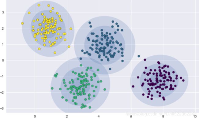
Similarly, we can use the GMM approach to fit our stretched dataset; allowing for a full covariance the model will fit even very oblong, stretched-out clusters:
gmm = GaussianMixture(n_components=4, covariance_type='full', random_state=42)

plt.figure(figsize=(10,6))
plot_gmm(gmm, X_stretched)
plt.show() 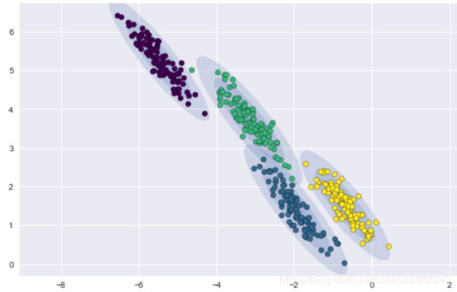
This makes clear that GMM addresses the two main practical issues with k-means encountered before.
Choosing the covariance type
If you look at the details of the preceding fits, you will see that the covariance_type option was set differently within each. This hyperparameter controls the degrees of freedom in the shape of each cluster; it is essential to set this carefully for any given problem. The default is covariance_type="diag", which means that the size of the cluster along each dimension can be set independently, with the resulting ellipse constrained to align with the axes. A slightly simpler and faster model is covariance_type="spherical", which constrains the shape of the cluster such that all dimensions are equal. The resulting clustering will have similar characteristics to that of k-means, though it is not entirely equivalent. A more complicated and computationally expensive model (especially as the number of dimensions grows) is to use covariance_type="full", which allows each cluster to be modeled as an ellipse with arbitrary orientation.
We can see a visual representation of these three choices for a single cluster within the following figure:
You can impose constraints on the covariance matrices that the algorithm looks for by setting the covariance_typehyperparameter:
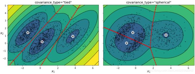
"full"(default): no constraint, all clusters can take on any ellipsoidal shape of any size."tied": all clusters must have the same shape, which can be any ellipsoid (i.e., they all share the same covariance matrix)."spherical": all clusters must be spherical, but they can have different diameters (i.e., different variances)."diag": clusters can take on any ellipsoidal shape of any size, but the ellipsoid's axes must be parallel to the axes (i.e., the covariance matrices must be diagonal).
GMM as Density Estimation
Though GMM is often categorized as a clustering algorithm, fundamentally it is an algorithm for density estimation. That is to say, the result of a GMM fit to some data is technically not a clustering model, but a generative probabilistic model describing the distribution of the data.
from sklearn.datasets import make_moons

Xmoon, ymoon = make_moons(200, noise=0.05, random_state=0)

plt.figure(figsize=(10,6))
plt.scatter(Xmoon[:,0], Xmoon[:,1], c='blue')
plt.show() 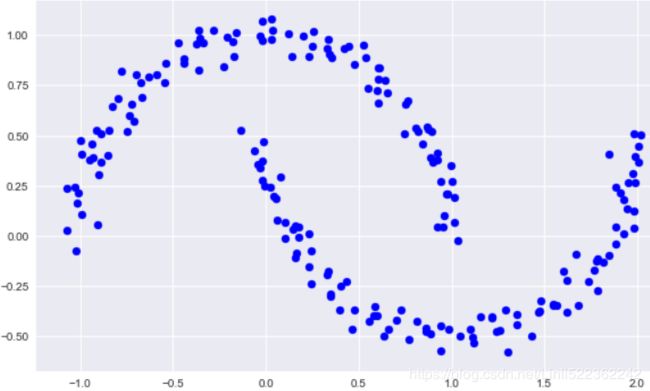
If we try to fit this with a two-component GMM viewed as a clustering model, the results are not particularly useful:
gmm2 = GaussianMixture(n_components=2, covariance_type='full', random_state=0)

plt.figure(figsize=(10,6))
plot_gmm(gmm2, Xmoon) 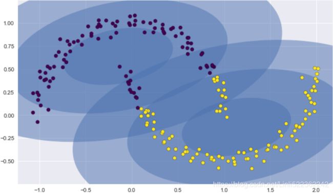
But if we instead use many more components and ignore the cluster labels, we find a fit that is much closer to the input data:
gmm2 = GaussianMixture(n_components=16, covariance_type='full', random_state=0)

plt.figure(figsize=(10,6))
plot_gmm(gmm2, Xmoon) 
Here the mixture of 16 Gaussians serves not to find separated clusters of data, but rather to model the overall distribution of the input data. This is a generative model of the distribution, meaning that the GMM gives us the recipe to generate new random data distributed similarly to our input.
For example, here are 400 new points drawn from this 16-component GMM fit to our original data:
Xnew = gmm16.sample(400) #tuple(array, array):tuple(data_2D,label_1D )

plt.figure( figsize=(10,6))
plt.scatter(Xnew[0][:,0],Xnew[0][:,1], c="blue")
plt.show() 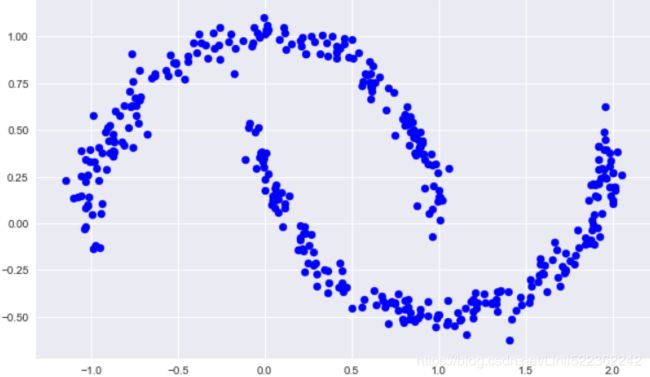
GMM is convenient as a flexible means of modeling an arbitrary multi-dimensional distribution of data.
How many components?
The fact that GMM is a generative model gives us a natural means of determining the optimal number of components for a given dataset. A generative model is inherently a probability distribution for the dataset, and so we can simply evaluate the likelihood of the data under the model, using cross-validation to avoid over-fitting. Another means of correcting for over-fitting is to adjust the model likelihoods using some analytic criterion such as the Akaike information criterion (AIC) or the Bayesian information criterion (BIC). Scikit-Learn's GMM estimator actually includes built-in methods that compute both of these, and so it is very easy to operate on this approach.
Let's look at the AIC and BIC as a function as the number of GMM components for our moon dataset:
n_components = np.arange(1,21)
models=[GaussianMixture(n, covariance_type='full', random_state=0).fit(Xmoon)
       for n in n_components
      ]

plt.figure(figsize=(10,6))
plt.plot( n_components, [m.bic(Xmoon) for m in models], label='BIC' )
plt.plot( n_components, [m.aic(Xmoon) for m in models], label='AIC' )
plt.legend(loc='best')
plt.axis([0,20, 200,800])
plt.xticks(np.arange(0,21))
plt.xlabel('n_components')

plt.show() 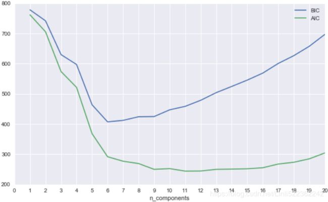
The optimal number of clusters is the value that minimizes the AIC or BIC, depending on which approximation we wish to use. The AIC tells us that our choice of 16 components above was probably too many: around 8-12 components would have been a better choice. As is typical with this sort of problem, the BIC recommends a simpler model.
Notice the important point: this choice of number of components measures how well GMM works as a density estimator, not how well it works as a clustering algorithm. I'd encourage you to think of GMM primarily as a density estimator, and use it for clustering only when warranted within simple datasets.
Example: GMM for Generating New Data
We just saw a simple example of using GMM as a generative model of data in order to create new samples from the distribution defined by the input data. Here we will run with this idea and generate new handwritten digits from the standard digits corpus[计]语料库 that we have used before.
To start with, let's load the digits data using Scikit-Learn's data tools:
from sklearn.datasets import load_digits

digits = load_digits()
digits.data.shap ![]() # 64= 8x8
# 64= 8x8
Next let's plot the first 100 (10 rows * 10 columns) of these to recall exactly what we're looking at:
https://blog.csdn.net/ggt55ng6/article/details/88879689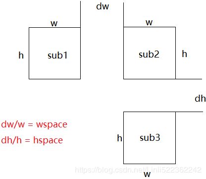
https://blog.csdn.net/Linli522362242/article/details/105139547
def plot_digits(data):                                           #remove xticks and yticks
    fig, ax = plt.subplots(10, 10, figsize=(8,8), subplot_kw=dict(xticks=[], yticks=[]))
    fig.subplots_adjust( hspace=0.5, wspace=0.05 )

    #https://blog.csdn.net/bubble_story/article/details/79531495
    # flat: A 1-D iterator over the array.
    # flatten : Return a copy of the array collapsed into one dimension.
    for i, axi in enumerate(ax.flat): # if plt.subplots(10, 10) return an array with 100 plots
        im = axi.imshow(data[i].reshape(8,8), cmap='binary')
        # matplotlib.pyplot.clim(vmin=None, vmax=None)
        # Set the color limits of the current image.
        # If either vmin or vmax is None, the image min/max respectively will be used for color scaling.
        im.set_clim(0,16)

plot_digits(digits.data) 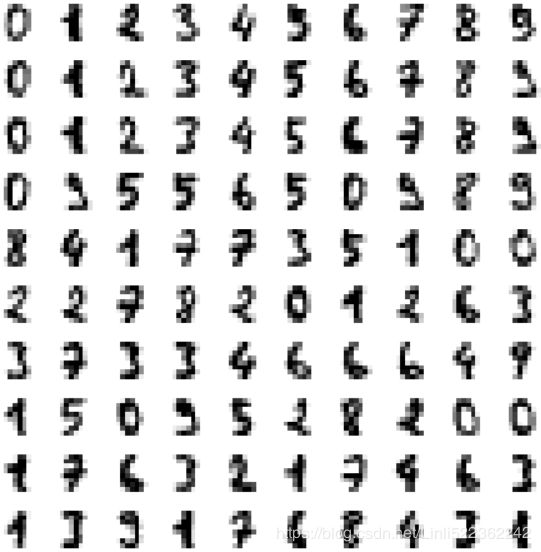
We have nearly 1,800 digits###(1797, 64)### in 64 dimensions, and we can build a GMM on top of these to generate more. GMMs can have difficulty converging in such a high dimensional space, so we will start with an invertible dimensionality reduction algorithm on the data. Here we will use a straightforward PCA, asking it to preserve 99% of the variance in the projected data:
from sklearn.decomposition import PCA
# whiten
# When True (False by default) the `components_` vectors are multiplied by the square root of
# n_samples and then divided by the singular values to ensure uncorrelated outputs with
# unit component-wise variances.
pca=PCA(n_components=0.99, whiten=True)
data = pca.fit_transform(digits.data)
data.shape ![]()
The result is 41 dimensions, a reduction of nearly 1/3 with almost no information loss(n_components=0.99). Given this projected data, let's use the AIC to get a gauge 评估 for the number of GMM components we should use:
n_components = np.arange(80,240, 10)
models = [ GaussianMixture(n, covariance_type='full', random_state=0) for n in n_components ]
aics = [ model.fit(data).aic(data) for model in models ]
plt.plot(n_components, aics)
plt.show()
It appears that around 150 components minimizes the AIC; we will use this model. Let's quickly fit this to the data and confirm that it has converged:
gmm = GaussianMixture(n_components=150, covariance_type='full', random_state=0)
gmm.fit(data)
print(gmm.converged_)![]()
Now we can draw samples of 100 new points within this 41-dimensional projected space, using the GMM as a generative model:
data_new = gmm.sample(100) #tuple(array, array):tuple(data_2D,label_1D ) #label_1xD: cluster_index
data_new[0].shape ![]()
Finally, we can use the inverse transform of the PCA object to construct the new digits:
digits_new = pca.inverse_transform(data_new[0])
plot_digits(digits_new) 
The results for the most part look like plausible 貌似有理的 digits from the dataset!
Consider what we've done here: given a sampling of handwritten digits, we have modeled the distribution of that data in such a way that we can generate brand new samples of digits from the data: these are "handwritten digits" which do not individually appear in the original dataset, but rather capture the general features of the input data as modeled by the mixture model. Such a generative model of digits can prove very useful as a component of a Bayesian generative classifier, as we shall see in the next section.
https://jakevdp.github.io/PythonDataScienceHandbook/05.12-gaussian-mixtures.html
################
from sklearn.datasets import make_blobs
import matplotlib.pyplot as plt
                                               #positions
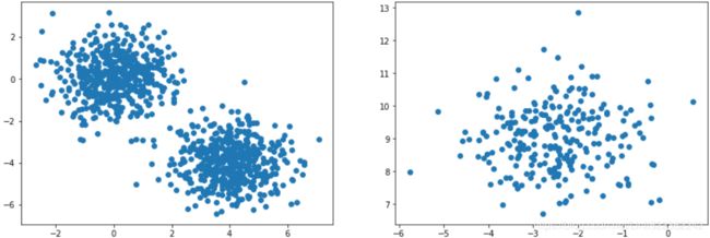
X1, y1 = make_blobs( n_samples=1000, centers=( (4,-4), (0,0) ), random_state=42 )
                                    #the number of centers
X2, y2 = make_blobs( n_samples=250, centers=1, random_state=42)

plt.figure( figsize=(15,5) )

plt.subplot(121)
plt.scatter(X1[:,0], X1[:,1])

plt.subplot(122)
plt.scatter(X2[:,0], X2[:,1])
plt.show()
X1=X1.dot(np.array([[0.374, 0.95],
[0.732, 0.598]
])
)
X2 = X2 + [6, -8]
plt.figure( figsize=(15,5) )
plt.subplot(121)
plt.scatter(X1[:,0], X1[:,1])
plt.subplot(122)
plt.scatter(X2[:,0], X2[:,1])
plt.show()these transformed clusters are non-circular
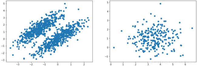
Mixture
X = np.r_[X1, X2]
y = np.r_[y1, y2]
X.shape![]()
plt.figure( figsize=(10,5) )

plt.scatter(X[:,0], X[:,1])
plt.show()
Let's train a Gaussian mixture model on the previous dataset:
from sklearn.mixture import GaussianMixture

gm = GaussianMixture(n_components=3, n_init=10, random_state=42)
gm.fit(X)
Let's look at the parameters that the EM algorithm estimated (9.17) where we have defined
  (9.18)
We can interpret ![]() as the effective number of points assigned to cluster k. Note carefully the form of this solution. We see that the mean
as the effective number of points assigned to cluster k. Note carefully the form of this solution. We see that the mean ![]() for the
for the ![]() Gaussian component is obtained by taking a weighted mean of all of the points in the data set, in which the weighting factor for data point
Gaussian component is obtained by taking a weighted mean of all of the points in the data set, in which the weighting factor for data point ![]() is given by the posterior probability
is given by the posterior probability ![]() that component k was responsible for generating
that component k was responsible for generating ![]() .
. OR
OR 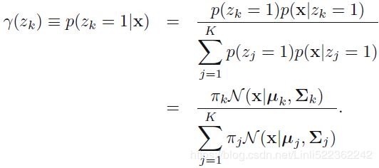
gm.weights_gm.means_gm.covariances_array([[[ 0.68825143, 0.79617956],
[ 0.79617956, 1.21242183]
],
[[ 1.14740131, -0.03271106],
[-0.03271106, 0.95498333]
],
[[ 0.63478217, 0.72970097],
[ 0.72970097, 1.16094925]
]
])Did the algorithm actually converge?
gm.converged_![]()
Yes, good. How many iterations did it take?
gm.n_iter_![]()
# https://blog.csdn.net/jasonzhoujx/article/details/81947663
from matplotlib.patches import Ellipse

def draw_ellipse( position, covariance, ax=None, **kwargs):
    """Draw an ellipse with a given position and covariance"""
    ax = ax or plt.gca()

    # https://blog.csdn.net/Linli522362242/article/details/105139547
    # Convert covariance to principal axes
    if covariance.shape ==(2,2):
        # A A^T=U
        # s contains all singular values
        # A^T A=Vt # Vt contains all the principal components
        U,s,Vt = np.linalg.svd( covariance)
        # y/x=tan(A), then A=arctan(y/x), A=arctan(y,x)
        angle = np.degrees( np.arctan2( U[1,0], U[0,0] ) )
        width, height = 2 * np.sqrt(s) # np.sqrt(s)==eigen value
    else:
        angle=0
        width, height = 2*np.sqrt( covariance )

    # Draw the Ellipse
    for nsig in range(1,4):
        ax.add_patch(Ellipse( position, nsig*width, nsig*height, angle, **kwargs) )

def plot_gmm(gmm, X, label=True, ax=None):
    ax = ax or plt.gca()
    labels = gmm.fit(X).predict(X) #clusters

    if label:
        ax.scatter( X[:,0], X[:,1], c=labels, s=40, ec='black', cmap="viridis", zorder=2 )
    else:
        ax.scatter( X[:,0], X[:,1], s=40, ec='black', zorder=2 )
    ax.axis('equal')

    # weights_ OR pi: This attribute stores the mixing weights for each mixture component.
    # sum(gmm.weights_)==1
    for pos, covar, w in zip(gmm.means_, gmm.covariances_, gmm.weights_): #for each componen
        draw_ellipse( pos, covar, alpha=w) # set the alpha transparency of the patch


plt.figure(figsize=(10,6))
plot_gmm(gm, X)
plt.show()
You can now use the model to predict which cluster each instance belongs to (hard clustering) or the probabilities that it came from each cluster. For this, just use predict() method or the predict_proba() method:
gm.predict(X)![]()
gm.predict_proba(X)
This is a generative model, so you can sample new instances from it (and get their labels):
( Now we can draw samples of 6 new points within this 2-dimensional space, using the GMM as a generative model: )
X_new, y_new = gm.sample(6)
X_newy_new![]()
Notice that they are sampled sequentially from each cluster.
You can also estimate the log of the probability density function (PDF) at any location using the score_samples() method:
score_samples(self, X)
Compute the weighted log probabilities for each sample.
################################################
https://blog.csdn.net/Linli522362242/article/details/106036242
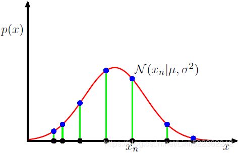 Figure 1.14 Illustration of the likelihood function for a Gaussian distribution, shown by the red curve. Here the black points denote a data set of values {
![]() }, and the likelihood function given by (1.53
}, and the likelihood function given by (1.53  ) corresponds to the product乘积 of the blue values. Maximizing the likelihood involves adjusting the mean and variance of the Gaussian so as to maximize this product.
Maximizing the log likelihood function (9.14  ) for a Gaussian mixture mode.
Compute the weighted log probabilities for a sample: ![]() *
*![]() ==>
==>
 *
*  ==> ln (
![]() ) for a sample/instance in a Gaussian mixture mode. (here, we can treat
) for a sample/instance in a Gaussian mixture mode. (here, we can treat ![]() as a weight)
as a weight)
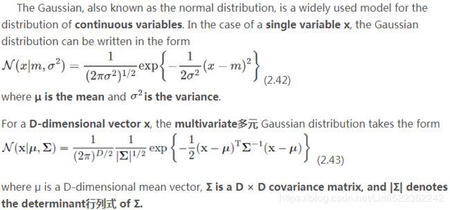
Note: the pdf for the Gaussian distribution with D-dimensional vector x (here: multivariate 多元 Gaussian distribution) : ln( ![]() ) and
) and
the pdf for a single gaussian distribution with one-dimensional variable x:
################################################
You can also estimate the log of the probability density function (PDF) at any location using the score_samples() method:
gm.score_samples(X)# gm.score_samples(X).shape == (1250,)Let's check that the PDF integrates to 1 over the whole space. We just take a large square around the clusters, and chop it into a grid of tiny squares, 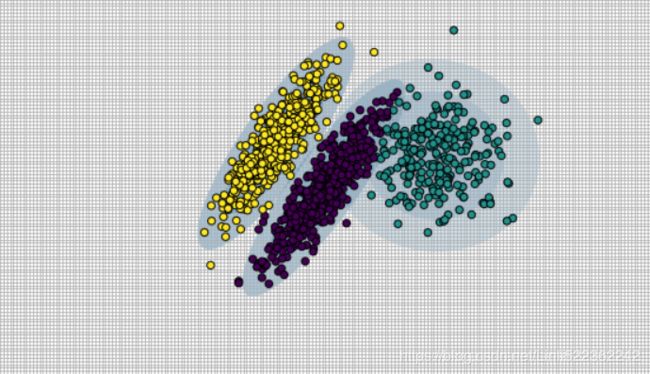
then we compute the approximate probability that the instances will be generated in each tiny square (by multiplying the PDF at one corner of the tiny square by the area of the square), and finally summing all these probabilities). The result is very close to 1:
resolution = 100
grid = np.arange(-10,10, 1/resolution)
xx, yy = np.meshgrid(grid, grid)
X_full = np.vstack( [xx.ravel(), yy.ravel()] ).T  #or# np.c_[xx.ravel(), yy.ravel
X_full
# compute the approximate probability that the instances will be generated in each tiny square
# (by multiplying the PDF at one corner of the tiny square by the area of the square)
pdf = np.exp( gm.score_samples(X_full) )
pdf_probas = pdf * (1/resolution)**2 # (1/resolution)**2 since xx, yy = np.meshgrid(grid, grid)
pdf_probas.sum() # finally summing all these probabilities![]()
Now let's plot the resulting decision boundaries (dashed lines) and density contours:
from matplotlib.colors import LogNorm
import numpy as np

def plot_centroids( centroids, weights=None, circle_color='w', cross_color='k'):
    if weights is not None:
        centroids = centroids[ weights > weights.max()/10 ]
    plt.scatter( centroids[:,0], centroids[:,1], marker='o', s=30, linewidths=8, color=circle_color,
               zorder=10, alpha=0.9 )
    plt.scatter( centroids[:,0], centroids[:,1], marker='x', s=50, linewidths=50, color=cross_color,
               zorder=11, alpha=1 )

def plot_gaussian_mixture( clusterer, X, resolution=1000, show_ylabels=True ):
    mins = X.min( axis=0 ) - 0.1
    maxs = X.max( axis=0 ) + 0.1
    xx, yy = np.meshgrid( np.linspace(mins[0], maxs[0], resolution),
                          np.linspace(mins[1], maxs[1], resolution)
                        )

    #score_samples: negative value follow the rule "great is the better"
    Z = -clusterer.score_samples( np.c_[ xx.ravel(), yy.ravel() ])
    Z = Z.reshape( xx.shape )
    # norm
    # If a colormap is used, the Normalize instance scales the level values to the canonical colormap
    # range [0, 1] for mapping to colors. ###If not given, the default linear scaling is used###

    # vmin,vmax
    # If not None, either or both of these values will be supplied to the Normalize instance,
    ### overriding the default color scaling based on levels.###

    # np.logspace : default base=10
    ### 10^0, 10^1, 10^2,...12...10^2 ###
    plt.contourf( xx, yy, Z, norm=LogNorm(vmin=1.0, vmax=30.0), levels=np.logspace(0,2,12) )
    plt.contour( xx, yy, Z, norm=LogNorm(vmin=1.0, vmax=30.0), levels=np.logspace(0,2,12),
                linewidths=1, colors='k')
    Z = clusterer.predict( np.c_[xx.ravel(), yy.ravel()] )
    Z = Z.reshape( xx.shape )
    plt.contour(xx, yy, Z, linewidths=2, colors='r', linestyles='dashed')
    plt.plot( X[:,0], X[:,1], 'k.', markersize=2 )
    plot_centroids( clusterer.means_, clusterer.weights_ )

    plt.xlabel( "$x_1$", fontsize=14 )

    if show_ylabels:
        plt.ylabel("$x_2$", fontsize=14, rotation=0 )
    else:
        plt.tick_params( labelleft=False )
plt.figure(figsize=(10,6))
plot_gaussian_mixture(gm,X)
plt.show()You can impose constraints on the covariance matrices that the algorithm looks for by setting the covariance_typehyperparameter:
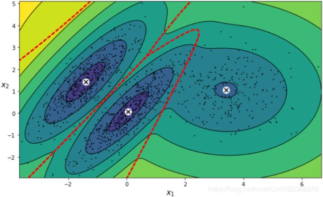
"full"(default): no constraint, all clusters can take on any ellipsoidal shape of any size."tied": all clusters must have the same shape, which can be any ellipsoid (i.e., they all share the same covariance matrix)."spherical": all clusters must be spherical, but they can have different diameters (i.e., different variances)."diag": clusters can take on any ellipsoidal shape of any size, but the ellipsoid's axes must be parallel to the axes (i.e., the covariance matrices must be diagonal).gm_full = GaussianMixture( n_components=3, n_init=10, covariance_type="full", random_state=42 ) gm_tied = GaussianMixture( n_components=3, n_init=10, covariance_type="tied", random_state=42 ) gm_spherical = GaussianMixture( n_components=3, n_init=10, covariance_type="spherical", random_state=42) gm_diag = GaussianMixture( n_components=3, n_init=10, covariance_type="diag", random_state=42 ) gm_full.fit(X) gm_tied.fit(X) gm_spherical.fit(X) gm_diag.fit(X)def compare_gaussian_mixtures(gm1, gm2, X): plt.figure(figsize=(15,5)) plt.subplots_adjust(wspace=0.05) plt.subplot(121) plot_gaussian_mixture(gm1, X) plt.title('covariance_type="{}"'.format(gm1.covariance_type), fontsize=14) plt.subplot(122) plot_gaussian_mixture(gm2, X, show_ylabels=False) plt.title('covariance_type="{}"'.format(gm2.covariance_type), fontsize=14)compare_gaussian_mixtures(gm_tied, gm_spherical, X) plt.show()compare_gaussian_mixtures(gm_full, gm_diag, X) plt.tight_layout() plt.show()-
Anomaly Detection using Gaussian Mixtures
https://www.zhihu.com/question/263467674Gaussian Mixtures can be used for anomaly detection: instances located in low-density regions can be considered anomalies. You must define what density threshold you want to use. For example, in a manufacturing company that tries to detect defective products, the ratio of defective products is usually well-known. Say it is equal to 4%, then you can set the density threshold to be the value that results in having 4% of the instances located in areas below that threshold density:
# for a single Gaussian Distribution with a single variable x: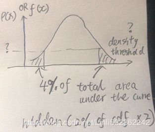
# use np.percentile() to get the density threshold then extract the anormal points# pdf = np.exp( gm.score_samples(X_full) ) # ~ X densities = gm.score_samples(X) #log(pdf) ~ X # 4% of the instances located in areas below that threshold density(<=P(x) OR <=f(x) OR <=log(pdf)) density_threshold = np.percentile( densities, 4) #hidden: (2% of cdf )x2 #return the density_threshold anomalies = X[densities < density_threshold]plt.figure( figsize=(10,6) ) plot_gaussian_mixture(gm,X) plt.scatter(anomalies[:,0], anomalies[:,1], color="r", marker="*") plt.ylim(top=5.1) plt.show() -
Model selection
https://blog.csdn.net/Linli522362242/article/details/105722461 -
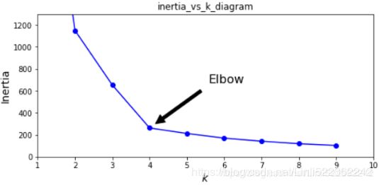 (inertia is the sum of the squared distances between each training instance and its closest centroid:)
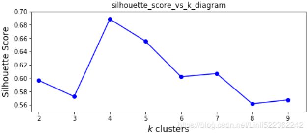 (the silhouette score, which is the mean silhouette coefficient over all the instances, which is equivalent to numpy.mean(silhouette_samples(…)).. An instance's silhouette coefficient is equal to (b-a)/max(a,b) where a is the mean distance to the other instances in the same cluster (it is the mean intra-cluster distance), and b is the mean nearest-cluster distance, that is the mean distance (of An instance) to the instances of the next closest cluster (defined as the one that minimizes , excluding the instance's own cluster). The silhouette coefficient can vary between -1 and +1: a coefficient close to +1 means that the instance is well inside its own cluster and far from other clusters, while a coefficient close to 0 means that it is close to a cluster boundary, and finally a coefficient close to -1 means that the instance may have been assigned to the wrong cluster.)
 -
We cannot use the inertia or the silhouette score because they both assume that the clusters are spherical. Instead, we can try to find the model that minimizes a theoretical information criterion such as the Bayesian Information Criterion (BIC) or the Akaike Information Criterion (AIC):


- n is the number of instances, the number of data points in X, the number of observations, or equivalently, the sample size;
- k is the number of parameters learned by the model, the number of parameters estimated by the model. For example, in multiple linear regression, the estimated parameters are the intercept, the
 slope parameters, and the constant variance of the errors; thus
  ,
,  is the maximized value of the likelihood function of the model M. i.e.
  , where
  are the parameter values that maximize the likelihood function,
  = the observed data;
- AIC和BIC主要用于模型的选择,AIC、BIC越小越好。
在对不同模型进行比较时,AIC、BIC降低越多,说明该模型的拟合效果越好;选择最优模型的指导思想是从两个方面去考察:一个是似然函数最大化,另一个是模型中的未知参数个数最小化。似然函数值越大说明模型拟合的效果越好,但是我们不能单纯地以拟合精度来衡量模型的优劣,这样回导致模型中未知参数k越来越多,模型变得越来越复杂,会造成过拟合。所以一个好的模型应该是拟合精度和未知参数个数的综合最优化配置。 -
当两个模型之间存在较大差异时,差异主要体现在似然函数项,当似然函数差异不显著时,上式第一项,即模型复杂度则起作用,从而参数个数少的模型是较好的选择。
AIC: 一般而言,当模型复杂度提高(k增大)时,似然函数
Both BIC and AIC penalize models that have more parameters to learn (e.g., more clusters), and reward models that fit the data well (i.e., models that give a high likelihood to the observed data). 也会增大,从而使AIC变小,但是k过大时,似然函数增速减缓,导致AIC增大,模型过于复杂容易造成过拟合现象。目标是选取AIC最小的模型,AIC不仅要提高模型拟合度(极大似然),而且引入了惩罚项,使模型参数尽可能少,有助于降低过拟合的可能性。
AIC和BIC均引入了与模型参数个数相关的惩罚项,BIC的惩罚项比AIC的大,考虑了样本数量,样本数量过多时,可有效防止模型精度过高造成的模型复杂度过高(kln(n)惩罚项在维数过大且训练样本数据相对较少的情况下,可以有效避免出现维度灾难现象。)gm.bic(X)
gm.aic(X)
We could compute the and
and  manually like this: https://blog.csdn.net/Linli522362242/article/details/106036242
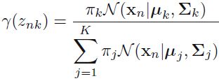
Compute the weighted log probabilities for a sample: *
* ==>
==>
 *
*  ==> ln (
 ) for a sample/instance in a Gaussian mixture mode. (here, we can treat
  as a weight)
 -
n_clusters = 3
n_dims = 2
#There's one weight(pi_k) per cluster, but the sum must be equal to 1,
#so we have one degree of freedom less
n_params_for_weights = n_clusters-1
n_params_for_means = n_clusters*n_dims
# for each cluster' covariance matrix with each instance has n_dimmensions(1+2+...+n_dims) ==> n_dims * (n_dims+1)//2
n_params_for_covariance = n_clusters * n_dims * (n_dims+1)//2
n_params = n_params_for_weights + n_params_for_means + n_params_for_covariance
max_log_likelihood = gm.score(X) * len(X) # log(L^)
bic = np.log(len(X)) * n_params - 2*max_log_likelihood
aic = 2*n_params - 2*max_log_likelihood

bic, aic
n_params
There's one weight per cluster, but the sum must be equal to 1 , so we have one degree of freedom less, hence the -1. Similarly, the degrees of freedom for an n_dims * n_dims covariance matrix is n_dims * n_dims , but 1 + 2 + ... + n_dims = (n_dims)*(n_dims+1) //2.
 -
Let's train Gaussian Mixture models with various values of k and measure their BIC:
# We set n_init=10 to run the k-means clustering algorithms 10 times independently
# with different random centroids to choose the final model
gm_per_k = [GaussianMixture(n_components=k, n_init=10, random_state=42).fit(X) for k in range(1,11)]

bics = [model.bic(X) for model in gm_per_k]
aics = [model.aic(X) for model in gm_per_k]


plt.figure(figsize=(10,6))

plt.plot(range(1,11), bics, "bo-", label="BIC")
plt.plot(range(1,11), aics, "go--", label="AIC")
plt.xlabel("$k$ clusters", fontsize=14)
plt.ylabel("Information Criterion", fontsize=14)
plt.axis([ 1, 9.5, np.min(aics)-50, np.max(aics)+50 ])
plt.annotate("Minimum", xy=(3, bics[2]),
             xytext=(0.35, 0.6), textcoords="figure fraction", fontsize=14,
             arrowprops=dict(facecolor="black", shrink=0.1)
            )
plt.legend()
plt.title("AIC_BIC_vs_k_diagram")
plt.show()
Let's search for best combination of values for both the number of clusters and thecovariance_typehyperparameter:min_bic = np.infty for k in range(1,11): for ct in ("full", "tied", "spherical", "diag"): bic = GaussianMixture(n_components=k, n_init=10, covariance_type=ct, random_state=42).fit(X).bic(X) if bic
best_covariance_type
Variational Bayesian Gaussian Mixtures
-
https://scikit-learn.org/stable/auto_examples/mixture/plot_concentration_prior.html#sphx-glr-auto-examples-mixture-plot-concentration-prior-py
https://scikit-learn.org/0.19/_downloads/scikit-learn-docs.pdfRather than manually searching for the optimal number of clusters, it is possible to use instead the
BayesianGaussianMixtureclass which is capable of giving weights equal (or close) to zero to unnecessary clusters. Just set the number of components to a value that you believe is greater than the optimal number of clusters, and the algorithm will eliminate the unnecessary clusters automatically.from sklearn.mixture import BayesianGaussianMixture bgm = BayesianGaussianMixture(n_components=10, n_init=10, random_state=42) bgm.fit(X)
The Dirichlet process prior allows to define an infinite number of components and automatically selects the correct number of components: it activates a component only if it is necessary.np.round(bgm.weights_, 2)
plt.figure( figsize=(10,5) ) plot_gaussian_mixture(bgm, X) plt.show() -
https://scikit-learn.org/0.19/_downloads/scikit-learn-docs.pdf
https://scikit-learn.org/stable/auto_examples/mixture/plot_concentration_prior.html#sphx-glr-auto-examples-mixture-plot-concentration-prior-py
Due to its Bayesian nature, the variational algorithm needs more hyper- parameters than expectation-maximization, the most important of these being the concentration parameter weight_concentration_prior. Specifying a low value for the concentration prior will make the model put most of the weight on few components set the remaining components weights very close to zero. High values of the concentration prior will allow a larger number of components to be active in the mixture. -
The parameters implementation of the BayesianGaussianMixture class proposes two types of prior for the weights distribution: a finite mixture model with Dirichlet distribution and an infinite mixture model with the Dirichlet Process. In practice Dirichlet Process inference algorithm is approximated and uses a truncated distribution with a fixed maximum number of components (called the Stick-breaking representation). The number of components actually used almost always depends on the data.
-
The next figure compares the results obtained for the different type of the weight concentration prior (parameter weight_concentration_prior_type) for different values of weight_concentration_prior. Here, we can see the value of the weight_concentration_prior parameter has a strong impact on the effective number of active components obtained. We can also notice that large values for the concentration weight prior lead to more uniform weights when the type of prior is ‘dirichlet_distribution’ while this is not necessarily the case for the ‘dirichlet_process’ type (used by default).
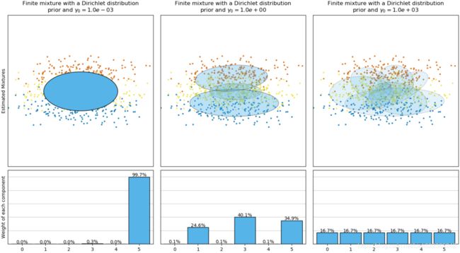
On the contrary the classical finite mixture model with a Dirichlet distribution prior will favor more uniformly weighted components and therefore tends to divide natural clusters into unnecessary sub-components.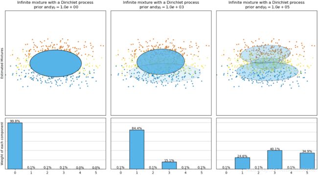
The Dirichlet process prior allows to define an infinite number of components and automatically selects the correct number of components: it activates a component only if it is necessary.# weight_concentration_prior. Specifying a low value for the concentration prior will make # the model put most of the weight on few components set the remaining components weights # very close to zero. High values of the concentration prior will allow a larger number of # components to be active in the mixture. bgm_low = BayesianGaussianMixture(n_components=10, max_iter=1000, n_init=1, weight_concentration_prior=0.01, random_state=42) bgm_high= BayesianGaussianMixture(n_components=10, max_iter=1000, n_init=1, weight_concentration_prior=10000, random_state=42) nn=73 bgm_low.fit(X[:nn]) bgm_high.fit(X[:nn])
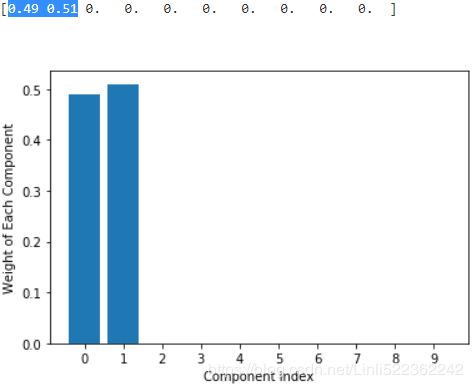
Specifying a low value for the concentration prior will make the model put most of the weight on few components set the remaining components weights very close to zero. High values of the concentration prior will allow a larger number of components to be active in the mixture.print( np.round(bgm_low.weights_, 2) ) plt.bar( np.arange(0,10) ,np.round(bgm_low.weights_, 2) ) plt.ylabel('Weight of Each Component') plt.xlabel("Component Index") plt.xticks(np.arange(0,10)) plt.show()print( np.round(bgm_high.weights_, 2) ) plt.bar( np.arange(0,10), np.round(bgm_high.weights_, 2) ) plt.ylabel('Weight of Each Component') plt.xlabel("Component Index") plt.xticks(np.arange(0,10)) plt.show()plt.figure( figsize=(15,5) ) plt.subplot(121) plot_gaussian_mixture( bgm_low, X[:nn] ) plt.title("weight_concentration_prior=0.01", fontsize=14) plt.subplot(122) plot_gaussian_mixture( bgm_high, X[:nn], show_ylabels=False) plt.title("weight_concentration_prior=10000", fontsize=14) #plt.title("Mixture Concentraction Prior Diagram") plt.show()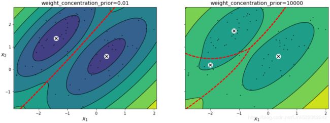
the distribution of weight in all component determine the number of centroids.
Another example:
from sklearn.datasets import make_moons

X_moons, y_moons = make_moons(n_samples=1000, noise=0.05, random_state=42)


bgm = BayesianGaussianMixture( n_components=10, n_init=10, random_state=42 )
bgm.fit(X_moons)
"full" (default): no constraint, all clusters can take on any ellipsoidal shape of any size.
The Dirichlet process prior allows to define an infinite number of components and automatically selects the correct number of components: it activates a component only if it is necessary.
print( np.round(bgm.weights_, 2) )
plt.bar( np.arange(0,10), np.round(bgm.weights_, 2) )
plt.ylabel('Weight of Each Component')
plt.xlabel("Component Index")
plt.xticks(np.arange(0,10))
plt.show()
def plot_data(X):
plt.plot( X[:,0], X[:,1], 'k.', markersize=2 )
plt.figure( figsize=(15,5) )
plt.subplots_adjust(wspace=0.03)
#plt.tight_layout()
plt.subplot(121)
plot_data(X_moons)
plt.xlabel("$x_1$", fontsize=14)
plt.ylabel("$x_2$", fontsize=14, rotation=False)
plt.subplot(122)
plot_gaussian_mixture(bgm, X_moons, show_ylabels=False)
plt.show()
Oops, not great... instead of detecting 2 moon-shaped clusters, the algorithm detected 8 ellipsoidal clusters( 8 centroids). However, the density plot does not look too bad, so it might be usable for anomaly detection.
# pdf = np.exp( bgm.score_samples(X_moons) ) # ~ X_moons
densities = bgm.score_samples(X_moons)

# 4% of the instances located in areas below that threshold density(<=P(x) OR <=f(x) OR <=log(pdf))
density_threshold = np.percentile( densities, 4) #log(pdf) ~ X_moons#hidden: (2% of cdf )x2 #return the density_threshold
anomalies = X_moons[densities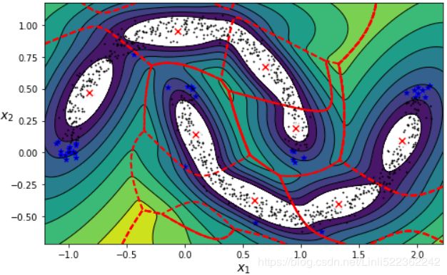
08_Dimensionality Reduction_04_Mixture Models and EM_K-means_Image segmentation_compression
https://blog.csdn.net/Linli522362242/article/details/106036242
08_Dimensionality Reduction_05
https://blog.csdn.net/Linli522362242/article/details/106214887

