使用python plt画图的一些记录
我实在是太不会写总结了,每次写博客都很水。
显示中文问题
plt.rcParams['font.family'] = ['sans-serif']
plt.rcParams['font.sans-serif'] = ['SimHei']
整数前面补0的问题
f'{h:02d}:{m:02d}'
加刻度,并变竖直
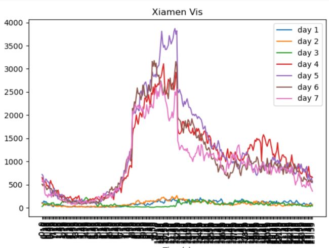
这里卡了好久,开始的时候x轴的标签黑漆漆的
plt.xticks(index, index_label, rotation=90)
这里rotation=90是把显示的字旋转90度,也就是变成竖直的
然后是前面的index和index_label,这个是调整刻度间隔用的
index表示哪些地方要显示刻度,index_label表示显示的字是啥
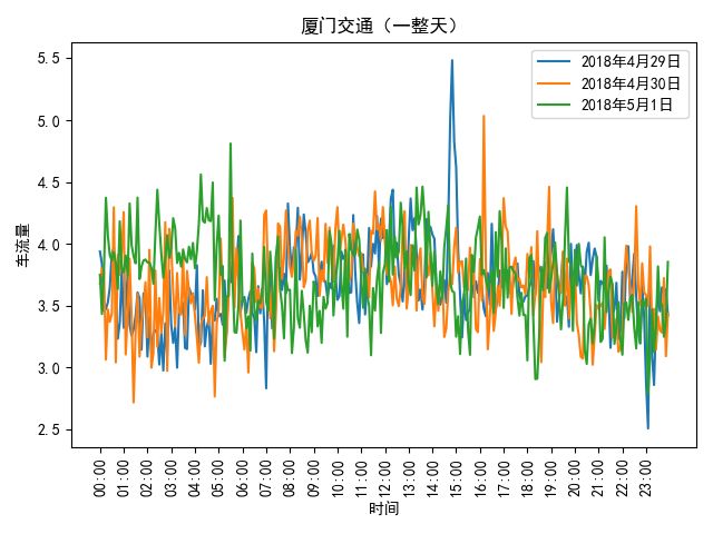
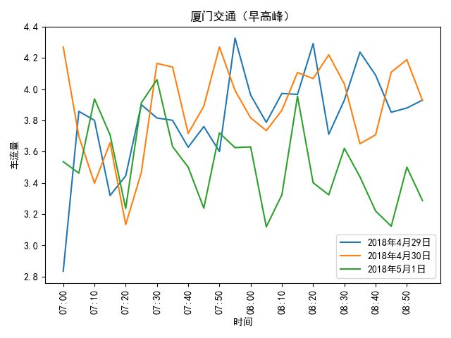
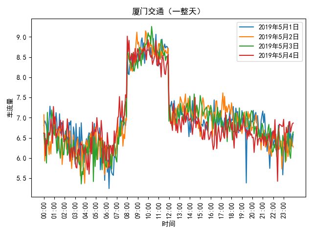
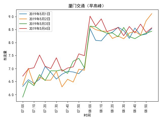
最后的效果
最后贴代码
import sys
import os
import os.path as osp
import pickle
import matplotlib.pyplot as plt

plt.rcParams['font.family'] = ['sans-serif']
plt.rcParams['font.sans-serif'] = ['SimHei']
with open('feature_5m_avg_count.pkl', 'rb') as f:
    data = pickle.load(f)
    print('')

def _format_time(m: int):
    # m = m % (60 * 60)
    h = m / 60
    h = int(h)
    m = m % 60
    m = int(m)
    return f'{h:02d}:{m:02d}'

def draw_whole_day(x, y, xlabel):
    _x = [x[sample] for sample in range(0, len(x), 12)]
    plt.plot(y, label=xlabel[i])
    plt.xlabel("时间")
    plt.ylabel("车流量")
    plt.xticks(range(0, len(x), 12), _x, rotation=90)
    plt.title("厦门交通(一整天)")
    plt.legend()

def draw_high_commuting(x, y, xlabel):
    _x = [x[sample] for sample in range(0, len(x), 2)]
    plt.plot(y, label=xlabel[i])
    plt.xlabel("时间")
    plt.ylabel("车流量")
    plt.xticks(range(0, len(x), 2), _x, rotation=90)
    plt.title("厦门交通(早高峰)")
    plt.legend()
# 2018年4月29日 - 5月1日
xlabel = ['2018年4月29日', '2018年4月30日', '2018年5月1日']
point = 171
feat = 0
for i in range(3):
    day = i + 1
    start = (day - 1) * 12 * 24
    end = day * 12 * 24
    y = data[start:end, point, feat]
    x = [_format_time(_x * 5) for _x in range(12 * 24)]
    draw_whole_day(x, y, xlabel)
plt.show()
for i in range(3):
    day = i + 1
    # 7:00 - 9:00
    start = (day - 1) * 12 * 24 + 12 * 7
    end = (day - 1) * 12 * 24 + 12 * 9
    y = data[start:end, point, feat]
    x = [_format_time(_x * 5 + 5 * 12 * 7) for _x in range(12 * 2)]
    draw_high_commuting(x, y, xlabel)
plt.show()
# 2019年5月1日 - 5月4日
xlabel = ['2019年5月1日', '2019年5月2日', '2019年5月3日', '2019年5月4日']
point = 171
feat = 0
for i in range(len(xlabel)):
    day = i + 1 + 3
    start = (day - 1) * 12 * 24
    end = day * 12 * 24
    y = data[start:end, point, feat]
    x = [_format_time(_x * 5) for _x in range(12 * 24)]
    draw_whole_day(x, y, xlabel)
plt.show()
for i in range(len(xlabel)):
    day = i + 1 + 3
    # 7:00 - 9:00
    start = (day - 1) * 12 * 24 + 12 * 7
    end = (day - 1) * 12 * 24 + 12 * 9
    y = data[start:end, point, feat]
    x = [_format_time(_x * 5 + 5 * 12 * 7) for _x in range(12 * 2)]
    draw_high_commuting(x, y, xlabel)
plt.show()