R语言中使用ggstatsplot增强统计输出
文章目录
- 1. ggstatsplot简介
-
- 1.1 统计分析
- 1.2 统计图
- 2 参数说明
-
- 2.1 统计检验
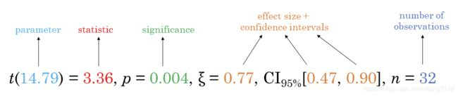
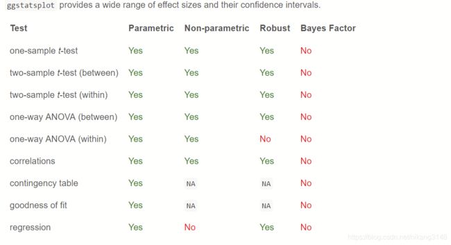
- 2.2 效应值 effect size
- 2.3 配对检验方法
- 2.4 Robust检验
- 2.5 贝叶斯检验
- 3. 常用函数示例
-
- 3.1 ggbetweenstats
- 3.2 ggwithinstats
- 3.3 gghistostats/ggdotplotstats
- 3.4 ggcorrmat
- 3.5 ggscattterstats
- 3.6 ggpiestats/ggbarstats
- 3.7 ggcoefstats
- 3.8 只用ggstatsplot结果,其他包绘图
ggstatsplot是基于ggplot包扩展的统计绘图包,但其中提供了丰富的统计参数输出。本文并不重复绘图的过程,而是着重于解释重要的统计参数的说明。
注:图中代码与图形引自博文一文解决基本科研绘图需求,部分代码增加了更多参数,以方便提供参数说明。
1. ggstatsplot简介
一般统计图主要显示数据分布及检验结果,而ggstatsplot在统计图上同时显示探索数据分析(EDA)与推断统计(IS)的结果,一图胜千言,可以大大减少对统计分析结果的文字说明。
1.1 统计分析
ggstatsplot在统计学分析方面支持最常见的统计测试类型:
- t-test
- ANOVA,
- 非参数检验
- 相关性分析
- 列联表分析
- 回归分析。
1.2 统计图
图片输出方面支持输出:
- 小提琴图(violin 用于不同组之间连续数据的异同分析)
- 饼图(pie 用于分类数据的分布检验)
- 条形图(bar 用于分类数据的分布检验)
- 散点图(scatter 于两个变量之间的相关性分析)
- 相关矩阵(corr用于多个变量之间的相关性分析)
- 直方图和点图(hist/dotplot关于分布的假设检验)
- 点须图(用于回归模型、meta分析,森林图)
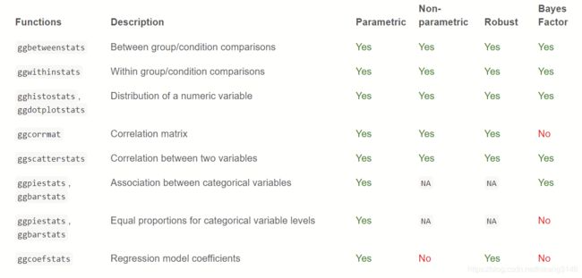
2 参数说明
此段为重点概念,解释参数的具体内容。
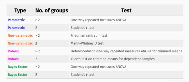
2.1 统计检验
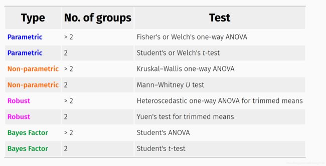
检验方法参数涉及组间、组内的均值比较检验,检验方法有:
- 参数检验(p: t/anova)
- 非参数检验(np)
- robust检验(r)
- 贝叶斯检验 (bf)
根据类别多少,有不同的方法:
 不同统计方法,具有不同的输出,以2组变量为例:
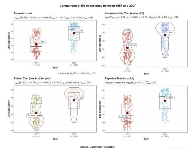 参数方法中默认是 Welch’s ANOVA/t-test,当var.equal =TRUE时才会选择F检验或者student。
Welch’s ANOVA/t-test具有很多优点,参考这篇博文。
在组内比较(重复测量比较)中,检验方法为:
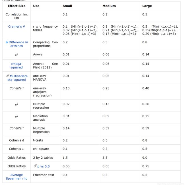
2.2 效应值 effect size
与显著性检验,如p值不同,effect size主要阐述重要性“how important”,可参考此处概念。在ggstatsplot包中不同的检验方法有不同的效应值,可参考此处说明文档。
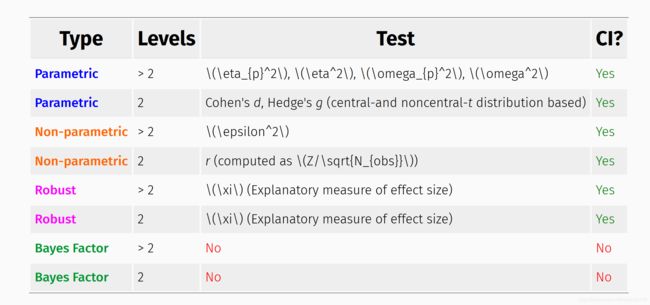 当为重复测量比较(组内比较)时,则有如下效应值度量方法:
effect size大小可参考下表:
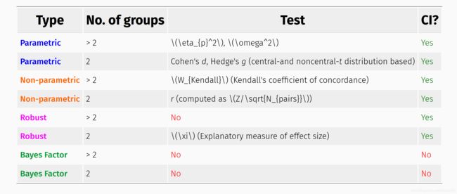
2.3 配对检验方法
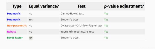
组间比较时:
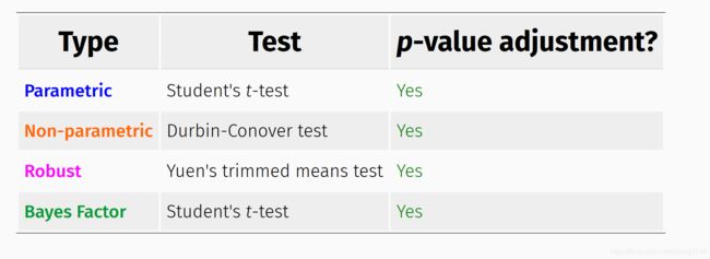
 组内比较时:
2.4 Robust检验
- Heteroscedastic one-way ANOVA trimmed means (3组以上)
- Yuen’s trimmed means test (2组)
采用了WRS2包中的“A Collection of Robust Statistical Methods ”,所谓robust方法就是指检验结果对方差齐性、正态性不敏感。原理是通过去除x%两端极值计算相关统计参数,如均值、sd、se等。ggstatsplot包中通过设置参数tr来设定去除多少,默认为0.1,即去除10%的数据,如10个数据,首尾各去除1个,剩余8个。
2.5 贝叶斯检验
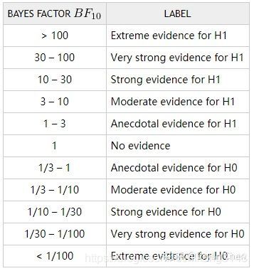
NHST(Null Hypothesis Significance Test)中用于验证假设的p值并不能解释假设本身。根据美国统计协会(ASA)在2016年的一份声明中对p值的解释:在统计检验当中,p值只能解释数据与假设之间的关系,并不能衡量研究假设为真时的概率(Wasserstein & Lazar, 2016)。NHST关于p值的定义是:假定H0为真时,以完全相同的条件无数次地重复当前实验/测量/抽样,得到的结果与H0一致或者极端相反的概率。而现实生活中,“无数次”这个定语往往被忽略,许多研究者都单纯地误认为p值是一次检验中拒绝H0时犯错误的概率。因此,陆续有研究者推荐使用贝叶斯因子(Bayes Factor)来替代NHST中的p值。
贝叶斯因子是贝叶斯统计中用来进行模型比较和假设检验的方法。在贝叶斯统计框架下的假设检验中,相当于我们根据当前收集到的数据来检验某个理论模型为真的可能性。因此,贝叶斯因子代表的是当前数据对H0与H1支持的强度之间的比率。相比之下,p值在研究中反映的只是样本均值之间的差别有无统计学意义,并不表示其差别大小。
一般来说,我们用BF10来表示数据支持备择假设(alternative hypothesis,即H1的程度。其中下标的“10”即代表 H1与H0,所以同理,BF01则代表数据支持原假设(null hypothesis,即H0的程度。
 具体信息还可以参考知乎文章。
# with `tidyBF` ----------------------------------------
library(tidyBF)

# independent t-test
bf_ttest(data = mtcars, x = am, y = wt)
#> # A tibble: 1 x 7
#>    bf10     bf01 log_e_bf10 log_e_bf01 log_10_bf10 log_10_bf01 bf.prior
#>
#> 1 1383. 0.000723       7.23      -7.23        3.14       -3.14    0.707

# paired t-test
bf_ttest(data = sleep, x = group, y = extra, paired = TRUE)
#> # A tibble: 1 x 7
#>    bf10   bf01 log_e_bf10 log_e_bf01 log_10_bf10 log_10_bf01 bf.prior
#>
#> 1  17.3 0.0579       2.85      -2.85        1.24       -1.24    0.707
![]()
ggstatsplot包只是精简了bayesfactor包中函数,详细说明还是需要参考bayesfactor包。
另外,这篇博文中有关于Cauchy值的说明,即Cauchy指柯西分布。
The BayesFactor package has a few built-in “default” named settings.
They all have the same shape; the only differ by their scale, denoted
by r. The three named defaults are medium = 0.707, wide = 1, and
ultrawide = 1.414. “Medium”, is the default. The scale controls how
large, on average, the expected true effect sizes are. For a
particular scale 50% of the true effect sizes are within the interval
(−r, r). For the default scale of “medium”, 50% of the prior effect
sizes are within the range (−0.7071, 0.7071). Increasing r increases
the sizes of expected effects; decreasing r decreases the size of the
expected effects.
3. 常用函数示例
根据数据比较类型,常用函数有:
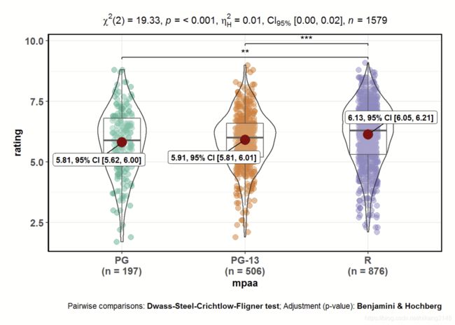
3.1 ggbetweenstats
用于组间均值比较,常用统计检验有方差分析、t检验(含配对t检验)、非参数检验、robust检验。输出boxplot、violinplot或者二者结合,通过plot.type参数定义。
ggbetweenstats(
  data = movies_long,
  x = mpaa,
  y = rating,
  type = "np", #非参数检验 (默认p,其他有np、r、bf)
  mean.ci = TRUE,
  pairwise.comparisons = TRUE, #配对检验
  pairwise.display = "s",
  p.adjust.method = "fdr", #p只调整,有holm、bonferroni、fdr等
  effectsize.type="biased" , #effect size类型, 有“biased”,如“d” Cohen's d for t-test; "partial_eta" for partial eta-squared for anova) ;还有"unbiased" ( "g" Hedge's g for t-test; "partial_omega" for partial omega-squared for anova)).
  messages = FALSE
)
输出结果图为:
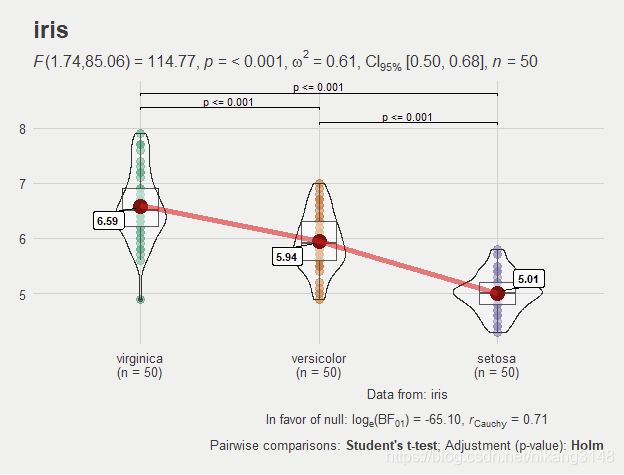
3.2 ggwithinstats
参数与ggbetweenstats基本相同:
ggstatsplot::ggwithinstats(
  data = iris,
  x = Species,
  y = Sepal.Length,
  sort = "descending", # ordering groups along the x-axis based on
  sort.fun = median, # values of `y` variable
  pairwise.comparisons = TRUE,
  pairwise.display = "s",
  pairwise.annotation = "p",
  title = "iris",
  caption = "Data from: iris",
  ggtheme = ggthemes::theme_fivethirtyeight(),
  ggstatsplot.layer = FALSE,
  messages = FALSE
)
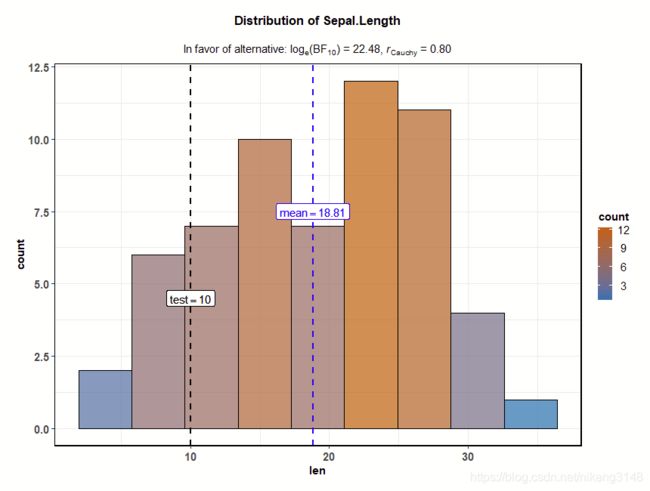
3.3 gghistostats/ggdotplotstats
直方图和点图主要用于查看一个变量的分布并通过一个样本测试检查它是否与指定值明显不同,
ggstatsplot::gghistostats(
  data = ToothGrowth, # dataframe from which variable is to be taken
  x = len, # numeric variable whose distribution is of interest
  title = "Distribution of Sepal.Length", # title for the plot
  fill.gradient = TRUE, # use color gradient
  test.value = 10, # the comparison value for t-test
  test.value.line = TRUE, # display a vertical line at test value
  type = "bf", # bayes factor for one sample t-test
  bf.prior = 0.8, # prior width for calculating the bayes factor
  messages = FALSE # turn off the messages
)
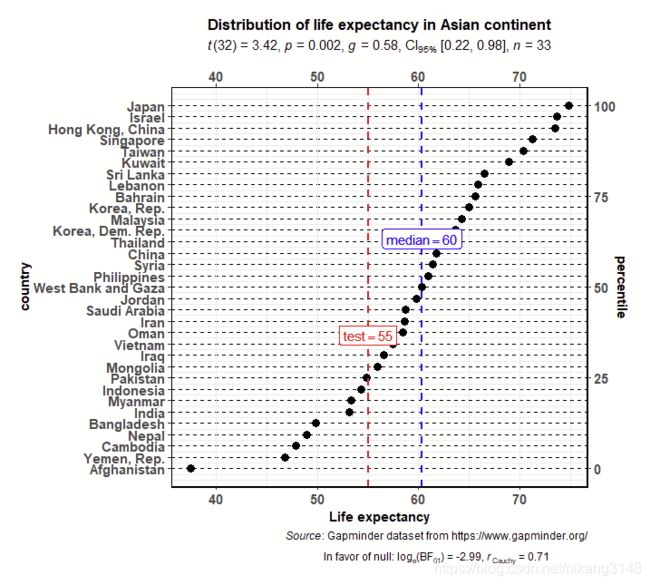
ggdotplotstats(
  data = dplyr::filter(.data = gapminder::gapminder, continent == "Asia"),
  y = country,
  x = lifeExp,
  test.value = 55,
  test.value.line = TRUE,
  test.line.labeller = TRUE,
  test.value.color = "red",
  centrality.para = "median",
  centrality.k = 0,
  title = "Distribution of life expectancy in Asian continent",
  xlab = "Life expectancy",
  messages = FALSE,
  caption = substitute(
    paste(
      italic("Source"),
      ": Gapminder dataset from https://www.gapminder.org/"
    )
  )
)
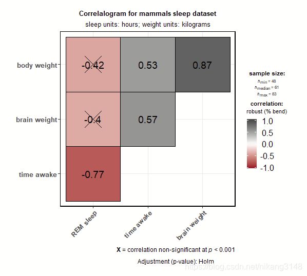
3.4 ggcorrmat
主要输出相关矩阵。
ggstatsplot::ggcorrmat(
  data = ggplot2::msleep,
  corr.method = "robust", # correlation method
  sig.level = 0.001, # threshold of significance
  p.adjust.method = "holm", # p-value adjustment method for multiple comparisons
  cor.vars = c(sleep_rem, awake:bodywt), # a range of variables can be selected
  cor.vars.names = c(
    "REM sleep", # variable names
    "time awake",
    "brain weight",
    "body weight"
  ),
  matrix.type = "upper", # type of visualization matrix
  colors = c("#B2182B", "white", "#4D4D4D"),
  title = "Correlalogram for mammals sleep dataset",
  subtitle = "sleep units: hours; weight units: kilograms"
)
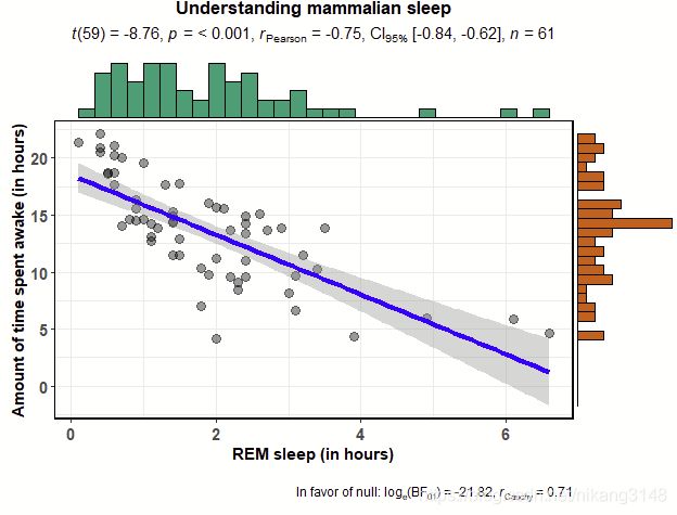
3.5 ggscattterstats
ggstatsplot::ggscatterstats(
  data = ggplot2::msleep,
  x = sleep_rem,
  y = awake,
  xlab = "REM sleep (in hours)",
  ylab = "Amount of time spent awake (in hours)",
  title = "Understanding mammalian sleep",
  method="lm",#统计方法,如lm、glm、loess或者自定义函数
  marginal.type = "histogram", # 边缘分布显示方式,直方图/密度曲线图/箱线图/小提琴图
  messages = FALSE
)
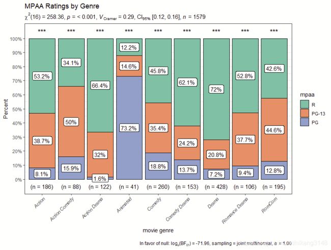
3.6 ggpiestats/ggbarstats
条图
# for reproducibility
set.seed(123)
# plot
ggstatsplot::ggbarstats(
  data = ggstatsplot::movies_long,
  main = mpaa,
  condition = genre,
  sampling.plan = "jointMulti",
  title = "MPAA Ratings by Genre",
  xlab = "movie genre",
  perc.k = 1,
  x.axis.orientation = "slant",
  ggtheme = hrbrthemes::theme_modern_rc(),
  ggstatsplot.layer = FALSE,
  ggplot.component = ggplot2::theme(axis.text.x = ggplot2::element_text(face = "italic")),
  palette = "Set2",
  messages = FALSE
)
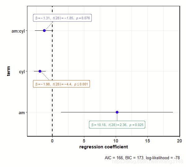
3.7 ggcoefstats
输出回归系数的点估计值作为带有置信区间的点,类似森林图。
# for reproducibility
set.seed(123)

# model
mod <- stats::lm(
  formula = mpg ~ am * cyl,
  data = mtcars
)

# plot
ggstatsplot::ggcoefstats(x = mod)
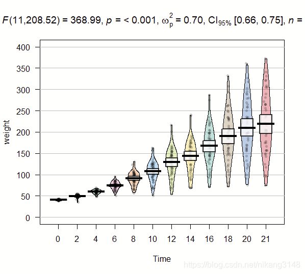
3.8 只用ggstatsplot结果,其他包绘图
# for reproducibility
set.seed(123)

# loading the needed libraries
library(yarrr)
library(ggstatsplot)

# using `ggstatsplot` to get call with statistical results
stats_results <-
  ggstatsplot::ggbetweenstats(
    data = ChickWeight,
    x = Time,
    y = weight,
    return = "subtitle",
    messages = FALSE
  )
# using `yarrr` to create plot
yarrr::pirateplot(
  formula = weight ~ Time,
  data = ChickWeight,
  theme = 1,
  main = stats_results
)