Python数据可视化Matplotlib学习
Matplotlib 是 Python 中最基本的可视化工具。类比一下人类和 Matplotlib 画图过程,人类画图需要三个步骤:
- 找画板
- 用调色板
- 画画
Matplotlib 模拟了类似过程,也分三步
- FigureCanvas
- Renderer
- Artist

上面是 Matplotlib 里的三层 API:
- FigureCanvas 帮你确定画图的地方
- Renderer 帮你把想画的东西展示在屏幕上
- Artist 帮你用 Renderer 在 Canvas 上画图
一般用户只需用 Artist 就能自由的在电脑上画图了。
import matplotlib as mpl
import matplotlib.pyplot as plt
%matplotlib inline
注:%matplotlib inline 就是在 Jupyter notebook 里面内嵌画图的
# 可以将自己喜欢的颜色代码定义出来,然后再使用。
r_hex = '#dc2624'     # red,       RGB = 220,38,36
dt_hex = '#2b4750'    # dark teal, RGB = 43,71,80
tl_hex = '#45a0a2'    # teal,      RGB = 69,160,162
r1_hex = '#e87a59'    # red,       RGB = 232,122,89
tl1_hex = '#7dcaa9'   # teal,      RGB = 125,202,169
g_hex = '#649E7D'     # green,     RGB = 100,158,125
o_hex = '#dc8018'     # orange,    RGB = 220,128,24
tn_hex = '#C89F91'    # tan,       RGB = 200,159,145
g50_hex = '#6c6d6c'   # grey-50,   RGB = 108,109,108
bg_hex = '#4f6268'    # blue grey, RGB = 79,98,104
g25_hex = '#c7cccf'   # grey-25,   RGB = 199,204,207

1 Matplotlib基础介绍
1.1 概览
Matplotlib 包含两类元素:
- 基础 (primitives) 类:线 (line), 点 (marker), 文字 (text), 图例 (legend), 网格 (grid), 标题 (title), 图片 (image) 等。
- 容器 (containers) 类:图 (figure), 坐标系 (axes), 坐标轴 (axis) 和刻度 (tick)
基础类元素是我们想画出的标准对象,而容器类元素是基础类元素的寄居处,它们也有层级结构。
图 → 坐标系 → 坐标轴 → 刻度
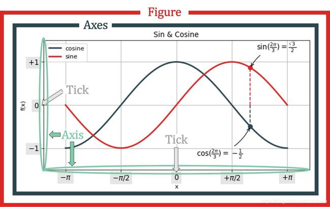
由上图看出:
- 图包含着坐标系 (多个)
- 坐标系由坐标轴 组成 (横轴 xAxis 和纵轴 yAxis)
- 坐标轴 上面有刻度 (主刻度 MajorTicks 和副刻度 MinorTicks)
Python里面“万物皆对象”,坐标系、坐标轴和刻度都是对象。
fig = plt.figure()
ax = fig.add_subplot(1,1,1)
plt.show()

xax = ax.xaxis
yax = ax.yaxis

print( 'fig.axes:', fig.axes, '\n')
print( 'ax.xaxis:', xax )
print( 'ax.yaxis:', yax, '\n' )
print( 'ax.xaxis.majorTicks:', xax.majorTicks, '\n' )
print( 'ax.yaxis.majorTicks:', yax.majorTicks, '\n')
print( 'ax.xaxis.minorTicks:', xax.minorTicks )
print( 'ax.yaxis.minorTicks:', yax.minorTicks )
fig.axes: []

ax.xaxis: XAxis(54.0,36.0)
ax.yaxis: YAxis(54.0,36.0)

ax.xaxis.majorTicks: [, , , , , ]

ax.yaxis.majorTicks: [, , , , , ]

ax.xaxis.minorTicks: []
ax.yaxis.minorTicks: []
坐标系和坐标轴指向同一个图 (侧面验证了图、坐标系和坐标轴的层级性)。
print( 'axes.figure:', ax.figure )
print( 'xaxis.figure:', xax.figure )
print( 'yaxis.figure:', yax.figure )
axes.figure: Figure(432x288)
xaxis.figure: Figure(432x288)
yaxis.figure: Figure(432x288)
创造完以上四个容器元素后,我们可在上面添加各种基础元素,比如:
- 在坐标轴和刻度上添加标签
- 在坐标系中添加线、点、网格、图例和文字
- 在图中添加图例
1.2 图
# 图是整个层级的顶部,在图中可以添加基本元素「文字」。
plt.figure()
plt.text( 0.5, 0.5, 'Figure', ha='center',
          va='center', size=20, alpha=.5 )
plt.xticks([]), plt.yticks([])
plt.show()

用 plt.text() 函数,其参数解释如下:
- 第一、二个参数是指文字所处位置的横轴和纵轴坐标
- 第三个参数字符是指要显示的内容
- ha, va 是横向和纵向位置,指文字与其所处“坐标”之间是左对齐、右对齐或居中对齐
- size 设置字体大小
- alpha 设置字体透明度 (0.5 是半透明)
# 在图中可以添加基本元素「折线」。
plt.figure()
plt.plot( [0,1],[0,1] )
plt.show()

当我们每次说画东西,看起来是在图 (Figure) 里面进行的,实际上是在坐标系 (Axes) 里面进行的。一幅图中可以有多个坐标系,因此在坐标系里画东西更方便 (有些设置使用起来也更灵活)。
1.3 坐标系与子图
一幅图 (Figure) 中可以有多个坐标系 (Axes),那不是说一幅图中有多幅子图 (Subplot),因此坐标系和子图是不是同样的概念?
在绝大多数情况下是的,两者有一点细微差别:
- 子图在母图中的网格结构一定是规则的
- 坐标系在母图中的网格结构可以是不规则的
子图
把图想成矩阵,那么子图就是矩阵中的元素,因此可像定义矩阵那样定义子图 - (行数、列数、第几个子图)。
subplot(rows, columns, i-th plots)
plt.subplot(2, 1, 1)
plt.xticks([])
plt.yticks([])
plt.text(0.5, 0.5, 'subplot(2, 1, 1)', ha='center', va='center', size=20, alpha=0.5)

plt.subplot(2, 1, 2)
plt.xticks([])
plt.yticks([])
plt.text(0.5, 0.5, 'subplot(2, 1, 2)', ha='center', va='center', size=20, alpha=0.5)
Text(0.5, 0.5, 'subplot(2, 1, 2)')
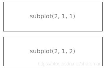
这两个子图类似于一个列向量
- subplot(2,1,1) 是第一幅
- subplot(2,1,2) 是第二幅
plt.subplot(1, 2, 1)
plt.xticks([])
plt.yticks([])
plt.text(0.5, 0.5, 'subplot(1, 2, 1)', ha='center', va='center', size=20, alpha=0.5)

plt.subplot(1, 2, 2)
plt.xticks([])
plt.yticks([])
plt.text(0.5, 0.5, 'subplot(1, 2, 2)', ha='center', va='center', size=20, alpha=0.5)
Text(0.5, 0.5, 'subplot(1, 2, 2)')
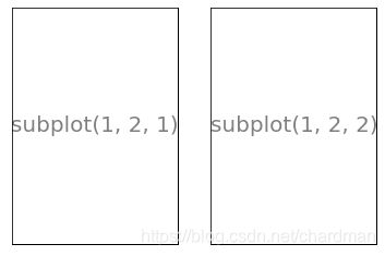
这两个子图类似于一个行向量
- subplot(1,2,1) 是第一幅
- subplot(1,2,2) 是第二幅
fig, axes = plt.subplots(nrows=2, ncols=2)

for i, ax in enumerate(axes.flat):
    ax.set(xticks=[], yticks=[])
    s = 'subplot(2, 2,' + str(i) + ')'
    ax.text(0.5, 0.5, s, ha='center', va='center', size=20, alpha=0.5)
plt.show()
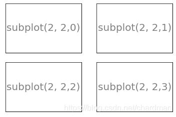
这次我们用过坐标系来生成子图 (子图是坐标系的特例嘛),第 1 行
fig, axes = plt.subplots(nrows=2, ncols=2)
得到的 axes 是一个 2×2 的对象。在第 3 行的 for 循环中用 axes.flat 将其打平,然后在每个 ax 上生成子图。
坐标系
坐标系比子图更通用,有两种生成方式
- 用 gridspec 包加上 subplot()
- 用 plt.axes()
不规则网格
import matplotlib.gridspec as gridspec
G = gridspec.GridSpec(3, 3) # 将整幅图分成 3×3 份赋值给 G

ax1 = plt.subplot(G[0, :])
plt.xticks([]), plt.yticks([])
plt.text(0.5, 0.5, 'Axes 1', ha='center', va='center', size=20, alpha=0.5)

ax2 = plt.subplot(G[1,:-1])
plt.xticks([]), plt.yticks([])
plt.text(0.5, 0.5, 'Axes 2', ha='center', va='center', size=20, alpha=0.5)

ax3 = plt.subplot(G[1:,-1])
plt.xticks([]), plt.yticks([])
plt.text(0.5, 0.5, 'Axes 3', ha='center', va='center', size=20, alpha=0.5)

ax4 = plt.subplot(G[-1, 0])
plt.xticks([]), plt.yticks([])
plt.text(0.5, 0.5, 'Axes 4', ha='center', va='center', size=20, alpha=0.5)

ax5 = plt.subplot(G[-1,1])
plt.xticks([]), plt.yticks([])
plt.text(0.5, 0.5, 'Axes 5', ha='center', va='center', size=20, alpha=0.5)

plt.show()
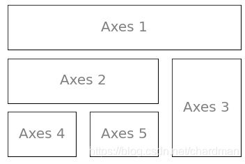
plt.subplot(G[]) 函数生成五个坐标系。G[] 里面的切片和 Numpy 数组用法一样:
- G[0, :] = 图的第一行 (Axes 1)
- G[1, :-1] = 图的第二行,第一二列 (Axes 2)
- G[1:, -1] = 图的第二三行,第三列 (Axes 3)
- G[-1, 0] = 图的第三行,第一列 (Axes 4)
- G[-1, 1] = 图的第三行,第二列 (Axes 5)
大图套小图
plt.axes([0.1, 0.1, 0.8, 0.8])
plt.xticks([]), plt.yticks([])
plt.text(0.6, 0.6, 'axes([0.1,0.1,0.8,0.8])', ha='center', va='center', size=20, alpha=0.5)

plt.axes([0.2, 0.2, 0.3, 0.3])
plt.xticks([]), plt.yticks([])
plt.text(0.5, 0.5, 'axes([0.2,0.2,0.3,0.3])', ha='center', va='center', size=10, alpha=0.5)

plt.show()
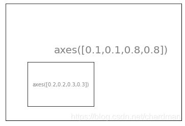
plt.axes([l,b,w,h]) 函数,其中 [l, b, w, h] 可以定义坐标系
- l 代表坐标系左边到 Figure 左边的水平距离
- b 代表坐标系底边到 Figure 底边的垂直距离
- w 代表坐标系的宽度
- h 代表坐标系的高度
如果 l, b, w, h 都小于 1,那它们是标准化 (normalized) 后的距离。比如 Figure 底边长度为 10, 坐标系底边到它的垂直距离是 2,那么 b = 2/10 = 0.2。
生成坐标系的2种方式
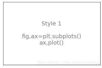
# 1.同时生成图和坐标系
fig, ax = plt.subplots()
plt.xticks([]), plt.yticks([])
s = 'Style 1\n\nfig,ax=plt.subplots()\nax,plot()'
ax.text(0.5, 0.5, s, ha='center', va='center',size=20,alpha=0.5)
plt.show()
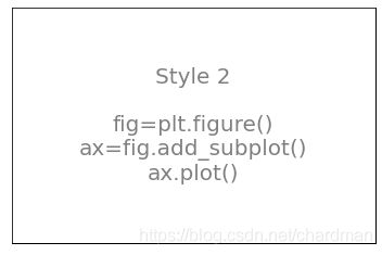
# 2.先生成图,再添加坐标系
fig = plt.figure()
ax = fig.add_subplot(1,1,1)
ax.set(xticks=[],yticks=[])
s = 'Style 2\n\nfig=plt.figure()\nax=fig.add_subplot()\nax.plot()'
ax.text(0.5,0.5,s,ha='center',va='center',size=20,alpha=0.5)
plt.show()
1.4 坐标轴
一个坐标系 (Axes),通常是二维,有两条坐标轴 (Axis):
- 横轴:XAxis
- 纵轴:YAxis
每个坐标轴都包含两个元素
- 容器类元素「刻度」,该对象里还包含刻度本身和刻度标签
- 基础类元素「标签」,该对象包含的是坐标轴标签
「刻度」和「标签」都是对象。
r_hex
'#dc2624'
fig, ax = plt.subplots()
ax.set_xlabel('Label on x-axis')
ax.set_ylabel('Label on y-axis')

for label in ax.xaxis.get_ticklabels():
    # label is a text instance
    # 标签是一个文本对象
    label.set_color(dt_hex)
    label.set_rotation(45)
    label.set_fontsize(20)

for line in ax.yaxis.get_ticklines():
    # line is a line2D instance
    # 刻度是一个二维线段对象

    line.set_markersize(20)
    line.set_markeredgewidth(3)

plt.show()

第 2 和 3 行打印出 x 轴和 y 轴的标签。
第 5 到 9 行处理「刻度」对象里的刻度标签,将它颜色设定为深青色,字体大小为 20,旋转度 45 度。
第 11 到 15 行处理「标签」对象的刻度本身 (即一条短线),标记长度和宽度为 20 和 3。
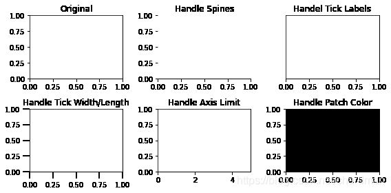
1.5 刻度
刻度 (Tick) 的核心内容就是
- 一条短线 (刻度本身)
- 一串字符 (刻度标签)
首先定义一个 setup(ax) 函数,主要功能有
- 去除左纵轴 (y 轴)、右纵轴和上横轴
- 去除 y 轴上的刻度
- 将 x 轴上的刻度位置定在轴底
- 设置主刻度和副刻度的长度和宽度
- 设置 x 轴和 y 轴的边界
- 将图中 patch 设成完全透明
将上面效果全部合并,这个 setup(ax) 就是把坐标系里所有元素都去掉,只留 x 轴来添加各种刻度。
import matplotlib.ticker as ticker
def setup(ax):
    ax.spines['right'].set_color('none') # 去除左纵轴 (y 轴)
    ax.spines['left'].set_color('none') # 去除右纵轴
    ax.spines['top'].set_color('none') # 去除上横轴
    ax.yaxis.set_major_locator(ticker.NullLocator()) # 去除y轴上的刻度
    ax.xaxis.set_ticks_position('bottom') # 把x轴上的刻度位置定在轴底

    ax.tick_params(which='major', width=2.00) #设置主刻度和副刻度的长度和宽度
    ax.tick_params(which='major', length=10)
    ax.tick_params(which='minor', width=0.75)
    ax.tick_params(which='minor', length=2.5)

    ax.set_xlim(0, 5) # 设置 x 轴和 y 轴的边界
    ax.set_ylim(0, 1)

    ax.patch.set_alpha(0.0)# 将图中 patch 设成完全透明
fig, axes = plt.subplots(nrows=2, ncols=3, figsize=(8, 4))

axes[0, 0].set_title('Original')

axes[0, 1].spines['right'].set_color('none')
axes[0, 1].spines['left'].set_color('none')
axes[0, 1].spines['top'].set_color('none')
axes[0, 1].set_title('Handle Spines')

axes[0, 2].yaxis.set_major_locator(ticker.NullLocator())
axes[0, 2].xaxis.set_ticks_position('bottom')
axes[0, 2].set_title('Handel Tick Labels')

axes[1, 0].tick_params(which='major', width=2.00)
axes[1, 0].tick_params(which='major', length=10)
axes[1, 0].tick_params(which='minor', width=0.75)
axes[1, 0].tick_params(which='minor', length=2.5)
axes[1, 0].set_title('Handle Tick Width/Length')

axes[1, 1].set_xlim(0, 5)
axes[1, 1].set_ylim(0, 1)
axes[1, 1].set_title('Handle Axis Limit')

axes[1, 2].patch.set_color('black')
axes[1, 2].patch.set_alpha(0.3)
axes[1, 2].set_title('Handle Patch Color')

plt.tight_layout()
plt.show()
刻度展示
不同的 locator() 可以生成不同的刻度对象,我们来研究以下 8 种:
- NullLocator(): 空刻度
- MultipleLocator(a): 刻度间隔 = 标量 a
- FixedLocator(a): 刻度位置由数组 a 决定
- LinearLocator(a): 刻度数目 = a, a 是标量
- IndexLocator(b, o): 刻度间隔 = 标量 b,偏移量 = 标量 o
- AutoLocator(): 根据默认设置决定
- MaxNLocator(a): 最大刻度数目 = 标量 a
- LogLocator(b, n): 基数 = 标量 b,刻度数目 = 标量 n
plt.figure(figsize=(8,6))
n = 8

# Null Locator 空刻度
ax = plt.subplot(n, 1, 1)
setup(ax)
ax.xaxis.set_major_locator(ticker.NullLocator())
ax.xaxis.set_minor_locator(ticker.NullLocator())
ax.text(0.0, 0.1, 'NullLocator()', fontsize=14, transform=ax.transAxes)

# Multiple Locator 刻度间隔0.5
ax = plt.subplot(n, 1, 2)
setup(ax)
ax.xaxis.set_major_locator(ticker.MultipleLocator(0.5))
ax.xaxis.set_minor_locator(ticker.MultipleLocator(0.1))
ax.text(0.0, 0.1, 'MultipleLocator(0.5)', fontsize=14, transform=ax.transAxes)

# Fixed Locator 固定刻度,传入一个列表或数组作为刻度
ax = plt.subplot(n, 1, 3)
setup(ax)
majors = [0, 1, 5]
ax.xaxis.set_major_locator(ticker.FixedLocator(majors))
import numpy as np
minors = np.linspace(0,1,11)[1:-1]
ax.xaxis.set_minor_locator(ticker.FixedLocator(minors))
ax.text(0.0, 0.1, 'FixedLocator([0,1,5])', fontsize=14, transform=ax.transAxes)

# Linear Locator 线性刻度,传入刻度数量
ax = plt.subplot(n, 1, 4)
setup(ax)
ax.xaxis.set_major_locator(ticker.LinearLocator(3))
ax.xaxis.set_minor_locator(ticker.LinearLocator(31))
ax.text(0.0, 0.1, 'LinearLocator(numticks=3)', fontsize=14, transform=ax.transAxes)

# Index Locator 间隔刻度
ax = plt.subplot(n, 1, 5)
setup(ax)
ax.plot(range(0, 5), [0]*5, color='white')
ax.xaxis.set_major_locator(ticker.IndexLocator(base=0.5, offset=0.25))
ax.text(0.0, 0.1, 'IndexLocator(base=0.5, offset=0.25)', fontsize=14, transform=ax.transAxes)

# Auto Locator 自动刻度
ax = plt.subplot(n,1,6)
setup(ax)
ax.xaxis.set_major_locator(ticker.AutoLocator())
ax.xaxis.set_minor_locator(ticker.AutoLocator())
ax.text(0.0, 0.1, 'AutoLocator()', fontsize=14, transform=ax.transAxes)

# MaxN Locator 最大数量刻度
ax = plt.subplot(n, 1, 7)
setup(ax)
ax.xaxis.set_major_locator(ticker.MaxNLocator(4))
ax.xaxis.set_minor_locator(ticker.MaxNLocator(40))
ax.text(0.0, 0.1, 'MaxNLocator(n=4)', fontsize=14, transform=ax.transAxes)

# Log Locator
ax = plt.subplot(n, 1, 8)
setup(ax)
ax.set_xlim(10**3, 10**10)
ax.set_xscale('log')
ax.xaxis.set_major_locator(ticker.LogLocator(base=10.0, numticks=15))
ax.text(0.0, 0.1, 'LogLocator(base-10,numticks=15)', fontsize=14,transform=ax.transAxes)

# 因为只看底部的x轴,所以调整坐标系的位置。
plt.subplots_adjust(left=0.05, right=0.95, bottom=0.05, top=1.05)
plt.show()
1.6 基础元素
我们已经介绍四个最重要的容器以及它们之间的层级
Figure → Axes → Axis → Ticks

图 → 坐标系 → 坐标轴 → 刻度
但要画出一幅有内容的图,还需要在容器里添加基础元素比如线 (line), 点(marker), 文字 (text), 图例 (legend), 网格 (grid), 标题 (title), 图片 (image) 等,具体来说
- 画一条线,用 plt.plot() 或 ax.plot()
- 画个记号,用 plt.scatter() 或 ax.scatter()
- 添加文字,用 plt.text() 或 ax.text()
- 添加图例,用 plt.legend() 或 ax.legend()
- 添加图片,用 plt.imshow() 或 ax.imshow()
2 画图
2.1 画第一幅图
画一幅标准普尔 500 指数在 2007-2010 的走势图。
#首先用 pd.read_csv 函数读取 S&P500.csv
import pandas as pd
data = pd.read_csv('S&P500.csv', parse_dates=True,
                   index_col='Date', dayfirst=True)
data.head(3).append(data.tail(3))
| Open | High | Low | Close | Adj Close | Volume | |
|---|---|---|---|---|---|---|
| Date | ||||||
| 1950-01-03 | 16.660000 | 16.660000 | 16.660000 | 16.660000 | 16.660000 | 1260000 |
| 1950-01-04 | 16.850000 | 16.850000 | 16.850000 | 16.850000 | 16.850000 | 1890000 |
| 1950-01-05 | 16.930000 | 16.930000 | 16.930000 | 16.930000 | 16.930000 | 2550000 |
| 2019-04-22 | 2898.780029 | 2909.510010 | 2896.350098 | 2907.969971 | 2907.969971 | 2997950000 |
| 2019-04-23 | 2909.989990 | 2936.310059 | 2908.530029 | 2933.679932 | 2933.679932 | 3635030000 |
| 2019-04-24 | 2934.000000 | 2936.830078 | 2926.050049 | 2927.250000 | 2927.250000 | 3448960000 |
# 截取2007年~2010年部分的数据
spx = data.loc['2007-01-01':'2010-12-31', 'Adj Close']
# 'Close'不带[],获得的是一个Series,带上[],获得的是一个DataFrame
spx.head(3).append(spx.tail(3))
Date
2007-01-03    1416.599976
2007-01-04    1418.339966
2007-01-05    1409.709961
2010-12-29    1259.780029
2010-12-30    1257.880005
2010-12-31    1257.640015
Name: Adj Close, dtype: float64
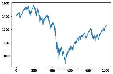
plt.plot(spx.values)
plt.show()

**注:**在 plot() 函数里面只有变量 y 时 (y = spx.values),那么自变量就是默认赋值为 range(len(y))。
此外我们没有设置图的尺寸,像素、线的颜色宽度、坐标轴的刻度和标签、图例、标题等等,所有设置都用的是 matplotlib 的默认设置。
2.2 图的默认设置
plt.rcParams # 可查看上图的所有默认属性
RcParams({'_internal.classic_mode': False,
          'agg.path.chunksize': 0,
          'animation.avconv_args': [],
          'animation.avconv_path': 'avconv',
          'animation.bitrate': -1,
          'animation.codec': 'h264',
          'animation.convert_args': [],
          'animation.convert_path': 'convert',
          'animation.embed_limit': 20.0,
          'animation.ffmpeg_args': [],
          'animation.ffmpeg_path': 'ffmpeg',
          'animation.frame_format': 'png',
          'animation.html': 'none',
          'animation.html_args': [],
          'animation.writer': 'ffmpeg',
          'axes.autolimit_mode': 'data',
          'axes.axisbelow': 'line',
          'axes.edgecolor': 'black',
          'axes.facecolor': 'white',
          'axes.formatter.limits': [-5, 6],
          'axes.formatter.min_exponent': 0,
          'axes.formatter.offset_threshold': 4,
          'axes.formatter.use_locale': False,
          'axes.formatter.use_mathtext': False,
          'axes.formatter.useoffset': True,
          'axes.grid': False,
          'axes.grid.axis': 'both',
          'axes.grid.which': 'major',
          'axes.labelcolor': 'black',
          'axes.labelpad': 4.0,
          'axes.labelsize': 'medium',
          'axes.labelweight': 'normal',
          'axes.linewidth': 0.8,
          'axes.prop_cycle': cycler('color', ['#1f77b4', '#ff7f0e', '#2ca02c', '#d62728', '#9467bd', '#8c564b', '#e377c2', '#7f7f7f', '#bcbd22', '#17becf']),
          'axes.spines.bottom': True,
          'axes.spines.left': True,
          'axes.spines.right': True,
          'axes.spines.top': True,
          'axes.titlecolor': 'auto',
          'axes.titlelocation': 'center',
          'axes.titlepad': 6.0,
          'axes.titlesize': 'large',
          'axes.titleweight': 'normal',
          'axes.titley': None,
          'axes.unicode_minus': True,
          'axes.xmargin': 0.05,
          'axes.ymargin': 0.05,
          'axes3d.grid': True,
          'backend': 'module://ipykernel.pylab.backend_inline',
          'backend_fallback': True,
          'boxplot.bootstrap': None,
          'boxplot.boxprops.color': 'black',
          'boxplot.boxprops.linestyle': '-',
          'boxplot.boxprops.linewidth': 1.0,
          'boxplot.capprops.color': 'black',
          'boxplot.capprops.linestyle': '-',
          'boxplot.capprops.linewidth': 1.0,
          'boxplot.flierprops.color': 'black',
          'boxplot.flierprops.linestyle': 'none',
          'boxplot.flierprops.linewidth': 1.0,
          'boxplot.flierprops.marker': 'o',
          'boxplot.flierprops.markeredgecolor': 'black',
          'boxplot.flierprops.markeredgewidth': 1.0,
          'boxplot.flierprops.markerfacecolor': 'none',
          'boxplot.flierprops.markersize': 6.0,
          'boxplot.meanline': False,
          'boxplot.meanprops.color': 'C2',
          'boxplot.meanprops.linestyle': '--',
          'boxplot.meanprops.linewidth': 1.0,
          'boxplot.meanprops.marker': '^',
          'boxplot.meanprops.markeredgecolor': 'C2',
          'boxplot.meanprops.markerfacecolor': 'C2',
          'boxplot.meanprops.markersize': 6.0,
          'boxplot.medianprops.color': 'C1',
          'boxplot.medianprops.linestyle': '-',
          'boxplot.medianprops.linewidth': 1.0,
          'boxplot.notch': False,
          'boxplot.patchartist': False,
          'boxplot.showbox': True,
          'boxplot.showcaps': True,
          'boxplot.showfliers': True,
          'boxplot.showmeans': False,
          'boxplot.vertical': True,
          'boxplot.whiskerprops.color': 'black',
          'boxplot.whiskerprops.linestyle': '-',
          'boxplot.whiskerprops.linewidth': 1.0,
          'boxplot.whiskers': 1.5,
          'contour.corner_mask': True,
          'contour.linewidth': None,
          'contour.negative_linestyle': 'dashed',
          'date.autoformatter.day': '%Y-%m-%d',
          'date.autoformatter.hour': '%m-%d %H',
          'date.autoformatter.microsecond': '%M:%S.%f',
          'date.autoformatter.minute': '%d %H:%M',
          'date.autoformatter.month': '%Y-%m',
          'date.autoformatter.second': '%H:%M:%S',
          'date.autoformatter.year': '%Y',
          'date.epoch': '1970-01-01T00:00:00',
          'docstring.hardcopy': False,
          'errorbar.capsize': 0.0,
          'figure.autolayout': False,
          'figure.constrained_layout.h_pad': 0.04167,
          'figure.constrained_layout.hspace': 0.02,
          'figure.constrained_layout.use': False,
          'figure.constrained_layout.w_pad': 0.04167,
          'figure.constrained_layout.wspace': 0.02,
          'figure.dpi': 72.0,
          'figure.edgecolor': (1, 1, 1, 0),
          'figure.facecolor': (1, 1, 1, 0),
          'figure.figsize': [6.0, 4.0],
          'figure.frameon': True,
          'figure.max_open_warning': 20,
          'figure.raise_window': True,
          'figure.subplot.bottom': 0.125,
          'figure.subplot.hspace': 0.2,
          'figure.subplot.left': 0.125,
          'figure.subplot.right': 0.9,
          'figure.subplot.top': 0.88,
          'figure.subplot.wspace': 0.2,
          'figure.titlesize': 'large',
          'figure.titleweight': 'normal',
          'font.cursive': ['Apple Chancery',
                           'Textile',
                           'Zapf Chancery',
                           'Sand',
                           'Script MT',
                           'Felipa',
                           'cursive'],
          'font.family': ['sans-serif'],
          'font.fantasy': ['Comic Neue',
                           'Comic Sans MS',
                           'Chicago',
                           'Charcoal',
                           'ImpactWestern',
                           'Humor Sans',
                           'xkcd',
                           'fantasy'],
          'font.monospace': ['DejaVu Sans Mono',
                             'Bitstream Vera Sans Mono',
                             'Computer Modern Typewriter',
                             'Andale Mono',
                             'Nimbus Mono L',
                             'Courier New',
                             'Courier',
                             'Fixed',
                             'Terminal',
                             'monospace'],
          'font.sans-serif': ['DejaVu Sans',
                              'Bitstream Vera Sans',
                              'Computer Modern Sans Serif',
                              'Lucida Grande',
                              'Verdana',
                              'Geneva',
                              'Lucid',
                              'Arial',
                              'Helvetica',
                              'Avant Garde',
                              'sans-serif'],
          'font.serif': ['DejaVu Serif',
                         'Bitstream Vera Serif',
                         'Computer Modern Roman',
                         'New Century Schoolbook',
                         'Century Schoolbook L',
                         'Utopia',
                         'ITC Bookman',
                         'Bookman',
                         'Nimbus Roman No9 L',
                         'Times New Roman',
                         'Times',
                         'Palatino',
                         'Charter',
                         'serif'],
          'font.size': 10.0,
          'font.stretch': 'normal',
          'font.style': 'normal',
          'font.variant': 'normal',
          'font.weight': 'normal',
          'grid.alpha': 1.0,
          'grid.color': '#b0b0b0',
          'grid.linestyle': '-',
          'grid.linewidth': 0.8,
          'hatch.color': 'black',
          'hatch.linewidth': 1.0,
          'hist.bins': 10,
          'image.aspect': 'equal',
          'image.cmap': 'viridis',
          'image.composite_image': True,
          'image.interpolation': 'antialiased',
          'image.lut': 256,
          'image.origin': 'upper',
          'image.resample': True,
          'interactive': True,
          'keymap.all_axes': ['a'],
          'keymap.back': ['left', 'c', 'backspace', 'MouseButton.BACK'],
          'keymap.copy': ['ctrl+c', 'cmd+c'],
          'keymap.forward': ['right', 'v', 'MouseButton.FORWARD'],
          'keymap.fullscreen': ['f', 'ctrl+f'],
          'keymap.grid': ['g'],
          'keymap.grid_minor': ['G'],
          'keymap.help': ['f1'],
          'keymap.home': ['h', 'r', 'home'],
          'keymap.pan': ['p'],
          'keymap.quit': ['ctrl+w', 'cmd+w', 'q'],
          'keymap.quit_all': [],
          'keymap.save': ['s', 'ctrl+s'],
          'keymap.xscale': ['k', 'L'],
          'keymap.yscale': ['l'],
          'keymap.zoom': ['o'],
          'legend.borderaxespad': 0.5,
          'legend.borderpad': 0.4,
          'legend.columnspacing': 2.0,
          'legend.edgecolor': '0.8',
          'legend.facecolor': 'inherit',
          'legend.fancybox': True,
          'legend.fontsize': 'medium',
          'legend.framealpha': 0.8,
          'legend.frameon': True,
          'legend.handleheight': 0.7,
          'legend.handlelength': 2.0,
          'legend.handletextpad': 0.8,
          'legend.labelspacing': 0.5,
          'legend.loc': 'best',
          'legend.markerscale': 1.0,
          'legend.numpoints': 1,
          'legend.scatterpoints': 1,
          'legend.shadow': False,
          'legend.title_fontsize': None,
          'lines.antialiased': True,
          'lines.color': 'C0',
          'lines.dash_capstyle': 'butt',
          'lines.dash_joinstyle': 'round',
          'lines.dashdot_pattern': [6.4, 1.6, 1.0, 1.6],
          'lines.dashed_pattern': [3.7, 1.6],
          'lines.dotted_pattern': [1.0, 1.65],
          'lines.linestyle': '-',
          'lines.linewidth': 1.5,
          'lines.marker': 'None',
          'lines.markeredgecolor': 'auto',
          'lines.markeredgewidth': 1.0,
          'lines.markerfacecolor': 'auto',
          'lines.markersize': 6.0,
          'lines.scale_dashes': True,
          'lines.solid_capstyle': 'projecting',
          'lines.solid_joinstyle': 'round',
          'markers.fillstyle': 'full',
          'mathtext.bf': 'sans:bold',
          'mathtext.cal': 'cursive',
          'mathtext.default': 'it',
          'mathtext.fallback': 'cm',
          'mathtext.fallback_to_cm': None,
          'mathtext.fontset': 'dejavusans',
          'mathtext.it': 'sans:italic',
          'mathtext.rm': 'sans',
          'mathtext.sf': 'sans',
          'mathtext.tt': 'monospace',
          'mpl_toolkits.legacy_colorbar': True,
          'patch.antialiased': True,
          'patch.edgecolor': 'black',
          'patch.facecolor': 'C0',
          'patch.force_edgecolor': False,
          'patch.linewidth': 1.0,
          'path.effects': [],
          'path.simplify': True,
          'path.simplify_threshold': 0.111111111111,
          'path.sketch': None,
          'path.snap': True,
          'pcolor.shading': 'flat',
          'pdf.compression': 6,
          'pdf.fonttype': 3,
          'pdf.inheritcolor': False,
          'pdf.use14corefonts': False,
          'pgf.preamble': '',
          'pgf.rcfonts': True,
          'pgf.texsystem': 'xelatex',
          'polaraxes.grid': True,
          'ps.distiller.res': 6000,
          'ps.fonttype': 3,
          'ps.papersize': 'letter',
          'ps.useafm': False,
          'ps.usedistiller': None,
          'savefig.bbox': None,
          'savefig.directory': '~',
          'savefig.dpi': 'figure',
          'savefig.edgecolor': 'auto',
          'savefig.facecolor': 'auto',
          'savefig.format': 'png',
          'savefig.jpeg_quality': 95,
          'savefig.orientation': 'portrait',
          'savefig.pad_inches': 0.1,
          'savefig.transparent': False,
          'scatter.edgecolors': 'face',
          'scatter.marker': 'o',
          'svg.fonttype': 'path',
          'svg.hashsalt': None,
          'svg.image_inline': True,
          'text.antialiased': True,
          'text.color': 'black',
          'text.hinting': 'force_autohint',
          'text.hinting_factor': 8,
          'text.kerning_factor': 0,
          'text.latex.preamble': '',
          'text.latex.preview': False,
          'text.usetex': False,
          'timezone': 'UTC',
          'tk.window_focus': False,
          'toolbar': 'toolbar2',
          'webagg.address': '127.0.0.1',
          'webagg.open_in_browser': True,
          'webagg.port': 8988,
          'webagg.port_retries': 50,
          'xaxis.labellocation': 'center',
          'xtick.alignment': 'center',
          'xtick.bottom': True,
          'xtick.color': 'black',
          'xtick.direction': 'out',
          'xtick.labelbottom': True,
          'xtick.labelsize': 'medium',
          'xtick.labeltop': False,
          'xtick.major.bottom': True,
          'xtick.major.pad': 3.5,
          'xtick.major.size': 3.5,
          'xtick.major.top': True,
          'xtick.major.width': 0.8,
          'xtick.minor.bottom': True,
          'xtick.minor.pad': 3.4,
          'xtick.minor.size': 2.0,
          'xtick.minor.top': True,
          'xtick.minor.visible': False,
          'xtick.minor.width': 0.6,
          'xtick.top': False,
          'yaxis.labellocation': 'center',
          'ytick.alignment': 'center_baseline',
          'ytick.color': 'black',
          'ytick.direction': 'out',
          'ytick.labelleft': True,
          'ytick.labelright': False,
          'ytick.labelsize': 'medium',
          'ytick.left': True,
          'ytick.major.left': True,
          'ytick.major.pad': 3.5,
          'ytick.major.right': True,
          'ytick.major.size': 3.5,
          'ytick.major.width': 0.8,
          'ytick.minor.left': True,
          'ytick.minor.pad': 3.4,
          'ytick.minor.right': True,
          'ytick.minor.size': 2.0,
          'ytick.minor.visible': False,
          'ytick.minor.width': 0.6,
          'ytick.right': False})
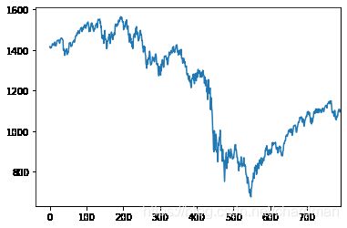
在图表尺寸 (figsize),每英寸像素点 (dpi),线条颜色 (color),线条风格 (linestyle),线条宽度 (linewidth),横纵轴刻度 (xticks, yticks),横纵轴边界 (xlim, ylim) 做改进。
print( 'figure size:', plt.rcParams['figure.figsize'] )
print( 'figure dpi:',plt.rcParams['figure.dpi'] )
print( 'line color:',plt.rcParams['lines.color'] )
print( 'line style:',plt.rcParams['lines.linestyle'] )
print( 'line width:',plt.rcParams['lines.linewidth'] )

fig = plt.figure()
ax = fig.add_subplot(1, 1, 1)
ax.plot( spx.values )

print( 'xticks:', ax.get_xticks() )
print( 'yticks:', ax.get_yticks() )
print( 'xlim:', ax.get_xlim() )
print( 'ylim:', ax.get_ylim() )
figure size: [6.0, 4.0]
figure dpi: 72.0
line color: C0
line style: -
line width: 1.5
xticks: [-200.    0.  200.  400.  600.  800. 1000. 1200.]
yticks: [ 600.  800. 1000. 1200. 1400. 1600. 1800.]
xlim: (-50.35, 1057.35)
ylim: (632.0990292500001, 1609.58102375)
将属性值打印结果和图一起看一目了然。现在我们知道这张图大小是 6×4,每英寸像素有 72 个,线颜色 C0 代表是蓝色,风格 - 是连续线,宽度 1.5,等等
把这些默认属性值显性的在代码出写出来,画出来的跟什么设置都不写生成的图应该是一样的,以便于我们理解这些属性值。
# Creat a new figure of size 6×4 points, using 72 dots per inch
plt.figure(figsize=(6, 4), dpi=72)

# Plot using blue color (C0) with a continuous line of width 1.5 (pixels)
plt.plot(spx.values, color='C0', linewidth=1.5, linestyle='-')

# Set x ticks
plt.xticks(np.linspace(-100,800,10))

# Set y ticks
plt.yticks(np.linspace(600,1800,7))

# Set x limits
plt.xlim(-37.72,792.75)

# Set y limits
plt.ylim(632.099029250001, 1609.58102375)

# Show result on screen
plt.show()
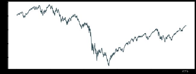
2.3 设置尺寸和DPI
用 figsize 和 dpi 一起可以控制图的大小和像素。
-
函数 figsize(w,h) 决定图的宽和高 (单位是英寸)
-
属性 dpi 全称 dots per inches,测量每英寸多少像素。两个属性一起用,那么得到的图的像素为
(w*dpi, h*dpi)
套用在下面代码中,我们其实将图的大小设置成 16×6 平方英寸,而像素设置成 (1600, 600),因为 dpi = 100。
plt.figure( figsize=(16,6), dpi=100 )
plt.plot( spx.values )
plt.show()

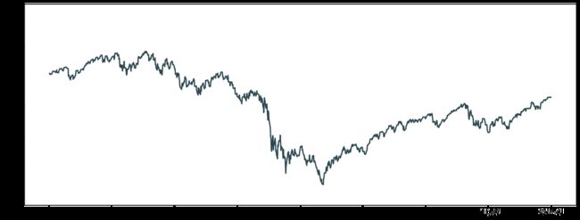
2.4 设置颜色-风格-宽度
在 plt.plot() 用 color,linewidth 和 linestyle 属性一起可以控制折线的颜色、宽度 (2 像素) 和风格 (连续线)。
plt.figure( figsize=(16,6), dpi=100 )
plt.plot( spx.values, color=dt_hex,
          linewidth=2, linestyle='-' )
plt.show()
2.5 设置边界
在图中 (fig) 添加了一个坐标系 (ax),然后所有操作都在 ax 里面完成,比如用
- ax.plot() 来画折线
- ax.set_xlim(), ax_set_ylim() 来设置横轴和纵轴的边界
fig = plt.figure(figsize=(16, 6), dpi=100)
ax = fig.add_subplot(1, 1, 1)
x = spx.index
y = spx.values
ax.plot(x, y, color=dt_hex, linewidth=2, linestyle='-')

ax.set_ylim(y.min()*0.8, y.max()*1.2)
plt.show()
x.sort_values()
DatetimeIndex(['2007-01-02', '2007-01-03', '2007-01-05', '2007-01-06',
               '2007-01-08', '2007-01-10', '2007-01-11', '2007-01-16',
               '2007-01-17', '2007-01-18',
               ...
               '2010-12-17', '2010-12-20', '2010-12-21', '2010-12-22',
               '2010-12-23', '2010-12-27', '2010-12-28', '2010-12-29',
               '2010-12-30', '2010-12-31'],
              dtype='datetime64[ns]', name='Date', length=1008, freq=None)
2.6 设置刻度和标签
上图横轴的刻度个数和标签显示都是默认设置,为了显示年月日,可以用以下两个函数:
- 先用 ax.set_ticks() 设置出数值刻度
- 再用 ax.set_xticklabels() 在对应的数值刻度上写标签
fig = plt.figure(figsize=(16, 6), dpi=100)
ax = fig.add_subplot(1, 1, 1)
x = spx.index
y = spx.values
ax.plot(y, color=dt_hex, linewidth=2, linestyle='-')
# 需要去掉x
ax.set_xlim(-1, len(x)+1)
ax.set_ylim(y.min()*0.8, y.max()*1.2)

ax.set_xticks(range(0, len(x), 40))
ax.set_xticklabels([x[i].strftime('%Y-%m-%d') for i in ax.get_xticks()],
                    rotation=45)
plt.show()

2.7 添加图例
添加图例 (legend) 非常简单,只需要在 ax.plot() 里多设定一个参数 label,然后用
ax.legend()
其中 loc = 0 表示 matplotlib 自动安排一个最好位置显示图例,而 frameon = True 给图例加了外框。
fig = plt.figure(figsize=(16, 6), dpi=100)
ax = fig.add_subplot(1, 1, 1)
x = spx.index
y = spx.values
ax.plot(y, color=dt_hex, linewidth=2, linestyle='-', label='S&P500')
ax.legend(loc=0, frameon=True)

ax.set_xlim(-1, len(x)+1)
ax.set_ylim(y.min()*0.8, y.max()*1.2)

ax.set_xticks(range(0, len(x), 40))
ax.set_xticklabels([x[i].strftime('%Y-%m-%d') for i in ax.get_xticks()],
                    rotation=45)
plt.show()

2.8 添加第二幅图
添加恐慌指数VIX指数。
VIX 指数是芝加哥期权交易所 (CBOE) 市场波动率指数的交易代号,常见于衡量 S&P500 指数期权的隐含波动性,通常被称为「恐慌指数」,它是了解市场对未来30天市场波动性预期的一种衡量方法。
# 首先用 pd.read_csv 函数读取VIX.csv。
data = pd.read_csv( 'VIX.csv', index_col=0,
                               parse_dates=True,
                               dayfirst=True )
vix = data.loc['2007-01-01':'2010-12-31', 'Adj Close']
vix.head(3).append(vix.tail(3))
Date
2007-01-03    12.040000
2007-01-04    11.510000
2007-01-05    12.140000
2010-12-29    17.280001
2010-12-30    17.520000
2010-12-31    17.750000
Name: Adj Close, dtype: float64
添加第二幅图很简单,用两次 plt.plot() 或者 ax.plot() 即可。
一般情况下,plt.plot() 或者 ax.plot()可以随意使用,但两者在使用「.methods」时存在一定差异:
- plt.xlim
- plt.ylim
- plt.xticks
而
- ax.set_xlim
- ax.set_ylim
- ax_set_xticks
fig = plt.figure(figsize=(16, 6), dpi=100)
x = spx.index
y1 = spx.values
y2 = vix.values
plt.plot(y1, color=dt_hex, linewidth=2, linestyle='-', label='S&P500')
plt.plot(y2, color=r_hex, linewidth=2, linestyle='-', label='VIX')
plt.legend(loc=0, frameon=True)

plt.xlim(-1, len(x)+1)
plt.ylim(np.vstack([y1,y2]).min()*0.8, np.vstack([y1,y2]).max()*1.2)

x_tick = range(0, len(x), 40)
x_label = [x[i].strftime('%Y-%m-%d') for i in ax.get_xticks()]
plt.xticks(x_tick, x_label, rotation=45)
plt.show()

VIX线几乎完全贴近横轴。
2.9 两个坐标系与两幅子图
S&P500 的量纲都是千位数,而 VIX 的量刚是两位数,两者放在一起,那可不是 VIX 就像一条水平线一样。两种改进方式:
- 用两个坐标系 (two axes)
- 用两幅子图 (two subplots)
两个坐标系
fig = plt.figure(figsize=(16, 6), dpi=100)
ax1 = fig.add_subplot(1,1,1)

x = spx.index
y1 = spx.values
y2 = vix.values

ax1.plot(y1, color=dt_hex, linewidth=2, linestyle='-', label='S&P500')
ax1.set_xlim(-1, len(x)+1)
ax1.set_ylim(y1.min()*0.8, y1.max()*1.2)

x_tick = range(0, len(x), 40)
x_label = [x[i].strftime('%Y-%m-%d') for i in ax.get_xticks()]
ax1.set_xticks(x_tick)
ax1.set_xticklabels(x_label, rotation=45)
ax1.legend(loc='upper left', frameon=True)

# Add a second axes
ax2 = ax1.twinx()
ax2.plot(y2, color=r_hex, linewidth=2, linestyle='-', label='VIX')
ax2.legend(loc='upper right', frameon=True)

plt.show()

用 ax1 和 ax2 就能实现在两个坐标系上画图,代码核心部分是第 19 行的
ax2 = ax1.twinx()
### 两幅子图
fig = plt.figure(figsize=(16, 12), dpi=100)

# subplot 1
plt.subplot(2, 1, 1)
x = spx.index
y1 = spx.values

plt.plot(y1, color=dt_hex, linewidth=2, linestyle='-', label='S&P500')
plt.xlim(-1, len(x)+1)
plt.ylim(y1.min()*0.8, y1.max()*1.2)

x_tick = range(0, len(x), 40)
x_label = [x[i].strftime('%Y-%m-%d') for i in ax.get_xticks()]
plt.xticks(x_tick, x_label, rotation=45)
plt.legend(loc='upper left', frameon=True)

# subplot2
plt.subplot(2, 1, 2)
y2 = vix.values

plt.plot(y2, color=r_hex, linewidth=2, linestyle='-', label='S&P500')
plt.xlim(-1, len(x)+1)
plt.ylim(y2.min()*0.8, y2.max()*1.2)

x_tick = range(0, len(x), 40)
x_label = [x[i].strftime('%Y-%m-%d') for i in ax.get_xticks()]
plt.xticks(x_tick, x_label, rotation=45)
plt.legend(loc='upper left', frameon=True)

plt.show()

这两种方法都可用,但在本例中,S&P500 和 VIX 放在一起 (用两个坐标系) 更能看出它们之间的关系,比如 2008 年 9 月到 2009 年 3 月的金融危机期间,S&P 500 在狂泻和 VIX 在飙升。
2.10 设置标注
在金融危机时期,市场发生了 5 件大事,分别是
- 2017-10-11: 牛市顶点
- 2008-03-12: 贝尔斯登倒闭
- 2008-09-15: 雷曼兄弟倒闭
- 2009-01-20: 苏格兰皇家银行股票抛售
- 2009-04-02: G20 峰会
fig = plt.figure(figsize=(16, 6), dpi=100)

from datetime import datetime
crisis_data = [(datetime(2007, 10, 11), 'Peak of bull market'),
              (datetime(2008, 3, 12), 'Bear Steans Fails'),
              (datetime(2008, 9, 15), 'Lehman Bankruptcy'),
              (datetime(2009, 1, 20), 'RBS Sell-off'),
              (datetime(2009, 4, 2), 'G20 Summit')]

ax1 = fig.add_subplot(1,1,1)

x = spx.index
y1 = spx.values
y2 = vix.values

ax1.plot(y1, color=dt_hex, linewidth=2, linestyle='-', label='S&P500')
ax1.set_xlim(-1, len(x)+1)
ax1.set_ylim(y1.min()*0.8, y1.max()*1.2)

x_tick = range(0, len(x), 40)
x_label = [x[i].strftime('%Y-%m-%d') for i in ax.get_xticks()]
ax1.set_xticks(x_tick)
ax1.set_xticklabels(x_label, rotation=45)
ax1.legend(loc='upper left', frameon=True)

for date, label in crisis_data:
    date = date.strftime('%Y-%m-%d')
    xi = x.get_loc(date)
    yi = spx.asof(date)
    ax1.scatter(xi, yi, 80, color=r_hex)
    ax1.annotate(label, xy=(xi, yi+60),
                 xytext=(xi, yi+300),
                arrowprops=dict(facecolor='black', headwidth=4, width=1, headlength=6),
                horizontalalignment='left', verticalalignment='top')

# Add a second axes
ax2 = ax1.twinx()
ax2.plot(y2, color=r_hex, linewidth=2, linestyle='-', label='VIX')
ax2.legend(loc='upper right', frameon=True)

plt.show()
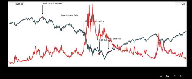
2.11 设置透明度
S&P 500 和 VIX 两条线画在一起太混乱了,而且事件标注也看不清楚。S&P 500 是主线,VIX 是副线,因此需要把副线的透明读调高点。
fig = plt.figure(figsize=(16, 6), dpi=100)

from datetime import datetime
crisis_data = [(datetime(2007, 10, 11), 'Peak of bull market'),
              (datetime(2008, 3, 12), 'Bear Steans Fails'),
              (datetime(2008, 9, 15), 'Lehman Bankruptcy'),
              (datetime(2009, 1, 20), 'RBS Sell-off'),
              (datetime(2009, 4, 2), 'G20 Summit')]

ax1 = fig.add_subplot(1,1,1)

x = spx.index
y1 = spx.values
y2 = vix.values

ax1.plot(y1, color=dt_hex, linewidth=2, linestyle='-', label='S&P500')
ax1.set_xlim(-1, len(x)+1)
ax1.set_ylim(y1.min()*0.8, y1.max()*1.2)

x_tick = range(0, len(x), 40)
x_label = [x[i].strftime('%Y-%m-%d') for i in ax.get_xticks()]
ax1.set_xticks(x_tick)
ax1.set_xticklabels(x_label, rotation=45)
ax1.legend(loc='upper left', frameon=True)

for date, label in crisis_data:
    date = date.strftime('%Y-%m-%d')
    xi = x.get_loc(date)
    yi = spx.asof(date)
    ax1.scatter(xi, yi, 80, color=r_hex)
    ax1.annotate(label, xy=(xi, yi+60),
                 xytext=(xi, yi+300),
                arrowprops=dict(facecolor='black', headwidth=4, width=1, headlength=6),
                horizontalalignment='left', verticalalignment='top')

# Add a second axes
ax2 = ax1.twinx()
ax2.plot(y2, color=r_hex, linewidth=2, linestyle='-', label='VIX', alpha=0.3)
ax2.legend(loc='upper right', frameon=True)

plt.show()

3 画有效图
3.1 概览
在做图表设计时候经常面临着怎么选用合适的图表,图表展示的关系分为四大类 (点击下图放大):
- 分布 (distribution)
- 联系 (relationship)
- 比较 (comparison)
- 构成 (composition)

在选用图表前首先要想清楚:你要表达什么样的数据关系。上面的图表分类太过繁多,接下来我们只讨论在量化金融中用的最多的几种类型,即
- 用直方图来展示股票价格和收益的分布
- 用散点图来展示两支股票之间的联系
- 用折线图来比较汇率在不同窗口的移动平均线
- 用饼状图来展示股票组合的构成成分
下面代码就是从 API 获取数据,股票用的是股票代号 (stock code),而货币用的该 API 要求的格式,比如「欧元美元」用 EURUSD=X,而不是市场常见的 EURUSD,而「美元人民币」用 CNY=X 而不是 USDCNY,「美元日元」用 JPY=X 而不是 USDJPY。
from yahoofinancials import YahooFinancials
start_date = '2018-04-29'
end_date = '2019-04-29'
stock_code=['NVDA', 'AMZN', 'BABA', 'FB', 'AAPL']
currency_code = ['EURUSD=X', 'JPY=X', 'CNY=X']
stock = YahooFinancials(stock_code)
currency = YahooFinancials(currency_code)
stock_daily = stock.get_historical_price_data(start_date, end_date, 'daily')
currency_daily = currency.get_historical_price_data(start_date, end_date, 'daily')
该 API 返回结果 stock_daily 和 currency_daily 是「字典」格式
currency_daily
{'EURUSD=X': {'eventsData': {},
  'firstTradeDate': {'formatted_date': '2003-12-01', 'date': 1070236800},
  'currency': 'USD',
  'instrumentType': 'CURRENCY',
  'timeZone': {'gmtOffset': 0},
  'prices': [{'date': 1525042800,
    'high': 1.2138574123382568,
    'low': 1.2066364288330078,
    'open': 1.2128562927246094,
    'close': 1.2122827768325806,
    'volume': 0,
    'adjclose': 1.2122827768325806,
    'formatted_date': '2018-04-29'},
   {'date': 1525129200,
    'high': 1.2084592580795288,
    'low': 1.1983511447906494,
    'open': 1.208313226699829,
    'close': 1.2081234455108643,
    'volume': 0,
    'adjclose': 1.2081234455108643,
    'formatted_date': '2018-04-30'},
{...},
 'JPY=X': {'eventsData': {},
  'firstTradeDate': {'formatted_date': '1996-10-30', 'date': 846633600},
  'currency': 'JPY',
  'instrumentType': 'CURRENCY',
  'timeZone': {'gmtOffset': 0},
  'prices': [{'date': 1525042800,
    'high': 109.43949890136719,
    'low': 109.0199966430664,
    'open': 109.09500122070312,
    'close': 109.0979995727539,
    'volume': 0,
    'adjclose': 109.0979995727539,
    'formatted_date': '2018-04-29'},
   {...},
通过pandas,将上面的「原始数据」转换成 DataFrame
def data_converter(price_data, code, asset):
    # convert raw data to dataframe
    if asset == 'FX':
        # 如果 Asset 是股票类,直接用其股票代码;
        # 如果 Asset 是汇率类,一般参数写成 EURUSD 或 USDJPY
        code = str(code[3:] if code[3:] != 'USD' else code) + '=X'

    columns = ['open','close','low','high']
    # 定义好开盘价、收盘价、最低价和最高价的标签。
    price_dict = price_data[code]['prices']
    # 获取出一个「字典」格式的数据。
    index = [p['formatted_date'] for p in price_dict]
    # 用列表解析式 (list comprehension) 将获取出来。
    price = [[p[c] for c in columns] for p in price_dict]
    # 用列表解析式 (list comprehension) 将价格获取出来。
    data = pd.DataFrame(price,
                       index=pd.Index(index, name='date'),
                       columns = pd.Index(columns, name='OHLC'))
    return(data)
EURUSD = data_converter( currency_daily, 'EURCNY', 'FX' )
EURUSD.head(3).append(EURUSD.tail(3))
| OHLC | open | close | low | high |
|---|---|---|---|---|
| date | ||||
| 2018-04-29 | 6.3348 | 6.3370 | 6.3233 | 6.3364 |
| 2018-04-30 | 6.3318 | 6.3321 | 6.3233 | 6.3324 |
| 2018-05-01 | 6.3233 | 6.3323 | 6.3233 | 6.3640 |
| 2019-04-24 | 6.7119 | 6.7209 | 6.7119 | 6.7479 |
| 2019-04-25 | 6.7331 | 6.7421 | 6.7194 | 6.7421 |
| 2019-04-28 | 6.7198 | 6.7288 | 6.7197 | 6.7348 |
NVDA = data_converter( stock_daily, 'NVDA',' EQ' )
NVDA.head(3).append(NVDA.tail(3))
| OHLC | open | close | low | high |
|---|---|---|---|---|
| date | ||||
| 2018-04-30 | 226.990005 | 224.899994 | 224.119995 | 229.000000 |
| 2018-05-01 | 224.570007 | 227.139999 | 222.199997 | 227.250000 |
| 2018-05-02 | 227.000000 | 226.309998 | 225.250000 | 228.800003 |
| 2019-04-24 | 191.089996 | 191.169998 | 188.639999 | 192.809998 |
| 2019-04-25 | 189.550003 | 186.910004 | 183.699997 | 190.449997 |
| 2019-04-26 | 180.710007 | 178.089996 | 173.300003 | 180.889999 |
3.2 直方图
直方图 (histogram chart),又称质量分布图,是一种统计报告图,由一系列高度不等的纵向条纹或线段表示数据分布的情况。 一般用横轴表示数据类型,纵轴表示分布情况。在 Matplotlib 里的语法是
- plt.hist()
- ax.hist()
p_NVDA = NVDA['close']
fig = plt.figure(figsize=(8, 4))

plt.hist(p_NVDA, bins=30, color=dt_hex)
plt.xlabel('Nvidia Price')
plt.ylabel('Number of Days Observed')
plt.title('Frequency Distribution of Nvidia Prices, Apr-2018 to Apr-2019')

plt.show()
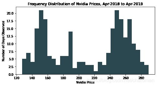
在本例中函数 hist() 里的参数有
- p_NVDA:Series,也可以是 list 或者 ndarray
- bins:分成多少堆
- colors:用之前定义的深青色
在研究股票价格序列中,由于收益率有些好的统计性质,我们对其更感兴趣,接下来再看看英伟达 (NVDA) 的对数收益 (log-return) 的分布。
date = p_NVDA.index
price = p_NVDA.values
r_NVDA = pd.Series(np.log(price[1:]/price[:-1]), index=date[1:])
fig = plt.figure(figsize=(8, 4))

plt.hist(r_NVDA, bins=30, color=dt_hex)
plt.xlabel('Nvidia Daily Log-Return')
plt.ylabel('Number of Days Observed')
plt.title('Frequency Distribution of Nvidia Daily Log-Return, Apr-2018 to Apr-2019')

plt.show()
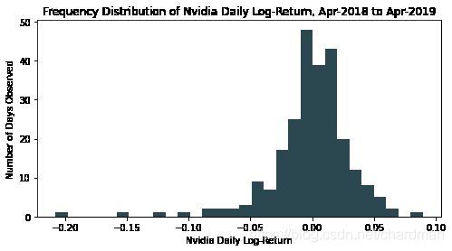
首先对数收益的计算公式为
r(t) = ln(P(t)/P(t-1))
得到 r_NVDA。计算一天的收益率需要两天的价格,因此用 p_NVDA 计算 r_NVDA 时,会丢失最新一天的数据,因此我们用 date[1:] 作为 r_NVDA 的行标签 (index)。
3.3 散点图
散点图 (scatter chart) 用两组数据构成多个坐标点,考察坐标点的分布,判断两变量之间是否存在某种联系的分布模式。在 Matplotlib 里的语法是
- plt.scatter()
- ax.scatter()
AMZN = data_converter( stock_daily, 'AMZN',' EQ' )
p_AMZN = AMZN['close']
date = p_AMZN.index
price = p_AMZN.values
r_AMZN = pd.Series(np.log(price[1:]/price[:-1]), index=date[1:])
BABA = data_converter( stock_daily, 'BABA',' EQ' )
p_BABA = BABA['close']
date = p_BABA.index
price = p_BABA.values
r_BABA = pd.Series(np.log(price[1:]/price[:-1]), index=date[1:])
fig, axes = plt.subplots(nrows=1, ncols=2, figsize=(14, 6))

axes[0].scatter(p_AMZN, p_BABA, color=dt_hex)
axes[0].set_xlabel('Amazon Price')
axes[0].set_ylabel('Alibaba Price')
axes[0].set_title('Daily Prices from Apr-2018 to Apr-2019')

axes[1].scatter(r_AMZN, r_BABA, color=r_hex)
axes[1].set_xlabel('Amazon Log-Return')
axes[1].set_ylabel('Alibaba Log-Return')
axes[1].set_title('Daily Returns from Apr-2018 to Apr-2019')

plt.show()
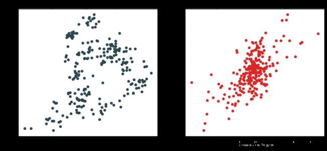
在本例中函数 scatter() 里的参数有
- p_AMZN (r_AMZN):Series,也可以是 list 或者 ndarray
- p_BABA (r_BABA):Series,也可以是 list 或者 ndarray
- colors:用之前定义的深青色和红色
3.4 折线图
折线图 (line chart) 显示随时间而变化的连续数据,因此非常适用于显示在相等时间间隔下数据的趋势。在 Matplotlib 里的语法是
- plt.plot()
- ax.plot()
# 首先获取EURUSD的收盘价
curr = 'EURUSD'
EURUSD = data_converter(currency_daily, curr, 'FX')
rate = EURUSD['close']
用 Pandas 里面的 rolling() 函数来计算 MA,再画出收盘价,MA20 和 MA60 三条折线。
fig =plt.figure(figsize=(16, 6))
ax = fig.add_subplot(1, 1, 1)

ax.set_title(curr + '- Moving Average')
ax.set_xticks(range(0, len(rate.index), 10))
ax.set_xticklabels([rate.index[i] for i in ax.get_xticks()], rotation=45)

ax.plot(rate, color=dt_hex, linewidth=2, label='Close')

MA_20 = rate.rolling(20).mean()
MA_60 = rate.rolling(60).mean()

ax.plot(MA_20, color=r_hex, linewidth=2, label='MA20')
ax.plot(MA_60, color=g_hex, linewidth=2, label='MA60')

ax.legend(loc=0)

plt.show()
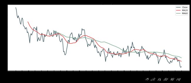
在本例中函数 plot() 里的参数有
- rate, MA_20, MA_60:Series,也可以是 list 或者 ndarray
- colors:用之前定义的深青色,红色,绿色
- linewidth:像素 2
- label:用于显示图例
3.5 饼状图
饼状图 (pie chart) 是一个划分为几个扇形的圆形统计图表,用于描述量、频率或百分比之间的相对关系。 在饼状图中,每个扇区面积大小为其所表示的数量的比例。在 Matplotlib 里的语法是
- plt.pie()
- ax.pie()
问题:如何画出一个股票投资组合在 2019 年 4 月 26 日的饼状图,假设组合里面有 100 股英伟达,20 股亚马逊,50 股阿里巴巴,30 股脸书和 40 股苹果。
# 首先计算组合里五支股票在 2019 年 4 月 26 日的市值 (market value, MV)
stock_list = ['NVDA', 'AMZN', 'BABA', 'FB', 'AAPL']
date = '2019-04-26'

MV = [data_converter(stock_daily, code, 'EQ')['close'][date] for code in stock_list]
MV = np.array(MV) * np.array([100, 20, 50, 30, 40])
MV
array([17808.99963379, 39012.60009766,  9354.49981689,  5744.70016479,
        2043.00003052])
# 设定好五种颜色和百分数格式 %.0f%% (小数点后面保留 0 位),画出饼状图。
fig = plt.figure(figsize=(16, 6))
ax = fig.add_subplot(1, 1, 1)

ax.pie(MV, labels=stock_list, colors=[dt_hex, r_hex, g_hex, tn_hex, g25_hex],
       autopct='%.0f%%')
plt.show()
在本例中函数 pie() 里的参数有
- MV:股票组合市值,ndarray
- labels:标识,list
- colors:用之前定义的一组颜色,list
- autopct:显示百分数的格式,str
3.6 同理心
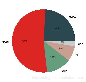
把饼当成钟,大多数人习惯顺时针的看里面的内容,因此把面积最大的那块的一条边 (见下图) 放在 12 点的位置最能突显其重要性,之后按面积从大到小顺时针排列。
在画饼状图前,我们需要额外做两件事:
- 按升序排列 5 只股票的市值
- 设定 pie() 的相关参数达到上述「最大块放 12 点位置」的效果
idx = MV.argsort()[::-1]
MV = MV[idx]
stock_list = [ stock_list[i] for i in idx ]
print( MV )
print( stock_list )
[39012.60009766 17808.99963379  9354.49981689  5744.70016479
  2043.00003052]
['AMZN', 'NVDA', 'BABA', 'FB', 'AAPL']
设定参数
- startangle = 90 是说第一片扇形 (AMZN 深青色那块) 的左边在 90 度位置
- counterclock = False 是说顺时针拜访每块扇形
fig = plt.figure(figsize=(16, 6))
ax = fig.add_subplot(1, 1, 1)

ax.pie(MV, labels = stock_list, colors=[dt_hex, r_hex, g_hex,tn_hex,g25_hex],
      autopct='%.0f%%', startangle=90, counterclock=False)
plt.show()

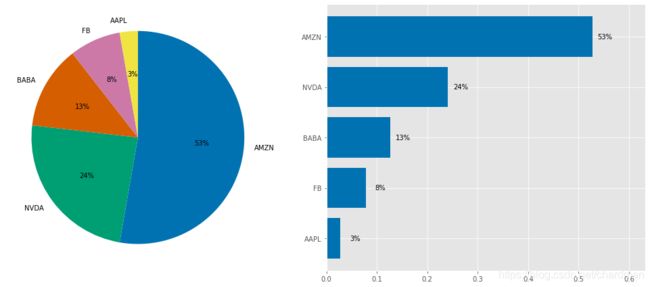
当饼状图里面扇形多过 5 个时,面积相近的扇形大小并不容易一眼辨别出来,不信看上图的 BABA 和 APPL,没看到数字很难看出那个面积大。但绝大多数人是感官动物,图形和数字肯定先选择看图形,这个时候用柱状图 (bar chart) 来代替饼状图,每个市值成分大小一目了然
用 ax.bar() 函数来画柱状图
fig = plt.figure(figsize=(8, 6))
ax = fig.add_subplot(1, 1, 1)

pct_MV = MV / np.sum(MV)
index = np.arange(len(pct_MV))

ax.bar(index, pct_MV, facecolor=r_hex, edgecolor=dt_hex)
ax.set_xticks(index)
ax.set_xticklabels(stock_list)
ax.set_ylim(0, np.max(pct_MV) * 1.2)

for x, y in zip(index, pct_MV):
    ax.text(x+0.04, y+0.01, '{0:.0%}'.format(y), ha='center', va='center')

plt.show()
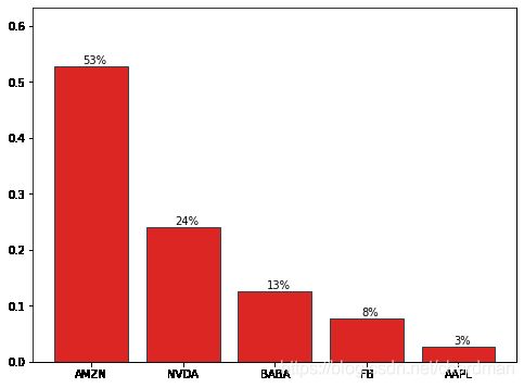
函数 bar() 里的参数有
- index:横轴刻度,ndarray
- pct_MV:股票组合市值比例,ndarray
- facecolor:柱状颜色,红色
- edgecolor:柱边颜色,深青色
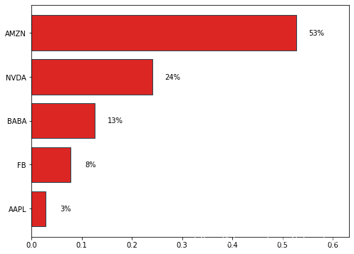
如果柱状很多时,或者标签名字很长时,用横向柱状图 (horizontal bar chart),函数为 ax.barh()。
fig = plt.figure(figsize=(8, 6))
ax = fig.add_subplot(1, 1, 1)

pct_MV = MV[::-1] / np.sum(MV)
index = np.arange(len(pct_MV))

ax.barh(index, pct_MV, facecolor=r_hex, edgecolor=dt_hex)
ax.set_yticks(index)
ax.set_yticklabels(stock_list[::-1])
ax.set_xlim(0, np.max(pct_MV) * 1.2)

for x, y in zip( pct_MV, index ):
    ax.text(x+0.04, y, '{0:.0%}'.format(x), ha='center', va='center')

plt.show()
plt.style.use('ggplot')
fig, axes = plt.subplots(nrows=1, ncols=2, figsize=(14, 6))

axes[0].pie(MV, labels = stock_list, autopct='%.0f%%',
            startangle=90, counterclock=False)

pct_MV = MV[::-1] / np.sum(MV)
index = np.arange(len(pct_MV))

axes[1].barh(index, pct_MV)
axes[1].set_yticks(index)
axes[1].set_yticklabels(stock_list[::-1])
axes[1].set_xlim(0, np.max(pct_MV) * 1.2)

for x, y in zip( pct_MV, index ):
    axes[1].text(x+0.04, y, '{0:.0%}'.format(x), ha='right', va='center')

plt.tight_layout()
plt.show()

plt.style.use('seaborn-colorblind')
fig, axes = plt.subplots(nrows=1, ncols=2, figsize=(14, 6))

axes[0].pie(MV, labels = stock_list, autopct='%.0f%%',
            startangle=90, counterclock=False)

pct_MV = MV[::-1] / np.sum(MV)
index = np.arange(len(pct_MV))

axes[1].barh(index, pct_MV)
axes[1].set_yticks(index)
axes[1].set_yticklabels(stock_list[::-1])
axes[1].set_xlim(0, np.max(pct_MV) * 1.2)

for x, y in zip( pct_MV, index ):
    axes[1].text(x+0.04, y, '{0:.0%}'.format(x), ha='right', va='center')

plt.tight_layout()
plt.show()
plt.style.use('tableau-colorblind10')
fig, axes = plt.subplots(nrows=1, ncols=2, figsize=(14, 6))

axes[0].pie(MV, labels = stock_list, autopct='%.0f%%',
            startangle=90, counterclock=False)

pct_MV = MV[::-1] / np.sum(MV)
index = np.arange(len(pct_MV))

axes[1].barh(index, pct_MV)
axes[1].set_yticks(index)
axes[1].set_yticklabels(stock_list[::-1])
axes[1].set_xlim(0, np.max(pct_MV) * 1.2)

for x, y in zip( pct_MV, index ):
    axes[1].text(x+0.04, y, '{0:.0%}'.format(x), ha='right', va='center')

plt.tight_layout()
plt.show()
