Knowledge Graph 绘图
图论是一种非常强大的数据科学工具,可让您可视化和理解复杂的交互。NetworkX是一个用于构建图形的 Python 包,它具有大部分可用的默认值,但利用 matplotlib 允许我们自定义图形的几乎所有可能的方面。 我知道我希望它在我的脑海中是什么样子,但是经过数小时的文档和 StackOverflow 搜索后,我决定为我学会如何改变的所有东西创建这个一站式商店! 现在,您也可以构建可读的图表来帮助可视化复杂的关系。
1. 创建 NetworkX 图
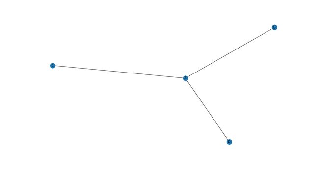
我们将从制作一个基本图表开始! 有几种方法可以做到这一点。 我发现最简单的方法是从你指定边缘的 pandas DataFrame 中。 什么是优势? 好吧,图是使用节点和边构建的。 一个节点代表某个对象,可能是一个人或一个组织,而一条边代表从一个节点到另一个节点的实际连接。 所以在下面的例子中,“A”、“B”、“C”和“D”是节点,它们之间的线是边。
fig, ax = plt.subplots(figsize=(15,8))

relationships = pd.DataFrame({'from': ['A', 'A', 'A'],
                              'to':   ['B', 'C', 'D']})

G = nx.from_pandas_edgelist(relationships, 'from', 'to', create_using=nx.Graph())

nx.draw(G, with_labels=True)
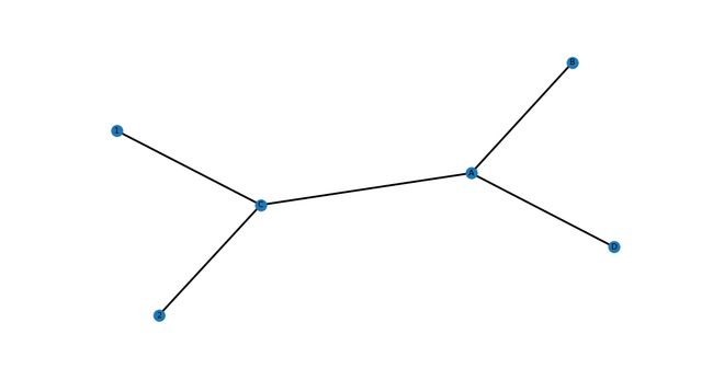
2. 节点颜色
我们也可以很容易地改变所有节点的颜色。 您会注意到一种模式,即为图形全局更改特征非常简单(在 .draw() 方法中使用关键字)。
fig, ax = plt.subplots(figsize=(15,8))

relationships = pd.DataFrame({'from': ['A', 'A', 'A'],
                              'to':   ['B', 'C', 'D']})

G = nx.from_pandas_edgelist(relationships, 'from', 'to', create_using=nx.Graph())

# Set node_color
nx.draw(G, with_labels=True, node_color='red')

3. 节点类型的节点颜色
但是假设我们想根据类型而不是全局更改节点的颜色。 这需要一些设置,但一旦到位,我们可以快速添加新类型并相应地自动着色。 基本上,我们创建另一个 DataFrame,在其中指定节点 ID 和节点类型,并使用 pd.Categorical() 方法应用颜色图。
所以现在我们的字母节点是蓝色的,我们的数字节点是橙色的!
fig, ax = plt.subplots(figsize=(15, 8))

relationships = pd.DataFrame({'from': ['A', 'A', 'A', '1', '2'],
                              'to':   ['B', 'C', 'D', 'C', 'C']})

# Create DF for node characteristics
carac = pd.DataFrame({'ID':['A', 'B', 'C', 'D', '1', '2'],
                      'type':['Letter','Letter', 'Letter', 'Letter',
                      'Number', 'Number']})

# Create graph object
G = nx.from_pandas_edgelist(relationships, 'from', 'to', create_using=nx.Graph())

# Make types into categories
carac = carac.set_index('ID')
carac = carac.reindex(G.nodes())

carac['type'] = pd.Categorical(carac['type'])
carac['type'].cat.codes

# Specify colors
cmap = matplotlib.colors.ListedColormap(['C0', 'darkorange'])

# Draw graph
nx.draw(G, with_labels=True, node_color=carac['type'].cat.codes, cmap=cmap)

4. 节点大小
同样,通过 .draw() 方法中的关键字参数来全局更改节点大小非常简单——只需指定 node_size!
fig, ax = plt.subplots(figsize=(15, 8))

relationships = pd.DataFrame({'from': ['A', 'A', 'A', '1', '2'],
                              'to':   ['B', 'C', 'D', 'C', 'C']})

G = nx.from_pandas_edgelist(relationships, 'from', 'to', create_using=nx.Graph())

# Set node size
nx.draw(G, with_labels=True, node_size=1000)

5. 按节点类型划分的节点大小
我们可以按类型改变节点大小,就像我们可以改变颜色一样! 我发现这对于将人员与组织联系起来非常有用,因为组织有许多相关人员,因此将它们视为枢纽,以人为辐条是有意义的。
因此,我们将根据类型示例从节点颜色构建,但我们将传递节点大小列表,而不是 node_size 的单个关键字参数,该列表引用用于选择节点颜色的节点类型。
对于 DataFrame 中的每个节点,如果该节点的类型不是“Letter”,则将节点大小设置为 4000,否则将节点大小设置为 1000。结果是任何不是字母的都将是一个更大的节点。 目前只有两种节点类型,这可能有点矫枉过正,但以后会更好地扩展。
fig, ax = plt.subplots(figsize=(15, 8))

relationships = pd.DataFrame({'from': ['A', 'A', 'A', '1', '2'],
                              'to':   ['B', 'C', 'D', 'C', 'C']})

# Create DF for node characteristics
carac = pd.DataFrame({'ID':['A', 'B', 'C', 'D', '1', '2'],
                      'type':['Letter','Letter', 'Letter', 'Letter',
                      'Number', 'Number']})

# Create graph object
G = nx.from_pandas_edgelist(relationships, 'from', 'to', create_using=nx.Graph())

# Make types into categories
carac = carac.set_index('ID')
carac = carac.reindex(G.nodes())

carac['type'] = pd.Categorical(carac['type'])
carac['type'].cat.codes

# Specify colors
cmap = matplotlib.colors.ListedColormap(['C0', 'darkorange'])

# Set node sizes
node_sizes = [4000 if entry != 'Letter' else 1000 for entry in carac.type]

# Draw graph
nx.draw(G, with_labels=True, node_color=carac['type'].cat.codes, cmap=cmap,
        node_size=node_sizes)

6. 手动节点大小
如果我们不需要按类型更改节点大小,而只是想引起对特定节点的注意,我们可以手动指定大小列表。 这些需要与存储节点的顺序相同,因此调用 G.nodes() 以生成要遵循的列表。 下面标记了一些具有代表性的尺寸,以便您了解它们的相对尺寸。
fig, ax = plt.subplots(figsize=(15, 8))

relationships = pd.DataFrame({'from': ['10', '10', '10', '5000', '10000'],
                              'to':   ['100', '500', '1000', '500', '500']})

# Create graph object
G = nx.from_pandas_edgelist(relationships, 'from', 'to', create_using=nx.Graph())

# Manually set each nodes size
node_sizes = [10, 100, 500, 1000, 5000, 10000]

# Draw graph
nx.draw(G, with_labels=True, node_size=node_sizes)

7. 边宽
现在我们已经介绍了节点属性,我们可以移动到边。 设置全局边大小或颜色与节点一样简单,只需在 .draw() 方法中指定宽度关键字。
fig, ax = plt.subplots(figsize=(15, 8))

relationships = pd.DataFrame({'from': ['A', 'A', 'A', '1', '2'],
                              'to':   ['B', 'C', 'D', 'C', 'C']})

G = nx.from_pandas_edgelist(relationships, 'from', 'to', create_using=nx.Graph())

# Set edge width
nx.draw(G, with_labels=True, width=3)
8. 边颜色
通过传入属性列表而不是单个值,可以单独而不是全局地对边缘进行着色或调整大小。 所以下面我们有 edge_colors 和 edge_widths 被循环使用。
fig, ax = plt.subplots(figsize=(15, 8))

relationships = pd.DataFrame({'from': ['A', 'A', 'A', '1', '2'],
                              'to':   ['B', 'C', 'D', 'C', 'C']})

G = nx.from_pandas_edgelist(relationships, 'from', 'to', create_using=nx.Graph())

# Set edge colors
edge_colors = ['blue', 'red', 'green', 'orange', 'blue']

# Set edge widths
edge_widths = [0.1, 1, 2, 3, 5]

# Set width and edge_color
nx.draw(G, with_labels=True, width=edge_widths, edge_color=edge_colors)

9. 节点边框颜色
最后,我们还可以使用一个容易混淆的关键字“edgecolors”为节点添加彩色边框,这与“edge_color”不同。 这可用于帮助澄清和分离节点,您可以在下面的示例图中看到。
fig, ax = plt.subplots(figsize=(15, 8))

relationships = pd.DataFrame({'from': ['A', 'A', 'A', '1', '2'],
                              'to':   ['B', 'C', 'D', 'C', 'C']})

G = nx.from_pandas_edgelist(relationships, 'from', 'to', create_using=nx.Graph())

# Set edgecolors and node_color and node_size for better visibility
nx.draw(G, with_labels=True, edgecolors='red', node_color='lightgray', node_size=1000)

10. 图布局
图表最重要的方面之一是它的布局! 这将最终决定图表的可读性和有用性。 NetworkX 有许多用于确定布局的选项,其中我介绍了下面最流行的 4 个。 默认值是在上述所有情况下使用的 spring_layout,但根据您的用例,其他情况下也有优点。 我建议尝试几个,看看什么效果最好。
您可以在此处查看布局文档: Drawing。
# Set overall figure size
f = plt.figure(figsize=(20,20))
f.tight_layout()

# Specify data and attributes
relationships = pd.DataFrame({'from': ['A', 'A', 'A', '1', '2', '3', '1', 'Center', 'Center',
                                       'Center', 'Center', 'Center', 'Center', 'Center'],
                              'to': ['B', 'C', 'D', 'C', 'C', 'A', '3', '1', '3', '2', 'A', 'B',
                                     'C', 'D']})

# Create DF for node characteristics
carac = pd.DataFrame({'ID':['A', 'B', 'C', 'D', '1', '2', '3', 'Center'],
                      'type':['Letter','Letter', 'Letter', 'Letter', 'Number', 'Number',
                              'Number', 'Center']})

# Create graph object
G = nx.from_pandas_edgelist(relationships, 'from', 'to', create_using=nx.Graph())

# Make types into categories
carac= carac.set_index('ID')
carac=carac.reindex(G.nodes())

carac['type']=pd.Categorical(carac['type'])
carac['type'].cat.codes

# Set node colors
cmap = matplotlib.colors.ListedColormap(['dodgerblue', 'lightgray', 'darkorange'])

# Set node sizes
node_sizes = [4000 if entry != 'Letter' else 1000 for entry in carac.type]

# Create Layouts

# Subplot 1
plt.subplot(2, 2, 1)
nx.draw(G, with_labels=True, node_color=carac['type'].cat.codes, cmap=cmap,
        node_size = node_sizes, edgecolors='gray')
plt.title('Spring Layout (Default)', fontsize=18)

# Subplot 2
plt.subplot(2, 2, 2)
nx.draw_random(G, with_labels=True, node_color=carac['type'].cat.codes, cmap=cmap,
               node_size = node_sizes, edgecolors='gray')
plt.title('Random Layout', fontsize=18)

# Subplot 3
plt.subplot(2, 2, 3)
nx.draw_shell(G, with_labels=True, node_color=carac['type'].cat.codes, cmap=cmap,
            node_size = node_sizes, edgecolors='gray')
plt.title('Shell Layout', fontsize=18)

# Subplot 4
plt.subplot(2, 2, 4)
nx.draw_spectral(G, with_labels=True, node_color=carac['type'].cat.codes, cmap=cmap,
            node_size = node_sizes, edgecolors='gray')
plt.title('Spectral Layout', fontsize=18)
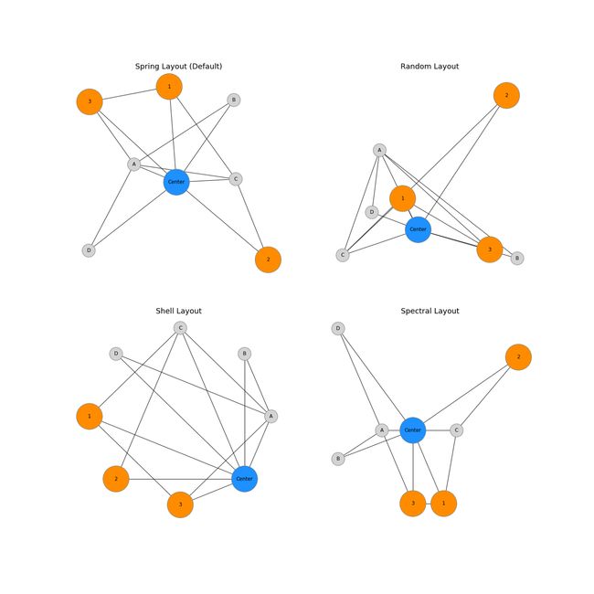
我希望本指南为您提供有关如何自定义 NetworkX 图的大多数方面以提高可读性的工作示例。 NetworkX 是一个非常强大的软件包,虽然它的默认设置非常好,但随着项目规模的扩大,您需要注意不同的信息。 这可以通过多种方式完成,但更改节点大小和颜色、边宽度和图形布局是一个很好的起点。
参考资源
[1] Graph generators
[2] Customizing NetworkX Graphs