ggbeeswarm 包画蜂群图:一种更优雅的画散点图的方法
【简说基因】蜂群图事实上也是一种散点图,不过比传统散点图和抖动散点图更加优雅,也比箱线图和小提琴图能够展示更多细节。
蜂群图(也称为柱形散点图或小提琴散点图)是一种绘制数据点的方式,通常情况下这些点会重叠在一起,蜂群图则将它们相邻排列。除了减少重叠,它还有助于可视化每个数据点的数据密度(类似于小提琴图),同时仍然显示每个数据点的具体数值。
画蜂群图的 R 包主要有:beeswarm 和 ggbeeswarm,本文介绍后者,它为画更好的散点图提供两个几何对象:
geom_quasirandom:准随机散点图几何对象。
geom_beeswarm:蜂群图几何对象。
安装
install.packages('ggbeeswarm')示例
使用 iris 数据集,先比较一下抖动散点图和准随机散点图:
set.seed(12345)
library(ggplot2)
library(ggbeeswarm)
library(patchwork)
#compare to jitter
p1 = ggplot(iris,aes(Species, Sepal.Length)) + geom_jitter() + ggtitle("jitter")
p2 = ggplot(iris,aes(Species, Sepal.Length)) + geom_quasirandom() + ggtitle("quasirandom")
p1 / p2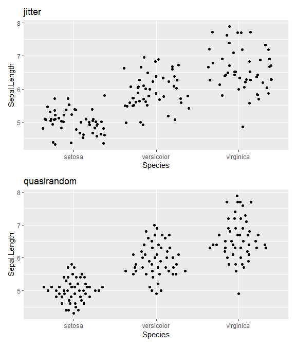
geom_quasirandom()
#default geom_quasirandom
ggplot(mpg,aes(class, hwy)) + geom_quasirandom()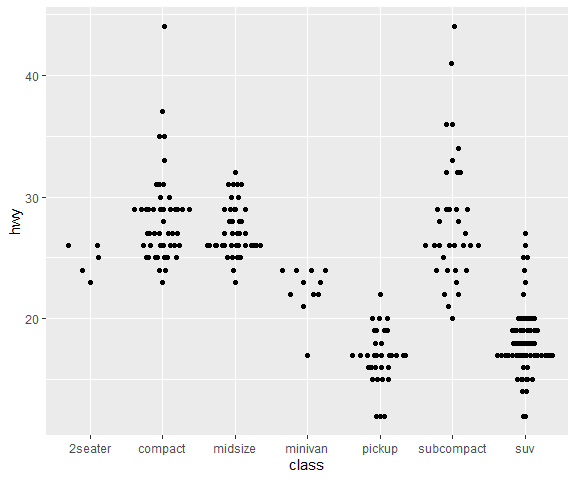
# With categorical y-axis
ggplot(mpg,aes(hwy, class)) + geom_quasirandom(groupOnX=FALSE)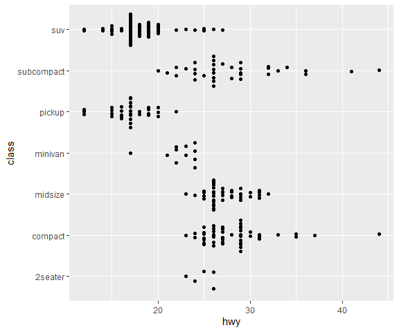
# Some groups may have only a few points. Use `varwidth=TRUE` to adjust width dynamically.
ggplot(mpg,aes(class, hwy)) + geom_quasirandom(varwidth = TRUE)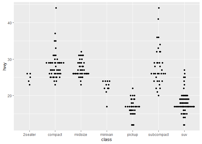
# Automatic dodging
sub_mpg <- mpg[mpg$class %in% c("midsize", "pickup", "suv"),]
ggplot(sub_mpg, aes(class, displ, color=factor(cyl))) + geom_quasirandom(dodge.width=1)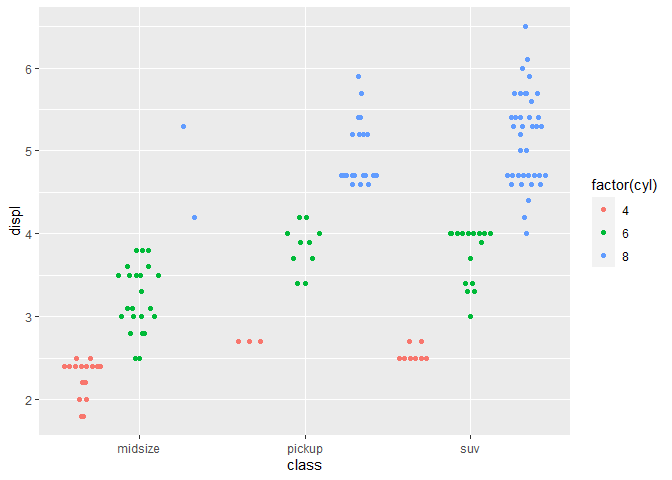
改变方法
geom_quasirandom 还有许多其他方法用于分布点,例如:
ggplot(iris, aes(Species, Sepal.Length)) + geom_quasirandom(method = "tukey") + ggtitle("Tukey texture")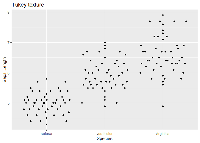
ggplot(iris, aes(Species, Sepal.Length)) + geom_quasirandom(method = "tukeyDense") +
    ggtitle("Tukey + density")
ggplot(iris, aes(Species, Sepal.Length)) + geom_quasirandom(method = "frowney") +
    ggtitle("Banded frowns")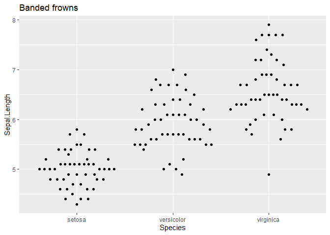
ggplot(iris, aes(Species, Sepal.Length)) + geom_quasirandom(method = "smiley") +
    ggtitle("Banded smiles")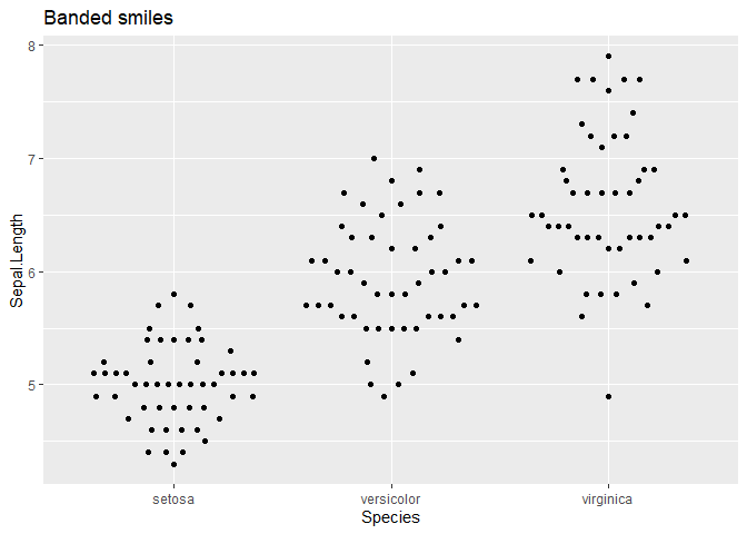
ggplot(iris, aes(Species, Sepal.Length)) + geom_quasirandom(method = "pseudorandom") +
    ggtitle("Jittered density")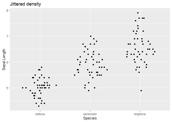
geom_beeswarm()
ggplot(iris, aes(Species, Sepal.Length)) + geom_beeswarm() + ggtitle("Beeswarm")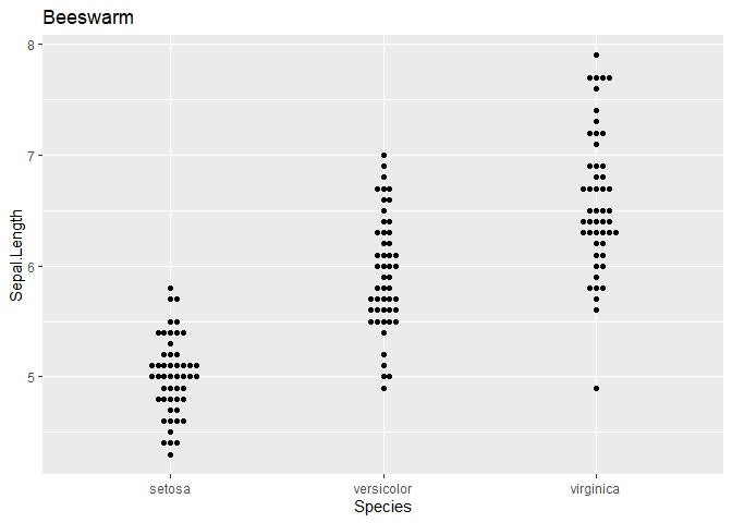
ggplot(iris,aes(Species, Sepal.Length)) + geom_beeswarm(side = 1L)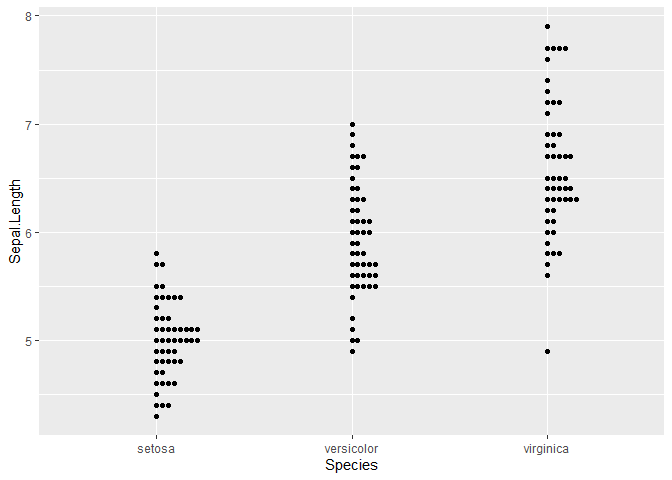
ggplot(mpg,aes(class, hwy)) + geom_beeswarm(size=.5)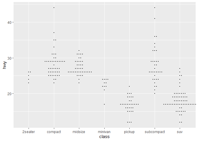
# With categorical y-axis
ggplot(mpg,aes(hwy, class)) + geom_beeswarm(size=.5)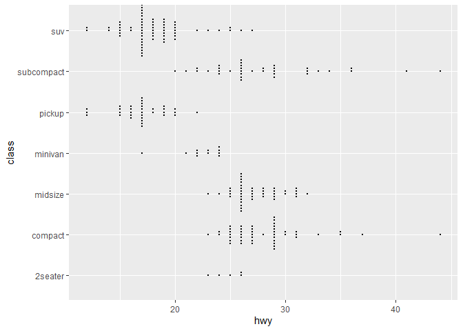
# Also watch out for points escaping from the plot with geom_beeswarm
ggplot(mpg,aes(hwy, class)) + geom_beeswarm(size=.5) + scale_y_discrete(expand=expansion(add=c(0.5,1)))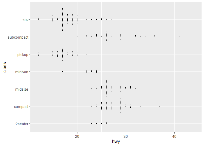
ggplot(mpg,aes(class, hwy)) + geom_beeswarm(size=1.1)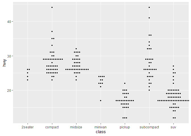
# With automatic dodging
ggplot(sub_mpg, aes(class, displ, color=factor(cyl))) + geom_beeswarm(dodge.width=0.5)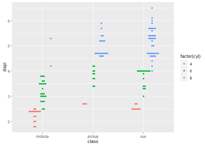
改变方法
df <- data.frame(
  x = "A",
  y = sample(1:100, 200, replace = TRUE)
)
ggplot(df, aes(x = x, y = y)) + geom_beeswarm(cex = 2.5, method = "swarm") + ggtitle('method = "swarm" (default)')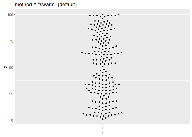
ggplot(df, aes(x = x, y = y)) + geom_beeswarm(cex = 2.5, method = "compactswarm") + ggtitle('method = "compactswarm"')
ggplot(df, aes(x = x, y = y)) + geom_beeswarm(cex = 2.5, method = "compactswarm") + ggtitle('method = "compactswarm"')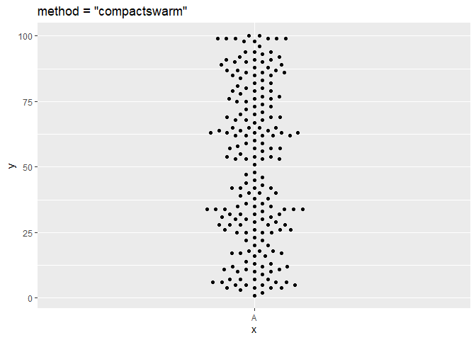
ggplot(df, aes(x = x, y = y)) + geom_beeswarm(cex = 2.5, method = "hex") + ggtitle('method = "hex"')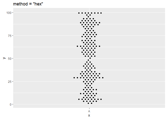
ggplot(df, aes(x = x, y = y)) + geom_beeswarm(cex = 2.5, method = "square") + ggtitle('method = "square"')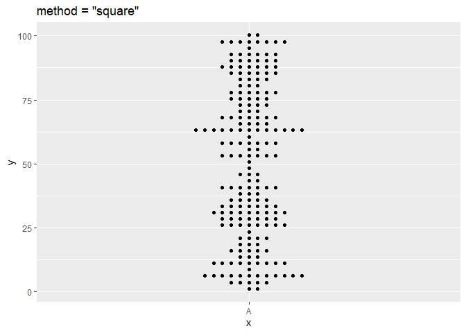
ggplot(df, aes(x = x, y = y)) + geom_beeswarm(cex = 2.5, method = "center") + ggtitle('method = "center"')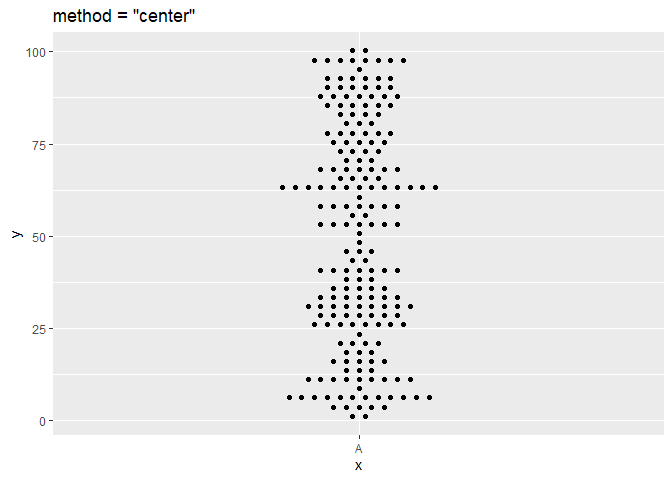
点分布的优先级
#With different beeswarm point distribution priority
dat<-data.frame(x=rep(1:3,c(20,40,80)))
dat$y<-rnorm(nrow(dat),dat$x)
ggplot(dat,aes(x,y)) + geom_beeswarm(cex=2) + ggtitle('Default (ascending)') + scale_x_continuous(expand=expansion(add=c(0.5,.5)))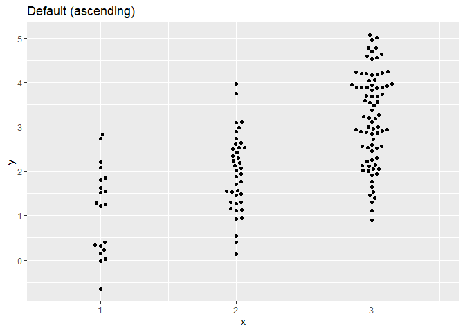
ggplot(dat,aes(x,y)) + geom_beeswarm(cex=2,priority='descending') + ggtitle('Descending') + scale_x_continuous(expand=expansion(add=c(0.5,.5)))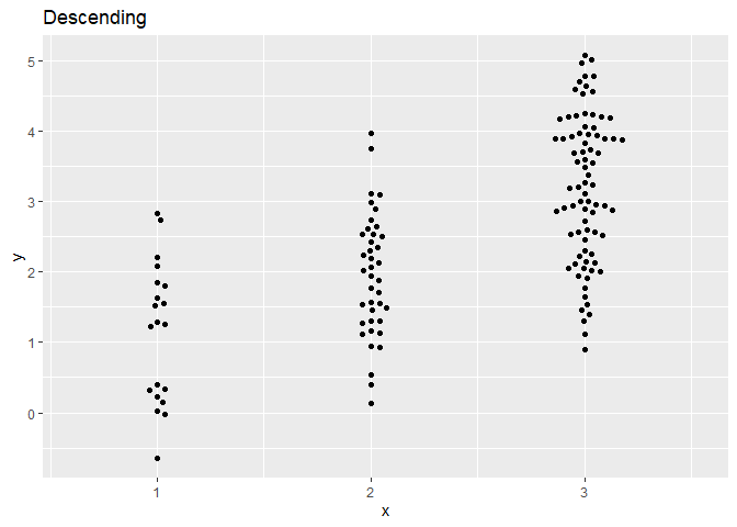
ggplot(dat,aes(x,y)) + geom_beeswarm(cex=2,priority='density') + ggtitle('Density') + scale_x_continuous(expand=expansion(add=c(0.5,.5)))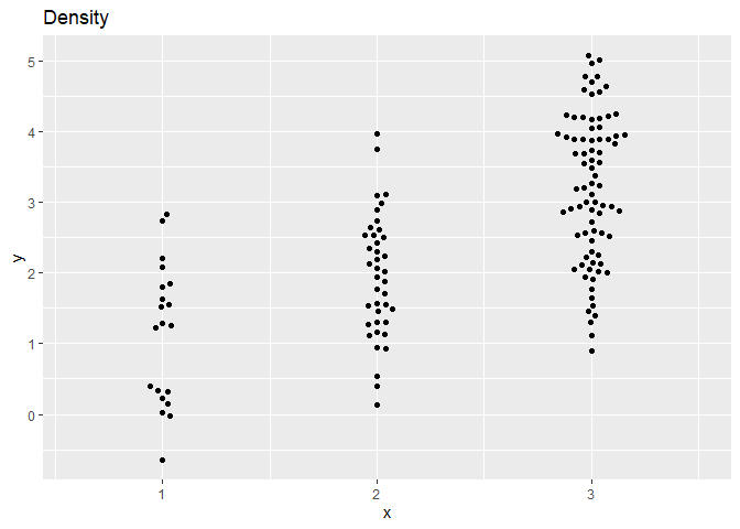
ggplot(dat,aes(x,y)) + geom_beeswarm(cex=2,priority='random') + ggtitle('Random') + scale_x_continuous(expand=expansion(add=c(0.5,.5)))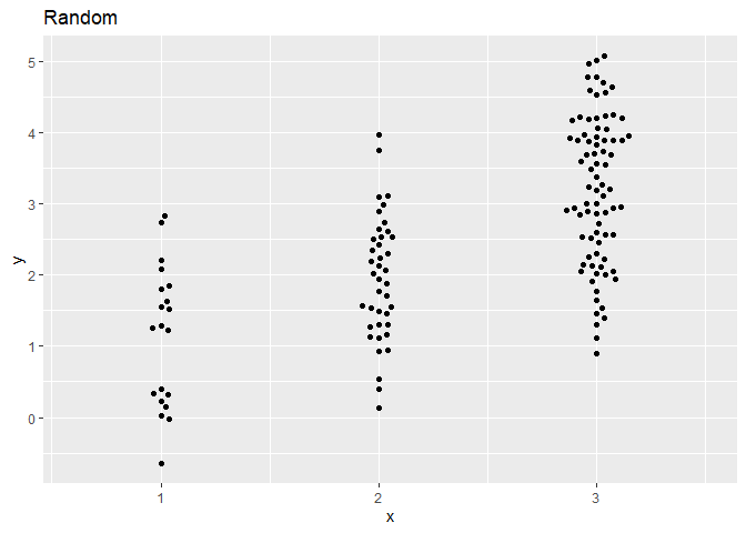
围捕逃逸点
set.seed(1995)
df2 <- data.frame(
  y = rnorm(1000),
  id = sample(c("G1", "G2", "G3"), size = 1000, replace = TRUE)
)
p <- ggplot(df2, aes(x = id, y = y, colour = id))

# use corral.width to control corral width
p + geom_beeswarm(cex = 2.5, corral = "none", corral.width = 0.9) + ggtitle('corral = "none" (default)')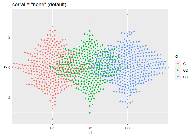
p + geom_beeswarm(cex = 2.5, corral = "gutter", corral.width = 0.9) + ggtitle('corral = "gutter"')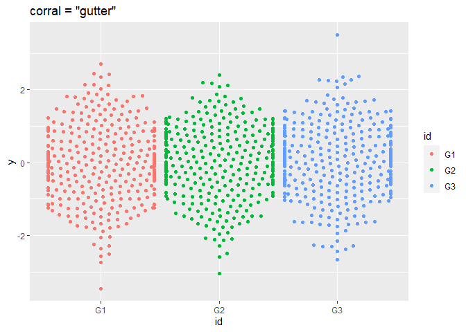
p + geom_beeswarm(cex = 2.5, corral = "wrap", corral.width = 0.9) + ggtitle('corral = "wrap"')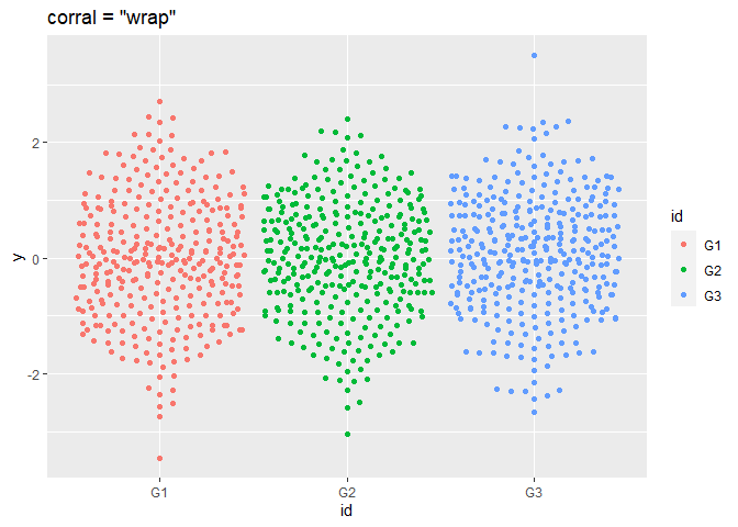
p + geom_beeswarm(cex = 2.5, corral = "random", corral.width = 0.9) + ggtitle('corral = "random"')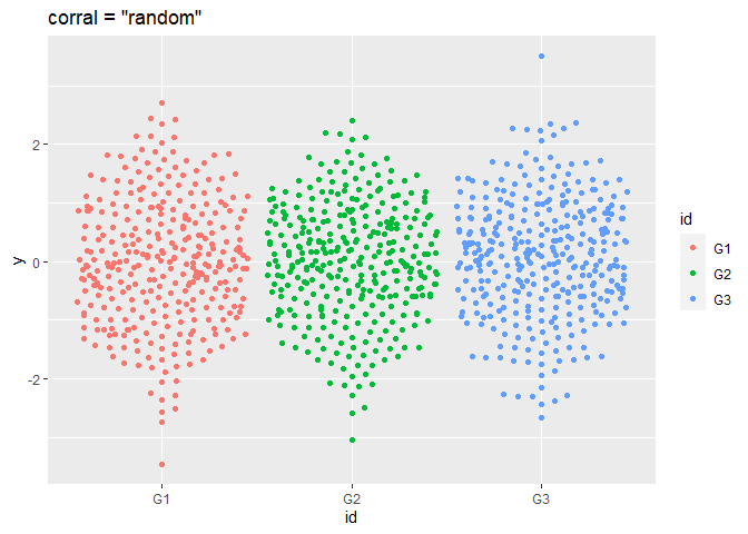
p + geom_beeswarm(cex = 2.5, corral = "omit", corral.width = 0.9) + ggtitle('corral = "omit"')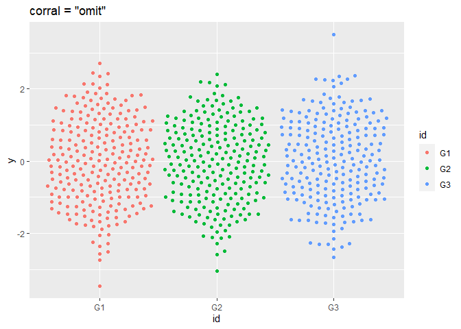
总结
蜂群图可以更好地展示数据点之间的关系,避免数据点的重叠,同时也可以进行分组和着色,方便进行数据的比较和分析。但是需要注意的是,由于数据点会在 x 轴上分散,因此其位置并不准确,需要根据具体情况进行分析和解释。
参考文献:
https://github.com/eclarke/ggbeeswarm