streamlit+matplotlib分析log绘制报表、饼图、折线图
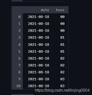
原始数据:
概况:
本文对服务器log进行分析,pandas 提取错误日志,matplotlib图形化分析每小时出现错误的次数,最后通过streamlit展示在页面上
说明:
1、读取文件:打开本地log文件,逐行读取,如果符合过滤条件,放入pd里。 lst_log.append(line) df_etllog = pd.DataFrame({ 'message':lst_log})
2、数据解析:
正则提取到错误产生的时间df[‘new_col’] = df[‘selected_col’].str.extract(‘正则表达式’, expand = True)
对日期数据进行2次分段df_etllog1 = df_etllog.message.str.split( ':',expand = True)
df_etllog1.columns = ['datehour','minute','second'] 最终得到hour数据
对相同时间出现的次数进行计数 labelslist=list(df_etllog2['hour']) result = pd.value_counts(labelslist).sort_index()
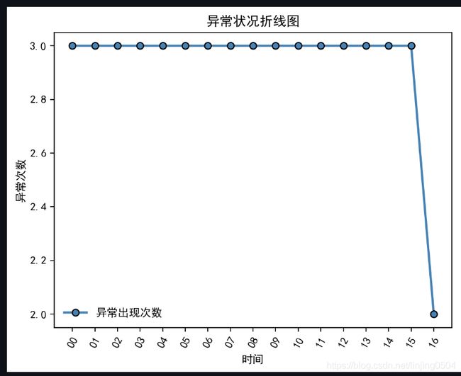
3、matplotlib画出饼图和折线图
4、通过streamlit st.write页面展示
代码:
import pandas as pd
import matplotlib.pyplot as plt
import numpy as np
import streamlit as st
import re
pd.set_option('display.max_columns',1000)#设置列数
pd.set_option('display.width', 1000)
pd.set_option('display.max_colwidth',1000)#设置每个字段显示长度
#获取有效数据
lst_log=[]
with open("xxx.log", encoding='utf-8') as lines:
for line in lines:
#逐行读取数据 ,只取有效数据
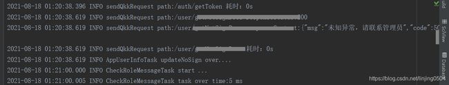
if "sendQkkRequest path:/user" in line and "未知异常,请联系管理"in line:
lst_log.append(line)
df_etllog = pd.DataFrame({ 'message':lst_log})
st.table(df_etllog)#全部显示,不会缩减隐藏长度
#数据解析
df_etllog['message'] = df_etllog['message'].str.extract('(.*) INFO ', expand = True)#pandas对具体列的内容通过正则表达式进行数据提取df[‘new_col’] = df[‘selected_col’].str.extract(‘正则表达式’, expand = True)
st.write(df_etllog)
df_etllog1 = df_etllog.message.str.split( ':',expand = True)
st.write(df_etllog1)
df_etllog1.columns = ['datehour','minute','second']
st.write(df_etllog1)
df_etllog2 = df_etllog1['datehour'].str.split( ' ',expand = True)
st.write(df_etllog2)
df_etllog2.columns = ['date','hour']
st.write(df_etllog2)
#对相同时间出现的次数进行计数
labelslist=list(df_etllog2['hour'])
result = pd.value_counts(labelslist).sort_index()#注意这里加入了.sort_index()按照index进行了排序,如果仅仅是pd.value_counts(labelslist),会data的大小排序
st.write(result)
plt.rcParams['font.sans-serif']=['SimHei']
plt.rcParams['axes.unicode_minus'] = False
index=result.index.tolist()
data=result.data.tolist()
#饼图
labels = index
sizes = data
fig = plt.figure()
plt.pie(sizes, labels=labels, autopct='%1.1f%%',
shadow=True, startangle=90)#'%1.1f':指小数点后保留一位有效数值;'%1.2f%%'保留两位小数点,增加百分号(%);startangle=90则从y轴正方向画起
plt.axis('equal')#该行代码使饼图长宽相等
plt.title('各时段异常占比', fontdict={'size':15})
plt.legend(loc="upper right",fontsize=10,bbox_to_anchor=(1.1,1.05),borderaxespad=0.3)#添加图例
st.pyplot(fig)
#折线图
fig = plt.figure()
x=index
st.write(x)
y=data
# 绘图,做折线图
plt.plot(x,#x轴
y,#y轴
linestyle = '-', # 折线类型
linewidth = 2, # 折线宽度
color = 'steelblue', # 折线颜色
marker = 'o', # 点的形状
markersize = 6, # 点的大小
markeredgecolor='black', # 点的边框色
markerfacecolor='steelblue', # 点的填充色
label='异常出现次数'#标签
)
# 添加标题和坐标轴标签
plt.title('异常状况折线图')
plt.xlabel('时间')
plt.ylabel('异常次数')
plt.xticks(rotation = 60)#x轴标签倾斜60度
plt.legend(loc='best',frameon=False)#图例,显示label,去掉边框
st.pyplot(fig)
图形展示:效果