地铁地图的自动生成方法
地铁地图的自动生成方法
Automatic Generation of Transit Maps
Jonathan Stott’s thesis Automatic Layout of Metro Maps Using Multicriteria Optimisation (PDF) is a comprehensive look at the state-of-the-art of automatic transit map generation. The premise: start with a geographic map of subway or transit stations and lines, then convert this map into an abstract yet informative representation of the transit system akin to those standard transit maps found in the world’s major cities. My aim in this post will be to provide a brief summary of Stott’s thesis.
Aesthetics of the transit map
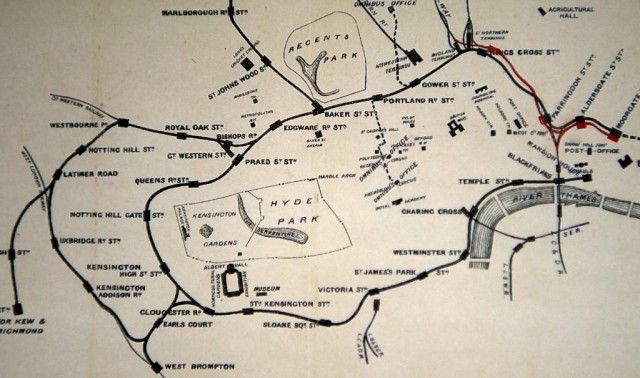
Transit maps have existed for centuries. From their genesis, these maps have expressed a tendency towards simplicity—perhaps encouraging customers to visions of quick and simple travel in an age when trains and ferries were still novelties and their complexity not yet understood. The 1874 London trains map removes much of the city clutter for the sake of a simple, almost playful, representation of rail lines and stations (see above).
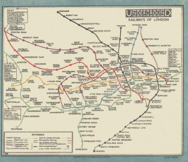
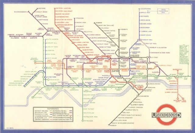
But the classic example in this space is Harry Beck’s 1933 map of the London Underground. Previous maps of the London Underground had maintained high geographic accuracy for line and terminal position. Beck’s landmark map codified rules for an abstract map: building from an inflexible grid independent of geography, adjusting the map’s scale to account for discrepencies in station density, and aligning transit lines along regular horizontal, vertical, or 45-degree angles. This codification produced a highly-readable diagrammatic map whose influence is strongly felt to the present day.
Altogether, we might create the following list of guidelines for generating a stylized, diagrammatic transit map:
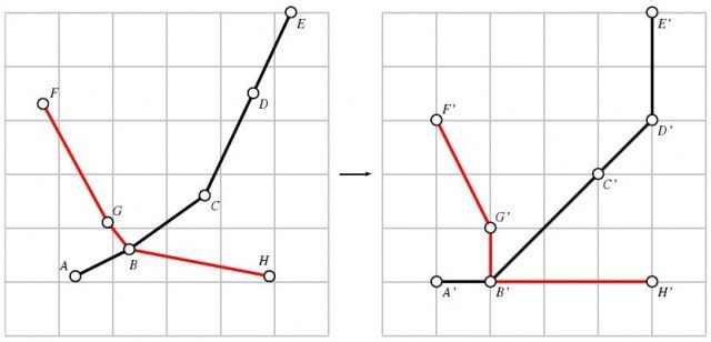
- Angle/shape generalization – Line segments should be restricted to vertical, horizontal, and 45-degree angles, and shapes should be made regular where possible.
- Scale generalization – The scale of the map should be compressed in sparse areas and expanded in dense areas to maintain readability.
- Color-coded lines – Separate transit lines should be colored with separate, distinguishable colors.
- Intelligent labels – Sans-serif font, proper capitalization, and a predominately horizontal orientation.
- Topographic metadata – Large rivers, parks, or coastlines should appear as background elements to provide context for the map.
- Stations as symbols – Continuity of symbol should be used for individual stations. Dots, hashes, or circles are all suitable. Transfer points between lines should be clearly indicated, usually with a symbol that stretches to touch all the relevant lines.
Syott’s thesis is concerned with codifying these guidelines and writing software that will automatically generate transit maps given an arbitrary, geographic transit map.
Hill-climbing
A large portion of this thesis is dedicated to exploring and critiquing existing algorithms to automatically draw transit maps. Transit maps are but one example of a directed graph, that is, a set of nodes connected by a set of directed edges that each contain a weight (such as distance, or travel time). Since graphs are well-studied in the computer science literature, much of the research on visualizing graphs can also be used when visualizing transit maps.
Stott’s basic approach is to define a set of criteria for what might be considered a good transit map (as we have outlined above), and then use a hill-climbing algorithm to find an optimal visualization. He breaks the visualization strategy into multiple stages, starting with grid alignment and finishing with label placement.
At each phase, software “guesses” what a good map might be, and subsequently an evaluation function is run on the resulting map. If the current guess is better than the previous guess, then the software uses the current guess as the basis from which to generate its next guess. An optimal solution is reached when the algorithm has achieved a high score that other guesses are unable to best—that is to say, the algorithm will have reached the peak of the hill.
A full overview of this algorithm is beyond the scope of this review, but can be found in section 3 of the thesis.
Engaging tourists and travelers
Stott tests his computer-generated maps (a wide variety of city transit maps were used) by having individuals compare his maps with both their geographic and official counterparts. The results are mostly positive. Travelers find the diagrammatic maps on the whole to be better than their geographically-oriented counterparts. Computer generated maps tend to score against official maps, and many in fact preferred Stott’s maps to the official ones. The automatically-generated maps rate especially well when travelers were asked to estimate an optimal route from one place to another within a transit system.
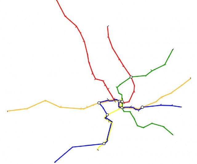
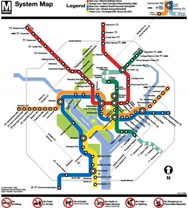
Our evaluation: Stott’s DC Metro map is in many ways a better map than Metro’s official version. Stott’s map possesses greater resemblance to actual geography. The transfer stations and lines in central DC, especially around Metro Center and Federal Triangle are greatly distorted on the official map, whereas Stott’s version better captures the geographic relationships of these stations and their neighbors. Having lived in DC for some time, we are well acquainted with the scattering of downtown stations (many with multiple entrances), and Stott’s map neatly captures a lot of what we know from personal experience.
Stott’s maps are far from perfect, but are easily classified as good starting points that have massive head-starts on the traditional approach. In the case of the DC map, the adjustments might be simple: a green swath for Rock Creek Park, blue lines for the Potomac and Anacostia Rivers, adjustments to line weight, and perhaps label font and alignment.
Repurposing the transit map metaphor
As we briefly explored in our last post that described a stylized subway map of the web, a transit map metaphor is potentially useful in any number of network visualization or graph visualization tasks. Stott summarizes some examples of transit map visualizations.
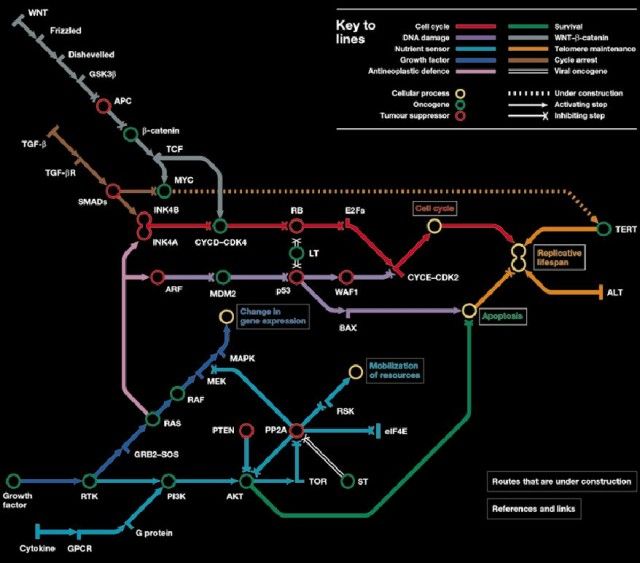
In one example, a “trains of thought” metaphor demonstrates logical strands of argument woven through the author’s PhD thesis. Another example shows the route of a project plan from start to finish, highlighting intersections where key components need to be brought together. The most striking visualization is a map of cancer pathways (above).
Resources
- Download Jonathan Stott’s complete thesis (PDF, 366 pages. Oct 2008).
- Helpful distortion at NYC and London subway maps at 37Signals
- Edward Tufte on the London Underground map
