
The following contents are digested from Heydon Pickering's book: Inclusive Design Patterns.
Introduction
In any case, thinking about the structure of data and trying to arrive at an optimal solution is designing and there’s not an Adobe license or copy of Sketch in sight. In fact, it’s really a kind of inclusive design: here, the right solution is one which is inclusive of different kinds of addresses. We’d like to be able to deal with consistent, uniform addresses, but that’s not reality. Instead, we make allowances.
Replace “structure of data” with “interface” and swap “addresses” for “people” in the previous paragraph, and you’ve got inclusive interface design in a nutshell.
For example, to design a button on web: The graphic designer has no idea of how to put that button on a web page or to make it do anything. The designer who codes will set background image to div element and use JS to control the click event. What's wrong with these two methods?
- Users who zoom their web pages to ease reading will get degraded and blurry button.
- Users who switch off image loading in mobile browser for bandwidth saving will not see the button.
- Users who choose to navigate and operate web pages with a keyboard cannot focus or operate on element, unlike the purpose-built
element.- Users who have severe vision impairments hence using a syntheic voice aids their comprehension are left entirely bereft.
element is semantically inert, offering noo information non-visually that it is, indeed, a button.- A button with information in a background image is unavailable to assistive technologies, eg. untranslatable into different languages.
The inclusive designer anticipates these problems, because experience tells them that people differ, well, in lots of different ways. Far from being daunted or frustrated, they know that by exploiting standard conventions they can achieve more by doing less. In other words, they know when to design and when to employ what is already designed — a simple HTML button element, provided as standard by the HTML specification. Resizable, translatable, focusable, interoperable, stylable, restylable, maintainable, mutable, simple.
Document

There are a handful of document-level best practices we should stick to. The aim here is not to go in search of the ultimate boilerplate but to configure a parent web page for an inclusive interface.
The Doctype
Whether your web page is an old-school static resource or a single-page app, it is unavoidably a document. The clue is in the “DOC” part which should appear in the first line of code:
.Without a doctype declared, the browser simply doesn’t know how to interpret the content and can regress into a non-compliant and incompatible mode, often called quirks mode.
The lang Attribute
The element’s lang attribute tells browser which language it is written in.
It also helps browsers choose and render system fonts with the appropriate character sets. Eg.
lang="zh-Hans"will invoke the rendering of simplified Chinese font.It is possible to switch languages within a page using the
langattribute on child elements within the. Eg.:Ceci n’est pas une pipe
— René Magritte
In CSS, selecting any sections declared as French using the
:langpseudo-class, applying a font well suited to the French character set, thereby improving legibility::lang(fr) { font-family: French Font, fallback, sans-serif; }Responsive Design
Allow pinch-to-zoom with
viewportintag.The reason of allowing pinch-to-zoom can be found in Adrian Roselli's Don't Disable Zoom
When zoom is enabled, avoid using positioned elements, especially with
position: fixed. When content is enlarged, any element stuck to a certain area is liable to become blind spots.Font Size
It's true that a great number of users will operate full-page zoom using Cmd (or Ctrl) and +, but modern browsers and operating systems still support text-only resizing. To make sure
font-size,paddingandmarginall resize proportionately, each should be set using the relative unitsrem,emorch. (Commented by Hubert: Kind of disagree with this, cause setting margin and padding by rem, em, or ch will make page layout hard to controll. Imagine that when margin, padding, and font-size all enlarged, the box will become thin, making the whole layout crash.)Media query and setting font-size by percentage are the convention of making page responsive:
p { margin: 1.5rem 0; font-size: 1rem; line-height: 1.5; } @media (max-width: 60em) { html { font-size: 80%; } }Be careful when you want to ensure the media query triggers at the correct point relative to user-defined font size: the
remunit causes problem in Safari, as PX, EM or REM Media Queries? by Zell Liew.Progressive Enhancement
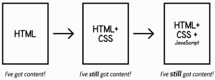
Patterns in this book are founded on well-formed and semantic HTML structures, enhanced by CSS and JavaScript. Where possible, integrated JavaScript widgets degrade into well-structured static content or interactive form elements, meaning users without JavaScript or CSS — temporarily or otherwise — can traverse and use content.
In a progressively enhanced setup, scripts should be inserted at the end of the document, just before the closing tag. This allows the main DOM content to be rendered before the scripts are executed.
Managing Web Font Assets
Web fonts are typically large assets which should be treated as an enhancement. In particular, FOIT (flash of invisible text) should be avoided: if the font resource is indefinitely stalled (it happens!), users of some devices and browsers will be stuck with a page that has no visible text. That’s pretty uninclusive of users on temperamental networks.
The trick is to load the page then the font, using the
onloadevent as a watershed. For this to work, the fonts will have to be base64-encoded and embedded into the style sheet in question. In Keith Clark’s example,has anonloadhandler which switches the media type fromnonetoall. If JavaScript is entirely unavailable, the CSS is loaded regardless using.The base64-encoded font would be included inside an @font-face declaration block:
@font-face { font-family: Merriweather; font-style: normal; font-weight: 400; src: local('Merriweather'), url('data:application/x-font-woff;charset=utf-8;base64...'); }A more comprehensive way of overcoming FOIT is offered by Bram Stein7 and requires a small JavaScript dependency. Font Face Observer allows you to watch and wait on the completion of a font resource loading using a simple promise-based interface:
var observer = new FontFaceObserver('MyWebSerif'); observer.check().then(function() { document.documentElement.className += "fonts-loaded"; });It’s simple to then supply the font in your CSS, using the
.fonts-loadedclass selector shown above:html { /* system font with fallback */ font-family: MySystemSerif, serif; } html.fonts-loaded { /* web font with fallbacks */ font-family: MyWebSerif, MySystemSerif, serif; }In defeating FOIT, you have to accept a lesser evil called FOUT (flash of unstyled text). This is a rather unjust moniker since all fonts are styled and intrinsically larger or smaller than the other, causing lines to wrap in different places.
The best strategy to mitigate this is to set fallback fonts which are similar to the web font.
Subsetting Fonts
When including fonts using Google Fonts8, you can append a text parameter to the URI listing just the characters you need.
If you are serving your own fonts, you can first subset them using Font Squirrel’s generator, then set fallback fonts in case of character not supported.
body { font-family: SubsettedWebFont, ExtensiveSystemFont, sans-serif; }The
</code> Element</h3> <p>Conventional practice is to describe the page and append author and site information. For example, “Inclusive Design Template | Heydon’s Site.” For a search results page, you should include the search term the user provided; something like, “[Website name] | Search results for [search phrase].</p> <h3>The <code><main></code> Element</h3> <p>Some parts of web pages, like navigation regions, should appear consistently between pages of the sites. Others will contribute to the modular, often dynamic content that makes up unique pages. In conventional web page anatomy, this content is designated to a main content area.</p> <pre><code class="HTML"><main id="main"> <!-- this page’s unique content --> </main> </code></pre> <p>The concept of main content is not a new one, but it is only recently that we’ve been afforded a tool to inclusively separate it from surrounding page apparatus like headers, navigation regions and footers. The <code><main></code> element defines a region recognized and communicated by screen readers. (Commented by Hubert: such as the reading mode of Safari browser on iPhone.)</p> <p>Since <code><main></code> is designed to contain the salient content of a page, it can make the writing of a print style sheet easier. If your navigation, header, footer and sidebar (<code><aside></code>) regions are correctly made the siblings of <code><main></code>, you can target them quite easily with CSS:</p> <pre><code class="CSS">@media print { body > *:not(main) { display: none; } } </code></pre> <h3>Skip Links</h3> <p>A skip link appears above all other content on the page and points to the main content area. But who’s it for? Conventional wisdom says screen reader users but, as I’ve already covered, they have other means to reach the <code><main></code> element. The principal beneficiaries of skip links are sighted keyboard users.</p> <pre><code class="CSS">[href="#main"] { position: absolute; top: 0; right: 100%; /* moves off screen */ } [href="#main"]:focus { right: auto; } </code></pre> <h3>Putting The Page Together</h3> <pre><code class="HTML"><!DOCTYPE html> <!-- the main language of the page declared --> <html lang="en"> <head> <meta charset="utf-8"> <!-- a viewport declaration which does not disable zooming --> <meta name="viewport" content="width=device-width, initial-scale=1.0"> <!-- a non-blocking base64 encoded font resource --> <link rel="stylesheet" href="fonts.css" media="none" onload="if(media!='all')media='all'"> <noscript><link rel="stylesheet" href="fonts.css"></noscript> <!-- a non-blocking stylesheet --> <link rel="stylesheet" href="main.css" media="none" onload="if(media!='all')media='all'"> <noscript><link rel="stylesheet" href="main.css"></noscript> <!-- a descriptive label for the page --> <title>Inclusive Design Template | Heydon’s Site skip to main contentParagraph

The Typeface
One well-supported claim is that sans serif fonts are more readable than serif ones. Nonetheless, it is entirely possible to design an excruciatingly unreadable font which is technically sans serif. As Typefaces for dyslexia states, the r and n in Arial are so close that “modern” could be read as “modem”.
By choosing a typeface that we feel the average user could read, we’d be consciously alienating a section of our users. As the excellent article “Designing for the extremes” points out, designing first for users in extreme situations helps us better serve everyone.
However, it’s important not to think about extreme cases in isolation and to target specific groups. In an experimental study carried out in Spain which investigated the readability of different fonts to dyslexic people, a typeface designed specifically for dyslexic readers performed very poorly.
Typesetting
MEASURE: A paragraph with 60rem wide is nicely within the range for comfort, as in Robert Bringhurst’s book The Elements of Typographic Style, he recommends a measure between 45 and 75 characters.
main { max-width: 60rem; }JUSTIFICATION: For good readability without JavaScript dependencies and their attendant performance issues, the default text-align value of left is preferable. This results in a ragged right-hand side to your paragraphs, but users won’t care.

LEADING(LINE-HEIGHT): Leading relates to the height of individual lines. It is the vertical measure between one line’s baseline and the next. In the W3C’s WCAG 2.0 accessibility guideline 1.4.8 Visual Presentation10, it is recommended that a generous “space-and-a-half” of leading is applied to paragraphs.
p { font-size: 1rem; line-height: 1.5; }CONTRAST: What’s less known is that very high contrast can actually diminish readability for some users. Sufferers of scotopic sensitivity syndrome (or Irlen syndrome) are sensitive to glare, and stark contrast can result in blurred text or text that appears to move around. It is advisable to slightly temper the contrast between your paragraph text and background color.
main { background: #eee; } p { color: #222; }Inline Links
All browsers render text with text-decoration: underline by default, making inline link design a classic case of doing nothing being a perfectly good resolution. But it’s possible to improve on
text-decoration: underline.IMPROVE LINK UNDERLINES: Since an underline tends to sit directly below the typeface’s baseline, it cuts through the descenders of letterforms like g and j, diminishing the readability of linked text. Ideally, the underline should not intersect the form of descenders but leave space for them. A solution partly developed at Medium does just this, using a CSS background gradient and text shadow. Here is my adapted version:
p a { text-decoration: none; text-shadow: 0.05em 0 0 #fff, -0.05em 0 0 #fff, 0 0.05em 0 #fff, 0 -0.05em 0 #fff, 0.1em 0 0 #fff, -0.1em 0 0 #fff, 0 0.1em 0 #fff, 0 -0.1em 0 #fff; background-image: linear-gradient(to right, currentColor 0%, currentColor 100%); background-repeat: repeat-x; background-position: bottom 0.05em center; background-size: 100% 0.05em; }
INDICATING FOCUS: Making an element keyboard-accessible is quite straightforward:
- Make sure the element is focusable.
- Make sure the focusable element is visible.
- Make sure the focus state of the element is visible.
p a:focus { outline: none; background-color: #cef; }Automated Icons
When linking to an external resource on a separate domain, it’s polite to inform the user that following the link will take them out of the current context. This is especially helpful to screen reader users who will have become accustomed to the current site’s features and layout. In other words, you avoid a “Where the hell am I?” moment.
IDENTIFYING EXTERNAL LINKS: Any link href which begins with http (i.e. is not a relative link) and does not link to the current domain passes muster. So a selector can be built like this:
[href^="http"]:not([href*="heydonworks.com"])PROVIDING THE ICON: we can use CSS pseudo-content to automatically add the icon based on the matched selector:
[href^="http"]:not([href*="heydonworks.com"])::after { display: inline-block; width: 1em; height: 1em; background-image: url('path/to/external-icon.svg'); background-repeat: no-repeat; background-position: center; background-size: 75% auto; }ALTERNATIVE TEXT: That just leaves adding some hidden text to also inform screen reader users that the link is external. This is achievable using the content property and a few supplementary rules to move it out of sight without affecting layout.
[href^="http"]:not([href*="heydonworks.com"])::after { display: inline-block; width: 1em; height: 1em; background-image: url('path/to/external-icon.svg'); background-repeat: no-repeat; background-position: center; background-size: 75% auto; /* alternative text rules */ content: '(external link)'; overflow: hidden; white-space: nowrap; text-indent: 1em; /* the width of the icon */ }Blog Post

The
ElementAt a blog permalink, the salient content is the blog article itself, so it should be placed inside
. Note the id below, which allows keyboard users to navigate to the article via a skip link (also discussed in “The Document”):Heading structure
-
should be the title of blog post - subtitle: do not use
as subtitle, insertelement and drop it into a new line with css
How To Mark Up Blog Articles In Seven Easy Steps
The
element"If it is an article, should it be in the
element?"Title here
The answer is: probably not, but maybe. Theoretically, the
should start a new subsection by deferring to the HTML5 outline algorithm. It would be poorly placed here because we haven’t even begun the main content of the document (which is the outermost section). But, since the outline algorithm is not actually implemented in any user agents, this has no effect on assistive technology users.But
can be helpful for JAWS screen reader when there are severalelements on the same page. This is usuallly used in the archive page where multiple recent posts are listed:A note on Singl-page Application
Single-page applications are typified by their use of client-side JavaScript to render and rerender content. Providing client-rendered content means that content is not parsable by third parties using command line tools like cURL. It’s for all these reasons that Tantek Çelik, cofounder of the IndieWeb movement, believes JavaScript-dependent static content is not in keeping with web design fundamentals. In short:
“If it’s not curlable, it’s not on the web.” - Tantek Çelik
curl http://mr-why.com/post/category/frontend/inclusive-design-patternsGrouping and separating
If paragraphs have a line-height of 1.5, one unit of vertical whitespace should be 1.5em. This basic spacing should be applied generally, with just a few exceptions.
main * + * { margin-top: 1.5rem; } li, dt, dd, br, th, td { margin-top: 0; }To separate supplementary content such as blockquotes and illustrations from the paragraph text, you can apply a greater margin for anything that isn’t a
:main * + *:not(p) { margin: 3rem 0; }Editors almost invariably have a habit of leaving lots of undesired, invisible junk in the source.
The display:none; declaration eliminates the element’s layout, including any margins attributed to it.
main :empty { display: none; }Navigation Regions

Don't differentiate by color alone
“Color is not used as the only visual means of conveying information, indicating an action, prompting a response, or distinguishing a visual element.” – WCAG2.0 1.4.1 Use of Color
Two solutions to distinguish current tag:

a.current-page { display: inline-block; padding: 0.5rem; text-decoration: underline; background: $highlight-color; }
a.current-page { display: inline-block; padding: 0.5rem; background: $highlight-color; transform: scale(1.2); } a.current-page::after { content: ''; position: absolute; left: 0; right: 0; bottom: -0.25em; height: 0.25rem; background: url('images/pointer.svg') center no-repeat; background-size: auto 100%; }Check site without color on Mac: go to System Preferences… → Accessibility → Display and check Use grayscale.
Tables of contents
Wikipedia provides the
“Contents” to locate the table of contents in assistive technology. The following is the basic structure of contents provided by Wikipedia. We can do it better by includingrole="navigation"on the parent element.Menu Button

As a rule of thumb, if the menu has fewer than five items, just lay them out; make them available to the user at all times. If you don't need a menu button, don't involve one.
In desktop viewports, there’s rarely any reason to hide a navigation menu away, regardless of the number of items it contains.
Louie A points out in “Why and How to Avoid Hamburger Menus” that foregoing the button is often a question of information architecture.

Four ways to get hambergur button
1: Image
Several drawbacks:
- User abandons images in browser
- Not scalable
- Strange in contrast mode

2: Icon Font
Icon font is scalable and works well in contrast mode. But it becomes problematic when users choose their own fonts for web pages, as described by Seren D in "Death To Icon Fonts".
3: Unicode
There is indeed an approximate Unicode symbol: U+2630
But here are several issues:
- Not all devices support a Unicode set extensive enough to include this character
- This character is more likely to be interpreted by assistive technology
4: SVG Sprites
The
element.In the CSS, we change the icon’s default 20×20px size (set in the referenced SVG’s viewBox definition) to fit and scale along “with the “menu” text:
button svg { width: 1em; height: 1em; }Labeling
All interactive elements should have an accessible name so they can be interpreted and communicated in assistive technologies. This relates to WCAG’s 4.1.2 criterion, Name, Role, Value.
Here are two ways to implement the labeling.
1: visual hidden with css trick
2: the
aria-labelattributeThe author wrote an article on the UX of aria-label for Dev.Opera.
Touch target
Apple and Android differ in their advice on touch targets with Apple recommending 44 points × 44 points (a density-independent unit of measure related to pixels and unique to Apple) and Android 48px × 48px.
Anthony Thomas’s “Finger-Friendly Design: Ideal Mobile Touch Target Sizes”
Patrick H Lauke has undertaken research for The W3C Mobile Accessibility Taskforce into touch/pointer target size
Registration Form

Conventionally, registration forms are counterparts to login forms provided for users who already have accounts. In fact, it’s usually the login form that you would encounter first, with an option to register instead. This registration option usually takes the form of some tiny link text reading “Don’t have an account?” and placed after the login form’s submit button.

However, a clearer solution for all users would be to present them with a choice of login or registration at the outset.

Basic form
Several things to notice:
- For elements that accept user input like text inputs, an auxiliary label must be associated with it. The standard way to achieve this is by using a
element, which takes a for attribute. - The standard elements and attributes such as type="password" are a safer choice where available. They would enable developers to communicate the security of a custom field without necessarily ensuring that security (masking the inputed characters) is actually present.
The
placeholderattributeTwo things to notice when using the
placeholderattribute.1: Do not use placeholder as label
Some screen readers and browsers do not support placeholder, so using it to supplant a proper label will result in missing information.“Using placeholder as a label is esp. bad when combined with autofill. Just had a whole form autofilled and I have no clue what anything is.” – Lea Verou, on Twitter
2: Text disappears after focusing

A solution is: The float label pattern by Matt D Smith animates the label out of the way of the user’s cursor on focus.
Required fields
For many people, an asterisk (*) character suffixing the field label is familiar.
Note that the
requiredattribute in HTML5 is not used here because it hasn't been supported by all browsers. Safari does NOT supportrequiredattribute.Showing the password

var password = document.getElementById('password'); var showPassword = document.getElementById('showPassword'); showPassword.addEventListener('change', function() { var type = this.checked ? 'text' : 'password'; password.setAttribute('type', type); });Validation

Please make sure all your registration information is correct.
Control error information to display when error:
var form = document.getElementById('register'); form.addEventListener('submit', function(event) { if (errors) { event.preventDefault(); // do not submit document.getElementById('error').style.display = "block"; } });Apart from the error alert of the data validation for the whole form, we can also do sindle field validaiton:
 Your password must be at least 6 characters long