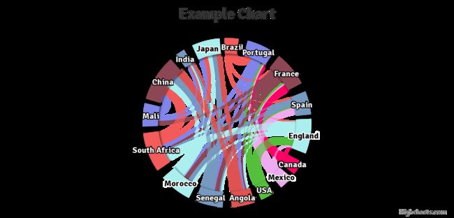
许多R包都可以画桑基图和轮状图,如 circlize, networkD3, and ggalluvial。
这些包都非常好,非常有用。问题来了,吃饱了撑的再弄一个同样的画图包。
作者说了,桑基图和轮状图有些关联,一个R包画两张图,岂不更美。于是乎就有了sankeywheel,除此之外,这个包使用“Highcharts”增加了交互性,另外这个包更简单易用。
1、先安装包
devtools::install_github('czxa/sankeywheel', build_vignettes = TRUE)

devtools::install_git("https://github.com/czxa/sankeywheel.git", build_vignettes = TRUE)

install.packages("sankeywheel")
2、基本使用
library(sankeywheel)
head(sankeydf)#用它内置的数据集
# A tibble: 6 x 3
  from   to       weight

1 Brazil Portugal      5
2 Brazil France        1
3 Brazil Spain         1
4 Brazil England       1
5 Canada Portugal      1
6 Canada France        5
3、画轮状网络图
sankeywheel(from = sankeydf$from,
            to = sankeydf$to,
            weight = sankeydf$weight,
            type = "dependencywheel",
            width = "100%")
4、画桑基图
sankeywheel(from = sankeydf$from,
            to = sankeydf$to,
            weight = sankeydf$weight,
            type = "sankey",
            width = "100%")
4、更改主题参数
library(manipulateWidget)
combineWidgets(
  sankeywheel(from = sankeydf$from,
            to = sankeydf$to,
            weight = sankeydf$weight,
            type = "sankey",
            width = "100%",
            theme = "sunset",
            title = "SUNSET"),
  sankeywheel(from = sankeydf$from,
            to = sankeydf$to,
            weight = sankeydf$weight,
            type = "dependencywheel",
            width = "100%",
            theme = "sunset",
            title = "SUNSET"),
  byrow = TRUE, ncol = 2, width = "100%", height = "300px"
)
sankeywheel(from = sankeydf$from,
            to = sankeydf$to,
            weight = sankeydf$weight,
            type = "dependencywheel",
            seriesName = "Random data: ",
            width = "100%",
            height = "400px",
            theme = "sunset",
            title = "SUNSET",
            titleAlign = "center",
            titleSize = "18px",
            titleColor = "black",
            subtitle = "czxa.top",
            subtitleAlign = "center",
            subtitleSize = "14px",
            subtitleColor = "black")


