Primary Color
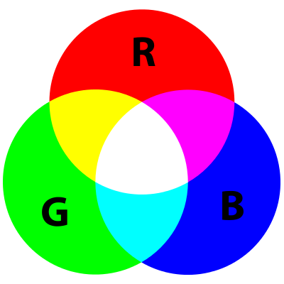
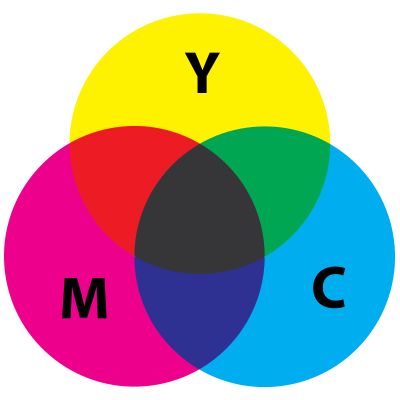
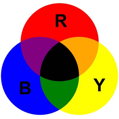
Primary colors (or primary colours) are sets of colors that can be combined to make a useful range of colors. The primary colors are those which cannot be created by mixing other colors in a given color space.
- The color mode for light: RGB color model
- The color mode for printing: CMYK color model
- The color mode for Art: RYB color model
Secondary color
A secondary color is a color made by mixing two primary colors in a given color space.
Tertiary color
A tertiary color is a color made by mixing full saturation of one primary color with half saturation of another primary color and none of a third primary color, in a given color space.
subtractive color(CMYK)
Subtractive color mixing means that one begins with white and ends with black; as one adds color, the result gets darker and tends to black.
additive color(RGB)
Additive color mixing begins with black and ends with white; as more color is added, the result is lighter and tends to white.
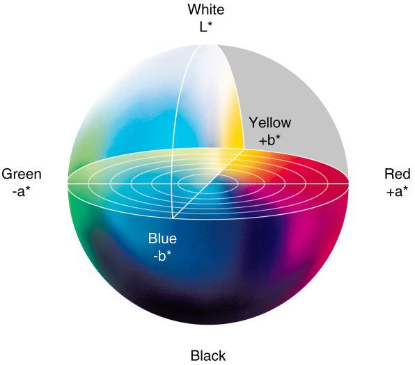
Lab
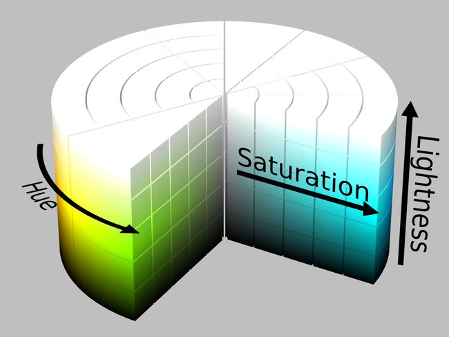
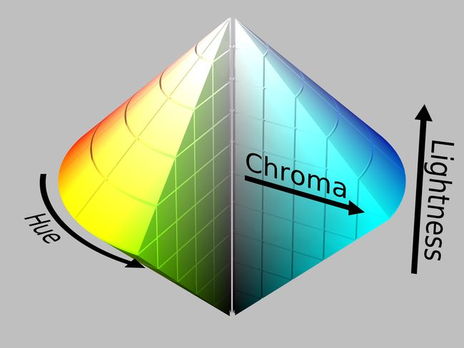
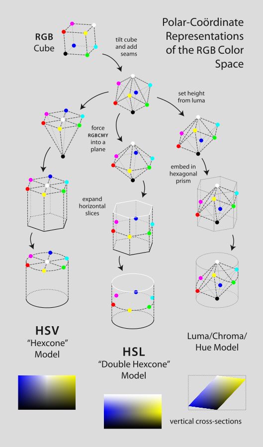
HSL
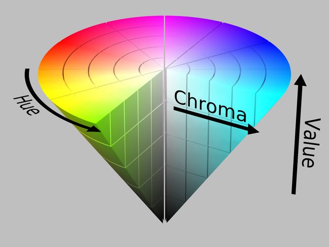
HSL: Hue, Saturation, Lightness
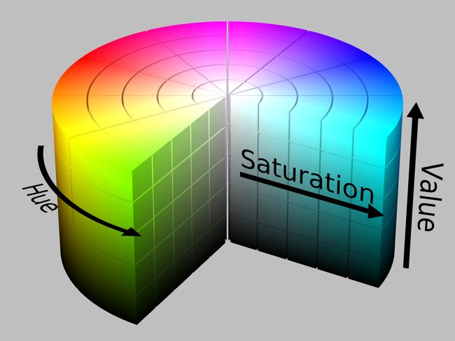
HSV
HSV: Hue, Saturation, Value
RGB cube
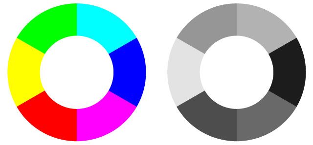
Natural value of lightness
Tint, Shade, Tone
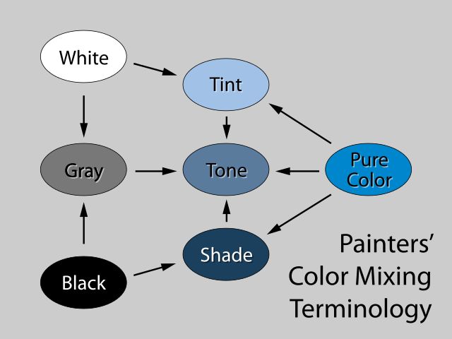
In color theory, a tint is the mixture of a color with white, which increases lightness, and a shade is the mixture of a color with black, which reduces lightness. A tone is produced either by the mixture of a color with grey, or by both tinting and shading. Mixing a color with any neutral color (including black, gray and white) reduces the chroma, or colorfulness, while the hue remains unchanged.
Colors of the same hue and saturation, but of different lightness, are called tints and shades. Colors of the same hue and lightness, but of different saturation, are called tones.
color schemes
- Monochromatic colors
Monochromatic colors are all the colors (tints, tones, and shades) of a single hue. Monochromatic color schemes are derived from a single base hue and extended using its shades, tones and tints.
- Complementary colors
Complementary colors are pairs of colors which, when combined, cancel each other out. This means that when combined, they produce a gray-scale color like white or black. When placed next to each other, they create the strongest contrast for those particular two colors.
- Split-Complementary colors
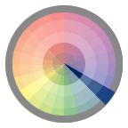
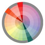
The split-complementary color scheme is a variation of the complementary color scheme. In addition to the base color, it uses the two "Analogous" colors adjacent to its complement. Split-complementary color scheme has the same strong visual contrast as the complementary color scheme, but has less pressure.
- Achromatic colors(Neutral)
Meaning literally that it is a color "without color." Pure achromatic colors include black, white and all grays.
- Analogous colors
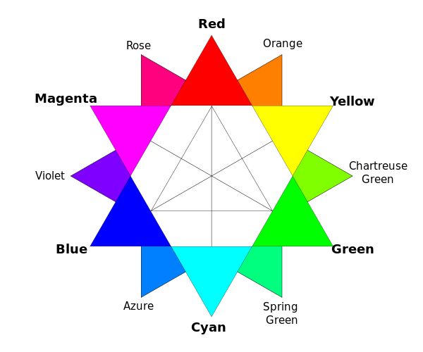
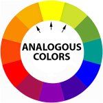
Analogous colors are groups of three colors that are next to each other on the color wheel, sharing a common color, with one being the dominant color, which tends to be a primary or secondary color, and two on either side complementing, which tend to be tertiary.
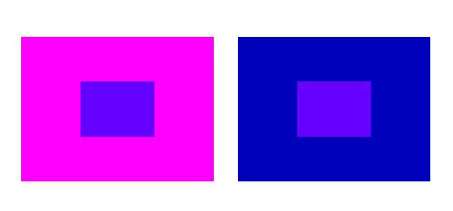
Between blue and magenta on the color wheel there’s purple. Purple is analogous to either blue or magenta. Analogous colors also push colors away so a purple color on a magenta background will appear bluer while a purple color on a blue background will appear to be more magenta.
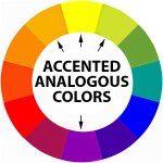
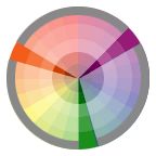
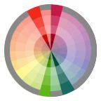
- Accented Analogous colors
An accented analogous scheme (also called analogous complementary) is a combination of the analogous and complementary color schemes. It consists of colors which sit next to each other on the color wheel and a color that is directly opposite to these.
- Triadic colors
The triadic color scheme uses three colors equally spaced around the color wheel.
-
Tetradic colors
The tetradic (double complementary) colors scheme is the richest of all the schemes because it uses four colors arranged into two complementary color pairs.-
Rectangle
The rectangle or tetradic color scheme uses four colors arranged into two complementary pairs.
Square
The square color scheme is similar to the rectangle, but with all four colors spaced evenly around the color circle.
-
Polychromatic colors
The term polychromatic means having several colors.
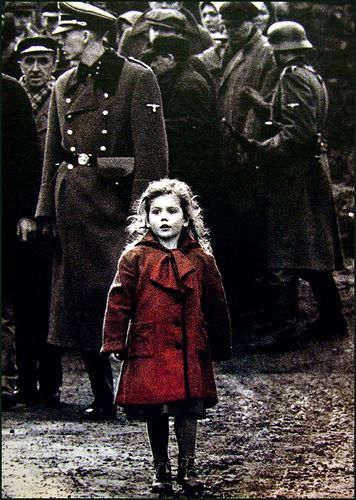
- Accented Neutral Color Scheme
Very similar to your plain-jane neutral color scheme except you accent it with a color or colors
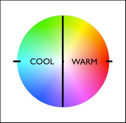
Warm colors v.s. Cool colors
Absolutely warm and cool colors can be found at 0 (red – no warmer color) and 180 (cyan – no cooler color) degrees. Determining whether one color is warmer or cooler than another can be measured by their proximities to these poles. A line between 90 (green-yellow) and 270 degrees(blue-megent) can be used to broadly demarcate warm colors from cool colors; colors on the right (towards red) are warm while colors on the left (towards cyan) are cool.
The association of yellow with the sun, a warm light source, subtly skews the associative quality of warmth towards yellow (60) and away from blue; as a result, colors above the line between 0 and 180 tend to seem warmer than colors below it. (i.e. while both are equally distant from red (0), orange (30) seems warmer than blue red (330).)
