正确率、召回率及ROC曲线
如果将一个正例判断为正例,称为真正例(TP),类似的,将一个反例判断为反例,称为真反例(TN),将一个正例判断为反例,称为伪反例(FN),将一个反例判断为正例,即伪正例(FP);
1、正确率P是指判断为正确的样本中,实际为正确样本的个数:
P=TP/(TP+FP)
2、召回率R是指所有正例样本中预测为正例样本的比例:
R=TP/(TP+FN)
我们要构造一个同时使正确率和召回率最大的分类器是具有挑战性的。
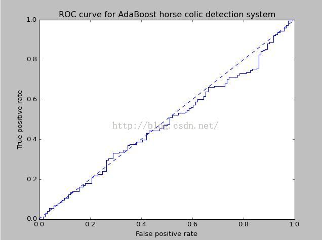
3、ROC曲线也可以用来比较不同分类器的性能
ROC曲线的横坐标为假正例率=FP/(FP+TN) ,如果这个值为0,意味着将所有的反例都能正确的判断出来,例如能正确地过滤到所有的垃圾邮件。意思就是本身就是垃圾邮件,能正确地判断出为垃圾邮件,而不会将好的邮件判断为垃圾邮件。因此这个值越小越好。纵坐标是召回率R,即所有的好的邮件中我预测出来的也都是好的邮件,这个值越高越好。因此数据集中在左上角比较好,既能很好的过滤掉所有的垃圾邮件,又能很好的区分出好的邮件。
4、对不同的ROC曲线进行比较的一个指标是曲线下的面积AUC,AUC给出的是分类器的平均性能,一个完美的分类器的AUC为1,而随机猜测的如上图所示为0.5。
5、为了画出ROC曲线,分类器必须提供给每个样例的阳性或者阴性的值,及横纵坐标值;
def plotROC(predStrengths, classLabels):
    import matplotlib.pyplot as plt
    cur = (1.0,1.0) #cursor
    ySum = 0.0 #variable to calculate AUC
    numPosClas = sum(array(classLabels)==1.0)
    yStep = 1/float(numPosClas); xStep = 1/float(len(classLabels)-numPosClas)
    sortedIndicies = predStrengths.argsort()#get sorted index, it's reverse
    fig = plt.figure()
    fig.clf()
    ax = plt.subplot(111)
    #loop through all the values, drawing a line segment at each point
    for index in sortedIndicies.tolist()[0]:
        if classLabels[index] == 1.0:
            delX = 0; delY = yStep;
        else:
            delX = xStep; delY = 0;
            ySum += cur[1]
        #draw line from cur to (cur[0]-delX,cur[1]-delY)
        ax.plot([cur[0],cur[0]-delX],[cur[1],cur[1]-delY], c='b')
        cur = (cur[0]-delX,cur[1]-delY)
    ax.plot([0,1],[0,1],'b--')
    plt.xlabel('False positive rate'); plt.ylabel('True positive rate')
    plt.title('ROC curve for AdaBoost horse colic detection system')
    ax.axis([0,1,0,1])
    plt.show()
    print "the Area Under the Curve is: ",ySum*xStep
6、结果