CSS属性之过渡(transition)属性
定义
过渡transition是个复合属性,它包括了transition-property、transition-duration、transition-timing-function、transition-delay这四个属性,配合这四个属性完成一个完整的过渡动画效果。
transition-property: 过渡属性,指定属性的name、transition效果(默认值为all)
transition-duration: 过渡效果需要多久时间完成,指定完成过渡的时间。(单位:s/ms)
transition-timing-function: 指定完成过渡的曲线。(是匀速还是非匀速)
transition-delay: 指定延迟时间。(延迟多久后开始执行)
缩写形式:transition: transition-property transition-duration transition-timing-function transition-delay;
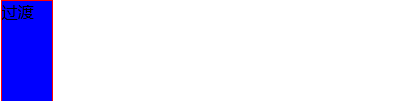
过渡属性
过渡
效果如下:

在transition的这四个属性中,只有transition-duration是必需且不能为0的,transition-duration与transition-delay都表示时间,当这两个放在一起的时候,第一个是transition-duration,第二个是transition-delay,当只有一个时,表示的是transition-duration,transition-delay默认值是0。
当有两个时间时:
#trans {
	    width: 50px;
		height: 100px;
		border: 1px solid red;
		background-color: blue;

		transition: 1s 1s; /* 当只有两个时间时 */
	  }
效果如下:

当只有一个时间时:
#trans {
	    width: 50px;
		height: 100px;
		border: 1px solid red;
		background-color: blue;

		transition: 1s; /* 当只有一个时间时 */
	  }
效果如下:
注:transition的这四个属性不能用逗号隔开,能用逗号隔开的是不同的属性(transition能有多个不同的属性),如:width,height,background-color,用空格隔开的是不同属性的四个子属性。
transition-property(过渡属性name)
不是所有的CSS属性能有过渡属性,只有具备中间值的属性有过渡效果。
常见有过渡效果的css属性有:
颜色:color background-color border-color outline-color
位置:background-position top right bottom left
长度:max-height max-width height width min-height min-width
border-width margin padding outline-width
font-size line-height text-indent vertical-align
letter-spacing word-spacing
数值:opacity font-weight z-index
组合:transform text-shadow box-shadow clip
transition-duration属性
transition-duration属性指定过渡持续时间,过渡所需时间。单位是s或者ms
该值必须有且不能为负值,默认值是0s,0表示无效值。所以必需带单位。
当时间值为单值时,表示 所有的过渡属性 都 对应同样时间,当时间是多值时,过渡属性 按照顺序 对应持续时间。
transition-delay属性
transition-delay属性指定延迟多少时间后开始过渡效果,同样必需带单位,单位是s或者ms
不带单位为无效值。若为负值,则无延迟效果。
当为单值时,表示 所有的过渡属性 都 对应同样时间,当时间是多值时,过渡属性 按照顺序 对应持续时间。
transition-timing-function属性
该属性指定过渡速度。
linear:以匀速过渡。
ease:慢速开始,中间快速,以慢速结束。
ease-in:慢速开始。
ease-out:慢速结束。
ease-in-out:以慢速开始和结束。
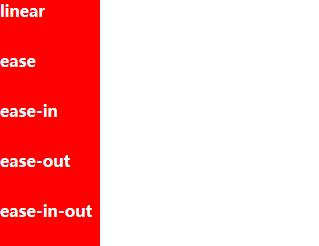
过渡属性
linear
ease
ease-in
ease-out
ease-in-out
效果如下:
多值
transition的属性值用 逗号隔开时,表示为多个属性值设置过渡属性。
1)若不同的transition-property值,对应的其它(duration||timing-function||delay)属性值相同时,对应的属性值设置一个即可。
div {
	    width: 100px;
		height: 100px;
		font-weight: bold;
		background-color: red;
		color: white;

		transition: width,background-color; /* 不同的property值 */
		transition-duration: 1s;
		transition-timing-function: linear;  /* 对应的属性值设置一个 */
		transition-delay: 1s;

	  }

	  div:hover {
	    width: 300px;
		background-color: blue;
	  }
效果如下:

可以看出,上面property的属性值不同,但它们对应的其它属性值相同,所以其它的属性值只设置一个即可。
2)当property的值的个数多于其它属性值(其它属性值的个数大于1)时,按照顺序取值。
div {
	    width: 100px;
		height: 100px;
		font-weight: bold;
		background-color: red;
		color: white;

		transition: width,background-color,opacity;
		transition-duration: 1s,5s;
		transition-timing-function: linear,ease;
		transition-delay: 1s,20ms;

	  }
效果如下

3)当property的属性值个数少于其它属性值的个数时,多余的将无效(按顺序取值)。
div {
	    width: 100px;
		height: 100px;
		font-weight: bold;
		background-color: red;
		color: white;
        transition: width;
		transition-duration: 1s,5s;
		transition-timing-function: linear,ease;
		transition-delay: .5s,20ms;

	  }

	  div:hover {
	    width: 300px;
	  }
效果如下:

4)当property属性值中出现一个无效值时,依然按顺序对应其它属性值(若其它属性值也出现无效值情况类似)。
div {
	    width: 100px;
		height: 100px;
		font-weight: bold;
		background-color: red;
		color: white;

        transition: width,wuxiaozhi,background-color;
		transition-duration: 1s,5s;
		transition-timing-function: linear,ease;
		transition-delay: .5s,20ms;

	  }

	  div:hover {
	    width: 300px;
		background-color: blue;
	  }
效果如下:

5)当property属性值出现重复值时,只取最后一个值为准,前面重复值无效,并按顺序对应其它属性值。
过渡阶段
过渡开始时间=样式改变的时刻+过渡延迟时间;而过渡结束时间=过渡开始时间+过渡持续时间
过渡起始值=过渡前 的过渡属性值;而过渡结束值=过渡完成后 的过渡属性值
过渡分为两个阶段:前进(forward)和反向(reverse)。若前进阶段进行一段时间后进入反向阶段,则反向阶段的初始值是前进阶段结束时的瞬时值