R语言-快速画图
函数介绍
qplot(x, y, …, data, facets = NULL, margins = FALSE, geom = “auto”,
xlim = c(NA, NA), ylim = c(NA, NA), log = “”, main = NULL,
xlab = NULL, ylab = NULL, asp = NA, stat = NULL, position = NULL)
准备工作:
> library(ggplot2)
> #下载好包之后,在使用前加载包,如果窗口不重启加载一次就ok
> data(diamonds)
> #使用ggplot2中自带的一个叫做diamonds的数据集,里面包含了月5400颗钻石的价格和质量信息。

> diamonds.data <- diamonds[sample(nrow(diamonds),200),]
> diamonds.data
> #随机取到200条数据,并查看一下
# A tibble: 200 x 10
   carat cut       color clarity depth table price     x     y     z
   <dbl> <ord>     <ord> <ord>   <dbl> <dbl> <int> <dbl> <dbl> <dbl>
 1  0.7  Very Good F     SI2      60.9    58  1940  5.7   5.77  3.49
 2  0.73 Premium   D     VS1      60      58  3557  5.9   5.86  3.53
 3  0.4  Ideal     F     VS1      61.3    56   982  4.73  4.76  2.91
 4  0.71 Ideal     E     SI2      58.7    57  2340  5.89  5.86  3.44
 5  0.71 Ideal     G     SI1      61.5    55  3061  5.75  5.79  3.55
 6  0.54 Ideal     G     VS2      61.5    55  1422  5.24  5.27  3.23
 7  0.3  Good      H     VVS1     63.4    55   684  4.28  4.3   2.72
 8  0.3  Premium   E     VVS2     61.3    59  1013  4.32  4.3   2.64
 9  0.51 Ideal     F     SI2      61.3    57  1146  5.16  5.19  3.17
10  0.55 Ideal     G     IF       60.9    57  2789  5.28  5.3   3.22
# ... with 190 more rows
这里简单看一下数据结构
> summary(diamonds)
     carat               cut        color        clarity          depth
 Min.   :0.2000   Fair     : 1610   D: 6775   SI1    :13065   Min.   :43.00
 1st Qu.:0.4000   Good     : 4906   E: 9797   VS2    :12258   1st Qu.:61.00
 Median :0.7000   Very Good:12082   F: 9542   SI2    : 9194   Median :61.80
 Mean   :0.7979   Premium  :13791   G:11292   VS1    : 8171   Mean   :61.75
 3rd Qu.:1.0400   Ideal    :21551   H: 8304   VVS2   : 5066   3rd Qu.:62.50
 Max.   :5.0100                     I: 5422   VVS1   : 3655   Max.   :79.00
                                    J: 2808   (Other): 2531
     table           price             x                y                z
 Min.   :43.00   Min.   :  326   Min.   : 0.000   Min.   : 0.000   Min.   : 0.000
 1st Qu.:56.00   1st Qu.:  950   1st Qu.: 4.710   1st Qu.: 4.720   1st Qu.: 2.910
 Median :57.00   Median : 2401   Median : 5.700   Median : 5.710   Median : 3.530
 Mean   :57.46   Mean   : 3933   Mean   : 5.731   Mean   : 5.735   Mean   : 3.539
 3rd Qu.:59.00   3rd Qu.: 5324   3rd Qu.: 6.540   3rd Qu.: 6.540   3rd Qu.: 4.040
 Max.   :95.00   Max.   :18823   Max.   :10.740   Max.   :58.900   Max.   :31.800
这里对diamonds里的数据属性进行简单翻译方便数据的理解,
carat:克拉
cut:切割(Levels: Fair < Good < Very Good < Premium < Ideal)
color:颜色(Levels: D < E < F < G < H < I < J)
clarity:纯度(Levels: I1 < SI2 < SI1 < VS2 < VS1 < VVS2 < VVS1 < IF)
depth:全深比
table:台面
price:价格 *
绘图
简单比较plot()和qplot()图像
我们将数据分别用plot() 和qplot() 进行绘制,简单对比一下。
plot(diamonds.rand200$carat,diamonds.rand200$price)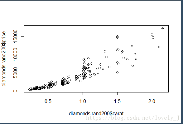
qplot(diamonds.rand200$carat,diamonds.rand200$price)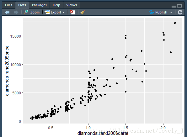
数据内容是一样的,qplot的网格背景有效增强了数据的可阅读性。
除此之外 在qplot中可以设置图形属性,以更形象地展示图形中的信息,常用的图形属性包括形状(shape)、颜色(colour)、大小(size)、透明度(alpha)等。这些属性都有默认的取值情况,也可以通过I()自己设定图形属性。
用颜色区分属性的取值
 > attach(diamonds.rand200)
 > #为了方面选择数据,将diamonds.rand200这个数组绑定一下,后面就可以直接用列名选取里面某列的数据
The following objects are masked from diamonds:

carat, clarity, color, cut, depth, price, table, x, y, zcolour属性会智能地依据所选属性的取值情况来安排颜色,下面举两个例子
- 以cut-钻石切割工艺(数据取值是有限集合)进行颜色划分
qplot(carat,price,data = diamonds.rand200,colour = cut)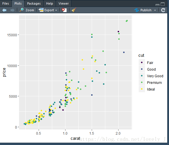
2. 以depth-钻石全深比(数据取值在连续区间内)进行颜色划分
qplot(carat,price,colour = depth)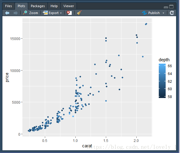
用形状区分属性的取值
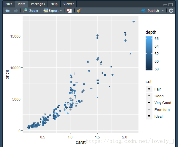
qplot()函数里的shapes的属性默认有6种图形,这个大家要注意,如果一个属性是在区间内取值或取值可能超过6种,就不要使用形状来区分数据了,编译器也会给出相应的警告信息The shape palette can deal with a maximum of 6 discrete values because more
than 6 becomes difficult to discriminate;...
qplot(carat,price,colour = depth,shape = cut)在使用cut作为形状区分的指标时系统会给出警告:Warning message: 。目前还不知道为什么和应该怎么改,如果大家有什么意见或者建议欢迎留言~
Using shapes for an ordinal variable is not advised
设置点的透明度
使用到alpha = I(n) 属性,做出来的图将每个点的透明度降至n,n越小,点越透明,透明度越大,可以把n理解为显多少色(取值范围在0~1)。
qplot(carat,price,colour = depth,alpha = I(1/5))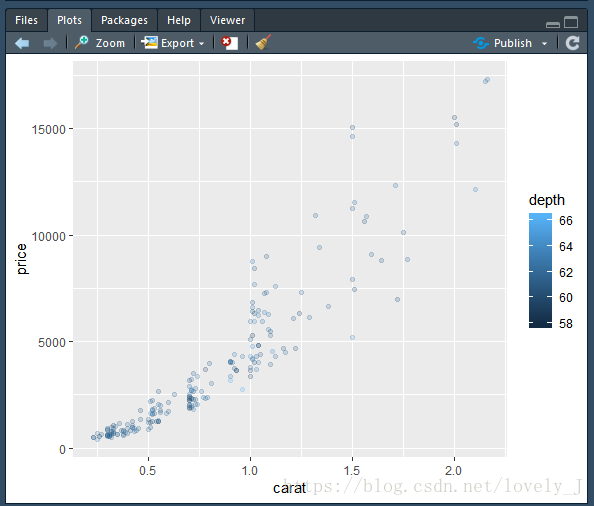
qplot(carat,price,colour = depth,alpha = I(1/10))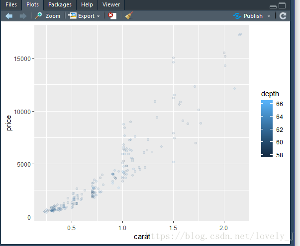
qplot(carat,price,colour = depth,alpha = I(3/5))
#这里皮了一下,一般情况是使用1/m这样的数值,其实在自定义的取值里只要是0~1的数值都可以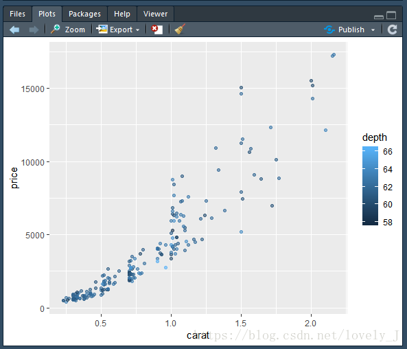
绘制其他形状的图
qplot(cut,price,geom = 'boxplot',color = cut)
#boxplot的x轴属性的取值需要是有限种的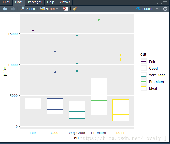
qplot(carat,price,geom = 'line',color = cut)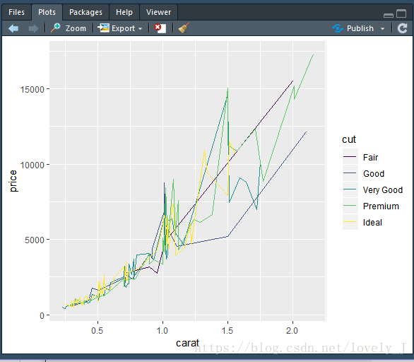
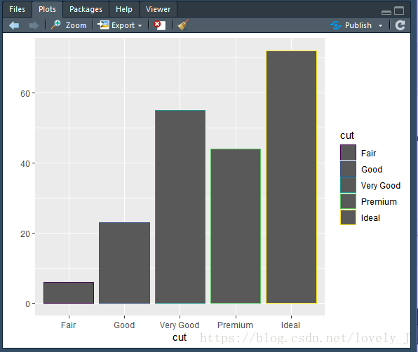
qplot(cut,geom = 'bar',colour = cut)