老师在课上罗列了几种用css绝对居中的方法,也列出了关键代码,这篇文章就作为上课内容的一个补充,文中所用图片也来自老师教案,老师教案传送门ʘᴗʘ:
https://github.com/quanta2015/Web-Mooc/blob/master/T02-web-css-center.md
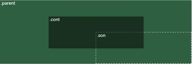
01负外边距
基本思路:将设置了绝对定位的子元素水平和垂直偏移50%,然后在水平和垂直方向分别偏移负自身宽高的一半,示意图如下:
代码如下:
#parent1{
    width: 500px;
    height: 300px;
    position: relative;
    background-color: rgb(46,95,62);
}

#son1{
    width: 250px;
    height: 150px;
    position: absolute;
    left: 50%;
    top: 50%;
}

#cont1{
    width: 100%;
    height: 150px;
    margin-left: -50%;
    margin-top: -75px;
    background-color: rgb(23,48,31);
}
优点:兼容性好,代码量少
不足:子元素的宽高需要确定,对于高度自适应的容器会带来问题,建议把盒子设置成box-sizing:border-box
02负位移
基本思路:将设置了绝对定位的子元素水平和垂直偏移50%,然后用transforms属性值将子元素偏移负自身宽高的一半,示意图如下:

代码如下:
#parent2{
    width: 500px;
    height: 300px;
    position: relative;
    background-color: rgb(46,95,62);
}

#son2{
    width: 250px;
    height: 150px;
    position: absolute;
    left: 50%;
    top: 50%;
    transform: translate(-50%,-50%);
    background-color: rgb(23,48,31);
}
优点:支持子容器高度自适应;适用于响应式布局环境;移动浏览器支持较好;代码量少
不足:不支持IE8及以西啊浏览器;需要添加浏览器私有前缀;translate可能受transform其他子属性值的影响
03表格块
基本思路:通过display中的table和table-cell属性,模拟表格布局,示意图如下:
代码如下:
#parent3{
    width: 500px;
    height: 300px;
    display: table;
    background-color: rgb(46,95,62);
}

#son3{
    display: table-cell;
    vertical-align: middle;
}

#cont3{
    width: 50%;
    height: 50%;
    margin: auto;
    background-color: rgb(23,48,31);
}
优点:支持高度自适应;可适应响应式环境;适用于多个子元素水平垂直居中环境;兼容性好;
不足:需要额外标签
04行内块
基本思路:将子容器和任一伪元素设置为行内块及水平居中,然后对父容器文本居中,示意图如下:
代码如下:
#parent4{
    width: 500px;
    height: 250px;
    text-align: center;
    overflow: auto;
    background-color: rgb(46,95,62);
}

#parent4:after{
    content: '';
    display: inline-block;
    vertical-align: middle;
    height: 100%;
    width: 0;
}

#son4{
    width: 250px;
    height: 150px;
    display: inline-block;
    vertical-align: middle;
    background-color: rgb(23,48,31);
}
优点:支持子元素高度自适应;适应于多个子元素水平垂直居中环境;兼容性良好,IE7及以上支持
不足:当存在多个子容器时,注意盒子之间的间隙
05伸缩盒模型
基本思路:使用flexbox弹性盒模型设置居中,示意图如下:

代码如下:
#parent5{
    width: 500px;
    height: 300px;
    background-color: rgb(46,95,62);
    display: flex;
    align-items: center;
    justify-content: center;
}

#son5{
    width: 250px;
    height: 150px;
    background-color: rgb(23,48,31);
}
优点:不需要设置子元素的宽高;适用于任意子元素水平垂直居中环境;提供更开阔和便捷的布局思想;代码量少;((ฅ>ω<*ฅ)
自己比较喜欢的一个方法)
不足:IE10及以上兼容,高级浏览器也部分存在兼容问题;需要添加浏览器私有前缀;可能存在性能问题。
06绝对居中块
基本思路:设置子元素外边距auto及四个方向的偏移值为0做到水平垂直居中,示意图如下:
代码如下:
#parent6{
    width: 500px;
    height: 300px;
    background-color: rgb(46,95,62);
    position: absolute;
}

#son6{
    width: 50%;
    height: 50%;
    background-color: rgb(23,48,31);
    margin: auto;
    position: absolute;
    top: 0;
    right: 0;
    left: 0;
    bottom: 0;
}
优点:支持IE8及以上;代码量少,便签结构简单;通过用%设置宽高值实现适用于响应式环境的目的
不足:高度必须定义
07外插入一个空元素&利用浮动
基本思路:
通过定义一个子元素,把它的高定义为50%,宽随意,设置margin-bottom达到绝对居中,示意图如下:
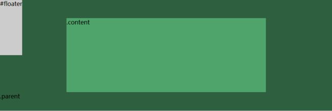
代码如下:
#parent7{
    width: 500px;
    height: 300px;
    background-color: rgb(46,95,62);
}

#content7{
    clear: both;
    height: 150px;
    position: relative;
    width: 50%;
    margin: auto;
    background-color: rgb(23,48,31);
}

#floater{
    background-color: #ccc;
    float: left;
    margin-bottom: -75px;
    height: 50%;
    width: 50px;
}
优点:使用于大多数浏览器(包括IE8及以上);没有足够的空间时(如:窗口缩小),content不会被截断
不足:需要额外的空元素;用到了浮动,容易影响整体布局
主要都是老师的内容照搬照抄,一些地方加入了自己的理解,方便查阅。