CSS多栏布局-两栏布局和三栏布局
目录
- 前言
- ------两栏布局
-
- 一、左列定宽,右列自适应
-
- 1.浮动+margin
- 2.浮动+BFC
- 3.定位
- 4.flex
- 5.浮动+负外边距
- 6.table布局
- 二、左列不定宽,右列自适应
-
- 1.flex
- 2.浮动+BFC
- ------三栏布局
-
- 左右两列定宽,中间自适应
-
- 1.浮动+margin
- 2.浮动+BFC
- 3.flex
- 4.table
- 5.定位
- 6.圣杯布局
- 7.双飞翼布局
- 写在后面
前言
在牛客上看面经时,发现有很多关于CSS布局的问题,尤其是两栏、三栏布局。
b站css两栏布局
b站css三栏布局
------两栏布局
一、左列定宽,右列自适应
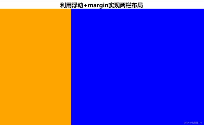
1.浮动+margin
 <div class="container">
        <h2 style="text-align:center">利用浮动+margin实现两栏布局h2>
        <div class="left">div>
        <div class="right">div>
    div>
     * {
            margin: 0;
            padding: 0;
        }
        .left {
            height:100%;
            width:300px;
            background-color: orange;
            float: left;
        }
        .right {
            height:100%;
            background-color: blue;
            margin-left: 300px;
        }
        .container {
            height:800px;
        }
效果:
2.浮动+BFC
了解BFC
.left {
            height:100%;
            width:300px;
            background-color: orange;
            float: left;
        }
        .right {
            height:100%;
            background-color: blue;
            /* 触发BFC */
            overflow: hidden;
        }
        .container {
            height:800px;
        }
3.定位
.container {
            position: relative;
            height:800px;
        }
        .left {
            height:100%;
            position: absolute;
            left:0;
            width:300px;
            background-color: orange;
        }
        /* .right {
            height:100%;
            background-color: blue;
            margin-left: 300px;
        } */
        .right {
            height:100%;
            position: absolute;
            background-color: blue;
            left: 300px;
            right:0;
        }
4.flex
.container {
     display: flex;
     height:800px;
 }
 .left {
     height:100%;
     width:300px;
     background-color: orange;
 }
 .right {
     height:100%;
     flex:1;
     background-color: blue;
 }
5.浮动+负外边距
.container {
            height:800px;
        }
        .left {
            height:100%;
            width:300px;
            float: left;
            margin-right: -100%;
            background-color: orange;
        }
        .right {
            height:100%;
            width: 100%;
            float: left;
            /* background-color: red; */
        }
        .content{
            height: 100%;
            margin-left: 300px;
            background-color: blue;
        }
6.table布局
.container {
      width:100%;
      display: table;
      height:800px;
  }
  .left {
      height:100%;
      width:300px;
      display: table-cell;
      background-color: orange;
  }
  .right {
      height:100%;
      display: table-cell;
      background-color: blue;
  }
二、左列不定宽,右列自适应
在左列定宽,右列自适应的情况下,去掉左列的宽度即可。
1.flex
左列的宽度:
width:20%;
2.浮动+BFC
左列的宽度:
width:20%;
------三栏布局
左右两列定宽,中间自适应
1.浮动+margin
<h2 style="text-align:center">利用浮动+margin实现三栏布局h2>
    <div class="container">
        <div class="left">div>
        <div class="right">div>
        <div class="main">div>
    div>
.container{
        height: 800px;
    }
    .left{
        height: 100%;
        float: left;
        width: 200px;
        background-color: red;
    }
    .right{
        height: 100%;
        float: right;
        width: 200px;
        background-color: blue;
    }
    .main{
        height: 100%;
        margin-left: 200px;
        margin-right: 200px;
        background-color: green;
    }
效果图:

2.浮动+BFC
触发中间列的BFC
.main{
        height: 100%;
        overflow: hidden;
        background-color: green;
    }
3.flex
.container{
        height: 800px;
        display: flex;
    }
    .left{
        height: 100%;
        width: 200px;
        background-color: red;
    }
    .right{
        height: 100%;
        width: 200px;
        background-color: blue;
    }
    .main{
        height: 100%;
        flex: 1;
        background-color: green;
    }
4.table
.container{
        height: 800px;
        display: table;
        width: 100%;
    }
    .left{
        height: 100%;
        display: table-cell;
        width: 200px;
        background-color: red;
    }
    .right{
        height: 100%;
        display: table-cell;
        width: 200px;
        background-color: blue;
    }
    .main{
        height: 100%;
        width: 60%;
        display: table-cell;
        background-color: green;
    }
注意容器的排列顺序:
<div class="left">div>
<div class="main">div>
<div class="right">div>
5.定位
.container{
        height: 800px;
        position: relative;
    }
    .left{
        height: 100%;
        position: absolute;
        left: 0;
        width: 200px;
        background-color: red;
    }
    .right{
        height: 100%;
        position: absolute;
        right: 0;
        width: 200px;
        background-color: blue;
    }
    .main{
        height: 100%;
        margin: 0 200px;
        background-color: green;
    }
看效果图,这个好像未实现

6.圣杯布局
圣杯布局以class="main"这个div为主:
<div class="container">
       <div class="main">div>
       <div class="left">div>
       <div class="right">div>
 div>
.container{
        height: 800px;
        margin-left: 200px;
        margin-right: 200px;
    }
    .main{
        width: 100%;
        height: 100%;
        float: left;
        background-color: red;
    }
    .left{
        height: 100%;
        float: left;
        width: 200px;
        margin-left: -100%;
        position: relative;
        left: -200px;
        background-color: blue;
    }
    .right{
        height: 100%;
        float: left;
        width: 200px;
        margin-left: -200px;
        position: relative;
        right: -200px;
        background-color: green;
    }
7.双飞翼布局
    <div class="content">
        <div class="main">div>
    div>
    <div class="left">div>
    <div class="right">div>
.content{
        height: 600px;
        float: left;
        width: 100%;
    }
    .main{
        margin-left: 200px;
        margin-right: 200px;
        height: 600px;
        background-color: red;
    }
    .left{
        height: 600px;
        float: left;
        width: 200px;
        margin-left: -100%;
        background-color: blue;
    }
    .right{
        height: 600px;
        float: left;
        width: 200px;
        margin-left: -200px;
        background-color: green;
    }
看起来也没有实现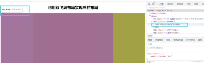
写在后面
视频中的例子都没加高度,所以写的时候要自己加高度。
圣杯布局和双飞翼布局好难理解